Comprehensive Guide to Matplotlib.axis.Tick.set_zorder() Function in Python
Matplotlib.axis.Tick.set_zorder() function in Python is a powerful tool for controlling the drawing order of ticks in Matplotlib plots. This function allows you to adjust the z-order of tick marks, which determines their visibility when overlapping with other plot elements. In this comprehensive guide, we’ll explore the Matplotlib.axis.Tick.set_zorder() function in depth, covering its usage, parameters, and practical applications in various plotting scenarios.
Understanding the Basics of Matplotlib.axis.Tick.set_zorder()
The Matplotlib.axis.Tick.set_zorder() function is part of the Matplotlib library, specifically within the axis module. It operates on Tick objects, which represent the individual tick marks on an axis. The primary purpose of this function is to set the z-order of a tick, determining its drawing priority relative to other elements in the plot.
Let’s start with a simple example to illustrate the basic usage of Matplotlib.axis.Tick.set_zorder():
import matplotlib.pyplot as plt

fig, ax = plt.subplots()
ax.plot([1, 2, 3, 4], [1, 4, 2, 3], label='Data')
ax.set_title('How2matplotlib.com: Basic Tick Z-Order Example')

# Get the x-axis ticks
x_ticks = ax.xaxis.get_major_ticks()

# Set z-order for the first tick
x_ticks[0].set_zorder(10)

plt.legend()
plt.show()
Output:
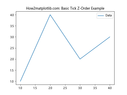
In this example, we create a simple line plot and then access the x-axis ticks using ax.xaxis.get_major_ticks(). We then use the Matplotlib.axis.Tick.set_zorder() function to set the z-order of the first tick to 10. This will cause the first tick to be drawn on top of other elements with lower z-order values.
Exploring the Parameters of Matplotlib.axis.Tick.set_zorder()
The Matplotlib.axis.Tick.set_zorder() function has a single parameter:
level(float): The z-order value to set for the tick. Higher values are drawn on top of lower values.
Let’s examine how different z-order values affect the appearance of ticks:
import matplotlib.pyplot as plt

fig, ax = plt.subplots()
ax.plot([1, 2, 3, 4], [1, 4, 2, 3], label='Data')
ax.set_title('How2matplotlib.com: Z-Order Comparison')

x_ticks = ax.xaxis.get_major_ticks()
y_ticks = ax.yaxis.get_major_ticks()

# Set different z-orders for x and y ticks
for i, tick in enumerate(x_ticks):
    tick.set_zorder(10 - i)

for i, tick in enumerate(y_ticks):
    tick.set_zorder(5 + i)

plt.legend()
plt.show()
Output:
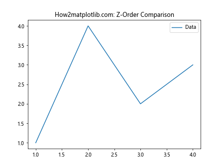
In this example, we set decreasing z-order values for x-axis ticks and increasing z-order values for y-axis ticks. This will create a visual hierarchy among the ticks, with some appearing more prominent than others.
Practical Applications of Matplotlib.axis.Tick.set_zorder()
Now that we understand the basics, let’s explore some practical applications of the Matplotlib.axis.Tick.set_zorder() function in various plotting scenarios.
1. Emphasizing Specific Ticks
You can use Matplotlib.axis.Tick.set_zorder() to emphasize certain ticks by giving them a higher z-order:
import matplotlib.pyplot as plt

fig, ax = plt.subplots()
ax.plot([1, 2, 3, 4, 5], [2, 4, 1, 3, 5], label='Data')
ax.set_title('How2matplotlib.com: Emphasizing Specific Ticks')

x_ticks = ax.xaxis.get_major_ticks()

# Emphasize the middle tick
middle_tick_index = len(x_ticks) // 2
x_ticks[middle_tick_index].set_zorder(10)

# Make the middle tick larger and red
x_ticks[middle_tick_index].label1.set_fontsize(14)
x_ticks[middle_tick_index].label1.set_color('red')

plt.legend()
plt.show()
Output:
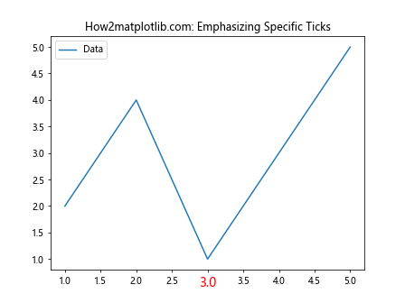
This example emphasizes the middle x-axis tick by setting its z-order higher than the others and making it larger and red.
2. Creating Layered Axes
Matplotlib.axis.Tick.set_zorder() can be used to create layered axes effects:
import matplotlib.pyplot as plt

fig, (ax1, ax2) = plt.subplots(2, 1, sharex=True)
fig.suptitle('How2matplotlib.com: Layered Axes')

ax1.plot([1, 2, 3, 4], [1, 4, 2, 3], label='Data 1')
ax2.plot([1, 2, 3, 4], [3, 1, 4, 2], label='Data 2')

# Set z-order for ax1 ticks
for tick in ax1.xaxis.get_major_ticks():
    tick.set_zorder(10)

# Set z-order for ax2 ticks
for tick in ax2.xaxis.get_major_ticks():
    tick.set_zorder(5)

ax1.legend()
ax2.legend()
plt.show()
Output:
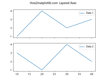
In this example, we create two subplots with shared x-axes. By setting different z-order values for the ticks of each subplot, we can control which ticks appear on top when the plots overlap.
3. Customizing Tick Visibility in 3D Plots
The Matplotlib.axis.Tick.set_zorder() function can also be useful in 3D plots to control tick visibility:
import matplotlib.pyplot as plt
from mpl_toolkits.mplot3d import Axes3D
import numpy as np

fig = plt.figure()
ax = fig.add_subplot(111, projection='3d')

x = np.linspace(-5, 5, 100)
y = np.linspace(-5, 5, 100)
X, Y = np.meshgrid(x, y)
Z = np.sin(np.sqrt(X**2 + Y**2))

ax.plot_surface(X, Y, Z)
ax.set_title('How2matplotlib.com: 3D Plot with Custom Tick Z-Order')

# Customize z-order for x-axis ticks
for tick in ax.xaxis.get_major_ticks():
    tick.set_zorder(10)

# Customize z-order for y-axis ticks
for tick in ax.yaxis.get_major_ticks():
    tick.set_zorder(5)

# Customize z-order for z-axis ticks
for tick in ax.zaxis.get_major_ticks():
    tick.set_zorder(15)

plt.show()
Output:
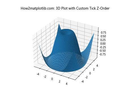
This example demonstrates how to use Matplotlib.axis.Tick.set_zorder() in a 3D plot to control the visibility of ticks on different axes.
Advanced Techniques with Matplotlib.axis.Tick.set_zorder()
Let’s explore some advanced techniques using the Matplotlib.axis.Tick.set_zorder() function.
1. Dynamic Z-Order Based on Data
You can dynamically set the z-order of ticks based on your data:
import matplotlib.pyplot as plt
import numpy as np

fig, ax = plt.subplots()
data = np.random.randn(100)
ax.plot(data, label='Random Data')
ax.set_title('How2matplotlib.com: Dynamic Z-Order Based on Data')

x_ticks = ax.xaxis.get_major_ticks()

for i, tick in enumerate(x_ticks):
    if i < len(data):
        # Set z-order based on data value
        tick.set_zorder(int(data[i] * 10))

plt.legend()
plt.show()
Output:
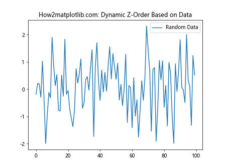
In this example, we set the z-order of each x-axis tick based on the corresponding data value, creating a visual representation of the data's magnitude in the tick z-order.
2. Combining Z-Order with Other Tick Properties
You can combine Matplotlib.axis.Tick.set_zorder() with other tick properties for more complex visualizations:
import matplotlib.pyplot as plt
import numpy as np

fig, ax = plt.subplots()
x = np.linspace(0, 10, 11)
y = np.sin(x)
ax.plot(x, y, label='Sine Wave')
ax.set_title('How2matplotlib.com: Combined Tick Properties')

x_ticks = ax.xaxis.get_major_ticks()

for i, tick in enumerate(x_ticks):
    # Set z-order based on sine value
    z_order = int((y[i] + 1) * 10)
    tick.set_zorder(z_order)

    # Adjust tick label color based on z-order
    color = plt.cm.viridis(z_order / 20)
    tick.label1.set_color(color)

    # Adjust tick length based on z-order
    tick.tick1line.set_markersize(z_order)

plt.legend()
plt.show()
Output:
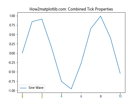
This example combines z-order, color, and tick length to create a visually rich representation of the sine wave in the tick properties.
3. Using Z-Order for Tick Label Overlap Prevention
Matplotlib.axis.Tick.set_zorder() can be used to prevent tick label overlap in dense plots:
import matplotlib.pyplot as plt
import numpy as np

fig, ax = plt.subplots(figsize=(10, 6))
x = np.linspace(0, 10, 100)
y = np.sin(x) * np.exp(-x/10)
ax.plot(x, y, label='Damped Sine Wave')
ax.set_title('How2matplotlib.com: Preventing Tick Label Overlap')

x_ticks = ax.xaxis.get_major_ticks()

for i, tick in enumerate(x_ticks):
    if i % 2 == 0:
        tick.set_zorder(10)
        tick.label1.set_fontweight('bold')
    else:
        tick.set_zorder(5)
        tick.label1.set_fontsize(8)

plt.legend()
plt.show()
Output:
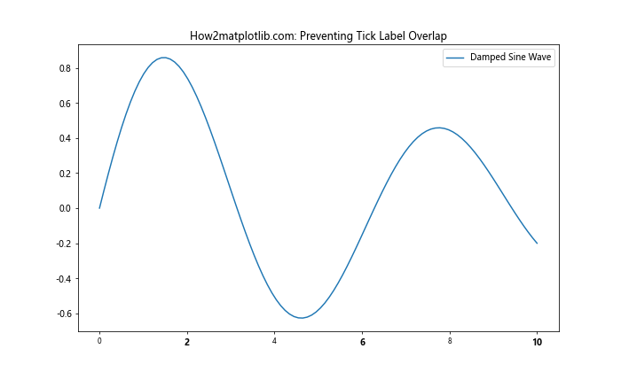
In this example, we alternate the z-order and appearance of x-axis tick labels to prevent overlap in a dense plot.
Best Practices for Using Matplotlib.axis.Tick.set_zorder()
When working with the Matplotlib.axis.Tick.set_zorder() function, consider the following best practices:
- Consistency: Maintain a consistent z-order scheme throughout your plot to avoid confusion.
- Purpose-driven: Use z-order to enhance the readability and interpretability of your plot, not just for aesthetic reasons.
- Combine with other properties: Leverage z-order in combination with other tick properties for more effective visualizations.
- Document your choices: When using complex z-order schemes, document your choices to make your code more maintainable.
Let's see an example that incorporates these best practices:
import matplotlib.pyplot as plt
import numpy as np

def set_tick_properties(tick, z_order, color, fontsize):
    tick.set_zorder(z_order)
    tick.label1.set_color(color)
    tick.label1.set_fontsize(fontsize)

fig, ax = plt.subplots()
x = np.linspace(0, 10, 11)
y1 = np.sin(x)
y2 = np.cos(x)
ax.plot(x, y1, label='Sine')
ax.plot(x, y2, label='Cosine')
ax.set_title('How2matplotlib.com: Best Practices Example')

x_ticks = ax.xaxis.get_major_ticks()
y_ticks = ax.yaxis.get_major_ticks()

# Set properties for x-axis ticks
for i, tick in enumerate(x_ticks):
    if i % 2 == 0:
        set_tick_properties(tick, 10, 'red', 12)
    else:
        set_tick_properties(tick, 5, 'blue', 10)

# Set properties for y-axis ticks
for i, tick in enumerate(y_ticks):
    if i % 2 == 0:
        set_tick_properties(tick, 15, 'green', 12)
    else:
        set_tick_properties(tick, 8, 'purple', 10)

plt.legend()
plt.show()
Output:
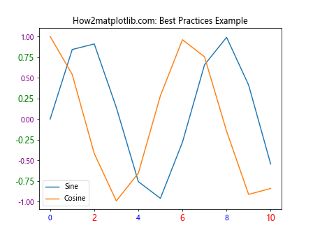
This example demonstrates a consistent and purpose-driven approach to using Matplotlib.axis.Tick.set_zorder(), combining it with other tick properties and using a helper function to improve code readability.
Advanced Applications of Matplotlib.axis.Tick.set_zorder()
Let's explore some advanced applications of the Matplotlib.axis.Tick.set_zorder() function to create more complex and informative visualizations.
1. Creating a Depth Illusion in 2D Plots
You can use z-order to create a sense of depth in 2D plots:
import matplotlib.pyplot as plt
import numpy as np

fig, ax = plt.subplots(figsize=(10, 6))
x = np.linspace(0, 10, 100)
y1 = np.sin(x)
y2 = np.cos(x)
y3 = np.tan(x)

ax.plot(x, y1, label='Sine', zorder=1)
ax.plot(x, y2, label='Cosine', zorder=2)
ax.plot(x, y3, label='Tangent', zorder=3)
ax.set_title('How2matplotlib.com: Depth Illusion in 2D')

x_ticks = ax.xaxis.get_major_ticks()
y_ticks = ax.yaxis.get_major_ticks()

# Create depth illusion with tick z-order
for i, tick in enumerate(x_ticks + y_ticks):
    tick.set_zorder(10 - i * 0.5)
    tick.label1.set_fontsize(10 + i * 0.5)

ax.set_ylim(-5, 5)
plt.legend()
plt.show()
Output:
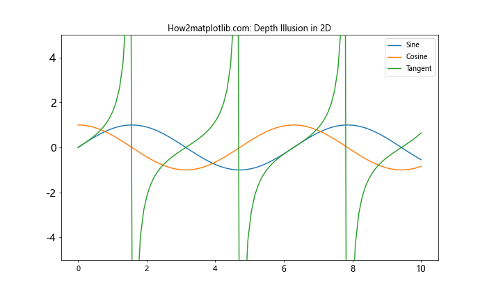
This example creates a depth illusion by gradually changing the z-order and font size of the ticks.
2. Highlighting Specific Data Ranges
Use Matplotlib.axis.Tick.set_zorder() to highlight specific data ranges:
import matplotlib.pyplot as plt
import numpy as np

fig, ax = plt.subplots(figsize=(10, 6))
x = np.linspace(0, 10, 100)
y = np.sin(x) * np.exp(-x/5)
ax.plot(x, y, label='Damped Sine')
ax.set_title('How2matplotlib.com: Highlighting Data Ranges')

x_ticks = ax.xaxis.get_major_ticks()

# Highlight middle range
middle_start = len(x_ticks) // 3
middle_end = 2 * len(x_ticks) // 3

for i, tick in enumerate(x_ticks):
    if middle_start <= i < middle_end:
        tick.set_zorder(15)
        tick.label1.set_color('red')
        tick.label1.set_fontweight('bold')
    else:
        tick.set_zorder(5)
        tick.label1.set_color('gray')

ax.axvspan(x[middle_start], x[middle_end-1], alpha=0.2, color='red', zorder=0)

plt.legend()
plt.show()
Output:
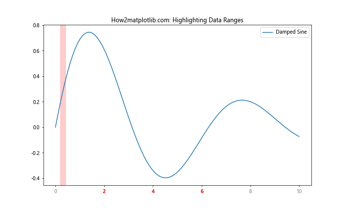
This example highlights a specific data range by adjusting the z-order and appearance of ticks within that range.
3. Creating a Layered Legend
You can use Matplotlib.axis.Tick.set_zorder() to create a layered legend effect:
import matplotlib.pyplot as plt
import numpy as np

fig, ax = plt.subplots(figsize=(10, 6))
x = np.linspace(0, 10, 100)
y1 = np.sin(x)
y2 = np.cos(x)
y3 = np.tan(x)

ax.plot(x, y1, label='Sine', zorder=1)
ax.plot(x, y2, label='Cosine', zorder=2)
ax.plot(x, y3, label='Tangent', zorder=3)
ax.set_title('How2matplotlib.com: Layered Legend')

# Create layered legend
legend = ax.legend(loc='upper right', frameon=True, framealpha=0.8)
legend.set_zorder(20)

# Adjust z-order of legend text and patches
for i, text in enumerate(legend.get_texts()):
    text.set_zorder(23 - i)
for i, patch in enumerate(legend.get_patches()):
    patch.set_zorder(22 - i)

# Set z-order for ticks
for tick in ax.xaxis.get_major_ticks() + ax.yaxis.get_major_ticks():
    tick.set_zorder(10)

ax.set_ylim(-5, 5)
plt.show()
Output:
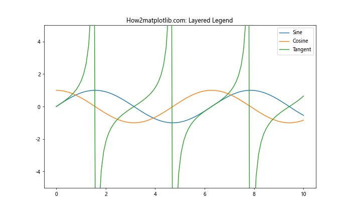
This example creates a layered legend effect by adjusting the z-order of legend elements and ticks.
Integrating Matplotlib.axis.Tick.set_zorder() with Other Matplotlib Features
The Matplotlib.axis.Tick.set_zorder() function can be effectively integrated with other Matplotlib features to create more sophisticated visualizations. Let's explore some of these integrations:
1. Combining with Custom Tick Formatters
You can combine Matplotlib.axis.Tick.set_zorder() with custom tick formatters for enhanced tick control:
import matplotlib.pyplot as plt
import numpy as np

def custom_formatter(x, pos):
    return f'Value: {x:.2f}'

fig, ax = plt.subplots(figsize=(10, 6))
x = np.linspace(0, 10, 100)
y = np.sin(x) * np.exp(-x/5)
ax.plot(x, y, label='Damped Sine')
ax.set_title('How2matplotlib.com: Custom Tick Formatter with Z-Order')

# Set custom formatter
ax.xaxis.set_major_formatter(plt.FuncFormatter(custom_formatter))

x_ticks = ax.xaxis.get_major_ticks()

for i, tick in enumerate(x_ticks):
    tick.set_zorder(10 - i * 0.5)
    tick.label1.set_rotation(45)
    tick.label1.set_ha('right')

plt.legend()
plt.tight_layout()
plt.show()
Output:
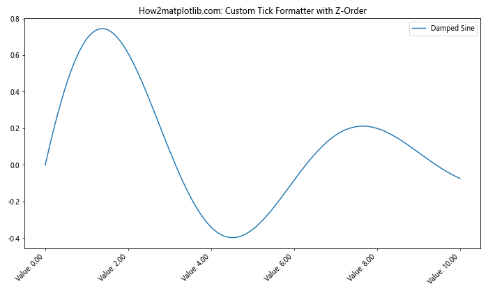
This example combines a custom tick formatter with z-order adjustments to create a unique tick appearance.
2. Using Z-Order with Polar Plots
Matplotlib.axis.Tick.set_zorder() can be applied to polar plots for interesting effects:
import matplotlib.pyplot as plt
import numpy as np

fig, ax = plt.subplots(subplot_kw=dict(projection='polar'))
r = np.linspace(0, 1, 100)
theta = 2 * np.pi * r
ax.plot(theta, r, label='Spiral')
ax.set_title('How2matplotlib.com: Polar Plot with Custom Tick Z-Order')

# Adjust z-order for radial ticks
for tick in ax.yaxis.get_major_ticks():
    tick.set_zorder(10 - tick.get_loc())
    tick.label1.set_fontsize(8 + tick.get_loc() * 2)

# Adjust z-order for angular ticks
for tick in ax.xaxis.get_major_ticks():
    tick.set_zorder(15)
    tick.label1.set_fontweight('bold')

plt.legend()
plt.show()
Output:
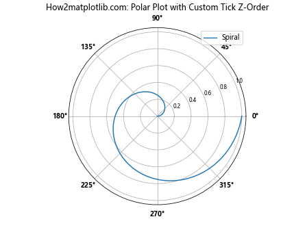
This example applies z-order adjustments to both radial and angular ticks in a polar plot.
3. Integrating with Colorbar Ticks
You can also apply Matplotlib.axis.Tick.set_zorder() to colorbar ticks:
import matplotlib.pyplot as plt
import numpy as np

fig, ax = plt.subplots(figsize=(10, 6))
x, y = np.meshgrid(np.linspace(-2, 2, 100), np.linspace(-2, 2, 100))
z = np.sin(x) * np.cos(y)

im = ax.imshow(z, cmap='viridis', extent=[-2, 2, -2, 2])
ax.set_title('How2matplotlib.com: Colorbar with Custom Tick Z-Order')

cbar = fig.colorbar(im)

# Adjust z-order for colorbar ticks
for i, tick in enumerate(cbar.ax.yaxis.get_major_ticks()):
    tick.set_zorder(10 - i)
    tick.label1.set_fontsize(8 + i)

plt.show()
Output:
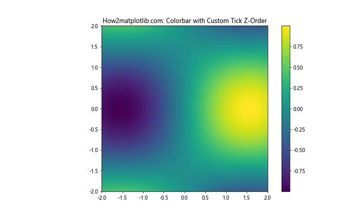
This example applies z-order adjustments to the ticks of a colorbar associated with an image plot.
Performance Considerations When Using Matplotlib.axis.Tick.set_zorder()
While the Matplotlib.axis.Tick.set_zorder() function is powerful, it's important to consider its performance implications, especially when working with large datasets or creating complex visualizations.
1. Limiting Z-Order Adjustments
For better performance, limit z-order adjustments to only the necessary ticks:
import matplotlib.pyplot as plt
import numpy as np

fig, ax = plt.subplots(figsize=(10, 6))
x = np.linspace(0, 100, 1000)
y = np.sin(x) * np.exp(-x/50)
ax.plot(x, y, label='Damped Sine')
ax.set_title('How2matplotlib.com: Optimized Z-Order Adjustments')

x_ticks = ax.xaxis.get_major_ticks()

# Adjust z-order only for every 5th tick
for i, tick in enumerate(x_ticks):
    if i % 5 == 0:
        tick.set_zorder(10)
        tick.label1.set_fontweight('bold')
    else:
        tick.set_zorder(5)

plt.legend()
plt.show()
Output:
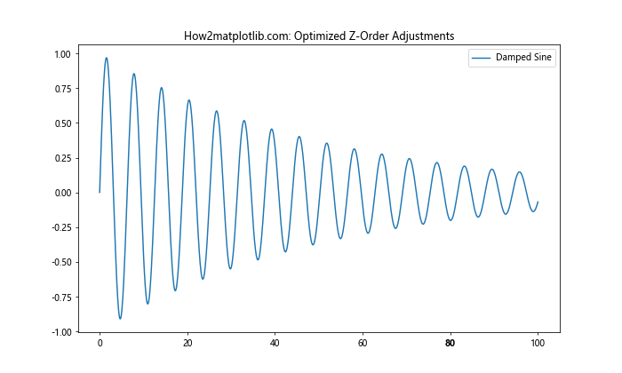
This example adjusts the z-order for only every 5th tick, reducing the number of operations.
2. Using Vectorized Operations
When possible, use vectorized operations instead of loops for better performance:
import matplotlib.pyplot as plt
import numpy as np

fig, ax = plt.subplots(figsize=(10, 6))
x = np.linspace(0, 10, 100)
y = np.sin(x)
ax.plot(x, y, label='Sine')
ax.set_title('How2matplotlib.com: Vectorized Z-Order Operations')

x_ticks = ax.xaxis.get_major_ticks()

# Vectorized z-order setting
z_orders = np.linspace(5, 15, len(x_ticks))
for tick, z_order in zip(x_ticks, z_orders):
    tick.set_zorder(z_order)

plt.legend()
plt.show()
Output:
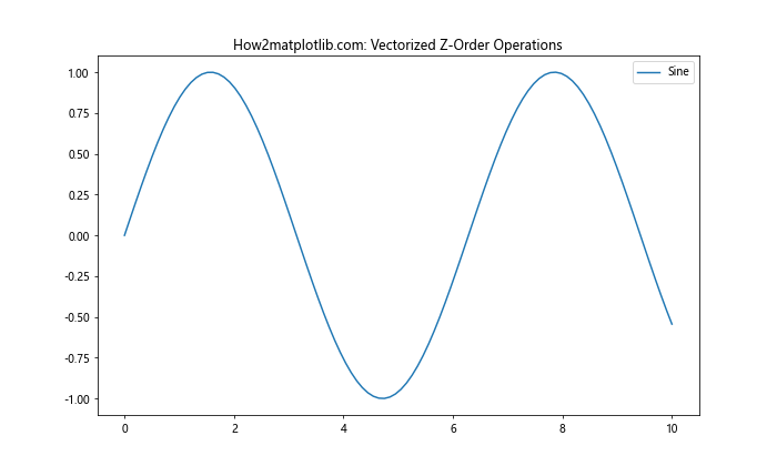
This example uses numpy's linspace function to create a range of z-order values, which are then applied to the ticks in a single loop.
Conclusion: Mastering Matplotlib.axis.Tick.set_zorder()
Throughout this comprehensive guide, we've explored the Matplotlib.axis.Tick.set_zorder() function in Python, covering its basic usage, advanced techniques, integration with other Matplotlib features, and performance considerations. This function provides a powerful tool for controlling the visual hierarchy of plot elements, particularly ticks, allowing for more informative and visually appealing visualizations.