Comprehensive Guide to Matplotlib.axis.Tick.set_figure() Function in Python
Matplotlib.axis.Tick.set_figure() function in Python is an essential method for customizing tick objects in Matplotlib plots. This function allows you to associate a tick object with a specific figure, enabling precise control over the appearance and behavior of tick marks on your plot axes. In this comprehensive guide, we’ll explore the Matplotlib.axis.Tick.set_figure() function in depth, covering its usage, parameters, and practical applications with numerous examples.
Understanding the Matplotlib.axis.Tick.set_figure() Function
The Matplotlib.axis.Tick.set_figure() function is a method of the Tick class in Matplotlib’s axis module. It is used to set the figure instance for a tick object. This function is particularly useful when you need to manipulate tick properties in relation to a specific figure.
Basic Syntax
The basic syntax of the Matplotlib.axis.Tick.set_figure() function is as follows:
tick.set_figure(fig)
Where:
tickis an instance of the Tick classfigis the Figure instance to associate with the tick
Let’s look at a simple example to illustrate the usage of Matplotlib.axis.Tick.set_figure():
import matplotlib.pyplot as plt

# Create a figure and axis
fig, ax = plt.subplots()

# Get the first x-axis tick
tick = ax.xaxis.get_major_ticks()[0]

# Set the figure for the tick
tick.set_figure(fig)

# Plot some data
ax.plot([1, 2, 3, 4], [1, 4, 2, 3], label='Data from how2matplotlib.com')

plt.title('Using Matplotlib.axis.Tick.set_figure()')
plt.legend()
plt.show()
Output:
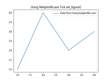
In this example, we create a figure and axis, get the first major tick on the x-axis, and then use Matplotlib.axis.Tick.set_figure() to associate it with the figure. This allows us to manipulate the tick properties in relation to the specific figure we’ve created.
Why Use Matplotlib.axis.Tick.set_figure()?
The Matplotlib.axis.Tick.set_figure() function is particularly useful in scenarios where you need to:
- Customize tick properties for a specific figure
- Ensure that tick objects are properly associated with the correct figure
- Manipulate tick objects across different figures
Let’s explore each of these use cases with examples.
Customizing Tick Properties for a Specific Figure
When you want to customize tick properties for a particular figure, using Matplotlib.axis.Tick.set_figure() ensures that your changes are applied to the correct figure. Here’s an example:
import matplotlib.pyplot as plt

# Create two figures
fig1, ax1 = plt.subplots()
fig2, ax2 = plt.subplots()

# Get the first x-axis tick for each figure
tick1 = ax1.xaxis.get_major_ticks()[0]
tick2 = ax2.xaxis.get_major_ticks()[0]

# Set the figure for each tick
tick1.set_figure(fig1)
tick2.set_figure(fig2)

# Customize tick properties
tick1.label1.set_color('red')
tick2.label1.set_color('blue')

# Plot data
ax1.plot([1, 2, 3, 4], [1, 4, 2, 3], label='Data 1 from how2matplotlib.com')
ax2.plot([1, 2, 3, 4], [3, 1, 4, 2], label='Data 2 from how2matplotlib.com')

ax1.set_title('Figure 1 with Red Tick')
ax2.set_title('Figure 2 with Blue Tick')

plt.show()
Output:
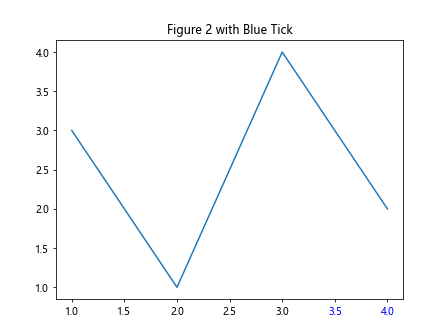
In this example, we create two separate figures and customize the color of the first x-axis tick for each figure. By using Matplotlib.axis.Tick.set_figure(), we ensure that the customizations are applied to the correct figures.
Ensuring Proper Association of Tick Objects
When working with multiple figures or subplots, it’s crucial to ensure that tick objects are properly associated with the correct figure. Matplotlib.axis.Tick.set_figure() helps maintain this association. Here’s an example:
import matplotlib.pyplot as plt

# Create a figure with two subplots
fig, (ax1, ax2) = plt.subplots(1, 2, figsize=(10, 4))

# Get the first x-axis tick for each subplot
tick1 = ax1.xaxis.get_major_ticks()[0]
tick2 = ax2.xaxis.get_major_ticks()[0]

# Set the figure for each tick
tick1.set_figure(fig)
tick2.set_figure(fig)

# Customize tick properties
tick1.label1.set_fontsize(14)
tick2.label1.set_fontsize(10)

# Plot data
ax1.plot([1, 2, 3, 4], [1, 4, 2, 3], label='Data 1 from how2matplotlib.com')
ax2.plot([1, 2, 3, 4], [3, 1, 4, 2], label='Data 2 from how2matplotlib.com')

ax1.set_title('Subplot 1 with Larger Tick Font')
ax2.set_title('Subplot 2 with Smaller Tick Font')

plt.tight_layout()
plt.show()
Output:
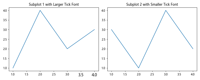
In this example, we create a figure with two subplots and customize the font size of the first x-axis tick for each subplot. By using Matplotlib.axis.Tick.set_figure(), we ensure that the tick objects are correctly associated with the main figure, allowing for proper rendering and manipulation.
Manipulating Tick Objects Across Different Figures
The Matplotlib.axis.Tick.set_figure() function is particularly useful when you need to manipulate tick objects across different figures. This can be helpful when creating complex visualizations or when comparing data across multiple plots. Here’s an example:
import matplotlib.pyplot as plt

# Create two separate figures
fig1, ax1 = plt.subplots()
fig2, ax2 = plt.subplots()

# Get the first x-axis tick for each figure
tick1 = ax1.xaxis.get_major_ticks()[0]
tick2 = ax2.xaxis.get_major_ticks()[0]

# Set the figure for each tick
tick1.set_figure(fig1)
tick2.set_figure(fig2)

# Customize tick properties
tick1.label1.set_rotation(45)
tick2.label1.set_rotation(90)

# Plot data
ax1.plot([1, 2, 3, 4], [1, 4, 2, 3], label='Data 1 from how2matplotlib.com')
ax2.plot([1, 2, 3, 4], [3, 1, 4, 2], label='Data 2 from how2matplotlib.com')

ax1.set_title('Figure 1 with 45° Rotated Tick')
ax2.set_title('Figure 2 with 90° Rotated Tick')

plt.show()
Output:
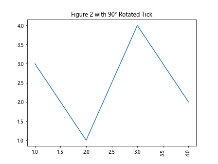
In this example, we create two separate figures and customize the rotation of the first x-axis tick for each figure. By using Matplotlib.axis.Tick.set_figure(), we can easily manipulate tick objects across different figures, allowing for greater flexibility in our visualizations.
Advanced Usage of Matplotlib.axis.Tick.set_figure()
Now that we’ve covered the basics of Matplotlib.axis.Tick.set_figure(), let’s explore some more advanced usage scenarios and techniques.
Customizing Multiple Ticks
While our previous examples focused on customizing a single tick, you can use Matplotlib.axis.Tick.set_figure() to customize multiple ticks on an axis. Here’s an example:
import matplotlib.pyplot as plt

# Create a figure and axis
fig, ax = plt.subplots()

# Get all x-axis ticks
x_ticks = ax.xaxis.get_major_ticks()

# Set the figure for all ticks and customize them
for i, tick in enumerate(x_ticks):
    tick.set_figure(fig)
    tick.label1.set_color(['red', 'green', 'blue', 'orange', 'purple'][i % 5])

# Plot data
ax.plot([1, 2, 3, 4, 5], [1, 4, 2, 3, 5], label='Data from how2matplotlib.com')

ax.set_title('Customizing Multiple Ticks')
plt.legend()
plt.show()
Output:
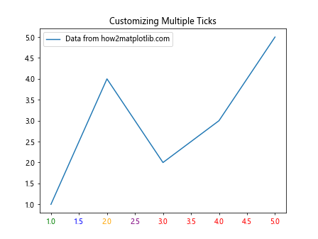
In this example, we iterate through all x-axis ticks, set the figure for each tick, and customize their colors. This demonstrates how Matplotlib.axis.Tick.set_figure() can be used in conjunction with other tick customization methods.
Dynamically Updating Tick Properties
The Matplotlib.axis.Tick.set_figure() function can be particularly useful when you need to dynamically update tick properties based on data or user input. Here’s an example that demonstrates this:
import matplotlib.pyplot as plt
import numpy as np

# Create a figure and axis
fig, ax = plt.subplots()

# Generate some random data
x = np.linspace(0, 10, 100)
y = np.sin(x)

# Plot the data
line, = ax.plot(x, y, label='Sin wave from how2matplotlib.com')

# Get all x-axis ticks
x_ticks = ax.xaxis.get_major_ticks()

# Function to update tick colors based on y-values
def update_tick_colors(event):
    for tick in x_ticks:
        tick.set_figure(fig)
        x_val = tick.get_loc()
        y_val = np.sin(x_val)
        if y_val >= 0:
            tick.label1.set_color('red')
        else:
            tick.label1.set_color('blue')
    fig.canvas.draw()

# Connect the function to the button press event
fig.canvas.mpl_connect('button_press_event', update_tick_colors)

ax.set_title('Click to Update Tick Colors')
plt.legend()
plt.show()
Output:
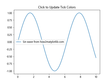
In this interactive example, we use Matplotlib.axis.Tick.set_figure() to ensure that each tick is associated with the correct figure. When the user clicks on the plot, the tick colors are updated based on the corresponding y-values of the sine wave.
Customizing Tick Appearance Across Subplots
When working with multiple subplots, Matplotlib.axis.Tick.set_figure() can help maintain consistency in tick appearance. Here’s an example:
import matplotlib.pyplot as plt

# Create a figure with four subplots
fig, ((ax1, ax2), (ax3, ax4)) = plt.subplots(2, 2, figsize=(10, 8))
axes = [ax1, ax2, ax3, ax4]

# Function to customize ticks for a given axis
def customize_ticks(ax):
    for tick in ax.xaxis.get_major_ticks() + ax.yaxis.get_major_ticks():
        tick.set_figure(fig)
        tick.label1.set_fontweight('bold')
        tick.label1.set_fontsize(8)

# Customize ticks for all subplots
for ax in axes:
    customize_ticks(ax)
    ax.plot([1, 2, 3, 4], [1, 4, 2, 3], label=f'Data from how2matplotlib.com')
    ax.legend()

ax1.set_title('Subplot 1')
ax2.set_title('Subplot 2')
ax3.set_title('Subplot 3')
ax4.set_title('Subplot 4')

plt.tight_layout()
plt.show()
Output:
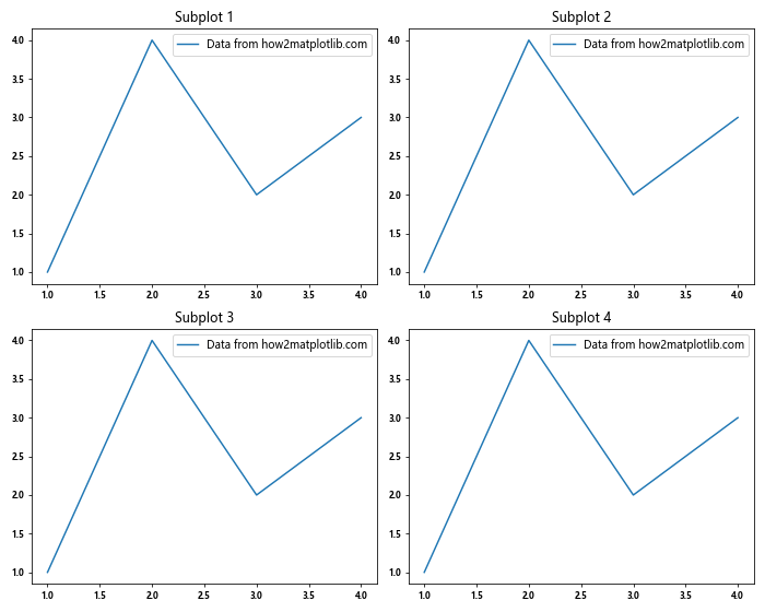
In this example, we create a function that customizes the ticks for a given axis using Matplotlib.axis.Tick.set_figure(). We then apply this function to all subplots, ensuring consistent tick appearance across the entire figure.
Common Pitfalls and Best Practices
When using the Matplotlib.axis.Tick.set_figure() function, there are some common pitfalls to avoid and best practices to follow:
- Always set the figure before customizing tick properties to ensure proper association.
- Be cautious when working with shared axes, as tick customizations may affect multiple subplots.
- Remember that Matplotlib.axis.Tick.set_figure() does not automatically update the plot; you may need to call
plt.draw()orfig.canvas.draw()to see the changes.
Let’s look at an example that demonstrates these best practices:
import matplotlib.pyplot as plt

# Create a figure with shared x-axis
fig, (ax1, ax2) = plt.subplots(2, 1, sharex=True, figsize=(8, 6))

# Get x-axis ticks
x_ticks = ax1.xaxis.get_major_ticks()

# Customize ticks
for tick in x_ticks:
    tick.set_figure(fig)  # Set figure before customization
    tick.label1.set_fontweight('bold')
    tick.label1.set_fontsize(10)

# Plot data
ax1.plot([1, 2, 3, 4], [1, 4, 2, 3], label='Data 1 from how2matplotlib.com')
ax2.plot([1, 2, 3, 4], [3, 1, 4, 2], label='Data 2 from how2matplotlib.com')

ax1.set_title('Subplot 1')
ax2.set_title('Subplot 2')

ax1.legend()
ax2.legend()

# Update the figure to show changes
fig.canvas.draw()

plt.tight_layout()
plt.show()
Output:
In this example, we create a figure with shared x-axis and customize the ticks. We set the figure for each tick before customizing its properties and update the figure at the end to ensure all changes are visible.
Integrating Matplotlib.axis.Tick.set_figure() with Other Matplotlib Features
The Matplotlib.axis.Tick.set_figure() function can be seamlessly integrated with other Matplotlib features to create more complex and informative visualizations. Let’s explore some examples of how to combine this function with other Matplotlib capabilities.
Combining with Custom Tick Formatters
You can use Matplotlib.axis.Tick.set_figure() in conjunction with custom tick formatters to create highly customized axis labels. Here’s an example:
import matplotlib.pyplot as plt
import matplotlib.ticker as ticker

# Create a figure and axis
fig, ax = plt.subplots()

# Define a custom tick formatter
def custom_formatter(x, pos):
    return f'Value: {x:.2f}'

# Set the custom formatter
ax.xaxis.set_major_formatter(ticker.FuncFormatter(custom_formatter))

# Get x-axis ticks and customize them
x_ticks = ax.xaxis.get_major_ticks()
for tick in x_ticks:
    tick.set_figure(fig)
    tick.label1.set_rotation(45)
    tick.label1.set_ha('right')

# Plot data
ax.plot([1, 2, 3, 4], [1, 4, 2, 3], label='Data from how2matplotlib.com')

ax.set_title('Custom Tick Formatter with Rotated Labels')
plt.legend()
plt.tight_layout()
plt.show()
Output:
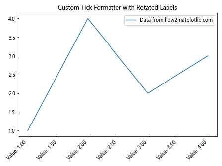
In this example, we define a custom tick formatter and combine it with Matplotlib.axis.Tick.set_figure() to create rotated, custom-formatted tick labels.
Enhancing Tick Visibility in Complex Plots
When creating complex plots with multiple data series, it can be challenging to ensure that tick labels remain visible and legible. Matplotlib.axis.Tick.set_figure() can help address this issue. Here’s an example:
import matplotlib.pyplot as plt
import numpy as np

# Create a figure and axis
fig, ax = plt.subplots(figsize=(10, 6))

# Generate multiple data series
x = np.linspace(0, 10, 100)
y1 = np.sin(x)
y2 = np.cos(x)
y3 = np.tan(x)

# Plot the data
ax.plot(x, y1, label='Sin from how2matplotlib.com')
ax.plot(x, y2, label='Cos from how2matplotlib.com')
ax.plot(x, y3, label='Tan from how2matplotlib.com')

# Get x-axis ticks
x_ticks = ax.xaxis.get_major_ticks()

# Customize ticks for better visibility
for tick in x_ticks:
    tick.set_figure(fig)
    tick.label1.set_fontweight('bold')
    tick.label1.set_fontsize(8)
    tick.label1.set_backgroundcolor('white')
    tick.label1.set_alpha(0.7)

ax.set_title('Complex Plot with Enhanced Tick Visibility')
plt.legend()
plt.tight_layout()
plt.show()
Output:
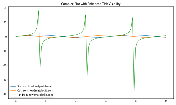
In this example, we create a complex plot with multiple data series and use Matplotlib.axis.Tick.set_figure() to enhance the visibility of tick labels by making them bold, adjusting their size, and adding a semi-transparent white background.
Creating Interactive Tick Labels
Matplotlib.axis.Tick.set_figure() can be used to create interactive tick labels that respond to user input. Here’s an example that demonstrates this:
import matplotlib.pyplot as plt
import numpy as np

# Create a figure and axis
fig, ax = plt.subplots()

# Generate data
x = np.linspace(0, 10, 100)
y = np.sin(x)

# Plot the data
line, = ax.plot(x, y, label='Sin wave from how2matplotlib.com')

# Get x-axis ticks
x_ticks = ax.xaxis.get_major_ticks()

# Function to update tick labels on hover
def update_tick_label(event):
    if event.inaxes == ax:
        for tick in x_ticks:
            tick.set_figure(fig)
            if abs(event.xdata - tick.get_loc()) < 0.5:
                tick.label1.set_color('red')
                tick.label1.set_fontweight('bold')
            else:
                tick.label1.set_color('black')
                tick.label1.set_fontweight('normal')
        fig.canvas.draw()

# Connect the function to the motion_notify_event
fig.canvas.mpl_connect('motion_notify_event', update_tick_label)

ax.set_title('Interactive Tick Labels (Hover to Highlight)')
plt.legend()
plt.show()
Output:
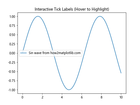
In this interactive example, we use Matplotlib.axis.Tick.set_figure() to ensure that each tick is associated with the correct figure. As the user hovers over the plot, the nearest tick label is highlighted, creating an interactive experience.
Advanced Techniques with Matplotlib.axis.Tick.set_figure()
Let's explore some advanced techniques that leverage the power of Matplotlib.axis.Tick.set_figure() to create more sophisticated visualizations.
Animating Tick Properties
Matplotlib.axis.Tick.set_figure() can be used to create animations that dynamically update tick properties. Here's an example of a simple animation that changes tick colors:
import matplotlib.pyplot as plt
import matplotlib.animation as animation
import numpy as np

# Create a figure and axis
fig, ax = plt.subplots()

# Plot some data
x = np.linspace(0, 10, 100)
y = np.sin(x)
line, = ax.plot(x, y, label='Sin wave from how2matplotlib.com')

# Get x-axis ticks
x_ticks = ax.xaxis.get_major_ticks()

# Animation function
def animate(frame):
    for i, tick in enumerate(x_ticks):
        tick.set_figure(fig)
        tick.label1.set_color(plt.cm.viridis(frame / 100))
    return line,

# Create the animation
anim = animation.FuncAnimation(fig, animate, frames=100, interval=50, blit=True)

ax.set_title('Animated Tick Colors')
plt.legend()
plt.show()
Output:
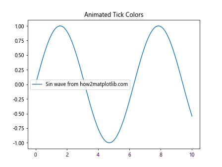
In this example, we create an animation that cycles through different colors for the tick labels using Matplotlib.axis.Tick.set_figure() to ensure proper association with the figure.
Troubleshooting Common Issues with Matplotlib.axis.Tick.set_figure()
When working with Matplotlib.axis.Tick.set_figure(), you may encounter some common issues. Let's explore these issues and their solutions:
Issue 1: Tick Customizations Not Appearing
If your tick customizations are not appearing after using Matplotlib.axis.Tick.set_figure(), it may be because the plot hasn't been redrawn. To fix this, you can explicitly call plt.draw() or fig.canvas.draw() after making your customizations.
import matplotlib.pyplot as plt

# Create a figure and axis
fig, ax = plt.subplots()

# Plot some data
ax.plot([1, 2, 3, 4], [1, 4, 2, 3], label='Data from how2matplotlib.com')

# Get x-axis ticks
x_ticks = ax.xaxis.get_major_ticks()

# Customize ticks
for tick in x_ticks:
    tick.set_figure(fig)
    tick.label1.set_color('red')

# Redraw the figure to show changes
fig.canvas.draw()

ax.set_title('Tick Customizations with Explicit Redraw')
plt.legend()
plt.show()
Output:
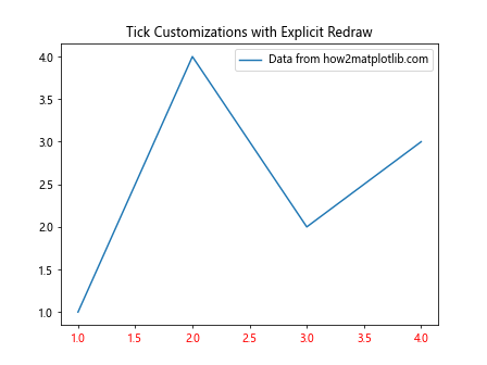
In this example, we explicitly call fig.canvas.draw() after customizing the ticks to ensure that the changes are visible.
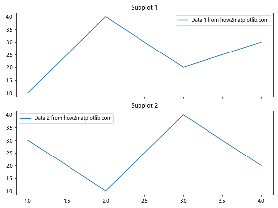
Issue 2: Inconsistent Tick Appearance Across Subplots
When working with multiple subplots, you may notice inconsistent tick appearances. This can often be resolved by applying Matplotlib.axis.Tick.set_figure() to all subplots and ensuring that shared axes are handled correctly.
import matplotlib.pyplot as plt

# Create a figure with two subplots sharing the x-axis
fig, (ax1, ax2) = plt.subplots(2, 1, sharex=True, figsize=(8, 6))

# Function to customize ticks
def customize_ticks(ax):
    for tick in ax.xaxis.get_major_ticks() + ax.yaxis.get_major_ticks():
        tick.set_figure(fig)
        tick.label1.set_fontweight('bold')
        tick.label1.set_fontsize(8)

# Customize ticks for both subplots
customize_ticks(ax1)
customize_ticks(ax2)

# Plot data
ax1.plot([1, 2, 3, 4], [1, 4, 2, 3], label='Data 1 from how2matplotlib.com')
ax2.plot([1, 2, 3, 4], [3, 1, 4, 2], label='Data 2 from how2matplotlib.com')

ax1.set_title('Subplot 1')
ax2.set_title('Subplot 2')

ax1.legend()
ax2.legend()

plt.tight_layout()
plt.show()
Output:
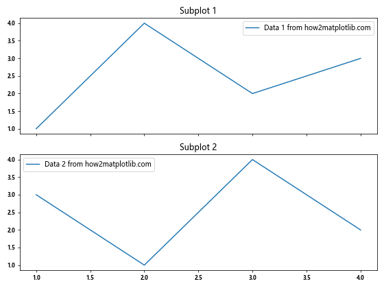
In this example, we create a function to customize ticks and apply it to both subplots, ensuring consistent appearance across the shared x-axis.
Issue 3: Tick Labels Overlapping
When customizing tick labels, you may encounter issues with overlapping text, especially when rotating labels or using long text. You can address this by adjusting the layout or using Matplotlib's automatic label collision detection.
import matplotlib.pyplot as plt

# Create a figure and axis
fig, ax = plt.subplots(figsize=(10, 6))

# Plot some data
ax.plot([1, 2, 3, 4, 5], [1, 4, 2, 3, 5], label='Data from how2matplotlib.com')

# Get x-axis ticks
x_ticks = ax.xaxis.get_major_ticks()

# Customize ticks
for tick in x_ticks:
    tick.set_figure(fig)
    tick.label1.set_rotation(45)
    tick.label1.set_ha('right')

# Use tight layout to adjust spacing
plt.tight_layout()

# Adjust bottom margin to prevent label cutoff
plt.subplots_adjust(bottom=0.2)

ax.set_title('Rotated Tick Labels without Overlap')
plt.legend()
plt.show()
Output:
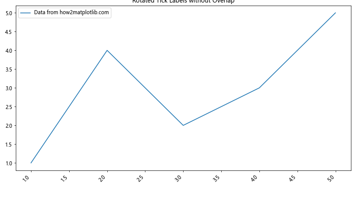
In this example, we rotate the tick labels and use plt.tight_layout() and plt.subplots_adjust() to prevent overlapping and cutoff issues.
Conclusion
The Matplotlib.axis.Tick.set_figure() function is a powerful tool for customizing tick objects in Matplotlib plots. Throughout this comprehensive guide, we've explored its usage, parameters, and practical applications with numerous examples. We've covered basic usage, advanced techniques, integration with other Matplotlib features, and troubleshooting common issues.
By leveraging Matplotlib.axis.Tick.set_figure(), you can create more sophisticated and visually appealing plots, with precise control over tick appearance and behavior. Whether you're working with simple line plots or complex multi-subplot visualizations, this function provides the flexibility needed to fine-tune your axis ticks.