Comprehensive Guide to Matplotlib.axis.Tick.set_clip_on() Function in Python
Matplotlib.axis.Tick.set_clip_on() function in Python is a powerful tool for controlling the visibility of tick marks in Matplotlib plots. This function allows you to specify whether tick marks should be clipped to the axes area or allowed to extend beyond it. In this comprehensive guide, we’ll explore the Matplotlib.axis.Tick.set_clip_on() function in detail, providing numerous examples and explanations to help you master its usage.
Understanding the Basics of Matplotlib.axis.Tick.set_clip_on()
The Matplotlib.axis.Tick.set_clip_on() function is a method of the Tick class in Matplotlib’s axis module. It is used to set the clipping behavior of tick marks on an axis. When you call this function, you can control whether the tick marks are confined within the plot area or allowed to extend beyond it.
Let’s start with a simple example to demonstrate the basic usage of Matplotlib.axis.Tick.set_clip_on():
import matplotlib.pyplot as plt

# Create a figure and axis
fig, ax = plt.subplots()

# Plot some data
ax.plot([1, 2, 3, 4], [1, 4, 2, 3], label='Data from how2matplotlib.com')

# Get the x-axis ticks
x_ticks = ax.xaxis.get_major_ticks()

# Set clip_on to False for all x-axis ticks
for tick in x_ticks:
    tick.set_clip_on(False)

# Add labels and title
ax.set_xlabel('X-axis')
ax.set_ylabel('Y-axis')
ax.set_title('Matplotlib.axis.Tick.set_clip_on() Example')

# Show the plot
plt.legend()
plt.show()
Output:
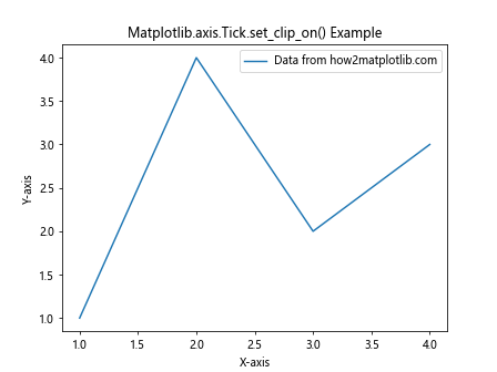
In this example, we create a simple line plot and then use Matplotlib.axis.Tick.set_clip_on() to set the clipping behavior of the x-axis ticks. By setting clip_on to False, we allow the tick marks to extend beyond the plot area if necessary.
The Importance of Matplotlib.axis.Tick.set_clip_on() in Data Visualization
Matplotlib.axis.Tick.set_clip_on() plays a crucial role in creating clear and visually appealing plots. By controlling the visibility of tick marks, you can enhance the readability of your charts and ensure that important information is not cut off at the edges of the plot area.
Here’s an example that demonstrates the importance of using Matplotlib.axis.Tick.set_clip_on():
import matplotlib.pyplot as plt
import numpy as np

# Create data
x = np.linspace(0, 10, 100)
y = np.sin(x)

# Create a figure and axis
fig, (ax1, ax2) = plt.subplots(1, 2, figsize=(12, 5))

# Plot data on both axes
ax1.plot(x, y, label='Sin wave from how2matplotlib.com')
ax2.plot(x, y, label='Sin wave from how2matplotlib.com')

# Set clip_on to True for ax1 and False for ax2
for tick in ax1.xaxis.get_major_ticks():
    tick.set_clip_on(True)
for tick in ax2.xaxis.get_major_ticks():
    tick.set_clip_on(False)

# Customize the plots
ax1.set_title('Ticks Clipped (Default)')
ax2.set_title('Ticks Not Clipped')
ax1.set_xlabel('X-axis')
ax2.set_xlabel('X-axis')
ax1.set_ylabel('Y-axis')
ax2.set_ylabel('Y-axis')

# Add legends
ax1.legend()
ax2.legend()

# Adjust layout and show the plot
plt.tight_layout()
plt.show()
Output:
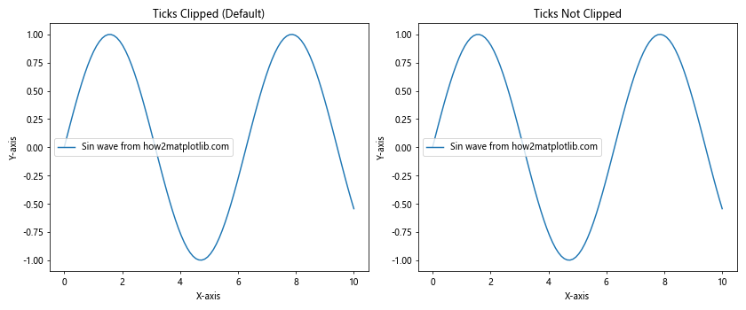
In this example, we create two subplots side by side. The left subplot uses the default clipping behavior (clip_on=True), while the right subplot has clipping turned off (clip_on=False) using Matplotlib.axis.Tick.set_clip_on(). This comparison helps visualize the difference in tick mark visibility.
Advanced Usage of Matplotlib.axis.Tick.set_clip_on()
Matplotlib.axis.Tick.set_clip_on() can be used in more advanced scenarios to create custom visualizations. Let’s explore some advanced techniques:
Selectively Clipping Ticks
You can use Matplotlib.axis.Tick.set_clip_on() to selectively clip certain ticks while leaving others visible:
import matplotlib.pyplot as plt
import numpy as np

# Create data
x = np.linspace(0, 10, 100)
y = np.exp(x)

# Create a figure and axis
fig, ax = plt.subplots()

# Plot the data
ax.plot(x, y, label='Exponential growth from how2matplotlib.com')

# Get the x-axis ticks
x_ticks = ax.xaxis.get_major_ticks()

# Set clip_on to False for even-indexed ticks and True for odd-indexed ticks
for i, tick in enumerate(x_ticks):
    tick.set_clip_on(i % 2 != 0)

# Customize the plot
ax.set_xlabel('X-axis')
ax.set_ylabel('Y-axis')
ax.set_title('Selectively Clipped Ticks using Matplotlib.axis.Tick.set_clip_on()')

# Add legend and show the plot
plt.legend()
plt.show()
Output:
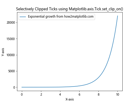
In this example, we use Matplotlib.axis.Tick.set_clip_on() to create an alternating pattern of clipped and unclipped ticks on the x-axis. This can be useful for emphasizing certain tick marks or creating a unique visual style.
Matplotlib.axis.Tick.set_clip_on() and Different Plot Types
Matplotlib.axis.Tick.set_clip_on() can be applied to various types of plots. Let’s explore how it works with different chart types:
Bar Charts
import matplotlib.pyplot as plt
import numpy as np

# Create data
categories = ['A', 'B', 'C', 'D', 'E']
values = [3, 7, 2, 5, 8]

# Create a figure and axis
fig, ax = plt.subplots()

# Create the bar chart
ax.bar(categories, values, label='Data from how2matplotlib.com')

# Set clip_on to False for all x-axis ticks
for tick in ax.xaxis.get_major_ticks():
    tick.set_clip_on(False)

# Customize the plot
ax.set_xlabel('Categories')
ax.set_ylabel('Values')
ax.set_title('Bar Chart with Matplotlib.axis.Tick.set_clip_on()')

# Add legend and show the plot
plt.legend()
plt.show()
Output:
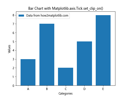
In this example, we apply Matplotlib.axis.Tick.set_clip_on() to a bar chart, allowing the x-axis tick labels to extend beyond the plot area if necessary.
Scatter Plots
import matplotlib.pyplot as plt
import numpy as np

# Create data
x = np.random.rand(50)
y = np.random.rand(50)

# Create a figure and axis
fig, ax = plt.subplots()

# Create the scatter plot
ax.scatter(x, y, label='Random data from how2matplotlib.com')

# Set clip_on to False for all x-axis and y-axis ticks
for tick in ax.xaxis.get_major_ticks() + ax.yaxis.get_major_ticks():
    tick.set_clip_on(False)

# Customize the plot
ax.set_xlabel('X-axis')
ax.set_ylabel('Y-axis')
ax.set_title('Scatter Plot with Matplotlib.axis.Tick.set_clip_on()')

# Add legend and show the plot
plt.legend()
plt.show()
Output:
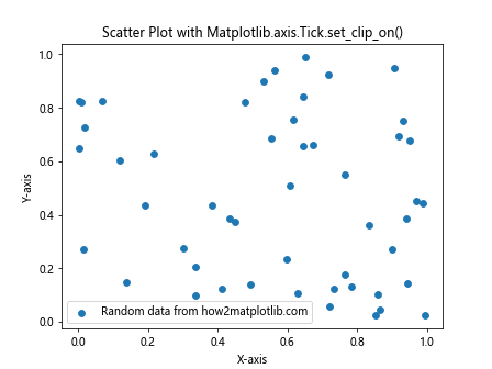
Here, we use Matplotlib.axis.Tick.set_clip_on() on both x-axis and y-axis ticks in a scatter plot, ensuring that all tick labels are fully visible.
Handling Edge Cases with Matplotlib.axis.Tick.set_clip_on()
When working with Matplotlib.axis.Tick.set_clip_on(), it’s important to consider edge cases and potential issues that may arise. Let’s explore some scenarios and how to handle them:
Dealing with Overlapping Ticks
In some cases, setting clip_on to False may cause tick labels to overlap, especially when dealing with dense data or long tick labels. Here’s an example of how to handle this:
import matplotlib.pyplot as plt
import numpy as np

# Create data
x = np.linspace(0, 10, 11)
y = x ** 2

# Create a figure and axis
fig, ax = plt.subplots(figsize=(10, 6))

# Plot the data
ax.plot(x, y, label='Quadratic function from how2matplotlib.com')

# Set clip_on to False for all x-axis ticks
for tick in ax.xaxis.get_major_ticks():
    tick.set_clip_on(False)

# Rotate x-axis tick labels to prevent overlap
plt.xticks(rotation=45, ha='right')

# Customize the plot
ax.set_xlabel('X-axis')
ax.set_ylabel('Y-axis')
ax.set_title('Handling Overlapping Ticks with Matplotlib.axis.Tick.set_clip_on()')

# Add legend and adjust layout
plt.legend()
plt.tight_layout()

# Show the plot
plt.show()
Output:
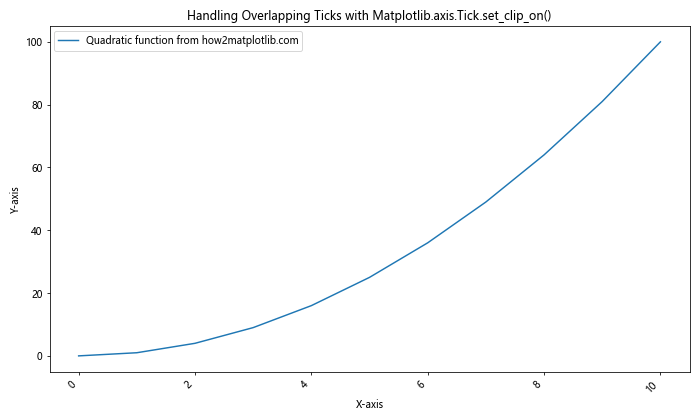
In this example, we rotate the x-axis tick labels to prevent overlap when using Matplotlib.axis.Tick.set_clip_on(). This technique is particularly useful when dealing with long tick labels or dense data points.
Handling Logarithmic Scales
When working with logarithmic scales, Matplotlib.axis.Tick.set_clip_on() may behave differently. Here’s how to handle this scenario:
import matplotlib.pyplot as plt
import numpy as np

# Create data
x = np.logspace(0, 5, 6)
y = x ** 2

# Create a figure and axis
fig, ax = plt.subplots(figsize=(10, 6))

# Plot the data
ax.plot(x, y, label='Quadratic function on log scale from how2matplotlib.com')

# Set logarithmic scale for x-axis
ax.set_xscale('log')

# Set clip_on to False for all x-axis ticks
for tick in ax.xaxis.get_major_ticks():
    tick.set_clip_on(False)

# Customize the plot
ax.set_xlabel('X-axis (log scale)')
ax.set_ylabel('Y-axis')
ax.set_title('Matplotlib.axis.Tick.set_clip_on() with Logarithmic Scale')

# Add legend and adjust layout
plt.legend()
plt.tight_layout()

# Show the plot
plt.show()
Output:
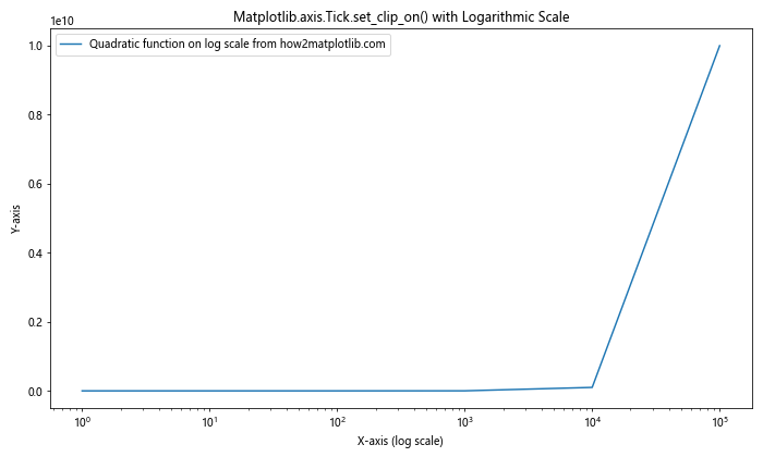
In this example, we use Matplotlib.axis.Tick.set_clip_on() with a logarithmic x-axis scale. This demonstrates how the function behaves in more complex scaling scenarios.
Troubleshooting Common Issues with Matplotlib.axis.Tick.set_clip_on()
When working with Matplotlib.axis.Tick.set_clip_on(), you may encounter some common issues. Here are a few problems and their solutions:
Issue 1: Ticks Not Visible After Setting clip_on to False
If you find that your ticks are not visible even after setting clip_on to False, it might be due to the figure size or margins. Try adjusting the figure size or margins:
import matplotlib.pyplot as plt
import numpy as np

# Create data
x = np.linspace(0, 10, 100)
y= np.sin(x)

# Create a figure and axis with adjusted size and margins
fig, ax = plt.subplots(figsize=(12, 6))
plt.subplots_adjust(left=0.1, right=0.9, top=0.9, bottom=0.1)

# Plot the data
ax.plot(x, y, label='Sine wave from how2matplotlib.com')

# Set clip_on to False for all x-axis ticks
for tick in ax.xaxis.get_major_ticks():
    tick.set_clip_on(False)

# Customize the plot
ax.set_xlabel('X-axis')
ax.set_ylabel('Y-axis')
ax.set_title('Troubleshooting Matplotlib.axis.Tick.set_clip_on(): Adjusting Figure Size and Margins')

# Add legend and show the plot
plt.legend()
plt.show()
Output:
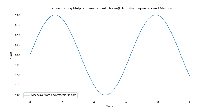
In this example, we’ve adjusted the figure size and margins to ensure that the ticks are visible when using Matplotlib.axis.Tick.set_clip_on().
Issue 2: Inconsistent Behavior Across Different Matplotlib Backends
Sometimes, Matplotlib.axis.Tick.set_clip_on() may behave differently depending on the backend you’re using. To ensure consistent behavior, you can explicitly set the backend before creating your plot:
import matplotlib
matplotlib.use('Agg')  # Set the backend to Agg
import matplotlib.pyplot as plt
import numpy as np

# Create data
x = np.linspace(0, 10, 100)
y = np.cos(x)

# Create a figure and axis
fig, ax = plt.subplots()

# Plot the data
ax.plot(x, y, label='Cosine wave from how2matplotlib.com')

# Set clip_on to False for all x-axis ticks
for tick in ax.xaxis.get_major_ticks():
    tick.set_clip_on(False)

# Customize the plot
ax.set_xlabel('X-axis')
ax.set_ylabel('Y-axis')
ax.set_title('Matplotlib.axis.Tick.set_clip_on() with Explicit Backend')

# Add legend and show the plot
plt.legend()
plt.show()
Output:
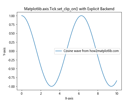
By setting the backend explicitly, you can ensure more consistent behavior of Matplotlib.axis.Tick.set_clip_on() across different environments.
Advanced Techniques with Matplotlib.axis.Tick.set_clip_on()
Let’s explore some advanced techniques using Matplotlib.axis.Tick.set_clip_on() to create more complex and informative visualizations.
Combining Matplotlib.axis.Tick.set_clip_on() with Custom Tick Formatters
You can combine Matplotlib.axis.Tick.set_clip_on() with custom tick formatters to create highly customized axis labels:
import matplotlib.pyplot as plt
import numpy as np

# Create data
x = np.linspace(0, 2*np.pi, 100)
y = np.sin(x)

# Create a figure and axis
fig, ax = plt.subplots(figsize=(12, 6))

# Plot the data
ax.plot(x, y, label='Sine wave from how2matplotlib.com')

# Define a custom tick formatter
def custom_formatter(x, pos):
    return f'π×{x/np.pi:.1f}'

# Set the custom formatter
ax.xaxis.set_major_formatter(plt.FuncFormatter(custom_formatter))

# Set clip_on to False for all x-axis ticks
for tick in ax.xaxis.get_major_ticks():
    tick.set_clip_on(False)

# Customize the plot
ax.set_xlabel('X-axis')
ax.set_ylabel('Y-axis')
ax.set_title('Matplotlib.axis.Tick.set_clip_on() with Custom Tick Formatter')

# Add legend and show the plot
plt.legend()
plt.show()
Output:
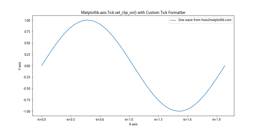
In this example, we’ve combined Matplotlib.axis.Tick.set_clip_on() with a custom tick formatter to display x-axis labels in terms of π.
Using Matplotlib.axis.Tick.set_clip_on() with Polar Plots
Matplotlib.axis.Tick.set_clip_on() can also be used with polar plots to create interesting visualizations:
import matplotlib.pyplot as plt
import numpy as np

# Create data
theta = np.linspace(0, 2*np.pi, 100)
r = np.sin(4*theta)

# Create a figure and polar axis
fig, ax = plt.subplots(subplot_kw={'projection': 'polar'})

# Plot the data
ax.plot(theta, r, label='r = sin(4θ) from how2matplotlib.com')

# Set clip_on to False for all theta ticks
for tick in ax.xaxis.get_major_ticks():
    tick.set_clip_on(False)

# Customize the plot
ax.set_title('Polar Plot with Matplotlib.axis.Tick.set_clip_on()')

# Add legend and show the plot
plt.legend()
plt.show()
Output:
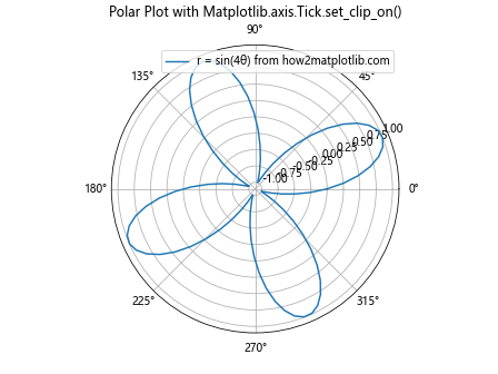
This example demonstrates how to use Matplotlib.axis.Tick.set_clip_on() in a polar plot, allowing the theta labels to extend beyond the circular plot area if necessary.
Matplotlib.axis.Tick.set_clip_on() in Real-World Applications
Let’s explore how Matplotlib.axis.Tick.set_clip_on() can be used in real-world data visualization scenarios.
Financial Data Visualization
In financial data visualization, Matplotlib.axis.Tick.set_clip_on() can be useful for creating clear and readable stock price charts:
import matplotlib.pyplot as plt
import numpy as np
import pandas as pd

# Create sample stock data
dates = pd.date_range(start='2023-01-01', end='2023-12-31', freq='D')
prices = 100 + np.cumsum(np.random.randn(len(dates)) * 0.5)
df = pd.DataFrame({'Date': dates, 'Price': prices})

# Create a figure and axis
fig, ax = plt.subplots(figsize=(12, 6))

# Plot the data
ax.plot(df['Date'], df['Price'], label='Stock price from how2matplotlib.com')

# Set clip_on to False for all x-axis ticks
for tick in ax.xaxis.get_major_ticks():
    tick.set_clip_on(False)

# Rotate x-axis labels for better readability
plt.xticks(rotation=45, ha='right')

# Customize the plot
ax.set_xlabel('Date')
ax.set_ylabel('Price')
ax.set_title('Stock Price Chart with Matplotlib.axis.Tick.set_clip_on()')

# Add legend and adjust layout
plt.legend()
plt.tight_layout()

# Show the plot
plt.show()
Output:
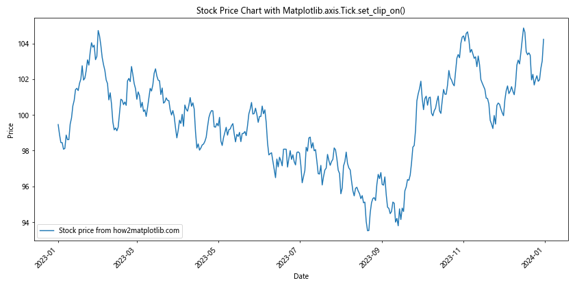
In this example, we use Matplotlib.axis.Tick.set_clip_on() to ensure that all date labels on the x-axis are fully visible, even if they extend beyond the plot area.
Scientific Data Visualization
Matplotlib.axis.Tick.set_clip_on() can be particularly useful in scientific data visualization, where precise labeling is crucial:
import matplotlib.pyplot as plt
import numpy as np

# Create sample scientific data
x = np.linspace(0, 10, 100)
y1 = np.exp(-0.1 * x) * np.sin(2 * np.pi * x)
y2 = np.exp(-0.2 * x) * np.cos(2 * np.pi * x)

# Create a figure and axis
fig, ax = plt.subplots(figsize=(12, 6))

# Plot the data
ax.plot(x, y1, label='Damped sine wave from how2matplotlib.com')
ax.plot(x, y2, label='Damped cosine wave from how2matplotlib.com')

# Set clip_on to False for all x-axis and y-axis ticks
for tick in ax.xaxis.get_major_ticks() + ax.yaxis.get_major_ticks():
    tick.set_clip_on(False)

# Customize the plot
ax.set_xlabel('Time (s)')
ax.set_ylabel('Amplitude')
ax.set_title('Damped Oscillations with Matplotlib.axis.Tick.set_clip_on()')

# Add grid for better readability
ax.grid(True, linestyle='--', alpha=0.7)

# Add legend and adjust layout
plt.legend()
plt.tight_layout()

# Show the plot
plt.show()
Output:
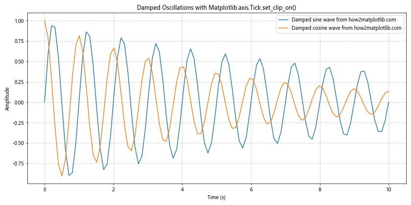
In this scientific visualization example, we use Matplotlib.axis.Tick.set_clip_on() to ensure that all tick labels are fully visible, which is crucial for accurate data interpretation.
Conclusion
Matplotlib.axis.Tick.set_clip_on() is a powerful function that allows you to control the visibility of tick marks in Matplotlib plots. Throughout this comprehensive guide, we’ve explored various aspects of this function, including its basic usage, advanced techniques, troubleshooting common issues, and real-world applications.