Comprehensive Guide to Matplotlib.axis.Axis.set() Function in Python
Matplotlib.axis.Axis.set() function in Python is a powerful tool for customizing axis properties in Matplotlib plots. This versatile function allows you to modify various aspects of an axis, including labels, limits, scales, and more. In this comprehensive guide, we’ll explore the Matplotlib.axis.Axis.set() function in depth, providing numerous examples and explanations to help you master its usage.
Understanding the Basics of Matplotlib.axis.Axis.set()
The Matplotlib.axis.Axis.set() function is a method of the Axis class in Matplotlib. It provides a convenient way to set multiple properties of an axis at once. This function is particularly useful when you want to make several changes to an axis without calling individual setter methods for each property.
Let’s start with a simple example to demonstrate the basic usage of Matplotlib.axis.Axis.set():
import matplotlib.pyplot as plt
import numpy as np

x = np.linspace(0, 10, 100)
y = np.sin(x)

fig, ax = plt.subplots()
ax.plot(x, y)

ax.xaxis.set(label='X-axis (how2matplotlib.com)', ticks=range(0, 11, 2))
ax.yaxis.set(label='Y-axis (how2matplotlib.com)', ticks=[-1, 0, 1])

plt.show()
Output:
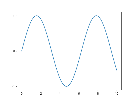
In this example, we use Matplotlib.axis.Axis.set() to set the labels and ticks for both the x-axis and y-axis. The function allows us to specify multiple properties in a single call, making our code more concise and readable.
Customizing Tick Locations and Labels with Matplotlib.axis.Axis.set()
Matplotlib.axis.Axis.set() provides a convenient way to customize tick locations and labels. You can specify the positions of the ticks and provide custom labels for them.
Here’s an example that demonstrates how to set custom tick locations and labels:
import matplotlib.pyplot as plt
import numpy as np

x = np.linspace(0, 2*np.pi, 100)
y = np.sin(x)

fig, ax = plt.subplots()
ax.plot(x, y)

ax.xaxis.set(
    ticks=[0, np.pi/2, np.pi, 3*np.pi/2, 2*np.pi],
    ticklabels=['0', 'π/2', 'π', '3π/2', '2π']
)
ax.yaxis.set(
    ticks=[-1, 0, 1],
    ticklabels=['Min', 'Zero', 'Max']
)

plt.title('Sine Wave (how2matplotlib.com)')
plt.show()
Output:
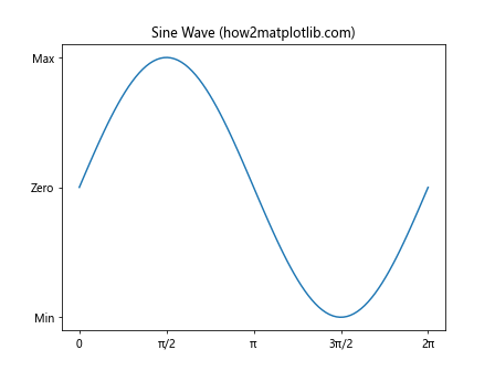
In this example, we use Matplotlib.axis.Axis.set() to set custom tick locations and labels for both the x-axis and y-axis. This allows us to create more meaningful and informative tick labels for our sine wave plot.
Setting Axis Locators with Matplotlib.axis.Axis.set()
Matplotlib.axis.Axis.set() allows you to set custom locators for axis ticks. Locators determine the positions of the ticks on an axis.
Here’s an example that demonstrates how to set custom locators:
import matplotlib.pyplot as plt
import numpy as np
from matplotlib.ticker import MultipleLocator, AutoMinorLocator

x = np.linspace(0, 10, 100)
y = np.sin(x)

fig, ax = plt.subplots()
ax.plot(x, y)

ax.xaxis.set(
    major_locator=MultipleLocator(2),
    minor_locator=AutoMinorLocator()
)
ax.yaxis.set(
    major_locator=MultipleLocator(0.5),
    minor_locator=AutoMinorLocator()
)

plt.title('Custom Tick Locators (how2matplotlib.com)')
plt.show()
Output:
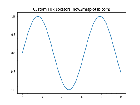
In this example, we use Matplotlib.axis.Axis.set() to set custom major and minor locators for both the x-axis and y-axis. We use MultipleLocator for major ticks and AutoMinorLocator for minor ticks.
Customizing Axis Formatters with Matplotlib.axis.Axis.set()
Matplotlib.axis.Axis.set() can be used to set custom formatters for axis tick labels. Formatters determine how the tick labels are displayed.
Here’s an example that shows how to set custom formatters:
import matplotlib.pyplot as plt
import numpy as np
from matplotlib.ticker import FuncFormatter

def currency_formatter(x, p):
    return f'${x:.2f}'

x = np.linspace(0, 100, 11)
y = x**2

fig, ax = plt.subplots()
ax.plot(x, y)

ax.xaxis.set(major_formatter=FuncFormatter(lambda x, p: f'{x:.0f}%'))
ax.yaxis.set(major_formatter=FuncFormatter(currency_formatter))

plt.title('Custom Tick Formatters (how2matplotlib.com)')
plt.show()
Output:
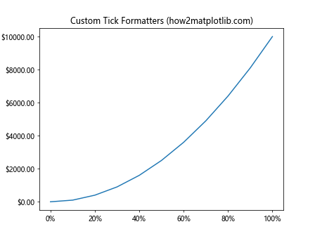
In this example, we use Matplotlib.axis.Axis.set() to set custom formatters for both the x-axis and y-axis. We use lambda functions and custom formatter functions to display the x-axis labels as percentages and the y-axis labels as currency.
Adjusting Axis Positions with Matplotlib.axis.Axis.set()
Matplotlib.axis.Axis.set() allows you to adjust the position of an axis. This can be useful for creating non-standard plot layouts or for emphasizing certain aspects of your data.
Here’s an example that shows how to adjust axis positions:
import matplotlib.pyplot as plt
import numpy as np

x = np.linspace(-5, 5, 100)
y = x**2

fig, ax = plt.subplots()
ax.plot(x, y)

ax.spines['left'].set_position('center')
ax.spines['bottom'].set_position('center')
ax.spines['right'].set_color('none')
ax.spines['top'].set_color('none')

ax.xaxis.set(ticks_position='bottom')
ax.yaxis.set(ticks_position='left')

plt.title('Centered Axes (how2matplotlib.com)')
plt.show()
Output:
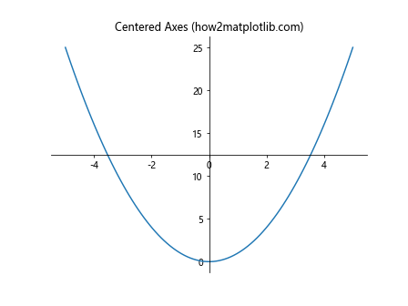
In this example, we use Matplotlib.axis.Axis.set() in combination with spine manipulation to create a plot with centered axes. We adjust the position of the left and bottom spines and set the tick positions accordingly.
Customizing Axis Tick Locations with Matplotlib.axis.Axis.set()
Matplotlib.axis.Axis.set() provides fine-grained control over tick locations. You can specify exact positions for major and minor ticks, which is useful for creating custom scales or emphasizing specific data points.
Here’s an example that demonstrates how to set custom tick locations:
import matplotlib.pyplot as plt
import numpy as np

x = np.linspace(0, 10, 100)
y = np.sin(x)

fig, ax = plt.subplots()
ax.plot(x, y)

ax.xaxis.set(
    major_locator=plt.FixedLocator([0, np.pi, 2*np.pi, 3*np.pi]),
    minor_locator=plt.FixedLocator([np.pi/2, 3*np.pi/2, 5*np.pi/2, 7*np.pi/2]),
    major_formatter=plt.FuncFormatter(lambda val, pos: f'{val/np.pi:.0f}π' if val != 0 else '0')
)

ax.yaxis.set(
    major_locator=plt.MultipleLocator(0.5),
    minor_locator=plt.MultipleLocator(0.1)
)

plt.title('Custom Tick Locations (how2matplotlib.com)')
plt.show()
Output:
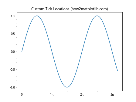
In this example, we use Matplotlib.axis.Axis.set() to set custom major and minor tick locations for the x-axis using FixedLocator. We also set a custom formatter to display the x-axis ticks in terms of π. For the y-axis, we use MultipleLocator to set evenly spaced ticks.
Using Matplotlib.axis.Axis.set() with Date Axes
Matplotlib.axis.Axis.set() can be particularly useful when working with date axes. It allows you to easily set date formatters and locators to customize the display of date-based data.
Here’s an example that demonstrates how to use Matplotlib.axis.Axis.set() with date axes:
import matplotlib.pyplot as plt
import numpy as np
from datetime import datetime, timedelta
from matplotlib.dates import DateFormatter, DayLocator, MonthLocator

start_date = datetime(2023, 1, 1)
dates = [start_date + timedelta(days=i) for i in range(180)]
values = np.cumsum(np.random.randn(180))

fig, ax = plt.subplots(figsize=(12, 6))
ax.plot(dates, values)

ax.xaxis.set(
    major_locator=MonthLocator(),
    major_formatter=DateFormatter('%b %Y'),
    minor_locator=DayLocator(bymonthday=[1, 15])
)

plt.title('Time Series Data (how2matplotlib.com)')
plt.xlabel('Date')
plt.ylabel('Value')
plt.xticks(rotation=45)
plt.tight_layout()
plt.show()
Output:
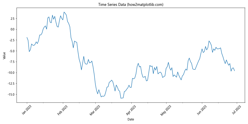
In this example, we use Matplotlib.axis.Axis.set() to set a custom date formatter and locators for the x-axis. This allows us to display the dates in a more readable format and control the frequency of major and minor ticks.
Combining Matplotlib.axis.Axis.set() with Other Customizations
Matplotlib.axis.Axis.set() can be used in combination with other Matplotlib customization techniques to create highly customized and informative plots. Here’s an example that combines various customization techniques:
import matplotlib.pyplot as plt
import numpy as np

x = np.linspace(0, 10, 100)
y1 = np.sin(x)
y2 = np.cos(x)

fig, ax = plt.subplots(figsize=(10, 6))
ax.plot(x, y1, label='sin(x)')
ax.plot(x, y2, label='cos(x)')

ax.xaxis.set(
    label='x (how2matplotlib.com)',
    ticks=np.arange(0, 11, 2),
    minor_locator=plt.MultipleLocator(0.5)
)
ax.yaxis.set(
    label='y (how2matplotlib.com)',
    ticks=np.arange(-1, 1.1, 0.5),
    minor_locator=plt.MultipleLocator(0.1)
)

ax.set_title('Sine and Cosine Functions')
ax.legend()
ax.grid(True, which='both', linestyle='--', alpha=0.5)

plt.tight_layout()
plt.show()
Output:
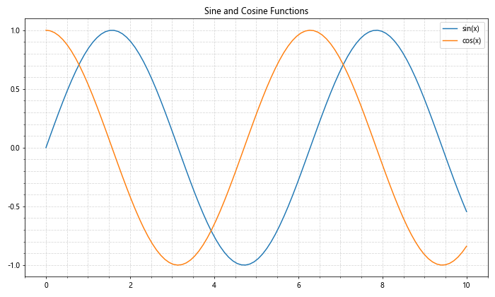
In this example, we use Matplotlib.axis.Axis.set() to customize the x-axis and y-axis properties, including labels, major ticks, and minor ticks. We also add a legend, grid, and title to create a comprehensive and informative plot.
Conclusion
The Matplotlib.axis.Axis.set() function is a powerful and versatile tool for customizing axis properties in Matplotlib plots. Throughout this article, we’ve explored various aspects of this function, including:
- Setting axis labels and customizing their appearance
- Adjusting axis limits and scales
- Customizing tick locations and labels
- Changing axis colors and styles
- Setting grid properties
- Using custom locators and formatters
- Working with date axes
- Combining Matplotlib.axis.Axis.set() with other customization techniques