How to Master Matplotlib Axhline with Various Linestyles: A Comprehensive Guide

How to Master Matplotlib Axhline with Various Linestyles: A Comprehensive Guide

Matplotlib axhline linestyles are essential tools for data visualization in Python. This comprehensive guide will explore the various aspects of using matplotlib axhline with different linestyles to enhance your plots and charts. We’ll cover everything from basic usage to advanced techniques, providing you with the knowledge and skills to create stunning visualizations using matplotlib axhline and linestyles.

Understanding Matplotlib Axhline and Linestyles

Matplotlib axhline is a function that allows you to draw horizontal lines across an entire axis. When combined with various linestyles, it becomes a powerful tool for adding reference lines, thresholds, or visual separators to your plots. Linestyles in matplotlib define the appearance of lines, including solid, dashed, dotted, and dash-dot patterns.

Let’s start with a basic example of using matplotlib axhline with a solid linestyle:

import matplotlib.pyplot as plt

fig, ax = plt.subplots()
ax.set_title('Basic Matplotlib Axhline Example - how2matplotlib.com')
ax.axhline(y=0.5, color='r', linestyle='-')
plt.show()

Output:

How to Master Matplotlib Axhline with Various Linestyles: A Comprehensive Guide

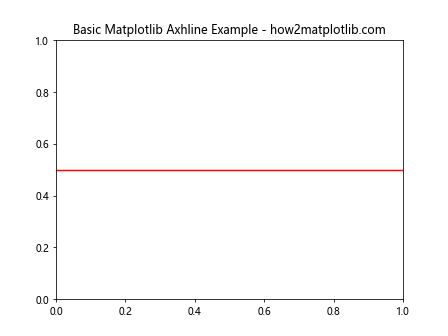
In this example, we create a horizontal line at y=0.5 using a solid red line. The axhline function is called on the axis object (ax) and takes parameters for the y-position, color, and linestyle.

Exploring Different Linestyles with Matplotlib Axhline

Matplotlib offers a variety of linestyles that can be used with axhline. Let’s explore some of the most common ones:

  1. Solid line (‘-‘)
  2. Dashed line (‘–‘)
  3. Dotted line (‘:’)
  4. Dash-dot line (‘-.’)

Here’s an example showcasing these linestyles:

import matplotlib.pyplot as plt

fig, ax = plt.subplots(figsize=(10, 6))
ax.set_title('Matplotlib Axhline Linestyles - how2matplotlib.com')

linestyles = ['-', '--', ':', '-.']
colors = ['r', 'g', 'b', 'm']

for i, (style, color) in enumerate(zip(linestyles, colors)):
    ax.axhline(y=0.2 * (i + 1), color=color, linestyle=style, label=f'Style: {style}')

ax.legend()
plt.show()

Output:

How to Master Matplotlib Axhline with Various Linestyles: A Comprehensive Guide

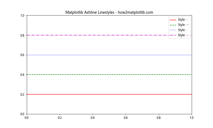
This example demonstrates four different linestyles using matplotlib axhline. Each line is drawn at a different y-position with a unique color and linestyle.

Customizing Matplotlib Axhline Properties

In addition to linestyles, matplotlib axhline allows you to customize various other properties of the line. Let’s explore some of these options:

Line Width

You can adjust the thickness of the line using the linewidth parameter:

import matplotlib.pyplot as plt

fig, ax = plt.subplots()
ax.set_title('Matplotlib Axhline with Custom Line Width - how2matplotlib.com')
ax.axhline(y=0.5, color='r', linestyle='--', linewidth=2)
ax.axhline(y=0.7, color='b', linestyle=':', linewidth=4)
plt.show()

Output:

How to Master Matplotlib Axhline with Various Linestyles: A Comprehensive Guide

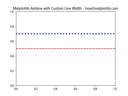
This example shows two horizontal lines with different line widths, demonstrating how you can use the linewidth parameter to create varying thicknesses.

Alpha (Transparency)

The alpha parameter allows you to control the transparency of the line:

import matplotlib.pyplot as plt

fig, ax = plt.subplots()
ax.set_title('Matplotlib Axhline with Alpha - how2matplotlib.com')
ax.axhline(y=0.3, color='r', linestyle='-', alpha=0.3)
ax.axhline(y=0.5, color='g', linestyle='--', alpha=0.6)
ax.axhline(y=0.7, color='b', linestyle=':', alpha=1.0)
plt.show()

Output:

How to Master Matplotlib Axhline with Various Linestyles: A Comprehensive Guide

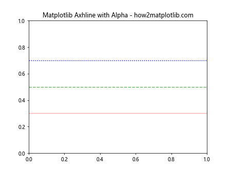
This example demonstrates three horizontal lines with different alpha values, showing how transparency can be used to layer multiple lines effectively.

Combining Matplotlib Axhline with Other Plot Elements

Matplotlib axhline can be combined with other plot elements to create more informative visualizations. Let’s explore some examples:

Adding Axhline to a Scatter Plot

import matplotlib.pyplot as plt
import numpy as np

fig, ax = plt.subplots()
ax.set_title('Scatter Plot with Matplotlib Axhline - how2matplotlib.com')

x = np.random.rand(50)
y = np.random.rand(50)
ax.scatter(x, y, alpha=0.5)

ax.axhline(y=0.5, color='r', linestyle='--', label='Threshold')
ax.legend()
plt.show()

Output:

How to Master Matplotlib Axhline with Various Linestyles: A Comprehensive Guide

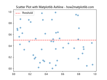
This example demonstrates how to add a horizontal line to a scatter plot, which can be useful for indicating thresholds or reference values.

Using Axhline with Bar Charts

import matplotlib.pyplot as plt
import numpy as np

fig, ax = plt.subplots()
ax.set_title('Bar Chart with Matplotlib Axhline - how2matplotlib.com')

categories = ['A', 'B', 'C', 'D', 'E']
values = np.random.rand(5) * 10

ax.bar(categories, values)
ax.axhline(y=5, color='r', linestyle='--', label='Average')
ax.legend()
plt.show()

Output:

How to Master Matplotlib Axhline with Various Linestyles: A Comprehensive Guide

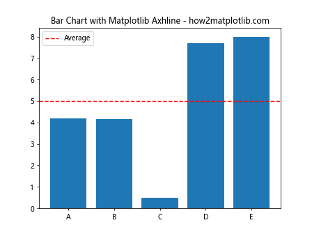
In this example, we add a horizontal line to a bar chart to represent an average or target value.

Advanced Techniques with Matplotlib Axhline and Linestyles

Now that we’ve covered the basics, let’s explore some more advanced techniques for using matplotlib axhline with various linestyles.

Multiple Axhlines with Different Styles

You can use multiple axhlines with different styles to create more complex visualizations:

import matplotlib.pyplot as plt
import numpy as np

fig, ax = plt.subplots()
ax.set_title('Multiple Axhlines with Different Styles - how2matplotlib.com')

x = np.linspace(0, 10, 100)
y = np.sin(x)
ax.plot(x, y)

ax.axhline(y=0, color='k', linestyle='-', linewidth=0.5)
ax.axhline(y=0.5, color='r', linestyle='--', linewidth=1)
ax.axhline(y=-0.5, color='b', linestyle=':', linewidth=1.5)

plt.show()

Output:

How to Master Matplotlib Axhline with Various Linestyles: A Comprehensive Guide

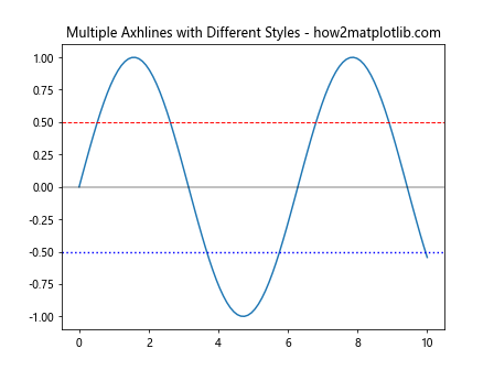
This example shows how to use multiple axhlines with different styles to highlight various aspects of a sine wave plot.

Customizing Axhline with Line Properties

Matplotlib allows you to customize axhlines using line properties. Here’s an example:

import matplotlib.pyplot as plt

fig, ax = plt.subplots()
ax.set_title('Customized Axhline with Line Properties - how2matplotlib.com')

line = ax.axhline(y=0.5, color='r', linestyle='--', linewidth=2)
line.set_dashes([5, 2, 2, 2])  # 5 points on, 2 off, 2 on, 2 off

plt.show()

Output:

How to Master Matplotlib Axhline with Various Linestyles: A Comprehensive Guide

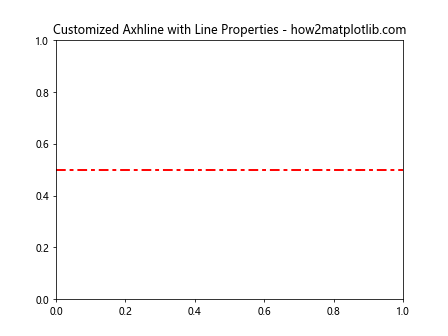
In this example, we use the set_dashes method to create a custom dash pattern for the axhline.

Using Axhline with Subplots

Matplotlib axhline can be used effectively with subplots to create more complex visualizations:

import matplotlib.pyplot as plt
import numpy as np

fig, (ax1, ax2) = plt.subplots(2, 1, figsize=(8, 8))
fig.suptitle('Axhline with Subplots - how2matplotlib.com')

x = np.linspace(0, 10, 100)
y1 = np.sin(x)
y2 = np.cos(x)

ax1.plot(x, y1)
ax1.axhline(y=0, color='r', linestyle='--')
ax1.set_title('Sine Wave')

ax2.plot(x, y2)
ax2.axhline(y=0, color='g', linestyle=':')
ax2.set_title('Cosine Wave')

plt.tight_layout()
plt.show()

Output:

How to Master Matplotlib Axhline with Various Linestyles: A Comprehensive Guide

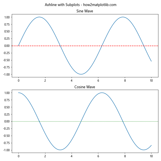
This example demonstrates how to use axhline with subplots to add reference lines to multiple charts.

Practical Applications of Matplotlib Axhline and Linestyles

Let’s explore some practical applications of matplotlib axhline and linestyles in real-world scenarios.

Visualizing Stock Price Thresholds

import matplotlib.pyplot as plt
import numpy as np

fig, ax = plt.subplots()
ax.set_title('Stock Price with Thresholds - how2matplotlib.com')

dates = np.arange('2023-01-01', '2023-01-31', dtype='datetime64[D]')
prices = np.cumsum(np.random.randn(30)) + 100

ax.plot(dates, prices)
ax.axhline(y=100, color='g', linestyle='--', label='Support')
ax.axhline(y=105, color='r', linestyle='--', label='Resistance')

ax.legend()
plt.xticks(rotation=45)
plt.tight_layout()
plt.show()

Output:

How to Master Matplotlib Axhline with Various Linestyles: A Comprehensive Guide

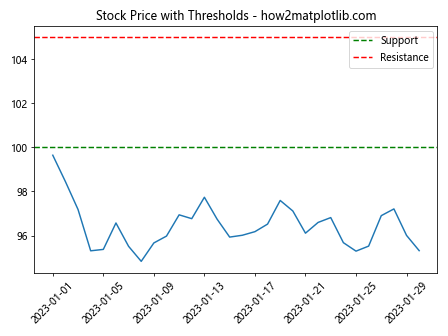
This example uses matplotlib axhline to visualize support and resistance levels in a stock price chart.

Highlighting Data Ranges

import matplotlib.pyplot as plt
import numpy as np

fig, ax = plt.subplots()
ax.set_title('Data Ranges Highlighted with Axhline - how2matplotlib.com')

x = np.linspace(0, 10, 100)
y = np.sin(x) + np.random.normal(0, 0.1, 100)

ax.scatter(x, y, alpha=0.5)
ax.axhline(y=0.5, color='r', linestyle='-', alpha=0.3)
ax.axhline(y=-0.5, color='r', linestyle='-', alpha=0.3)
ax.fill_between(x, -0.5, 0.5, alpha=0.1, color='r')

plt.show()

Output:

How to Master Matplotlib Axhline with Various Linestyles: A Comprehensive Guide

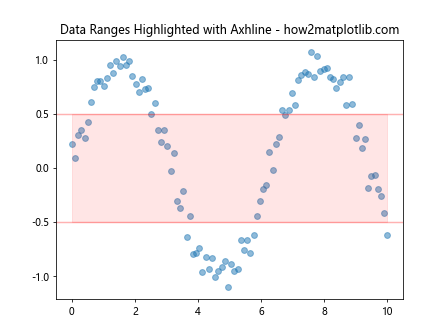
This example uses axhline to highlight a specific range of data points in a scatter plot.

Best Practices for Using Matplotlib Axhline and Linestyles

When working with matplotlib axhline and linestyles, consider the following best practices:

  1. Choose appropriate linestyles: Use solid lines for primary references and dashed or dotted lines for secondary information.

  2. Use colors effectively: Select colors that contrast well with your plot’s background and other elements.

  3. Adjust line width: Use thicker lines for important references and thinner lines for less critical information.

  4. Add labels: Always include labels or a legend to explain the meaning of your axhlines.

  5. Consider transparency: Use alpha values to prevent axhlines from obscuring other plot elements.

Here’s an example incorporating these best practices:

import matplotlib.pyplot as plt
import numpy as np

fig, ax = plt.subplots(figsize=(10, 6))
ax.set_title('Best Practices for Matplotlib Axhline - how2matplotlib.com')

x = np.linspace(0, 10, 100)
y = np.sin(x) + np.random.normal(0, 0.1, 100)

ax.plot(x, y, label='Data')
ax.axhline(y=0, color='k', linestyle='-', linewidth=0.5, label='Zero')
ax.axhline(y=1, color='r', linestyle='--', linewidth=1, label='Upper Limit')
ax.axhline(y=-1, color='b', linestyle=':', linewidth=1, label='Lower Limit')

ax.fill_between(x, -1, 1, alpha=0.1, color='g')
ax.legend()
plt.show()

Output:

How to Master Matplotlib Axhline with Various Linestyles: A Comprehensive Guide

This example demonstrates the use of different linestyles, colors, and widths to convey various levels of information effectively.

Troubleshooting Common Issues with Matplotlib Axhline and Linestyles

When working with matplotlib axhline and linestyles, you may encounter some common issues. Here are some problems and their solutions:

Issue 1: Axhline Not Visible

If your axhline is not visible, it might be outside the current axis limits. To fix this, you can either adjust the axis limits or set the zorder parameter to ensure the line is drawn on top of other elements.

import matplotlib.pyplot as plt
import numpy as np

fig, ax = plt.subplots()
ax.set_title('Fixing Invisible Axhline - how2matplotlib.com')

x = np.linspace(0, 10, 100)
y = np.sin(x)
ax.plot(x, y)

ax.axhline(y=1.5, color='r', linestyle='--', zorder=10)
ax.set_ylim(-2, 2)  # Adjust y-axis limits to include the axhline

plt.show()

Output:

How to Master Matplotlib Axhline with Various Linestyles: A Comprehensive Guide

Issue 2: Inconsistent Linestyle Appearance

Sometimes, linestyles may appear inconsistent across different plot sizes. To address this, you can use the dashes parameter to explicitly define the dash pattern:

import matplotlib.pyplot as plt

fig, ax = plt.subplots(figsize=(10, 6))
ax.set_title('Consistent Linestyle Appearance - how2matplotlib.com')

ax.axhline(y=0.3, color='r', linestyle='--', dashes=(5, 2))
ax.axhline(y=0.5, color='g', linestyle=':', dashes=(1, 1))
ax.axhline(y=0.7, color='b', linestyle='-.', dashes=(3, 1, 1, 1))

plt.show()

Output:

How to Master Matplotlib Axhline with Various Linestyles: A Comprehensive Guide

Issue 3: Axhline Overlapping with Other Elements

If your axhline is overlapping with other plot elements, you can adjust its z-order or use transparency:

import matplotlib.pyplot as plt
import numpy as np

fig, ax = plt.subplots()
ax.set_title('Handling Axhline Overlap - how2matplotlib.com')

x = np.linspace(0, 10, 100)
y = np.sin(x)
ax.plot(x, y)

ax.axhline(y=0, color='r', linestyle='--', alpha=0.5, zorder=5)
ax.scatter(x, y, alpha=0.5, zorder=10)

plt.show()

Output:

How to Master Matplotlib Axhline with Various Linestyles: A Comprehensive Guide

Advanced Customization of Matplotlib Axhline and Linestyles

For even more control over the appearance of your axhlines, you can use some advanced customization techniques:

Custom Line Dash Patterns

You can create custom dash patterns using a sequence of on/off lengths:

import matplotlib.pyplot as plt

fig, ax = plt.subplots()
ax.set_title('Custom Dash Patterns for Axhline - how2matplotlib.com')

ax.axhline(y=0.2, color='r', linestyle=(0, (5, 2, 1, 2)))
ax.axhline(y=0.4, color='g', linestyle=(0, (3, 1, 1, 1, 1, 1)))
ax.axhline(y=0.6, color='b', linestyle=(0, (1, 10)))

plt.show()

Output:

How to Master Matplotlib Axhline with Various Linestyles: A Comprehensive Guide

This example demonstrates how to create complex dash patterns for axhlines.

Combining Matplotlib Axhline with Other Matplotlib Features

Matplotlib axhline can be combined with other matplotlib features to create more complex and informative visualizations. Let’s explore some examples:

Axhline with Text Annotations

You can add text annotations to your axhlines to provide additional context:

import matplotlib.pyplot as plt
import numpy as np

fig, ax = plt.subplots()
ax.set_title('Axhline with Text Annotations - how2matplotlib.com')

x = np.linspace(0, 10, 100)
y = np.sin(x)
ax.plot(x, y)

ax.axhline(y=0.5, color='r', linestyle='--')
ax.text(0.5, 0.52, 'Upper Threshold', color='r', ha='left', va='bottom')

ax.axhline(y=-0.5, color='b', linestyle='--')
ax.text(0.5, -0.48, 'Lower Threshold', color='b', ha='left', va='top')

plt.show()

Output:

How to Master Matplotlib Axhline with Various Linestyles: A Comprehensive Guide

This example demonstrates how to add text annotations to axhlines, providing context for the horizontal lines.

Axhline with Shaded Regions

You can use axhline in combination with fill_between to create shaded regions:

import matplotlib.pyplot as plt
import numpy as np

fig, ax = plt.subplots()
ax.set_title('Axhline with Shaded Regions - how2matplotlib.com')

x = np.linspace(0, 10, 100)
y = np.sin(x)
ax.plot(x, y)

ax.axhline(y=0.5, color='r', linestyle='--')
ax.axhline(y=-0.5, color='b', linestyle='--')

ax.fill_between(x, 0.5, 1, alpha=0.2, color='r')
ax.fill_between(x, -0.5, -1, alpha=0.2, color='b')

plt.show()

Output:

How to Master Matplotlib Axhline with Various Linestyles: A Comprehensive Guide

This example uses axhline to define boundaries for shaded regions, highlighting areas above and below certain thresholds.

Using Matplotlib Axhline in Different Plot Types

Matplotlib axhline can be used in various types of plots. Let’s explore some examples:

Axhline in Histogram

import matplotlib.pyplot as plt
import numpy as np

fig, ax = plt.subplots()
ax.set_title('Histogram with Axhline - how2matplotlib.com')

data = np.random.normal(0, 1, 1000)
ax.hist(data, bins=30, alpha=0.7)

mean = np.mean(data)
ax.axhline(y=mean, color='r', linestyle='--', label=f'Mean: {mean:.2f}')

ax.legend()
plt.show()

Output:

How to Master Matplotlib Axhline with Various Linestyles: A Comprehensive Guide

This example demonstrates how to use axhline to indicate the mean value in a histogram.

Axhline in Box Plot

import matplotlib.pyplot as plt
import numpy as np

fig, ax = plt.subplots()
ax.set_title('Box Plot with Axhline - how2matplotlib.com')

data = [np.random.normal(0, std, 100) for std in range(1, 4)]
ax.boxplot(data)

ax.axhline(y=0, color='r', linestyle='--', label='Reference')

ax.legend()
plt.show()

Output:

How to Master Matplotlib Axhline with Various Linestyles: A Comprehensive Guide

This example shows how to add a reference line using axhline in a box plot.

Matplotlib Axhline in Real-World Data Visualization

Let’s explore some real-world applications of matplotlib axhline in data visualization:

Visualizing Economic Data

import matplotlib.pyplot as plt
import numpy as np

fig, ax = plt.subplots(figsize=(10, 6))
ax.set_title('GDP Growth Rate with Recession Indicator - how2matplotlib.com')

years = np.arange(2000, 2021)
gdp_growth = np.random.uniform(-2, 5, len(years))

ax.bar(years, gdp_growth)
ax.axhline(y=0, color='k', linestyle='-', linewidth=0.5)
ax.axhline(y=-1, color='r', linestyle='--', label='Recession Threshold')

ax.set_xlabel('Year')
ax.set_ylabel('GDP Growth Rate (%)')
ax.legend()

plt.show()

Output:

How to Master Matplotlib Axhline with Various Linestyles: A Comprehensive Guide

This example uses axhline to indicate a recession threshold in an economic data visualization.

Visualizing Climate Data

import matplotlib.pyplot as plt
import numpy as np

fig, ax = plt.subplots(figsize=(10, 6))
ax.set_title('Monthly Temperature Anomalies - how2matplotlib.com')

months = np.arange(1, 13)
temp_anomalies = np.random.uniform(-1, 1, 12)

ax.plot(months, temp_anomalies, marker='o')
ax.axhline(y=0, color='k', linestyle='-', linewidth=0.5)
ax.axhline(y=0.5, color='r', linestyle='--', label='Warming Threshold')
ax.axhline(y=-0.5, color='b', linestyle='--', label='Cooling Threshold')

ax.set_xlabel('Month')
ax.set_ylabel('Temperature Anomaly (°C)')
ax.legend()

plt.show()

Output:

How to Master Matplotlib Axhline with Various Linestyles: A Comprehensive Guide

This example uses axhline to indicate warming and cooling thresholds in a climate data visualization.

Best Practices for Effective Use of Matplotlib Axhline and Linestyles

To make the most of matplotlib axhline and linestyles in your visualizations, consider the following best practices:

  1. Use consistent linestyles: Establish a convention for your linestyles and stick to it across your visualizations.

  2. Choose appropriate colors: Select colors that are easily distinguishable and complement your overall color scheme.

  3. Provide context: Always include labels or annotations to explain the significance of your axhlines.

  4. Balance visual elements: Avoid cluttering your plots with too many axhlines; use them sparingly for maximum impact.

  5. Consider accessibility: Ensure that your linestyles and colors are distinguishable for colorblind viewers.

Here’s an example that incorporates these best practices:

import matplotlib.pyplot as plt
import numpy as np

fig, ax = plt.subplots(figsize=(10, 6))
ax.set_title('Best Practices for Matplotlib Axhline - how2matplotlib.com')

x = np.linspace(0, 10, 100)
y = np.sin(x) + np.random.normal(0, 0.1, 100)

ax.scatter(x, y, alpha=0.5, label='Data Points')
ax.axhline(y=0, color='k', linestyle='-', linewidth=0.5, label='Baseline')
ax.axhline(y=1, color='r', linestyle='--', linewidth=1, label='Upper Limit')
ax.axhline(y=-1, color='b', linestyle='--', linewidth=1, label='Lower Limit')

ax.text(0.5, 1.05, 'Upper Threshold', color='r', ha='left', va='bottom')
ax.text(0.5, -1.05, 'Lower Threshold', color='b', ha='left', va='top')

ax.set_xlabel('X-axis')
ax.set_ylabel('Y-axis')
ax.legend()

plt.show()

Output:

How to Master Matplotlib Axhline with Various Linestyles: A Comprehensive Guide

This example demonstrates the use of consistent linestyles, appropriate colors, context through labels and annotations, and a balanced overall design.

Matplotlib axhline linestyles Conclusion

Matplotlib axhline and linestyles are powerful tools for enhancing your data visualizations. By mastering these features, you can create more informative and visually appealing plots that effectively communicate your data insights. Remember to experiment with different linestyles, colors, and combinations to find the best approach for your specific visualization needs.

Like(0)