How to Master Matplotlib Axhline and Text: A Comprehensive Guide
Matplotlib axhline and text are essential components for creating informative and visually appealing plots in Python. This comprehensive guide will explore the various aspects of using matplotlib axhline and text functions to enhance your data visualizations. We’ll cover everything from basic usage to advanced techniques, providing you with the knowledge and skills to create professional-looking charts and graphs.
Understanding Matplotlib Axhline
Matplotlib axhline is a powerful function that allows you to add horizontal lines to your plots. These lines can be used to highlight specific values, indicate thresholds, or simply improve the overall readability of your visualizations. Let’s start by exploring the basic syntax and usage of matplotlib axhline.
Basic Usage of Matplotlib Axhline
To use matplotlib axhline, you first need to import the matplotlib library and create a figure and axes object. Here’s a simple example:
import matplotlib.pyplot as plt

fig, ax = plt.subplots()
ax.axhline(y=0.5, color='r', linestyle='--')
ax.set_title('Basic Matplotlib Axhline Example - how2matplotlib.com')
plt.show()
Output:
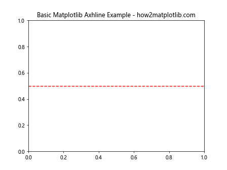
In this example, we create a horizontal line at y=0.5 with a red color and dashed linestyle. The axhline function is called on the axes object (ax) and takes several parameters to customize the appearance of the line.
Customizing Matplotlib Axhline
Matplotlib axhline offers various customization options to make your horizontal lines more informative and visually appealing. Let’s explore some of these options:
import matplotlib.pyplot as plt

fig, ax = plt.subplots()
ax.axhline(y=0.5, color='b', linestyle='-', linewidth=2, alpha=0.7)
ax.set_title('Customized Matplotlib Axhline - how2matplotlib.com')
plt.show()
Output:
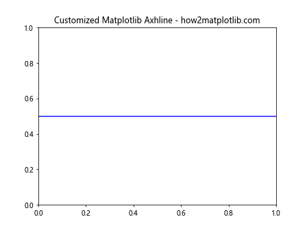
In this example, we’ve customized the horizontal line by changing its color to blue, using a solid linestyle, increasing the linewidth, and adding transparency with the alpha parameter.
Multiple Matplotlib Axhline
You can add multiple horizontal lines to your plot using matplotlib axhline. This is useful when you want to highlight different thresholds or compare multiple values:
import matplotlib.pyplot as plt

fig, ax = plt.subplots()
ax.axhline(y=0.25, color='r', linestyle='--', label='Lower Threshold')
ax.axhline(y=0.75, color='g', linestyle='--', label='Upper Threshold')
ax.set_title('Multiple Matplotlib Axhline - how2matplotlib.com')
ax.legend()
plt.show()
Output:
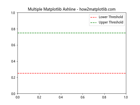
This example demonstrates how to add two horizontal lines with different colors and labels. We’ve also added a legend to explain the meaning of each line.
Integrating Matplotlib Text with Axhline
Combining matplotlib axhline with text annotations can greatly enhance the information conveyed by your plots. Let’s explore how to effectively use matplotlib text in conjunction with axhline.
Adding Basic Text to Plots
Before we combine text with axhline, let’s start with a basic example of adding text to a plot:
import matplotlib.pyplot as plt

fig, ax = plt.subplots()
ax.text(0.5, 0.5, 'Hello, how2matplotlib.com!', ha='center', va='center')
ax.set_title('Basic Matplotlib Text Example')
plt.show()
Output:
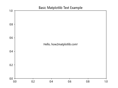
This example adds a simple text annotation to the center of the plot. The text function takes x and y coordinates, the text string, and optional parameters for horizontal and vertical alignment.
Combining Matplotlib Axhline and Text
Now, let’s combine matplotlib axhline and text to create more informative visualizations:
import matplotlib.pyplot as plt

fig, ax = plt.subplots()
ax.axhline(y=0.5, color='r', linestyle='--')
ax.text(0.5, 0.52, 'Threshold: 0.5', ha='center', va='bottom')
ax.set_title('Matplotlib Axhline with Text - how2matplotlib.com')
plt.show()
Output:
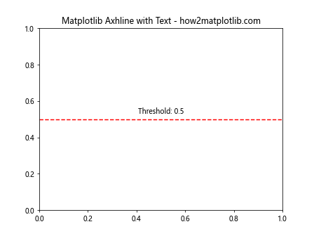
In this example, we’ve added a horizontal line at y=0.5 and placed a text annotation just above it to explain its meaning.
Customizing Text Appearance
Matplotlib offers various options to customize the appearance of text annotations. Let’s explore some of these options:
import matplotlib.pyplot as plt

fig, ax = plt.subplots()
ax.axhline(y=0.5, color='b', linestyle='-', linewidth=2)
ax.text(0.5, 0.52, 'Important Threshold', ha='center', va='bottom',
        fontsize=12, fontweight='bold', color='b',
        bbox=dict(facecolor='white', edgecolor='b', alpha=0.8))
ax.set_title('Customized Matplotlib Text with Axhline - how2matplotlib.com')
plt.show()
Output:
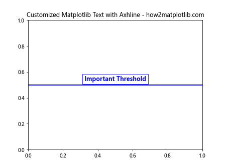
This example demonstrates how to customize the text appearance by changing the font size, weight, color, and adding a background box.
Advanced Techniques with Matplotlib Axhline and Text
Now that we’ve covered the basics, let’s explore some advanced techniques for using matplotlib axhline and text to create more complex and informative visualizations.
Using Matplotlib Axhline with Data
Often, you’ll want to use matplotlib axhline to highlight specific values in your data. Here’s an example that demonstrates this:
import matplotlib.pyplot as plt
import numpy as np

x = np.linspace(0, 10, 100)
y = np.sin(x)

fig, ax = plt.subplots()
ax.plot(x, y)
ax.axhline(y=0, color='r', linestyle='--')
ax.text(5, 0.1, 'y = 0', color='r', ha='center', va='bottom')
ax.set_title('Matplotlib Axhline with Data - how2matplotlib.com')
plt.show()
Output:
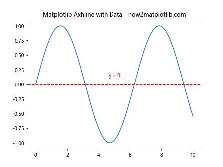
This example plots a sine wave and adds a horizontal line at y=0 to highlight the x-axis. We’ve also added a text annotation to explain the meaning of the line.
Creating Multiple Subplots with Axhline and Text
When working with multiple subplots, you can use matplotlib axhline and text to add information to each subplot:
import matplotlib.pyplot as plt
import numpy as np

fig, (ax1, ax2) = plt.subplots(2, 1, figsize=(8, 8))

x = np.linspace(0, 10, 100)
y1 = np.sin(x)
y2 = np.cos(x)

ax1.plot(x, y1)
ax1.axhline(y=0, color='r', linestyle='--')
ax1.text(5, 0.1, 'y = 0', color='r', ha='center', va='bottom')
ax1.set_title('Sine Wave - how2matplotlib.com')

ax2.plot(x, y2)
ax2.axhline(y=0, color='g', linestyle='--')
ax2.text(5, 0.1, 'y = 0', color='g', ha='center', va='bottom')
ax2.set_title('Cosine Wave - how2matplotlib.com')

plt.tight_layout()
plt.show()
Output:
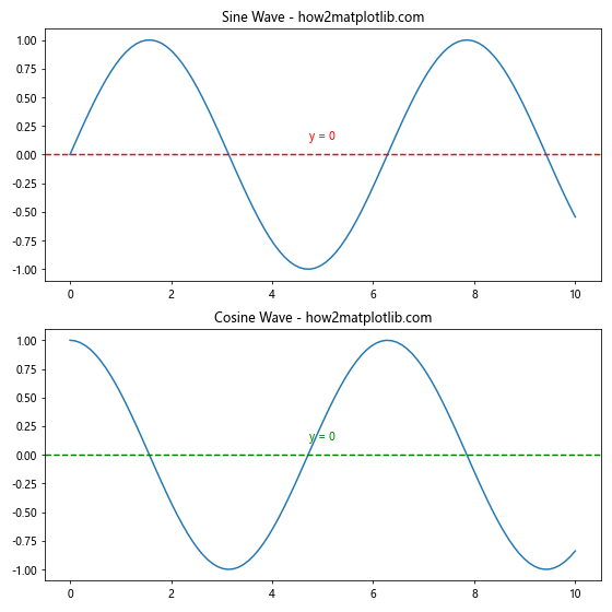
This example creates two subplots, each with its own plot, horizontal line, and text annotation.
Using Matplotlib Axhline for Statistical Visualization
Matplotlib axhline can be particularly useful for statistical visualizations. Here’s an example that uses axhline to show the mean and standard deviation of a dataset:
import matplotlib.pyplot as plt
import numpy as np

data = np.random.normal(0, 1, 1000)
mean = np.mean(data)
std = np.std(data)

fig, ax = plt.subplots()
ax.hist(data, bins=30, alpha=0.7)
ax.axhline(y=mean, color='r', linestyle='--', label='Mean')
ax.axhline(y=mean+std, color='g', linestyle=':', label='Mean + Std')
ax.axhline(y=mean-std, color='g', linestyle=':', label='Mean - Std')

ax.text(3, mean, f'Mean: {mean:.2f}', ha='right', va='bottom', color='r')
ax.text(3, mean+std, f'Mean + Std: {mean+std:.2f}', ha='right', va='bottom', color='g')
ax.text(3, mean-std, f'Mean - Std: {mean-std:.2f}', ha='right', va='top', color='g')

ax.set_title('Statistical Visualization with Matplotlib Axhline and Text - how2matplotlib.com')
ax.legend()
plt.show()
Output:
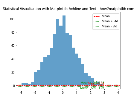
This example creates a histogram of normally distributed data and uses matplotlib axhline to show the mean and standard deviation. Text annotations are added to provide numerical values for these statistics.
Matplotlib Axhline and Text for Time Series Data
Matplotlib axhline and text can be particularly useful when working with time series data. Let’s explore some examples of how to use these functions effectively with date-based plots.
Adding Reference Lines to Time Series Plots
When visualizing time series data, you might want to add reference lines to highlight specific dates or values. Here’s an example:
import matplotlib.pyplot as plt
import pandas as pd
import numpy as np

dates = pd.date_range(start='2023-01-01', end='2023-12-31', freq='D')
values = np.cumsum(np.random.randn(len(dates)))

fig, ax = plt.subplots(figsize=(10, 6))
ax.plot(dates, values)

reference_date = pd.Timestamp('2023-07-01')
ax.axvline(x=reference_date, color='r', linestyle='--')
ax.text(reference_date, ax.get_ylim()[1], 'Reference Date',
        ha='right', va='top', rotation=90, color='r')

ax.axhline(y=0, color='g', linestyle=':')
ax.text(ax.get_xlim()[1], 0, 'Baseline', ha='right', va='bottom', color='g')

ax.set_title('Time Series with Matplotlib Axhline and Text - how2matplotlib.com')
plt.show()
Output:
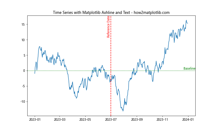
In this example, we’ve created a time series plot and added a vertical line to highlight a specific date, as well as a horizontal line to show the baseline value. Text annotations are added to explain the meaning of these lines.
Using Matplotlib Axhline for Moving Averages
Matplotlib axhline can be useful for showing moving averages in time series data. Here’s an example that demonstrates this:
import matplotlib.pyplot as plt
import pandas as pd
import numpy as np

dates = pd.date_range(start='2023-01-01', end='2023-12-31', freq='D')
values = np.cumsum(np.random.randn(len(dates)))
moving_avg = pd.Series(values).rolling(window=30).mean()

fig, ax = plt.subplots(figsize=(10, 6))
ax.plot(dates, values, label='Original Data')
ax.plot(dates, moving_avg, color='r', label='30-day Moving Average')

ax.axhline(y=moving_avg.mean(), color='g', linestyle='--')
ax.text(ax.get_xlim()[1], moving_avg.mean(), 'Average of Moving Average',
        ha='right', va='bottom', color='g')

ax.set_title('Time Series with Moving Average - how2matplotlib.com')
ax.legend()
plt.show()
Output:
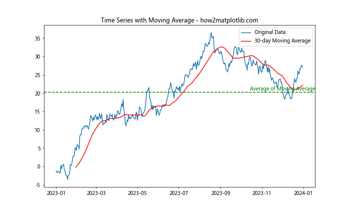
This example calculates and plots a 30-day moving average for the time series data. We’ve used matplotlib axhline to show the average of the moving average, providing additional context to the visualization.
Matplotlib Axhline and Text for Comparative Analysis
Matplotlib axhline and text can be powerful tools for comparative analysis. Let’s explore some examples that demonstrate how to use these functions to compare different datasets or categories.
Comparing Multiple Datasets with Axhline
When comparing multiple datasets, matplotlib axhline can be used to highlight important thresholds or averages. Here’s an example:
import matplotlib.pyplot as plt
import numpy as np

categories = ['A', 'B', 'C', 'D', 'E']
values1 = np.random.rand(5) * 10
values2 = np.random.rand(5) * 10

fig, ax = plt.subplots(figsize=(10, 6))
ax.bar(categories, values1, alpha=0.5, label='Dataset 1')
ax.bar(categories, values2, alpha=0.5, label='Dataset 2')

overall_mean = np.mean(np.concatenate([values1, values2]))
ax.axhline(y=overall_mean, color='r', linestyle='--')
ax.text(ax.get_xlim()[1], overall_mean, f'Overall Mean: {overall_mean:.2f}',
        ha='right', va='bottom', color='r')

ax.set_title('Comparative Analysis with Matplotlib Axhline and Text - how2matplotlib.com')
ax.legend()
plt.show()
Output:
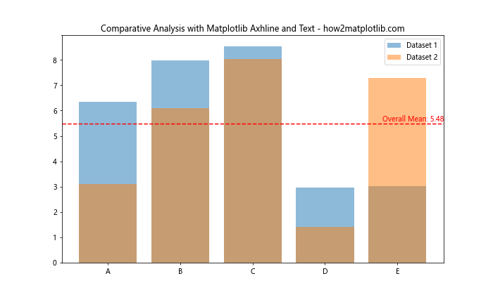
In this example, we’ve created a bar plot comparing two datasets across different categories. We’ve used matplotlib axhline to show the overall mean of both datasets, providing a reference point for comparison.
Using Axhline for Benchmark Comparison
Matplotlib axhline can be useful for showing benchmark values in comparative analyses. Here’s an example:
import matplotlib.pyplot as plt
import numpy as np

products = ['Product A', 'Product B', 'Product C', 'Product D']
scores = np.random.rand(4) * 100

fig, ax = plt.subplots(figsize=(10, 6))
ax.bar(products, scores)

benchmark = 75
ax.axhline(y=benchmark, color='r', linestyle='--')
ax.text(ax.get_xlim()[1], benchmark, f'Benchmark: {benchmark}',
        ha='right', va='bottom', color='r')

for i, score in enumerate(scores):
    ax.text(i, score, f'{score:.1f}', ha='center', va='bottom')

ax.set_title('Product Scores with Benchmark - how2matplotlib.com')
ax.set_ylim(0, 100)
plt.show()
Output:
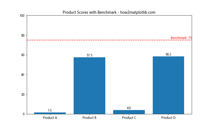
This example shows a bar plot of product scores with a benchmark line. We’ve used matplotlib axhline to display the benchmark value and added text annotations to show the exact scores for each product.
Advanced Styling with Matplotlib Axhline and Text
To create professional-looking visualizations, it’s important to pay attention to the styling of your plots. Let’s explore some advanced styling techniques using matplotlib axhline and text.
Custom Line Styles and Patterns
Matplotlib offers a wide range of line styles and patterns that you can use with axhline. Here’s an example that demonstrates some of these options:
import matplotlib.pyplot as plt

fig, ax = plt.subplots(figsize=(10, 6))

line_styles = ['-', '--', '-.', ':']
colors = ['r', 'g', 'b', 'm']

for i, (style, color) in enumerate(zip(line_styles, colors)):
    ax.axhline(y=i, color=color, linestyle=style, linewidth=2)
    ax.text(0.5, i, f'Style: {style}', ha='left', va='center', color=color)

ax.set_title('Custom Line Styles with Matplotlib Axhline - how2matplotlib.com')
ax.set_ylim(-1, 4)
ax.set_xlim(0, 1)
ax.axis('off')
plt.show()
Output:
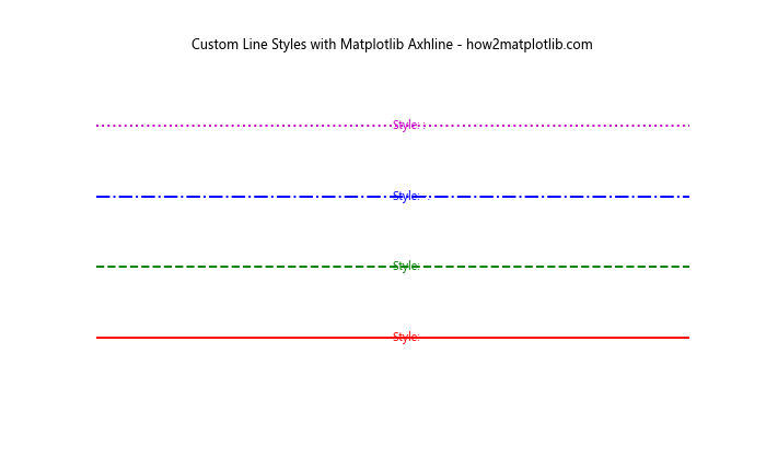
This example showcases different line styles available in matplotlib, using axhline to display them and text to label each style.
Using Gradient Colors with Axhline
You can create visually appealing plots by using gradient colors with matplotlib axhline. Here’s an example that demonstrates this technique:
import matplotlib.pyplot as plt
import numpy as np

fig, ax = plt.subplots(figsize=(10, 6))

num_lines = 20
colors = plt.cm.viridis(np.linspace(0, 1, num_lines))

for i, color in enumerate(colors):
    y = i / (num_lines - 1)
    ax.axhline(y=y, color=color, linewidth=2)
    ax.text(1.01, y, f'{y:.2f}', va='center', ha='left', color=color)

ax.set_title('Gradient Colors with Matplotlib Axhline - how2matplotlib.com')
ax.set_xlim(0, 1)
ax.set_ylim(0, 1)
ax.axis('off')
plt.show()
Output:
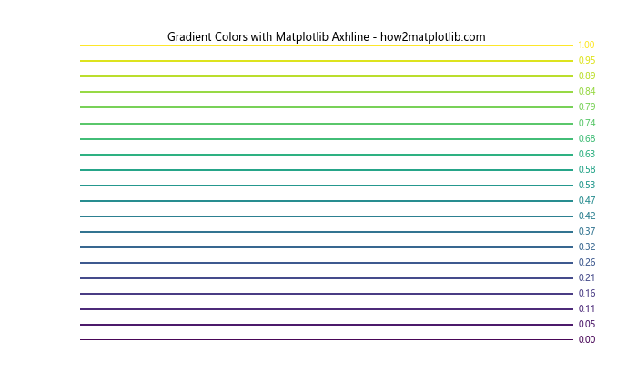
This example creates a series of horizontal lines with a gradient color scheme, using matplotlib axhline and text to create a visually appealing color scale.
Combining Axhline with Other Plot Elements
To create more complex visualizations, you can combine matplotlib axhline and text with other plot elements. Here’s an example that demonstrates this:
import matplotlib.pyplot as plt
import numpy as np

x = np.linspace(0, 10, 100)
y1 = np.sin(x)
y2 = np.cos(x)

fig, ax = plt.subplots(figsize=(10, 6))

ax.plot(x, y1, label='sin(x)')
ax.plot(x, y2, label='cos(x)')

ax.axhline(y=0, color='k', linestyle='--', linewidth=0.5)
ax.axvline(x=np.pi, color='r', linestyle='--')
ax.text(np.pi, 1, 'x = π', ha='right', va='top', color='r')

ax.fill_between(x, y1, y2, where=(y1 > y2), alpha=0.3, color='g', interpolate=True)
ax.text(5, 0.5, 'y1 > y2', ha='center', va='center', color='g')

ax.set_title('Complex Plot with Matplotlib Axhline and Text - how2matplotlib.com')
ax.legend()
plt.show()
Output:
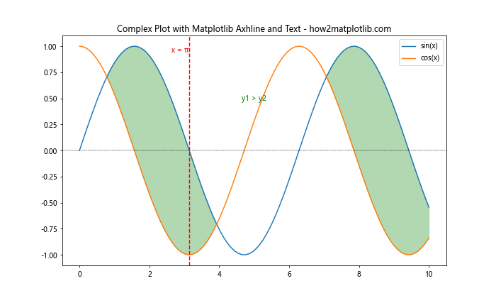
This example combines line plots, axhline, axvline, text annotations, and filled areas to create a complex and informative visualization.
Matplotlib Axhline and Text for Data Analysis
Matplotlib axhline and text can be powerful tools for data analysis, helping to highlight important features and trends in your data. Let’s explore some examples of how to use these functions for data analysis tasks.
Visualizing Outliers with Axhline
Matplotlib axhline can be useful for visualizing outliers in your data. Here’s an example:
import matplotlib.pyplot as plt
import numpy as np

np.random.seed(42)
data = np.random.normal(0, 1, 1000)
outliers = np.random.uniform(-5, 5, 20)
data = np.concatenate([data, outliers])

fig, ax = plt.subplots(figsize=(10, 6))

ax.boxplot(data)

q1, q3 = np.percentile(data, [25, 75])
iqr = q3 - q1
lower_bound = q1 - 1.5 * iqr
upper_bound = q3 + 1.5 * iqr

ax.axhline(y=lower_bound, color='r', linestyle='--')
ax.text(1.1, lower_bound, f'Lower Bound: {lower_bound:.2f}', ha='left', va='center', color='r')

ax.axhline(y=upper_bound, color='r', linestyle='--')
ax.text(1.1, upper_bound, f'Upper Bound: {upper_bound:.2f}', ha='left', va='center', color='r')

ax.set_title('Outlier Visualization with Matplotlib Axhline - how2matplotlib.com')
plt.show()
Output:
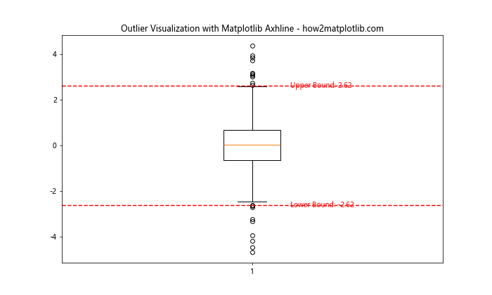
This example creates a box plot of the data and uses matplotlib axhline to show the lower and upper bounds for outlier detection.
Highlighting Trends with Axhline and Text
You can use matplotlib axhline and text to highlight trends in your data. Here’s an example:
import matplotlib.pyplot as plt
import numpy as np

x = np.linspace(0, 10, 100)
y = 2 * x + 1 + np.random.normal(0, 1, 100)

fig, ax = plt.subplots(figsize=(10, 6))

ax.scatter(x, y, alpha=0.5)

m, b = np.polyfit(x, y, 1)
ax.plot(x, m*x + b, color='r', label='Trend Line')

ax.axhline(y=np.mean(y), color='g', linestyle='--')
ax.text(ax.get_xlim()[1], np.mean(y), f'Mean: {np.mean(y):.2f}', ha='right', va='bottom', color='g')

ax.set_title('Trend Analysis with Matplotlib Axhline and Text - how2matplotlib.com')
ax.legend()
plt.show()
Output:
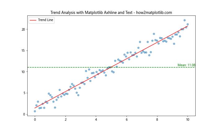
This example creates a scatter plot of data points, adds a trend line, and uses matplotlib axhline to show the mean value of the data.
Best Practices for Using Matplotlib Axhline and Text
To make the most of matplotlib axhline and text in your visualizations, it’s important to follow some best practices. Here are some tips to keep in mind:
- Use consistent colors and styles: When using multiple axhline or text elements, try to use a consistent color scheme and style to make your plots more visually appealing and easier to understand.
Avoid clutter: While axhline and text can provide valuable information, too many lines or annotations can make your plot cluttered and hard to read. Use them judiciously and consider removing unnecessary elements.
Provide context: When adding horizontal lines or text annotations, make sure to provide enough context for the reader to understand their significance. Use clear labels and consider adding a legend if necessary.
Consider accessibility: Choose colors and styles that are easily distinguishable, even for people with color vision deficiencies. Use high-contrast combinations and consider using different line styles in addition to colors.
Align text carefully: When adding text annotations, pay attention to their alignment and position to ensure they don’t overlap with other plot elements or each other.
Use appropriate font sizes: Make sure your text annotations are legible by using appropriate font sizes. Consider the overall size of your plot and adjust text sizes accordingly.
Be consistent with decimal places: When displaying numerical values in text annotations, be consistent with the number of decimal places you show across your plot.
Here’s an example that demonstrates some of these best practices: