How to Use Matplotlib.axes.Axes.get_data_ratio() in Python
Matplotlib.axes.Axes.get_data_ratio() in Python is an essential method for understanding and manipulating the aspect ratio of your plots. This function is particularly useful when you need to ensure that your data is displayed accurately and proportionally. In this comprehensive guide, we’ll explore the ins and outs of Matplotlib.axes.Axes.get_data_ratio(), providing you with detailed explanations and practical examples to help you master this powerful tool.
Understanding Matplotlib.axes.Axes.get_data_ratio()
Matplotlib.axes.Axes.get_data_ratio() is a method that returns the aspect ratio of the data limits. This ratio is calculated by dividing the height of the axes by its width. The method is particularly useful when you want to ensure that your plot maintains the correct proportions, especially when dealing with different scales on the x and y axes.
Let’s start with a simple example to demonstrate how to use Matplotlib.axes.Axes.get_data_ratio():
import matplotlib.pyplot as plt

# Create a figure and axis
fig, ax = plt.subplots()

# Plot some data
ax.plot([0, 1, 2], [0, 1, 4], label='Data from how2matplotlib.com')

# Get the data ratio
data_ratio = ax.get_data_ratio()

# Print the data ratio
print(f"Data ratio: {data_ratio}")

plt.legend()
plt.title('Using Matplotlib.axes.Axes.get_data_ratio()')
plt.show()
Output:
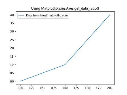
In this example, we create a simple plot and then use the get_data_ratio() method to obtain the aspect ratio of the data limits. The result will be printed to the console, giving you an idea of the current proportions of your plot.
The Importance of Aspect Ratio in Data Visualization
Understanding and controlling the aspect ratio of your plots is crucial for accurate data representation. Matplotlib.axes.Axes.get_data_ratio() plays a significant role in this process by providing you with the necessary information to make informed decisions about your plot’s layout.
Let’s explore a more complex example that demonstrates the importance of aspect ratio:
import matplotlib.pyplot as plt
import numpy as np

# Create data
x = np.linspace(0, 10, 100)
y = np.sin(x)

# Create a figure with two subplots
fig, (ax1, ax2) = plt.subplots(1, 2, figsize=(12, 5))

# Plot data on both subplots
ax1.plot(x, y, label='Sine wave from how2matplotlib.com')
ax2.plot(x, y, label='Sine wave from how2matplotlib.com')

# Set different aspect ratios
ax1.set_aspect('equal')
ax2.set_aspect('auto')

# Get and print data ratios
ratio1 = ax1.get_data_ratio()
ratio2 = ax2.get_data_ratio()

print(f"Data ratio for subplot 1: {ratio1}")
print(f"Data ratio for subplot 2: {ratio2}")

# Add titles and labels
ax1.set_title('Equal Aspect Ratio')
ax2.set_title('Auto Aspect Ratio')
ax1.legend()
ax2.legend()

plt.tight_layout()
plt.show()
Output:
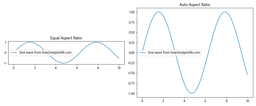
In this example, we create two subplots with different aspect ratios. The first subplot uses an ‘equal’ aspect ratio, while the second uses ‘auto’. We then use Matplotlib.axes.Axes.get_data_ratio() to obtain and print the data ratios for both subplots. This comparison helps illustrate how different aspect ratios can affect the visual representation of your data.
Adjusting Plot Dimensions Based on Data Ratio
One practical application of Matplotlib.axes.Axes.get_data_ratio() is adjusting your plot’s dimensions to maintain a specific aspect ratio. This can be particularly useful when you want to ensure that your data is displayed with the correct proportions.
Here’s an example that demonstrates how to adjust plot dimensions based on the data ratio:
import matplotlib.pyplot as plt
import numpy as np

# Create data
x = np.linspace(0, 10, 100)
y = np.sin(x)

# Create a figure and axis
fig, ax = plt.subplots()

# Plot data
ax.plot(x, y, label='Sine wave from how2matplotlib.com')

# Get the initial data ratio
initial_ratio = ax.get_data_ratio()

# Set a target aspect ratio (e.g., 1:1)
target_ratio = 1

# Adjust the plot dimensions
current_ratio = ax.get_data_ratio()
if current_ratio < target_ratio:
    ax.set_aspect(aspect=target_ratio/current_ratio)
else:
    ax.set_aspect(aspect=current_ratio/target_ratio)

# Get the new data ratio
new_ratio = ax.get_data_ratio()

print(f"Initial data ratio: {initial_ratio}")
print(f"New data ratio: {new_ratio}")

ax.set_title('Adjusted Plot Dimensions')
ax.legend()
plt.show()
Output:
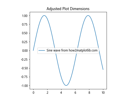
In this example, we first plot our data and get the initial data ratio using Matplotlib.axes.Axes.get_data_ratio(). We then set a target aspect ratio and adjust the plot dimensions accordingly. Finally, we get the new data ratio to confirm that our adjustments have been applied successfully.
Using get_data_ratio() with Different Plot Types
Matplotlib.axes.Axes.get_data_ratio() can be used with various types of plots. Let's explore how it works with different plot types and how you can use this information to enhance your visualizations.
Scatter Plots
Scatter plots are commonly used to display the relationship between two variables. Here's an example of using get_data_ratio() with a scatter plot:
import matplotlib.pyplot as plt
import numpy as np

# Create data
x = np.random.rand(50)
y = np.random.rand(50)

# Create a figure and axis
fig, ax = plt.subplots()

# Create scatter plot
ax.scatter(x, y, label='Random data from how2matplotlib.com')

# Get and print the data ratio
data_ratio = ax.get_data_ratio()
print(f"Data ratio: {data_ratio}")

# Adjust aspect ratio to make the plot square
ax.set_aspect('equal')

# Get and print the new data ratio
new_ratio = ax.get_data_ratio()
print(f"New data ratio: {new_ratio}")

ax.set_title('Scatter Plot with Adjusted Aspect Ratio')
ax.legend()
plt.show()
Output:
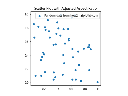
In this example, we create a scatter plot and use Matplotlib.axes.Axes.get_data_ratio() to obtain the initial data ratio. We then adjust the aspect ratio to make the plot square and get the new data ratio to confirm the change.
Bar Plots
Bar plots are useful for comparing categorical data. Let's see how get_data_ratio() works with bar plots:
import matplotlib.pyplot as plt
import numpy as np

# Create data
categories = ['A', 'B', 'C', 'D', 'E']
values = np.random.randint(1, 10, 5)

# Create a figure and axis
fig, ax = plt.subplots()

# Create bar plot
ax.bar(categories, values, label='Random data from how2matplotlib.com')

# Get and print the data ratio
data_ratio = ax.get_data_ratio()
print(f"Data ratio: {data_ratio}")

# Adjust the plot dimensions
ax.set_aspect(0.5 * data_ratio)

# Get and print the new data ratio
new_ratio = ax.get_data_ratio()
print(f"New data ratio: {new_ratio}")

ax.set_title('Bar Plot with Adjusted Dimensions')
ax.legend()
plt.show()
Output:
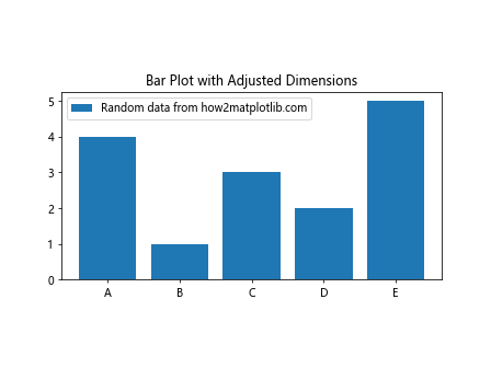
In this example, we create a bar plot and use Matplotlib.axes.Axes.get_data_ratio() to obtain the initial data ratio. We then adjust the plot dimensions based on this ratio to create a more visually appealing layout.
Handling Multiple Subplots with get_data_ratio()
When working with multiple subplots, Matplotlib.axes.Axes.get_data_ratio() can be particularly useful for ensuring consistency across your visualizations. Let's explore an example that demonstrates how to use get_data_ratio() with multiple subplots:
import matplotlib.pyplot as plt
import numpy as np

# Create data
x = np.linspace(0, 10, 100)
y1 = np.sin(x)
y2 = np.cos(x)
y3 = np.tan(x)

# Create a figure with three subplots
fig, (ax1, ax2, ax3) = plt.subplots(1, 3, figsize=(15, 5))

# Plot data on each subplot
ax1.plot(x, y1, label='Sine from how2matplotlib.com')
ax2.plot(x, y2, label='Cosine from how2matplotlib.com')
ax3.plot(x, y3, label='Tangent from how2matplotlib.com')

# Get and print data ratios for each subplot
for i, ax in enumerate([ax1, ax2, ax3], 1):
    ratio = ax.get_data_ratio()
    print(f"Data ratio for subplot {i}: {ratio}")

# Set the same aspect ratio for all subplots
target_ratio = 0.5
for ax in [ax1, ax2, ax3]:
    current_ratio = ax.get_data_ratio()
    ax.set_aspect(aspect=target_ratio/current_ratio)

# Get and print new data ratios
for i, ax in enumerate([ax1, ax2, ax3], 1):
    new_ratio = ax.get_data_ratio()
    print(f"New data ratio for subplot {i}: {new_ratio}")

# Add titles and labels
ax1.set_title('Sine Wave')
ax2.set_title('Cosine Wave')
ax3.set_title('Tangent Wave')
for ax in [ax1, ax2, ax3]:
    ax.legend()

plt.tight_layout()
plt.show()
Output:
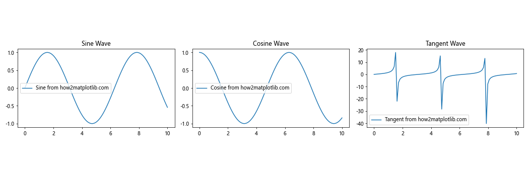
In this example, we create three subplots with different trigonometric functions. We use Matplotlib.axes.Axes.get_data_ratio() to obtain the initial data ratios for each subplot and then adjust them to a target ratio. This ensures that all subplots have consistent proportions, improving the overall visual coherence of the figure.
Combining get_data_ratio() with Other Matplotlib Features
Matplotlib.axes.Axes.get_data_ratio() can be combined with other Matplotlib features to create more advanced and customized visualizations. Let's explore some examples that demonstrate how to integrate get_data_ratio() with other Matplotlib functionalities.
Using get_data_ratio() with Colorbar
Colorbars are often used to represent the scale of colors in a plot. Here's an example of how to use get_data_ratio() to adjust the colorbar size:
import matplotlib.pyplot as plt
import numpy as np

# Create data
x = np.linspace(-5, 5, 100)
y = np.linspace(-5, 5, 100)
X, Y = np.meshgrid(x, y)
Z = np.sin(np.sqrt(X**2 + Y**2))

# Create a figure and axis
fig, ax = plt.subplots()

# Create a contour plot
im = ax.contourf(X, Y, Z, cmap='viridis')

# Get the data ratio
data_ratio = ax.get_data_ratio()

# Create a colorbar with adjusted size
cbar = plt.colorbar(im, ax=ax, fraction=0.046*data_ratio)

ax.set_title('Contour Plot with Adjusted Colorbar')
ax.set_xlabel('X-axis from how2matplotlib.com')
ax.set_ylabel('Y-axis from how2matplotlib.com')
plt.show()
Output:
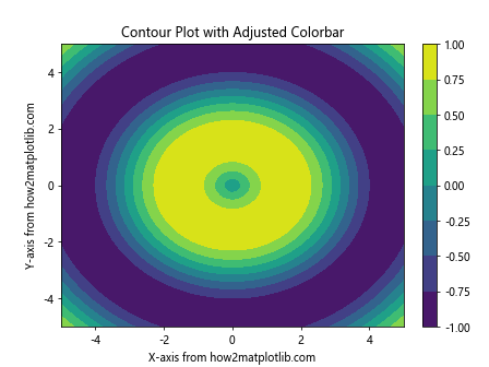
In this example, we create a contour plot and use Matplotlib.axes.Axes.get_data_ratio() to adjust the size of the colorbar. By multiplying the fraction parameter by the data ratio, we ensure that the colorbar size is proportional to the plot dimensions.
Adjusting Text Position Based on Data Ratio
You can use get_data_ratio() to dynamically adjust the position of text annotations in your plot. Here's an example:
import matplotlib.pyplot as plt
import numpy as np

# Create data
x = np.linspace(0, 10, 100)
y = np.sin(x)

# Create a figure and axis
fig, ax = plt.subplots()

# Plot data
ax.plot(x, y, label='Sine wave from how2matplotlib.com')

# Get the data ratio
data_ratio = ax.get_data_ratio()

# Add text annotation with position adjusted based on data ratio
ax.text(5, 0.5, 'Dynamic Text Position',
        ha='center', va='center',
        transform=ax.transAxes,
        bbox=dict(facecolor='white', alpha=0.8),
        fontsize=12 * data_ratio)  # Adjust font size based on data ratio

ax.set_title('Text Position Adjusted by Data Ratio')
ax.legend()
plt.show()
Output:
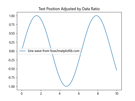
In this example, we use Matplotlib.axes.Axes.get_data_ratio() to adjust the font size of a text annotation. This ensures that the text remains readable regardless of the plot's aspect ratio.
Troubleshooting Common Issues with get_data_ratio()
While Matplotlib.axes.Axes.get_data_ratio() is a powerful tool, you may encounter some issues when using it. Here are some common problems and their solutions:
Issue 1: Unexpected Data Ratios
Sometimes, you might get unexpected results from get_data_ratio(). This can often be due to automatic adjustments made by Matplotlib. Here's an example of how to investigate and fix this issue:
import matplotlib.pyplot as plt
import numpy as np

# Create data
x = np.linspace(0, 10, 100)
y = np.sin(x)

# Create a figure and axis
fig, ax = plt.subplots()

# Plot data
ax.plot(x, y, label='Sine wave from how2matplotlib.com')

# Get the initial data ratio
initial_ratio = ax.get_data_ratio()
print(f"Initial data ratio: {initial_ratio}")

# Force the data limits
ax.set_xlim(0, 10)
ax.set_ylim(-1, 1)

# Get the new data ratio
new_ratio = ax.get_data_ratio()
print(f"New data ratio: {new_ratio}")

ax.set_title('Adjusted Data Limits')
ax.legend()
plt.show()
Output:
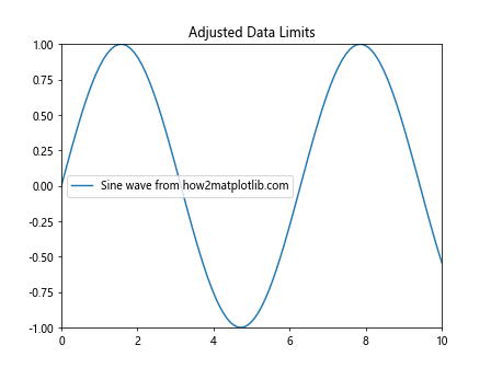
In this example, we first get the initial data ratio, which might be affected by Matplotlib's automatic adjustments. We then manually set the data limits using set_xlim() and set_ylim() to ensure we get the expected data ratio.
Issue 2: Inconsistent Ratios Across Subplots
When working with multiple subplots, you might notice inconsistent data ratios. Here's how to address this issue:
import matplotlib.pyplot as plt
import numpy as np

# Create data
x = np.linspace(0, 10, 100)
y1 = np.sin(x)
y2 = np.cos(x)

# Create a figure with two subplots
fig, (ax1, ax2) = plt.subplots(1, 2, figsize=(12, 5))

# Plot data
ax1.plot(x, y1, label='Sine from how2matplotlib.com')
ax2.plot(x, y2, label='Cosine from how2matplotlib.com')

# Get initial data ratios
ratio1 = ax1.get_data_ratio()
ratio2 = ax2.get_data_ratio()
print(f"Initial ratios: {ratio1}, {ratio2}")

# Set consistent data limits
for ax in [ax1, ax2]:
    ax.set_xlim(0, 10)
    ax.set_ylim(-1, 1)

# Get new data ratios
new_ratio1 = ax1.get_data_ratio()
new_ratio2 = ax2.get_data_ratio()
print(f"New ratios: {new_ratio1}, {new_ratio2}")

# Add titles and labels
ax1.set_title('Sine Wave')
ax2.set_title('Cosine Wave')
ax1.legend()
ax2.legend()

plt.tight_layout()
plt.show()
Output:
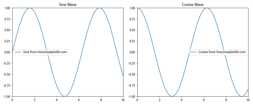
In this example, we ensure consistent data ratios across subplots by manually setting the same data limits for both axes.
Best Practices for Using get_data_ratio()
To make the most of Matplotlib.axes.Axes.get_data_ratio(), consider the following best practices:
- Always check the data ratio before making adjustments to ensure you're working with the expected values.
Use get_data_ratio() in combination with set_aspect() to maintain proper proportions in your plots.
When working with multiple subplots, consider using get_data_ratio() to ensure consistency across all plots.
Be aware of how different plot types and data ranges can affect the data ratio, and adjust your code accordingly.
Use get_data_ratio() to create dynamic layouts that adapt to your data and plot content.
Conclusion
Matplotlib.axes.Axes.get_data_ratio() is a powerful tool that can significantly enhance your data visualization capabilities in Python. By understanding how to use this method effectively, you can create more accurate, visually appealing, and informative plots. Throughout this comprehensive guide, we've explored various aspects of Matplotlib.axes.Axes.get_data_ratio(), including: