Comprehensive Guide to Using Matplotlib.artist.Artist.set_rasterized() in Python for Data Visualization
Matplotlib.artist.Artist.set_rasterized() in Python is a powerful method that allows you to control the rendering of artists in Matplotlib plots. This function is particularly useful when dealing with complex visualizations or when you need to optimize the output file size. In this comprehensive guide, we’ll explore the ins and outs of Matplotlib.artist.Artist.set_rasterized() in Python, providing detailed explanations and practical examples to help you master this essential feature of Matplotlib.
Understanding Matplotlib.artist.Artist.set_rasterized() in Python
Matplotlib.artist.Artist.set_rasterized() in Python is a method that belongs to the Artist class in Matplotlib. It allows you to set whether an artist should be rasterized when drawing. Rasterization is the process of converting vector graphics into a raster image (a bitmap). This can be particularly useful when dealing with complex plots or when you need to reduce file size for certain output formats.
The basic syntax for using Matplotlib.artist.Artist.set_rasterized() in Python is as follows:
import matplotlib.pyplot as plt
import numpy as np

fig, ax = plt.subplots()
x = np.linspace(0, 10, 100)
y = np.sin(x)
line = ax.plot(x, y, label='how2matplotlib.com')[0]
line.set_rasterized(True)
plt.legend()
plt.show()
Output:
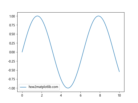
In this example, we create a simple sine wave plot and apply rasterization to the line artist using Matplotlib.artist.Artist.set_rasterized() in Python. The True argument indicates that the line should be rasterized.
Benefits of Using Matplotlib.artist.Artist.set_rasterized() in Python
There are several advantages to using Matplotlib.artist.Artist.set_rasterized() in Python:
- File size reduction: Rasterizing complex vector graphics can significantly reduce file size, especially for PDF or SVG outputs.
- Performance improvement: Rasterization can improve rendering performance for complex plots.
- Compatibility: Some output formats or viewers may have issues with complex vector graphics, and rasterization can help ensure compatibility.
Let’s look at an example that demonstrates the file size reduction benefit:
import matplotlib.pyplot as plt
import numpy as np

fig, (ax1, ax2) = plt.subplots(1, 2, figsize=(12, 6))

x = np.linspace(0, 10, 1000)
y = np.sin(x) * np.exp(-x/10)

# Non-rasterized plot
ax1.plot(x, y, linewidth=2, label='how2matplotlib.com')
ax1.set_title('Non-rasterized')

# Rasterized plot
line = ax2.plot(x, y, linewidth=2, label='how2matplotlib.com')[0]
line.set_rasterized(True)
ax2.set_title('Rasterized')

plt.savefig('comparison.pdf')
plt.show()
Output:
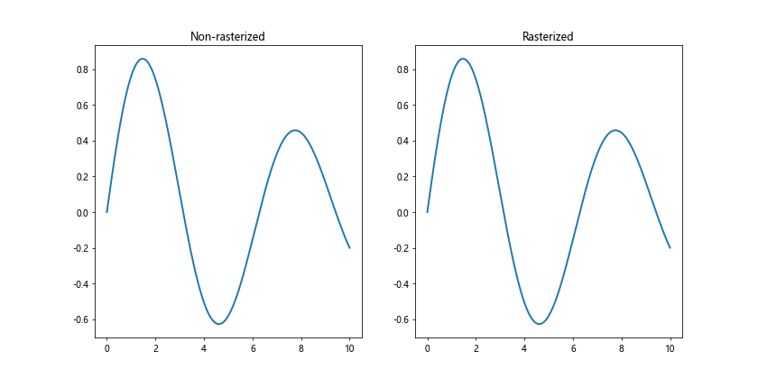
In this example, we create two identical plots, but rasterize one of them using Matplotlib.artist.Artist.set_rasterized() in Python. When saved as a PDF, the rasterized version will typically have a smaller file size.
When to Use Matplotlib.artist.Artist.set_rasterized() in Python
Knowing when to use Matplotlib.artist.Artist.set_rasterized() in Python is crucial for optimizing your visualizations. Here are some scenarios where it’s particularly useful:
- Complex plots with many data points
- Plots with dense scatter points or line collections
- When creating high-resolution images for print
- When file size is a concern (e.g., for web applications)
Let’s look at an example of a complex plot where rasterization can be beneficial:
import matplotlib.pyplot as plt
import numpy as np

fig, ax = plt.subplots(figsize=(10, 8))

n = 10000
x = np.random.randn(n)
y = np.random.randn(n)

scatter = ax.scatter(x, y, c=np.random.randn(n), cmap='viridis', alpha=0.5)
scatter.set_rasterized(True)

ax.set_title('Complex Scatter Plot (how2matplotlib.com)')
plt.colorbar(scatter)
plt.show()
Output:
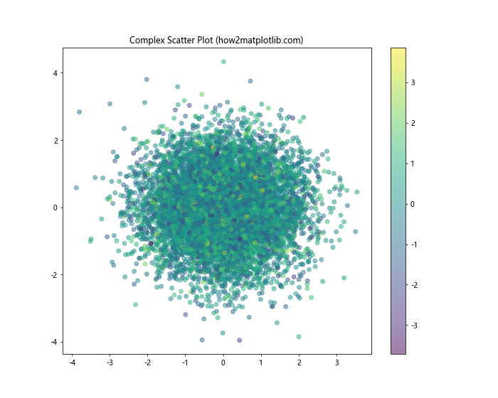
In this example, we create a complex scatter plot with 10,000 points and apply rasterization using Matplotlib.artist.Artist.set_rasterized() in Python. This can significantly reduce the file size when saving the plot, especially in vector formats like PDF or SVG.
Combining Rasterized and Vector Elements
One of the powerful features of Matplotlib.artist.Artist.set_rasterized() in Python is the ability to combine rasterized and vector elements in the same plot. This can be particularly useful when you want to keep certain elements (like text and axes) in vector format for scalability while rasterizing complex plot elements.
Here’s an example that demonstrates this technique:
import matplotlib.pyplot as plt
import numpy as np

fig, ax = plt.subplots(figsize=(10, 8))

# Create a complex background
x = np.linspace(0, 10, 1000)
y = np.sin(x) * np.cos(2*x)
background = ax.pcolormesh(x, y, np.random.randn(len(x), len(y)), cmap='viridis')
background.set_rasterized(True)

# Add vector elements
ax.plot(x, np.sin(x), color='red', linewidth=2, label='Sine wave')
ax.set_title('Combining Rasterized and Vector Elements (how2matplotlib.com)')
ax.set_xlabel('X-axis')
ax.set_ylabel('Y-axis')
plt.legend()

plt.savefig('combined_plot.pdf', dpi=300)
plt.show()
Output:
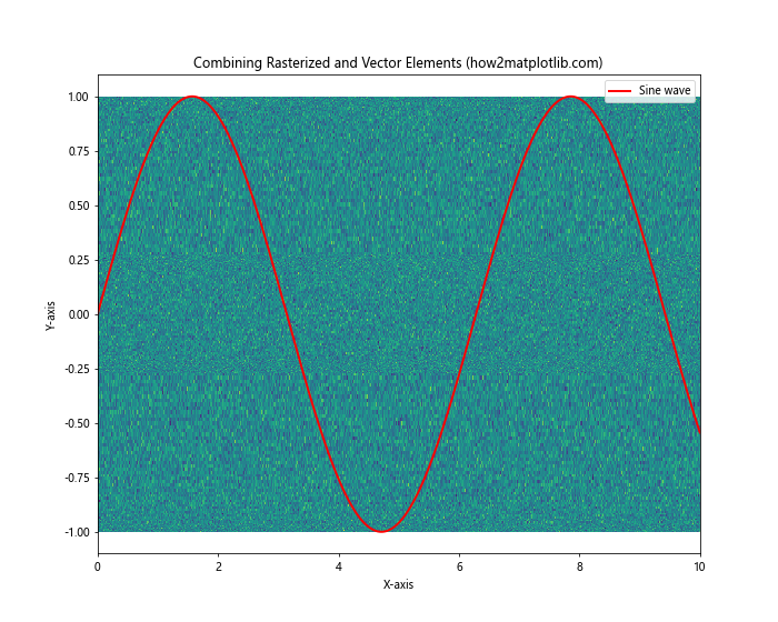
In this example, we use Matplotlib.artist.Artist.set_rasterized() in Python to rasterize the complex background created with pcolormesh, while keeping the sine wave plot and text elements as vector graphics. This approach provides a good balance between file size and quality.
Rasterization in 3D Plots
Matplotlib.artist.Artist.set_rasterized() in Python can also be applied to 3D plots, which can be particularly beneficial for complex surfaces or scatter plots. Here’s an example:
import matplotlib.pyplot as plt
import numpy as np
from mpl_toolkits.mplot3d import Axes3D

fig = plt.figure(figsize=(10, 8))
ax = fig.add_subplot(111, projection='3d')

x = np.linspace(-5, 5, 100)
y = np.linspace(-5, 5, 100)
X, Y = np.meshgrid(x, y)
Z = np.sin(np.sqrt(X**2 + Y**2))

surface = ax.plot_surface(X, Y, Z, cmap='viridis')
surface.set_rasterized(True)

ax.set_title('Rasterized 3D Surface Plot (how2matplotlib.com)')
ax.set_xlabel('X-axis')
ax.set_ylabel('Y-axis')
ax.set_zlabel('Z-axis')

plt.savefig('rasterized_3d_plot.pdf', dpi=300)
plt.show()
Output:
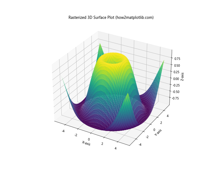
In this example, we create a 3D surface plot and apply rasterization using Matplotlib.artist.Artist.set_rasterized() in Python. This can significantly reduce the file size of the output, especially for complex 3D surfaces.
Rasterization in Animations
When creating animations with Matplotlib, using Matplotlib.artist.Artist.set_rasterized() in Python can help improve performance and reduce file size. Here’s an example of how to apply rasterization to an animated plot:
import matplotlib.pyplot as plt
import matplotlib.animation as animation
import numpy as np

fig, ax = plt.subplots(figsize=(8, 6))

x = np.linspace(0, 2*np.pi, 100)
line, = ax.plot(x, np.sin(x))
line.set_rasterized(True)

def animate(frame):
    line.set_ydata(np.sin(x + frame/10))
    return line,

ani = animation.FuncAnimation(fig, animate, frames=100, interval=50, blit=True)
ax.set_title('Animated Rasterized Plot (how2matplotlib.com)')

plt.show()
Output:
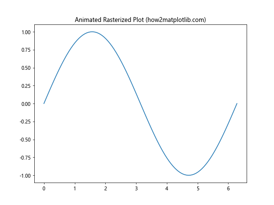
In this example, we create an animated sine wave and apply rasterization using Matplotlib.artist.Artist.set_rasterized() in Python. This can help improve the performance of the animation, especially for complex plots.
Rasterization in Subplots
When working with multiple subplots, you can apply Matplotlib.artist.Artist.set_rasterized() in Python to individual artists in each subplot. This allows for fine-grained control over which elements are rasterized. Here’s an example:
import matplotlib.pyplot as plt
import numpy as np

fig, (ax1, ax2) = plt.subplots(1, 2, figsize=(12, 6))

x = np.linspace(0, 10, 1000)
y1 = np.sin(x)
y2 = np.cos(x)

line1 = ax1.plot(x, y1, label='Sine')[0]
line1.set_rasterized(True)
ax1.set_title('Rasterized Sine (how2matplotlib.com)')

line2 = ax2.plot(x, y2, label='Cosine')[0]
ax2.set_title('Vector Cosine (how2matplotlib.com)')

plt.tight_layout()
plt.savefig('subplot_rasterization.pdf', dpi=300)
plt.show()
Output:
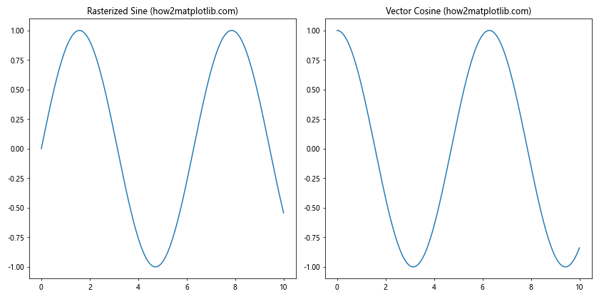
In this example, we create two subplots and apply rasterization using Matplotlib.artist.Artist.set_rasterized() in Python only to the sine plot in the first subplot. This demonstrates how you can selectively rasterize elements in a multi-plot figure.
Rasterization in Polar Plots
Matplotlib.artist.Artist.set_rasterized() in Python can also be applied to polar plots, which can be useful for complex radial visualizations. Here’s an example:
import matplotlib.pyplot as plt
import numpy as np

fig, ax = plt.subplots(subplot_kw=dict(projection='polar'), figsize=(8, 8))

theta = np.linspace(0, 2*np.pi, 1000)
r = 1 + 0.5 * np.sin(5 * theta)

line = ax.plot(theta, r)[0]
line.set_rasterized(True)

ax.set_title('Rasterized Polar Plot (how2matplotlib.com)')
plt.savefig('rasterized_polar_plot.pdf', dpi=300)
plt.show()
Output:
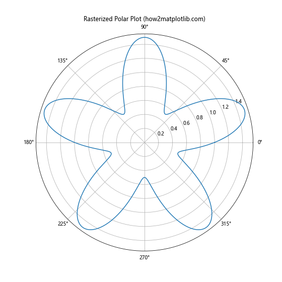
In this example, we create a polar plot with a complex radial function and apply rasterization using Matplotlib.artist.Artist.set_rasterized() in Python. This can help reduce file size and improve rendering performance for intricate polar plots.
Rasterization in Heatmaps
When working with heatmaps, especially those with a large number of cells, using Matplotlib.artist.Artist.set_rasterized() in Python can be beneficial. Here’s an example:
import matplotlib.pyplot as plt
import numpy as np

fig, ax = plt.subplots(figsize=(10, 8))

data = np.random.rand(100, 100)
heatmap = ax.imshow(data, cmap='viridis')
heatmap.set_rasterized(True)

ax.set_title('Rasterized Heatmap (how2matplotlib.com)')
plt.colorbar(heatmap)
plt.savefig('rasterized_heatmap.pdf', dpi=300)
plt.show()
Output:
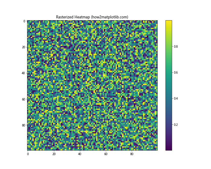
In this example, we create a heatmap with 10,000 cells and apply rasterization using Matplotlib.artist.Artist.set_rasterized() in Python. This can significantly reduce the file size of the output, especially when saving in vector formats.
Rasterization in Contour Plots
Contour plots can also benefit from rasterization, especially when dealing with complex data or many contour levels. Here’s how to use Matplotlib.artist.Artist.set_rasterized() in Python with contour plots:
import matplotlib.pyplot as plt
import numpy as np

fig, ax = plt.subplots(figsize=(10, 8))

x = np.linspace(-3, 3, 100)
y = np.linspace(-3, 3, 100)
X, Y = np.meshgrid(x, y)
Z = np.sin(X) * np.cos(Y)

contour = ax.contourf(X, Y, Z, levels=20, cmap='viridis')
for collection in contour.collections:
    collection.set_rasterized(True)

ax.set_title('Rasterized Contour Plot (how2matplotlib.com)')
plt.colorbar(contour)
plt.savefig('rasterized_contour_plot.pdf', dpi=300)
plt.show()
Output:
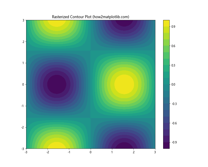
In this example, we create a contour plot and apply rasterization to each contour collection using Matplotlib.artist.Artist.set_rasterized() in Python. This can help reduce file size and improve rendering performance for complex contour plots.
Rasterization in Quiver Plots
Quiver plots, which are used to visualize vector fields, can also benefit from rasterization, especially when dealing with dense vector fields. Here’s an example using Matplotlib.artist.Artist.set_rasterized() in Python:
import matplotlib.pyplot as plt
import numpy as np

fig, ax = plt.subplots(figsize=(10, 8))

x, y = np.meshgrid(np.arange(-2, 2, 0.2), np.arange(-2, 2, 0.2))
u = -y
v = x

quiver = ax.quiver(x, y, u, v)
quiver.set_rasterized(True)

ax.set_title('Rasterized Quiver Plot (how2matplotlib.com)')
plt.savefig('rasterized_quiver_plot.pdf', dpi=300)
plt.show()
Output:
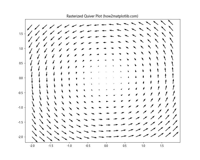
In this example, we create a quiver plot to visualize a simple vector field and apply rasterization using Matplotlib.artist.Artist.set_rasterized() in Python. This can help reduce file size and improve rendering performance for dense quiver plots.
Advanced Techniques with Matplotlib.artist.Artist.set_rasterized() in Python
Now that we’ve covered the basics and common applications, let’s explore some advanced techniques using Matplotlib.artist.Artist.set_rasterized() in Python.
Selective Rasterization in Complex Plots
Sometimes, you may want to rasterize only certain parts of a complex plot. Here’s an example that demonstrates this technique:
import matplotlib.pyplot as plt
import numpy as np

fig, ax = plt.subplots(figsize=(10, 8))

# Create a complex background
x = np.linspace(0, 10, 1000)
y = np.linspace(0, 10, 1000)
X, Y = np.meshgrid(x, y)
Z = np.sin(X) * np.cos(Y)

background = ax.pcolormesh(X, Y, Z, cmap='viridis')
background.set_rasterized(True)

# Add non-rasterized elements
ax.plot(x, 5 + np.sin(x), color='red', linewidth=2, label='Sine wave')
ax.scatter(np.random.rand(50)*10, np.random.rand(50)*10, color='white', s=50, label='Scatter')

ax.set_title('Selective Rasterization (how2matplotlib.com)')
ax.legend()

plt.savefig('selective_rasterization.pdf', dpi=300)
plt.show()
Output:
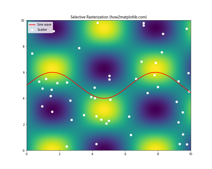
In this example, we use Matplotlib.artist.Artist.set_rasterized() in Python to rasterize only the complex background created with pcolormesh, while keeping the line plot and scatter plot as vector elements. This approach allows for a good balance between file size reduction and maintaining the quality of important plot elements.
Rasterization in Logarithmic Plots
Matplotlib.artist.Artist.set_rasterized() in Python can also be applied to logarithmic plots. This can be particularly useful when dealing with data that spans multiple orders of magnitude. Here’s an example:
import matplotlib.pyplot as plt
import numpy as np

fig, ax = plt.subplots(figsize=(10, 8))

x = np.logspace(0, 5, 1000)
y = x**2

line = ax.loglog(x, y, label='y = x^2')[0]
line.set_rasterized(True)

ax.set_title('Rasterized Logarithmic Plot (how2matplotlib.com)')
ax.set_xlabel('X-axis (log scale)')
ax.set_ylabel('Y-axis (log scale)')
ax.legend()

plt.savefig('rasterized_log_plot.pdf', dpi=300)
plt.show()
Output:
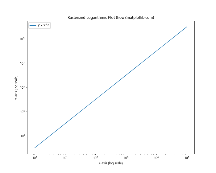
In this example, we create a logarithmic plot and apply rasterization using Matplotlib.artist.Artist.set_rasterized() in Python. This can help reduce file size while maintaining the visual quality of the plot across multiple orders of magnitude.
Rasterization in Filled Plots
When working with filled plots, such as area plots or stacked area plots, Matplotlib.artist.Artist.set_rasterized() in Python can be particularly beneficial. Here’s an example:
import matplotlib.pyplot as plt
import numpy as np

fig, ax = plt.subplots(figsize=(10, 8))

x = np.linspace(0, 10, 100)
y1 = np.exp(-x/10) * np.sin(x)
y2 = np.exp(-x/10) * np.cos(x)

area1 = ax.fill_between(x, 0, y1, alpha=0.5, label='Sine')
area2 = ax.fill_between(x, y1, y1+y2, alpha=0.5, label='Cosine')

area1.set_rasterized(True)
area2.set_rasterized(True)

ax.set_title('Rasterized Filled Plot (how2matplotlib.com)')
ax.legend()

plt.savefig('rasterized_filled_plot.pdf', dpi=300)
plt.show()
Output:
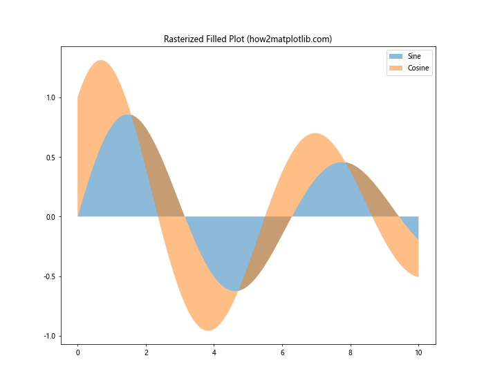
In this example, we create a stacked area plot and apply rasterization to both filled areas using Matplotlib.artist.Artist.set_rasterized() in Python. This can significantly reduce file size for complex filled plots while maintaining visual quality.
Rasterization in Histogram Plots
Histograms, especially those with many bins, can benefit from rasterization. Here’s how to use Matplotlib.artist.Artist.set_rasterized() in Python with histogram plots:
import matplotlib.pyplot as plt
import numpy as np

fig, ax = plt.subplots(figsize=(10, 8))

data = np.random.randn(10000)
n, bins, patches = ax.hist(data, bins=100, density=True, alpha=0.7)

for patch in patches:
    patch.set_rasterized(True)

ax.set_title('Rasterized Histogram (how2matplotlib.com)')
ax.set_xlabel('Value')
ax.set_ylabel('Frequency')

plt.savefig('rasterized_histogram.pdf', dpi=300)
plt.show()
Output:
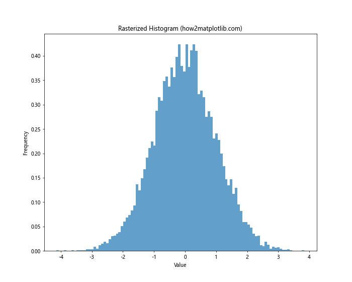
In this example, we create a histogram with 100 bins and apply rasterization to each bar using Matplotlib.artist.Artist.set_rasterized() in Python. This can help reduce file size for histograms with many bins or when working with large datasets.
Rasterization in Violin Plots
Violin plots, which combine aspects of box plots and kernel density plots, can also benefit from rasterization. Here’s an example using Matplotlib.artist.Artist.set_rasterized() in Python:
import matplotlib.pyplot as plt
import numpy as np

fig, ax = plt.subplots(figsize=(10, 8))

data = [np.random.normal(0, std, 100) for std in range(1, 5)]
violin_parts = ax.violinplot(data, showmeans=True, showextrema=True, showmedians=True)

for pc in violin_parts['bodies']:
    pc.set_rasterized(True)

ax.set_title('Rasterized Violin Plot (how2matplotlib.com)')
ax.set_xlabel('Dataset')
ax.set_ylabel('Value')

plt.savefig('rasterized_violin_plot.pdf', dpi=300)
plt.show()
Output:
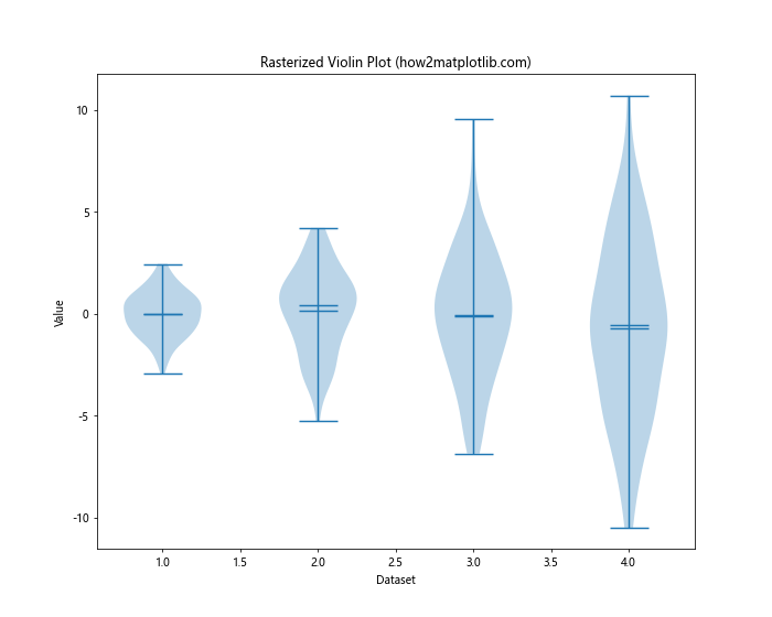
In this example, we create a violin plot for four different datasets and apply rasterization to the violin bodies using Matplotlib.artist.Artist.set_rasterized() in Python. This can help reduce file size and improve rendering performance for complex violin plots.
Best Practices for Using Matplotlib.artist.Artist.set_rasterized() in Python
To make the most of Matplotlib.artist.Artist.set_rasterized() in Python, consider the following best practices:
- Identify complex elements: Focus on rasterizing elements that contribute most to file size or rendering complexity, such as dense scatter plots or complex line collections.
Maintain vector text: Keep text elements (titles, labels, legends) as vector graphics for better scalability and readability.
Experiment with DPI: Adjust the DPI setting to find the right balance between image quality and file size.
Combine vector and raster: Use a combination of vector and rasterized elements to optimize both file size and quality.
Test different formats: Check your plots in various output formats (PDF, SVG, PNG) to ensure they render correctly and maintain the desired balance between quality and file size.
Consider interactivity: If your plots need to be interactive, be mindful of how rasterization might affect performance and responsiveness.
Document your choices: When sharing code or collaborating, comment on your use of Matplotlib.artist.Artist.set_rasterized() in Python to explain your rationale for rasterizing specific elements.
Troubleshooting Common Issues with Matplotlib.artist.Artist.set_rasterized() in Python
When working with Matplotlib.artist.Artist.set_rasterized() in Python, you might encounter some common issues. Here are some troubleshooting tips: