Comprehensive Guide to Matplotlib.artist.Artist.axes in Python
Matplotlib.artist.Artist.axes in Python is a crucial component of the Matplotlib library, providing powerful tools for customizing and manipulating plot elements. This comprehensive guide will explore the various aspects of Matplotlib.artist.Artist.axes, demonstrating its versatility and importance in creating stunning visualizations. We’ll delve into the intricacies of this feature, providing numerous examples and explanations to help you master the art of plot customization using Matplotlib.artist.Artist.axes in Python.
Understanding Matplotlib.artist.Artist.axes in Python
Matplotlib.artist.Artist.axes in Python refers to the Axes object associated with an Artist instance. The Axes object is a fundamental component of Matplotlib, representing a single plot or subplot within a figure. It contains most of the plot elements, including axis lines, tick marks, labels, and the plotting area itself. The Artist class is the base class for all visible elements in a Matplotlib figure, and the axes attribute allows access to the Axes object that contains the Artist.
Let’s start with a simple example to illustrate the basic usage of Matplotlib.artist.Artist.axes:
import matplotlib.pyplot as plt

fig, ax = plt.subplots()
line, = ax.plot([1, 2, 3, 4], [1, 4, 2, 3], label='how2matplotlib.com')
print(line.axes)
plt.show()
Output:
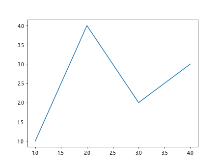
In this example, we create a simple line plot and access the Axes object associated with the Line2D artist using the axes attribute. The print statement will output information about the Axes object.
Accessing and Manipulating Axes Properties
One of the primary uses of Matplotlib.artist.Artist.axes in Python is to access and modify various properties of the Axes object. This allows for fine-tuned control over the appearance and behavior of your plots.
Here’s an example demonstrating how to modify axis limits using Matplotlib.artist.Artist.axes:
import matplotlib.pyplot as plt

fig, ax = plt.subplots()
line, = ax.plot([1, 2, 3, 4], [1, 4, 2, 3], label='how2matplotlib.com')
line.axes.set_xlim(0, 5)
line.axes.set_ylim(0, 5)
plt.show()
Output:
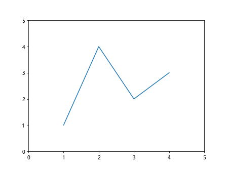
In this code snippet, we use the axes attribute of the Line2D artist to access the Axes object and set custom x and y limits for the plot.
Customizing Axis Labels and Titles
Matplotlib.artist.Artist.axes in Python provides convenient methods for customizing axis labels and titles. Let’s explore how to leverage this feature:
import matplotlib.pyplot as plt

fig, ax = plt.subplots()
scatter = ax.scatter([1, 2, 3, 4], [1, 4, 2, 3], label='how2matplotlib.com')
scatter.axes.set_xlabel('X-axis (how2matplotlib.com)')
scatter.axes.set_ylabel('Y-axis (how2matplotlib.com)')
scatter.axes.set_title('Scatter Plot (how2matplotlib.com)')
plt.show()
Output:
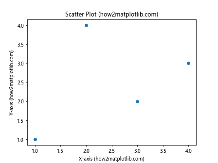
This example demonstrates how to use Matplotlib.artist.Artist.axes to set custom labels for the x and y axes, as well as a title for the plot.
Adjusting Tick Marks and Tick Labels
Matplotlib.artist.Artist.axes in Python offers powerful methods for customizing tick marks and their corresponding labels. Here’s an example:
import matplotlib.pyplot as plt
import numpy as np

fig, ax = plt.subplots()
x = np.linspace(0, 2*np.pi, 100)
line, = ax.plot(x, np.sin(x), label='how2matplotlib.com')
line.axes.set_xticks([0, np.pi/2, np.pi, 3*np.pi/2, 2*np.pi])
line.axes.set_xticklabels(['0', 'π/2', 'π', '3π/2', '2π'])
line.axes.set_yticks([-1, 0, 1])
line.axes.set_yticklabels(['Min', 'Zero', 'Max'])
plt.show()
Output:
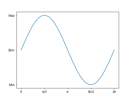
This code snippet demonstrates how to use Matplotlib.artist.Artist.axes to set custom tick locations and labels for both the x and y axes.
Adding Grid Lines
Grid lines can greatly enhance the readability of your plots. Matplotlib.artist.Artist.axes in Python provides an easy way to add and customize grid lines:
import matplotlib.pyplot as plt
import numpy as np

fig, ax = plt.subplots()
x = np.linspace(0, 10, 100)
line, = ax.plot(x, np.sin(x), label='how2matplotlib.com')
line.axes.grid(True, linestyle='--', alpha=0.7)
plt.show()
Output:
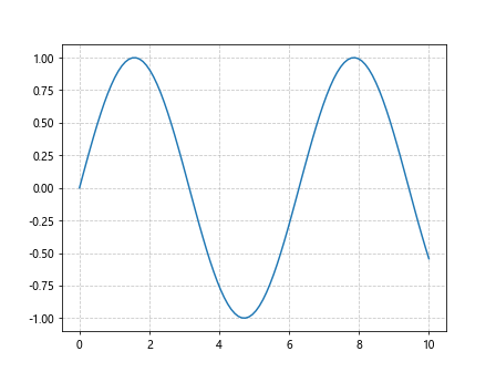
In this example, we use Matplotlib.artist.Artist.axes to add dashed grid lines with reduced opacity to our plot.
Customizing Spines
Spines are the lines that connect the axis tick marks and form the boundaries of the data area. Matplotlib.artist.Artist.axes in Python allows for easy customization of these spines:
import matplotlib.pyplot as plt
import numpy as np

fig, ax = plt.subplots()
x = np.linspace(-5, 5, 100)
line, = ax.plot(x, x**2, label='how2matplotlib.com')
line.axes.spines['top'].set_visible(False)
line.axes.spines['right'].set_visible(False)
line.axes.spines['bottom'].set_position(('data', 0))
line.axes.spines['left'].set_position(('data', 0))
plt.show()
Output:
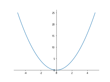
This code demonstrates how to use Matplotlib.artist.Artist.axes to hide the top and right spines and position the bottom and left spines at the origin.
Adding Text Annotations
Text annotations can provide valuable context to your plots. Matplotlib.artist.Artist.axes in Python offers methods for adding and customizing text annotations:
import matplotlib.pyplot as plt
import numpy as np

fig, ax = plt.subplots()
x = np.linspace(0, 10, 100)
line, = ax.plot(x, np.sin(x), label='how2matplotlib.com')
line.axes.annotate('Peak', xy=(np.pi/2, 1), xytext=(np.pi/2, 1.5),
                   arrowprops=dict(facecolor='black', shrink=0.05))
plt.show()
Output:
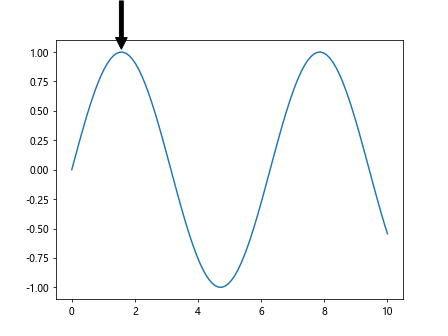
This example shows how to use Matplotlib.artist.Artist.axes to add an annotated arrow pointing to a specific point on the plot.
Creating Multiple Subplots
Matplotlib.artist.Artist.axes in Python is particularly useful when working with multiple subplots. Here’s an example demonstrating how to create and customize multiple subplots:
import matplotlib.pyplot as plt
import numpy as np

fig, (ax1, ax2) = plt.subplots(1, 2, figsize=(10, 4))
x = np.linspace(0, 10, 100)
line1, = ax1.plot(x, np.sin(x), label='how2matplotlib.com')
line2, = ax2.plot(x, np.cos(x), label='how2matplotlib.com')

line1.axes.set_title('Sine Wave')
line2.axes.set_title('Cosine Wave')

for ax in [line1.axes, line2.axes]:
    ax.set_xlabel('X-axis (how2matplotlib.com)')
    ax.set_ylabel('Y-axis (how2matplotlib.com)')
    ax.legend()

plt.tight_layout()
plt.show()
Output:
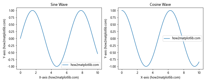
This code snippet demonstrates how to use Matplotlib.artist.Artist.axes to customize multiple subplots, setting titles, labels, and legends for each subplot.
Customizing Color Maps
Color maps are an essential tool for visualizing data in Matplotlib. Matplotlib.artist.Artist.axes in Python provides methods for applying and customizing color maps:
import matplotlib.pyplot as plt
import numpy as np

fig, ax = plt.subplots()
x, y = np.meshgrid(np.linspace(-2, 2, 100), np.linspace(-2, 2, 100))
z = np.sin(x) * np.cos(y)
im = ax.imshow(z, cmap='viridis', extent=[-2, 2, -2, 2])
im.axes.set_title('Color Map Example (how2matplotlib.com)')
plt.colorbar(im)
plt.show()
Output:
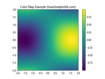
This example demonstrates how to use Matplotlib.artist.Artist.axes to create a color map visualization and add a color bar to the plot.
Adding Legends
Legends are crucial for identifying different elements in a plot. Matplotlib.artist.Artist.axes in Python offers methods for adding and customizing legends:
import matplotlib.pyplot as plt
import numpy as np

fig, ax = plt.subplots()
x = np.linspace(0, 10, 100)
line1, = ax.plot(x, np.sin(x), label='Sine (how2matplotlib.com)')
line2, = ax.plot(x, np.cos(x), label='Cosine (how2matplotlib.com)')
line1.axes.legend(loc='upper right')
plt.show()
Output:
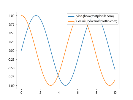
This code snippet shows how to use Matplotlib.artist.Artist.axes to add a legend to the plot and position it in the upper right corner.
Customizing Axis Scales
Matplotlib.artist.Artist.axes in Python allows for easy customization of axis scales, including linear, logarithmic, and symlog scales:
import matplotlib.pyplot as plt
import numpy as np

fig, (ax1, ax2) = plt.subplots(1, 2, figsize=(10, 4))
x = np.logspace(0, 4, 100)
y = x**2

line1, = ax1.plot(x, y, label='how2matplotlib.com')
line1.axes.set_xscale('log')
line1.axes.set_yscale('log')
line1.axes.set_title('Log-Log Scale')

line2, = ax2.plot(x, y, label='how2matplotlib.com')
line2.axes.set_xscale('linear')
line2.axes.set_yscale('linear')
line2.axes.set_title('Linear Scale')

for ax in [line1.axes, line2.axes]:
    ax.set_xlabel('X-axis (how2matplotlib.com)')
    ax.set_ylabel('Y-axis (how2matplotlib.com)')
    ax.legend()

plt.tight_layout()
plt.show()
Output:
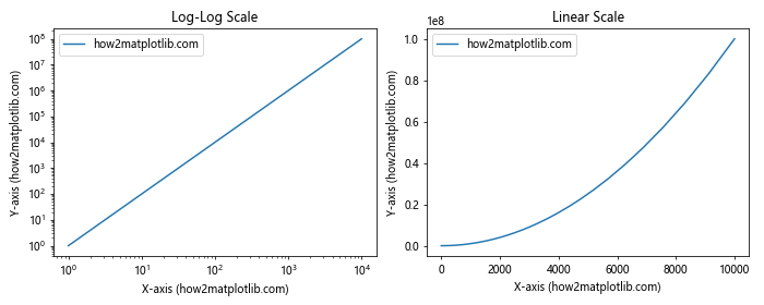
This example demonstrates how to use Matplotlib.artist.Artist.axes to set different axis scales for two subplots, comparing log-log and linear scales.
Adding Secondary Axes
Matplotlib.artist.Artist.axes in Python provides methods for adding secondary axes to your plots, allowing you to display data with different scales on the same plot:
import matplotlib.pyplot as plt
import numpy as np

fig, ax1 = plt.subplots()
x = np.linspace(0, 10, 100)
line1, = ax1.plot(x, np.sin(x), 'b-', label='Sine (how2matplotlib.com)')
ax1.set_xlabel('X-axis (how2matplotlib.com)')
ax1.set_ylabel('Sine', color='b')

ax2 = ax1.twinx()
line2, = ax2.plot(x, np.exp(x), 'r-', label='Exponential (how2matplotlib.com)')
ax2.set_ylabel('Exponential', color='r')

lines = [line1, line2]
labels = [l.get_label() for l in lines]
ax1.legend(lines, labels, loc='upper left')

plt.title('Dual Axis Plot (how2matplotlib.com)')
plt.show()
Output:
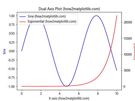
This code snippet demonstrates how to use Matplotlib.artist.Artist.axes to create a plot with two y-axes, each with its own scale and label.
Customizing Marker Styles
Matplotlib.artist.Artist.axes in Python offers a wide range of marker styles for scatter plots and line plots. Here’s an example showcasing different marker styles:
import matplotlib.pyplot as plt
import numpy as np

fig, ax = plt.subplots(figsize=(10, 6))
x = np.linspace(0, 10, 10)
y = np.random.rand(10)

marker_styles = ['o', 's', '^', 'D', 'v', '<', '>', 'p', '*', 'h']
for i, marker in enumerate(marker_styles):
    line, = ax.plot(x[i], y[i], marker=marker, markersize=10, linestyle='None',
                    label=f'Marker {marker} (how2matplotlib.com)')

line.axes.legend(ncol=2)
line.axes.set_title('Marker Styles (how2matplotlib.com)')
plt.show()
Output:
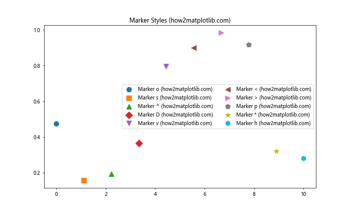
This example demonstrates how to use Matplotlib.artist.Artist.axes to create a plot with various marker styles, showcasing the diversity of options available in Matplotlib.
Customizing Line Styles
In addition to marker styles, Matplotlib.artist.Artist.axes in Python provides numerous options for customizing line styles in your plots:
import matplotlib.pyplot as plt
import numpy as np

fig, ax = plt.subplots(figsize=(10, 6))
x = np.linspace(0, 10, 100)

line_styles = ['-', '--', '-.', ':', (0, (3, 1, 1, 1)), (0, (5, 1))]
for i, style in enumerate(line_styles):
    line, = ax.plot(x, np.sin(x + i), linestyle=style,
                    label=f'Style {i+1} (how2matplotlib.com)')

line.axes.legend()
line.axes.set_title('Line Styles (how2matplotlib.com)')
plt.show()
Output:
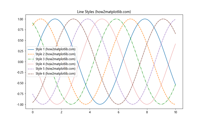
This code snippet shows how to use Matplotlib.artist.Artist.axes to create a plot with various line styles, including solid, dashed, dash-dot, dotted, and custom patterns.
Creating Filled Plots
Matplotlib.artist.Artist.axes in Python allows for the creation of filled plots, which can be useful for visualizing areas under curves or between multiple curves:
import matplotlib.pyplot as plt
import numpy as np

fig, ax = plt.subplots()
x = np.linspace(0, 10, 100)
y1 = np.sin(x)
y2 = np.cos(x)

line, = ax.plot(x, y1, label='Sine (how2matplotlib.com)')
ax.fill_between(x, y1, y2, where=(y1 > y2), alpha=0.3, color='green',
                label='Sine > Cosine (how2matplotlib.com)')
ax.fill_between(x, y1, y2, where=(y1 <= y2), alpha=0.3, color='red',
                label='Sine <= Cosine (how2matplotlib.com)')

line.axes.legend()
line.axes.set_title('Filled Plot (how2matplotlib.com)')
plt.show()
Output:
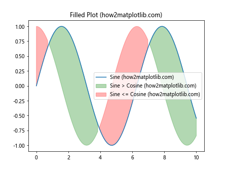
This example demonstrates how to use Matplotlib.artist.Artist.axes to create a filled plot, highlighting the areas where one curve is greater than another.
Customizing Histogram Plots
Histogram plots are essential for visualizing the distribution of data. Matplotlib.artist.Artist.axes in Python provides methods for creating and customizing histogram plots:
import matplotlib.pyplot as plt
import numpy as np

fig, ax = plt.subplots()
data = np.random.normal(0, 1, 1000)
n, bins, patches = ax.hist(data, bins=30, edgecolor='black',
                           label='how2matplotlib.com')

patches[0].axes.set_xlabel('Value')
patches[0].axes.set_ylabel('Frequency')
patches[0].axes.set_title('Histogram Plot (how2matplotlib.com)')
patches[0].axes.legend()
plt.show()
Output:
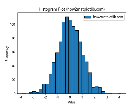
This code snippet demonstrates how to use Matplotlib.artist.Artist.axes to create a histogram plot and customize its appearance.
Creating Box Plots
Box plots are useful for visualizing the distribution of data across different categories. Matplotlib.artist.Artist.axes in Python offers methods for creating and customizing box plots:
import matplotlib.pyplot as plt
import numpy as np

fig, ax = plt.subplots()
data = [np.random.normal(0, std, 100) for std in range(1, 4)]
box = ax.boxplot(data, labels=['A', 'B', 'C'])

box['boxes'][0].axes.set_xlabel('Category')
box['boxes'][0].axes.set_ylabel('Value')
box['boxes'][0].axes.set_title('Box Plot (how2matplotlib.com)')
plt.show()
Output:
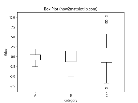
This example shows how to use Matplotlib.artist.Artist.axes to create a box plot and customize its labels and title.
Customizing 3D Plots
Matplotlib.artist.Artist.axes in Python extends to 3D plotting as well, allowing for the creation and customization of three-dimensional visualizations:
import matplotlib.pyplot as plt
import numpy as np
from mpl_toolkits.mplot3d import Axes3D

fig = plt.figure()
ax = fig.add_subplot(111, projection='3d')

x = np.linspace(-5, 5, 100)
y = np.linspace(-5, 5, 100)
X, Y = np.meshgrid(x, y)
Z = np.sin(np.sqrt(X**2 + Y**2))

surface = ax.plot_surface(X, Y, Z, cmap='viridis')

surface.axes.set_xlabel('X-axis (how2matplotlib.com)')
surface.axes.set_ylabel('Y-axis (how2matplotlib.com)')
surface.axes.set_zlabel('Z-axis (how2matplotlib.com)')
surface.axes.set_title('3D Surface Plot (how2matplotlib.com)')

plt.colorbar(surface)
plt.show()
Output:
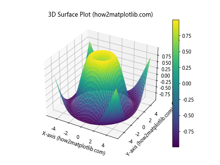
This code snippet demonstrates how to use Matplotlib.artist.Artist.axes to create a 3D surface plot and customize its labels and color map.
Conclusion
Matplotlib.artist.Artist.axes in Python is a powerful and versatile tool for customizing and manipulating plots in Matplotlib. Throughout this comprehensive guide, we've explored various aspects of this feature, from basic usage to advanced techniques for creating complex visualizations.
We've covered topics such as accessing and manipulating axes properties, customizing labels and titles, adjusting tick marks, adding grid lines, customizing spines, adding text annotations, working with multiple subplots, customizing color maps, adding legends, customizing axis scales, adding secondary axes, and exploring different plot types including scatter plots, line plots, histograms, box plots, and 3D plots.
By leveraging Matplotlib.artist.Artist.axes, you can create highly customized and professional-looking visualizations tailored to your specific needs. The examples provided in this guide serve as a starting point for your own explorations, and you're encouraged to experiment with different combinations of techniques to create unique and informative plots.