Matplotlib Colormap
Matplotlib is a popular Python library used for creating static, animated, and interactive visualizations. One of the key features of Matplotlib is its ability to customize the appearance of plots, including the color schemes. In this article, we will delve into the concept of colormaps in Matplotlib and learn how to effectively use them in our plots.
What is a Colormap?
A colormap, or color map, is a series of colors that are mapped to the values in a plot. It is used to represent data visually by assigning colors to different numerical or categorical values. Matplotlib provides a variety of built-in colormaps that can be easily applied to plots.
How to Use Colormaps in Matplotlib
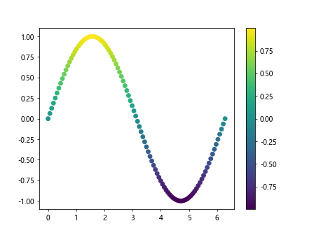
Example 1: Using the ‘viridis’ Colormap
import matplotlib.pyplot as plt
import numpy as np

x = np.linspace(0, 2*np.pi, 100)
y = np.sin(x)

plt.scatter(x, y, c=y, cmap='viridis')
plt.colorbar()
plt.show()
Output:
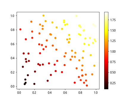
Example 2: Using the ‘hot’ Colormap
import matplotlib.pyplot as plt
import numpy as np

x = np.random.rand(100)
y = np.random.rand(100)

plt.scatter(x, y, c=x+y, cmap='hot')
plt.colorbar()
plt.show()
Output:
Example 3: Using the ‘coolwarm’ Colormap
import matplotlib.pyplot as plt
import numpy as np

x = np.linspace(0, 10, 100)
y = np.linspace(0, 10, 100)
z = np.sin(x) * np.cos(y)

plt.contourf(x, y, z, cmap='coolwarm')
plt.colorbar()
plt.show()
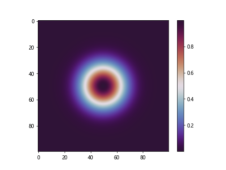
Example 4: Using the ‘twilight_shifted’ Colormap
import matplotlib.pyplot as plt
import numpy as np

x = np.linspace(-3, 3, 100)
y = np.linspace(-3, 3, 100)
X, Y = np.meshgrid(x, y)
Z = np.exp(-X**2 - Y**2)

plt.imshow(Z, cmap='twilight_shifted')
plt.colorbar()
plt.show()
Output:
Customizing Colormaps
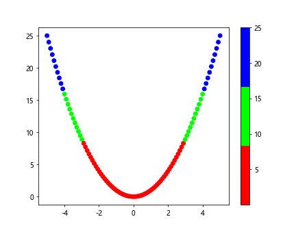
In addition to using built-in colormaps, Matplotlib allows users to create custom colormaps to suit their specific requirements. This can be achieved using the ListedColormap class.
Example 5: Creating a Custom Colormap
import matplotlib.pyplot as plt
import numpy as np
from matplotlib.colors import ListedColormap

colors = ['#FF0000', '#00FF00', '#0000FF']  # Red, Green, Blue
cmap_custom = ListedColormap(colors)

x = np.linspace(-5, 5, 100)
y = x**2

plt.scatter(x, y, c=y, cmap=cmap_custom)
plt.colorbar()
plt.show()
Output:
Reversing Colormaps
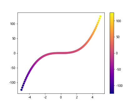
Sometimes it is useful to reverse the colors in a colormap for better visualization. Matplotlib provides a convenient way to achieve this using the ReversedColormap class.
Example 6: Reversing a Colormap
import matplotlib.pyplot as plt
import numpy as np
import matplotlib.cm as cm

x = np.linspace(-5, 5, 100)
y = x**3

plt.scatter(x, y, c=y, cmap=cm.plasma)
plt.colorbar()
plt.show()
Output:
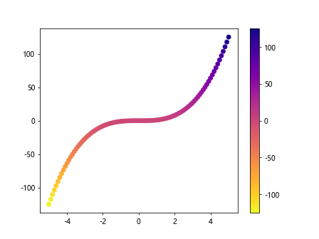
Example 7: Reversing the ‘plasma’ Colormap
import matplotlib.pyplot as plt
import numpy as np
import matplotlib.cm as cm

x = np.linspace(-5, 5, 100)
y = x**3

plt.scatter(x, y, c=y, cmap=cm.plasma.reversed())
plt.colorbar()
plt.show()
Output:
Discrete Colormaps
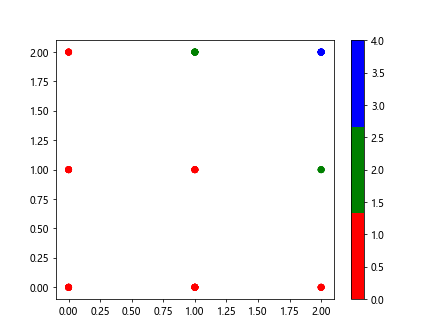
In some cases, it is preferable to use a discrete colormap instead of a continuous one. Matplotlib provides the ListedColormap class for creating discrete colormaps.
Example 8: Using a Discrete Colormap
import matplotlib.pyplot as plt
import numpy as np
from matplotlib.colors import ListedColormap

colors = ['red', 'green', 'blue']
cmap_discrete = ListedColormap(colors)

x = np.random.randint(0, 3, 100)
y = np.random.randint(0, 3, 100)

plt.scatter(x, y, c=x*y, cmap=cmap_discrete)
plt.colorbar()
plt.show()
Output:
Colormap Normalization
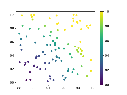
Colormap normalization is the process of mapping data values to the range of colors in a colormap. Matplotlib provides the Normalize class to normalize the data before applying the colormap.
Example 9: Normalizing Colormap
import matplotlib.pyplot as plt
import numpy as np
from matplotlib.colors import Normalize

x = np.random.rand(100)
y = np.random.rand(100)
z = x**2 + y**2

norm = Normalize(vmin=0, vmax=1)

plt.scatter(x, y, c=z, cmap='viridis', norm=norm)
plt.colorbar()
plt.show()
Output:
Combining Colormaps
Matplotlib also allows users to combine multiple colormaps using the ListedColormap and BoundaryNorm classes.
Example 10: Combining Colormaps
import matplotlib.pyplot as plt
import numpy as np
from matplotlib.colors import ListedColormap, BoundaryNorm

cmap1 = ListedColormap(['red', 'green'])
cmap2 = ListedColormap(['blue', 'yellow'])

cmap_combined = plt.cm.get_cmap('tab10', 2)

bounds = np.array([0, 1, 2])
norm = BoundaryNorm(bounds, cmap_combined.N)

x = np.random.randint(0, 2, 100)
y = np.random.randint(0, 2, 100)

plt.scatter(x, y, c=x+y, cmap=cmap_combined, norm=norm)
plt.colorbar()
plt.show()
Conclusion
In this article, we have explored the concept of colormaps in Matplotlib and learned how to effectively use them in plots. Colormaps play a crucial role in visualizing data and conveying information effectively. By understanding the different types of colormaps and customization options available in Matplotlib, users can create visually appealing and informative plots for their data analysis and visualization needs. Experiment with the provided examples and explore the vast possibilities of colormaps in Matplotlib.