Line of Best Fit in Matplotlib
In data visualization, a line of best fit is a straight line that best represents the relationship between two variables in a set of data points. The line is typically drawn through the data points to show the overall trend. In this article, we will explore how to plot a line of best fit in Matplotlib, a popular Python library for creating 2D plots.
Scatter Plot with Line of Best Fit
One common way to visualize the relationship between two variables is to create a scatter plot with a line of best fit. Here’s an example of how to do this using Matplotlib:
import matplotlib.pyplot as plt
import numpy as np

# Generate some random data
np.random.seed(0)
x = np.random.rand(100)
y = 2 * x + 1 + np.random.randn(100)

# Plot the data points
plt.scatter(x, y, label='Data')

# Fit a line to the data
m, b = np.polyfit(x, y, 1)
plt.plot(x, m*x + b, color='red', label='Line of Best Fit')

plt.legend()
plt.show()
Output:
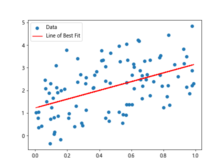
In this example, we first generate some random data points x and y. We then use the np.polyfit() function from NumPy to fit a line (in this case, a linear regression line) to the data. Finally, we plot the data points as a scatter plot and the line of best fit on the same graph.
Customizing the Line of Best Fit
You can customize the line of best fit by changing its color, style, and width. Here’s an example that demonstrates how to do this:
import matplotlib.pyplot as plt
import numpy as np

# Generate some random data
np.random.seed(1)
x = np.random.rand(50)
y = 3 * x + 2 + np.random.randn(50)

# Plot the data points
plt.scatter(x, y, label='Data')

# Fit a line to the data
m, b = np.polyfit(x, y, 1)
plt.plot(x, m*x + b, color='green', linestyle='--', linewidth=2, label='Line of Best Fit')

plt.legend()
plt.show()
Output:
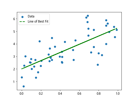
In this example, we have changed the color of the line to green, set the line style to dashed (--), and increased the line width to 2. These customization options allow you to make the line of best fit stand out more on the plot.
Polynomial Line of Best Fit
In addition to fitting a straight line to the data, you can also fit a polynomial to the data to capture more complex relationships. Here’s an example of how to fit a polynomial line of best fit using Matplotlib:
import matplotlib.pyplot as plt
import numpy as np

# Generate some random data
np.random.seed(2)
x = np.random.rand(50)
y = 3 * x**2 - 2 * x + 1 + np.random.randn(50)

# Plot the data points
plt.scatter(x, y, label='Data')

# Fit a polynomial to the data
coeffs = np.polyfit(x, y, 2)
p = np.poly1d(coeffs)
plt.plot(x, p(x), color='purple', label='Line of Best Fit (Polynomial)')

plt.legend()
plt.show()
Output:
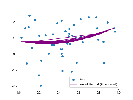
In this example, we have generated random data with a quadratic relationship. We use the np.polyfit() function with a degree of 2 to fit a polynomial line to the data. The resulting line of best fit is a curve rather than a straight line, allowing for a better representation of the underlying relationship.
Using Seaborn for Line of Best Fit
Another popular Python library for data visualization is Seaborn, which provides a high-level interface for creating attractive and informative statistical graphics. Here’s an example of how to plot a line of best fit using Seaborn:
import matplotlib.pyplot as plt
import seaborn as sns
import numpy as np

# Generate some random data
np.random.seed(3)
x = np.random.rand(75)
y = 0.5 * x + 0.75 + np.random.randn(75)

# Plot the data points with a regression line
sns.regplot(x=x, y=y, color='orange', label='Line of Best Fit')

plt.legend()
plt.show()
Output:
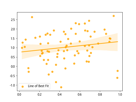
In this example, we use the sns.regplot() function from Seaborn to create a scatter plot with a regression line (line of best fit) overlaid on top of the data points. Seaborn automatically fits a linear regression model to the data and plots the resulting line.
Conclusion
In this article, we have explored how to plot a line of best fit in Matplotlib and Seaborn. We have covered fitting both straight lines and polynomial lines to data points, as well as customizing the appearance of the line of best fit. By visualizing the relationship between two variables using a line of best fit, you can gain insights into trends and patterns in your data. Experiment with different types of lines and customization options to create informative and visually appealing plots for your data analysis projects.