How to Create Stunning Line Charts in Matplotlib
Line chart in Matplotlib is a powerful tool for visualizing data trends over time or across categories. This article will explore the various aspects of creating line charts using Matplotlib, one of the most popular data visualization libraries in Python. We’ll cover everything from basic line plots to advanced customization techniques, ensuring you have a thorough understanding of how to create effective and visually appealing line charts in Matplotlib.
Introduction to Line Charts in Matplotlib
A line chart in Matplotlib is a type of plot that displays information as a series of data points connected by straight line segments. It’s particularly useful for showing trends in data over time or comparing multiple datasets. Matplotlib provides a flexible and extensive set of tools for creating line charts, allowing you to customize every aspect of your visualization.
Let’s start with a simple example of a line chart in Matplotlib:
import matplotlib.pyplot as plt
import numpy as np

x = np.linspace(0, 10, 100)
y = np.sin(x)

plt.figure(figsize=(10, 6))
plt.plot(x, y, label='Sine Wave')
plt.title('Simple Line Chart in Matplotlib - how2matplotlib.com')
plt.xlabel('X-axis')
plt.ylabel('Y-axis')
plt.legend()
plt.grid(True)
plt.show()
Output:
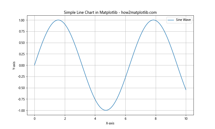
In this example, we create a basic line chart of a sine wave. The plot() function is the core of creating a line chart in Matplotlib. We’ll explore more advanced uses of this function throughout the article.
Basic Line Chart Customization
When creating a line chart in Matplotlib, you have numerous options for customization. Let’s look at some basic ways to modify the appearance of your line charts.
Changing Line Styles and Colors
Matplotlib offers various line styles and colors to make your line charts more distinctive:
import matplotlib.pyplot as plt
import numpy as np

x = np.linspace(0, 10, 100)
y1 = np.sin(x)
y2 = np.cos(x)

plt.figure(figsize=(10, 6))
plt.plot(x, y1, 'r--', label='Sine')
plt.plot(x, y2, 'b-.', label='Cosine')
plt.title('Line Styles and Colors in Matplotlib - how2matplotlib.com')
plt.xlabel('X-axis')
plt.ylabel('Y-axis')
plt.legend()
plt.grid(True)
plt.show()
Output:
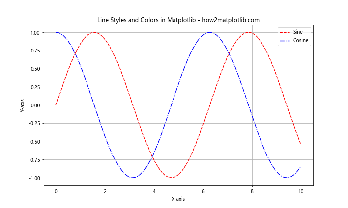
In this example, we use ‘r–‘ for a red dashed line and ‘b-.’ for a blue dash-dot line. Matplotlib provides a wide range of color and line style options for your line charts.
Adjusting Line Width and Marker Styles
You can also modify the width of the lines and add markers to data points:
import matplotlib.pyplot as plt
import numpy as np

x = np.linspace(0, 5, 20)
y = x ** 2

plt.figure(figsize=(10, 6))
plt.plot(x, y, 'go-', linewidth=2, markersize=8)
plt.title('Line Width and Markers in Matplotlib - how2matplotlib.com')
plt.xlabel('X-axis')
plt.ylabel('Y-axis')
plt.grid(True)
plt.show()
Output:
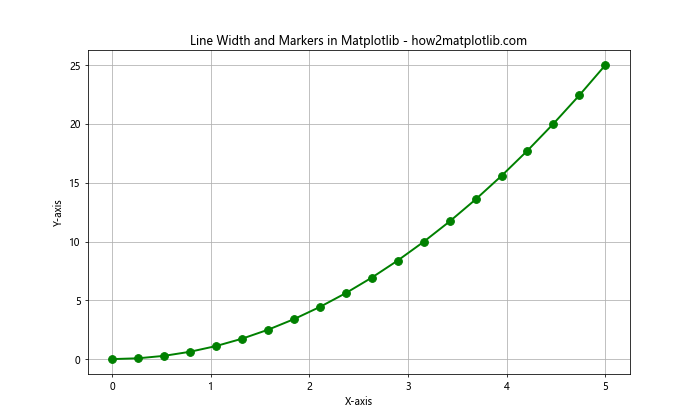
Here, we use ‘go-‘ to create a green line with circle markers. The linewidth parameter controls the thickness of the line, while markersize adjusts the size of the markers.
Multiple Lines and Subplots
Often, you’ll want to compare multiple datasets or create more complex visualizations using line charts in Matplotlib. Let’s explore how to achieve this.
Plotting Multiple Lines
You can easily plot multiple lines on the same axes:
import matplotlib.pyplot as plt
import numpy as np

x = np.linspace(0, 10, 100)
y1 = np.sin(x)
y2 = np.cos(x)
y3 = np.tan(x)

plt.figure(figsize=(12, 6))
plt.plot(x, y1, label='Sine')
plt.plot(x, y2, label='Cosine')
plt.plot(x, y3, label='Tangent')
plt.title('Multiple Lines in Matplotlib - how2matplotlib.com')
plt.xlabel('X-axis')
plt.ylabel('Y-axis')
plt.legend()
plt.grid(True)
plt.ylim(-2, 2)  # Set y-axis limits
plt.show()
Output:
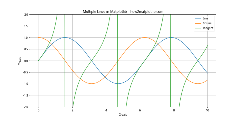
This example demonstrates how to plot three different trigonometric functions on the same axes, each with a different color and label.
Creating Subplots
For more complex comparisons, you might want to use subplots:
import matplotlib.pyplot as plt
import numpy as np

x = np.linspace(0, 10, 100)
y1 = np.sin(x)
y2 = np.cos(x)

fig, (ax1, ax2) = plt.subplots(2, 1, figsize=(10, 8))
ax1.plot(x, y1, 'r-')
ax1.set_title('Sine Wave - how2matplotlib.com')
ax2.plot(x, y2, 'b-')
ax2.set_title('Cosine Wave - how2matplotlib.com')

for ax in (ax1, ax2):
    ax.set_xlabel('X-axis')
    ax.set_ylabel('Y-axis')
    ax.grid(True)

plt.tight_layout()
plt.show()
Output:
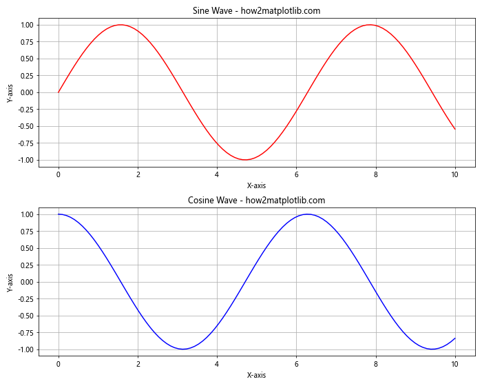
This code creates two subplots, one for a sine wave and another for a cosine wave, allowing for easy comparison between the two.
Customizing Axes and Labels
Proper axis and label customization can greatly enhance the readability and effectiveness of your line charts in Matplotlib.
Setting Axis Limits and Ticks
You can control the range of your axes and the placement of tick marks:
import matplotlib.pyplot as plt
import numpy as np

x = np.linspace(0, 10, 100)
y = np.exp(x)

plt.figure(figsize=(10, 6))
plt.plot(x, y)
plt.title('Customized Axes in Matplotlib - how2matplotlib.com')
plt.xlabel('X-axis')
plt.ylabel('Y-axis (log scale)')
plt.xlim(0, 5)
plt.ylim(1, 1000)
plt.yscale('log')
plt.xticks(np.arange(0, 6, 1))
plt.yticks([1, 10, 100, 1000])
plt.grid(True)
plt.show()
Output:
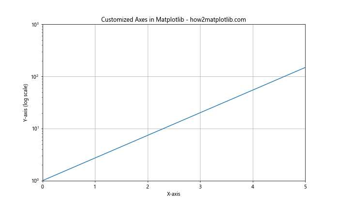
This example demonstrates how to set axis limits, use a logarithmic scale, and customize tick locations.
Adding Annotations and Text
Annotations and text can provide valuable context to your line charts in Matplotlib.
Adding Text and Arrows
You can add explanatory text and arrows to highlight specific points:
import matplotlib.pyplot as plt
import numpy as np

x = np.linspace(0, 10, 100)
y = np.sin(x)

plt.figure(figsize=(10, 6))
plt.plot(x, y)
plt.title('Annotated Line Chart in Matplotlib - how2matplotlib.com')
plt.xlabel('X-axis')
plt.ylabel('Y-axis')

plt.annotate('Maximum', xy=(np.pi/2, 1), xytext=(np.pi/2, 1.3),
             arrowprops=dict(facecolor='black', shrink=0.05))

plt.text(7, 0.5, 'Sine Wave', fontsize=12, bbox=dict(facecolor='white', alpha=0.5))

plt.grid(True)
plt.show()
Output:
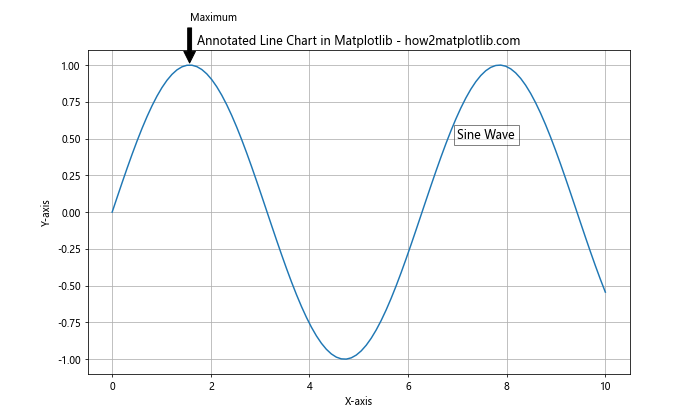
This example adds an annotation with an arrow pointing to the maximum of the sine wave and a text box describing the curve.
Using Mathematical Expressions
Matplotlib supports LaTeX-style mathematical expressions in text:
import matplotlib.pyplot as plt
import numpy as np

x = np.linspace(-2*np.pi, 2*np.pi, 100)
y = np.sin(x)

plt.figure(figsize=(10, 6))
plt.plot(x, y)
plt.title('Mathematical Expressions in Matplotlib - how2matplotlib.com')
plt.xlabel('X-axis')
plt.ylabel('Y-axis')

plt.text(0, 0, r'$f(x) = \sin(x)$', fontsize=16)

plt.grid(True)
plt.show()
Output:
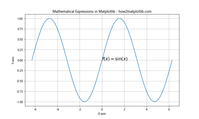
This code adds the mathematical expression for the sine function to the plot using LaTeX syntax.
Styling and Themes
Matplotlib offers various ways to style your line charts for different purposes and aesthetics.
Creating Custom Color Cycles
You can also create your own color cycles for line charts:
import matplotlib.pyplot as plt
import numpy as np

x = np.linspace(0, 10, 100)
custom_cycler = plt.cycler(color=['c', 'm', 'y', 'k'])

plt.figure(figsize=(10, 6))
plt.rc('axes', prop_cycle=custom_cycler)

for i in range(4):
    plt.plot(x, np.sin(x + i*np.pi/4))

plt.title('Custom Color Cycle in Matplotlib - how2matplotlib.com')
plt.xlabel('X-axis')
plt.ylabel('Y-axis')
plt.legend(['Wave 1', 'Wave 2', 'Wave 3', 'Wave 4'])
plt.grid(True)
plt.show()
Output:
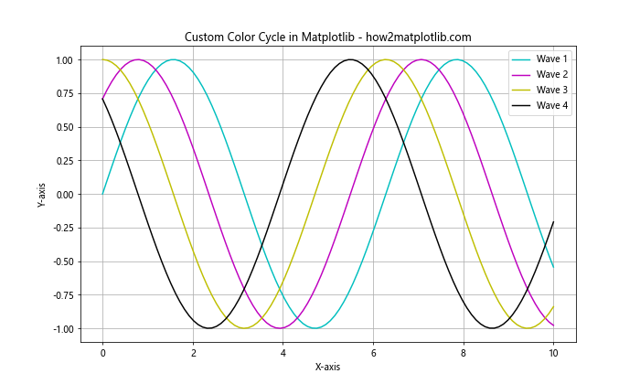
This code creates a custom color cycle and applies it to multiple line plots.
Interactive Features
Matplotlib allows you to add interactive features to your line charts, enhancing user engagement.
Adding a Slider
You can create a slider to dynamically adjust parameters:
import matplotlib.pyplot as plt
import numpy as np
from matplotlib.widgets import Slider

def update(val):
    amp = slider.val
    line.set_ydata(amp * np.sin(x))
    fig.canvas.draw_idle()

x = np.linspace(0, 2*np.pi, 100)
y = np.sin(x)

fig, ax = plt.subplots(figsize=(10, 6))
line, = ax.plot(x, y)
ax.set_title('Interactive Slider in Matplotlib - how2matplotlib.com')
ax.set_xlabel('X-axis')
ax.set_ylabel('Y-axis')

slider_ax = plt.axes([0.2, 0.02, 0.6, 0.03])
slider = Slider(slider_ax, 'Amplitude', 0, 2, valinit=1)
slider.on_changed(update)

plt.show()
Output:
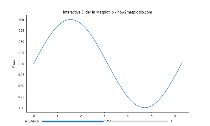
This example creates a slider that adjusts the amplitude of a sine wave in real-time.
Zoom and Pan
You can enable zoom and pan functionality for your line charts:
import matplotlib.pyplot as plt
import numpy as np
from matplotlib.widgets import Button

x = np.linspace(0, 10, 1000)
y = np.sin(x) * np.exp(-x/10)

fig, ax = plt.subplots(figsize=(10, 6))
line, = ax.plot(x, y)
ax.set_title('Zoom and Pan in Matplotlib - how2matplotlib.com')
ax.set_xlabel('X-axis')
ax.set_ylabel('Y-axis')

def reset(event):
    ax.set_xlim(0, 10)
    ax.set_ylim(-1, 1)
    fig.canvas.draw()

button_ax = plt.axes([0.8, 0.025, 0.1, 0.04])
button = Button(button_ax, 'Reset')
button.on_clicked(reset)

plt.show()
Output:
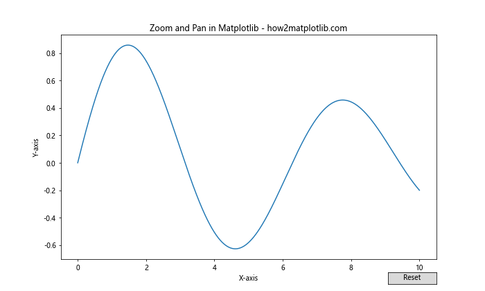
This code enables zoom and pan functionality and adds a reset button to return to the original view.
Advanced Line Chart Techniques
Let’s explore some advanced techniques for creating more complex and informative line charts in Matplotlib.
Filled Area Between Lines
You can fill the area between two lines to highlight the difference:
import matplotlib.pyplot as plt
import numpy as np

x = np.linspace(0, 10, 100)
y1 = np.sin(x)
y2 = np.cos(x)

plt.figure(figsize=(10, 6))
plt.plot(x, y1, 'r', label='Sine')
plt.plot(x, y2, 'b', label='Cosine')
plt.fill_between(x, y1, y2, where=(y1 > y2), alpha=0.3, color='red')
plt.fill_between(x, y1, y2, where=(y1 <= y2), alpha=0.3, color='blue')
plt.title('Filled Area Between Lines in Matplotlib - how2matplotlib.com')
plt.xlabel('X-axis')
plt.ylabel('Y-axis')
plt.legend()
plt.grid(True)
plt.show()
Output:
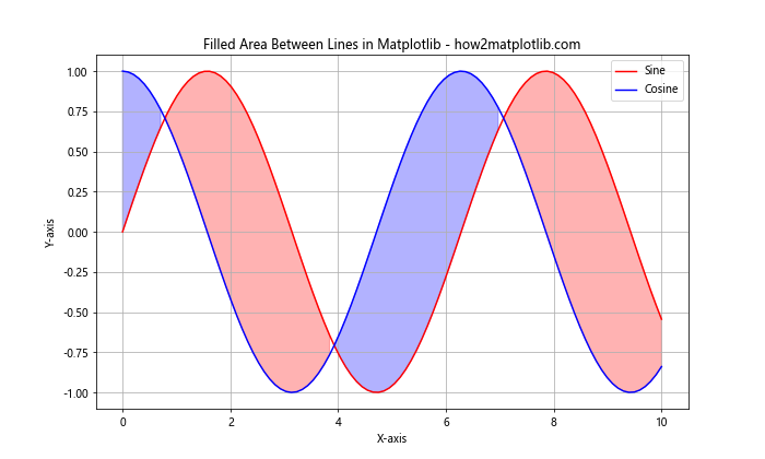
This example fills the area between sine and cosine curves with different colors based on which curve is higher.
Step Charts
Step charts are useful for displaying changes at irregular intervals:
import matplotlib.pyplot as plt
import numpy as np

x = np.arange(10)
y = np.random.randint(0, 10, 10)

plt.figure(figsize=(10, 6))
plt.step(x, y, where='post', label='Step Post')
plt.plot(x, y, 'o--', alpha=0.5, label='Line')
plt.title('Step Chart in Matplotlib - how2matplotlib.com')
plt.xlabel('X-axis')
plt.ylabel('Y-axis')
plt.legend()
plt.grid(True)
plt.show()
Output:
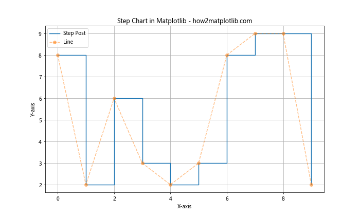
This code creates a step chart alongside a regular line plot for comparison.
Handling Time Series Data
Line charts are particularly useful for visualizing time series data. Let's look at some techniques specific to time-based data.
Handling Missing Data
When dealing with time series, you may encounter missing data. Matplotlib provides ways to handle this:
import matplotlib.pyplot as plt
import pandas as pd
import numpy as np

dates = pd.date_range(start='1/1/2021', periods=100, freq='D')
values = np.random.randn(100)
values[10:20] = np.nan  # Introduce missing data

plt.figure(figsize=(12, 6))
plt.plot(dates, values, 'b-', label='Data')
plt.plot(dates, values, 'ro', label='Points')
plt.title('Handling Missing Data in Matplotlib - how2matplotlib.com')
plt.xlabel('Date')
plt.ylabel('Value')
plt.legend()
plt.grid(True)
plt.show()
Output:
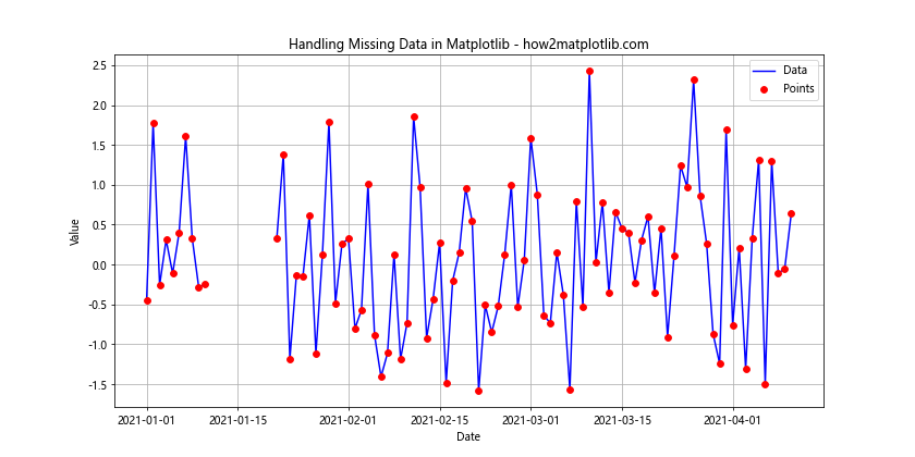
This code shows how Matplotlib automatically handles missing data by not connecting lines through NaN values.
Customizing Line Charts for Specific Use Cases
Different types of data and analysis require different approaches to line charts. Let's explore some specific use cases.
Candlestick Charts
For financial data, candlestick charts are a popular variation of line charts:
import matplotlib.pyplot as plt
import matplotlib.dates as mdates
import pandas as pd
import numpy as np

def candlestick(ax, opens, highs, lows, closes, dates):
    width = 0.6
    up = closes > opens
    down = opens > closes

    ax.bar(dates[up], highs[up]-lows[up], width, bottom=lows[up], color='g', alpha=0.5)
    ax.bar(dates[up], closes[up]-opens[up], width, bottom=opens[up], color='g')

    ax.bar(dates[down], highs[down]-lows[down], width, bottom=lows[down], color='r', alpha=0.5)
    ax.bar(dates[down], opens[down]-closes[down], width, bottom=closes[down], color='r')

dates = pd.date_range(start='1/1/2021', periods=50, freq='D')
opens = np.random.randn(50).cumsum() + 100
highs = opens + np.random.rand(50)
lows = opens - np.random.rand(50)
closes = opens + np.random.randn(50)

fig, ax = plt.subplots(figsize=(12, 6))
candlestick(ax, opens, highs, lows, closes, dates)
ax.set_title('Candlestick Chart in Matplotlib - how2matplotlib.com')
ax.set_xlabel('Date')
ax.set_ylabel('Price')
ax.xaxis.set_major_locator(mdates.WeekdayLocator(byweekday=mdates.MONDAY))
ax.xaxis.set_major_formatter(mdates.DateFormatter('%d-%m-%Y'))
plt.gcf().autofmt_xdate()
plt.grid(True)
plt.show()
Output:
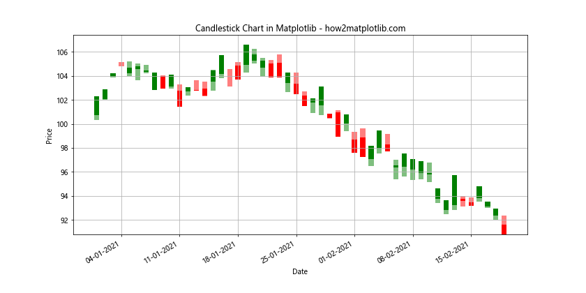
This example creates a basic candlestick chart, commonly used for stock price visualization.
Error Bands
Adding error bands to your line charts can help visualize uncertainty:
import matplotlib.pyplot as plt
import numpy as np

x = np.linspace(0, 10, 50)
y = np.sin(x) + 0.1 * np.random.randn(50)
error = 0.2 + 0.1 * x

plt.figure(figsize=(10, 6))
plt.plot(x, y, 'b-', label='Data')
plt.fill_between(x, y - error, y + error, alpha=0.3, label='Error Band')
plt.title('Line Chart with Error Bands in Matplotlib - how2matplotlib.com')
plt.xlabel('X-axis')
plt.ylabel('Y-axis')
plt.legend()
plt.grid(True)
plt.show()
Output:
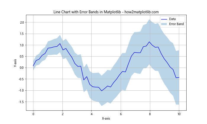
This code adds an error band around a line plot to show the range of possible values.
Optimizing Line Charts for Publication
When preparing line charts for publication, there are several considerations to keep in mind.
High-Resolution Output
For print-quality figures, you'll want to increase the DPI:
import matplotlib.pyplot as plt
import numpy as np

x = np.linspace(0, 10, 100)
y = np.sin(x)

plt.figure(figsize=(10, 6), dpi=300)
plt.plot(x, y)
plt.title('High-Resolution Line Chart in Matplotlib - how2matplotlib.com')
plt.xlabel('X-axis')
plt.ylabel('Y-axis')
plt.grid(True)
plt.savefig('high_res_plot.png', dpi=300, bbox_inches='tight')
plt.show()
Output:
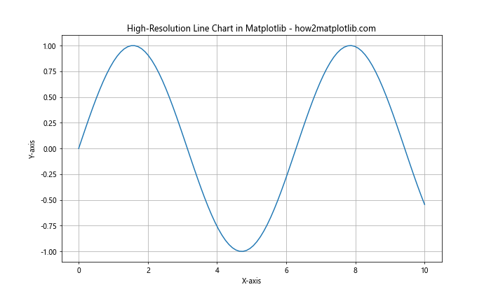
This example creates a high-resolution plot suitable for publication.
Adjusting for Colorblind Accessibility
It's important to make your line charts accessible to colorblind viewers:
import matplotlib.pyplot as plt
import numpy as np

x = np.linspace(0, 10, 100)
y1 = np.sin(x)
y2 = np.cos(x)

plt.figure(figsize=(10, 6))
plt.plot(x, y1, color='#0072B2', label='Sine')
plt.plot(x, y2, color='#D55E00', label='Cosine', linestyle='--')
plt.title('Colorblind-Friendly Line Chart in Matplotlib - how2matplotlib.com')
plt.xlabel('X-axis')
plt.ylabel('Y-axis')
plt.legend()
plt.grid(True)
plt.show()
Output:
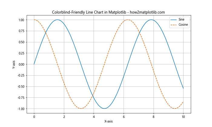
This code uses a colorblind-friendly color palette and different line styles to distinguish between plots.
Combining Line Charts with Other Plot Types
Line charts can be effectively combined with other types of plots to create more informative visualizations.
Line Chart with Scatter Plot
Combining a line chart with a scatter plot can highlight individual data points:
import matplotlib.pyplot as plt
import numpy as np

x = np.linspace(0, 10, 50)
y = np.sin(x) + 0.1 * np.random.randn(50)

plt.figure(figsize=(10, 6))
plt.plot(x, y, 'b-', label='Trend')
plt.scatter(x, y, color='red', s=20, label='Data Points')
plt.title('Line Chart with Scatter Plot in Matplotlib - how2matplotlib.com')
plt.xlabel('X-axis')
plt.ylabel('Y-axis')
plt.legend()
plt.grid(True)
plt.show()
Output:
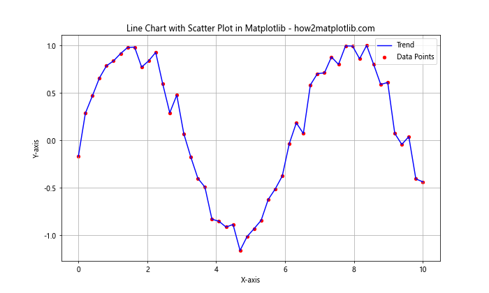
This example shows a line chart representing the trend, with scatter points showing the actual data.
Line Chart with Bar Plot
Combining line and bar charts can be useful for comparing different types of data:
import matplotlib.pyplot as plt
import numpy as np

x = np.arange(10)
y1 = np.random.rand(10)
y2 = np.random.rand(10)

fig, ax1 = plt.subplots(figsize=(10, 6))

ax1.bar(x, y1, alpha=0.7, label='Bar Data')
ax1.set_ylabel('Bar Values')
ax1.set_xlabel('X-axis')

ax2 = ax1.twinx()
ax2.plot(x, y2, 'r-', label='Line Data')
ax2.set_ylabel('Line Values')

plt.title('Combined Line and Bar Chart in Matplotlib - how2matplotlib.com')
fig.legend(loc='upper right', bbox_to_anchor=(1,1), bbox_transform=ax1.transAxes)

plt.tight_layout()
plt.show()
Output:
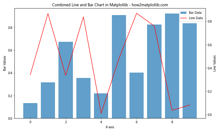
This code creates a chart with bars representing one dataset and a line representing another, using dual y-axes.
Conclusion
Line charts in Matplotlib are a versatile and powerful tool for data visualization. From basic plots to advanced customizations, Matplotlib provides a wide range of options to create effective and visually appealing line charts. By mastering these techniques, you can create line charts that effectively communicate your data and insights.