Label Points on Scatter Plot with Matplotlib
Matplotlib is a widely used Python library for creating static, animated, and interactive visualizations in Python. One common task in data visualization is to label specific points on a scatter plot to highlight or annotate certain data points. In this article, we will explore how to label points on a scatter plot using Matplotlib.
Basic Scatter Plot with Labels
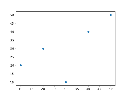
First, let’s start by creating a basic scatter plot using Matplotlib and then adding labels to specific points on the plot.
import matplotlib.pyplot as plt

# Create sample data
x = [1, 2, 3, 4, 5]
y = [2, 3, 1, 4, 5]
labels = ['A', 'B', 'C', 'D', 'E']

# Create scatter plot
plt.scatter(x, y)

# Add labels to points
for i, txt in enumerate(labels):
    plt.annotate(txt, (x[i], y[i]))

plt.show()
Output:
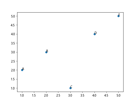
In the code above, we first create sample data for x and y coordinates, as well as labels for each point. We then create a simple scatter plot using plt.scatter() and use plt.annotate() to add labels to each point on the plot.
Coloring and Styling Labels
You can customize the appearance of labels on a scatter plot by changing the color, font size, and style of the text.
import matplotlib.pyplot as plt

# Create sample data
x = [1, 2, 3, 4, 5]
y = [2, 3, 1, 4, 5]
labels = ['A', 'B', 'C', 'D', 'E']

# Create scatter plot with colored labels
plt.scatter(x, y)

# Add labels with custom style
for i, txt in enumerate(labels):
    plt.annotate(txt, (x[i], y[i]), color='red', fontsize=12, fontweight='bold')

plt.show()
Output:
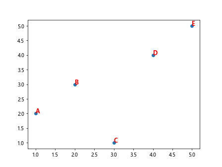
In the code above, we set the color of the labels to red, the font size to 12, and the font weight to bold. You can experiment with different styling options to make the labels stand out on the plot.
Labeling Specific Points
Sometimes you may want to label only specific points on a scatter plot based on certain conditions. Here’s an example of how to label points that meet a certain criteria.
import matplotlib.pyplot as plt

# Create sample data
x = [1, 2, 3, 4, 5]
y = [2, 3, 1, 4, 5]
labels = ['A', 'B', 'C', 'D', 'E']
colors = ['red', 'blue', 'green', 'orange', 'purple']

# Create scatter plot
plt.scatter(x, y)

# Label points that meet a condition
for i, txt in enumerate(labels):
    if x[i] > 3:
        plt.annotate(txt, (x[i], y[i]), color=colors[i])

plt.show()
Output:
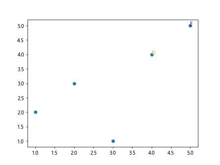
In the code above, we use a conditional statement to label only the points where the x-coordinate is greater than 3. We also assign different colors to the labels based on the index of the point.
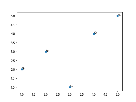
Adding Arrows to Labels
You can further enhance the labels on a scatter plot by adding arrows to point from the labels to the data points.
import matplotlib.pyplot as plt

# Create sample data
x = [1, 2, 3, 4, 5]
y = [2, 3, 1, 4, 5]
labels = ['A', 'B', 'C', 'D', 'E']

# Create scatter plot
plt.scatter(x, y)

# Add labels with arrows
for i, txt in enumerate(labels):
    plt.annotate(txt, (x[i], y[i]), arrowprops=dict(arrowstyle='->'))

plt.show()
Output:
In the code above, we use the arrowprops argument in plt.annotate() to add arrows pointing from the labels to the data points on the scatter plot.
Highlighting Specific Points
You can highlight specific points on a scatter plot by adding a different marker or changing the size of the marker for those points.
import matplotlib.pyplot as plt

# Create sample data
x = [1, 2, 3, 4, 5]
y = [2, 3, 1, 4, 5]
labels = ['A', 'B', 'C', 'D', 'E']
highlighted_points = [2, 4]

# Create scatter plot with highlighted points
plt.scatter(x, y, marker='o')

# Add labels to points and change marker for highlighted points
for i, txt in enumerate(labels):
    if i in highlighted_points:
        plt.scatter(x[i], y[i], color='red', marker='^', s=100)
    plt.annotate(txt, (x[i], y[i]))

plt.show()
Output:
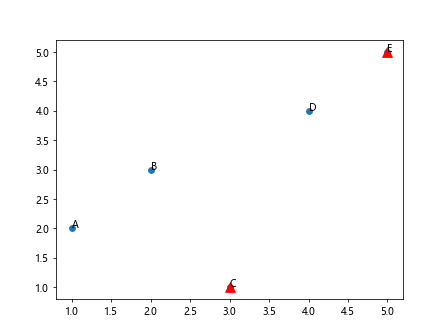
In the code above, we specify a list of highlighted_points and change the marker to a triangle with size 100 for those points. The labels are added as usual to all points on the scatter plot.
Rotating Labels
You can rotate the labels on a scatter plot to make them easier to read if they overlap or are too close to each other.
import matplotlib.pyplot as plt

# Create sample data
x = [1, 2, 3, 4, 5]
y = [2, 3, 1, 4, 5]
labels = ['A', 'B', 'C', 'D', 'E']

# Create scatter plot with rotated labels
plt.scatter(x, y)

# Add labels with rotation
for i, txt in enumerate(labels):
    plt.annotate(txt, (x[i], y[i]), rotation=45)

plt.show()
Output:
In the code above, we use the rotation argument in plt.annotate() to rotate the labels by 45 degrees. This can be helpful when dealing with a large number of labels or when labels are too close to each other.
Adding Labels from a DataFrame
If you are working with a Pandas DataFrame and want to label points on a scatter plot based on the data in the DataFrame, you can extract the data and labels from the DataFrame.
import matplotlib.pyplot as plt
import pandas as pd

# Create a sample DataFrame
data = {'x': [1, 2, 3, 4, 5],
        'y': [2, 3, 1, 4, 5],
        'labels': ['A', 'B', 'C', 'D', 'E']}
df = pd.DataFrame(data)

# Create scatter plot and label points
plt.scatter(df['x'], df['y'])
for i, txt in enumerate(df['labels']):
    plt.annotate(txt, (df['x'][i], df['y'][i]))

plt.show()
Output:

In the code above, we create a sample DataFrame with columns for x, y coordinates, and labels. We then extract the data and labels from the DataFrame to create a scatter plot with labeled points.
Using Subplots
If you want to create multiple scatter plots with labeled points side by side, you can use subplots in Matplotlib.
import matplotlib.pyplot as plt

# Create sample data for two subplots
x1 = [1, 2, 3, 4, 5]
y1 = [2, 3, 1, 4, 5]
labels1 = ['A', 'B', 'C', 'D', 'E']

x2 = [5, 4, 3, 2, 1]
y2 = [1, 2, 4, 3, 5]
labels2 = ['E', 'D', 'C', 'B', 'A']

# Create subplots with labeled points
fig, axs = plt.subplots(1, 2)

# First subplot
axs[0].scatter(x1, y1)
for i, txt in enumerate(labels1):
    axs[0].annotate(txt, (x1[i], y1[i]))

# Second subplot
axs[1].scatter(x2, y2)
for i, txt in enumerate(labels2):
    axs[1].annotate(txt, (x2[i], y2[i]))

plt.show()
Output:
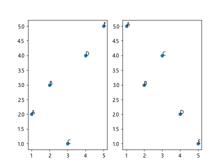
In the code above, we create two sets of sample data for two subplots and use the subplots() function tocreate a figure with two subplots. We then plot the scatter plots with labeled points on each subplot by iterating over the data points and labels.
Customizing Labels
You can customize the appearance of labels further by adding a border, background color, and adjusting the text alignment.
import matplotlib.pyplot as plt

# Create sample data
x = [1, 2, 3, 4, 5]
y = [2, 3, 1, 4, 5]
labels = ['A', 'B', 'C', 'D', 'E']

# Create scatter plot with custom labels
plt.scatter(x, y)

# Add labels with custom style
for i, txt in enumerate(labels):
    plt.annotate(txt, (x[i], y[i]), bbox=dict(facecolor='white', edgecolor='black', boxstyle='round,pad=0.2'), ha='center')

plt.show()
Output:
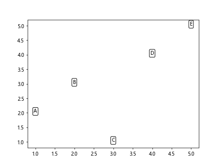
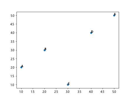
In the code above, we use the bbox argument in plt.annotate() to add a white background with a black border to the labels. We also adjust the text alignment to center (ha='center') to ensure the labels are centered on the points.
Interactive Labels
You can make labels on a scatter plot interactive by enabling the annotate button that allows users to click on points and add or remove labels.
import matplotlib.pyplot as plt
from matplotlib.widgets import Button

# Create sample data
x = [1, 2, 3, 4, 5]
y = [2, 3, 1, 4, 5]

# Create scatter plot
fig, ax = plt.subplots()
sc = ax.scatter(x, y)

# Add annotate button for interactive labels
ann_button = Button(plt.axes([0.7, 0.05, 0.1, 0.075]), 'Annotate')

def onclick(event):
    if event.inaxes == ax:
        x, y = event.xdata, event.ydata
        plt.annotate('Label', (x, y))

ann_button.on_clicked(onclick)
plt.show()
Output:
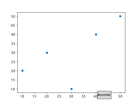
In the code above, we create a scatter plot and add an ‘Annotate’ button to enable interactive labeling. When the button is clicked, the user can click on any point on the plot to add a label at that point.
Dynamic Labels
You can dynamically update labels on a scatter plot based on user interaction or changes in data.
import matplotlib.pyplot as plt

# Create sample data
x = [1, 2, 3, 4, 5]
y = [2, 3, 1, 4, 5]
labels = ['A', 'B', 'C', 'D', 'E']

# Create scatter plot
fig, ax = plt.subplots()
sc = ax.scatter(x, y)

# Add labels with initial text
annot = ax.annotate('', xy=(0, 0), xytext=(20, 20), textcoords='offset points', bbox=dict(facecolor='white'))

def update_annot(ind):
    pos = sc.get_offsets()[ind["ind"][0]]
    annot.xy = pos
    text = f'{labels[ind["ind"][0]]}'
    annot.set_text(text)
    annot.get_bbox_patch().set_facecolor('white')
    annot.get_bbox_patch().set_alpha(0.9)

def hover(event):
    vis = annot.get_visible()
    if event.inaxes == ax:
        cont, ind = sc.contains(event)
        if cont:
            update_annot(ind)
            annot.set_visible(True)
            fig.canvas.draw_idle()
        else:
            if vis:
                annot.set_visible(False)
                fig.canvas.draw_idle()

fig.canvas.mpl_connect('motion_notify_event', hover)
plt.show()
Output:
In the code above, we create a scatter plot with labels that update dynamically as the user hovers over the points. The annotation text changes based on the point hovered over on the plot.
Conclusion
In this article, we explored various ways to label points on a scatter plot using Matplotlib. From basic labeling to interactive and dynamic labels, Matplotlib provides a versatile set of tools for annotating data points on visualizations. By customizing the appearance, layout, and interaction of labels, you can effectively communicate insights and highlight key information in your scatter plots. Experiment with these techniques in your own projects to enhance the readability and impact of your visualizations.