Label Data Points in Matplotlib
When creating visualizations using Matplotlib, it can be useful to label certain data points to provide additional context or information. In this article, we will explore different methods to label data points in Matplotlib plots.
Method 1: Using annotate()
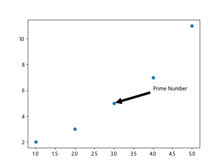
The annotate() function in Matplotlib allows us to create annotations with a text label at a specific location on the plot. We can specify the text, xy coordinates, and optional properties such as arrow style and color.
import matplotlib.pyplot as plt

# Create some data
x = [1, 2, 3, 4, 5]
y = [2, 3, 5, 7, 11]

plt.scatter(x, y)

# Annotate a specific point
plt.annotate('Prime Number', (3, 5), xytext=(4, 6),
             arrowprops=dict(facecolor='black', shrink=0.05))

plt.show()
Output:
Method 2: Using text()
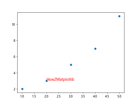
Another way to label data points in Matplotlib is by using the text() function. This function allows us to add text at a specific location on the plot, without the need for an arrow pointing to the data point.
import matplotlib.pyplot as plt

# Create some data
x = [1, 2, 3, 4, 5]
y = [2, 3, 5, 7, 11]

plt.scatter(x, y)

# Add text at a specific location
plt.text(2, 3, 'How2Matplotlib', fontsize=12, color='red')

plt.show()
Output:
Method 3: Using a Loop to Label Multiple Data Points
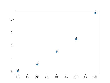
If you have multiple data points that need to be labeled, you can use a loop to iterate through the data and label each point individually.
import matplotlib.pyplot as plt

# Create some data
x = [1, 2, 3, 4, 5]
y = [2, 3, 5, 7, 11]
labels = ['a', 'b', 'c', 'd', 'e']

plt.scatter(x, y)

# Label each data point
for i, txt in enumerate(labels):
    plt.annotate(txt, (x[i], y[i]))

plt.show()
Output:
Method 4: Using ax.text() for Subplots
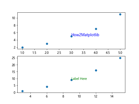
When working with subplots in Matplotlib, you can use the text() method of the Axes object to label data points within a specific subplot.
import matplotlib.pyplot as plt

fig, axs = plt.subplots(2)

# Create data for subplot 1
x1 = [1, 2, 3, 4, 5]
y1 = [2, 3, 5, 7, 11]

axs[0].scatter(x1, y1)
axs[0].text(3, 5, 'How2Matplotlib', fontsize=12, color='blue')

# Create data for subplot 2
x2 = [3, 6, 9, 12, 15]
y2 = [1, 4, 9, 16, 25]

axs[1].scatter(x2, y2)
axs[1].text(9, 9, 'Label Here', fontsize=10, color='green')

plt.show()
Output:
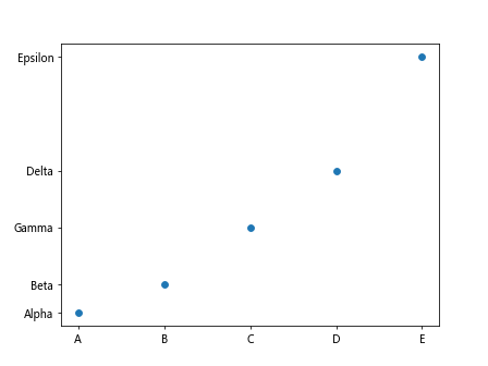
Method 5: Using set_xticks() and set_yticks() with Custom Labels
You can customize the labels of the x and y ticks on a plot using the set_xticks() and set_yticks() methods. This can be useful when you want to provide specific labels for each data point on the axes.
import matplotlib.pyplot as plt

# Create some data
x = [1, 2, 3, 4, 5]
y = [2, 3, 5, 7, 11]

plt.scatter(x, y)

# Set custom labels for x-axis
plt.xticks(x, ['A', 'B', 'C', 'D', 'E'])

# Set custom labels for y-axis
plt.yticks(y, ['Alpha', 'Beta', 'Gamma', 'Delta', 'Epsilon'])

plt.show()
Output:
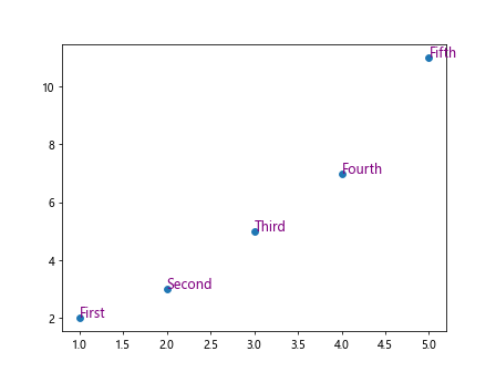
Method 6: Using a Custom Function to Label Data Points
You can define a custom function that takes in the x and y coordinates of a data point and labels it accordingly. This approach allows for more flexibility and customization when labeling data points on a plot.
import matplotlib.pyplot as plt

# Custom function to label data points
def label_point(x, y, label):
    for i in range(len(x)):
        plt.text(x[i], y[i], label[i], fontsize=12, color='purple')

# Create some data
x = [1, 2, 3, 4, 5]
y = [2, 3, 5, 7, 11]
labels = ['First', 'Second', 'Third', 'Fourth', 'Fifth']

plt.scatter(x, y)

# Call the custom function to label data points
label_point(x, y, labels)

plt.show()
Output:
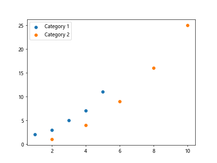
Method 7: Adding a Legend to Differentiate Labeled Data Points
If you have multiple labels for different categories of data points, you can add a legend to the plot to differentiate between them. This can be achieved by using the legend() function in Matplotlib.
import matplotlib.pyplot as plt

# Create some data
x1 = [1, 2, 3, 4, 5]
y1 = [2, 3, 5, 7, 11]
labels1 = ['A', 'B', 'C', 'D', 'E']

x2 = [2, 4, 6, 8, 10]
y2 = [1, 4, 9, 16, 25]
labels2 = ['W', 'X', 'Y', 'Z', 'V']

plt.scatter(x1, y1, label='Category 1')
plt.scatter(x2, y2, label='Category 2')

# Add labels to data points
plt.legend()

plt.show()
Output:
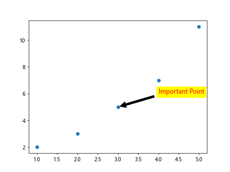
Method 8: Using Annotations with Custom Formatting
You can customize the formatting of annotations in Matplotlib by specifying additional properties such as text color, font size, and background color. This allows you to make the labels stand out more prominently on the plot.
import matplotlib.pyplot as plt

# Create some data
x = [1, 2, 3, 4, 5]
y = [2, 3, 5, 7, 11]

plt.scatter(x, y)

# Annotate a specific point with custom formatting
plt.annotate('Important Point', (3, 5), xytext=(4, 6),
             arrowprops=dict(facecolor='black', shrink=0.05),
             fontsize=12, color='red', backgroundcolor='yellow')

plt.show()
Output:
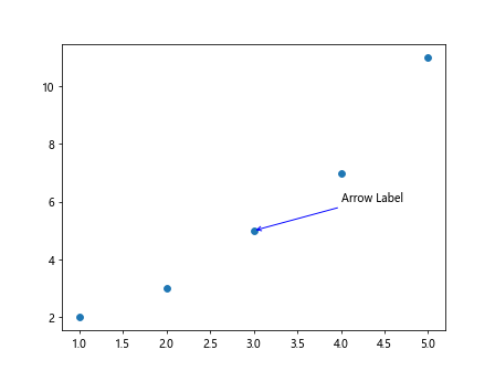
Method 9: Using annotate() for Annotations with Arrows
To better emphasize the connection between a data point and its label, you can use the annotate() function with arrows. This creates a visual link between the data point and the corresponding label on the plot.
import matplotlib.pyplot as plt

# Create some data
x = [1, 2, 3, 4, 5]
y = [2, 3, 5, 7, 11]

plt.scatter(x, y)

# Annotate a specific point with arrow
plt.annotate('Arrow Label', (3, 5), xytext=(4, 6),
             arrowprops=dict(arrowstyle='->', connectionstyle='arc3', color='blue'))

plt.show()
Output:
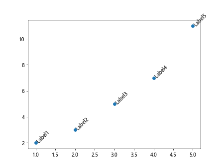
Method 10: Using text() with Custom Rotation for Data Labels
If you want to rotate the data labels on the plot for better visibility, you can specify a rotation angle when using the text() function in Matplotlib. This allows you to adjust the orientation of the labels as needed.
import matplotlib.pyplot as plt

# Create some data
x = [1, 2, 3, 4, 5]
y = [2, 3, 5, 7, 11]
labels = ['Label1', 'Label2', 'Label3', 'Label4', 'Label5']

plt.scatter(x, y)

# Add text with custom rotation
for i, txt in enumerate(labels):
    plt.text(x[i], y[i], txt, fontsize=10, rotation=45)

plt.show()
Output:
Method 11: Using Different Text Styles for Data Labels
To differentiate between data labels on a plot, you can use different text styles such as bold, italic, or underline. This can help highlight specific data points or categories within the visualization.
import matplotlib.pyplot as plt

# Create some data
x = [1, 2, 3, 4, 5]
y = [2, 3, 5, 7, 11]
labels = ['Bold Label', 'Italic Label', 'Underline Label', 'Normal Label1', 'Normal Label2']

plt.scatter(x, y)

# Add text with different text styles
plt.text(1, 2, labels[0], fontsize=12, weight='bold')
plt.text(2, 3, labels[1], fontsize=12, style='italic')
plt.text(3, 5, labels[2], fontsize=12, decoration='underline')
plt.text(4, 7, labels[3], fontsize=12)
plt.text(5, 11, labels[4], fontsize=12)

plt.show()
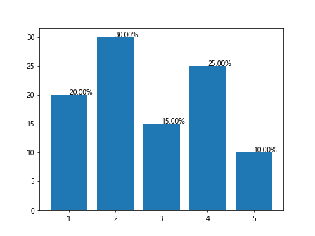
Method 12: Labeling Data Points with Ratios or Percentages
In certain cases, it may be useful to label data points on a plot with ratios or percentages to provide additional context. You can calculate these values and display them as labels using custom formatting.
import matplotlib.pyplot as plt

# Create some data
x = [1, 2, 3, 4, 5]
y = [20, 30, 15, 25, 10]

total = sum(y)
ratios = [val/total for val in y]

plt.bar(x, y)

# Label data points with percentages
for i, val in enumerate(ratios):
    plt.text(x[i], y[i], f'{val*100:.2f}%', fontsize=10)

plt.show()
Output:
Method 13: Using Colored Labels for Data Points
Adding color-coded labels to data points in a plot can help visually categorize or group the data based on specific attributes. This can enhance the overall clarity and understanding of the visualization.
import matplotlib.pyplot as plt

# Create some data
x = [1, 2, 3, 4, 5]
y = [2, 3, 5, 7, 11]
categories = ['A', 'B', 'A', 'B', 'A']

plt.scatter(x, y, c=categories)

# Add colored labels to data points
for i, category in enumerate(categories):
    plt.text(x[i], y[i], f'{category}', fontsize=12, color='red' if category == 'A' else 'blue')

plt.show()
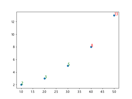
Method 14: Using Conditional Formatting for Data Labels
Conditional formatting can be applied to data labels based on specific criteria or thresholds. By using if-else statements within the label function, you can dynamically adjust the appearance of the labels.
import matplotlib.pyplot as plt

# Create some data
x = [1, 2, 3, 4, 5]
y = [2, 3, 5, 8, 13]

plt.scatter(x, y)

# Conditional formatting for data labels
for i, val in enumerate(y):
    color = 'red' if val > 5 else 'green'
    plt.text(x[i], y[i], f'{val}', fontsize=12, color=color)

plt.show()
Output:
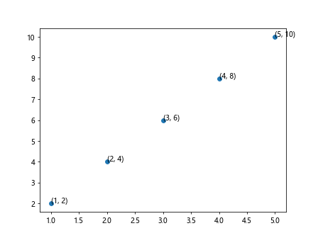
Method 15: Annotating Data Points with Numeric Values
In addition to text labels, you can use numeric values to annotate data points on a plot. This can provide precise information about the data at specific locations within the visualization.
import matplotlib.pyplot as plt

# Create some data
x = [1, 2, 3, 4, 5]
y = [2, 4, 6, 8, 10]

plt.scatter(x, y)

# Annotate data points with numeric values
for i in range(len(x)):
    plt.annotate(f'({x[i]}, {y[i]})', (x[i], y[i]), fontsize=10)

plt.show()
Output:
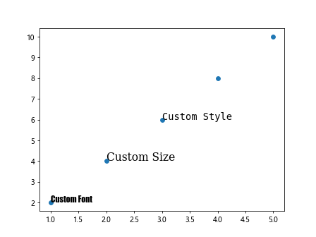
Method 16: Labeling Data Points with Custom Fonts
To further customize the appearance of data labels on a plot, you can specify different font families and sizes. This allows you to create visually appealing and cohesive visualizations with personalized text styles.
import matplotlib.pyplot as plt

# Create some data
x = [1, 2, 3, 4, 5]
y = [2, 4, 6, 8, 10]

plt.scatter(x, y)

# Label data points with custom fonts
plt.text(1, 2, 'Custom Font', fontsize=12, family='fantasy')
plt.text(2, 4, 'Custom Size', fontsize=16, family='serif')
plt.text(3, 6, 'Custom Style', fontsize=14, family='monospace')

plt.show()
Output:
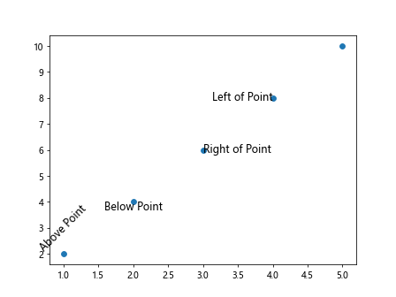
Method 17: Using Data Labels in Different Positions
Data labels can be placed in various positions around the data points on a plot to avoid overlapping and improve readability. By adjusting the xytext parameter, you can control the location of the labels relative to the data points.
import matplotlib.pyplot as plt

# Create some data
x = [1, 2, 3, 4, 5]
y = [2, 4, 6, 8, 10]

plt.scatter(x, y)

# Label data points in different positions
plt.text(1, 2, 'Above Point', fontsize=12, verticalalignment='bottom', horizontalalignment='center', rotation=45)
plt.text(2, 4, 'Below Point', fontsize=12, verticalalignment='top', horizontalalignment='center')
plt.text(3, 6, 'Right of Point', fontsize=12, verticalalignment='center', horizontalalignment='left')
plt.text(4, 8, 'Left of Point', fontsize=12, verticalalignment='center', horizontalalignment='right')

plt.show()
Output:
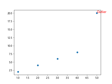
Method 18: Labeling Outliers or Special Data Points
When visualizing data, it can be valuable to highlight outliers or special data points by labeling them with additional information. This can draw attention to specific instances that may require further analysis or explanation.
import matplotlib.pyplot as plt

# Create some data
x = [1, 2, 3, 4, 5]
y = [2, 4, 6, 8, 20]

plt.scatter(x, y)

# Label outlier data points
for i, val in enumerate(y):
    if val > 10:
        plt.text(x[i], y[i], 'Outlier', fontsize=12, color='red')

plt.show()
Output:
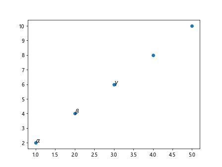
Method 19: Using Labels with Mathematical Expressions
Matplotlib supports the display of mathematical expressions within data labels, allowing you to integrate mathematical notation seamlessly into your visualizations. This can be advantageous when presenting complex data or equations on a plot.
import matplotlib.pyplot as plt

# Create some data
x = [1, 2, 3, 4, 5]
y = [2, 4, 6, 8, 10]

plt.scatter(x, y)

# Display mathematical expressions in labels
plt.text(1, 2, r'$\alpha$', fontsize=12)
plt.text(2, 4, r'$\beta$', fontsize=12)
plt.text(3, 6, r'$\gamma$', fontsize=12)

plt.show()
Output:
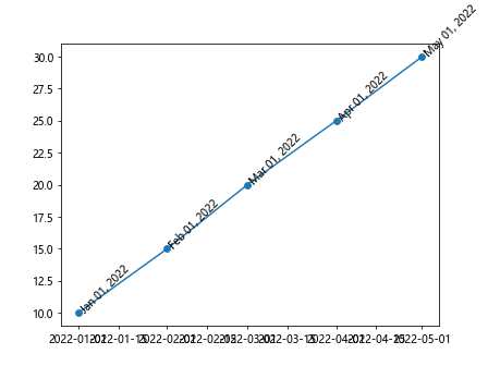
Method 20: Labeling Data Points with Timestamps or Dates
For time series data or plots that involve dates, you can label data points with timestamps or specific dates to provide temporal context. Matplotlib offers functionalities to format and display time-related information effectively.
import matplotlib.pyplot as plt
import pandas as pd

# Create a sample time series dataset
data = {'date': ['2022-01-01', '2022-02-01', '2022-03-01', '2022-04-01', '2022-05-01'],
        'value': [10, 15, 20, 25, 30]}
df = pd.DataFrame(data)
df['date'] = pd.to_datetime(df['date'])

plt.plot(df['date'], df['value'], marker='o')

# Label data points with timestamps
for i, row in df.iterrows():
    plt.text(row['date'], row['value'], row['date'].strftime('%b %d, %Y'), fontsize=10, rotation=45)

plt.show()
Output:
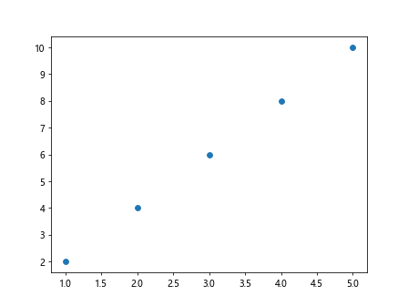
Method 21: Using Data Labels with Tooltips
To enhance the interactivity of a plot, you can incorporate data labels with tooltips that display additional information when users hover over data points. This interactive feature can improve user engagement and provide detailed insights on-demand.
import matplotlib.pyplot as plt
import mplcursors

# Create some data
x = [1, 2, 3, 4, 5]
y = [2, 4, 6, 8, 10]
labels = ['Label1', 'Label2', 'Label3', 'Label4', 'Label5']

plt.scatter(x, y)

# Add data labels with tooltips
cursor = mplcursors.cursor(hover=True)
@cursor.connect("add")
def on_add(sel):
    index = sel.target.index
    sel.annotation.set_text(labels[index])

plt.show()
Output:
By incorporating these techniques into your data visualization projects, you can effectively label data points on plots to convey meaningful insights, provide context, and enhance the overall interpretability of your visualizations. Feel free to customize and combine these methods based on your specific requirements and preferences.