Creating Bar Charts with Matplotlib
Bar charts are a fundamental way of representing data visually. They are incredibly versatile, allowing for the comparison of categorical data, showing trends, or illustrating changes over time. Matplotlib, a comprehensive library for creating static, animated, and interactive visualizations in Python, offers extensive support for bar charts. This article will guide you through creating various types of bar charts using Matplotlib, providing detailed examples to help you get started.
Getting Started with Matplotlib
Before diving into the examples, ensure you have Matplotlib installed. If not, you can install it using pip:
pip install matplotlib
Import Matplotlib’s pyplot module to get started:
import matplotlib.pyplot as plt
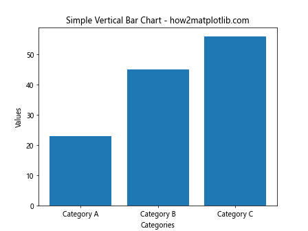
Basic Vertical Bar Chart
A vertical bar chart is the simplest form of bar charts. It represents data in rectangular bars, with the length of the bar proportional to the value it represents.
Example 1: Simple Vertical Bar Chart
import matplotlib.pyplot as plt

categories = ['Category A', 'Category B', 'Category C']
values = [23, 45, 56]

plt.bar(categories, values)
plt.title('Simple Vertical Bar Chart - how2matplotlib.com')
plt.xlabel('Categories')
plt.ylabel('Values')
plt.show()
Output:
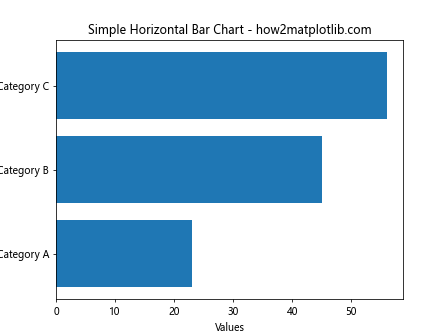
Basic Horizontal Bar Chart
Horizontal bar charts are similar to vertical bar charts, but they display information horizontally rather than vertically.
Example 2: Simple Horizontal Bar Chart
import matplotlib.pyplot as plt

categories = ['Category A', 'Category B', 'Category C']
values = [23, 45, 56]

plt.barh(categories, values)
plt.title('Simple Horizontal Bar Chart - how2matplotlib.com')
plt.xlabel('Values')
plt.ylabel('Categories')
plt.show()
Output:
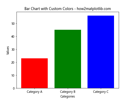
Customizing Bar Colors
Customizing the colors of bars in a bar chart can help in distinguishing between different categories or making the chart more visually appealing.
Example 3: Bar Chart with Custom Colors
import matplotlib.pyplot as plt

categories = ['Category A', 'Category B', 'Category C']
values = [23, 45, 56]
colors = ['red', 'green', 'blue']

plt.bar(categories, values, color=colors)
plt.title('Bar Chart with Custom Colors - how2matplotlib.com')
plt.xlabel('Categories')
plt.ylabel('Values')
plt.show()
Output:
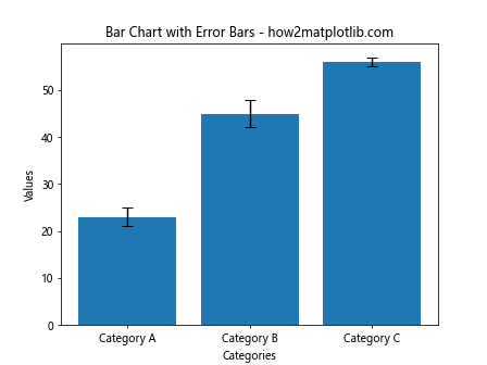
Adding Error Bars
Error bars can be added to bar charts to indicate the variability of the data and to show the uncertainty in measurements.
Example 4: Bar Chart with Error Bars
import matplotlib.pyplot as plt
import numpy as np

categories = ['Category A', 'Category B', 'Category C']
values = [23, 45, 56]
errors = [2, 3, 1]

plt.bar(categories, values, yerr=errors, capsize=5)
plt.title('Bar Chart with Error Bars - how2matplotlib.com')
plt.xlabel('Categories')
plt.ylabel('Values')
plt.show()
Output:
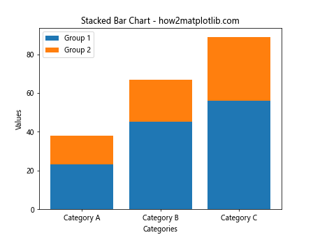
Stacked Bar Chart
Stacked bar charts are useful for comparing multiple categories of data while still displaying the total value for each bar.
Example 5: Stacked Bar Chart
import matplotlib.pyplot as plt

categories = ['Category A', 'Category B', 'Category C']
values1 = [23, 45, 56]
values2 = [15, 22, 33]

plt.bar(categories, values1, label='Group 1')
plt.bar(categories, values2, bottom=values1, label='Group 2')
plt.title('Stacked Bar Chart - how2matplotlib.com')
plt.xlabel('Categories')
plt.ylabel('Values')
plt.legend()
plt.show()
Output:
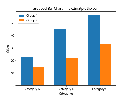
Grouped Bar Chart
Grouped bar charts are ideal for comparing multiple groups across different categories.
Example 6: Grouped Bar Chart
import matplotlib.pyplot as plt
import numpy as np

categories = ['Category A', 'Category B', 'Category C']
values1 = [23, 45, 56]
values2 = [15, 22, 33]
bar_width = 0.35

index = np.arange(len(categories))

plt.bar(index, values1, bar_width, label='Group 1')
plt.bar(index + bar_width, values2, bar_width, label='Group 2')

plt.title('Grouped Bar Chart - how2matplotlib.com')
plt.xlabel('Categories')
plt.ylabel('Values')
plt.xticks(index + bar_width / 2, categories)
plt.legend()
plt.show()
Output:
Bar Chart with Text Labels on Bars
Adding text labels on bars can make the data values more clear to the viewer.
Example 7: Bar Chart with Text Labels
import matplotlib.pyplot as plt

categories = ['Category A', 'Category B', 'Category C']
values = [23, 45, 56]

bars = plt.bar(categories, values)
plt.title('Bar Chart with Text Labels - how2matplotlib.com')
plt.xlabel('Categories')
plt.ylabel('Values')

for bar in bars:
    yval = bar.get_height()
    plt.text(bar.get_x() + bar.get_width()/2, yval + 1, yval, ha='center', va='bottom')

plt.show()
Output:

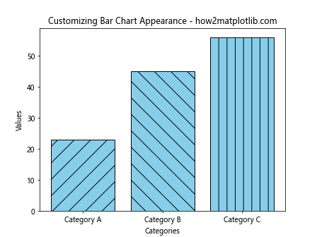
Customizing Bar Chart Appearance
Matplotlib allows extensive customization of bar charts, including setting the edge color of bars, adding patterns, and adjusting transparency.
Example 8: Customizing Bar Chart Appearance
import matplotlib.pyplot as plt

categories = ['Category A', 'Category B', 'Category C']
values = [23, 45, 56]
patterns = ['/', '\\', '|']

bars = plt.bar(categories, values, color='skyblue', edgecolor='black')

for bar, pattern in zip(bars, patterns):
    bar.set_hatch(pattern)

plt.title('Customizing Bar Chart Appearance - how2matplotlib.com')
plt.xlabel('Categories')
plt.ylabel('Values')
plt.show()
Output:
Conclusion
This article has introduced you to creating and customizing bar charts using Matplotlib. Through various examples, we’ve covered the basics, such as creating vertical and horizontal bar charts, and moved on to more complex types like stacked and grouped bar charts. Additionally, we’ve explored how to enhance the visual appeal and clarity of bar charts by customizing colors, adding error bars, text labels, and custom patterns. With these tools and techniques, you’re now equipped to create informative and visually appealing bar charts for your data visualization needs. Remember, the examples provided are fully functional and can be used as a starting point for your projects.