Comprehensive Guide: Introduction to 3D Plotting with Matplotlib
Introduction to 3D Plotting with Matplotlib is an essential topic for data visualization enthusiasts and professionals alike. Matplotlib, a powerful Python library, offers robust capabilities for creating three-dimensional plots that can bring your data to life. This article will delve deep into the world of 3D plotting with Matplotlib, exploring various techniques, plot types, and customization options to help you master this invaluable skill.
Understanding the Basics of 3D Plotting with Matplotlib
Before we dive into the intricacies of 3D plotting with Matplotlib, it’s crucial to understand the fundamental concepts. 3D plotting allows us to represent data in three dimensions, adding depth to our visualizations and enabling the exploration of complex relationships between variables.
Matplotlib’s 3D plotting capabilities are primarily provided through the mpl_toolkits.mplot3d module. This module extends Matplotlib’s functionality to support 3D plots, offering a wide range of plot types and customization options.
Let’s start with a simple example to illustrate the basic setup for 3D plotting with Matplotlib:
import matplotlib.pyplot as plt
from mpl_toolkits.mplot3d import Axes3D
import numpy as np

fig = plt.figure()
ax = fig.add_subplot(111, projection='3d')

x = np.linspace(-5, 5, 100)
y = np.linspace(-5, 5, 100)
X, Y = np.meshgrid(x, y)
Z = np.sin(np.sqrt(X**2 + Y**2))

ax.plot_surface(X, Y, Z)
ax.set_xlabel('X-axis')
ax.set_ylabel('Y-axis')
ax.set_zlabel('Z-axis')
ax.set_title('Introduction to 3D Plotting with Matplotlib - how2matplotlib.com')

plt.show()
Output:
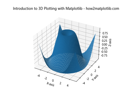
In this example, we import the necessary modules, create a figure and a 3D axes object, generate some sample data, and plot a 3D surface. This serves as a foundation for more complex 3D plots we’ll explore throughout this article.
Types of 3D Plots in Matplotlib
Matplotlib offers various types of 3D plots, each suited for different kinds of data and visualization needs. Let’s explore some of the most common types of 3D plots you can create with Matplotlib.
3D Line Plots
3D line plots are useful for visualizing trajectories or paths in three-dimensional space. Here’s an example of how to create a 3D line plot:
import matplotlib.pyplot as plt
from mpl_toolkits.mplot3d import Axes3D
import numpy as np

fig = plt.figure()
ax = fig.add_subplot(111, projection='3d')

t = np.linspace(0, 10, 100)
x = np.sin(t)
y = np.cos(t)
z = t

ax.plot(x, y, z, label='3D Line Plot')
ax.set_xlabel('X-axis')
ax.set_ylabel('Y-axis')
ax.set_zlabel('Z-axis')
ax.set_title('Introduction to 3D Plotting with Matplotlib - how2matplotlib.com')
ax.legend()

plt.show()
Output:
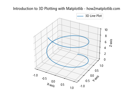
This code creates a 3D line plot of a spiral trajectory. The plot function is used to draw the line in 3D space.
3D Scatter Plots
Scatter plots in 3D are excellent for visualizing the distribution of data points in three-dimensional space. Here’s how to create a 3D scatter plot:
import matplotlib.pyplot as plt
from mpl_toolkits.mplot3d import Axes3D
import numpy as np

fig = plt.figure()
ax = fig.add_subplot(111, projection='3d')

n = 100
x = np.random.rand(n)
y = np.random.rand(n)
z = np.random.rand(n)
colors = np.random.rand(n)
sizes = 1000 * np.random.rand(n)

ax.scatter(x, y, z, c=colors, s=sizes, alpha=0.5)
ax.set_xlabel('X-axis')
ax.set_ylabel('Y-axis')
ax.set_zlabel('Z-axis')
ax.set_title('Introduction to 3D Plotting with Matplotlib - how2matplotlib.com')

plt.show()
Output:
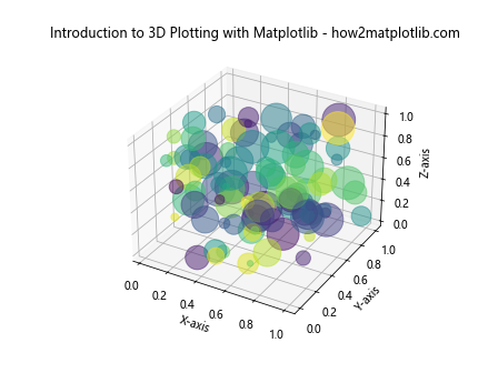
This example creates a 3D scatter plot with randomly generated data points. The color and size of each point can be customized to represent additional dimensions of data.
3D Surface Plots
Surface plots are ideal for visualizing functions of two variables or representing terrain-like data. Here’s an example of a 3D surface plot:
import matplotlib.pyplot as plt
from mpl_toolkits.mplot3d import Axes3D
import numpy as np

fig = plt.figure()
ax = fig.add_subplot(111, projection='3d')

x = np.linspace(-5, 5, 50)
y = np.linspace(-5, 5, 50)
X, Y = np.meshgrid(x, y)
Z = np.sin(np.sqrt(X**2 + Y**2))

surf = ax.plot_surface(X, Y, Z, cmap='viridis')
ax.set_xlabel('X-axis')
ax.set_ylabel('Y-axis')
ax.set_zlabel('Z-axis')
ax.set_title('Introduction to 3D Plotting with Matplotlib - how2matplotlib.com')
fig.colorbar(surf, shrink=0.5, aspect=5)

plt.show()
Output:

This code creates a 3D surface plot of a sinc function. The plot_surface function is used to generate the surface, and a colorbar is added to show the mapping between colors and Z values.
3D Wireframe Plots
Wireframe plots are similar to surface plots but only show the edges of the surface. They can be useful when you want to see through the surface. Here’s an example:
import matplotlib.pyplot as plt
from mpl_toolkits.mplot3d import Axes3D
import numpy as np

fig = plt.figure()
ax = fig.add_subplot(111, projection='3d')

x = np.linspace(-5, 5, 20)
y = np.linspace(-5, 5, 20)
X, Y = np.meshgrid(x, y)
Z = np.sin(np.sqrt(X**2 + Y**2))

ax.plot_wireframe(X, Y, Z)
ax.set_xlabel('X-axis')
ax.set_ylabel('Y-axis')
ax.set_zlabel('Z-axis')
ax.set_title('Introduction to 3D Plotting with Matplotlib - how2matplotlib.com')

plt.show()
Output:
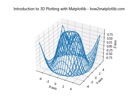
This example creates a wireframe plot of the same function used in the surface plot example. The plot_wireframe function is used instead of plot_surface.
Customizing 3D Plots in Matplotlib
One of the strengths of Matplotlib is its extensive customization options. When working with 3D plots, you have numerous ways to enhance your visualizations. Let’s explore some of these customization techniques.
Changing Color Maps
Color maps can significantly impact the readability and aesthetics of your 3D plots. Matplotlib offers a wide range of color maps. Here’s an example of how to change the color map of a surface plot:
import matplotlib.pyplot as plt
from mpl_toolkits.mplot3d import Axes3D
import numpy as np

fig = plt.figure()
ax = fig.add_subplot(111, projection='3d')

x = np.linspace(-5, 5, 50)
y = np.linspace(-5, 5, 50)
X, Y = np.meshgrid(x, y)
Z = np.sin(np.sqrt(X**2 + Y**2))

surf = ax.plot_surface(X, Y, Z, cmap='coolwarm')
ax.set_xlabel('X-axis')
ax.set_ylabel('Y-axis')
ax.set_zlabel('Z-axis')
ax.set_title('Introduction to 3D Plotting with Matplotlib - how2matplotlib.com')
fig.colorbar(surf, shrink=0.5, aspect=5)

plt.show()
Output:
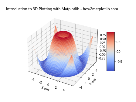
In this example, we’ve changed the color map to ‘coolwarm’. Matplotlib offers many other color maps like ‘viridis’, ‘plasma’, ‘inferno’, etc.
Adjusting View Angle
The view angle of a 3D plot can be adjusted to provide different perspectives of the data. Here’s how you can change the view angle:
import matplotlib.pyplot as plt
from mpl_toolkits.mplot3d import Axes3D
import numpy as np

fig = plt.figure()
ax = fig.add_subplot(111, projection='3d')

x = np.linspace(-5, 5, 50)
y = np.linspace(-5, 5, 50)
X, Y = np.meshgrid(x, y)
Z = np.sin(np.sqrt(X**2 + Y**2))

ax.plot_surface(X, Y, Z)
ax.set_xlabel('X-axis')
ax.set_ylabel('Y-axis')
ax.set_zlabel('Z-axis')
ax.set_title('Introduction to 3D Plotting with Matplotlib - how2matplotlib.com')

ax.view_init(elev=20, azim=45)

plt.show()
Output:
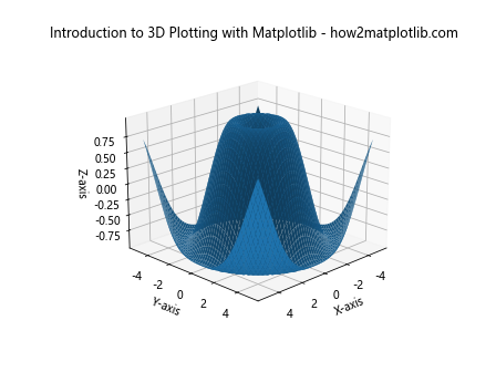
The view_init function allows you to set the elevation and azimuth angles of the view.
Adding a Colorbar
Colorbars can provide a reference for the mapping between colors and data values. Here’s how to add a colorbar to a 3D plot:
import matplotlib.pyplot as plt
from mpl_toolkits.mplot3d import Axes3D
import numpy as np

fig = plt.figure()
ax = fig.add_subplot(111, projection='3d')

x = np.linspace(-5, 5, 50)
y = np.linspace(-5, 5, 50)
X, Y = np.meshgrid(x, y)
Z = np.sin(np.sqrt(X**2 + Y**2))

surf = ax.plot_surface(X, Y, Z, cmap='viridis')
ax.set_xlabel('X-axis')
ax.set_ylabel('Y-axis')
ax.set_zlabel('Z-axis')
ax.set_title('Introduction to 3D Plotting with Matplotlib - how2matplotlib.com')

fig.colorbar(surf, shrink=0.5, aspect=5)

plt.show()
Output:
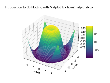
The colorbar function is used to add a colorbar to the plot. The shrink and aspect parameters control the size and shape of the colorbar.
Advanced 3D Plotting Techniques with Matplotlib
As you become more comfortable with basic 3D plotting in Matplotlib, you can explore more advanced techniques to create complex and informative visualizations. Let’s dive into some of these advanced techniques.
Combining Multiple 3D Plots
Sometimes, you may want to display multiple 3D plots side by side for comparison. Matplotlib allows you to create subplots in 3D. Here’s an example:
import matplotlib.pyplot as plt
from mpl_toolkits.mplot3d import Axes3D
import numpy as np

fig = plt.figure(figsize=(12, 5))

# First subplot
ax1 = fig.add_subplot(121, projection='3d')
x = np.linspace(-5, 5, 50)
y = np.linspace(-5, 5, 50)
X, Y = np.meshgrid(x, y)
Z1 = np.sin(np.sqrt(X**2 + Y**2))
ax1.plot_surface(X, Y, Z1, cmap='viridis')
ax1.set_title('Plot 1 - how2matplotlib.com')

# Second subplot
ax2 = fig.add_subplot(122, projection='3d')
Z2 = np.cos(np.sqrt(X**2 + Y**2))
ax2.plot_surface(X, Y, Z2, cmap='plasma')
ax2.set_title('Plot 2 - how2matplotlib.com')

plt.tight_layout()
plt.show()
Output:
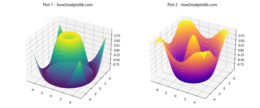
This example creates two 3D surface plots side by side, allowing for easy comparison of different functions or datasets.
3D Contour Plots
Contour plots can be extended to 3D, providing a different way to visualize 3D data. Here’s an example of a 3D contour plot:
import matplotlib.pyplot as plt
from mpl_toolkits.mplot3d import Axes3D
import numpy as np

fig = plt.figure()
ax = fig.add_subplot(111, projection='3d')

x = np.linspace(-5, 5, 50)
y = np.linspace(-5, 5, 50)
X, Y = np.meshgrid(x, y)
Z = np.sin(np.sqrt(X**2 + Y**2))

ax.contour3D(X, Y, Z, 50, cmap='viridis')
ax.set_xlabel('X-axis')
ax.set_ylabel('Y-axis')
ax.set_zlabel('Z-axis')
ax.set_title('Introduction to 3D Plotting with Matplotlib - how2matplotlib.com')

plt.show()
Output:
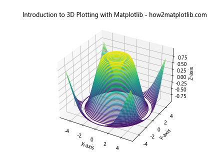
The contour3D function is used to create a 3D contour plot. The number 50 specifies the number of contour levels.
3D Bar Plots
Bar plots can also be extended to 3D, which can be useful for comparing multiple categories across different dimensions. Here’s an example:
import matplotlib.pyplot as plt
from mpl_toolkits.mplot3d import Axes3D
import numpy as np

fig = plt.figure()
ax = fig.add_subplot(111, projection='3d')

x = np.arange(5)
y = np.arange(5)
X, Y = np.meshgrid(x, y)
Z = np.random.rand(5, 5)

ax.bar3d(X.ravel(), Y.ravel(), np.zeros_like(Z.ravel()), 1, 1, Z.ravel())
ax.set_xlabel('X-axis')
ax.set_ylabel('Y-axis')
ax.set_zlabel('Z-axis')
ax.set_title('Introduction to 3D Plotting with Matplotlib - how2matplotlib.com')

plt.show()
Output:
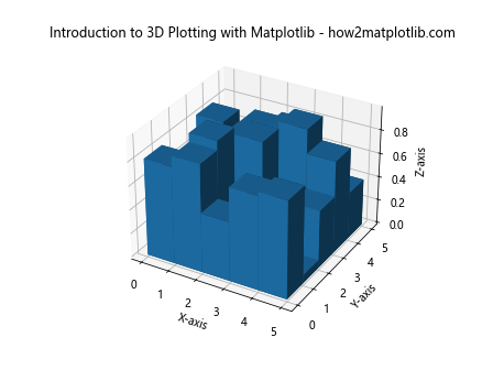
The bar3d function is used to create 3D bar plots. The first three arguments specify the x, y, and z coordinates of the bars’ bases, while the next three specify the width, depth, and height of the bars.
Handling Large Datasets in 3D Plotting with Matplotlib
When working with large datasets, 3D plotting can become computationally intensive. Matplotlib provides several techniques to handle large datasets efficiently. Let’s explore some of these techniques.
Downsampling Data
One way to handle large datasets is to downsample the data before plotting. Here’s an example:
import matplotlib.pyplot as plt
from mpl_toolkits.mplot3d import Axes3D
import numpy as np

fig = plt.figure()
ax = fig.add_subplot(111, projection='3d')

x = np.linspace(-5, 5, 1000)
y = np.linspace(-5, 5, 1000)
X, Y = np.meshgrid(x, y)
Z = np.sin(np.sqrt(X**2 + Y**2))

# Downsample the data
step = 10
ax.plot_surface(X[::step, ::step], Y[::step, ::step], Z[::step, ::step], cmap='viridis')

ax.set_xlabel('X-axis')
ax.set_ylabel('Y-axis')
ax.set_zlabel('Z-axis')
ax.set_title('Introduction to 3D Plotting with Matplotlib - how2matplotlib.com')

plt.show()
Output:
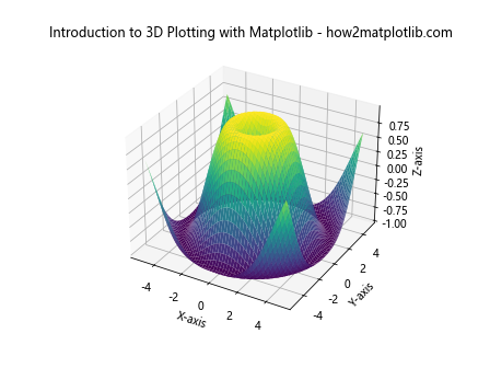
In this example, we use slicing with a step size to reduce the amount of data plotted. This can significantly improve performance when dealing with large datasets.
Using Scatter Plots for Large Datasets
For very large datasets, scatter plots can be more efficient than surface plots. Here’s an example:
import matplotlib.pyplot as plt
from mpl_toolkits.mplot3d import Axes3D
import numpy as np

fig = plt.figure()
ax = fig.add_subplot(111, projection='3d')

n = 100000
x = np.random.rand(n)
y = np.random.rand(n)
z = np.random.rand(n)

ax.scatter(x, y, z, c=z, cmap='viridis', s=1)
ax.set_xlabel('X-axis')
ax.set_ylabel('Y-axis')
ax.set_zlabel('Z-axis')
ax.set_title('Introduction to 3D Plotting with Matplotlib - how2matplotlib.com')

plt.show()
Output:
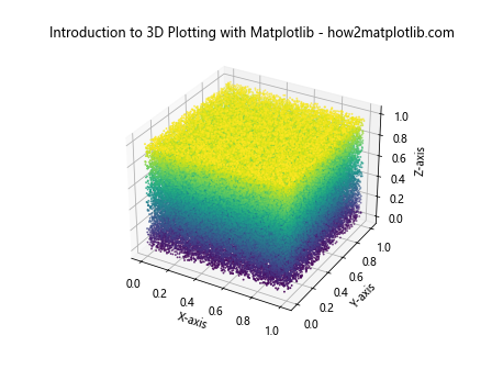
This example creates a scatter plot with 100,000 points. The small point size (s=1) helps to visualize the density of the data.
Animating 3D Plots with Matplotlib
Animation can add an extra dimension to your 3D plots, allowing you to visualize changes over time or different perspectives of your data. Let’s explore how to create animated 3D plots with Matplotlib.
Rotating 3D Plot Animation
One common animation is to rotate a 3D plot to show different angles. Here’s an example:
import matplotlib.pyplot as plt
from mpl_toolkits.mplot3d import Axes3D
import numpy as np
from matplotlib.animation import FuncAnimation

fig = plt.figure()
ax = fig.add_subplot(111, projection='3d')

x = np.linspace(-5, 5, 50)
y = np.linspace(-5, 5, 50)
X, Y = np.meshgrid(x, y)
Z = np.sin(np.sqrt(X**2 + Y**2))

surf = ax.plot_surface(X, Y, Z, cmap='viridis')

def animate(frame):
    ax.view_init(elev=10, azim=frame)
    return surf,

ani = FuncAnimation(fig, animate, frames=np.linspace(0, 360, 100), interval=50, blit=True)
ax.set_xlabel('X-axis')
ax.set_ylabel('Y-axis')
ax.set_zlabel('Z-axis')
ax.set_title('Introduction to 3D Plotting with Matplotlib - how2matplotlib.com')

plt.show()
Output:
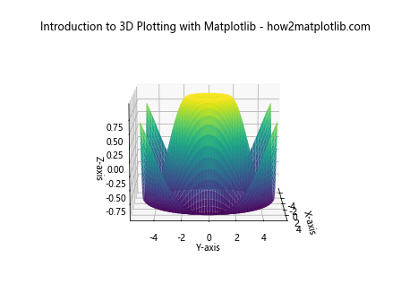
This animation rotates the 3D plot around its vertical axis, providing a 360-degree view of the surface.
Updating Data in 3D Animation
You can also create animations where the data itself changes over time. Here’s an example:
import matplotlib.pyplot as plt
from mpl_toolkits.mplot3d import Axes3D
import numpy as np
from matplotlib.animation import FuncAnimation

fig = plt.figure()
ax = fig.add_subplot(111, projection='3d')

x = np.linspace(-5, 5, 50)
y = np.linspace(-5, 5, 50)
X, Y = np.meshgrid(x, y)

def f(X, Y, t):
    return np.sin(np.sqrt(X**2 + Y**2) + t)

surf = ax.plot_surface(X, Y, f(X, Y, 0), cmap='viridis')

def animate(frame):
    ax.clear()
    surf = ax.plot_surface(X, Y, f(X, Y, frame), cmap='viridis')
    ax.set_xlabel('X-axis')
    ax.set_ylabel('Y-axis')
    ax.set_zlabel('Z-axis')
    ax.set_title('Introduction to 3D Plotting with Matplotlib - how2matplotlib.com')
    return surf,

ani = FuncAnimation(fig, animate, frames=np.linspace(0, 2*np.pi, 100), interval=50, blit=False)

plt.show()
Output:
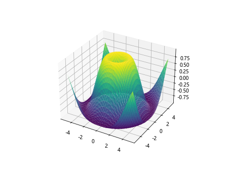
This animation updates the surface plot over time, creating a wave-like effect.
Best Practices for 3D Plotting with Matplotlib
When creating 3D plots with Matplotlib, there are several best practices to keep in mind to ensure your visualizations are effective and informative.
Choose the Right Type of Plot
Different types of 3D plots are suited for different kinds of data and purposes. For example:
- Use scatter plots for discrete data points in 3D space
- Use surface plots for continuous functions of two variables
- Use line plots for trajectories or paths in 3D space
- Use bar plots for comparing categorical data across multiple dimensions
Choose the plot type that best represents your data and communicates your message clearly.
Optimize for Readability
3D plots can sometimes be challenging to read. Here are some tips to improve readability:
- Use clear and contrasting colors
- Add gridlines to provide reference points
- Label axes clearly and use descriptive titles
- Adjust the view angle to best showcase your data
- Use transparency when dealing with overlapping elements
Here’s an example incorporating some of these practices:
import matplotlib.pyplot as plt
from mpl_toolkits.mplot3d import Axes3D
import numpy as np

fig = plt.figure(figsize=(10, 8))
ax = fig.add_subplot(111, projection='3d')

x = np.linspace(-5, 5, 50)
y = np.linspace(-5, 5, 50)
X, Y = np.meshgrid(x, y)
Z = np.sin(np.sqrt(X**2 + Y**2))

surf = ax.plot_surface(X, Y, Z, cmap='viridis', alpha=0.8)
ax.set_xlabel('X-axis', fontsize=12)
ax.set_ylabel('Y-axis', fontsize=12)
ax.set_zlabel('Z-axis', fontsize=12)
ax.set_title('Introduction to 3D Plotting with Matplotlib - how2matplotlib.com', fontsize=14)

ax.grid(True)
ax.view_init(elev=20, azim=45)
fig.colorbar(surf, shrink=0.5, aspect=5)

plt.show()
Output:
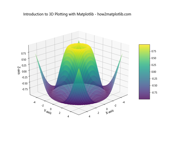
This example incorporates several best practices: it uses a clear color scheme, adds gridlines, labels axes clearly, adjusts the view angle, and includes a colorbar for reference.
Use Interactivity
While static 3D plots can be informative, interactive plots allow users to explore the data more deeply. Matplotlib can be used with interactive backends like Jupyter notebooks to create plots that users can rotate and zoom.
Here’s an example of how to enable interactive plotting in a Jupyter notebook:
%matplotlib notebook

import matplotlib.pyplot as plt
from mpl_toolkits.mplot3d import Axes3D
import numpy as np

fig = plt.figure()
ax = fig.add_subplot(111, projection='3d')

x = np.linspace(-5, 5, 50)
y = np.linspace(-5, 5, 50)
X, Y = np.meshgrid(x, y)
Z = np.sin(np.sqrt(X**2 + Y**2))

surf = ax.plot_surface(X, Y, Z, cmap='viridis')
ax.set_xlabel('X-axis')
ax.set_ylabel('Y-axis')
ax.set_zlabel('Z-axis')
ax.set_title('Introduction to 3D Plotting with Matplotlib - how2matplotlib.com')

plt.show()
When run in a Jupyter notebook, this will create an interactive 3D plot that users can manipulate.
Troubleshooting Common Issues in 3D Plotting with Matplotlib
Even with a solid understanding of 3D plotting techniques, you may encounter some common issues. Let’s address some of these and their solutions.
Issue: Plot Appears Flat or 2D
Sometimes, your 3D plot might appear flat or 2D-like. This is often due to the view angle or the scale of your data.
Solution:
- Adjust the view angle using
ax.view_init(elev, azim) - Ensure your data has significant variation in all three dimensions
- Adjust the aspect ratio of your plot
Here’s an example addressing this issue:
import matplotlib.pyplot as plt
from mpl_toolkits.mplot3d import Axes3D
import numpy as np

fig = plt.figure(figsize=(10, 8))
ax = fig.add_subplot(111, projection='3d')

x = np.linspace(-5, 5, 50)
y = np.linspace(-5, 5, 50)
X, Y = np.meshgrid(x, y)
Z = np.sin(np.sqrt(X**2 + Y**2))

surf = ax.plot_surface(X, Y, Z, cmap='viridis')
ax.set_xlabel('X-axis')
ax.set_ylabel('Y-axis')
ax.set_zlabel('Z-axis')
ax.set_title('Introduction to 3D Plotting with Matplotlib - how2matplotlib.com')

ax.view_init(elev=20, azim=45)
ax.set_box_aspect((np.ptp(X), np.ptp(Y), np.ptp(Z)))

plt.show()
Output:
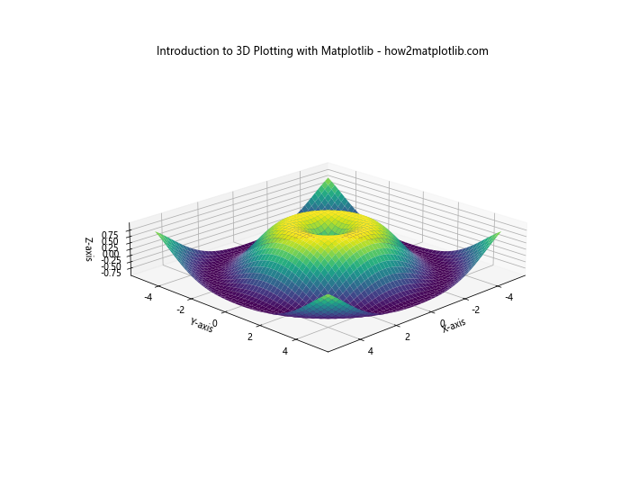
This example adjusts the view angle and sets the box aspect to ensure the plot appears properly three-dimensional.
Issue: Overlapping Labels or Tick Marks
In 3D plots, labels and tick marks can sometimes overlap, making them difficult to read.
Solution:
- Adjust the number of ticks using
ax.set_xticks(),ax.set_yticks(), andax.set_zticks() - Rotate labels using
ax.tick_params() - Adjust the figure size to provide more space
Here’s an example addressing this issue:
import matplotlib.pyplot as plt
from mpl_toolkits.mplot3d import Axes3D
import numpy as np

fig = plt.figure(figsize=(12, 9))
ax = fig.add_subplot(111, projection='3d')

x = np.linspace(-5, 5, 50)
y = np.linspace(-5, 5, 50)
X, Y = np.meshgrid(x, y)
Z = np.sin(np.sqrt(X**2 + Y**2))

surf = ax.plot_surface(X, Y, Z, cmap='viridis')
ax.set_xlabel('X-axis')
ax.set_ylabel('Y-axis')
ax.set_zlabel('Z-axis')
ax.set_title('Introduction to 3D Plotting with Matplotlib - how2matplotlib.com')

ax.set_xticks([-5, -2.5, 0, 2.5, 5])
ax.set_yticks([-5, -2.5, 0, 2.5, 5])
ax.set_zticks([-1, -0.5, 0, 0.5, 1])

ax.tick_params(axis='x', rotation=45)
ax.tick_params(axis='y', rotation=45)

plt.tight_layout()
plt.show()
Output:
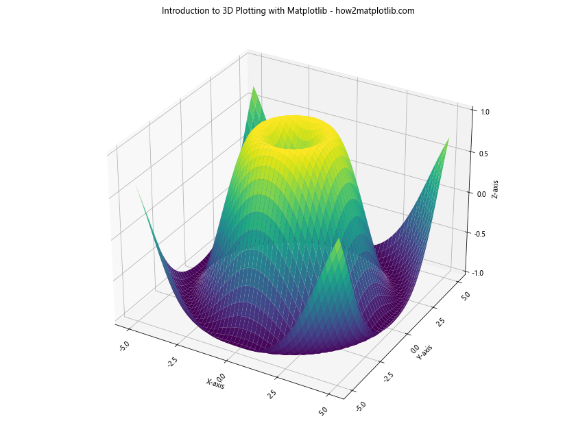
This example reduces the number of ticks, rotates the x and y labels, and adjusts the figure size to prevent overlapping.
Conclusion: Mastering 3D Plotting with Matplotlib
Throughout this comprehensive guide on Introduction to 3D Plotting with Matplotlib, we’ve explored a wide range of techniques and best practices for creating effective 3D visualizations. From basic plot types like scatter and surface plots to advanced techniques like animations and handling large datasets, Matplotlib provides a powerful toolkit for 3D data visualization.
Remember, the key to mastering 3D plotting with Matplotlib is practice and experimentation. Don’t be afraid to try different plot types, customize your visualizations, and push the boundaries of what’s possible. As you become more comfortable with these techniques, you’ll find that 3D plotting opens up new ways to explore and present your data.
Whether you’re visualizing scientific data, creating business presentations, or exploring personal projects, the skills you’ve learned in this introduction to 3D plotting with Matplotlib will serve you well. Keep experimenting, keep learning, and most importantly, keep visualizing!