How to Set Dataframe Column Value as X-axis Labels in Python Pandas
How to Set Dataframe Column Value as X-axis Labels in Python Pandas is a common task when working with data visualization in Python. This article will provide a detailed explanation of various methods and techniques to accomplish this task using Pandas and Matplotlib. We’ll cover everything from basic concepts to advanced techniques, ensuring you have a thorough understanding of how to set dataframe column values as x-axis labels.
Understanding the Basics of Dataframes and X-axis Labels
Before diving into the specifics of how to set dataframe column value as x-axis labels in Python Pandas, it’s essential to understand the fundamentals of dataframes and x-axis labels.
What is a Dataframe?
In Pandas, a dataframe is a two-dimensional labeled data structure with columns of potentially different types. It’s similar to a spreadsheet or a SQL table. Dataframes are the most commonly used Pandas object for data manipulation with integrated indexing.
What are X-axis Labels?
X-axis labels are the text or numeric values that appear along the horizontal axis of a plot. They provide context and meaning to the data points plotted on the graph. In the context of how to set dataframe column value as x-axis labels in Python Pandas, we’ll be using values from a specific column in our dataframe to label the x-axis.
Setting Up Your Environment
To get started with setting dataframe column value as x-axis labels in Python Pandas, you’ll need to set up your environment. Here’s a simple example of how to import the necessary libraries:
import pandas as pd
import matplotlib.pyplot as plt

# Create a sample dataframe
data = {
    'Date': ['2023-01-01', '2023-01-02', '2023-01-03', '2023-01-04', '2023-01-05'],
    'Value': [10, 15, 13, 17, 20]
}
df = pd.DataFrame(data)

print("Welcome to how2matplotlib.com!")
print(df)
In this example, we import Pandas and Matplotlib, create a sample dataframe, and print it. This sets the stage for our exploration of how to set dataframe column value as x-axis labels in Python Pandas.
Basic Method: Using plt.xticks()
One of the simplest methods to set dataframe column value as x-axis labels in Python Pandas is by using the plt.xticks() function. Here’s an example:
import pandas as pd
import matplotlib.pyplot as plt

# Create a sample dataframe
data = {
    'Date': ['2023-01-01', '2023-01-02', '2023-01-03', '2023-01-04', '2023-01-05'],
    'Value': [10, 15, 13, 17, 20]
}
df = pd.DataFrame(data)

# Create the plot
plt.figure(figsize=(10, 6))
plt.plot(df['Value'])

# Set x-axis labels
plt.xticks(range(len(df['Date'])), df['Date'], rotation=45)

plt.title('How to Set Dataframe Column Value as X-axis Labels - how2matplotlib.com')
plt.xlabel('Date')
plt.ylabel('Value')
plt.tight_layout()
plt.show()
Output:
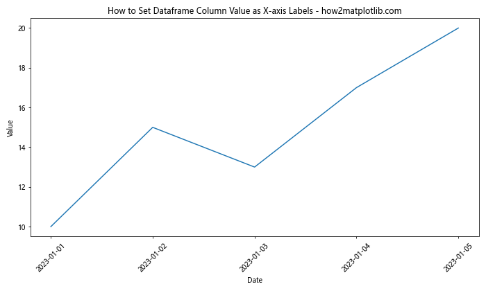
In this example, we use plt.xticks() to set the x-axis labels. The first argument specifies the positions of the ticks, and the second argument provides the labels. We use rotation=45 to angle the labels for better readability.
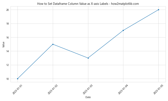
Using Pandas plot() Method
Another way to set dataframe column value as x-axis labels in Python Pandas is by using the built-in plot() method of Pandas. Here’s an example:
import pandas as pd
import matplotlib.pyplot as plt

# Create a sample dataframe
data = {
    'Date': ['2023-01-01', '2023-01-02', '2023-01-03', '2023-01-04', '2023-01-05'],
    'Value': [10, 15, 13, 17, 20]
}
df = pd.DataFrame(data)

# Set 'Date' as the index
df.set_index('Date', inplace=True)

# Create the plot
ax = df.plot(figsize=(10, 6), marker='o')

plt.title('How to Set Dataframe Column Value as X-axis Labels - how2matplotlib.com')
plt.xlabel('Date')
plt.ylabel('Value')
plt.xticks(rotation=45)
plt.tight_layout()
plt.show()
Output:
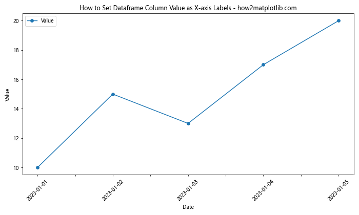
In this method, we set the ‘Date’ column as the index of the dataframe. When we use df.plot(), Pandas automatically uses the index as x-axis labels.
Advanced Techniques: Customizing X-axis Labels
Now that we’ve covered the basics of how to set dataframe column value as x-axis labels in Python Pandas, let’s explore some more advanced techniques for customizing these labels.
Using DatetimeIndex for Time Series Data
When working with time series data, it’s often beneficial to use a DatetimeIndex. This allows for more intuitive handling of dates and times. Here’s an example of how to set dataframe column value as x-axis labels using a DatetimeIndex:
import pandas as pd
import matplotlib.pyplot as plt

# Create a sample dataframe with a DatetimeIndex
dates = pd.date_range(start='2023-01-01', periods=5, freq='D')
data = {
    'Value': [10, 15, 13, 17, 20]
}
df = pd.DataFrame(data, index=dates)

# Create the plot
fig, ax = plt.subplots(figsize=(10, 6))
df.plot(ax=ax, marker='o')

plt.title('How to Set Dataframe Column Value as X-axis Labels - how2matplotlib.com')
plt.xlabel('Date')
plt.ylabel('Value')
plt.xticks(rotation=45)
plt.tight_layout()
plt.show()
Output:
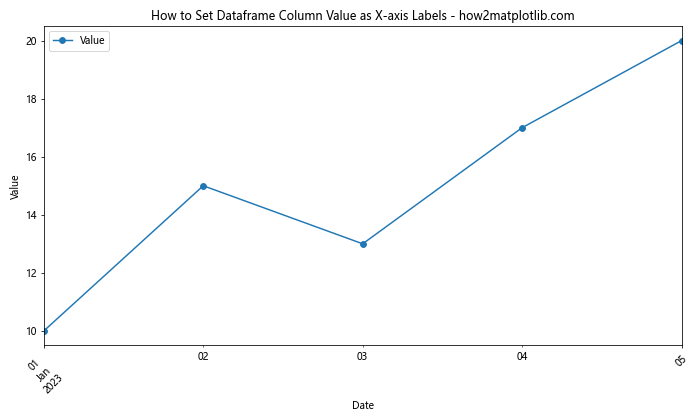
In this example, we create a DatetimeIndex using pd.date_range(). This automatically sets the x-axis labels to the dates in our index.
Customizing Label Frequency
When dealing with large datasets, you might want to customize the frequency of your x-axis labels. Here’s how you can do that:
import pandas as pd
import matplotlib.pyplot as plt

# Create a sample dataframe with a DatetimeIndex
dates = pd.date_range(start='2023-01-01', periods=30, freq='D')
data = {
    'Value': [i**2 for i in range(30)]
}
df = pd.DataFrame(data, index=dates)

# Create the plot
fig, ax = plt.subplots(figsize=(12, 6))
df.plot(ax=ax)

# Customize label frequency
ax.xaxis.set_major_locator(plt.MaxNLocator(5))

plt.title('How to Set Dataframe Column Value as X-axis Labels - how2matplotlib.com')
plt.xlabel('Date')
plt.ylabel('Value')
plt.xticks(rotation=45)
plt.tight_layout()
plt.show()
Output:
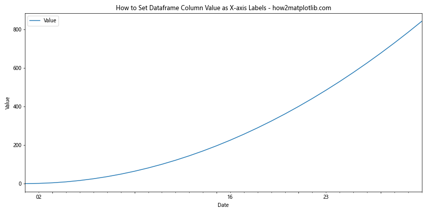
In this example, we use plt.MaxNLocator(5) to limit the number of x-axis labels to 5, regardless of the size of our dataset.
Handling Categorical Data
When setting dataframe column value as x-axis labels in Python Pandas, you might encounter categorical data. Here’s how to handle this scenario:
import pandas as pd
import matplotlib.pyplot as plt

# Create a sample dataframe with categorical data
data = {
    'Category': ['A', 'B', 'C', 'D', 'E'],
    'Value': [10, 15, 13, 17, 20]
}
df = pd.DataFrame(data)

# Create the plot
fig, ax = plt.subplots(figsize=(10, 6))
bars = ax.bar(df['Category'], df['Value'])

# Add value labels on top of each bar
for bar in bars:
    height = bar.get_height()
    ax.text(bar.get_x() + bar.get_width()/2., height,
            f'{height}',
            ha='center', va='bottom')

plt.title('How to Set Dataframe Column Value as X-axis Labels - how2matplotlib.com')
plt.xlabel('Category')
plt.ylabel('Value')
plt.tight_layout()
plt.show()
Output:
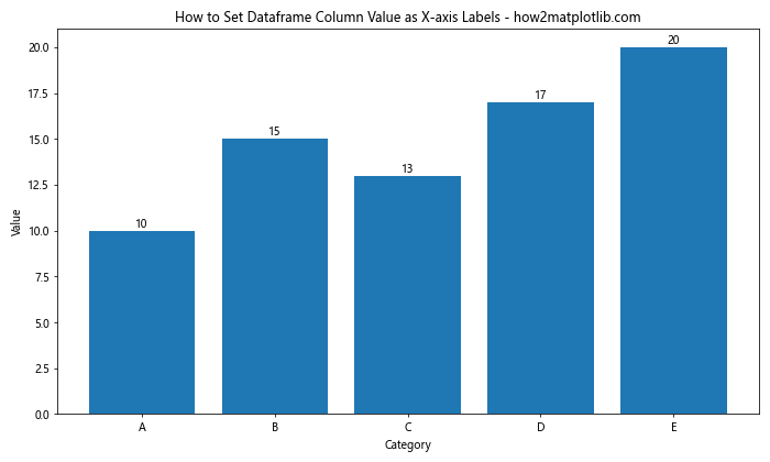
In this example, we create a bar plot using categorical data. The category names are automatically used as x-axis labels.
Multiple Series on the Same Plot
Sometimes, you might want to plot multiple series on the same graph. Here’s how to set dataframe column value as x-axis labels in this scenario:
import pandas as pd
import matplotlib.pyplot as plt

# Create a sample dataframe with multiple series
data = {
    'Date': ['2023-01-01', '2023-01-02', '2023-01-03', '2023-01-04', '2023-01-05'],
    'Series1': [10, 15, 13, 17, 20],
    'Series2': [5, 8, 11, 14, 18]
}
df = pd.DataFrame(data)

# Set 'Date' as the index
df.set_index('Date', inplace=True)

# Create the plot
ax = df.plot(figsize=(10, 6), marker='o')

plt.title('How to Set Dataframe Column Value as X-axis Labels - how2matplotlib.com')
plt.xlabel('Date')
plt.ylabel('Value')
plt.xticks(rotation=45)
plt.legend(title='Series')
plt.tight_layout()
plt.show()
Output:
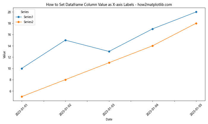
In this example, we plot two series on the same graph. The ‘Date’ column is used as the x-axis labels for both series.
Handling Missing Data
When setting dataframe column value as x-axis labels in Python Pandas, you might encounter missing data. Here’s how to handle this situation:
import pandas as pd
import matplotlib.pyplot as plt
import numpy as np

# Create a sample dataframe with missing data
data = {
    'Date': ['2023-01-01', '2023-01-02', '2023-01-03', '2023-01-04', '2023-01-05'],
    'Value': [10, np.nan, 13, 17, 20]
}
df = pd.DataFrame(data)

# Set 'Date' as the index
df.set_index('Date', inplace=True)

# Create the plot
ax = df.plot(figsize=(10, 6), marker='o')

plt.title('How to Set Dataframe Column Value as X-axis Labels - how2matplotlib.com')
plt.xlabel('Date')
plt.ylabel('Value')
plt.xticks(rotation=45)
plt.tight_layout()
plt.show()
Output:
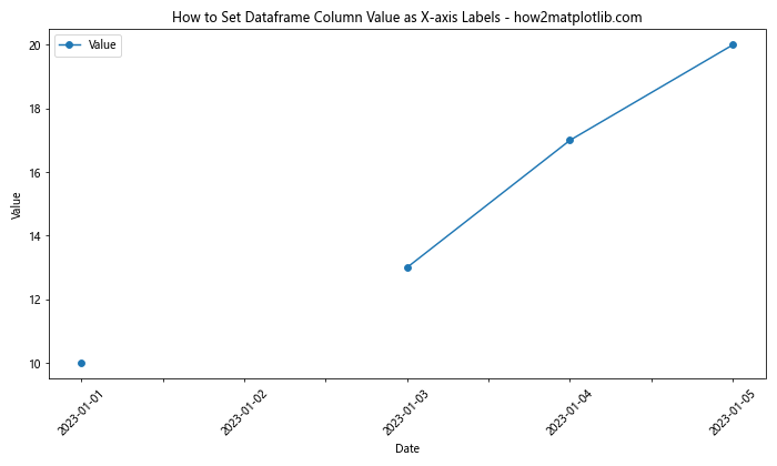
In this example, we have a NaN value in our data. Pandas automatically handles this by not plotting the missing value, but still including the corresponding x-axis label.
Using Seaborn for Enhanced Visualizations
While Matplotlib is powerful, Seaborn can provide more aesthetically pleasing visualizations with less code. Here’s how to set dataframe column value as x-axis labels using Seaborn:
import pandas as pd
import matplotlib.pyplot as plt
import seaborn as sns

# Create a sample dataframe
data = {
    'Date': ['2023-01-01', '2023-01-02', '2023-01-03', '2023-01-04', '2023-01-05'],
    'Value': [10, 15, 13, 17, 20]
}
df = pd.DataFrame(data)

# Set the style
sns.set_style("whitegrid")

# Create the plot
plt.figure(figsize=(10, 6))
sns.lineplot(x='Date', y='Value', data=df, marker='o')

plt.title('How to Set Dataframe Column Value as X-axis Labels - how2matplotlib.com')
plt.xlabel('Date')
plt.ylabel('Value')
plt.xticks(rotation=45)
plt.tight_layout()
plt.show()
Output:
In this example, Seaborn automatically uses the ‘Date’ column as x-axis labels and provides a more stylized plot.
Handling Long Labels
When setting dataframe column value as x-axis labels in Python Pandas, you might encounter long labels that overlap. Here’s how to handle this:
import pandas as pd
import matplotlib.pyplot as plt

# Create a sample dataframe with long labels
data = {
    'LongLabel': ['Very Long Label 1', 'Extremely Long Label 2', 'Incredibly Long Label 3', 'Unbelievably Long Label 4', 'Extraordinarily Long Label 5'],
    'Value': [10, 15, 13, 17, 20]
}
df = pd.DataFrame(data)

# Create the plot
plt.figure(figsize=(12, 6))
plt.bar(df['LongLabel'], df['Value'])

plt.title('How to Set Dataframe Column Value as X-axis Labels - how2matplotlib.com')
plt.xlabel('Category')
plt.ylabel('Value')
plt.xticks(rotation=90, ha='right')
plt.subplots_adjust(bottom=0.3)
plt.tight_layout()
plt.show()
Output:
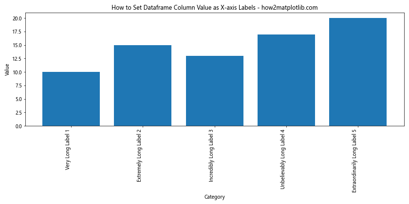
In this example, we rotate the labels 90 degrees and adjust the bottom margin of the plot to accommodate the long labels.
Using Logarithmic Scale
Sometimes, when setting dataframe column value as x-axis labels in Python Pandas, you might need to use a logarithmic scale. Here’s how to do that:
import pandas as pd
import matplotlib.pyplot as plt
import numpy as np

# Create a sample dataframe with exponential data
data = {
    'X': [1, 10, 100, 1000, 10000],
    'Y': [2, 4, 8, 16, 32]
}
df = pd.DataFrame(data)

# Create the plot
plt.figure(figsize=(10, 6))
plt.plot(df['X'], df['Y'], marker='o')

plt.title('How to Set Dataframe Column Value as X-axis Labels - how2matplotlib.com')
plt.xlabel('X (log scale)')
plt.ylabel('Y')
plt.xscale('log')
plt.xticks(df['X'], df['X'])
plt.grid(True)
plt.tight_layout()
plt.show()
Output:
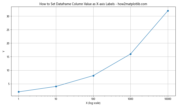
In this example, we use plt.xscale(‘log’) to set the x-axis to a logarithmic scale, which is useful for data that spans several orders of magnitude.
Handling Date Ranges
When setting dataframe column value as x-axis labels in Python Pandas for time series data, you might want to focus on a specific date range. Here’s how to do that:
import pandas as pd
import matplotlib.pyplot as plt

# Create a sample dataframe with a date range
dates = pd.date_range(start='2023-01-01', end='2023-12-31', freq='D')
data = {
    'Value': [i**2 for i in range(len(dates))]
}
df = pd.DataFrame(data, index=dates)

# Create the plot
fig, ax = plt.subplots(figsize=(12, 6))
df.plot(ax=ax)

# Set date range
start_date = '2023-06-01'
end_date = '2023-08-31'
ax.set_xlim([start_date, end_date])

plt.title('How to Set Dataframe Column Value as X-axis Labels - how2matplotlib.com')
plt.xlabel('Date')
plt.ylabel('Value')
plt.xticks(rotation=45)
plt.tight_layout()
plt.show()
Output:
In this example, we use ax.set_xlim() to focus on a specific date range, even though our dataframe contains data for the entire year.
Using Subplots
When you need to compare multiple datasets, using subplots can be helpful. Here’s how to set dataframe column value as x-axis labels in Python Pandas when using subplots:
import pandas as pd
import matplotlib.pyplot as plt

# Create sample dataframes
data1 = {
    'Date': ['2023-01-01', '2023-01-02', '2023-01-03', '2023-01-04', '2023-01-05'],
    'Value': [10, 15, 13, 17, 20]
}
df1 = pd.DataFrame(data1)

data2 = {
    'Date': ['2023-01-01', '2023-01-02', '2023-01-03', '2023-01-04', '2023-01-05'],
    'Value': [5, 8, 11, 14, 18]
}
df2 = pd.DataFrame(data2)

# Create subplots
fig, (ax1, ax2) = plt.subplots(2, 1, figsize=(10, 10))

# Plot on first subplot
df1.plot(x='Date', y='Value', ax=ax1, marker='o')
ax1.set_title('Dataset 1 - how2matplotlib.com')
ax1.set_xlabel('Date')
ax1.set_ylabel('Value')
ax1.tick_params(axis='x', rotation=45)

# Plot on second subplot
df2.plot(x='Date', y='Value', ax=ax2, marker='o', color='red')
ax2.set_title('Dataset 2 - how2matplotlib.com')
ax2.set_xlabel('Date')
ax2.set_ylabel('Value')
ax2.tick_params(axis='x', rotation=45)

plt.tight_layout()
plt.show()
Output:
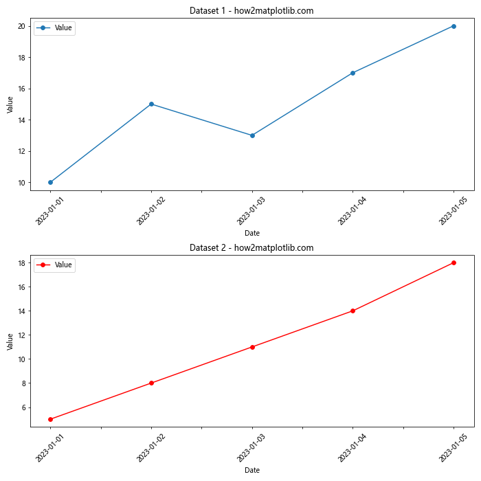
In this example, we create two subplots and plot different datasets on each. The x-axis labels are set independently for each subplot.
Handling Non-Numeric X-axis Values
Sometimes, when setting dataframe column value as x-axis labels in Python Pandas, you might encounter non-numeric values that aren’t dates. Here’s how to handle this:
import pandas as pd
import matplotlib.pyplot as plt

# Create a sample dataframe with non-numeric x-axis values
data = {
    'Country': ['USA', 'China', 'India', 'Brazil', 'Russia'],
    'Population': [331, 1439, 1380, 212, 146]
}
df = pd.DataFrame(data)

# Create the plot
plt.figure(figsize=(10, 6))
plt.bar(df['Country'], df['Population'])

plt.title('Population by Country - how2matplotlib.com')
plt.xlabel('Country')
plt.ylabel('Population (millions)')
plt.tight_layout()
plt.show()
Output:
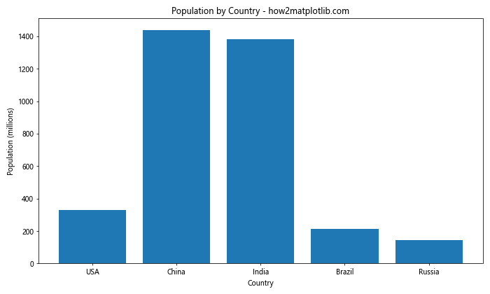
In this example, we use non-numeric country names as x-axis labels. Matplotlib automatically handles this by treating these labels as categorical data.
Using Color-Coded X-axis Labels
To make your x-axis labels more informative when setting dataframe column value as x-axis labels in Python Pandas, you can color-code them. Here’s an example:
import pandas as pd
import matplotlib.pyplot as plt

# Create a sample dataframe
data = {
    'Month': ['Jan', 'Feb', 'Mar', 'Apr', 'May'],
    'Temperature': [0, 5, 10, 15, 20],
    'Season': ['Winter', 'Winter', 'Spring', 'Spring', 'Spring']
}
df = pd.DataFrame(data)

# Create the plot
fig, ax = plt.subplots(figsize=(10, 6))
df.plot(x='Month', y='Temperature', ax=ax, marker='o')

# Color-code x-axis labels
colors = ['blue' if season == 'Winter' else 'green' for season in df['Season']]
for ticklabel, tickcolor in zip(ax.get_xticklabels(), colors):
    ticklabel.set_color(tickcolor)

plt.title('Temperature by Month - how2matplotlib.com')
plt.xlabel('Month')
plt.ylabel('Temperature (°C)')
plt.tight_layout()
plt.show()
Output:
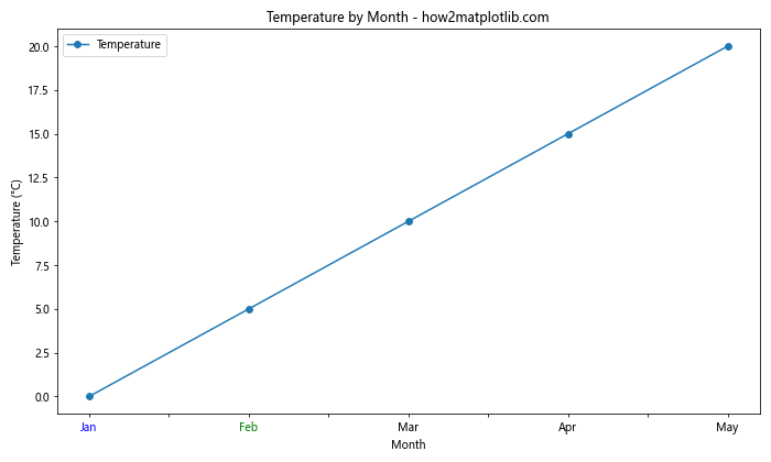
In this example, we color the x-axis labels based on the season, providing additional information at a glance.
Handling Overlapping Labels with Staggering
When you have many x-axis labels, they might overlap. One solution is to stagger them. Here’s how to do this when setting dataframe column value as x-axis labels in Python Pandas:
import pandas as pd
import matplotlib.pyplot as plt

# Create a sample dataframe with many labels
data = {
    'Date': pd.date_range(start='2023-01-01', periods=20, freq='D'),
    'Value': range(20)
}
df = pd.DataFrame(data)

# Create the plot
fig, ax = plt.subplots(figsize=(12, 6))
df.plot(x='Date', y='Value', ax=ax, marker='o')

# Stagger x-axis labels
for idx, label in enumerate(ax.xaxis.get_ticklabels()):
    if idx % 2 == 0:
        label.set_y(label.get_position()[1] - 0.05)

plt.title('Data Over Time - how2matplotlib.com')
plt.xlabel('Date')
plt.ylabel('Value')
plt.xticks(rotation=45)
plt.tight_layout()
plt.show()
Output:
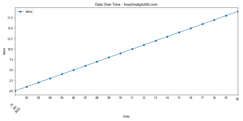
In this example, we lower every other label to create a staggered effect, reducing overlap.
Using Custom Tick Formatters
For more complex label formatting when setting dataframe column value as x-axis labels in Python Pandas, you can use custom tick formatters. Here’s an example:
import pandas as pd
import matplotlib.pyplot as plt
import matplotlib.ticker as ticker

# Create a sample dataframe
data = {
    'Date': pd.date_range(start='2023-01-01', periods=5, freq='D'),
    'Value': [10, 15, 13, 17, 20]
}
df = pd.DataFrame(data)

# Create the plot
fig, ax = plt.subplots(figsize=(10, 6))
df.plot(x='Date', y='Value', ax=ax, marker='o')

# Define custom formatter
def date_formatter(x, pos):
    date = pd.to_datetime(x)
    return date.strftime('%b %d\n%Y')

# Apply custom formatter
ax.xaxis.set_major_formatter(ticker.FuncFormatter(date_formatter))

plt.title('Data Over Time - how2matplotlib.com')
plt.xlabel('Date')
plt.ylabel('Value')
plt.tight_layout()
plt.show()
Output:
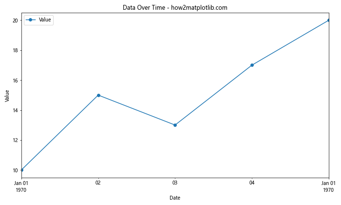
In this example, we use a custom formatter to display the date in a specific format, including a line break.
Conclusion
Setting dataframe column value as x-axis labels in Python Pandas is a crucial skill for data visualization. Throughout this article, we’ve explored various methods and techniques to accomplish this task, from basic plotting to advanced customization.
We’ve covered how to handle different types of data, including time series and categorical data. We’ve also looked at ways to deal with common issues like overlapping labels and long text. Additionally, we’ve explored how to enhance your plots with color-coding and custom formatting.
Remember, the key to effective data visualization is not just accurately representing your data, but also making it easily understandable to your audience. By mastering these techniques for setting dataframe column value as x-axis labels in Python Pandas, you’ll be able to create clear, informative, and visually appealing plots.