How to Plot Multiple DataFrames in Subplots in Python
How to plot multiple DataFrames in subplots in Python is an essential skill for data visualization enthusiasts and professionals alike. This comprehensive guide will walk you through the process of creating subplots with multiple DataFrames using Matplotlib, one of the most popular plotting libraries in Python. We’ll cover various techniques, customization options, and best practices to help you create informative and visually appealing plots.
Understanding the Basics of Plotting Multiple DataFrames in Subplots
Before diving into the specifics of how to plot multiple DataFrames in subplots, it’s crucial to understand the fundamental concepts. Subplots allow you to create multiple plots within a single figure, making it easier to compare and analyze different datasets side by side. When working with DataFrames, you can extract the necessary data and use Matplotlib’s subplot functionality to create a grid of plots.
Let’s start with a simple example of how to plot multiple DataFrames in subplots:
import matplotlib.pyplot as plt
import pandas as pd
import numpy as np

# Create sample DataFrames
df1 = pd.DataFrame({'x': np.arange(10), 'y': np.random.rand(10)})
df2 = pd.DataFrame({'x': np.arange(10), 'y': np.random.rand(10)})

# Create subplots
fig, (ax1, ax2) = plt.subplots(1, 2, figsize=(10, 4))

# Plot DataFrame 1
ax1.plot(df1['x'], df1['y'])
ax1.set_title('DataFrame 1 - how2matplotlib.com')

# Plot DataFrame 2
ax2.plot(df2['x'], df2['y'])
ax2.set_title('DataFrame 2 - how2matplotlib.com')

plt.tight_layout()
plt.show()
Output:
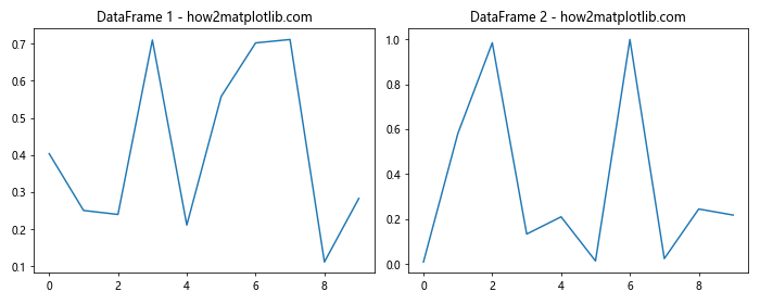
In this example, we create two sample DataFrames and plot them side by side using subplots. The plt.subplots() function creates a figure and a tuple of axes objects, which we can use to plot our data.
Creating a Grid of Subplots for Multiple DataFrames
When working with multiple DataFrames, you may want to create a grid of subplots to display your data. Matplotlib provides flexible options for creating subplot grids. Here’s an example of how to plot multiple DataFrames in a 2×2 grid of subplots:
import matplotlib.pyplot as plt
import pandas as pd
import numpy as np

# Create sample DataFrames
df1 = pd.DataFrame({'x': np.arange(10), 'y': np.random.rand(10)})
df2 = pd.DataFrame({'x': np.arange(10), 'y': np.random.rand(10)})
df3 = pd.DataFrame({'x': np.arange(10), 'y': np.random.rand(10)})
df4 = pd.DataFrame({'x': np.arange(10), 'y': np.random.rand(10)})

# Create a 2x2 grid of subplots
fig, axes = plt.subplots(2, 2, figsize=(12, 8))

# Plot DataFrames
axes[0, 0].plot(df1['x'], df1['y'])
axes[0, 0].set_title('DataFrame 1 - how2matplotlib.com')

axes[0, 1].plot(df2['x'], df2['y'])
axes[0, 1].set_title('DataFrame 2 - how2matplotlib.com')

axes[1, 0].plot(df3['x'], df3['y'])
axes[1, 0].set_title('DataFrame 3 - how2matplotlib.com')

axes[1, 1].plot(df4['x'], df4['y'])
axes[1, 1].set_title('DataFrame 4 - how2matplotlib.com')

plt.tight_layout()
plt.show()
Output:
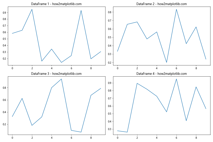
This example demonstrates how to plot multiple DataFrames in a 2×2 grid of subplots. The axes variable is now a 2D array, allowing you to access individual subplots using row and column indices.
Customizing Subplot Layouts for Multiple DataFrames
When plotting multiple DataFrames in subplots, you may want to customize the layout to better suit your data. Matplotlib offers various options for adjusting subplot arrangements. Let’s explore how to create a custom layout:
import matplotlib.pyplot as plt
import pandas as pd
import numpy as np

# Create sample DataFrames
df1 = pd.DataFrame({'x': np.arange(10), 'y': np.random.rand(10)})
df2 = pd.DataFrame({'x': np.arange(10), 'y': np.random.rand(10)})
df3 = pd.DataFrame({'x': np.arange(10), 'y': np.random.rand(10)})

# Create a custom subplot layout
fig = plt.figure(figsize=(12, 8))

ax1 = plt.subplot2grid((3, 3), (0, 0), colspan=2)
ax2 = plt.subplot2grid((3, 3), (1, 0), colspan=2)
ax3 = plt.subplot2grid((3, 3), (0, 2), rowspan=3)

# Plot DataFrames
ax1.plot(df1['x'], df1['y'])
ax1.set_title('DataFrame 1 - how2matplotlib.com')

ax2.plot(df2['x'], df2['y'])
ax2.set_title('DataFrame 2 - how2matplotlib.com')

ax3.plot(df3['x'], df3['y'])
ax3.set_title('DataFrame 3 - how2matplotlib.com')

plt.tight_layout()
plt.show()
Output:
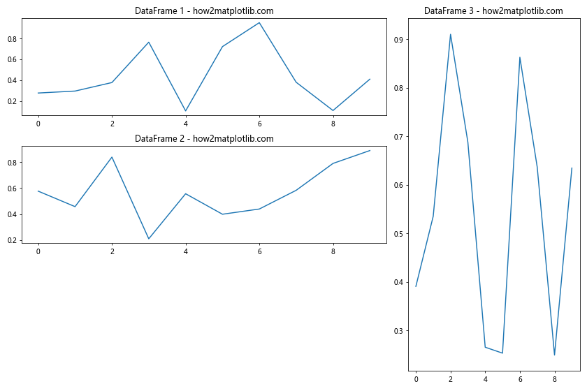
In this example, we use plt.subplot2grid() to create a custom layout for our subplots. This allows us to specify the position and size of each subplot individually, giving you more control over the arrangement of your plots.
Sharing Axes When Plotting Multiple DataFrames in Subplots
When plotting multiple DataFrames in subplots, you may want to share axes between plots to facilitate comparison. Matplotlib provides options for sharing x-axes, y-axes, or both. Here’s an example of how to plot multiple DataFrames with shared axes:
import matplotlib.pyplot as plt
import pandas as pd
import numpy as np

# Create sample DataFrames
df1 = pd.DataFrame({'x': np.arange(10), 'y': np.random.rand(10)})
df2 = pd.DataFrame({'x': np.arange(10), 'y': np.random.rand(10)})
df3 = pd.DataFrame({'x': np.arange(10), 'y': np.random.rand(10)})

# Create subplots with shared axes
fig, (ax1, ax2, ax3) = plt.subplots(3, 1, figsize=(8, 10), sharex=True, sharey=True)

# Plot DataFrames
ax1.plot(df1['x'], df1['y'])
ax1.set_title('DataFrame 1 - how2matplotlib.com')

ax2.plot(df2['x'], df2['y'])
ax2.set_title('DataFrame 2 - how2matplotlib.com')

ax3.plot(df3['x'], df3['y'])
ax3.set_title('DataFrame 3 - how2matplotlib.com')

plt.tight_layout()
plt.show()
Output:
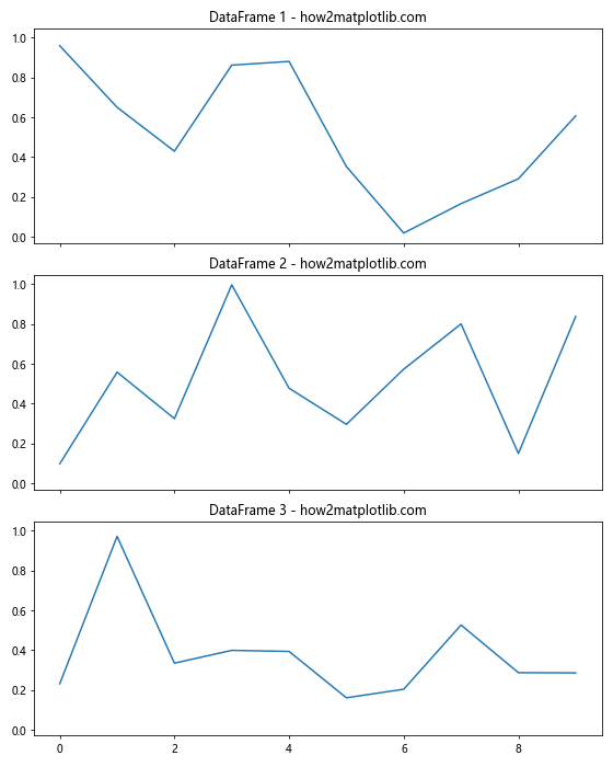
In this example, we use the sharex and sharey parameters in plt.subplots() to create subplots with shared x and y axes. This ensures that all subplots have the same scale, making it easier to compare the data across different DataFrames.
Adding Legends to Subplots with Multiple DataFrames
When plotting multiple DataFrames in subplots, it’s often helpful to include legends to identify different data series. Here’s an example of how to add legends to subplots:
import matplotlib.pyplot as plt
import pandas as pd
import numpy as np

# Create sample DataFrames
df1 = pd.DataFrame({'x': np.arange(10), 'y1': np.random.rand(10), 'y2': np.random.rand(10)})
df2 = pd.DataFrame({'x': np.arange(10), 'y1': np.random.rand(10), 'y2': np.random.rand(10)})

# Create subplots
fig, (ax1, ax2) = plt.subplots(1, 2, figsize=(12, 5))

# Plot DataFrame 1
ax1.plot(df1['x'], df1['y1'], label='Series 1')
ax1.plot(df1['x'], df1['y2'], label='Series 2')
ax1.set_title('DataFrame 1 - how2matplotlib.com')
ax1.legend()

# Plot DataFrame 2
ax2.plot(df2['x'], df2['y1'], label='Series 1')
ax2.plot(df2['x'], df2['y2'], label='Series 2')
ax2.set_title('DataFrame 2 - how2matplotlib.com')
ax2.legend()

plt.tight_layout()
plt.show()
Output:
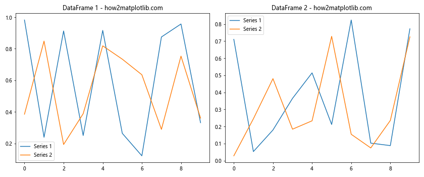
In this example, we plot multiple series from each DataFrame and add legends to each subplot using the legend() method. This helps viewers identify different data series within each plot.
Customizing Colors and Styles for Multiple DataFrame Plots
When plotting multiple DataFrames in subplots, you may want to customize the colors and styles of your plots to make them more visually appealing and easier to distinguish. Here’s an example of how to customize colors and styles:
import matplotlib.pyplot as plt
import pandas as pd
import numpy as np

# Create sample DataFrames
df1 = pd.DataFrame({'x': np.arange(10), 'y': np.random.rand(10)})
df2 = pd.DataFrame({'x': np.arange(10), 'y': np.random.rand(10)})
df3 = pd.DataFrame({'x': np.arange(10), 'y': np.random.rand(10)})

# Create subplots
fig, (ax1, ax2, ax3) = plt.subplots(1, 3, figsize=(15, 5))

# Plot DataFrames with custom colors and styles
ax1.plot(df1['x'], df1['y'], color='#FF5733', linestyle='--', marker='o')
ax1.set_title('DataFrame 1 - how2matplotlib.com', color='#FF5733')

ax2.plot(df2['x'], df2['y'], color='#33FF57', linestyle='-.', marker='s')
ax2.set_title('DataFrame 2 - how2matplotlib.com', color='#33FF57')

ax3.plot(df3['x'], df3['y'], color='#3357FF', linestyle=':', marker='^')
ax3.set_title('DataFrame 3 - how2matplotlib.com', color='#3357FF')

plt.tight_layout()
plt.show()
Output:
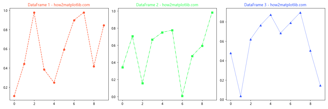
In this example, we customize the color, linestyle, and marker for each plot. We also set the title color to match the plot color, creating a cohesive visual theme for each subplot.
Adding Annotations to Subplots with Multiple DataFrames
Annotations can provide additional context and highlight important points in your plots. When plotting multiple DataFrames in subplots, you can add annotations to each subplot individually. Here’s an example:
import matplotlib.pyplot as plt
import pandas as pd
import numpy as np

# Create sample DataFrames
df1 = pd.DataFrame({'x': np.arange(10), 'y': np.random.rand(10)})
df2 = pd.DataFrame({'x': np.arange(10), 'y': np.random.rand(10)})

# Create subplots
fig, (ax1, ax2) = plt.subplots(1, 2, figsize=(12, 5))

# Plot DataFrame 1 and add annotation
ax1.plot(df1['x'], df1['y'])
ax1.set_title('DataFrame 1 - how2matplotlib.com')
ax1.annotate('Important point', xy=(5, df1['y'][5]), xytext=(6, 0.8),
             arrowprops=dict(facecolor='black', shrink=0.05))

# Plot DataFrame 2 and add annotation
ax2.plot(df2['x'], df2['y'])
ax2.set_title('DataFrame 2 - how2matplotlib.com')
ax2.annotate('Peak value', xy=(df2['y'].idxmax(), df2['y'].max()), xytext=(5, 0.9),
             arrowprops=dict(facecolor='red', shrink=0.05))

plt.tight_layout()
plt.show()
Output:
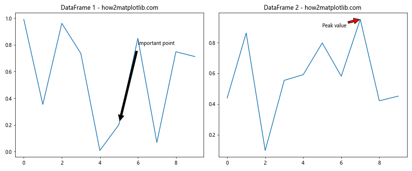
In this example, we add annotations to each subplot to highlight specific points of interest. The annotate() method allows you to add text and arrows to your plots, providing additional context for your data.
Creating Subplots with Different Plot Types for Multiple DataFrames
When working with multiple DataFrames, you may want to use different plot types to visualize your data effectively. Matplotlib allows you to create subplots with various chart types. Here’s an example of how to plot multiple DataFrames using different plot types:
import matplotlib.pyplot as plt
import pandas as pd
import numpy as np

# Create sample DataFrames
df1 = pd.DataFrame({'x': np.arange(10), 'y': np.random.rand(10)})
df2 = pd.DataFrame({'categories': ['A', 'B', 'C', 'D'], 'values': np.random.randint(1, 10, 4)})
df3 = pd.DataFrame({'x': np.random.randn(1000), 'y': np.random.randn(1000)})

# Create subplots
fig, (ax1, ax2, ax3) = plt.subplots(1, 3, figsize=(15, 5))

# Line plot for DataFrame 1
ax1.plot(df1['x'], df1['y'])
ax1.set_title('Line Plot - how2matplotlib.com')

# Bar plot for DataFrame 2
ax2.bar(df2['categories'], df2['values'])
ax2.set_title('Bar Plot - how2matplotlib.com')

# Scatter plot for DataFrame 3
ax3.scatter(df3['x'], df3['y'], alpha=0.5)
ax3.set_title('Scatter Plot - how2matplotlib.com')

plt.tight_layout()
plt.show()
Output:
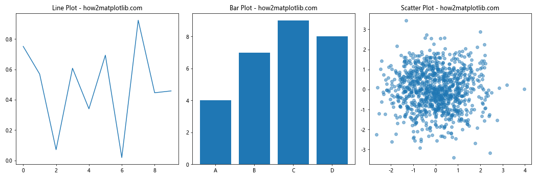
In this example, we create three subplots with different chart types: a line plot, a bar plot, and a scatter plot. This demonstrates how you can use various plot types to visualize different aspects of your data when working with multiple DataFrames.
Adjusting Subplot Spacing and Margins for Multiple DataFrame Plots
When plotting multiple DataFrames in subplots, you may need to adjust the spacing and margins between subplots to improve the overall layout. Matplotlib provides several methods to fine-tune the arrangement of your subplots. Here’s an example:
import matplotlib.pyplot as plt
import pandas as pd
import numpy as np

# Create sample DataFrames
df1 = pd.DataFrame({'x': np.arange(10), 'y': np.random.rand(10)})
df2 = pd.DataFrame({'x': np.arange(10), 'y': np.random.rand(10)})
df3 = pd.DataFrame({'x': np.arange(10), 'y': np.random.rand(10)})
df4 = pd.DataFrame({'x': np.arange(10), 'y': np.random.rand(10)})

# Create subplots
fig, axes = plt.subplots(2, 2, figsize=(12, 10))

# Plot DataFrames
axes[0, 0].plot(df1['x'], df1['y'])
axes[0, 0].set_title('DataFrame 1 - how2matplotlib.com')

axes[0, 1].plot(df2['x'], df2'y'])
axes[0, 1].set_title('DataFrame 2 - how2matplotlib.com')

axes[1, 0].plot(df3['x'], df3['y'])
axes[1, 0].set_title('DataFrame 3 - how2matplotlib.com')

axes[1, 1].plot(df4['x'], df4['y'])
axes[1, 1].set_title('DataFrame 4 - how2matplotlib.com')

# Adjust spacing between subplots
plt.tight_layout(pad=3.0, w_pad=2.0, h_pad=2.0)

# Adjust overall figure margins
plt.subplots_adjust(top=0.95, bottom=0.05, left=0.05, right=0.95)

plt.show()
In this example, we use plt.tight_layout() to automatically adjust the spacing between subplots. The pad, w_pad, and h_pad parameters allow you to fine-tune the padding around and between subplots. Additionally, we use plt.subplots_adjust() to modify the overall figure margins.
Creating Subplots with Different Sizes for Multiple DataFrames
When plotting multiple DataFrames, you might want to emphasize certain plots by giving them more space. Matplotlib allows you to create subplots with different sizes using gridspec. Here’s an example of how to plot multiple DataFrames in subplots with varying sizes:
import matplotlib.pyplot as plt
import matplotlib.gridspec as gridspec
import pandas as pd
import numpy as np

# Create sample DataFrames
df1 = pd.DataFrame({'x': np.arange(10), 'y': np.random.rand(10)})
df2 = pd.DataFrame({'x': np.arange(10), 'y': np.random.rand(10)})
df3 = pd.DataFrame({'x': np.arange(10), 'y': np.random.rand(10)})

# Create figure and gridspec
fig = plt.figure(figsize=(12, 8))
gs = gridspec.GridSpec(2, 2)

# Create subplots with different sizes
ax1 = fig.add_subplot(gs[0, 0])
ax2 = fig.add_subplot(gs[0, 1])
ax3 = fig.add_subplot(gs[1, :])

# Plot DataFrames
ax1.plot(df1['x'], df1['y'])
ax1.set_title('DataFrame 1 - how2matplotlib.com')

ax2.plot(df2['x'], df2['y'])
ax2.set_title('DataFrame 2 - how2matplotlib.com')

ax3.plot(df3['x'], df3['y'])
ax3.set_title('DataFrame 3 - how2matplotlib.com')

plt.tight_layout()
plt.show()
Output:
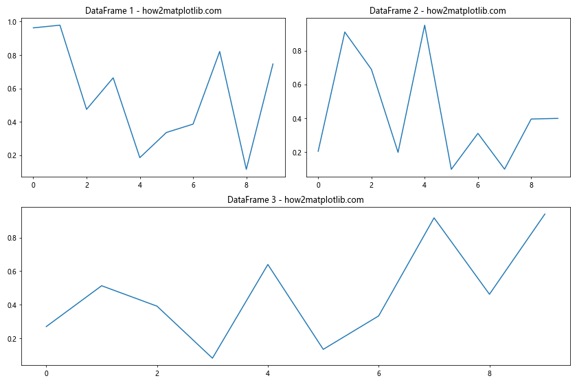
In this example, we use gridspec to create a custom grid layout for our subplots. The third subplot spans the entire bottom row, giving it more space compared to the other two subplots.
Adding a Common Colorbar for Multiple DataFrame Plots
When plotting multiple DataFrames that share a common color scale, it can be useful to add a single colorbar that applies to all subplots. Here’s an example of how to create subplots with a shared colorbar:
import matplotlib.pyplot as plt
import pandas as pd
import numpy as np

# Create sample DataFrames
df1 = pd.DataFrame(np.random.rand(10, 10))
df2 = pd.DataFrame(np.random.rand(10, 10))

# Create subplots
fig, (ax1, ax2) = plt.subplots(1, 2, figsize=(12, 5))

# Plot DataFrames
im1 = ax1.imshow(df1, cmap='viridis')
ax1.set_title('DataFrame 1 - how2matplotlib.com')

im2 = ax2.imshow(df2, cmap='viridis')
ax2.set_title('DataFrame 2 - how2matplotlib.com')

# Add colorbar
cbar = fig.colorbar(im1, ax=[ax1, ax2], orientation='vertical', fraction=0.05)
cbar.set_label('Value')

plt.tight_layout()
plt.show()
Output:
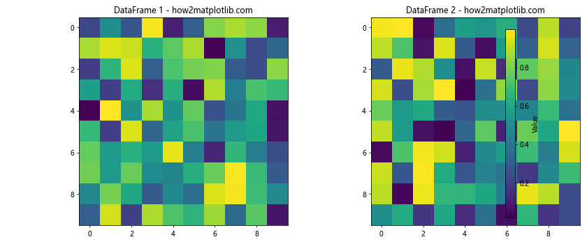
In this example, we create two heatmap plots using imshow() for our DataFrames. We then add a single colorbar that applies to both subplots using fig.colorbar().
Creating Subplots with Multiple Y-axes for Different DataFrames
When plotting multiple DataFrames with different scales, it can be helpful to use multiple y-axes to display the data clearly. Here’s an example of how to create subplots with multiple y-axes:
import matplotlib.pyplot as plt
import pandas as pd
import numpy as np

# Create sample DataFrames
df1 = pd.DataFrame({'x': np.arange(10), 'y1': np.random.rand(10) * 100})
df2 = pd.DataFrame({'x': np.arange(10), 'y2': np.random.rand(10)})

# Create subplot with two y-axes
fig, ax1 = plt.subplots(figsize=(10, 6))

# Plot DataFrame 1 on the primary y-axis
color = 'tab:blue'
ax1.set_xlabel('X-axis')
ax1.set_ylabel('Y1-axis', color=color)
ax1.plot(df1['x'], df1['y1'], color=color)
ax1.tick_params(axis='y', labelcolor=color)

# Create secondary y-axis and plot DataFrame 2
ax2 = ax1.twinx()
color = 'tab:orange'
ax2.set_ylabel('Y2-axis', color=color)
ax2.plot(df2['x'], df2['y2'], color=color)
ax2.tick_params(axis='y', labelcolor=color)

plt.title('Multiple Y-axes Plot - how2matplotlib.com')
plt.tight_layout()
plt.show()
Output:
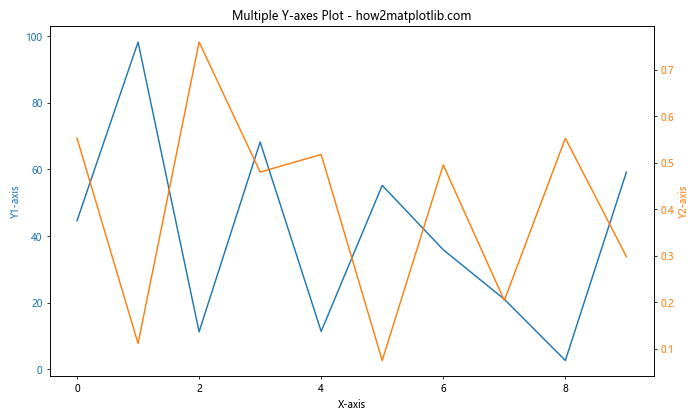
In this example, we create a subplot with two y-axes using the twinx() method. This allows us to plot two DataFrames with different scales on the same subplot, making it easier to compare trends between datasets.
Creating Animated Subplots for Multiple DataFrames
When working with time-series data in multiple DataFrames, you might want to create animated subplots to visualize changes over time. Here’s an example of how to create animated subplots for multiple DataFrames:
import matplotlib.pyplot as plt
import matplotlib.animation as animation
import pandas as pd
import numpy as np

# Create sample time-series DataFrames
dates = pd.date_range(start='2023-01-01', periods=100, freq='D')
df1 = pd.DataFrame({'date': dates, 'value': np.cumsum(np.random.randn(100))})
df2 = pd.DataFrame({'date': dates, 'value': np.cumsum(np.random.randn(100))})

# Create subplots
fig, (ax1, ax2) = plt.subplots(2, 1, figsize=(10, 8))

# Initialize empty lines
line1, = ax1.plot([], [])
line2, = ax2.plot([], [])

# Set up plot limits and labels
ax1.set_xlim(df1['date'].min(), df1['date'].max())
ax1.set_ylim(df1['value'].min(), df1['value'].max())
ax1.set_title('DataFrame 1 - how2matplotlib.com')

ax2.set_xlim(df2['date'].min(), df2['date'].max())
ax2.set_ylim(df2['value'].min(), df2['value'].max())
ax2.set_title('DataFrame 2 - how2matplotlib.com')

# Animation update function
def update(frame):
    line1.set_data(df1['date'][:frame], df1['value'][:frame])
    line2.set_data(df2['date'][:frame], df2['value'][:frame])
    return line1, line2

# Create animation
ani = animation.FuncAnimation(fig, update, frames=len(df1), interval=50, blit=True)

plt.tight_layout()
plt.show()
Output:
In this example, we create animated subplots for two time-series DataFrames. The animation.FuncAnimation() function is used to update the plot data for each frame, creating a smooth animation that shows how the data changes over time.
Conclusion
In this comprehensive guide, we’ve explored various techniques for plotting multiple DataFrames in subplots using Python and Matplotlib. We’ve covered topics such as creating basic subplots, customizing layouts, sharing axes, adding legends and annotations, using different plot types, adjusting spacing and margins, creating subplots with different sizes, adding common colorbars, using multiple y-axes, and even creating animated subplots.
By mastering these techniques, you’ll be able to create informative and visually appealing visualizations for your data analysis projects. Remember to experiment with different approaches and customize your plots to best suit your specific data and audience.
When working with multiple DataFrames, subplots offer a powerful way to compare and analyze different datasets side by side. By leveraging Matplotlib’s flexibility and extensive feature set, you can create complex and insightful visualizations that effectively communicate your data’s story.