How to Make a Mosaic Plot in Matplotlib
How to Make a Mosaic Plot in Matplotlib is an essential skill for data visualization enthusiasts and professionals alike. Mosaic plots, also known as marimekko charts or eikosograms, are powerful tools for displaying the relationship between two or more categorical variables. In this comprehensive guide, we’ll explore the ins and outs of creating mosaic plots using Matplotlib, one of the most popular plotting libraries in Python.
Understanding Mosaic Plots
Before diving into how to make a mosaic plot in Matplotlib, it’s crucial to understand what mosaic plots are and why they’re useful. Mosaic plots are graphical representations of data that show the relationship between two or more categorical variables. They’re particularly effective for visualizing contingency tables and displaying the proportions of different categories within a dataset.
The key features of a mosaic plot include:
- Rectangular tiles representing different categories
- Tile sizes proportional to the frequency or proportion of each category
- Hierarchical structure showing the relationship between variables
Mosaic plots are especially useful when you want to:
- Visualize the distribution of categorical data
- Identify patterns and relationships between variables
- Compare proportions across different categories
- Display complex contingency tables in a visually appealing manner
Now that we understand the basics, let’s explore how to make a mosaic plot in Matplotlib.
Setting Up Your Environment
Before we start creating mosaic plots, we need to ensure that our Python environment is properly set up. Here’s a step-by-step guide on how to make a mosaic plot in Matplotlib by first setting up your environment:
- Install Python (if not already installed)
- Install Matplotlib and its dependencies
- Import the necessary libraries
Let’s begin with a simple example to check if everything is set up correctly:
import matplotlib.pyplot as plt
import numpy as np

# Create a simple plot to test the setup
x = np.linspace(0, 10, 100)
y = np.sin(x)

plt.figure(figsize=(8, 6))
plt.plot(x, y)
plt.title("How to Make a Mosaic Plot in Matplotlib - Setup Test")
plt.xlabel("X-axis")
plt.ylabel("Y-axis")
plt.text(5, 0.5, "how2matplotlib.com", fontsize=12, ha='center')
plt.show()
Output:
This code creates a simple sine wave plot to ensure that Matplotlib is working correctly. If you see the plot without any errors, you’re ready to move on to creating mosaic plots.
Creating a Basic Mosaic Plot
Now that we’ve set up our environment, let’s learn how to make a mosaic plot in Matplotlib using a basic example. We’ll start with a simple dataset representing the relationship between gender and smoking habits.
import matplotlib.pyplot as plt
import numpy as np

# Sample data
data = np.array([[30, 20], [15, 35]])
categories = ['Male', 'Female']
subcategories = ['Smoker', 'Non-smoker']

fig, ax = plt.subplots(figsize=(10, 6))

# Create mosaic plot
ax.imshow(data, cmap='YlOrRd')

# Add labels and title
ax.set_xticks(np.arange(len(subcategories)))
ax.set_yticks(np.arange(len(categories)))
ax.set_xticklabels(subcategories)
ax.set_yticklabels(categories)
plt.setp(ax.get_xticklabels(), rotation=45, ha="right", rotation_mode="anchor")

ax.set_title("How to Make a Mosaic Plot in Matplotlib - Gender vs. Smoking Habits")

# Add text annotations
for i in range(len(categories)):
    for j in range(len(subcategories)):
        ax.text(j, i, data[i, j], ha="center", va="center", color="black")

plt.text(0.5, -0.2, "how2matplotlib.com", fontsize=12, ha='center', transform=ax.transAxes)
plt.tight_layout()
plt.show()
Output:
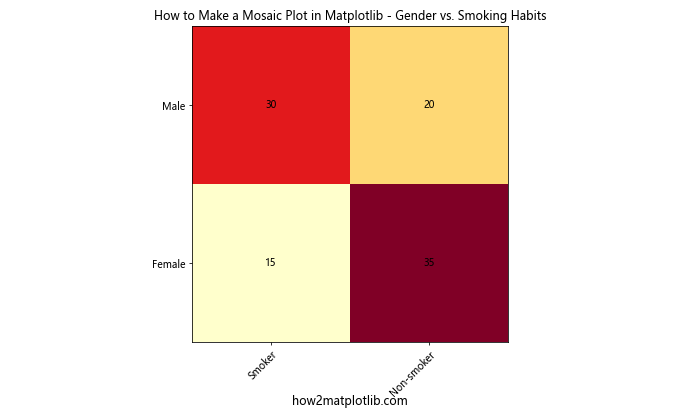
In this example, we’ve created a basic mosaic plot showing the relationship between gender and smoking habits. The plot uses color intensity to represent the frequency of each category, with darker colors indicating higher frequencies.
Customizing Mosaic Plots
One of the key aspects of learning how to make a mosaic plot in Matplotlib is understanding how to customize the appearance of your plots. Let’s explore some customization options:
Changing Color Schemes
You can modify the color scheme of your mosaic plot by changing the cmap parameter in the imshow function. Here’s an example:
import matplotlib.pyplot as plt
import numpy as np

data = np.array([[30, 20, 10], [15, 35, 25], [5, 15, 45]])
categories = ['Category A', 'Category B', 'Category C']
subcategories = ['Sub 1', 'Sub 2', 'Sub 3']

fig, ax = plt.subplots(figsize=(10, 6))

# Use a different color scheme
im = ax.imshow(data, cmap='viridis')

ax.set_xticks(np.arange(len(subcategories)))
ax.set_yticks(np.arange(len(categories)))
ax.set_xticklabels(subcategories)
ax.set_yticklabels(categories)

ax.set_title("How to Make a Mosaic Plot in Matplotlib - Custom Color Scheme")

for i in range(len(categories)):
    for j in range(len(subcategories)):
        ax.text(j, i, data[i, j], ha="center", va="center", color="white")

plt.colorbar(im, label="Frequency")
plt.text(0.5, -0.15, "how2matplotlib.com", fontsize=12, ha='center', transform=ax.transAxes)
plt.tight_layout()
plt.show()
Output:
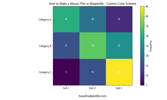
In this example, we’ve used the ‘viridis’ color scheme and added a colorbar to show the frequency scale.
Adding Gridlines
To improve the readability of your mosaic plot, you can add gridlines:
import matplotlib.pyplot as plt
import numpy as np

data = np.array([[30, 20], [15, 35]])
categories = ['Group 1', 'Group 2']
subcategories = ['A', 'B']

fig, ax = plt.subplots(figsize=(10, 6))

im = ax.imshow(data, cmap='coolwarm')

ax.set_xticks(np.arange(len(subcategories)))
ax.set_yticks(np.arange(len(categories)))
ax.set_xticklabels(subcategories)
ax.set_yticklabels(categories)

ax.set_title("How to Make a Mosaic Plot in Matplotlib - With Gridlines")

# Add gridlines
ax.set_xticks(np.arange(-.5, len(subcategories), 1), minor=True)
ax.set_yticks(np.arange(-.5, len(categories), 1), minor=True)
ax.grid(which="minor", color="w", linestyle='-', linewidth=2)

for i in range(len(categories)):
    for j in range(len(subcategories)):
        ax.text(j, i, data[i, j], ha="center", va="center", color="black")

plt.text(0.5, -0.15, "how2matplotlib.com", fontsize=12, ha='center', transform=ax.transAxes)
plt.tight_layout()
plt.show()
Output:
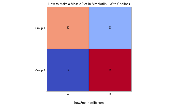
This example demonstrates how to add white gridlines to your mosaic plot, making it easier to distinguish between different categories.
Creating Hierarchical Mosaic Plots
When learning how to make a mosaic plot in Matplotlib, it’s important to understand that mosaic plots can represent hierarchical relationships. Let’s create a more complex mosaic plot with nested categories:
import matplotlib.pyplot as plt
import numpy as np

data = np.array([
    [[10, 5], [8, 7]],
    [[6, 9], [4, 11]],
    [[3, 12], [2, 13]]
])

categories = ['Category A', 'Category B', 'Category C']
subcategories = ['Sub 1', 'Sub 2']
subsubcategories = ['X', 'Y']

fig, ax = plt.subplots(figsize=(12, 8))

# Create hierarchical mosaic plot
im = ax.imshow(data.reshape(6, 2), cmap='YlGnBu')

# Set up ticks and labels
ax.set_xticks(np.arange(len(subsubcategories)))
ax.set_yticks(np.arange(len(categories) * len(subcategories)))
ax.set_xticklabels(subsubcategories)
ax.set_yticklabels([f"{cat} - {subcat}" for cat in categories for subcat in subcategories])

plt.setp(ax.get_yticklabels(), rotation=0, ha="right", rotation_mode="anchor")

ax.set_title("How to Make a Mosaic Plot in Matplotlib - Hierarchical Data")

# Add text annotations
for i in range(len(categories) * len(subcategories)):
    for j in range(len(subsubcategories)):
        ax.text(j, i, data.reshape(6, 2)[i, j], ha="center", va="center", color="black")

plt.colorbar(im, label="Value")
plt.text(0.5, -0.1, "how2matplotlib.com", fontsize=12, ha='center', transform=ax.transAxes)
plt.tight_layout()
plt.show()
Output:
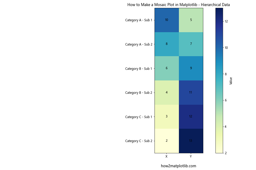
This example demonstrates how to create a hierarchical mosaic plot with three levels of categories. The plot shows the relationship between main categories, subcategories, and sub-subcategories.
Handling Missing Data in Mosaic Plots
When working with real-world data, you may encounter missing values. Let’s explore how to make a mosaic plot in Matplotlib that handles missing data:
import matplotlib.pyplot as plt
import numpy as np

data = np.array([
    [30, 20, np.nan],
    [15, 35, 25],
    [5, np.nan, 45]
])

categories = ['Group A', 'Group B', 'Group C']
subcategories = ['Type 1', 'Type 2', 'Type 3']

fig, ax = plt.subplots(figsize=(10, 6))

# Create a masked array to handle NaN values
masked_data = np.ma.masked_invalid(data)

im = ax.imshow(masked_data, cmap='plasma')

ax.set_xticks(np.arange(len(subcategories)))
ax.set_yticks(np.arange(len(categories)))
ax.set_xticklabels(subcategories)
ax.set_yticklabels(categories)

ax.set_title("How to Make a Mosaic Plot in Matplotlib - Handling Missing Data")

# Add text annotations, showing 'N/A' for missing values
for i in range(len(categories)):
    for j in range(len(subcategories)):
        value = data[i, j]
        text = 'N/A' if np.isnan(value) else f"{value:.0f}"
        ax.text(j, i, text, ha="center", va="center", color="white")

plt.colorbar(im, label="Value")
plt.text(0.5, -0.15, "how2matplotlib.com", fontsize=12, ha='center', transform=ax.transAxes)
plt.tight_layout()
plt.show()
Output:
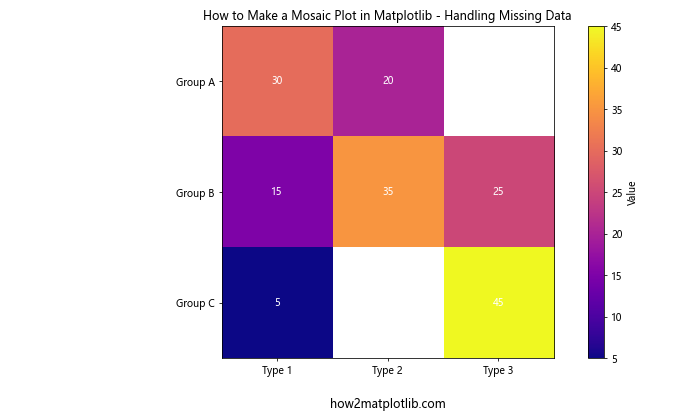
In this example, we’ve used a masked array to handle NaN values in the dataset. The missing values are displayed as white spaces in the plot, and we’ve added ‘N/A’ text annotations to clearly indicate the absence of data.
Creating Interactive Mosaic Plots
While static mosaic plots are useful, interactive plots can provide even more insights. Let’s explore how to make a mosaic plot in Matplotlib that includes interactive features:
import matplotlib.pyplot as plt
import numpy as np
from matplotlib.widgets import Button

data = np.array([
    [30, 20, 10],
    [15, 35, 25],
    [5, 15, 45]
])

categories = ['Category A', 'Category B', 'Category C']
subcategories = ['Sub 1', 'Sub 2', 'Sub 3']

fig, ax = plt.subplots(figsize=(12, 8))

im = ax.imshow(data, cmap='viridis')

ax.set_xticks(np.arange(len(subcategories)))
ax.set_yticks(np.arange(len(categories)))
ax.set_xticklabels(subcategories)
ax.set_yticklabels(categories)

ax.set_title("How to Make a Mosaic Plot in Matplotlib - Interactive")

for i in range(len(categories)):
    for j in range(len(subcategories)):
        ax.text(j, i, data[i, j], ha="center", va="center", color="white")

plt.colorbar(im, label="Value")

# Add buttons for interactivity
ax_reset = plt.axes([0.8, 0.05, 0.1, 0.075])
button_reset = Button(ax_reset, 'Reset')

ax_normalize = plt.axes([0.65, 0.05, 0.1, 0.075])
button_normalize = Button(ax_normalize, 'Normalize')

def reset(event):
    im.set_array(data)
    fig.canvas.draw()

def normalize(event):
    normalized_data = data / data.sum(axis=1, keepdims=True)
    im.set_array(normalized_data)
    fig.canvas.draw()

button_reset.on_clicked(reset)
button_normalize.on_clicked(normalize)

plt.text(0.5, -0.15, "how2matplotlib.com", fontsize=12, ha='center', transform=ax.transAxes)
plt.tight_layout()
plt.show()
Output:
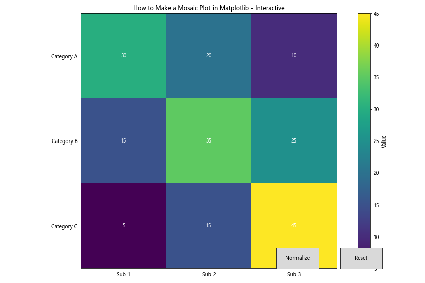
This example demonstrates how to create an interactive mosaic plot with buttons that allow users to reset the plot or normalize the data. The ‘Normalize’ button adjusts the values to show proportions within each category, while the ‘Reset’ button returns to the original data.
Combining Mosaic Plots with Other Visualizations
To create more comprehensive visualizations, you can combine mosaic plots with other types of charts. Let’s explore how to make a mosaic plot in Matplotlib alongside a bar chart:
import matplotlib.pyplot as plt
import numpy as np

data = np.array([
    [30, 20, 10],
    [15, 35, 25],
    [5, 15, 45]
])

categories = ['Category A', 'Category B', 'Category C']
subcategories = ['Sub 1', 'Sub 2', 'Sub 3']

fig, (ax1, ax2) = plt.subplots(1, 2, figsize=(16, 6))

# Mosaic plot
im = ax1.imshow(data, cmap='YlOrRd')

ax1.set_xticks(np.arange(len(subcategories)))
ax1.set_yticks(np.arange(len(categories)))
ax1.set_xticklabels(subcategories)
ax1.set_yticklabels(categories)

ax1.set_title("How to Make a Mosaic Plot in Matplotlib")

for i in range(len(categories)):
    for j in range(len(subcategories)):
        ax1.text(j, i, data[i, j], ha="center", va="center", color="black")

plt.colorbar(im, ax=ax1, label="Value")

# Bar chart
x = np.arange(len(categories))
width = 0.25

ax2.bar(x - width, data[:, 0], width, label=subcategories[0])
ax2.bar(x, data[:, 1], width, label=subcategories[1])
ax2.bar(x + width, data[:, 2], width, label=subcategories[2])

ax2.set_ylabel('Value')
ax2.set_title('Bar Chart Comparison')
ax2.set_xticks(x)
ax2.set_xticklabels(categories)
ax2.legend()

plt.text(0.5, -0.15, "how2matplotlib.com", fontsize=12, ha='center', transform=fig.transFigure)
plt.tight_layout()
plt.show()
Output:
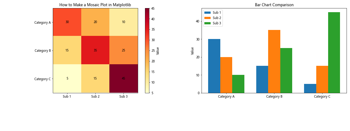
This example demonstrates how to create a figure with both a mosaic plot and a bar chart side by side. The mosaic plot provides an overview of the data distribution, while the bar chart allows for easier comparison of specific values across categories.
Handling Large Datasets in Mosaic Plots
When learning how to make a mosaic plot in Matplotlib for large datasets, it’s important to consider readability and performance. Let’s explore an example with a larger dataset:
import matplotlib.pyplot as plt
import numpy as np

# Generate a larger dataset
np.random.seed(42)
data = np.random.randint(1, 100, size=(10, 8))

categories = [f'Category {i}' for i in range(1, 11)]
subcategories = [f'Sub {i}' for i in range(1, 9)]

fig, ax = plt.subplots(figsize=(16, 10))

im = ax.imshow(data, cmap='viridis', aspect='auto')

ax.set_xticks(np.arange(len(subcategories)))
ax.set_yticks(np.arange(len(categories)))
ax.set_xticklabels(subcategories, rotation=45, ha='right')
ax.set_yticklabels(categories)

ax.set_title("How to Make a Mosaic Plot in Matplotlib - Large Dataset")

# Add text annotations only for values above a certain threshold
threshold = np.percentile(data, 75)
for i in range(len(categories)):
    for j in range(len(subcategories)):
        value = data[i, j]
        if value > threshold:
            ax.text(j, i, value, ha="center", va="center", color="white", fontweight='bold')

plt.colorbar(im, label="Value")
plt.text(0.5, -0.05, "how2matplotlib.com", fontsize=12, ha='center', transform=ax.transAxes)
plt.tight_layout()
plt.show()
Output:
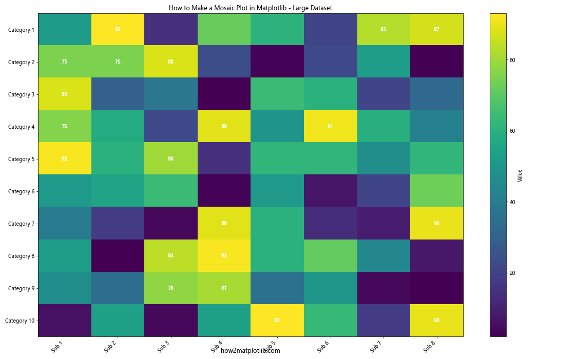
In this example, we’ve used a larger dataset and implemented the following strategies to improve readability:
- Increased figure size for better visibility
- Rotated x-axis labels to prevent overlap
- Added text annotations only for values above the 75th percentile to reduce clutter
- Used a color gradient to represent values, with a colorbar for reference
Creating Animated Mosaic Plots
To add an extra dimension to your visualizations, you can create animated mosaic plots. This is particularly useful when you want to show how data changes over time. Let’s explore how to make a mosaic plot in Matplotlib that animates:
import matplotlib.pyplot as plt
import numpy as np
from matplotlib.animation import FuncAnimation

# Generate time-series data
np.random.seed(42)
time_steps = 50
categories = ['A', 'B', 'C', 'D']
subcategories = ['X', 'Y', 'Z']
data = np.random.randint(1, 100, size=(time_steps, len(categories), len(subcategories)))

fig, ax = plt.subplots(figsize=(10, 6))

im = ax.imshow(data[0], cmap='viridis', aspect='auto')

ax.set_xticks(np.arange(len(subcategories)))
ax.set_yticks(np.arange(len(categories)))
ax.set_xticklabels(subcategories)
ax.set_yticklabels(categories)

ax.set_title("How to Make a Mosaic Plot in Matplotlib - Animated")

texts = []
for i in range(len(categories)):
    for j in range(len(subcategories)):
        texts.append(ax.text(j, i, '', ha="center", va="center", color="white"))

plt.colorbar(im, label="Value")

def update(frame):
    im.set_array(data[frame])
    for i, text in enumerate(texts):
        row = i // len(subcategories)
        col = i % len(subcategories)
        text.set_text(data[frame, row, col])
    ax.set_title(f"How to Make a Mosaic Plot in Matplotlib - Frame {frame+1}")
    return [im] + texts

anim = FuncAnimation(fig, update, frames=time_steps, interval=200, blit=True)

plt.text(0.5, -0.15, "how2matplotlib.com", fontsize=12, ha='center', transform=ax.transAxes)
plt.tight_layout()
plt.show()
Output:
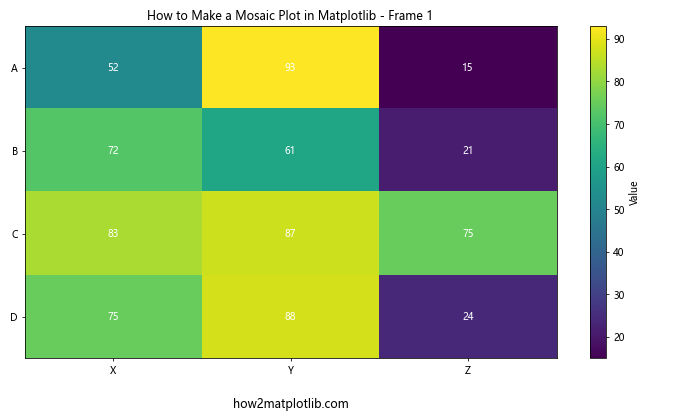
This example creates an animated mosaic plot that shows how the data changes over 50 time steps. The animation updates the color intensity and text values for each frame, providing a dynamic visualization of the changing data.
Customizing Mosaic Plot Axes
When learning how to make a mosaic plot in Matplotlib, it’s important to know how to customize the axes for better presentation. Let’s explore some advanced axis customization techniques:
import matplotlib.pyplot as plt
import numpy as np

data = np.array([
    [30, 20, 10],
    [15, 35, 25],
    [5, 15, 45]
])

categories = ['Category A', 'Category B', 'Category C']
subcategories = ['Sub 1', 'Sub 2', 'Sub 3']

fig, ax = plt.subplots(figsize=(12, 8))

im = ax.imshow(data, cmap='coolwarm')

# Customize x-axis
ax.set_xticks(np.arange(len(subcategories)))
ax.set_xticklabels(subcategories, rotation=45, ha='right')
ax.set_xlabel('Subcategories', fontweight='bold')

# Customize y-axis
ax.set_yticks(np.arange(len(categories)))
ax.set_yticklabels(categories)
ax.set_ylabel('Main Categories', fontweight='bold')

# Add a secondary y-axis
ax2 = ax.twinx()
ax2.set_yticks(np.arange(len(categories)))
ax2.set_yticklabels([f"Group {i+1}" for i in range(len(categories))])
ax2.set_ylabel('Alternative Grouping', fontweight='bold')

ax.set_title("How to Make a Mosaic Plot in Matplotlib - Custom Axes", fontsize=16)

for i in range(len(categories)):
    for j in range(len(subcategories)):
        ax.text(j, i, data[i, j], ha="center", va="center", color="black")

plt.colorbar(im, label="Value")
plt.text(0.5, -0.15, "how2matplotlib.com", fontsize=12, ha='center', transform=ax.transAxes)
plt.tight_layout()
plt.show()
Output:
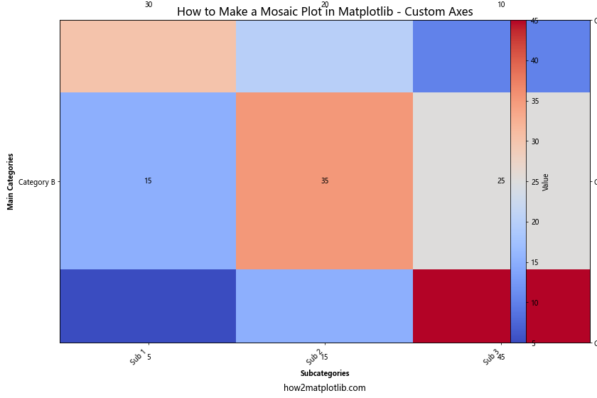
In this example, we’ve implemented the following customizations:
- Rotated x-axis labels for better readability
- Added bold labels for both x and y axes
- Included a secondary y-axis to show alternative grouping
- Increased the title font size for emphasis
These customizations help to create a more informative and visually appealing mosaic plot.
Creating Mosaic Plots with Pandas DataFrames
When working with real-world data, you’ll often encounter datasets in the form of Pandas DataFrames. Let’s explore how to make a mosaic plot in Matplotlib using data from a Pandas DataFrame:
import matplotlib.pyplot as plt
import numpy as np
import pandas as pd

# Create a sample DataFrame
data = {
    'Category': ['A', 'A', 'B', 'B', 'C', 'C'] * 5,
    'Subcategory': ['X', 'Y', 'X', 'Y', 'X', 'Y'] * 5,
    'Value': np.random.randint(1, 100, 30)
}
df = pd.DataFrame(data)

# Pivot the DataFrame to create a 2D array
pivot_table = df.pivot_table(values='Value', index='Category', columns='Subcategory', aggfunc='sum')

fig, ax = plt.subplots(figsize=(10, 6))

im = ax.imshow(pivot_table, cmap='YlGnBu')

ax.set_xticks(np.arange(len(pivot_table.columns)))
ax.set_yticks(np.arange(len(pivot_table.index)))
ax.set_xticklabels(pivot_table.columns)
ax.set_yticklabels(pivot_table.index)

ax.set_title("How to Make a Mosaic Plot in Matplotlib - Using Pandas DataFrame")

for i in range(len(pivot_table.index)):
    for j in range(len(pivot_table.columns)):
        ax.text(j, i, f"{pivot_table.iloc[i, j]:.0f}", ha="center", va="center", color="black")

plt.colorbar(im, label="Total Value")
plt.text(0.5, -0.15, "how2matplotlib.com", fontsize=12, ha='center', transform=ax.transAxes)
plt.tight_layout()
plt.show()
Output:
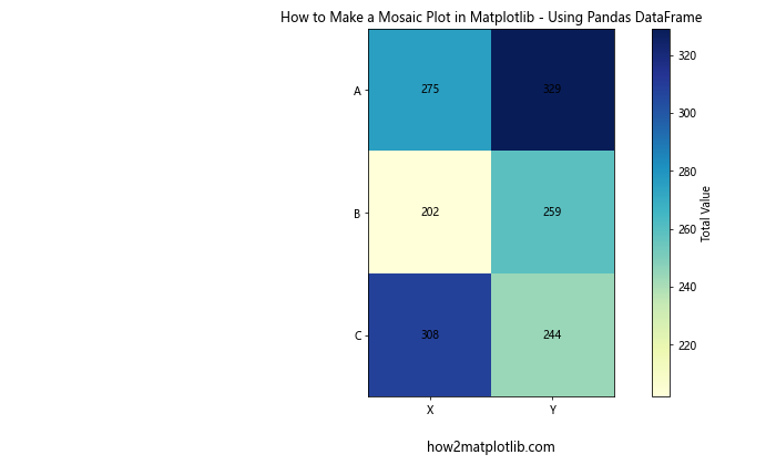
This example demonstrates how to create a mosaic plot from a Pandas DataFrame. We first pivot the DataFrame to create a 2D array suitable for plotting, then use this data to generate the mosaic plot.
Conclusion
In this comprehensive guide, we’ve explored various aspects of how to make a mosaic plot in Matplotlib. We’ve covered everything from basic plot creation to advanced techniques like handling missing data, creating interactive plots, and working with large datasets. By mastering these techniques, you’ll be able to create informative and visually appealing mosaic plots for a wide range of data visualization needs.
Remember that the key to creating effective mosaic plots is to understand your data and choose the right visualization techniques to highlight important patterns and relationships. Experiment with different color schemes, layouts, and customizations to find the best way to represent your specific dataset.