How to Have One Colorbar for All Subplots in Matplotlib
How to have one colorbar for all subplots in Matplotlib is a common challenge faced by data visualization enthusiasts. This article will provide a detailed exploration of the techniques and best practices for creating a single colorbar that applies to multiple subplots in Matplotlib. We’ll cover various scenarios, from simple to complex, and provide numerous examples to help you master this essential skill.
Understanding the Importance of a Shared Colorbar
Before diving into the specifics of how to have one colorbar for all subplots in Matplotlib, it’s crucial to understand why this technique is valuable. A shared colorbar across multiple subplots serves several purposes:
- Consistency: It ensures that color scales are consistent across all subplots, making comparisons easier.
- Space efficiency: Using a single colorbar saves space, especially when dealing with many subplots.
- Clarity: It reduces clutter and improves the overall readability of your visualization.
Now, let’s explore the various methods to achieve this goal.
Basic Approach: Using plt.colorbar()
The simplest way to have one colorbar for all subplots in Matplotlib is to use the plt.colorbar() function after creating all your subplots. Here’s a basic example:
import matplotlib.pyplot as plt
import numpy as np

fig, (ax1, ax2) = plt.subplots(1, 2, figsize=(10, 5))

data1 = np.random.rand(10, 10)
data2 = np.random.rand(10, 10)

im1 = ax1.imshow(data1, cmap='viridis')
im2 = ax2.imshow(data2, cmap='viridis')

ax1.set_title('Subplot 1 - how2matplotlib.com')
ax2.set_title('Subplot 2 - how2matplotlib.com')

cbar = plt.colorbar(im1, ax=[ax1, ax2])
cbar.set_label('Shared Colorbar')

plt.tight_layout()
plt.show()
Output:
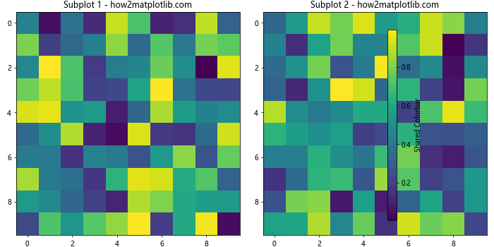
In this example, we create two subplots and use imshow() to display random data. The key is to call plt.colorbar() after creating both subplots and pass the ax parameter with a list of all axes. This creates a single colorbar that applies to both subplots.
Using make_axes_locatable for Precise Positioning
When you need more control over the positioning of your colorbar, you can use make_axes_locatable. This approach is particularly useful when you want to have one colorbar for all subplots in Matplotlib while maintaining a specific layout:
import matplotlib.pyplot as plt
import numpy as np
from mpl_toolkits.axes_grid1 import make_axes_locatable

fig, (ax1, ax2) = plt.subplots(1, 2, figsize=(12, 5))

data1 = np.random.rand(10, 10)
data2 = np.random.rand(10, 10)

im1 = ax1.imshow(data1, cmap='plasma')
im2 = ax2.imshow(data2, cmap='plasma')

ax1.set_title('Subplot 1 - how2matplotlib.com')
ax2.set_title('Subplot 2 - how2matplotlib.com')

divider = make_axes_locatable(ax2)
cax = divider.append_axes("right", size="5%", pad=0.1)
cbar = plt.colorbar(im2, cax=cax)
cbar.set_label('Shared Colorbar')

plt.tight_layout()
plt.show()
Output:
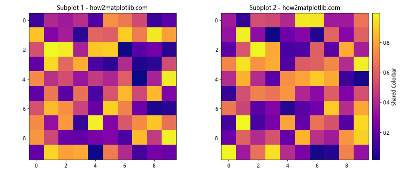
In this example, we use make_axes_locatable to create a new axis for the colorbar next to the second subplot. This gives us precise control over the colorbar’s position and size.
Creating a Colorbar for a GridSpec Layout
When working with more complex layouts using GridSpec, you can still have one colorbar for all subplots in Matplotlib. Here’s how to do it:
import matplotlib.pyplot as plt
import numpy as np
from matplotlib.gridspec import GridSpec

fig = plt.figure(figsize=(12, 8))
gs = GridSpec(2, 3, figure=fig)

ax1 = fig.add_subplot(gs[0, 0])
ax2 = fig.add_subplot(gs[0, 1])
ax3 = fig.add_subplot(gs[1, 0])
ax4 = fig.add_subplot(gs[1, 1])
cax = fig.add_subplot(gs[:, 2])

data = np.random.rand(10, 10)

for ax in [ax1, ax2, ax3, ax4]:
    im = ax.imshow(data, cmap='coolwarm')
    ax.set_title(f'Subplot - how2matplotlib.com')

cbar = fig.colorbar(im, cax=cax)
cbar.set_label('Shared Colorbar')

plt.tight_layout()
plt.show()
Output:
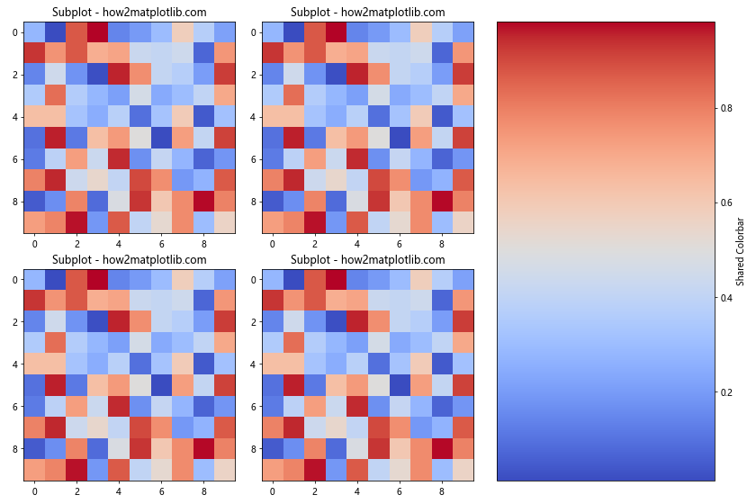
This example demonstrates how to have one colorbar for all subplots in Matplotlib when using a GridSpec layout. We create a separate subplot for the colorbar and use it as the cax parameter in fig.colorbar().
Handling Different Data Ranges
When your subplots have different data ranges, it’s still possible to have one colorbar for all subplots in Matplotlib. You’ll need to normalize the data across all subplots:
import matplotlib.pyplot as plt
import numpy as np
from matplotlib.colors import Normalize

fig, (ax1, ax2) = plt.subplots(1, 2, figsize=(10, 5))

data1 = np.random.rand(10, 10) * 100
data2 = np.random.rand(10, 10) * 1000

vmin = min(data1.min(), data2.min())
vmax = max(data1.max(), data2.max())
norm = Normalize(vmin=vmin, vmax=vmax)

im1 = ax1.imshow(data1, norm=norm, cmap='viridis')
im2 = ax2.imshow(data2, norm=norm, cmap='viridis')

ax1.set_title('Subplot 1 (0-100) - how2matplotlib.com')
ax2.set_title('Subplot 2 (0-1000) - how2matplotlib.com')

cbar = plt.colorbar(im2, ax=[ax1, ax2])
cbar.set_label('Shared Colorbar (0-1000)')

plt.tight_layout()
plt.show()
Output:
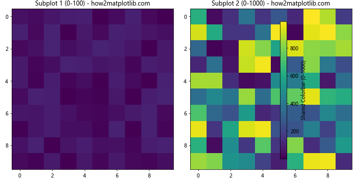
In this example, we use Normalize to create a common scale for both datasets, ensuring that the colorbar accurately represents the full range of values across all subplots.
Creating a Colorbar for 3D Plots
You can also have one colorbar for all subplots in Matplotlib when working with 3D plots. Here’s an example:
import matplotlib.pyplot as plt
import numpy as np
from mpl_toolkits.mplot3d import Axes3D

fig = plt.figure(figsize=(12, 5))
ax1 = fig.add_subplot(121, projection='3d')
ax2 = fig.add_subplot(122, projection='3d')

x = y = np.arange(-3.0, 3.0, 0.05)
X, Y = np.meshgrid(x, y)
Z1 = np.exp(-(X**2 + Y**2))
Z2 = np.exp(-(X**2 + Y**2)) * 2

norm = plt.Normalize(Z1.min(), Z2.max())

surf1 = ax1.plot_surface(X, Y, Z1, cmap='coolwarm', norm=norm)
surf2 = ax2.plot_surface(X, Y, Z2, cmap='coolwarm', norm=norm)

ax1.set_title('3D Subplot 1 - how2matplotlib.com')
ax2.set_title('3D Subplot 2 - how2matplotlib.com')

fig.colorbar(surf2, ax=[ax1, ax2], shrink=0.6, aspect=10)

plt.tight_layout()
plt.show()
Output:
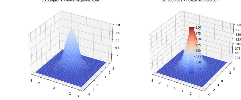
This example shows how to create a shared colorbar for two 3D surface plots with different data ranges.
Using Colorbars with Contour Plots
Contour plots are another type of visualization where you might want to have one colorbar for all subplots in Matplotlib. Here’s how to do it:
import matplotlib.pyplot as plt
import numpy as np

fig, (ax1, ax2) = plt.subplots(1, 2, figsize=(12, 5))

x = y = np.arange(-3.0, 3.0, 0.1)
X, Y = np.meshgrid(x, y)
Z1 = np.exp(-(X**2 + Y**2))
Z2 = np.exp(-(X**2 + Y**2)) * 2

levels = np.linspace(0, 2, 11)

cs1 = ax1.contourf(X, Y, Z1, levels=levels, cmap='viridis')
cs2 = ax2.contourf(X, Y, Z2, levels=levels, cmap='viridis')

ax1.set_title('Contour Subplot 1 - how2matplotlib.com')
ax2.set_title('Contour Subplot 2 - how2matplotlib.com')

cbar = fig.colorbar(cs2, ax=[ax1, ax2])
cbar.set_label('Shared Colorbar')

plt.tight_layout()
plt.show()
Output:
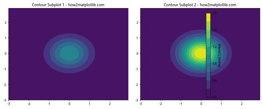
In this example, we create two contour plots with different data ranges but use the same levels for both. This ensures that the colorbar accurately represents both subplots.
Handling Categorical Data
Sometimes you might need to have one colorbar for all subplots in Matplotlib when dealing with categorical data. Here’s an approach using a custom colormap:
import matplotlib.pyplot as plt
import numpy as np
from matplotlib.colors import ListedColormap

fig, (ax1, ax2) = plt.subplots(1, 2, figsize=(12, 5))

categories = ['A', 'B', 'C', 'D']
colors = ['red', 'green', 'blue', 'yellow']
cmap = ListedColormap(colors)

data1 = np.random.choice(categories, (10, 10))
data2 = np.random.choice(categories, (10, 10))

category_to_int = {cat: i for i, cat in enumerate(categories)}
int_data1 = np.vectorize(category_to_int.get)(data1)
int_data2 = np.vectorize(category_to_int.get)(data2)

im1 = ax1.imshow(int_data1, cmap=cmap)
im2 = ax2.imshow(int_data2, cmap=cmap)

ax1.set_title('Categorical Subplot 1 - how2matplotlib.com')
ax2.set_title('Categorical Subplot 2 - how2matplotlib.com')

cbar = fig.colorbar(im1, ax=[ax1, ax2], ticks=range(len(categories)))
cbar.set_ticklabels(categories)
cbar.set_label('Categories')

plt.tight_layout()
plt.show()
Output:
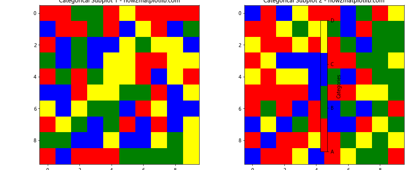
This example demonstrates how to create a shared colorbar for categorical data using a custom colormap.
Creating a Colorbar for Scatter Plots
Scatter plots can also benefit from having one colorbar for all subplots in Matplotlib. Here’s how to achieve this:
import matplotlib.pyplot as plt
import numpy as np

fig, (ax1, ax2) = plt.subplots(1, 2, figsize=(12, 5))

np.random.seed(42)
x1 = np.random.rand(50)
y1 = np.random.rand(50)
c1 = np.random.rand(50)

x2 = np.random.rand(50)
y2 = np.random.rand(50)
c2 = np.random.rand(50)

scatter1 = ax1.scatter(x1, y1, c=c1, cmap='viridis')
scatter2 = ax2.scatter(x2, y2, c=c2, cmap='viridis')

ax1.set_title('Scatter Subplot 1 - how2matplotlib.com')
ax2.set_title('Scatter Subplot 2 - how2matplotlib.com')

cbar = fig.colorbar(scatter1, ax=[ax1, ax2])
cbar.set_label('Shared Colorbar')

plt.tight_layout()
plt.show()
Output:
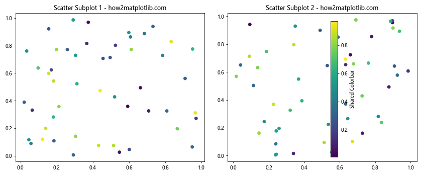
This example shows how to create a shared colorbar for two scatter plots, where the color of each point is determined by a third variable.
Handling Logarithmic Color Scales
When dealing with data that spans multiple orders of magnitude, you might want to use a logarithmic color scale. Here’s how to have one colorbar for all subplots in Matplotlib with a log scale:
import matplotlib.pyplot as plt
import numpy as np
from matplotlib.colors import LogNorm

fig, (ax1, ax2) = plt.subplots(1, 2, figsize=(12, 5))

data1 = np.random.rand(10, 10) * 1000
data2 = np.random.rand(10, 10) * 10000

vmin = min(data1.min(), data2.min())
vmax = max(data1.max(), data2.max())
norm = LogNorm(vmin=vmin, vmax=vmax)

im1 = ax1.imshow(data1, norm=norm, cmap='viridis')
im2 = ax2.imshow(data2, norm=norm, cmap='viridis')

ax1.set_title('Log Scale Subplot 1 - how2matplotlib.com')
ax2.set_title('Log Scale Subplot 2 - how2matplotlib.com')

cbar = fig.colorbar(im2, ax=[ax1, ax2])
cbar.set_label('Shared Log Colorbar')

plt.tight_layout()
plt.show()
Output:
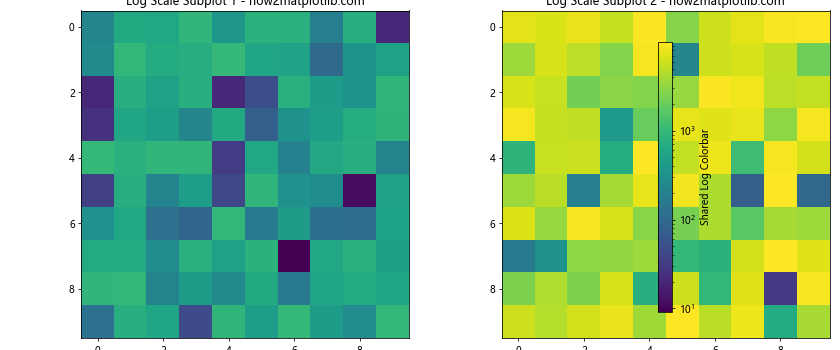
This example demonstrates how to use a logarithmic color scale with a shared colorbar across two subplots with different data ranges.
Creating a Colorbar for Polar Plots
Polar plots can also benefit from having one colorbar for all subplots in Matplotlib. Here’s an example:
import matplotlib.pyplot as plt
import numpy as np

fig, (ax1, ax2) = plt.subplots(1, 2, figsize=(12, 5), subplot_kw=dict(projection='polar'))

r = np.linspace(0, 1, 100)
theta = np.linspace(0, 2*np.pi, 100)
R, Theta = np.meshgrid(r, theta)

Z1 = R**2
Z2 = R**3

norm = plt.Normalize(min(Z1.min(), Z2.min()), max(Z1.max(), Z2.max()))

im1 = ax1.pcolormesh(Theta, R, Z1, norm=norm, cmap='viridis')
im2 = ax2.pcolormesh(Theta, R, Z2, norm=norm, cmap='viridis')

ax1.set_title('Polar Subplot 1 - how2matplotlib.com')
ax2.set_title('Polar Subplot 2 - how2matplotlib.com')

cbar = fig.colorbar(im2, ax=[ax1, ax2], pad=0.1)
cbar.set_label('Shared Colorbar')

plt.tight_layout()
plt.show()
Output:
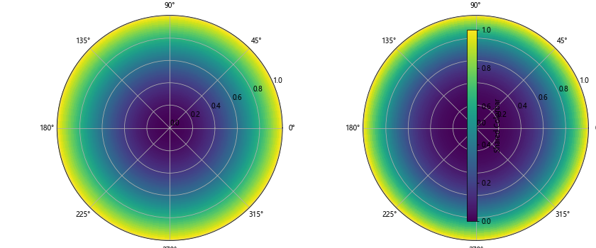
This example shows how to create a shared colorbar for two polar plots with different data ranges.
Handling Multiple Colormaps
Sometimes you might want to have one colorbar for all subplots in Matplotlib while using different colormaps for each subplot. Here’s how to achieve this:
import matplotlib.pyplot as plt
import numpy as np
from mpl_toolkits.axes_grid1 import make_axes_locatable

fig, (ax1, ax2) = plt.subplots(1, 2, figsize=(12, 5))

data1 = np.random.rand(10, 10)
data2 = np.random.rand(10, 10)

im1 = ax1.imshow(data1, cmap='viridis')
im2 = ax2.imshow(data2, cmap='plasma')

ax1.set_title('Subplot 1 (Viridis) - how2matplotlib.com')
ax2.set_title('Subplot 2 (Plasma) - how2matplotlib.com')

divider1 = make_axes_locatable(ax1)
cax1 = divider1.append_axes("right", size="5%", pad=0.05)
cbar1 = plt.colorbar(im1, cax=cax1)
cbar1.set_label('Colorbar 1')

divider2 = make_axes_locatable(ax2)
cax2 = divider2.append_axes("right", size="5%", pad=0.05)
cbar2 = plt.colorbar(im2, cax=cax2)
cbar2.set_label('Colorbar 2')

plt.tight_layout()
plt.show()
Output:
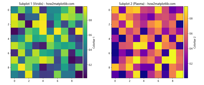
In this example, we create separate colorbars for each subplot, each with its own colormap. While this doesn’t strictly follow the “one colorbar for all subplots” approach, it demonstrates how to handle multiple colormaps in a single figure.
Creating a Colorbar for Heatmaps
Heatmaps are another type of visualization where you might want to have one colorbar for all subplots in Matplotlib. Here’s an example using seaborn:
import matplotlib.pyplot as plt
import seaborn as sns
import numpy as np

fig, (ax1, ax2) = plt.subplots(1, 2, figsize=(15, 6))

data1 = np.random.rand(10, 10)
data2 = np.random.rand(10, 10) * 2

vmin = min(data1.min(), data2.min())
vmax = max(data1.max(), data2.max())

sns.heatmap(data1, ax=ax1, cmap='YlGnBu', vmin=vmin, vmax=vmax, cbar=False)
sns.heatmap(data2, ax=ax2, cmap='YlGnBu', vmin=vmin, vmax=vmax, cbar_ax=fig.add_axes([0.92, 0.15, 0.02, 0.7]))

ax1.set_title('Heatmap 1 - how2matplotlib.com')
ax2.set_title('Heatmap 2 - how2matplotlib.com')

plt.tight_layout(rect=[0, 0, 0.9, 1])
plt.show()
Output:
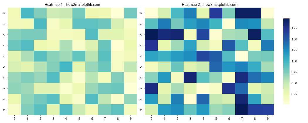
This example demonstrates how to create a shared colorbar for two heatmaps with different data ranges using seaborn.
Handling Diverging Colormaps
When working with data that has a natural midpoint (like temperature anomalies), you might want to use a diverging colormap. Here’s how to have one colorbar for all subplots in Matplotlib with a diverging colormap:
import matplotlib.pyplot as plt
import numpy as np

fig, (ax1, ax2) = plt.subplots(1, 2, figsize=(12, 5))

data1 = np.random.randn(10, 10)
data2 = np.random.randn(10, 10) * 2

vmin = min(data1.min(), data2.min())
vmax = max(data1.max(), data2.max())
vabs = max(abs(vmin), abs(vmax))

im1 = ax1.imshow(data1, cmap='RdBu_r', vmin=-vabs, vmax=vabs)
im2 = ax2.imshow(data2, cmap='RdBu_r', vmin=-vabs, vmax=vabs)

ax1.set_title('Diverging Subplot 1 - how2matplotlib.com')
ax2.set_title('Diverging Subplot 2 - how2matplotlib.com')

cbar = fig.colorbar(im2, ax=[ax1, ax2], extend='both')
cbar.set_label('Shared Diverging Colorbar')

plt.tight_layout()
plt.show()
Output:
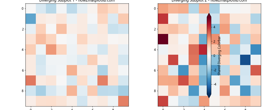
This example shows how to create a shared colorbar with a diverging colormap for two subplots with different data ranges.
Creating a Colorbar for Streamplot
Streamplots are useful for visualizing vector fields, and you might want to have one colorbar for all subplots in Matplotlib when working with multiple streamplots. Here’s an example:
import matplotlib.pyplot as plt
import numpy as np

fig, (ax1, ax2) = plt.subplots(1, 2, figsize=(12, 5))

Y, X = np.mgrid[-3:3:100j, -3:3:100j]
U1 = -1 - X**2 + Y
V1 = 1 + X - Y**2
U2 = -1 - X**2 + Y * 2
V2 = 1 + X - Y**2 * 2

speed1 = np.sqrt(U1**2 + V1**2)
speed2 = np.sqrt(U2**2 + V2**2)

vmin = min(speed1.min(), speed2.min())
vmax = max(speed1.max(), speed2.max())

stream1 = ax1.streamplot(X, Y, U1, V1, color=speed1, cmap='viridis', norm=plt.Normalize(vmin, vmax))
stream2 = ax2.streamplot(X, Y, U2, V2, color=speed2, cmap='viridis', norm=plt.Normalize(vmin, vmax))

ax1.set_title('Streamplot 1 - how2matplotlib.com')
ax2.set_title('Streamplot 2 - how2matplotlib.com')

cbar = fig.colorbar(stream1.lines, ax=[ax1, ax2])
cbar.set_label('Speed')

plt.tight_layout()
plt.show()
Output:
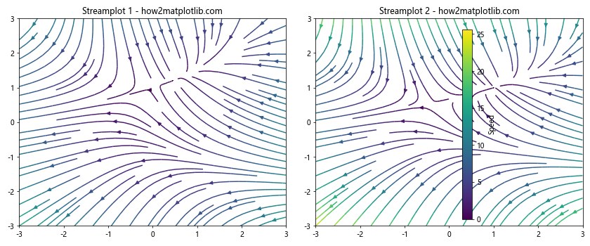
This example demonstrates how to create a shared colorbar for two streamplots with different vector fields.
Handling Discrete Colorbars
Sometimes you might want to have one colorbar for all subplots in Matplotlib with discrete color levels. Here’s how to achieve this:
import matplotlib.pyplot as plt
import numpy as np
from matplotlib.colors import BoundaryNorm
from matplotlib.ticker import MaxNLocator

fig, (ax1, ax2) = plt.subplots(1, 2, figsize=(12, 5))

data1 = np.random.rand(20, 20) * 10
data2 = np.random.rand(20, 20) * 20

levels = MaxNLocator(nbins=10).tick_values(0, 20)
cmap = plt.get_cmap('viridis')
norm = BoundaryNorm(levels, ncolors=cmap.N, clip=True)

im1 = ax1.pcolormesh(data1, cmap=cmap, norm=norm)
im2 = ax2.pcolormesh(data2, cmap=cmap, norm=norm)

ax1.set_title('Discrete Subplot 1 - how2matplotlib.com')
ax2.set_title('Discrete Subplot 2 - how2matplotlib.com')

cbar = fig.colorbar(im2, ax=[ax1, ax2], extend='both', ticks=levels)
cbar.set_label('Shared Discrete Colorbar')

plt.tight_layout()
plt.show()
Output:
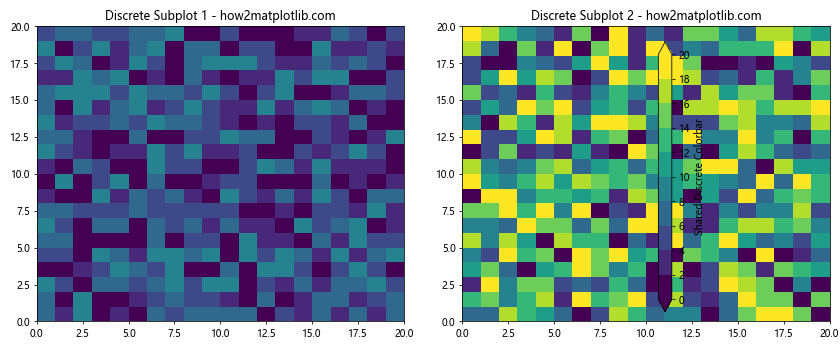
This example shows how to create a shared discrete colorbar for two subplots with different data ranges.
Conclusion
In this comprehensive guide, we’ve explored various techniques to have one colorbar for all subplots in Matplotlib. We’ve covered a wide range of scenarios, including:
- Basic approaches using
plt.colorbar() - Precise positioning with
make_axes_locatable - Handling GridSpec layouts
- Dealing with different data ranges
- Creating colorbars for 3D plots
- Working with contour plots
- Handling categorical data
- Creating colorbars for scatter plots
- Using logarithmic color scales
- Working with polar plots
- Handling multiple colormaps
- Creating colorbars for heatmaps
- Using diverging colormaps
- Working with streamplots
- Creating discrete colorbars
By mastering these techniques, you’ll be able to create more professional and informative visualizations in Matplotlib. Remember that having one colorbar for all subplots not only saves space but also makes it easier for viewers to interpret your data across multiple plots.