How to Generate Subplots With Matplotlib
How to Generate Subplots With Matplotlib is an essential skill for data visualization in Python. Subplots allow you to create multiple plots within a single figure, enabling side-by-side comparisons and complex data presentations. This article will dive deep into the various methods and techniques for generating subplots with Matplotlib, providing you with a thorough understanding of this powerful feature.
Understanding the Basics of Subplots in Matplotlib
Before we delve into how to generate subplots with Matplotlib, it’s crucial to understand what subplots are and why they’re useful. Subplots are individual plots arranged in a grid-like structure within a single figure. They allow you to display multiple related visualizations together, making it easier to compare and analyze different aspects of your data.
Let’s start with a simple example of how to generate subplots with Matplotlib:
import matplotlib.pyplot as plt
import numpy as np

# Create a figure with 2 subplots
fig, (ax1, ax2) = plt.subplots(1, 2, figsize=(10, 4))

# Data for the plots
x = np.linspace(0, 10, 100)
y1 = np.sin(x)
y2 = np.cos(x)

# Plot data on the first subplot
ax1.plot(x, y1, label='Sine')
ax1.set_title('Sine Wave - how2matplotlib.com')
ax1.legend()

# Plot data on the second subplot
ax2.plot(x, y2, label='Cosine')
ax2.set_title('Cosine Wave - how2matplotlib.com')
ax2.legend()

plt.tight_layout()
plt.show()
Output:
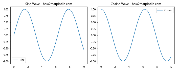
In this example, we create a figure with two subplots side by side. The plt.subplots() function is used to generate the figure and axes objects. We then plot a sine wave on the first subplot and a cosine wave on the second subplot.
How to Generate Subplots With Matplotlib: Different Layouts
When learning how to generate subplots with Matplotlib, it’s important to understand that you can create various layouts to suit your needs. Matplotlib provides flexibility in arranging subplots in different configurations.
Creating a Grid of Subplots
To create a grid of subplots, you can specify the number of rows and columns when calling plt.subplots(). Here’s an example of how to generate subplots with Matplotlib in a 2×2 grid:
import matplotlib.pyplot as plt
import numpy as np

# Create a 2x2 grid of subplots
fig, axs = plt.subplots(2, 2, figsize=(10, 8))

# Data for the plots
x = np.linspace(0, 10, 100)
y1 = np.sin(x)
y2 = np.cos(x)
y3 = np.tan(x)
y4 = np.exp(x)

# Plot data on each subplot
axs[0, 0].plot(x, y1)
axs[0, 0].set_title('Sine - how2matplotlib.com')

axs[0, 1].plot(x, y2)
axs[0, 1].set_title('Cosine - how2matplotlib.com')

axs[1, 0].plot(x, y3)
axs[1, 0].set_title('Tangent - how2matplotlib.com')

axs[1, 1].plot(x, y4)
axs[1, 1].set_title('Exponential - how2matplotlib.com')

plt.tight_layout()
plt.show()
Output:
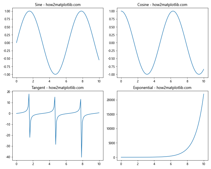
In this example, we create a 2×2 grid of subplots and plot different functions on each subplot. The axs variable is now a 2D array, allowing us to access each subplot using row and column indices.
Creating Subplots with Different Sizes
When learning how to generate subplots with Matplotlib, you might want to create subplots of different sizes. This can be achieved using gridspec. Here’s an example:
import matplotlib.pyplot as plt
import matplotlib.gridspec as gridspec
import numpy as np

# Create a figure and GridSpec
fig = plt.figure(figsize=(12, 8))
gs = gridspec.GridSpec(2, 2, width_ratios=[2, 1], height_ratios=[1, 2])

# Create subplots with different sizes
ax1 = fig.add_subplot(gs[0, 0])
ax2 = fig.add_subplot(gs[0, 1])
ax3 = fig.add_subplot(gs[1, :])

# Data for the plots
x = np.linspace(0, 10, 100)
y1 = np.sin(x)
y2 = np.cos(x)
y3 = np.tan(x)

# Plot data on each subplot
ax1.plot(x, y1)
ax1.set_title('Sine - how2matplotlib.com')

ax2.plot(x, y2)
ax2.set_title('Cosine - how2matplotlib.com')

ax3.plot(x, y3)
ax3.set_title('Tangent - how2matplotlib.com')

plt.tight_layout()
plt.show()
Output:
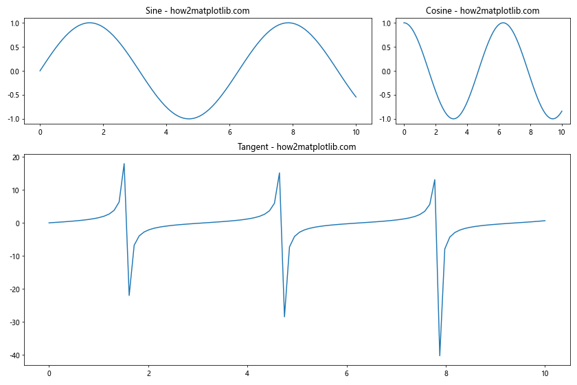
In this example, we use gridspec to create a layout with subplots of different sizes. The top-left subplot is twice as wide as the top-right subplot, and the bottom subplot spans the entire width of the figure.
How to Generate Subplots With Matplotlib: Customizing Subplots
Customizing subplots is an important aspect of learning how to generate subplots with Matplotlib. You can adjust various properties of subplots to enhance their appearance and readability.
Adding Titles and Labels
To make your subplots more informative, you can add titles, x-labels, and y-labels. Here’s an example of how to generate subplots with Matplotlib and add these elements:
import matplotlib.pyplot as plt
import numpy as np

# Create a figure with 2 subplots
fig, (ax1, ax2) = plt.subplots(1, 2, figsize=(12, 5))

# Data for the plots
x = np.linspace(0, 10, 100)
y1 = np.sin(x)
y2 = np.cos(x)

# Plot data on the first subplot
ax1.plot(x, y1)
ax1.set_title('Sine Wave - how2matplotlib.com')
ax1.set_xlabel('X-axis')
ax1.set_ylabel('Amplitude')

# Plot data on the second subplot
ax2.plot(x, y2)
ax2.set_title('Cosine Wave - how2matplotlib.com')
ax2.set_xlabel('X-axis')
ax2.set_ylabel('Amplitude')

# Add a main title to the figure
fig.suptitle('Trigonometric Functions', fontsize=16)

plt.tight_layout()
plt.show()
Output:
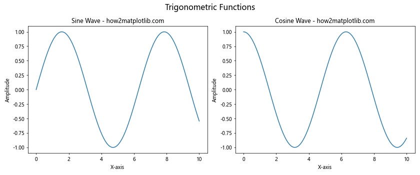
In this example, we add titles to each subplot using set_title(), x-labels using set_xlabel(), and y-labels using set_ylabel(). We also add a main title to the entire figure using fig.suptitle().
Adjusting Spacing Between Subplots
When learning how to generate subplots with Matplotlib, you might want to adjust the spacing between subplots for better visual appeal. Here’s how you can do it:
import matplotlib.pyplot as plt
import numpy as np

# Create a figure with 4 subplots
fig, axs = plt.subplots(2, 2, figsize=(10, 8))

# Data for the plots
x = np.linspace(0, 10, 100)
y1 = np.sin(x)
y2 = np.cos(x)
y3 = np.tan(x)
y4 = np.exp(x)

# Plot data on each subplot
axs[0, 0].plot(x, y1)
axs[0, 0].set_title('Sine - how2matplotlib.com')

axs[0, 1].plot(x, y2)
axs[0, 1].set_title('Cosine - how2matplotlib.com')

axs[1, 0].plot(x, y3)
axs[1, 0].set_title('Tangent - how2matplotlib.com')

axs[1, 1].plot(x, y4)
axs[1, 1].set_title('Exponential - how2matplotlib.com')

# Adjust spacing between subplots
plt.subplots_adjust(wspace=0.3, hspace=0.3)

plt.show()
Output:
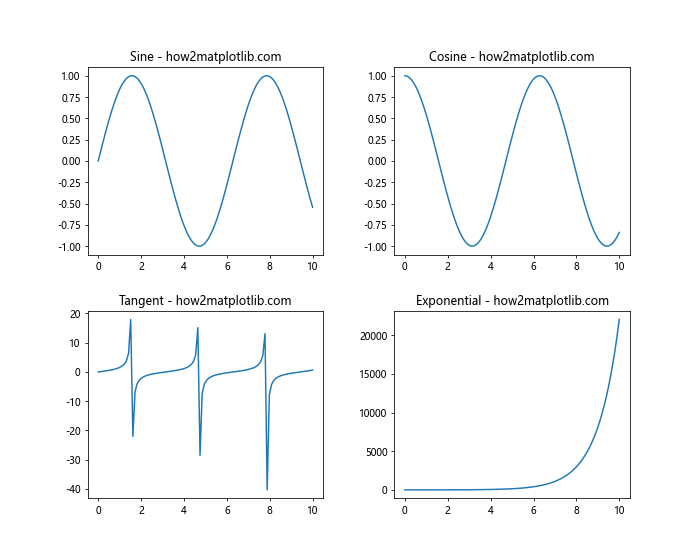
In this example, we use plt.subplots_adjust() to set the horizontal (wspace) and vertical (hspace) spacing between subplots. Adjusting these values can help improve the overall layout of your figure.
How to Generate Subplots With Matplotlib: Sharing Axes
When working with multiple subplots, it’s often useful to share axes between them. This can help maintain consistency and make comparisons easier. Let’s explore how to generate subplots with Matplotlib that share axes.
Sharing X-axis
Here’s an example of how to generate subplots with Matplotlib that share the x-axis:
import matplotlib.pyplot as plt
import numpy as np

# Create a figure with 3 subplots sharing the x-axis
fig, (ax1, ax2, ax3) = plt.subplots(3, 1, figsize=(10, 8), sharex=True)

# Data for the plots
x = np.linspace(0, 10, 100)
y1 = np.sin(x)
y2 = np.cos(x)
y3 = np.tan(x)

# Plot data on each subplot
ax1.plot(x, y1)
ax1.set_title('Sine - how2matplotlib.com')

ax2.plot(x, y2)
ax2.set_title('Cosine - how2matplotlib.com')

ax3.plot(x, y3)
ax3.set_title('Tangent - how2matplotlib.com')

# Add a common x-label
fig.text(0.5, 0.04, 'X-axis', ha='center')

plt.tight_layout()
plt.show()
Output:
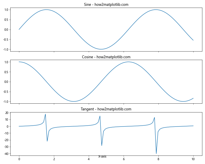
In this example, we use the sharex=True parameter when creating the subplots to share the x-axis. We also add a common x-label using fig.text().
Sharing Y-axis
Similarly, you can share the y-axis between subplots. Here’s how to generate subplots with Matplotlib that share the y-axis:
import matplotlib.pyplot as plt
import numpy as np

# Create a figure with 3 subplots sharing the y-axis
fig, (ax1, ax2, ax3) = plt.subplots(1, 3, figsize=(12, 4), sharey=True)

# Data for the plots
x = np.linspace(0, 10, 100)
y1 = np.sin(x)
y2 = np.cos(x)
y3 = np.sin(x) + np.cos(x)

# Plot data on each subplot
ax1.plot(x, y1)
ax1.set_title('Sine - how2matplotlib.com')

ax2.plot(x, y2)
ax2.set_title('Cosine - how2matplotlib.com')

ax3.plot(x, y3)
ax3.set_title('Sine + Cosine - how2matplotlib.com')

# Add a common y-label
fig.text(0.04, 0.5, 'Amplitude', va='center', rotation='vertical')

plt.tight_layout()
plt.show()
Output:
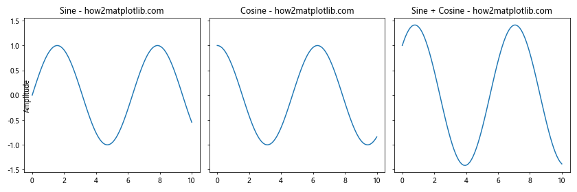
In this example, we use the sharey=True parameter to share the y-axis between subplots. We also add a common y-label using fig.text().
How to Generate Subplots With Matplotlib: Advanced Techniques
As you become more proficient in how to generate subplots with Matplotlib, you may want to explore more advanced techniques. Let’s look at some of these methods.
Creating Subplots with Different Scales
Sometimes, you may need to create subplots with different scales. Here’s an example of how to generate subplots with Matplotlib using different scales:
import matplotlib.pyplot as plt
import numpy as np

# Create a figure with 2 subplots
fig, (ax1, ax2) = plt.subplots(1, 2, figsize=(12, 5))

# Data for the plots
x = np.linspace(0, 10, 100)
y1 = np.sin(x)
y2 = np.exp(x)

# Plot data on the first subplot (linear scale)
ax1.plot(x, y1)
ax1.set_title('Sine Wave (Linear Scale) - how2matplotlib.com')
ax1.set_xlabel('X-axis')
ax1.set_ylabel('Amplitude')

# Plot data on the second subplot (log scale)
ax2.semilogy(x, y2)
ax2.set_title('Exponential Function (Log Scale) - how2matplotlib.com')
ax2.set_xlabel('X-axis')
ax2.set_ylabel('Amplitude')

plt.tight_layout()
plt.show()
Output:
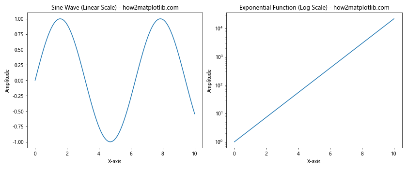
In this example, we use a linear scale for the first subplot and a logarithmic scale for the second subplot using the semilogy() function.
Creating Subplots with Insets
Insets are small plots within a larger plot. They can be useful for showing detailed views of specific regions. Here’s how to generate subplots with Matplotlib that include insets:
import matplotlib.pyplot as plt
import numpy as np

# Create a figure and a subplot
fig, ax = plt.subplots(figsize=(10, 6))

# Data for the main plot
x = np.linspace(0, 10, 100)
y = np.sin(x)

# Plot the main data
ax.plot(x, y)
ax.set_title('Sine Wave with Inset - how2matplotlib.com')

# Create an inset
axins = ax.inset_axes([0.6, 0.1, 0.3, 0.3])
axins.plot(x, y)
axins.set_xlim(4, 6)
axins.set_ylim(-1, 1)
axins.set_xticklabels([])
axins.set_yticklabels([])

# Add a box for the region of the inset
ax.indicate_inset_zoom(axins, edgecolor="black")

plt.show()
Output:
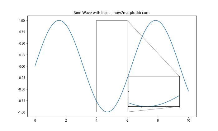
In this example, we create a main plot and then add an inset using ax.inset_axes(). The inset shows a zoomed-in view of a specific region of the main plot.
How to Generate Subplots With Matplotlib: Handling Different Types of Plots
When learning how to generate subplots with Matplotlib, it’s important to know how to handle different types of plots within the same figure. Let’s explore some examples.
Combining Line Plots and Scatter Plots
Here’s an example of how to generate subplots with Matplotlib that combine line plots and scatter plots:
import matplotlib.pyplot as plt
import numpy as np

# Create a figure with 2 subplots
fig, (ax1, ax2) = plt.subplots(1, 2, figsize=(12, 5))

# Data for the plots
x = np.linspace(0, 10, 50)
y1 = np.sin(x)
y2 = np.cos(x)

# Create a line plot on the first subplot
ax1.plot(x, y1, label='Sine')
ax1.set_title('Line Plot - how2matplotlib.com')
ax1.set_xlabel('X-axis')
ax1.set_ylabel('Y-axis')
ax1.legend()

# Create a scatter plot on the second subplot
ax2.scatter(x, y2, c=y2, cmap='viridis',label='Cosine')
ax2.set_title('Scatter Plot - how2matplotlib.com')
ax2.set_xlabel('X-axis')
ax2.set_ylabel('Y-axis')
ax2.legend()

plt.tight_layout()
plt.show()
Output:
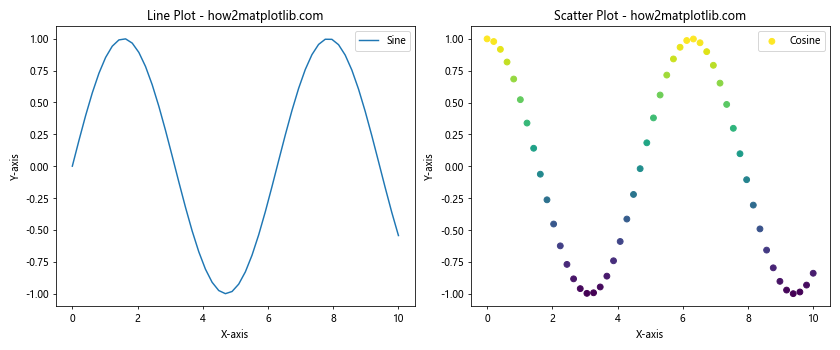
In this example, we create a line plot on the first subplot and a scatter plot on the second subplot. This demonstrates how to generate subplots with Matplotlib that combine different types of visualizations.
Adding Bar Plots and Histograms
Let’s explore how to generate subplots with Matplotlib that include bar plots and histograms:
import matplotlib.pyplot as plt
import numpy as np

# Create a figure with 2 subplots
fig, (ax1, ax2) = plt.subplots(1, 2, figsize=(12, 5))

# Data for the bar plot
categories = ['A', 'B', 'C', 'D', 'E']
values = [23, 45, 56, 78, 32]

# Create a bar plot on the first subplot
ax1.bar(categories, values)
ax1.set_title('Bar Plot - how2matplotlib.com')
ax1.set_xlabel('Categories')
ax1.set_ylabel('Values')

# Data for the histogram
data = np.random.normal(0, 1, 1000)

# Create a histogram on the second subplot
ax2.hist(data, bins=30, edgecolor='black')
ax2.set_title('Histogram - how2matplotlib.com')
ax2.set_xlabel('Values')
ax2.set_ylabel('Frequency')

plt.tight_layout()
plt.show()
Output:
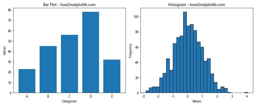
This example demonstrates how to generate subplots with Matplotlib that include a bar plot and a histogram. The bar plot shows categorical data, while the histogram displays the distribution of continuous data.
How to Generate Subplots With Matplotlib: Handling 3D Plots
Matplotlib also supports 3D plotting, which can be incorporated into subplots. Here’s an example of how to generate subplots with Matplotlib that include a 3D plot:
import matplotlib.pyplot as plt
import numpy as np
from mpl_toolkits.mplot3d import Axes3D

# Create a figure with 2 subplots (1 2D and 1 3D)
fig = plt.figure(figsize=(12, 5))
ax1 = fig.add_subplot(121)
ax2 = fig.add_subplot(122, projection='3d')

# Data for 2D plot
x = np.linspace(0, 10, 100)
y = np.sin(x)

# Data for 3D plot
X = np.arange(-5, 5, 0.25)
Y = np.arange(-5, 5, 0.25)
X, Y = np.meshgrid(X, Y)
R = np.sqrt(X**2 + Y**2)
Z = np.sin(R)

# Create 2D plot
ax1.plot(x, y)
ax1.set_title('2D Plot - how2matplotlib.com')
ax1.set_xlabel('X-axis')
ax1.set_ylabel('Y-axis')

# Create 3D surface plot
surf = ax2.plot_surface(X, Y, Z, cmap='viridis')
ax2.set_title('3D Surface Plot - how2matplotlib.com')
ax2.set_xlabel('X-axis')
ax2.set_ylabel('Y-axis')
ax2.set_zlabel('Z-axis')

plt.tight_layout()
plt.show()
Output:
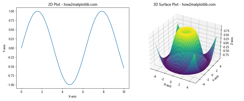
This example shows how to generate subplots with Matplotlib that combine a 2D plot and a 3D surface plot. The 3D plot is created using the projection='3d' parameter when adding the subplot.
How to Generate Subplots With Matplotlib: Customizing Subplot Layouts
Sometimes, you may need more control over the layout of your subplots. Matplotlib provides the GridSpec class for this purpose. Here’s an example of how to generate subplots with Matplotlib using GridSpec:
import matplotlib.pyplot as plt
import matplotlib.gridspec as gridspec
import numpy as np

# Create a figure
fig = plt.figure(figsize=(12, 8))

# Create GridSpec
gs = gridspec.GridSpec(3, 3)

# Create subplots using GridSpec
ax1 = fig.add_subplot(gs[0, :])
ax2 = fig.add_subplot(gs[1, :-1])
ax3 = fig.add_subplot(gs[1:, -1])
ax4 = fig.add_subplot(gs[-1, 0])
ax5 = fig.add_subplot(gs[-1, -2])

# Data for plots
x = np.linspace(0, 10, 100)
y1 = np.sin(x)
y2 = np.cos(x)
y3 = np.tan(x)
y4 = np.exp(x)
y5 = np.log(x)

# Create plots
ax1.plot(x, y1)
ax1.set_title('Sine - how2matplotlib.com')

ax2.plot(x, y2)
ax2.set_title('Cosine - how2matplotlib.com')

ax3.plot(x, y3)
ax3.set_title('Tangent - how2matplotlib.com')

ax4.plot(x, y4)
ax4.set_title('Exponential - how2matplotlib.com')

ax5.plot(x, y5)
ax5.set_title('Logarithm - how2matplotlib.com')

plt.tight_layout()
plt.show()
Output:
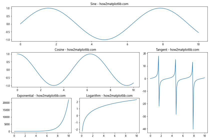
This example demonstrates how to generate subplots with Matplotlib using GridSpec to create a custom layout. The subplots are arranged in a 3×3 grid, but with varying sizes and positions.
How to Generate Subplots With Matplotlib: Adding Colorbars
When working with plots that use color mapping, it’s often useful to add colorbars. Here’s an example of how to generate subplots with Matplotlib that include colorbars:
import matplotlib.pyplot as plt
import numpy as np

# Create a figure with 2 subplots
fig, (ax1, ax2) = plt.subplots(1, 2, figsize=(12, 5))

# Data for the plots
x = np.linspace(-5, 5, 100)
y = np.linspace(-5, 5, 100)
X, Y = np.meshgrid(x, y)
Z1 = np.sin(np.sqrt(X**2 + Y**2))
Z2 = np.cos(np.sqrt(X**2 + Y**2))

# Create a contour plot on the first subplot
c1 = ax1.contourf(X, Y, Z1, cmap='viridis')
ax1.set_title('Contour Plot - how2matplotlib.com')
ax1.set_xlabel('X-axis')
ax1.set_ylabel('Y-axis')
fig.colorbar(c1, ax=ax1, label='Z-values')

# Create a pcolormesh plot on the second subplot
c2 = ax2.pcolormesh(X, Y, Z2, cmap='plasma')
ax2.set_title('Pcolormesh Plot - how2matplotlib.com')
ax2.set_xlabel('X-axis')
ax2.set_ylabel('Y-axis')
fig.colorbar(c2, ax=ax2, label='Z-values')

plt.tight_layout()
plt.show()
Output:
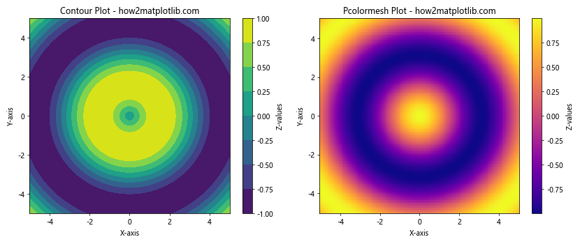
This example shows how to generate subplots with Matplotlib that include colorbars. We create a contour plot and a pcolormesh plot, each with its own colorbar.
How to Generate Subplots With Matplotlib: Handling Time Series Data
When working with time series data, you may need to create subplots that share a common time axis. Here’s an example of how to generate subplots with Matplotlib for time series data:
import matplotlib.pyplot as plt
import pandas as pd
import numpy as np

# Create sample time series data
dates = pd.date_range(start='2023-01-01', end='2023-12-31', freq='D')
series1 = pd.Series(np.random.randn(len(dates)).cumsum(), index=dates)
series2 = pd.Series(np.random.randn(len(dates)).cumsum(), index=dates)

# Create a figure with 2 subplots sharing the x-axis
fig, (ax1, ax2) = plt.subplots(2, 1, figsize=(12, 8), sharex=True)

# Plot the first time series
series1.plot(ax=ax1)
ax1.set_title('Time Series 1 - how2matplotlib.com')
ax1.set_ylabel('Values')

# Plot the second time series
series2.plot(ax=ax2)
ax2.set_title('Time Series 2 - how2matplotlib.com')
ax2.set_ylabel('Values')
ax2.set_xlabel('Date')

# Rotate and align the tick labels so they look better
fig.autofmt_xdate()

plt.tight_layout()
plt.show()
Output:
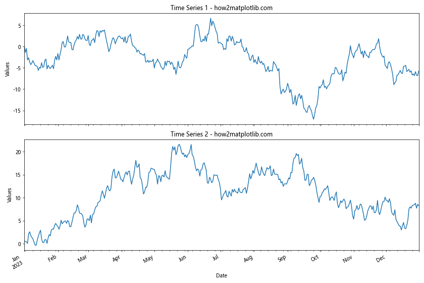
This example demonstrates how to generate subplots with Matplotlib for time series data. We create two subplots that share the x-axis, which represents dates. The fig.autofmt_xdate() function is used to format the date labels on the x-axis.
Conclusion: Mastering How to Generate Subplots With Matplotlib
In this comprehensive guide, we’ve explored various aspects of how to generate subplots with Matplotlib. We’ve covered basic subplot creation, customization, sharing axes, handling different types of plots, working with 3D plots, customizing layouts, adding colorbars, and dealing with time series data.
Mastering how to generate subplots with Matplotlib is crucial for creating complex and informative visualizations. By combining different types of plots, adjusting layouts, and fine-tuning the appearance, you can create powerful visual representations of your data.
Remember that practice is key when learning how to generate subplots with Matplotlib. Experiment with different configurations, plot types, and customization options to become proficient in creating the exact visualizations you need for your data analysis and presentation tasks.