How to Plot a Histogram with Various Variables in Matplotlib in Python
How to plot a histogram with various variables in Matplotlib in Python is an essential skill for data visualization and analysis. Histograms are powerful tools for displaying the distribution of data, and Matplotlib provides a flexible and robust platform for creating them. In this comprehensive guide, we’ll explore the various methods and techniques for plotting histograms with different variables using Matplotlib in Python.
Understanding Histograms and Their Importance
Before diving into the specifics of how to plot a histogram with various variables in Matplotlib, it’s crucial to understand what histograms are and why they’re important. A histogram is a graphical representation of the distribution of numerical data. It’s similar to a bar chart, but instead of showing individual values, it groups data into bins or intervals and displays the frequency of data points within each bin.
Histograms are particularly useful for:
- Visualizing the shape of data distribution
- Identifying outliers and anomalies
- Comparing distributions across different variables or datasets
- Estimating probability density functions
When learning how to plot a histogram with various variables in Matplotlib, it’s important to keep these applications in mind.
Setting Up Your Environment for Histogram Plotting
To begin plotting histograms with various variables in Matplotlib, you’ll need to set up your Python environment. Here’s a simple example of how to import the necessary libraries:
import matplotlib.pyplot as plt
import numpy as np

# Generate some sample data
data = np.random.normal(0, 1, 1000)

# Create a simple histogram
plt.hist(data, bins=30, edgecolor='black')
plt.title('How to plot a histogram with Matplotlib - how2matplotlib.com')
plt.xlabel('Value')
plt.ylabel('Frequency')
plt.show()
Output:
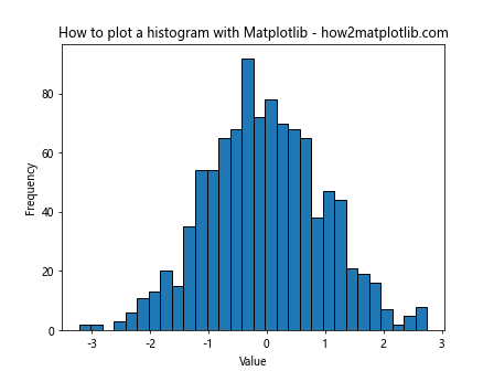
This basic example demonstrates how to plot a histogram with a single variable. As we progress, we’ll explore more complex scenarios for how to plot a histogram with various variables in Matplotlib.
Customizing Histogram Appearance
When learning how to plot a histogram with various variables in Matplotlib, it’s important to understand how to customize the appearance of your plots. Matplotlib offers a wide range of options for customization. Let’s look at some examples:
import matplotlib.pyplot as plt
import numpy as np

data = np.random.exponential(scale=2, size=1000)

plt.hist(data, bins=30, color='skyblue', edgecolor='black', alpha=0.7)
plt.title('Customized Histogram - how2matplotlib.com')
plt.xlabel('Value')
plt.ylabel('Frequency')
plt.grid(True, linestyle='--', alpha=0.7)
plt.show()
Output:
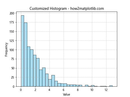
In this example, we’ve customized the color, edge color, and transparency of the histogram bars. We’ve also added a grid for better readability. These customizations are crucial when learning how to plot a histogram with various variables in Matplotlib, as they allow you to highlight different aspects of your data.
Plotting Multiple Histograms
One of the key aspects of learning how to plot a histogram with various variables in Matplotlib is understanding how to display multiple histograms on the same plot. This is particularly useful for comparing distributions across different variables or datasets. Here’s an example:
import matplotlib.pyplot as plt
import numpy as np

data1 = np.random.normal(0, 1, 1000)
data2 = np.random.normal(2, 1.5, 1000)

plt.hist(data1, bins=30, alpha=0.7, label='Dataset 1')
plt.hist(data2, bins=30, alpha=0.7, label='Dataset 2')
plt.title('Multiple Histograms - how2matplotlib.com')
plt.xlabel('Value')
plt.ylabel('Frequency')
plt.legend()
plt.show()
Output:
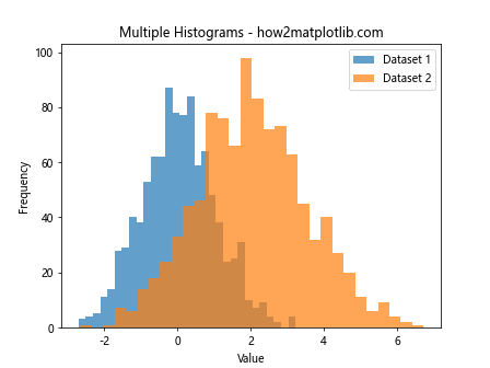
This example demonstrates how to plot two histograms on the same axes, using different colors and transparency to distinguish between them. This technique is fundamental when learning how to plot a histogram with various variables in Matplotlib.
Using Subplots for Multiple Histograms
Another approach to plotting histograms with various variables in Matplotlib is to use subplots. This method allows you to create separate histograms for each variable while still presenting them in a single figure. Here’s an example:
import matplotlib.pyplot as plt
import numpy as np

data1 = np.random.normal(0, 1, 1000)
data2 = np.random.exponential(2, 1000)
data3 = np.random.gamma(2, 2, 1000)

fig, (ax1, ax2, ax3) = plt.subplots(1, 3, figsize=(15, 5))

ax1.hist(data1, bins=30, edgecolor='black')
ax1.set_title('Normal Distribution - how2matplotlib.com')

ax2.hist(data2, bins=30, edgecolor='black')
ax2.set_title('Exponential Distribution - how2matplotlib.com')

ax3.hist(data3, bins=30, edgecolor='black')
ax3.set_title('Gamma Distribution - how2matplotlib.com')

plt.tight_layout()
plt.show()
Output:
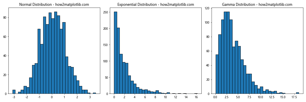
This example showcases how to create three separate histograms for different distributions using subplots. This method is particularly useful when learning how to plot a histogram with various variables in Matplotlib that have significantly different scales or distributions.
Stacked and Normalized Histograms
When dealing with multiple variables or categories, stacked and normalized histograms can provide valuable insights. Here’s an example of how to create a stacked histogram:
import matplotlib.pyplot as plt
import numpy as np

data1 = np.random.normal(0, 1, 1000)
data2 = np.random.normal(2, 1, 1000)
data3 = np.random.normal(4, 1, 1000)

plt.hist([data1, data2, data3], bins=30, stacked=True, label=['Data 1', 'Data 2', 'Data 3'])
plt.title('Stacked Histogram - how2matplotlib.com')
plt.xlabel('Value')
plt.ylabel('Frequency')
plt.legend()
plt.show()
Output:
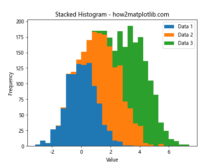
This example demonstrates how to create a stacked histogram, which is useful for showing the composition of different categories within each bin. When learning how to plot a histogram with various variables in Matplotlib, understanding stacked histograms is crucial for certain types of data analysis.
For normalized histograms, you can use the density parameter:
import matplotlib.pyplot as plt
import numpy as np

data1 = np.random.normal(0, 1, 1000)
data2 = np.random.normal(2, 1, 1500)

plt.hist([data1, data2], bins=30, density=True, alpha=0.7, label=['Data 1', 'Data 2'])
plt.title('Normalized Histogram - how2matplotlib.com')
plt.xlabel('Value')
plt.ylabel('Density')
plt.legend()
plt.show()
Output:
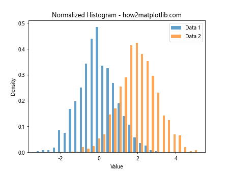
Normalized histograms are particularly useful when comparing distributions with different sample sizes, which is a common scenario when learning how to plot a histogram with various variables in Matplotlib.
2D Histograms and Heatmaps
When dealing with two continuous variables, 2D histograms and heatmaps can be powerful visualization tools. Here’s an example of how to create a 2D histogram:
import matplotlib.pyplot as plt
import numpy as np

x = np.random.normal(0, 1, 1000)
y = np.random.normal(0, 1, 1000)

plt.hist2d(x, y, bins=30, cmap='viridis')
plt.colorbar(label='Frequency')
plt.title('2D Histogram - how2matplotlib.com')
plt.xlabel('X Value')
plt.ylabel('Y Value')
plt.show()
Output:
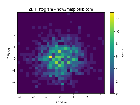
This example shows how to create a 2D histogram, which is essentially a heatmap of data point density. When learning how to plot a histogram with various variables in Matplotlib, 2D histograms are invaluable for visualizing the relationship between two continuous variables.
Histogram with Kernel Density Estimation (KDE)
Kernel Density Estimation (KDE) is a non-parametric way to estimate the probability density function of a random variable. Combining histograms with KDE can provide a more comprehensive view of data distribution. Here’s an example:
import matplotlib.pyplot as plt
import numpy as np
from scipy import stats

data = np.random.normal(0, 1, 1000)

plt.hist(data, bins=30, density=True, alpha=0.7, color='skyblue', edgecolor='black')
kde = stats.gaussian_kde(data)
x_range = np.linspace(data.min(), data.max(), 100)
plt.plot(x_range, kde(x_range), 'r-', lw=2)
plt.title('Histogram with KDE - how2matplotlib.com')
plt.xlabel('Value')
plt.ylabel('Density')
plt.show()
Output:
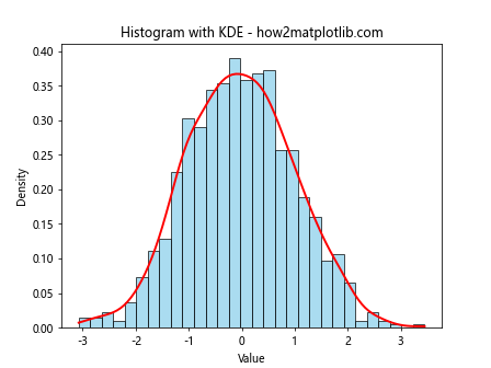
This example demonstrates how to overlay a KDE curve on a histogram. This technique is particularly useful when learning how to plot a histogram with various variables in Matplotlib, as it provides a smooth estimate of the probability density function.
Cumulative Histograms
Cumulative histograms are useful for showing the cumulative distribution of data. Here’s how to create one:
import matplotlib.pyplot as plt
import numpy as np

data = np.random.normal(0, 1, 1000)

plt.hist(data, bins=30, cumulative=True, density=True, alpha=0.7, color='skyblue', edgecolor='black')
plt.title('Cumulative Histogram - how2matplotlib.com')
plt.xlabel('Value')
plt.ylabel('Cumulative Frequency')
plt.grid(True, linestyle='--', alpha=0.7)
plt.show()
Output:
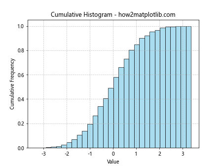
This example shows how to create a cumulative histogram. When learning how to plot a histogram with various variables in Matplotlib, cumulative histograms are particularly useful for understanding the distribution of data up to a certain point.
Logarithmic Scale Histograms
When dealing with data that spans several orders of magnitude, logarithmic scale histograms can be very useful. Here’s an example:
import matplotlib.pyplot as plt
import numpy as np

data = np.random.lognormal(0, 1, 1000)

plt.hist(data, bins=30, log=True)
plt.title('Logarithmic Scale Histogram - how2matplotlib.com')
plt.xlabel('Value')
plt.ylabel('Log Frequency')
plt.show()
Output:
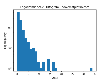
This example demonstrates how to create a histogram with a logarithmic y-axis. This is particularly useful when learning how to plot a histogram with various variables in Matplotlib that have a wide range of values or follow a power-law distribution.
Histograms with Error Bars
Adding error bars to histograms can provide information about the uncertainty in each bin. Here’s an example:
import matplotlib.pyplot as plt
import numpy as np

data = np.random.normal(0, 1, 1000)
counts, bins, _ = plt.hist(data, bins=30, alpha=0.7)
bin_centers = 0.5 * (bins[1:] + bins[:-1])
error = np.sqrt(counts)

plt.errorbar(bin_centers, counts, yerr=error, fmt='none', ecolor='black', capsize=2)
plt.title('Histogram with Error Bars - how2matplotlib.com')
plt.xlabel('Value')
plt.ylabel('Frequency')
plt.show()
Output:
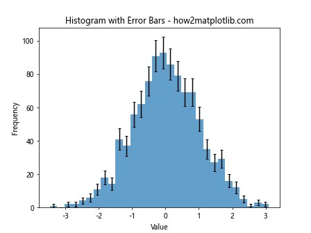
This example shows how to add error bars to a histogram. When learning how to plot a histogram with various variables in Matplotlib, including error bars can provide valuable information about the reliability of the data in each bin.
Histograms with Different Bin Widths
Sometimes, using variable bin widths can provide a better representation of the data distribution. Here’s an example:
import matplotlib.pyplot as plt
import numpy as np

data = np.random.exponential(2, 1000)
bins = [0, 1, 2, 4, 8, 16, 32]

plt.hist(data, bins=bins, edgecolor='black')
plt.title('Histogram with Variable Bin Widths - how2matplotlib.com')
plt.xlabel('Value')
plt.ylabel('Frequency')
plt.xscale('log')
plt.show()
Output:
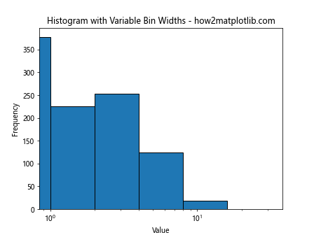
This example demonstrates how to create a histogram with custom bin widths. When learning how to plot a histogram with various variables in Matplotlib, using variable bin widths can be particularly useful for data with non-uniform distributions.
Polar Histograms (Rose Plots)
For circular data, polar histograms (also known as rose plots) can be an effective visualization tool. Here’s an example:
import matplotlib.pyplot as plt
import numpy as np

angles = np.random.uniform(0, 2*np.pi, 1000)
plt.subplot(111, projection='polar')
plt.hist(angles, bins=16)
plt.title('Polar Histogram (Rose Plot) - how2matplotlib.com')
plt.show()
Output:
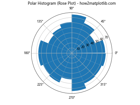
This example shows how to create a polar histogram. When learning how to plot a histogram with various variables in Matplotlib, polar histograms are particularly useful for directional or cyclical data.
Histograms with Outlier Detection
Detecting and visualizing outliers is an important aspect of data analysis. Here’s an example of how to create a histogram that highlights potential outliers:
import matplotlib.pyplot as plt
import numpy as np

data = np.concatenate([np.random.normal(0, 1, 990), np.random.uniform(5, 10, 10)])
q1, q3 = np.percentile(data, [25, 75])
iqr = q3 - q1
lower_bound = q1 - 1.5 * iqr
upper_bound = q3 + 1.5 * iqr

plt.hist(data, bins=30, edgecolor='black')
plt.axvline(lower_bound, color='r', linestyle='dashed', linewidth=2)
plt.axvline(upper_bound, color='r', linestyle='dashed', linewidth=2)
plt.title('Histogram with Outlier Detection - how2matplotlib.com')
plt.xlabel('Value')
plt.ylabel('Frequency')
plt.show()
Output:
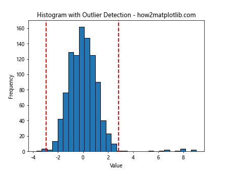
This example demonstrates how to create a histogram with vertical lines indicating potential outlier boundaries. When learning how to plot a histogram with various variables in Matplotlib, this technique can be valuable for identifying unusual data points.
Histograms with Fitted Distributions
Often, it’s useful to fit a theoretical distribution to your data and overlay it on the histogram. Here’s an example:
import matplotlib.pyplot as plt
import numpy as np
from scipy import stats

data = np.random.normal(0, 1, 1000)
mu, sigma = stats.norm.fit(data)

x = np.linspace(data.min(), data.max(), 100)
y = stats.norm.pdf(x, mu, sigma)

plt.hist(data, bins=30, density=True, alpha=0.7, color='skyblue', edgecolor='black')
plt.plot(x, y, 'r-', lw=2)
plt.title('Histogram with Fitted Normal Distribution - how2matplotlib.com')
plt.xlabel('Value')
plt.ylabel('Density')
plt.show()
Output:
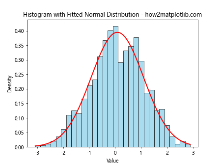
This example shows how to fit a normal distribution to the data and overlay it on the histogram. When learning how to plot a histogram with various variables in Matplotlib, this technique can help in understanding the underlying distribution of your data.
Advanced Histogram Techniques
As you become more proficient in how to plot a histogram with various variables in Matplotlib, you may want to explore some more advanced techniques. These can help you create even more informative and visually appealing visualizations.
Histograms with Multiple Y-axes
Sometimes, you may need to plot histograms with different scales on the same graph. Here’s an example of how to create a histogram with two y-axes:
import matplotlib.pyplot as plt
import numpy as np

data1 = np.random.normal(0, 1, 1000)
data2 = np.random.normal(0, 5, 1000)

fig, ax1 = plt.subplots()

ax1.hist(data1, bins=30, alpha=0.7, color='blue', label='Data 1')
ax1.set_ylabel('Frequency (Data 1)', color='blue')
ax1.tick_params(axis='y', labelcolor='blue')

ax2 = ax1.twinx()
ax2.hist(data2, bins=30, alpha=0.7, color='red', label='Data 2')
ax2.set_ylabel('Frequency (Data 2)', color='red')
ax2.tick_params(axis='y', labelcolor='red')

plt.title('Histogram with Multiple Y-axes - how2matplotlib.com')
plt.xlabel('Value')
plt.show()
Output:
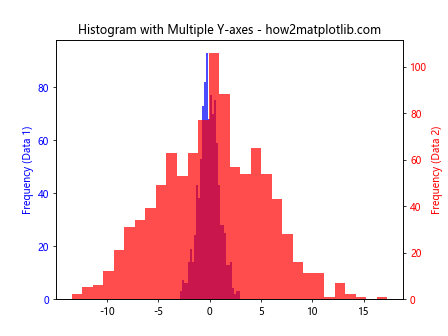
This example demonstrates how to create a histogram with two different y-axes, which can be useful when comparing datasets with significantly different scales.
Animated Histograms
Creating animated histograms can be a powerful way to visualize how data distributions change over time or with different parameters. Here’s a simple example of how to create an animated histogram:
import matplotlib.pyplot as plt
import numpy as np
from matplotlib.animation import FuncAnimation

fig, ax = plt.subplots()
x = np.random.normal(0, 1, 1000)
n, bins, patches = ax.hist(x, bins=30, range=(-4, 4))

def update(frame):
    x = np.random.normal(frame * 0.1, 1, 1000)
    n, _ = np.histogram(x, bins=bins)
    for rect, h in zip(patches, n):
        rect.set_height(h)
    ax.set_title(f'Animated Histogram - Frame {frame} - how2matplotlib.com')
    return patches

ani = FuncAnimation(fig, update, frames=range(50), blit=True, repeat=False)
plt.show()
Output:
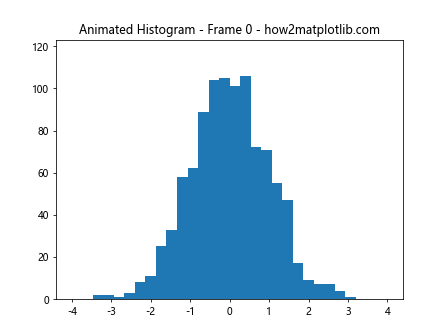
This example creates an animated histogram where the mean of the normal distribution changes over time. When learning how to plot a histogram with various variables in Matplotlib, animated histograms can be particularly useful for demonstrating changes in distributions.
Histograms with Confidence Intervals
Adding confidence intervals to your histograms can provide additional information about the reliability of your data. Here’s an example:
import matplotlib.pyplot as plt
import numpy as np
from scipy import stats

data = np.random.normal(0, 1, 1000)
counts, bins, _ = plt.hist(data, bins=30, alpha=0.7)
bin_centers = 0.5 * (bins[1:] + bins[:-1])

ci_low, ci_high = stats.t.interval(0.95, len(data)-1, loc=np.mean(data), scale=stats.sem(data))

plt.axvline(np.mean(data), color='r', linestyle='dashed', linewidth=2)
plt.axvline(ci_low, color='g', linestyle='dashed', linewidth=2)
plt.axvline(ci_high, color='g', linestyle='dashed', linewidth=2)

plt.title('Histogram with Confidence Interval - how2matplotlib.com')
plt.xlabel('Value')
plt.ylabel('Frequency')
plt.show()
Output:
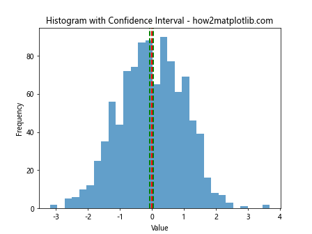
This example shows how to add vertical lines representing the mean and 95% confidence interval to a histogram. When learning how to plot a histogram with various variables in Matplotlib, including confidence intervals can provide valuable information about the reliability of your estimates.
Histograms with Kernel Density Estimation and Rug Plot
Combining histograms with kernel density estimation and rug plots can provide a comprehensive view of your data distribution. Here’s an example:
import matplotlib.pyplot as plt
import numpy as np
from scipy import stats

data = np.random.normal(0, 1, 1000)

plt.figure(figsize=(10, 6))
plt.hist(data, bins=30, density=True, alpha=0.7, color='skyblue', edgecolor='black')

kde = stats.gaussian_kde(data)
x_range = np.linspace(data.min(), data.max(), 100)
plt.plot(x_range, kde(x_range), 'r-', lw=2)

plt.plot(data, np.zeros_like(data), '|k', markeredgewidth=1)

plt.title('Histogram with KDE and Rug Plot - how2matplotlib.com')
plt.xlabel('Value')
plt.ylabel('Density')
plt.show()
Output:
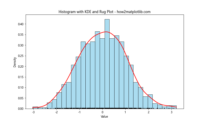
This example demonstrates how to create a histogram with an overlaid kernel density estimation curve and a rug plot at the bottom. When learning how to plot a histogram with various variables in Matplotlib, this combination can provide a detailed view of your data distribution.
Best Practices for Histogram Plotting
As you continue to explore how to plot a histogram with various variables in Matplotlib, keep these best practices in mind:
- Choose an appropriate number of bins: Too few bins can obscure important details, while too many can create noise. The optimal number of bins depends on your data and the story you want to tell.
Consider the bin width: Uniform bin widths are common, but variable bin widths can be useful for certain types of data.
Use color effectively: Color can help distinguish between different datasets or highlight important features of your histogram.
Label your axes clearly: Always include clear labels for your x and y axes, as well as a descriptive title for your histogram.
Include a legend when necessary: If you’re plotting multiple datasets on the same histogram, use a legend to identify each one.
Consider using density instead of frequency: Normalized histograms (using density instead of frequency) can be useful when comparing datasets of different sizes.
Add context with additional statistical information: Consider including mean, median, or other relevant statistics on your histogram plot.
Use appropriate scales: Linear scales are common, but log scales can be useful for data that spans several orders of magnitude.
Be mindful of outliers: Outliers can significantly affect the appearance of your histogram. Consider how you want to handle them in your visualization.
Combine histograms with other plot types when appropriate: As we’ve seen, combining histograms with KDE plots, rug plots, or other visualizations can provide additional insights.
Troubleshooting Common Issues
When learning how to plot a histogram with various variables in Matplotlib, you may encounter some common issues. Here are some tips for troubleshooting: