How to Plot a Dashed Line in Matplotlib
How to plot a dashed line in matplotlib is an essential skill for data visualization enthusiasts and professionals alike. Matplotlib, a powerful plotting library for Python, offers various ways to create dashed lines in your plots. This article will explore the different methods and techniques to plot dashed lines using matplotlib, providing you with a thorough understanding of this important feature.
Understanding Dashed Lines in Matplotlib
Before diving into the specifics of how to plot a dashed line in matplotlib, it’s crucial to understand what dashed lines are and why they’re important in data visualization. Dashed lines are non-continuous lines that consist of a series of dashes or dots. They are often used to:
- Differentiate between multiple lines in a single plot
- Indicate uncertainty or approximation
- Represent theoretical or predicted values
- Highlight specific regions or thresholds
Matplotlib provides several ways to create dashed lines, allowing you to customize their appearance to suit your specific needs.
Basic Method: Using the linestyle Parameter
The most straightforward way to plot a dashed line in matplotlib is by using the linestyle parameter when calling the plot() function. This parameter accepts various string values that define different line styles, including dashed lines.
Here’s a simple example of how to plot a dashed line in matplotlib:
import matplotlib.pyplot as plt

x = [1, 2, 3, 4, 5]
y = [2, 4, 6, 8, 10]

plt.plot(x, y, linestyle='--', label='how2matplotlib.com')
plt.title('How to Plot a Dashed Line in Matplotlib')
plt.xlabel('X-axis')
plt.ylabel('Y-axis')
plt.legend()
plt.show()
Output:
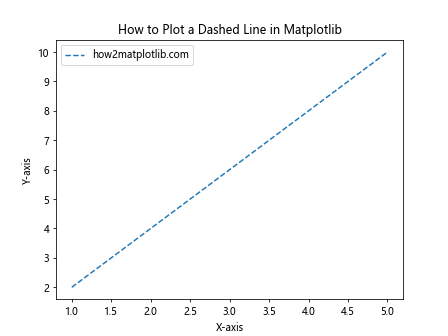
In this example, we set linestyle='--' to create a dashed line. Matplotlib recognizes several string shortcuts for different line styles:
'-': solid line (default)'--': dashed line'-.': dash-dot line':': dotted line
You can experiment with these different line styles to find the one that best suits your visualization needs.
Advanced Dashed Line Customization
While the basic method works well for simple dashed lines, matplotlib offers more advanced options for customizing the appearance of your dashed lines. Let’s explore some of these techniques.
Using Tuple Notation
For more precise control over the dash pattern, you can use tuple notation. This allows you to specify the exact lengths of the dashes and gaps.
Here’s an example of how to plot a dashed line in matplotlib using tuple notation:
import matplotlib.pyplot as plt
import numpy as np

x = np.linspace(0, 10, 100)
y = np.sin(x)

plt.plot(x, y, linestyle=(0, (5, 5)), label='how2matplotlib.com')
plt.title('How to Plot a Dashed Line in Matplotlib: Tuple Notation')
plt.xlabel('X-axis')
plt.ylabel('Y-axis')
plt.legend()
plt.show()
Output:
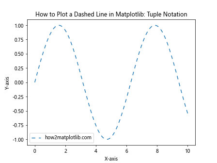
In this example, linestyle=(0, (5, 5)) creates a dashed line where each dash and gap is 5 points long. The first value in the tuple (0) represents the offset, while the second tuple (5, 5) defines the dash-gap pattern.
Creating Custom Dash Styles
You can create more complex dash patterns by specifying longer tuples. This allows you to alternate between different dash and gap lengths.
Here’s how to plot a dashed line in matplotlib with a custom dash style:
import matplotlib.pyplot as plt
import numpy as np

x = np.linspace(0, 10, 100)
y = np.cos(x)

plt.plot(x, y, linestyle=(0, (5, 2, 1, 2)), label='how2matplotlib.com')
plt.title('How to Plot a Dashed Line in Matplotlib: Custom Dash Style')
plt.xlabel('X-axis')
plt.ylabel('Y-axis')
plt.legend()
plt.show()
Output:
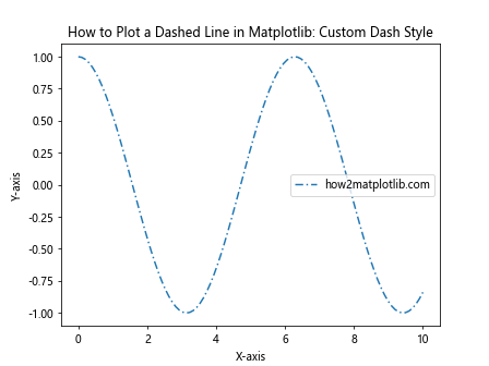
In this example, linestyle=(0, (5, 2, 1, 2)) creates a pattern with a 5-point dash, 2-point gap, 1-point dash, and 2-point gap, which then repeats.
Combining Dashed Lines with Other Line Properties
When learning how to plot a dashed line in matplotlib, it’s important to understand that you can combine dashed lines with other line properties to create even more distinctive visualizations.
Color and Dashed Lines
You can easily combine color with dashed lines to create visually appealing and informative plots.
Here’s an example:
import matplotlib.pyplot as plt
import numpy as np

x = np.linspace(0, 10, 100)
y1 = np.sin(x)
y2 = np.cos(x)

plt.plot(x, y1, linestyle='--', color='red', label='Sin (how2matplotlib.com)')
plt.plot(x, y2, linestyle='-.', color='blue', label='Cos (how2matplotlib.com)')
plt.title('How to Plot a Dashed Line in Matplotlib: With Colors')
plt.xlabel('X-axis')
plt.ylabel('Y-axis')
plt.legend()
plt.show()
Output:
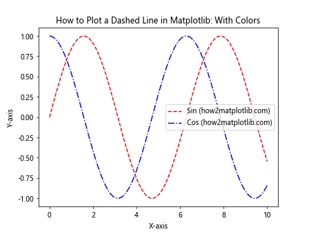
In this example, we’ve created two dashed lines with different colors and dash styles to distinguish between sine and cosine functions.
Line Width and Dashed Lines
Adjusting the line width can make your dashed lines more prominent or subtle, depending on your needs.
Here’s how to plot a dashed line in matplotlib with custom line width:
import matplotlib.pyplot as plt
import numpy as np

x = np.linspace(0, 10, 100)
y = np.exp(-x/10) * np.cos(x)

plt.plot(x, y, linestyle='--', linewidth=2.5, label='how2matplotlib.com')
plt.title('How to Plot a Dashed Line in Matplotlib: Custom Line Width')
plt.xlabel('X-axis')
plt.ylabel('Y-axis')
plt.legend()
plt.show()
Output:
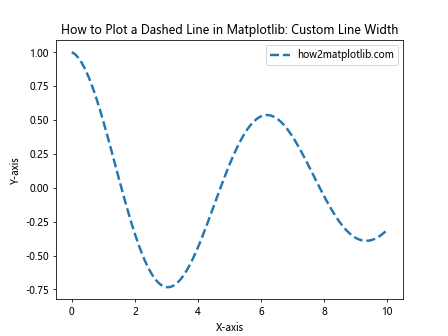
In this example, we’ve set linewidth=2.5 to create a thicker dashed line.
Dashed Lines in Different Plot Types
Now that we’ve covered the basics of how to plot a dashed line in matplotlib, let’s explore how to use dashed lines in different types of plots.
Dashed Lines in Scatter Plots
While scatter plots typically use markers to represent data points, you can add dashed lines to show trends or connections between points.
Here’s an example:
import matplotlib.pyplot as plt
import numpy as np

x = np.random.rand(20)
y = np.random.rand(20)

plt.scatter(x, y, label='Data Points (how2matplotlib.com)')
plt.plot(x, y, linestyle='--', color='red', label='Trend (how2matplotlib.com)')
plt.title('How to Plot a Dashed Line in Matplotlib: Scatter Plot')
plt.xlabel('X-axis')
plt.ylabel('Y-axis')
plt.legend()
plt.show()
Output:
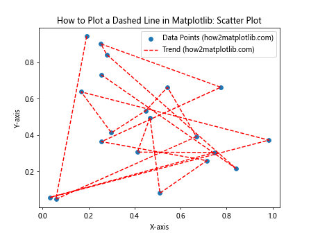
In this example, we’ve added a dashed line to connect the scattered points, which could represent a trend or relationship in the data.
Dashed Lines in Bar Plots
Dashed lines can be used in bar plots to indicate thresholds or average values.
Here’s how to plot a dashed line in matplotlib on a bar plot:
import matplotlib.pyplot as plt
import numpy as np

categories = ['A', 'B', 'C', 'D', 'E']
values = np.random.randint(1, 100, 5)
average = np.mean(values)

plt.bar(categories, values, label='Values (how2matplotlib.com)')
plt.axhline(y=average, linestyle='--', color='red', label='Average (how2matplotlib.com)')
plt.title('How to Plot a Dashed Line in Matplotlib: Bar Plot')
plt.xlabel('Categories')
plt.ylabel('Values')
plt.legend()
plt.show()
Output:
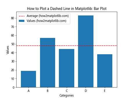
In this example, we’ve added a horizontal dashed line to represent the average value across all categories.
Dashed Lines in Subplots
When working with multiple subplots, you might want to know how to plot a dashed line in matplotlib across different axes. Let’s explore this scenario.
import matplotlib.pyplot as plt
import numpy as np

x = np.linspace(0, 10, 100)
y1 = np.sin(x)
y2 = np.cos(x)

fig, (ax1, ax2) = plt.subplots(2, 1, figsize=(8, 8))

ax1.plot(x, y1, linestyle='--', label='Sin (how2matplotlib.com)')
ax1.set_title('Subplot 1: Sin Function')
ax1.set_xlabel('X-axis')
ax1.set_ylabel('Y-axis')
ax1.legend()

ax2.plot(x, y2, linestyle='-.', label='Cos (how2matplotlib.com)')
ax2.set_title('Subplot 2: Cos Function')
ax2.set_xlabel('X-axis')
ax2.set_ylabel('Y-axis')
ax2.legend()

plt.tight_layout()
plt.show()
Output:
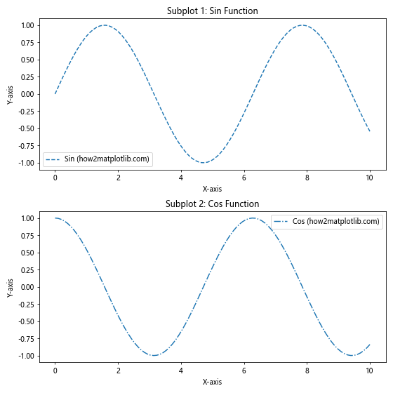
In this example, we’ve created two subplots, each with a different dashed line style.
Dashed Lines with Markers
Combining dashed lines with markers can provide additional visual cues in your plots. Here’s how to plot a dashed line in matplotlib with markers:
import matplotlib.pyplot as plt
import numpy as np

x = np.linspace(0, 10, 10)
y = x**2

plt.plot(x, y, linestyle='--', marker='o', label='how2matplotlib.com')
plt.title('How to Plot a Dashed Line in Matplotlib: With Markers')
plt.xlabel('X-axis')
plt.ylabel('Y-axis')
plt.legend()
plt.show()
Output:
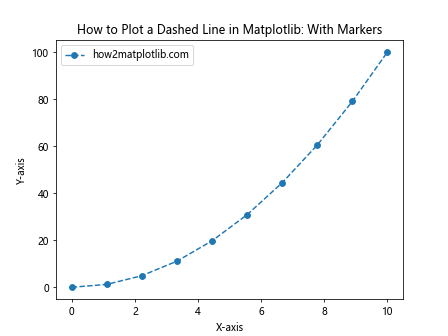
In this example, we’ve added circular markers ('o') to our dashed line plot.
Dashed Lines in Filled Plots
Dashed lines can also be used effectively in filled plots, such as area plots or filled curves. Here’s an example of how to plot a dashed line in matplotlib with a filled area:
import matplotlib.pyplot as plt
import numpy as np

x = np.linspace(0, 10, 100)
y1 = np.sin(x)
y2 = np.cos(x)

plt.fill_between(x, y1, y2, alpha=0.3, label='Filled Area (how2matplotlib.com)')
plt.plot(x, y1, linestyle='--', label='Sin (how2matplotlib.com)')
plt.plot(x, y2, linestyle='-.', label='Cos (how2matplotlib.com)')
plt.title('How to Plot a Dashed Line in Matplotlib: Filled Plot')
plt.xlabel('X-axis')
plt.ylabel('Y-axis')
plt.legend()
plt.show()
Output:
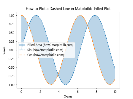
In this example, we’ve created a filled area between two curves and added dashed lines to highlight the individual functions.
Dashed Lines in 3D Plots
Matplotlib also supports 3D plotting, and you can use dashed lines in these plots as well. Here’s how to plot a dashed line in matplotlib in a 3D plot:
import matplotlib.pyplot as plt
import numpy as np
from mpl_toolkits.mplot3d import Axes3D

fig = plt.figure()
ax = fig.add_subplot(111, projection='3d')

t = np.linspace(0, 10, 100)
x = np.cos(t)
y = np.sin(t)
z = t

ax.plot(x, y, z, linestyle='--', label='how2matplotlib.com')
ax.set_title('How to Plot a Dashed Line in Matplotlib: 3D Plot')
ax.set_xlabel('X-axis')
ax.set_ylabel('Y-axis')
ax.set_zlabel('Z-axis')
ax.legend()
plt.show()
Output:
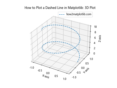
In this example, we’ve created a 3D spiral using a dashed line.
Dashed Lines with Different Dash Caps
Matplotlib allows you to customize the appearance of the dash caps (the ends of each dash). Here’s how to plot a dashed line in matplotlib with different dash cap styles:
import matplotlib.pyplot as plt
import numpy as np

x = np.linspace(0, 10, 100)
y1 = np.sin(x)
y2 = np.cos(x)
y3 = np.tan(x)

plt.plot(x, y1, linestyle='--', dash_capstyle='butt', linewidth=2, label='Butt Cap (how2matplotlib.com)')
plt.plot(x, y2, linestyle='--', dash_capstyle='round', linewidth=2, label='Round Cap (how2matplotlib.com)')
plt.plot(x, y3, linestyle='--', dash_capstyle='projecting', linewidth=2, label='Projecting Cap (how2matplotlib.com)')
plt.title('How to Plot a Dashed Line in Matplotlib: Different Dash Caps')
plt.xlabel('X-axis')
plt.ylabel('Y-axis')
plt.legend()
plt.ylim(-2, 2)  # Limit y-axis for better visibility
plt.show()
Output:
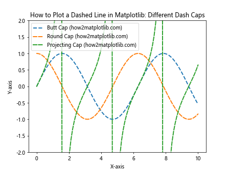
In this example, we’ve demonstrated three different dash cap styles: butt, round, and projecting.
Dashed Lines with Varying Opacity
You can also adjust the opacity of dashed lines to create interesting visual effects. Here’s how to plot a dashed line in matplotlib with varying opacity:
import matplotlib.pyplot as plt
import numpy as np

x = np.linspace(0, 10, 100)
y = np.sin(x)

for alpha in [0.2, 0.4, 0.6, 0.8, 1.0]:
    plt.plot(x, y + alpha, linestyle='--', alpha=alpha, label=f'Alpha: {alpha} (how2matplotlib.com)')

plt.title('How to Plot a Dashed Line in Matplotlib: Varying Opacity')
plt.xlabel('X-axis')
plt.ylabel('Y-axis')
plt.legend()
plt.show()
Output:
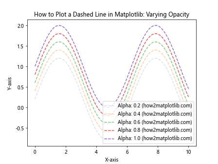
In this example, we’ve created multiple dashed lines with different levels of opacity.
Dashed Lines in Polar Plots
Dashed lines can also be used effectively in polar plots. Here’s how to plot a dashed line in matplotlib on a polar plot:
import matplotlib.pyplot as plt
import numpy as np

theta = np.linspace(0, 2*np.pi, 100)
r = np.sin(4*theta)

plt.polar(theta, r, linestyle='--', label='how2matplotlib.com')
plt.title('How to Plot a Dashed Line in Matplotlib: Polar Plot')
plt.legend()
plt.show()
Output:
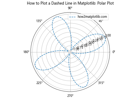
In this example, we’ve created a polar plot with a dashed line representing a four-leaved rose curve.
Best Practices for Using Dashed Lines in Matplotlib
When considering how to plot a dashed line in matplotlib, it’s important to keep in mind some best practices to ensure your visualizations are effective and professional:
- Use dashed lines purposefully: Don’t overuse dashed lines just because you can. Use them to highlight specific aspects of your data or to differentiate between different types of information.
Maintain consistency: If you’re using dashed lines to represent a certain type of data or relationship, maintain that consistency throughout your visualization or set of visualizations.
Consider color-blindness: When combining dashed lines with colors, ensure that your choices are accessible to color-blind viewers. You can use tools like ColorBrewer to select color-blind friendly palettes.
Balance with solid lines: Mixing dashed and solid lines can create visual interest and help differentiate between different data series.
Adjust for print: If your visualization will be printed, consider using thicker dashed lines to ensure they remain visible in print.
Troubleshooting Common Issues
Even when you know how to plot a dashed line in matplotlib, you might encounter some common issues. Here are some troubleshooting tips: