How to Make Line Plot in Matplotlib
Matplotlib is a popular plotting library in Python that can be used to create various types of plots, including line plots. Line plots are particularly useful for visualizing trends and relationships in data. In this article, we will explore how to make line plots in Matplotlib with detailed examples.
Basic Line Plot
import matplotlib.pyplot as plt

# Data
x = [1, 2, 3, 4, 5]
y = [2, 3, 5, 7, 11]

# Create a line plot
plt.plot(x, y)

# Add labels and title
plt.xlabel('X-axis')
plt.ylabel('Y-axis')
plt.title('Basic Line Plot')

# Display the plot
plt.show()
Output:
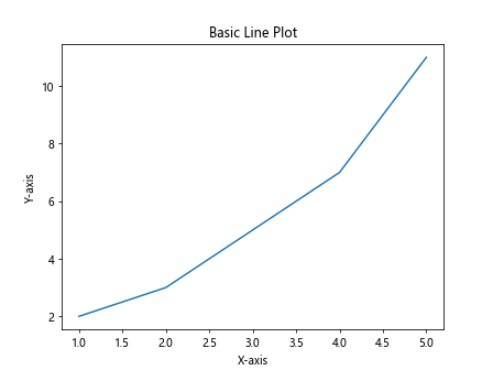
In the example above, we first create a set of data points x and y, then use the plot function in Matplotlib to create a basic line plot. We then add labels to the x and y-axis, as well as a title to the plot.
Customizing Line Plot
import matplotlib.pyplot as plt

# Data
x = [1, 2, 3, 4, 5]
y = [2, 3, 5, 7, 11]

# Create a line plot with customizations
plt.plot(x, y, color='red', linewidth=2, linestyle='--', marker='o', markersize=8, label='Data Points')

# Add labels and title
plt.xlabel('X-axis')
plt.ylabel('Y-axis')
plt.title('Customized Line Plot')

# Add legend
plt.legend()

# Display the plot
plt.show()
Output:
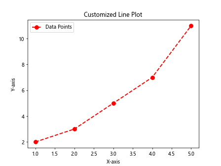
In this example, we customize the line plot by specifying the color, linewidth, linestyle, marker type, and markersize. We also add a label to the data points and a legend to the plot.
Multiple Line Plots
import matplotlib.pyplot as plt

# Data
x = [1, 2, 3, 4, 5]
y1 = [2, 3, 5, 7, 11]
y2 = [1, 4, 9, 16, 25]

# Create multiple line plots
plt.plot(x, y1, label='Line 1')
plt.plot(x, y2, label='Line 2')

# Add labels and title
plt.xlabel('X-axis')
plt.ylabel('Y-axis')
plt.title('Multiple Line Plots')

# Add legend
plt.legend()

# Display the plot
plt.show()
Output:
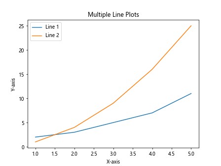
In this example, we create multiple line plots on the same figure by calling the plot function multiple times with different sets of data. We also add labels to each line plot and a legend to differentiate between them.
Line Plot with Annotations
import matplotlib.pyplot as plt

# Data
x = [1, 2, 3, 4, 5]
y = [2, 3, 5, 7, 11]

# Create a line plot
plt.plot(x, y)

# Add annotations
plt.annotate('Start', xy=(1, 2), xytext=(2, 3),
             arrowprops=dict(facecolor='black', shrink=0.05))

# Add labels and title
plt.xlabel('X-axis')
plt.ylabel('Y-axis')
plt.title('Line Plot with Annotations')

# Display the plot
plt.show()
Output:
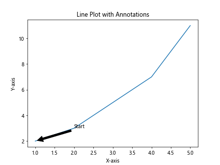
In this example, we add annotations to the line plot using the annotate function. We specify the text, location of the annotation, and the location of the annotation text.
Line Plot with Grid Lines
import matplotlib.pyplot as plt

# Data
x = [1, 2, 3, 4, 5]
y = [2, 3, 5, 7, 11]

# Create a line plot with grid lines
plt.plot(x, y)
plt.grid(True)

# Add labels and title
plt.xlabel('X-axis')
plt.ylabel('Y-axis')
plt.title('Line Plot with Grid Lines')

# Display the plot
plt.show()
Output:
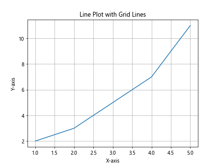
In this example, we add grid lines to the line plot by setting the grid parameter to True. Grid lines are helpful for comparing data points against a reference.
Line Plot with Different Marker Styles
import matplotlib.pyplot as plt

# Data
x = [1, 2, 3, 4, 5]
y = [2, 3, 5, 7, 11]

# Create a line plot with different marker styles
plt.plot(x, y, marker='s', label='Square Marker')
plt.plot(x, [val+1 for val in y], marker='^', label='Triangle Marker')

# Add labels and title
plt.xlabel('X-axis')
plt.ylabel('Y-axis')
plt.title('Line Plot with Different Marker Styles')

# Add legend
plt.legend()

# Display the plot
plt.show()
Output:
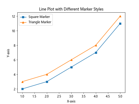
In this example, we create a line plot with different marker styles, such as squares and triangles. This can be useful when visualizing multiple data sets on the same plot.
Line Plot with Logarithmic Scale
import matplotlib.pyplot as plt

# Data
import numpy as np
x = [1, 2, 3, 4, 5]
y = [2, 3, 5, 7, 11]

# Create a line plot with logarithmic scale
plt.plot(x, y)
plt.yscale('log')

# Add labels and title
plt.xlabel('X-axis')
plt.ylabel('Y-axis')
plt.title('Line Plot with Logarithmic Scale')

# Display the plot
plt.show()
Output:
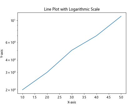
In this example, we create a line plot with a logarithmic scale on the y-axis by setting the yscale parameter to log. This can be helpful when visualizing data with a wide range of values.
Line Plot with Custom Line Styles
import matplotlib.pyplot as plt

# Data
x = [1, 2, 3, 4, 5]
y = [2, 3, 5, 7, 11]

# Create a line plot with custom line styles
plt.plot(x, y, linestyle='-.', color='purple', label='Dashed Dot Line')

# Add labels and title
plt.xlabel('X-axis')
plt.ylabel('Y-axis')
plt.title('Line Plot with Custom Line Styles')

# Add legend
plt.legend()

# Display the plot
plt.show()
Output:
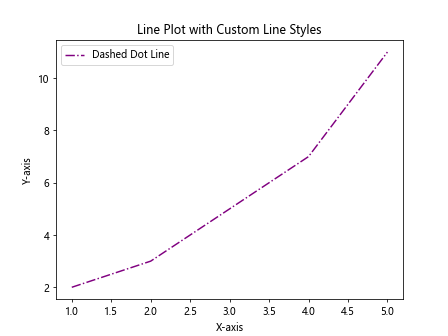
In this example, we create a line plot with a custom line style (dash-dot) and color (purple) by specifying the linestyle and color parameters.
Line Plot with Different Line Width
import matplotlib.pyplot as plt

# Data
x = [1, 2, 3, 4, 5]
y = [2, 3, 5, 7, 11]

# Create a line plot with different line width
plt.plot(x, y, linewidth=3, label='Thick Line')
plt.plot(x, [val+1 for val in y], linewidth=1, label='Thin Line')

# Add labels and title
plt.xlabel('X-axis')
plt.ylabel('Y-axis')
plt.title('Line Plot with Different Line Width')

# Add legend
plt.legend()

# Display the plot
plt.show()
Output:
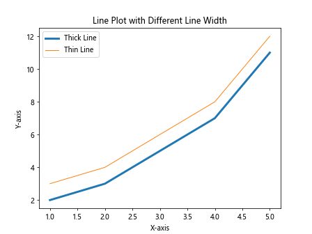
In this example, we create a line plot with lines of different widths by specifying the linewidth parameter. Thicker lines can be used to highlight important data points.
Line Plot with Secondary Y-axis
import matplotlib.pyplot as plt

# Data
x = [1, 2, 3, 4, 5]
y1 = [2, 3, 5, 7, 11]
y2 = [1, 4, 9, 16, 25]

fig, ax1 = plt.subplots()

# Create a line plot with secondary y-axis
ax1.plot(x, y1, color='b', label='Line 1')
ax1.set_xlabel('X-axis')
ax1.set_ylabel('Y1-axis', color='b')
ax1.tick_params('y', colors='b')

ax2 = ax1.twinx()
ax2.plot(x, y2, color='r', label='Line 2')
ax2.set_ylabel('Y2-axis', color='r')
ax2.tick_params('y', colors='r')

plt.title('Line Plot with Secondary Y-axis')
plt.show()
Output:
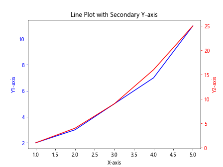
In this example, we create a line plot with a secondary y-axis to compare two different data sets with different scales. We use the subplots function to create two y-axes and plot the data on each axis.
Line Plot with Different Color Gradient
import matplotlib.pyplot as plt

# Data
import numpy as np
x = np.linspace(0, 10, 100)
y = np.sin(x)

# Create a line plot with color gradient
plt.plot(x, y, color=plt.cm.coolwarm(np.linspace(0, 1, 100)))

# Add labels and title
plt.xlabel('X-axis')
plt.ylabel('Y-axis')
plt.title('Line Plot with Color Gradient')

# Display the plot
plt.show()
In this example, we create a line plot with a color gradient by specifying a colormap (coolwarm) and mapping different colors to different data points. This can be used to visualize data trends with visually appealing colors.
Line Plot with Error Bars
import matplotlib.pyplot as plt

# Data
x = [1, 2, 3, 4, 5]
y = [2, 3, 5, 7, 11]
errors = [0.5, 0.3, 0.4, 0.6, 0.8]

# Create a line plot with error bars
plt.errorbar(x, y, yerr=errors, fmt='-o', label='Data with Error Bars')

# Add labels and title
plt.xlabel('X-axis')
plt.ylabel('Y-axis')
plt.title('Line Plot with Error Bars')

# Add legend
plt.legend()

# Display the plot
plt.show()
Output:
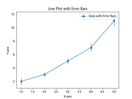
In this example, we create a line plot with error bars to visualize the uncertainty in data points. We specify the error values using the yerr parameter and format the error bars with markers and lines.
Line Plot with Horizontal Line
import matplotlib.pyplot as plt

# Data
x = [1, 2, 3, 4, 5]
y = [2, 3, 5, 7, 11]
threshold = 5

# Create a line plot with a horizontal line
plt.plot(x, y)
plt.axhline(y=threshold, color='r', linestyle='--', label='Threshold')

# Add labels and title
plt.xlabel('X-axis')
plt.ylabel('Y-axis')
plt.title('Line Plot with Horizontal Line')

# Add legend
plt.legend()

# Display the plot
plt.show()
Output:
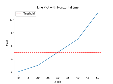
In this example, we create a line plot with a horizontal line to represent a threshold value. We use the axhline function to add a horizontal line with a specified color and linestyle.
Line Plot with Vertical Line
import matplotlib.pyplot as plt

# Data
x = [1, 2, 3, 4, 5]
y = [2, 3, 5, 7, 11]
threshold = 3

# Create a line plot with a vertical line
plt.plot(x, y)
plt.axvline(x=threshold, color='b', linestyle=':', label='Threshold')

# Add labels and title
plt.xlabel('X-axis')
plt.ylabel('Y-axis')
plt.title('Line Plot with Vertical Line')

# Add legend
plt.legend()

# Display the plot
plt.show()
Output:
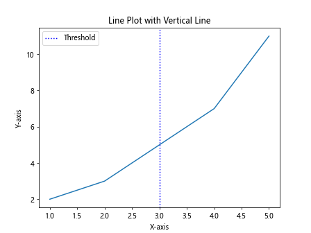
In this example, we create a line plot with a vertical line to represent a threshold value. We use the axvline function to add a vertical line with a specified color and linestyle.
Line Plot with Shaded Error Region
import matplotlib.pyplot as plt

# Data
x = np.linspace(0, 10, 100)
y = np.sin(x)
error = 0.1 * np.abs(y)

# Create a line plot with shaded error region
plt.plot(x, y)
plt.fill_between(x, y-error, y+error, color='gray', alpha=0.3)

# Add labels and title
plt.xlabel('X-axis')
plt.ylabel('Y-axis')
plt.title('Line Plot with Shaded Error Region')

# Display the plot
plt.show()
In this example, we create a line plot with a shaded error region to visualize the range of uncertainty in the data. We use the fill_between function to fill the area between two lines with a specified color and transparency.
Line Plot with Step Line Style
import matplotlib.pyplot as plt

# Data
x = [1, 2, 3, 4, 5]
y = [2, 3, 5, 7, 11]

# Create a step line plot
plt.step(x, y, label='Step Line')

# Add labels and title
plt.xlabel('X-axis')
plt.ylabel('Y-axis')
plt.title('Line Plot with Step Line Style')

# Add legend
plt.legend()

# Display the plot
plt.show()
Output:
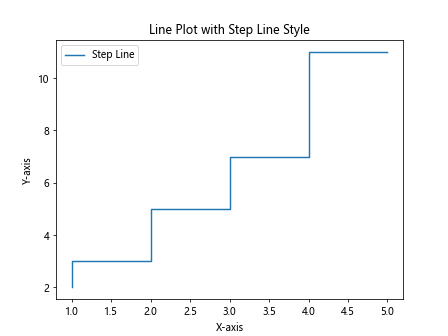
In this example, we create a step line plot to visualize data with discrete value changes. We use the step function to connect data points with step-like lines instead of continuous lines.
Line Plot with Different Line Styles
import matplotlib.pyplot as plt

# Data
x = np.linspace(0, 10, 100)
y = np.sin(x)

# Create a line plot with different line styles
plt.plot(x, y, linestyle='-', label='Solid Line')
plt.plot(x, np.cos(x), linestyle='--', label='Dashed Line')
plt.plot(x, np.tan(x), linestyle=':', label='Dotted Line')

# Add labels and title
plt.xlabel('X-axis')
plt.ylabel('Y-axis')
plt.title('Line Plot with Different Line Styles')

# Add legend
plt.legend()

# Display the plot
plt.show()
In this example, we create a line plot with lines of different styles (solid, dashed, and dotted) to visually differentiate between multiple data sets. Different line styles can help improve the readability of the plot.
Line Plot with Date Axis
import matplotlib.pyplot as plt

# Data
import pandas as pd
dates = pd.date_range('20220101', periods=5)
values = [2, 3, 5, 7, 11]

# Create a line plot with date axis
plt.plot(dates, values)

# Add labels and title
plt.xlabel('Date')
plt.ylabel('Values')
plt.title('Line Plot with Date Axis')

# Display the plot
plt.show()
Output:
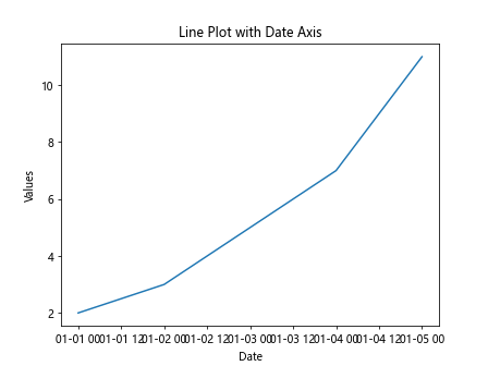
In this example, we create a line plot with a date axis by using dates as the x-axis values. This can be useful for visualizing time series data or data points that are associated with specific dates.
These examples demonstrate various ways to create and customize line plots in Matplotlib to effectively visualize data trends and relationships. By exploring different options for customization, you can create informative and visually appealing line plots for your data analysis and visualization projects.