How to Change Y-Axis Scale in Python Matplotlib
Matplotlib is a popular Python library for creating static, animated, and interactive visualizations in Python. One common customization that you may need to do when plotting data with Matplotlib is to change the scale of the y-axis. This can be useful for displaying data in a more visually appealing or informative way.
In this article, we will explore different methods to change the y-axis scale in Matplotlib, including changing the range, setting log scales, and customizing the ticks. We will provide detailed examples for each method to help you master the art of y-axis scale customization in Matplotlib.
1. Changing Y-Axis Range
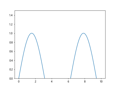
You can change the range of the y-axis in a Matplotlib plot by setting the limits using the set_ylim() method. Here’s an example:
import matplotlib.pyplot as plt
import numpy as np

x = np.linspace(0, 10, 100)
y = np.sin(x)

plt.plot(x, y)
plt.ylim(0, 1.5)  # Set y-axis limits from 0 to 1.5
plt.show()
Output:
2. Setting Logarithmic Scale
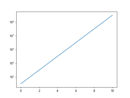
If you have data that covers several orders of magnitude, you may want to use a logarithmic scale for the y-axis. This can be achieved by using the semilogy() function instead of plot(). Here’s an example:
import matplotlib.pyplot as plt
import numpy as np

x = np.linspace(0, 10, 100)
y = 10 ** x

plt.semilogy(x, y)  # Use logarithmic scale for y-axis
plt.show()
Output:
3. Customizing Tick Locations and Labels
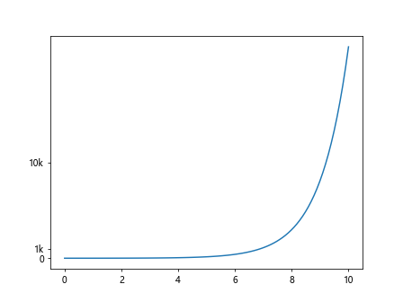
You can customize the tick locations and labels on the y-axis using the yticks() function. Here’s an example:
import matplotlib.pyplot as plt
import numpy as np

x = np.linspace(0, 10, 100)
y = np.exp(x)

plt.plot(x, y)
plt.yticks([0, 1000, 10000], ['0', '1k', '10k'])  # Set custom tick locations and labels
plt.show()
Output:
4. Changing Y-Axis Scale to Symmetrical Log
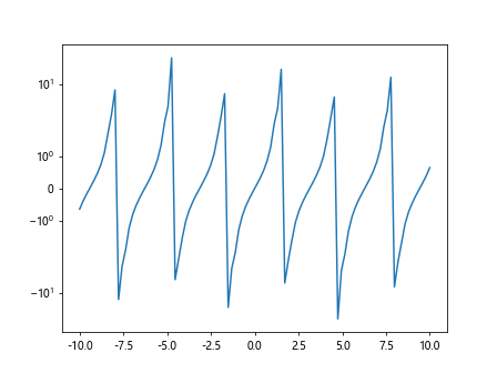
The symmetrical log scale is useful for plotting data that includes values around zero. You can set the y-axis to a symmetrical log scale using the symlog() function. Here’s an example:
import matplotlib.pyplot as plt
import numpy as np

x = np.linspace(-10, 10, 100)
y = np.tan(x)

plt.plot(x, y)
plt.yscale('symlog')  # Set y-axis to symmetrical log scale
plt.show()
Output:
5. Using Logit Scale for Probability Data
If you are plotting data that represents probabilities, you can use the logit scale for the y-axis. This can be done by using the semilogit() function. Here’s an example:
import matplotlib.pyplot as plt
import numpy as np

x = np.linspace(0, 1, 100)
y = x / (1 - x)

plt.semilogit(x, y)  # Use logit scale for y-axis
plt.show()
6. Adding a Secondary Y-Axis
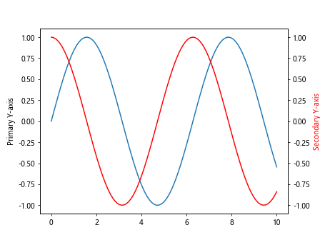
Sometimes, you may want to add a secondary y-axis to your plot to display additional data or units. You can achieve this by creating a secondary ax object and linking it to the primary ax object. Here’s an example:
import matplotlib.pyplot as plt
import numpy as np

fig, ax = plt.subplots()
x = np.linspace(0, 10, 100)
y1 = np.sin(x)
y2 = np.cos(x)

ax.plot(x, y1)
ax.set_ylabel('Primary Y-axis')

ax2 = ax.twinx()
ax2.plot(x, y2, color='r')
ax2.set_ylabel('Secondary Y-axis', color='r')

plt.show()
Output:
7. Using Broken Y-Axis
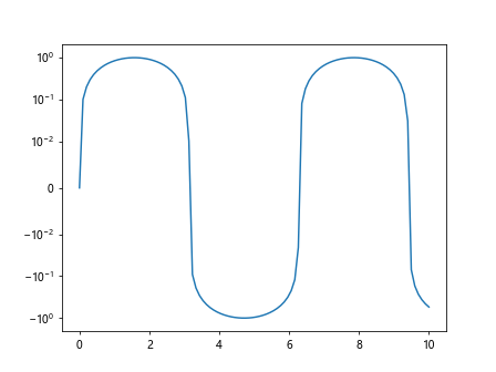
If your data has outliers that are distorting the scale of the y-axis, you can use a broken y-axis to remove the outliers while maintaining the overall trend. You can achieve this by setting the yscale() function to ‘symlog’ and specifying the range of values to display. Here’s an example:
import matplotlib.pyplot as plt
import numpy as np

x = np.linspace(0, 10, 100)
y = np.sin(x)

plt.plot(x, y)
plt.yscale('symlog', linthresh=0.01)  # Use broken y-axis with a threshold of 0.01
plt.show()
Output:
8. Reversing Y-Axis
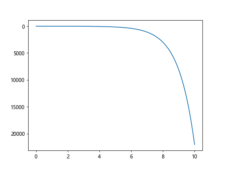
Sometimes, you may need to reverse the direction of the y-axis in your plot. This can be done by setting the invert_yaxis() function to True. Here’s an example:
import matplotlib.pyplot as plt
import numpy as np

x = np.linspace(0, 10, 100)
y = np.exp(x)

plt.plot(x, y)
plt.gca().invert_yaxis()  # Reverse the direction of the y-axis
plt.show()
Output:
9. Using Scalar Formatter for Y-Axis
If you want to format the tick labels on the y-axis as scalars, you can use the ScalarFormatter class from the matplotlib.ticker module. Here’s an example:
import matplotlib.pyplot as plt
import numpy as np

x = np.linspace(0, 10, 100)
y = np.log10(x)

plt.plot(x, y)
plt.gca().yaxis.set_major_formatter(ScalarFormatter())  # Format y-axis tick labels as scalars
plt.show()
10. Setting Y-Axis Scale to Symmetrical Log in Scatter Plot
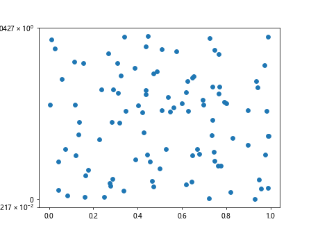
You can also use the symmetrical log scale in a scatter plot by setting the y-axis to a symmetrical log scale using the yscale() function. Here’s an example:
import matplotlib.pyplot as plt
import numpy as np

x = np.random.rand(100)
y = np.random.rand(100)

plt.scatter(x, y)
plt.yscale('symlog')  # Set y-axis to symmetrical log scale
plt.show()
Output:
11. Changing Y-Axis Scale to Logit in Bar Chart
If you are creating a bar chart and want to use the logit scale for the y-axis, you can achieve this by setting the semilogit() function in the y-axis. Here’s an example:
import matplotlib.pyplot as plt
import numpy as np

x = ['A', 'B', 'C', 'D']
y = [0.1, 0.8, 0.3, 0.2]

plt.bar(x, y)
plt.semilogit()  # Use logit scale for y-axis
plt.show()
12. Customizing Y-Axis Scale in Polar Plot
For polar plots, you can customize the y-axis scale using the set_rscale() method. Here’s an example:
import matplotlib.pyplot as plt
import numpy as np

theta = np.linspace(0, 2*np.pi, 100)
r = np.sin(3*theta)

plt.polar(theta, r)
plt.set_rscale('log')  # Set y-axis scale to logarithmic in polar plot
plt.show()
13. Using Logit Scale in Streamplot
If you are creating a streamplot and want to use the logit scale for the y-axis, you can achieve this by setting the semilogit() function in the y-axis. Here’s an example:
import matplotlib.pyplot as plt
import numpy as np

Y, X = np.mgrid[0:2*np.pi:100j, 0:2*np.pi:100j]
U = np.sin(X)*np.cos(Y)
V = -np.cos(X)*np.sin(Y)

plt.streamplot(X, Y, U, V)
plt.semilogit()  # Use logit scale for y-axis
plt.show()
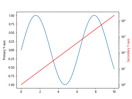
14. Combining Different Y-Axis Scales
You can combine different y-axis scales in a single plot by creating multiple ax objects and linking them to the primary ax object. Here’s an example:
import matplotlib.pyplot as plt
import numpy as np

fig, ax = plt.subplots()
x = np.linspace(0, 10, 100)
y1 = np.sin(x)
y2 = np.exp(x)

ax.plot(x, y1)
ax.set_ylabel('Primary Y-axis')

ax2 = ax.twinx()
ax2.plot(x, y2, color='r')
ax2.set_ylabel('Secondary Y-axis', color='r')
ax2.set_yscale('log')

plt.show()
Output:
15. Using Symmetrical Log Scale in Histogram
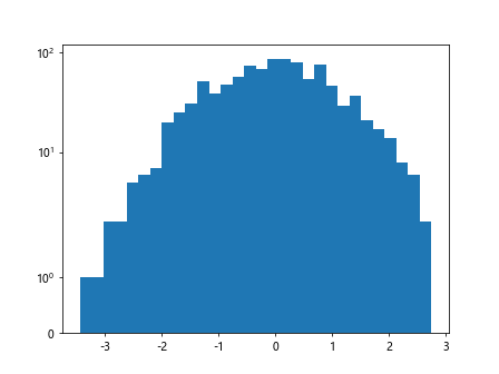
If you are creating a histogram and want to use the symmetrical log scale for the y-axis, you can achieve this by setting the symlog() function in the y-axis. Here’s an example:
import matplotlib.pyplot as plt
import numpy as np

data = np.random.randn(1000)

plt.hist(data, bins=30)
plt.yscale('symlog')  # Use symmetrical log scale for y-axis in histogram
plt.show()
Output:
16. Changing Y-Axis Scale in 3D Plot
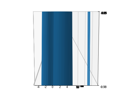
For 3D plots, you can change the y-axis scale by using the set_yscale() method on the ax object. Here’s an example:
from mpl_toolkits.mplot3d import Axes3D
import matplotlib.pyplot as plt
import numpy as np

fig = plt.figure()
ax = fig.add_subplot(111, projection='3d')

x = np.linspace(-5, 5, 100)
y = np.linspace(-5, 5, 100)
X, Y = np.meshgrid(x, y)
Z = np.sin(np.sqrt(X**2 + Y**2))

ax.plot_surface(X, Y, Z)

ax.set_yscale('log')  # Change y-axis scale in 3D plot to logarithmic
plt.show()
Output:
17. Using Custom Log Scale for Y-Axis
If you want to set a custom log scale for the y-axis, you can define your own log scale function and use it to transform the y-axis values. Here’s an example:
import matplotlib.pyplot as plt
import numpy as np

def custom_log_scale(x):
    return np.log(x + 1)  # Custom log scale function

x = np.linspace(0, 10, 100)
y = np.exp(x)

plt.plot(x, y)
plt.yscale(custom_log_scale)  # Use custom log scale for y-axis
plt.show()
18. Formatting Y-Axis Tick Labels
You can format the y-axis tick labels using the xtick.format property to specify the format of the tick labels. Here’s an example:
import matplotlib.pyplot as plt
import numpy as np

x = np.linspace(0, 10, 100)
y = np.exp(x)

plt.plot(x, y)
plt.gca().yaxis.set_major_formatter(FuncFormatter(lambda x, _: '{:,.0f}'.format(x)))  # Format y-axis tick labels
plt.show()
19. Changing Y-Axis Scale Inset
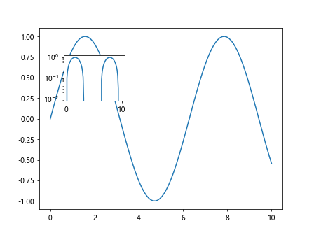
If you want to add an inset with a different y-axis scale in your plot, you can create a smaller ax object inside the main plot and set a different y-axis scale. Here’s an example:
import matplotlib.pyplot as plt
import numpy as np

fig, ax = plt.subplots()
x = np.linspace(0, 10, 100)
y = np.sin(x)

ax.plot(x, y)

axin = ax.inset_axes([0.1, 0.6, 0.25, 0.25])
axin.plot(x, y)
axin.set_yscale('log')  # Set different y-axis scale in the inset
plt.show()
Output:
20. Adjusting Y-Axis Limits Dynamically
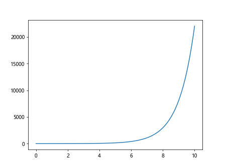
You can adjust the y-axis limits dynamically based on the data in your plot by using the autoscale() method. Here’s an example:
import matplotlib.pyplot as plt
import numpy as np

x = np.linspace(0, 10, 100)
y = np.exp(x)

plt.plot(x, y)
plt.autoscale(axis='y')  # Automatically adjust y-axis limits based on data
plt.show()
Output:
By following these methods and examples, you can effectively change the y-axis scale in Matplotlib plots to better visualize your data in a clear and informative way. Experiment with these techniques to find the best approach for your specific data and visualization needs.