How to Change Y Axis Values in Matplotlib
When creating plots using Matplotlib, it is important to have full control over the appearance of the plot, including the Y axis values. By default, Matplotlib automatically determines the range and values of the Y axis based on the data being plotted. However, there are times when you may want to customize the Y axis values to better represent your data or improve the readability of the plot.
In this article, we will explore different ways to change the Y axis values in Matplotlib with detailed examples.
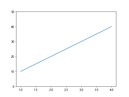
1. Setting Y Axis Limits
You can specify the limits of the Y axis using the set_ylim method. This allows you to define the minimum and maximum values displayed on the Y axis.
import matplotlib.pyplot as plt

plt.plot([1, 2, 3, 4], [10, 20, 30, 40])
plt.ylim(0, 50)
plt.show()
Output:
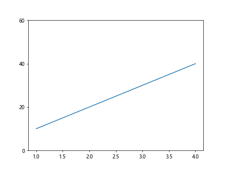
2. Setting Y Axis Tick Marks
You can modify the Y axis tick marks to show specific values using the yticks method. This allows you to manually set the tick positions and labels on the Y axis.
import matplotlib.pyplot as plt

plt.plot([1, 2, 3, 4], [10, 20, 30, 40])
plt.yticks([0, 20, 40, 60], ['0', '20', '40', '60'])
plt.show()
Output:
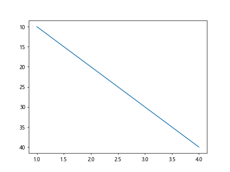
3. Reversing the Y Axis Direction
You can reverse the direction of the Y axis by using the invert_yaxis method. This will change the orientation of the Y axis values.
import matplotlib.pyplot as plt

plt.plot([1, 2, 3, 4], [10, 20, 30, 40])
plt.gca().invert_yaxis()
plt.show()
Output:
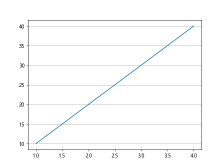
4. Adding Grid Lines to the Y Axis
You can add grid lines to the Y axis using the grid method. This will help in better aligning the data points on the plot.
import matplotlib.pyplot as plt

plt.plot([1, 2, 3, 4], [10, 20, 30, 40])
plt.grid(axis='y')
plt.show()
Output:
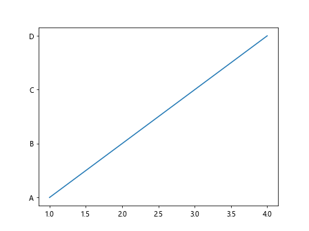
5. Changing Y Axis Labels
You can customize the Y axis labels by setting the yticklabels property. This allows you to specify the text displayed at each tick mark on the Y axis.
import matplotlib.pyplot as plt

plt.plot([1, 2, 3, 4], [10, 20, 30, 40])
plt.yticks([10, 20, 30, 40], ['A', 'B', 'C', 'D'])
plt.show()
Output:
6. Formatting Y Axis Values
You can format the Y axis values using functions like ScalarFormatter and FuncFormatter from the matplotlib.ticker module. This allows you to customize the appearance of the Y axis values.
import matplotlib.pyplot as plt
import matplotlib.ticker as ticker

fig, ax = plt.subplots()
ax.plot([1, 2, 3, 4], [1000, 2000, 3000, 4000])

formatter = ticker.ScalarFormatter(useMathText=True)
formatter.set_scientific(True)
formatter.set_powerlimits((-3, 4))
ax.yaxis.set_major_formatter(formatter)

plt.show()
Output:
7. Logarithmic Y Axis Scaling
You can change the Y axis to have a logarithmic scale by using the semilogy function. This is particularly useful when working with data that spans several orders of magnitude.
import matplotlib.pyplot as plt

plt.semilogy([1, 2, 3, 4], [10, 100, 1000, 10000])
plt.show()
Output:

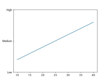
8. Setting Y Axis Ticks and Tick Labels
You can manually set the Y axis ticks and tick labels by using the set_yticks and set_yticklabels methods. This allows for fine-grained control over the Y axis values.
import matplotlib.pyplot as plt

plt.plot([1, 2, 3, 4], [10, 20, 30, 40])
plt.gca().set_yticks([0, 25, 50])
plt.gca().set_yticklabels(['Low', 'Medium', 'High'])
plt.show()
Output:
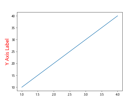
9. Customizing Y Axis Font Properties
You can change the font properties of the Y axis labels using the set_ylabel method. This allows you to modify the font size, style, color, and other properties.
import matplotlib.pyplot as plt

plt.plot([1, 2, 3, 4], [10, 20, 30, 40])
plt.ylabel('Y Axis Label', fontsize=16, color='red', style='italic')
plt.show()
Output:
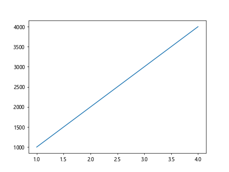
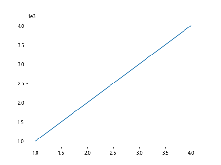
10. Using Scientific Notation on Y Axis
You can display the Y axis values in scientific notation by setting the sci property to True. This will format the Y axis labels in a compact way when dealing with large numbers.
import matplotlib.pyplot as plt

plt.plot([1, 2, 3, 4], [1000, 2000, 3000, 4000])
plt.ticklabel_format(axis='y', style='sci', scilimits=(0, 0))
plt.show()
Output:
Conclusion
In this article, we have covered various methods to change the Y axis values in Matplotlib. By using these techniques, you can enhance the appearance of your plots and better represent your data. Experiment with these examples and explore more customization options to create visually appealing and informative plots using Matplotlib.