How to Fill Color by Groups in Histogram Using Matplotlib
How to fill color by groups in histogram using Matplotlib is an essential skill for data visualization enthusiasts and professionals alike. This article will delve deep into the various techniques and methods to create visually appealing and informative histograms with grouped color fills using Matplotlib. We’ll explore different approaches, provide numerous examples, and offer insights into customizing your histograms to effectively communicate your data.
Understanding the Basics of Histograms in Matplotlib
Before we dive into how to fill color by groups in histogram using Matplotlib, let’s start with the fundamentals of creating histograms in Matplotlib. A histogram is a graphical representation of the distribution of numerical data, where the data is grouped into bins and the height of each bar represents the frequency or count of data points within that bin.
To create a basic histogram in Matplotlib, you can use the plt.hist() function. Here’s a simple example:
import matplotlib.pyplot as plt
import numpy as np

# Generate sample data
data = np.random.normal(0, 1, 1000)

# Create histogram
plt.hist(data, bins=30, edgecolor='black')
plt.title('Basic Histogram - how2matplotlib.com')
plt.xlabel('Value')
plt.ylabel('Frequency')
plt.show()
Output:
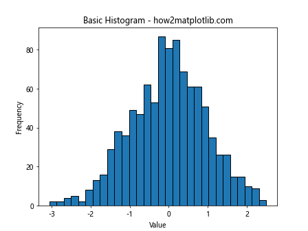
In this example, we generate random data from a normal distribution and create a histogram with 30 bins. The edgecolor parameter is set to ‘black’ to make the bars more distinct.
Grouping Data for Colored Histograms
Now that we understand the basics, let’s explore how to fill color by groups in histogram using Matplotlib. The first step is to group our data. We’ll create multiple datasets that we want to represent in different colors on the same histogram.
Here’s an example of how to create grouped data:
import matplotlib.pyplot as plt
import numpy as np

# Generate grouped data
group1 = np.random.normal(0, 1, 1000)
group2 = np.random.normal(2, 1, 800)
group3 = np.random.normal(-2, 1, 1200)

# Create histogram with grouped data
plt.hist([group1, group2, group3], bins=30, label=['Group 1', 'Group 2', 'Group 3'])
plt.title('Grouped Histogram - how2matplotlib.com')
plt.xlabel('Value')
plt.ylabel('Frequency')
plt.legend()
plt.show()
Output:
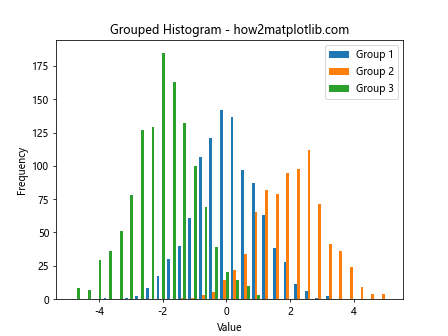
In this example, we create three groups of data with different means and sample sizes. We then use plt.hist() with a list of these groups as the first argument. Matplotlib automatically assigns different colors to each group.
Customizing Colors in Grouped Histograms
When learning how to fill color by groups in histogram using Matplotlib, it’s important to know how to customize the colors of your grouped histogram. Matplotlib provides several ways to do this.
Using a Color List
One simple way to customize colors is by providing a list of colors to the color parameter:
import matplotlib.pyplot as plt
import numpy as np

# Generate grouped data
group1 = np.random.normal(0, 1, 1000)
group2 = np.random.normal(2, 1, 800)
group3 = np.random.normal(-2, 1, 1200)

# Create histogram with custom colors
colors = ['#FF9999', '#66B2FF', '#99FF99']
plt.hist([group1, group2, group3], bins=30, color=colors, label=['Group 1', 'Group 2', 'Group 3'])
plt.title('Custom Colored Grouped Histogram - how2matplotlib.com')
plt.xlabel('Value')
plt.ylabel('Frequency')
plt.legend()
plt.show()
Output:
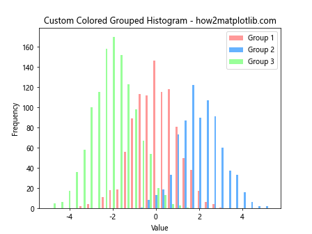
In this example, we define a list of hex color codes and pass it to the color parameter. This gives us full control over the colors of each group in our histogram.
Using Colormap
Another powerful way to fill color by groups in histogram using Matplotlib is by utilizing colormaps. Colormaps provide a range of colors that can be automatically assigned to your groups:
import matplotlib.pyplot as plt
import numpy as np

# Generate grouped data
group1 = np.random.normal(0, 1, 1000)
group2 = np.random.normal(2, 1, 800)
group3 = np.random.normal(-2, 1, 1200)

# Create histogram with colormap
plt.hist([group1, group2, group3], bins=30, label=['Group 1', 'Group 2', 'Group 3'],
         color=plt.cm.viridis(np.linspace(0, 1, 3)))
plt.title('Colormap Grouped Histogram - how2matplotlib.com')
plt.xlabel('Value')
plt.ylabel('Frequency')
plt.legend()
plt.show()
Output:
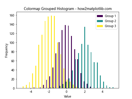
In this example, we use the ‘viridis’ colormap and create evenly spaced colors for our three groups. This technique is particularly useful when you have many groups and want a consistent color scheme.
Stacked Histograms
When exploring how to fill color by groups in histogram using Matplotlib, stacked histograms are an important variation to consider. Stacked histograms show the total frequency of all groups combined, with each group stacked on top of the previous one.
Here’s how to create a stacked histogram:
import matplotlib.pyplot as plt
import numpy as np

# Generate grouped data
group1 = np.random.normal(0, 1, 1000)
group2 = np.random.normal(2, 1, 800)
group3 = np.random.normal(-2, 1, 1200)

# Create stacked histogram
plt.hist([group1, group2, group3], bins=30, stacked=True, label=['Group 1', 'Group 2', 'Group 3'])
plt.title('Stacked Histogram - how2matplotlib.com')
plt.xlabel('Value')
plt.ylabel('Frequency')
plt.legend()
plt.show()
Output:
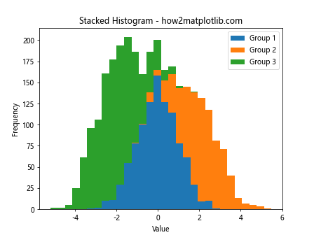
In this example, we add the stacked=True parameter to create a stacked histogram. This is particularly useful when you want to show both the individual group distributions and their combined distribution.
Side-by-Side Histograms
Another approach to fill color by groups in histogram using Matplotlib is to create side-by-side histograms. This method allows for easy comparison between groups without overlapping.
Here’s how to create side-by-side histograms:
import matplotlib.pyplot as plt
import numpy as np

# Generate grouped data
group1 = np.random.normal(0, 1, 1000)
group2 = np.random.normal(2, 1, 800)
group3 = np.random.normal(-2, 1, 1200)

# Create side-by-side histogram
plt.hist([group1, group2, group3], bins=30, label=['Group 1', 'Group 2', 'Group 3'],
         color=['#FF9999', '#66B2FF', '#99FF99'], alpha=0.7, rwidth=0.85)
plt.title('Side-by-Side Histogram - how2matplotlib.com')
plt.xlabel('Value')
plt.ylabel('Frequency')
plt.legend()
plt.show()
Output:
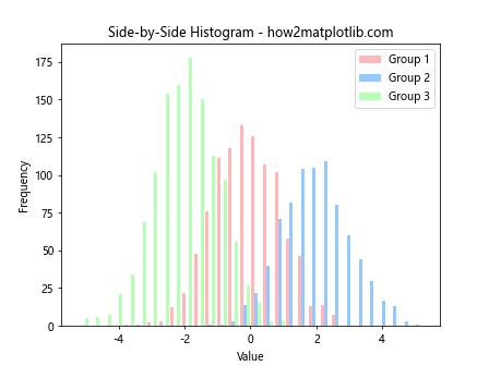
In this example, we use the alpha parameter to make the bars slightly transparent, and rwidth to reduce the width of each bar, creating space between groups. This approach is effective when you want to clearly show the distribution of each group separately.
Customizing Histogram Appearance
As we continue to explore how to fill color by groups in histogram using Matplotlib, it’s important to discuss how to customize the appearance of your histograms. Matplotlib offers a wide range of options to enhance the visual appeal and readability of your plots.
Adjusting Transparency
Adjusting the transparency of histogram bars can help when groups overlap:
import matplotlib.pyplot as plt
import numpy as np

# Generate grouped data
group1 = np.random.normal(0, 1, 1000)
group2 = np.random.normal(0.5, 1, 800)
group3 = np.random.normal(-0.5, 1, 1200)

# Create histogram with adjusted transparency
plt.hist([group1, group2, group3], bins=30, alpha=0.5, label=['Group 1', 'Group 2', 'Group 3'])
plt.title('Transparent Grouped Histogram - how2matplotlib.com')
plt.xlabel('Value')
plt.ylabel('Frequency')
plt.legend()
plt.show()
Output:
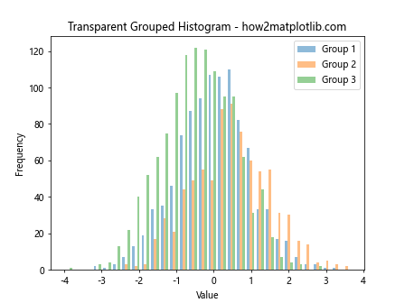
In this example, we set alpha=0.5 to make the bars 50% transparent. This allows you to see overlapping distributions more clearly.
Adding Edge Colors
Adding edge colors to your histogram bars can enhance their visibility:
import matplotlib.pyplot as plt
import numpy as np

# Generate grouped data
group1 = np.random.normal(0, 1, 1000)
group2 = np.random.normal(2, 1, 800)
group3 = np.random.normal(-2, 1, 1200)

# Create histogram with edge colors
plt.hist([group1, group2, group3], bins=30, edgecolor='black', linewidth=1.2,
         label=['Group 1', 'Group 2', 'Group 3'])
plt.title('Histogram with Edge Colors - how2matplotlib.com')
plt.xlabel('Value')
plt.ylabel('Frequency')
plt.legend()
plt.show()
Output:
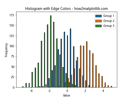
Here, we use edgecolor='black' and linewidth=1.2 to add black edges to our histogram bars, making them stand out more.
Advanced Techniques for Grouped Histograms
As we delve deeper into how to fill color by groups in histogram using Matplotlib, let’s explore some advanced techniques that can make your visualizations even more informative and visually appealing.
Normalized Histograms
When comparing groups of different sizes, it’s often useful to normalize the histogram:
import matplotlib.pyplot as plt
import numpy as np

# Generate grouped data
group1 = np.random.normal(0, 1, 1000)
group2 = np.random.normal(2, 1, 2000)
group3 = np.random.normal(-2, 1, 500)

# Create normalized histogram
plt.hist([group1, group2, group3], bins=30, density=True,
         label=['Group 1', 'Group 2', 'Group 3'])
plt.title('Normalized Grouped Histogram - how2matplotlib.com')
plt.xlabel('Value')
plt.ylabel('Density')
plt.legend()
plt.show()
Output:
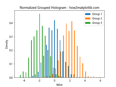
In this example, we use density=True to normalize the histogram. This ensures that the area under each histogram sums to 1, allowing for fair comparison between groups of different sizes.
Cumulative Histograms
Cumulative histograms can be useful for showing the distribution of data over time or in a cumulative manner:
import matplotlib.pyplot as plt
import numpy as np

# Generate grouped data
group1 = np.random.normal(0, 1, 1000)
group2 = np.random.normal(2, 1, 800)
group3 = np.random.normal(-2, 1, 1200)

# Create cumulative histogram
plt.hist([group1, group2, group3], bins=30, cumulative=True,
         label=['Group 1', 'Group 2', 'Group 3'])
plt.title('Cumulative Grouped Histogram - how2matplotlib.com')
plt.xlabel('Value')
plt.ylabel('Cumulative Frequency')
plt.legend()
plt.show()
Output:
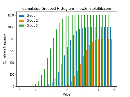
Here, we use cumulative=True to create a cumulative histogram. This shows the total count of data points up to each bin.
Combining Histograms with Other Plot Types
When learning how to fill color by groups in histogram using Matplotlib, it’s valuable to know how to combine histograms with other plot types for more comprehensive data visualization.
Histogram with Kernel Density Estimation (KDE)
Adding a KDE curve to your histogram can provide a smooth estimate of the probability density function:
import matplotlib.pyplot as plt
import numpy as np
from scipy import stats

# Generate grouped data
group1 = np.random.normal(0, 1, 1000)
group2 = np.random.normal(2, 1, 800)

# Create histogram with KDE
plt.hist([group1, group2], bins=30, density=True, alpha=0.7,
         label=['Group 1', 'Group 2'])
for i, group in enumerate([group1, group2]):
    kde = stats.gaussian_kde(group)
    x_range = np.linspace(group.min(), group.max(), 100)
    plt.plot(x_range, kde(x_range), label=f'KDE Group {i+1}')

plt.title('Histogram with KDE - how2matplotlib.com')
plt.xlabel('Value')
plt.ylabel('Density')
plt.legend()
plt.show()
Output:
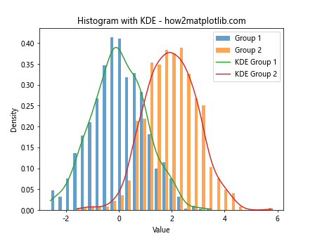
In this example, we create a histogram and overlay it with KDE curves for each group. This provides both a discrete and continuous view of the data distribution.
Histogram with Box Plot
Combining a histogram with a box plot can give a comprehensive view of the data distribution:
import matplotlib.pyplot as plt
import numpy as np

# Generate grouped data
group1 = np.random.normal(0, 1, 1000)
group2 = np.random.normal(2, 1, 800)

# Create subplot
fig, (ax1, ax2) = plt.subplots(2, 1, figsize=(10, 8), sharex=True,
                               gridspec_kw={'height_ratios': [3, 1]})

# Histogram
ax1.hist([group1, group2], bins=30, label=['Group 1', 'Group 2'])
ax1.set_title('Histogram with Box Plot - how2matplotlib.com')
ax1.set_ylabel('Frequency')
ax1.legend()

# Box plot
ax2.boxplot([group1, group2], vert=False)
ax2.set_xlabel('Value')
ax2.set_yticks([1, 2])
ax2.set_yticklabels(['Group 1', 'Group 2'])

plt.tight_layout()
plt.show()
Output:
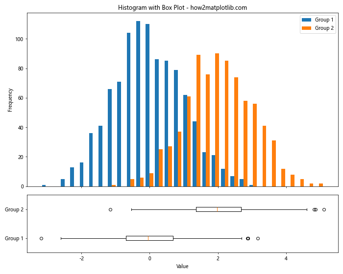
This example creates a subplot with a histogram on top and a box plot below, providing both a detailed view of the distribution and a summary of key statistics.
Handling Large Datasets
When working with large datasets, it’s important to know how to fill color by groups in histogram using Matplotlib efficiently. Here are some techniques to handle large datasets:
Using Log Scale
For datasets with a wide range of values, using a log scale can help visualize the distribution more effectively:
import matplotlib.pyplot as plt
import numpy as np

# Generate large grouped data
group1 = np.random.lognormal(0, 1, 100000)
group2 = np.random.lognormal(0.5, 1, 80000)

# Create histogram with log scale
plt.hist([group1, group2], bins=100, log=True, label=['Group 1', 'Group 2'])
plt.title('Log-scale Histogram - how2matplotlib.com')
plt.xlabel('Value (log scale)')
plt.ylabel('Frequency (log scale)')
plt.legend()
plt.show()
Output:
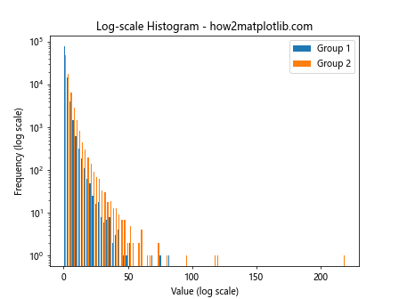
In this example, we use log=True to set both x and y axes to a logarithmic scale. This is particularly useful for data with exponential growth or decay.
Using 2D Histograms
For very large datasets, 2D histograms can be more informative:
import matplotlib.pyplot as plt
import numpy as np

# Generate large grouped data
group1_x = np.random.normal(0, 1, 100000)
group1_y = np.random.normal(0, 1, 100000)
group2_x = np.random.normal(2, 1, 80000)
group2_y = np.random.normal(2, 1, 80000)

# Create 2D histogram
plt.hist2d(np.concatenate([group1_x, group2_x]), np.concatenate([group1_y, group2_y]),
           bins=50, cmap='viridis')
plt.colorbar(label='Frequency')
plt.title('2D Histogram - how2matplotlib.com')
plt.xlabel('X Value')
plt.ylabel('Y Value')
plt.show()
Output:
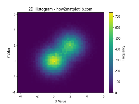
This example creates a 2D histogram using plt.hist2d(). It’s useful for visualizing the distribution of two variables simultaneously, especially with large datasets.
Customizing Histogram Bins
An important aspect of how to fill color by groups in histogram using Matplotlib is understanding how to customize the bins. The choice of bins can significantly affect the appearance and interpretation of your histogram.
Custom Bin Edges
You can specify custom bin edges to focus on specific ranges of your data:
import matplotlib.pyplot as plt
import numpy as np

# Generate grouped data
group1 = np.random.normal(0, 1, 1000)
group2 = np.random.normal(2, 1, 800)

# Create custom bin edges
bin_edges = np.linspace(-4, 6, 21)

# Create histogram with custom bins
plt.hist([group1, group2], bins=bin_edges, label=['Group 1', 'Group 2'])
plt.title('Histogram with Custom Bins - how2matplotlib.com')
plt.xlabel('Value')
plt.ylabel('Frequency')
plt.legend()
plt.show()
Output:
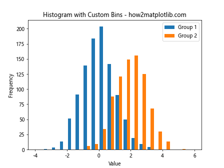
In this example, we create custom bin edges using np.linspace() and pass them to the bins parameter. This allows for precise control over the bin ranges.
Different Bin Widths
You can also create histograms with varying bin widths:
import matplotlib.pyplot as plt
import numpy as np

# Generate grouped data
group1 = np.random.exponential(1, 1000)
group2 = np.random.exponential(2, 800)

# Create bins with varying widths
bins = [0, 0.5, 1, 2, 4, 8, 16]

# Create histogram with varying bin widths
plt.hist([group1, group2], bins=bins, label=['Group 1', 'Group 2'])
plt.title('Histogram with Varying Bin Widths - how2matplotlib.com')
plt.xlabel('Value')
plt.ylabel('Frequency')
plt.legend()
plt.xscale('log')
plt.show()
Output:
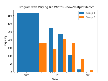
This example uses bins with increasing widths, which can be useful for data with exponential distributions. We also set the x-axis to a logarithmic scale to better visualize the distribution.
Enhancing Histogram Aesthetics
As we continue to explore how to fill color by groups in histogram using Matplotlib, let’s focus on enhancing the aesthetics of our histograms to make them more visually appealing and easier to interpret.
Using Seaborn for Styled Histograms
Seaborn, a statistical data visualization library built on top of Matplotlib, can be used to create aesthetically pleasing histograms:
import matplotlib.pyplot as plt
import seaborn as sns
import numpy as np

# Set seaborn style
sns.set_style("whitegrid")

# Generate grouped data
group1 = np.random.normal(0, 1, 1000)
group2 = np.random.normal(2, 1, 800)

# Create histogram using seaborn
sns.histplot(data=[group1, group2], kde=True, stat="density", common_norm=False)
plt.title('Seaborn Styled Histogram - how2matplotlib.com')
plt.xlabel('Value')
plt.ylabel('Density')
plt.legend(['Group 1', 'Group 2'])
plt.show()
Output:
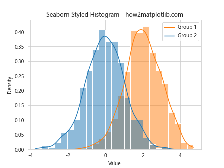
This example uses Seaborn’s histplot function to create a histogram with kernel density estimation. Seaborn automatically applies a pleasing color palette and styling.
Adding Text Annotations
Adding text annotations to your histogram can provide additional context or highlight specific features:
import matplotlib.pyplot as plt
import numpy as np

# Generate grouped data
group1 = np.random.normal(0, 1, 1000)
group2 = np.random.normal(2, 1, 800)

# Create histogram
plt.hist([group1, group2], bins=30, label=['Group 1', 'Group 2'])
plt.title('Histogram with Annotations - how2matplotlib.com')
plt.xlabel('Value')
plt.ylabel('Frequency')
plt.legend()

# Add annotations
plt.annotate('Peak of Group 1', xy=(0, 100), xytext=(1, 150),
             arrowprops=dict(facecolor='black', shrink=0.05))
plt.annotate('Peak of Group 2', xy=(2, 80), xytext=(3, 130),
             arrowprops=dict(facecolor='black', shrink=0.05))

plt.show()
Output:
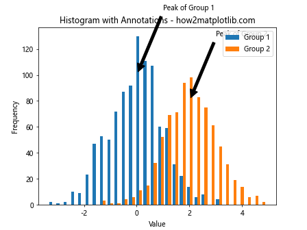
In this example, we use plt.annotate() to add text labels with arrows pointing to specific features of the histogram.
Handling Categorical Data
While histograms are typically used for continuous data, we can adapt the concept to visualize categorical data as well. Let’s explore how to fill color by groups in histogram using Matplotlib for categorical data.
Bar Plot for Categorical Data
For categorical data, we can use a bar plot, which is essentially a histogram for discrete categories:
import matplotlib.pyplot as plt
import numpy as np

# Generate categorical data
categories = ['A', 'B', 'C', 'D', 'E']
group1 = np.random.randint(10, 50, 5)
group2 = np.random.randint(10, 50, 5)

# Create bar plot
x = np.arange(len(categories))
width = 0.35

fig, ax = plt.subplots()
ax.bar(x - width/2, group1, width, label='Group 1')
ax.bar(x + width/2, group2, width, label='Group 2')

ax.set_ylabel('Frequency')
ax.set_title('Bar Plot for Categorical Data - how2matplotlib.com')
ax.set_xticks(x)
ax.set_xticklabels(categories)
ax.legend()

plt.show()
Output:
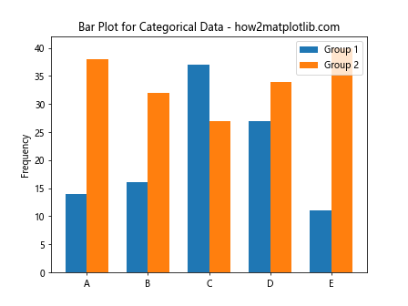
This example creates a grouped bar plot, which is an effective way to compare categorical data between two groups.
Interactive Histograms
Interactive histograms can provide a more engaging user experience. While Matplotlib itself doesn’t support interactivity, we can use libraries like Plotly, which is built on top of Matplotlib, to create interactive histograms.
Here’s an example using Plotly:
import plotly.graph_objects as go
import numpy as np

# Generate grouped data
group1 = np.random.normal(0, 1, 1000)
group2 = np.random.normal(2, 1, 800)

# Create interactive histogram
fig = go.Figure()
fig.add_trace(go.Histogram(x=group1, name='Group 1'))
fig.add_trace(go.Histogram(x=group2, name='Group 2'))

fig.update_layout(
    title_text='Interactive Grouped Histogram - how2matplotlib.com',
    xaxis_title_text='Value',
    yaxis_title_text='Count',
    bargap=0.2,
    bargroupgap=0.1
)

fig.show()
This example creates an interactive histogram using Plotly. Users can hover over bars to see exact values, zoom in and out, and toggle groups on and off.
Conclusion
In this comprehensive guide on how to fill color by groups in histogram using Matplotlib, we’ve explored a wide range of techniques and approaches. From basic histograms to advanced customizations, we’ve covered various aspects of creating informative and visually appealing grouped histograms.
We started with the basics of creating histograms and grouping data, then delved into customizing colors, creating stacked and side-by-side histograms, and adjusting transparency and edge colors. We explored advanced techniques like normalized and cumulative histograms, and how to combine histograms with other plot types like KDE curves and box plots.
We also addressed challenges with large datasets, customizing bins, enhancing aesthetics, handling categorical data, and even touched on creating interactive histograms. Throughout the article, we provided numerous examples with detailed explanations, giving you a solid foundation for creating grouped histograms in Matplotlib.
Remember, the key to effective data visualization is not just in the technical implementation, but also in choosing the right type of visualization for your data and audience. Histograms are powerful tools for showing the distribution of data, and by grouping and coloring them effectively, you can convey complex information in an easily digestible format.