How to Create a Scatter Plot with Empty Circles in Python Using Matplotlib
How to Do a Scatter Plot with Empty Circles in Python is an essential skill for data visualization enthusiasts and professionals alike. Scatter plots are widely used to display the relationship between two variables, and using empty circles can enhance the visual appeal and clarity of your plots. In this comprehensive guide, we’ll explore various techniques and best practices for creating scatter plots with empty circles using Python’s Matplotlib library.
Understanding Scatter Plots and Empty Circles
Before diving into the specifics of how to do a scatter plot with empty circles in Python, let’s first understand what scatter plots are and why empty circles can be beneficial.
A scatter plot is a type of plot that uses Cartesian coordinates to display values for two variables. The data is displayed as a collection of points, each having the value of one variable determining the position on the horizontal axis and the value of the other variable determining the position on the vertical axis.
Empty circles in scatter plots refer to markers that have a transparent or hollow interior, with only the outline visible. This technique can be particularly useful when:
- You want to reduce visual clutter in dense plots
- You need to distinguish overlapping points
- You want to emphasize the distribution of points rather than individual data points
- You’re plotting multiple datasets and want to differentiate between them
Now, let’s explore how to do a scatter plot with empty circles in Python using Matplotlib.
Setting Up Your Python Environment
To create scatter plots with empty circles in Python, you’ll need to have Matplotlib installed. If you haven’t already, you can install it using pip:
pip install matplotlib
Once installed, you can import Matplotlib in your Python script:
import matplotlib.pyplot as plt
import numpy as np
Basic Scatter Plot with Empty Circles
Let’s start with a simple example of how to do a scatter plot with empty circles in Python:
import matplotlib.pyplot as plt
import numpy as np

# Generate sample data
x = np.random.rand(50)
y = np.random.rand(50)

# Create scatter plot with empty circles
plt.figure(figsize=(8, 6))
plt.scatter(x, y, facecolors='none', edgecolors='blue')

# Add labels and title
plt.xlabel('X-axis - how2matplotlib.com')
plt.ylabel('Y-axis - how2matplotlib.com')
plt.title('Scatter Plot with Empty Circles - how2matplotlib.com')

# Show the plot
plt.show()
Output:
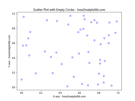
In this example, we’ve created a basic scatter plot with empty circles. Here’s a breakdown of the key elements:
- We generate random data for x and y using NumPy’s
random.rand()function. - We use
plt.scatter()to create the scatter plot. - The
facecolors='none'parameter makes the interior of the circles transparent. - The
edgecolors='blue'parameter sets the color of the circle outlines to blue.
This simple example demonstrates the fundamental technique for how to do a scatter plot with empty circles in Python.
Customizing Empty Circle Scatter Plots
Now that we’ve covered the basics, let’s explore various ways to customize your scatter plots with empty circles.
Adjusting Circle Size
You can control the size of the empty circles using the s parameter:
import matplotlib.pyplot as plt
import numpy as np

x = np.random.rand(50)
y = np.random.rand(50)

plt.figure(figsize=(8, 6))
plt.scatter(x, y, facecolors='none', edgecolors='red', s=100)

plt.xlabel('X-axis - how2matplotlib.com')
plt.ylabel('Y-axis - how2matplotlib.com')
plt.title('Scatter Plot with Larger Empty Circles - how2matplotlib.com')
plt.show()
Output:
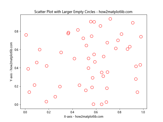
In this example, we’ve set s=100 to increase the size of the empty circles. You can adjust this value to achieve the desired circle size for your scatter plot.
Changing Line Width
To make the empty circles more prominent, you can increase the line width of the circle outlines:
import matplotlib.pyplot as plt
import numpy as np

x = np.random.rand(50)
y = np.random.rand(50)

plt.figure(figsize=(8, 6))
plt.scatter(x, y, facecolors='none', edgecolors='green', linewidth=2)

plt.xlabel('X-axis - how2matplotlib.com')
plt.ylabel('Y-axis - how2matplotlib.com')
plt.title('Scatter Plot with Thicker Empty Circles - how2matplotlib.com')
plt.show()
Output:
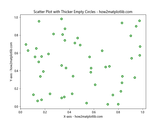
Here, we’ve used linewidth=2 to increase the thickness of the circle outlines. This can help make your scatter plot more visually striking.
Using Different Colors
You can create a more colorful scatter plot by using different colors for the empty circles:
import matplotlib.pyplot as plt
import numpy as np

x = np.random.rand(50)
y = np.random.rand(50)
colors = np.random.rand(50)

plt.figure(figsize=(8, 6))
plt.scatter(x, y, facecolors='none', edgecolors=plt.cm.viridis(colors), linewidth=1.5)

plt.xlabel('X-axis - how2matplotlib.com')
plt.ylabel('Y-axis - how2matplotlib.com')
plt.title('Scatter Plot with Colorful Empty Circles - how2matplotlib.com')
plt.colorbar(label='Color Scale - how2matplotlib.com')
plt.show()
Output:
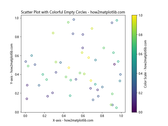
In this example, we’ve used a color map (plt.cm.viridis) to assign different colors to the empty circles based on a random color value. We’ve also added a colorbar to show the color scale.
Advanced Techniques for Scatter Plots with Empty Circles
Now that we’ve covered the basics of how to do a scatter plot with empty circles in Python, let’s explore some more advanced techniques to enhance your visualizations.
Combining Filled and Empty Circles
You can create a scatter plot that combines both filled and empty circles to highlight different aspects of your data:
import matplotlib.pyplot as plt
import numpy as np

x = np.random.rand(100)
y = np.random.rand(100)
colors = np.random.rand(100)
sizes = 1000 * np.random.rand(100)

plt.figure(figsize=(10, 8))
plt.scatter(x[:50], y[:50], c=colors[:50], s=sizes[:50], alpha=0.5, label='Filled Circles')
plt.scatter(x[50:], y[50:], facecolors='none', edgecolors=plt.cm.viridis(colors[50:]), s=sizes[50:], linewidth=1.5, label='Empty Circles')

plt.xlabel('X-axis - how2matplotlib.com')
plt.ylabel('Y-axis - how2matplotlib.com')
plt.title('Scatter Plot with Filled and Empty Circles - how2matplotlib.com')
plt.colorbar(label='Color Scale - how2matplotlib.com')
plt.legend()
plt.show()
Output:
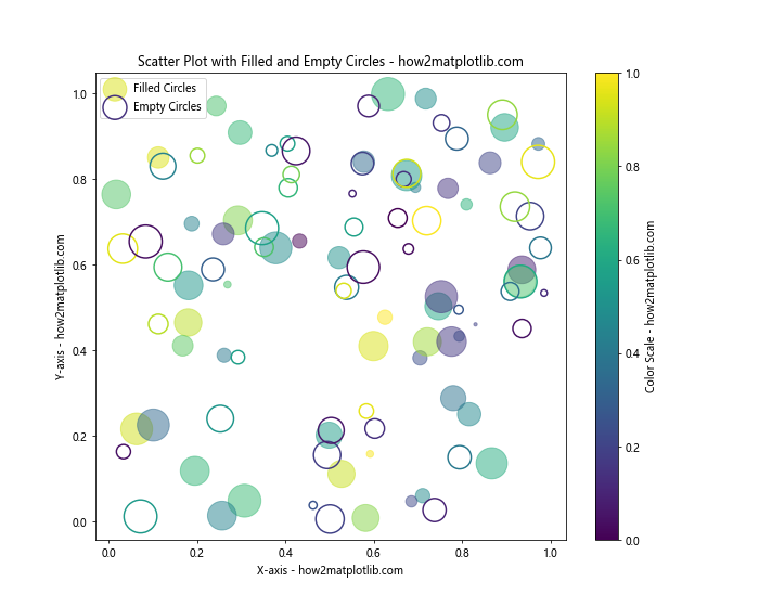
In this example, we’ve created a scatter plot with both filled and empty circles. The first half of the data points are represented by filled circles with varying sizes and colors, while the second half uses empty circles with colored outlines.
Adding Error Bars to Empty Circle Scatter Plots
Error bars can provide additional information about the uncertainty or variability of your data points. Here’s how you can add error bars to a scatter plot with empty circles:
import matplotlib.pyplot as plt
import numpy as np

x = np.linspace(0, 10, 20)
y = np.sin(x)
yerr = 0.1 + 0.2 * np.random.rand(len(x))

plt.figure(figsize=(10, 6))
plt.errorbar(x, y, yerr=yerr, fmt='none', ecolor='gray', capsize=3)
plt.scatter(x, y, facecolors='none', edgecolors='blue', s=50, label='Data Points')

plt.xlabel('X-axis - how2matplotlib.com')
plt.ylabel('Y-axis - how2matplotlib.com')
plt.title('Scatter Plot with Empty Circles and Error Bars - how2matplotlib.com')
plt.legend()
plt.show()
Output:
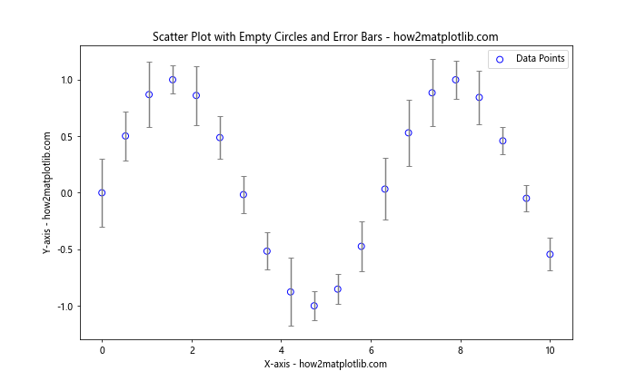
In this example, we’ve added error bars to our scatter plot with empty circles. The errorbar() function is used to create the error bars, while scatter() is used for the empty circles.
Creating a Bubble Chart with Empty Circles
A bubble chart is a variation of a scatter plot where a third variable is represented by the size of the markers. Here’s how to create a bubble chart with empty circles:
import matplotlib.pyplot as plt
import numpy as np

x = np.random.rand(50)
y = np.random.rand(50)
sizes = 1000 * np.random.rand(50)
colors = np.random.rand(50)

plt.figure(figsize=(10, 8))
plt.scatter(x, y, s=sizes, facecolors='none', edgecolors=plt.cm.viridis(colors), linewidth=1.5)

plt.xlabel('X-axis - how2matplotlib.com')
plt.ylabel('Y-axis - how2matplotlib.com')
plt.title('Bubble Chart with Empty Circles - how2matplotlib.com')
plt.colorbar(label='Color Scale - how2matplotlib.com')
plt.show()
Output:
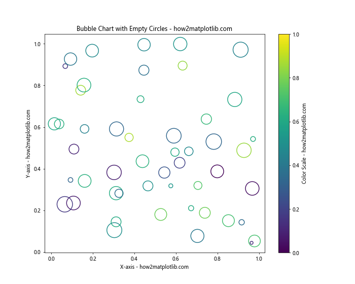
In this bubble chart, the size of each empty circle represents a third variable, while the color of the circle outline represents a fourth variable.
Handling Overlapping Points in Scatter Plots with Empty Circles
When working with large datasets, overlapping points can become an issue in scatter plots. Here are some techniques to address this problem while maintaining the use of empty circles.
Using Alpha Transparency
One way to handle overlapping points is to use alpha transparency:
import matplotlib.pyplot as plt
import numpy as np

x = np.random.normal(0, 1, 1000)
y = np.random.normal(0, 1, 1000)

plt.figure(figsize=(10, 8))
plt.scatter(x, y, facecolors='none', edgecolors='blue', alpha=0.5)

plt.xlabel('X-axis - how2matplotlib.com')
plt.ylabel('Y-axis - how2matplotlib.com')
plt.title('Scatter Plot with Transparent Empty Circles - how2matplotlib.com')
plt.show()
Output:
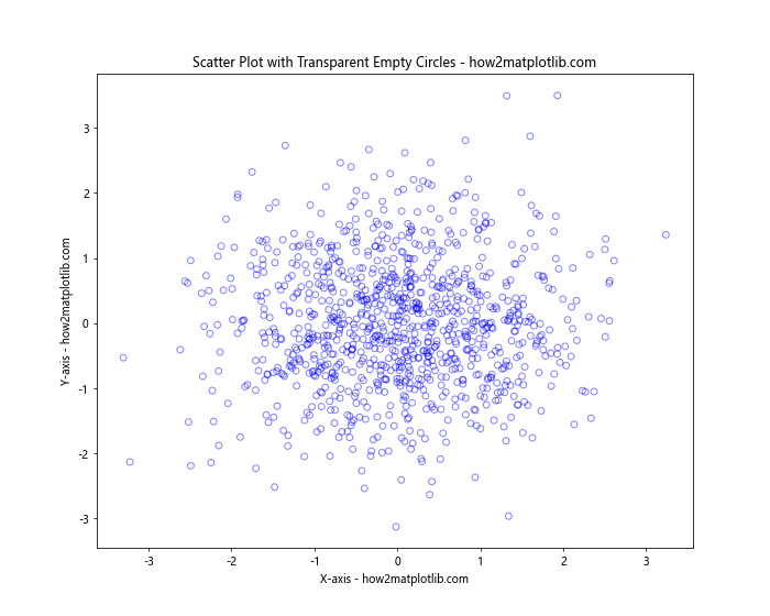
In this example, we’ve set alpha=0.5 to make the empty circles semi-transparent. This allows you to see overlapping points more clearly.
Implementing Jittering
Jittering is a technique where you add small random offsets to your data points to reduce overlapping:
import matplotlib.pyplot as plt
import numpy as np

x = np.random.randint(0, 10, 200)
y = np.random.randint(0, 10, 200)

jitter = 0.2
x_jittered = x + np.random.normal(0, jitter, len(x))
y_jittered = y + np.random.normal(0, jitter, len(y))

plt.figure(figsize=(10, 8))
plt.scatter(x_jittered, y_jittered, facecolors='none', edgecolors='green')

plt.xlabel('X-axis - how2matplotlib.com')
plt.ylabel('Y-axis - how2matplotlib.com')
plt.title('Scatter Plot with Jittered Empty Circles - how2matplotlib.com')
plt.show()
Output:
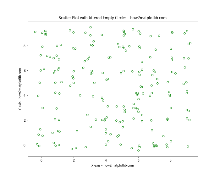
In this example, we’ve added small random offsets to the x and y coordinates to create a jittered scatter plot with empty circles.
Creating Animated Scatter Plots with Empty Circles
Animated scatter plots can be useful for visualizing how data changes over time. Here’s an example of how to create an animated scatter plot with empty circles:
import matplotlib.pyplot as plt
import matplotlib.animation as animation
import numpy as np

fig, ax = plt.subplots(figsize=(10, 8))

x = np.random.rand(20)
y = np.random.rand(20)

scatter = ax.scatter(x, y, facecolors='none', edgecolors='blue')

ax.set_xlim(0, 1)
ax.set_ylim(0, 1)
ax.set_xlabel('X-axis - how2matplotlib.com')
ax.set_ylabel('Y-axis - how2matplotlib.com')
ax.set_title('Animated Scatter Plot with Empty Circles - how2matplotlib.com')

def update(frame):
    global x, y
    x += np.random.uniform(-0.1, 0.1, 20)
    y += np.random.uniform(-0.1, 0.1, 20)
    x = np.clip(x, 0, 1)
    y = np.clip(y, 0, 1)
    scatter.set_offsets(np.c_[x, y])
    return scatter,

ani = animation.FuncAnimation(fig, update, frames=200, interval=50, blit=True)
plt.show()
Output:
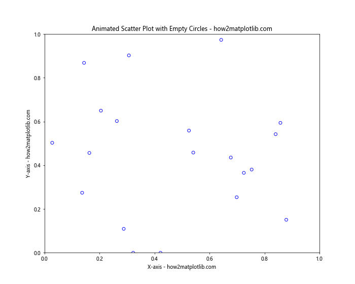
This example creates an animated scatter plot where the empty circles move randomly within the plot area. The animation.FuncAnimation() function is used to create the animation.
Combining Scatter Plots with Other Plot Types
Scatter plots with empty circles can be combined with other plot types to create more informative visualizations. Here are a few examples:
Scatter Plot with Empty Circles and Line Plot
import matplotlib.pyplot as plt
import numpy as np

x = np.linspace(0, 10, 50)
y1 = np.sin(x)
y2 = np.cos(x)

plt.figure(figsize=(10, 6))
plt.plot(x, y1, color='red', label='Sin(x)')
plt.scatter(x, y2, facecolors='none', edgecolors='blue', s=50, label='Cos(x)')

plt.xlabel('X-axis - how2matplotlib.com')
plt.ylabel('Y-axis - how2matplotlib.com')
plt.title('Scatter Plot with Empty Circles and Line Plot - how2matplotlib.com')
plt.legend()
plt.show()
Output:
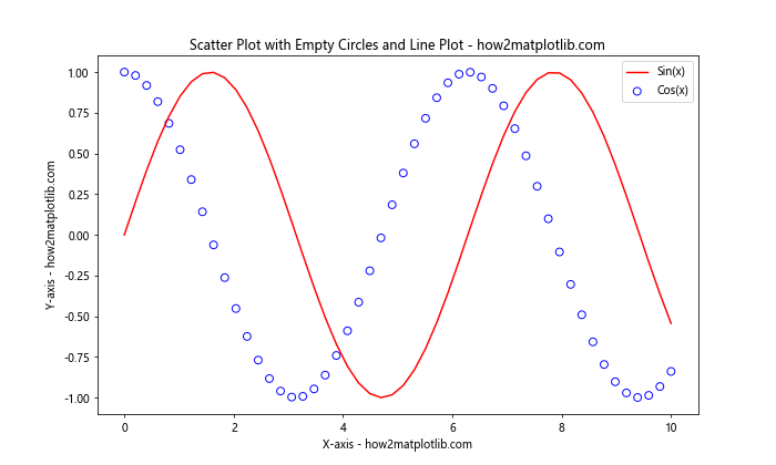
This example combines a line plot of the sine function with a scatter plot of empty circles representing the cosine function.
Scatter Plot with Empty Circles and Histogram
import matplotlib.pyplot as plt
import numpy as np

x = np.random.normal(0, 1, 1000)
y = np.random.normal(0, 1, 1000)

fig, (ax1, ax2) = plt.subplots(1, 2, figsize=(12, 5))

ax1.scatter(x, y, facecolors='none', edgecolors='purple')
ax1.set_xlabel('X-axis - how2matplotlib.com')
ax1.set_ylabel('Y-axis - how2matplotlib.com')
ax1.set_title('Scatter Plot with Empty Circles')

ax2.hist(x, bins=30, edgecolor='black')
ax2.set_xlabel('Value - how2matplotlib.com')
ax2.set_ylabel('Frequency - how2matplotlib.com')
ax2.set_title('Histogram of X Values')

plt.tight_layout()
plt.show()
Output:
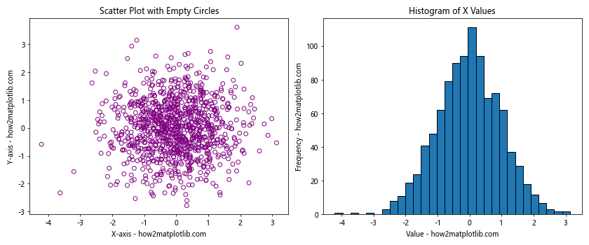
This example creates a side-by-side plot with a scatter plot of empty circles and a histogram of the x-values.
Best Practices for Scatter Plots with Empty Circles
When creating scatter plots with empty circles in Python, keep these best practices in mind:
- Choose appropriate circle sizes: Make sure the empty circles are large enough to be visible but not so large that they obscure other data points.
Use color effectively: Select colors that contrast well with your background and are easy to distinguish.
Add labels and titles: Always include clear labels for your axes and a descriptive title for your plot.
Consider using a legend: If you’re plotting multiple datasets or categories, include a legend to help viewers interpret your plot.
Adjust transparency: Use alpha transparency to handle overlapping points in dense scatter plots.
Combine with other plot types: Don’t hesitate to combine scatter plots with empty circles with other plot types to create more informative visualizations.
Use appropriate data scales: Make sureyour x and y scales are appropriate for your data to avoid distorting the visual representation.
Experiment with different marker styles: While we’ve focused on empty circles, you can also try other hollow marker styles like squares or triangles.
Be mindful of color blindness: Choose color schemes that are accessible to color-blind viewers.
Use gridlines judiciously: Add gridlines if they help interpret the data, but be careful not to clutter the plot.
Advanced Customization Techniques
Let’s explore some more advanced customization techniques for scatter plots with empty circles in Python.