How to Change Scale of Axis in Matplotlib
Matplotlib is a popular visualization library in Python that allows users to create a wide range of plots and charts. One common requirement when working with plots is changing the scale of the axis. In this article, we will explore various methods to customize the scale of the axes in Matplotlib.
Customizing Axis Scale
- Changing X-Axis Scale to Logarithmic Scale
import matplotlib.pyplot as plt

x = [1, 10, 100, 1000]
y = [2, 4, 6, 8]

plt.plot(x, y)
plt.xscale('log')
plt.show()
Output:

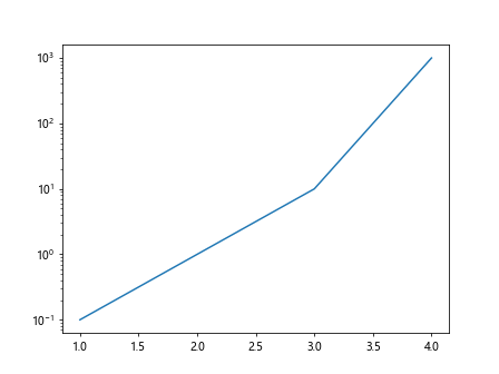
- Changing Y-Axis Scale to Logarithmic Scale
import matplotlib.pyplot as plt

x = [1, 2, 3, 4]
y = [0.1, 1, 10, 1000]

plt.plot(x, y)
plt.yscale('log')
plt.show()
Output:
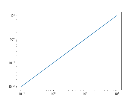
- Setting Logarithmic Scale for Both Axes
import matplotlib.pyplot as plt

x = [0.1, 1, 10, 100]
y = [0.01, 0.1, 1, 10]

plt.plot(x, y)
plt.xscale('log')
plt.yscale('log')
plt.show()
Output:
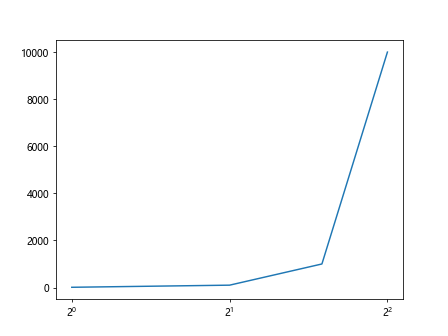
- Overriding the Default Logarithmic Base
import matplotlib.pyplot as plt

x = [1, 2, 3, 4]
y = [10, 100, 1000, 10000]

plt.plot(x, y)
plt.xscale('log', base=2)
plt.show()
Output:
Scaling Functions
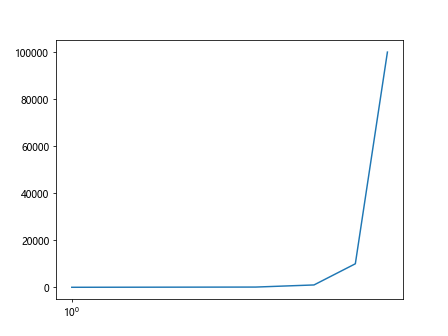
- Using Symmetrical Logarithmic Scale
import matplotlib.pyplot as plt

x = [1, 2, 3, 4, 5]
y = [10, 100, 1000, 10000, 100000]

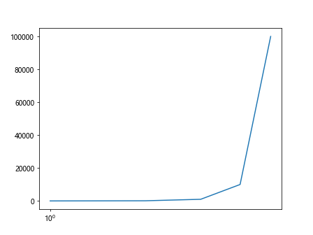
plt.plot(x, y)
plt.xscale('symlog')
plt.show()
Output:
- Setting Upper and Lower Thresholds for Symmetrical Logarithmic Scale
import matplotlib.pyplot as plt

x = [1, 2, 3, 4, 5]
y = [10, 100, 1000, 10000, 100000]

plt.plot(x, y)
plt.xscale('symlog', linthresh=1, linscale=0.5)
plt.show()
Output:
Customizing Tick Locators and Formatters
- Specifying Major and Minor Ticks for X-Axis
import matplotlib.pyplot as plt
import matplotlib.ticker as ticker

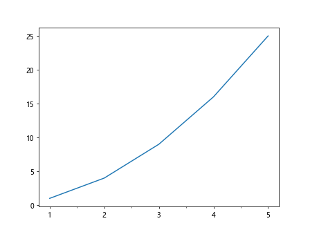
x = range(1, 6)
y = [1, 4, 9, 16, 25]

plt.plot(x, y)
plt.xscale('linear')
plt.gca().xaxis.set_major_locator(ticker.MultipleLocator(1))
plt.gca().xaxis.set_minor_locator(ticker.MultipleLocator(0.5))
plt.show()
Output:
- Customizing Tick Labels
import matplotlib.pyplot as plt

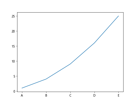
x = [1, 2, 3, 4, 5]
y = [1, 4, 9, 16, 25]

plt.plot(x, y)
plt.xticks(x, ['A', 'B', 'C', 'D', 'E'])
plt.show()
Output:
Logarithmic Scale on Scatter Plots
- Creating a Scatter Plot with Logarithmic Scale
import matplotlib.pyplot as plt
import numpy as np

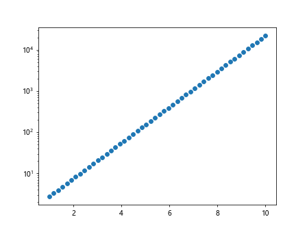
x = np.linspace(1, 10, 50)
y = np.exp(x)

plt.scatter(x, y)
plt.yscale('log')
plt.show()
Output:
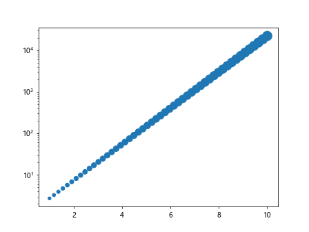
- Customizing Marker Size on Logarithmic Scale Scatter Plot
import matplotlib.pyplot as plt
import numpy as np

x = np.linspace(1, 10, 50)
y = np.exp(x)
sizes = np.linspace(20, 200, 50)

plt.scatter(x, y, s=sizes)
plt.yscale('log')
plt.show()
Output:
- Adding Colorbar on Logarithmic Scale Scatter Plot
import matplotlib.pyplot as plt
import numpy as np
from matplotlib.cm import ScalarMappable
from matplotlib.colors import Normalize

x = np.linspace(1, 10, 50)
y = np.exp(x)
colors = np.random.rand(50)

plt.scatter(x, y, c=colors, cmap='viridis')
plt.yscale('log')

norm = Normalize(vmin=colors.min(), vmax=colors.max())
sm = ScalarMappable(cmap='viridis', norm=norm)
sm.set_array([])
cbar = plt.colorbar(sm)
cbar.set_label('Color Bar')
plt.show()
Other Customizations
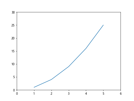
- Setting Axis Limits
import matplotlib.pyplot as plt

x = [1, 2, 3, 4, 5]
y = [1, 4, 9, 16, 25]

plt.plot(x, y)
plt.xlim(0, 6)
plt.ylim(0, 30)
plt.show()
Output:
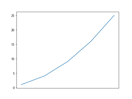
- Hiding Axis Labels
import matplotlib.pyplot as plt

x = [1, 2, 3, 4, 5]
y = [1, 4, 9, 16, 25]

plt.plot(x, y)
plt.gca().axes.get_xaxis().set_visible(False)
plt.show()
Output:
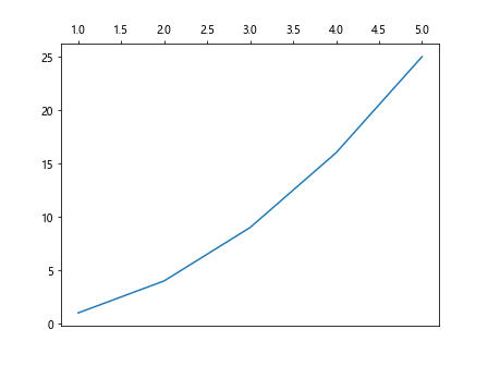
- Moving X-Axis to the Top
import matplotlib.pyplot as plt

x = [1, 2, 3, 4, 5]
y = [1, 4, 9, 16, 25]

plt.plot(x, y)
plt.gca().xaxis.set_ticks_position('top')
plt.show()
Output:
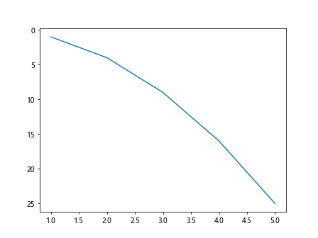
- Changing Direction of Axis
import matplotlib.pyplot as plt

x = [1, 2, 3, 4, 5]
y = [1, 4, 9, 16, 25]

plt.plot(x, y)
plt.gca().invert_yaxis()
plt.show()
Output:
Conclusion
In this article, we have explored various methods to change the scale of the axis in Matplotlib. By customizing the axis scale, users can create more meaningful and informative visualizations for their data. Experiment with these examples and leverage the versatility of Matplotlib to create interactive and engaging plots.