How to Change Colorbar Labels in Matplotlib
How to change colorbar labels in matplotlib is an essential skill for data visualization enthusiasts and professionals alike. Matplotlib, a powerful plotting library in Python, offers various ways to customize colorbars, including modifying their labels. This article will delve deep into the intricacies of changing colorbar labels in matplotlib, providing you with a thorough understanding of the subject and equipping you with practical skills to enhance your data visualizations.
Understanding Colorbars in Matplotlib
Before we dive into how to change colorbar labels in matplotlib, it’s crucial to understand what colorbars are and their significance in data visualization. Colorbars in matplotlib are visual representations of the mapping between color and data values in a plot. They provide a legend that helps viewers interpret the colors used in the visualization.
Colorbars are particularly useful when working with heatmaps, contour plots, or any visualization where color represents a continuous range of values. By learning how to change colorbar labels in matplotlib, you can make your visualizations more informative and easier to understand.
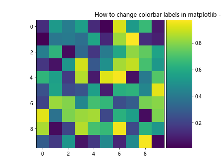
Let’s start with a basic example of creating a plot with a colorbar:
import matplotlib.pyplot as plt
import numpy as np

# Create sample data
data = np.random.rand(10, 10)

# Create a figure and axis
fig, ax = plt.subplots()

# Create a heatmap with a colorbar
im = ax.imshow(data)
cbar = plt.colorbar(im)

# Set the title
plt.title("How to change colorbar labels in matplotlib - Basic Example")

# Show the plot
plt.show()
Output:
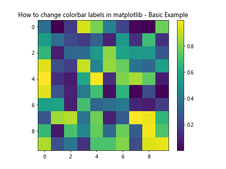
In this example, we’ve created a simple heatmap with a default colorbar. Now, let’s explore how to change colorbar labels in matplotlib to customize this visualization further.
Changing Colorbar Tick Labels
One of the most common ways to change colorbar labels in matplotlib is by modifying the tick labels. These are the numerical values displayed alongside the colorbar. Here’s how you can change them:
import matplotlib.pyplot as plt
import numpy as np

# Create sample data
data = np.random.rand(10, 10)

# Create a figure and axis
fig, ax = plt.subplots()

# Create a heatmap with a colorbar
im = ax.imshow(data)
cbar = plt.colorbar(im)

# Change colorbar tick labels
cbar.set_ticks([0, 0.5, 1])
cbar.set_ticklabels(['Low', 'Medium', 'High'])

# Set the title
plt.title("How to change colorbar labels in matplotlib - Custom Tick Labels")

# Show the plot
plt.show()
Output:
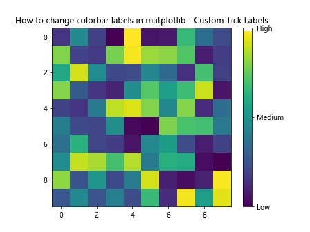
In this example, we’ve used the set_ticks() method to specify the positions of the ticks on the colorbar, and set_ticklabels() to set custom labels for these ticks. This is a powerful way to change colorbar labels in matplotlib, allowing you to provide more meaningful descriptions for your data ranges.
Formatting Colorbar Labels
Sometimes, you may want to change the format of the colorbar labels rather than replacing them entirely. Matplotlib provides several ways to achieve this. Let’s look at an example of how to change colorbar labels in matplotlib by formatting them:
import matplotlib.pyplot as plt
import numpy as np

# Create sample data
data = np.random.rand(10, 10) * 1000

# Create a figure and axis
fig, ax = plt.subplots()

# Create a heatmap with a colorbar
im = ax.imshow(data)
cbar = plt.colorbar(im)

# Format colorbar labels
cbar.formatter.set_scientific(False)
cbar.formatter.set_powerlimits((0, 0))
cbar.update_ticks()

# Set the title
plt.title("How to change colorbar labels in matplotlib - Formatted Labels")

# Show the plot
plt.show()
Output:
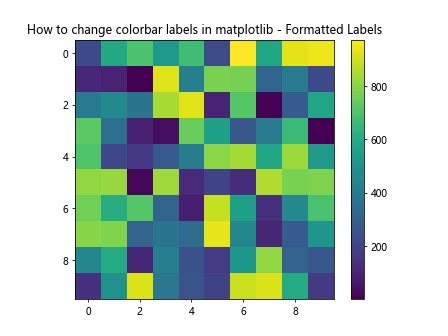
In this example, we’ve used the colorbar’s formatter to disable scientific notation and set power limits. This changes how the labels are displayed without altering their underlying values.
Adding a Label to the Colorbar
Another aspect of how to change colorbar labels in matplotlib is adding a label to the entire colorbar. This label can provide context for what the colors represent. Here’s how you can do it:
import matplotlib.pyplot as plt
import numpy as np

# Create sample data
data = np.random.rand(10, 10)

# Create a figure and axis
fig, ax = plt.subplots()

# Create a heatmap with a colorbar
im = ax.imshow(data)
cbar = plt.colorbar(im)

# Add a label to the colorbar
cbar.set_label('How to change colorbar labels in matplotlib - Value', rotation=270, labelpad=15)

# Set the title
plt.title("Adding a Label to the Colorbar")

# Show the plot
plt.show()
Output:
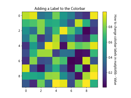
In this example, we’ve used the set_label() method to add a label to the colorbar. The rotation parameter rotates the label, and labelpad adjusts its position.
Changing Colorbar Label Font Properties
When learning how to change colorbar labels in matplotlib, it’s important to consider font properties. You can modify the font size, style, and color of your colorbar labels to make them more visually appealing or to match the style of your overall plot. Here’s an example:
import matplotlib.pyplot as plt
import numpy as np

# Create sample data
data = np.random.rand(10, 10)

# Create a figure and axis
fig, ax = plt.subplots()

# Create a heatmap with a colorbar
im = ax.imshow(data)
cbar = plt.colorbar(im)

# Change font properties of colorbar labels
cbar.ax.tick_params(labelsize=10, labelcolor='red', width=2)

# Set the title
plt.title("How to change colorbar labels in matplotlib - Font Properties")

# Show the plot
plt.show()
Output:
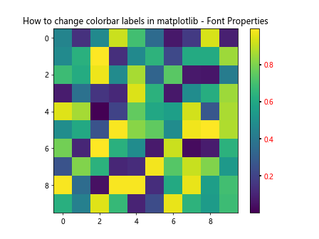
In this example, we’ve used the tick_params() method to change the size and color of the colorbar labels. This is a powerful way to enhance the visual appeal of your colorbar and ensure it integrates well with your overall plot design.
Using Custom Colors in Colorbars
An important aspect of how to change colorbar labels in matplotlib is customizing the colors used in the colorbar itself. While this doesn’t directly change the labels, it can significantly impact how your data is perceived. Let’s look at an example:
import matplotlib.pyplot as plt
import numpy as np
from matplotlib.colors import LinearSegmentedColormap

# Create sample data
data = np.random.rand(10, 10)

# Create a custom colormap
colors = ['blue', 'white', 'red']
n_bins = 100
cmap = LinearSegmentedColormap.from_list('how2matplotlib.com_cmap', colors, N=n_bins)

# Create a figure and axis
fig, ax = plt.subplots()

# Create a heatmap with a custom colorbar
im = ax.imshow(data, cmap=cmap)
cbar = plt.colorbar(im)

# Set the title
plt.title("How to change colorbar labels in matplotlib - Custom Colors")

# Show the plot
plt.show()
Output:
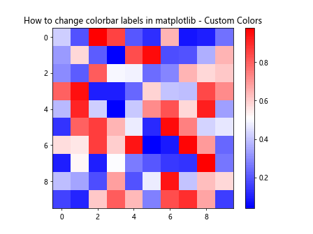
In this example, we’ve created a custom colormap using LinearSegmentedColormap.from_list(). This allows us to define our own color scheme, which can be particularly useful when you want to highlight specific ranges of values or create a colorbar that matches your project’s branding.
Changing Colorbar Orientation
While not directly related to changing labels, the orientation of your colorbar can affect how labels are displayed and perceived. Matplotlib allows you to change the orientation of your colorbar easily. Here’s how to do it:
import matplotlib.pyplot as plt
import numpy as np

# Create sample data
data = np.random.rand(10, 10)

# Create a figure and axis
fig, ax = plt.subplots()

# Create a heatmap with a horizontal colorbar
im = ax.imshow(data)
cbar = plt.colorbar(im, orientation='horizontal')

# Set the title
plt.title("How to change colorbar labels in matplotlib - Horizontal Orientation")

# Show the plot
plt.show()
Output:
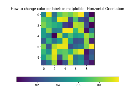
In this example, we’ve set the orientation parameter to ‘horizontal’ when creating the colorbar. This changes the colorbar’s orientation, which can be useful for different plot layouts or when you want to emphasize the colorbar.
Using LogNorm for Colorbar Scale
Sometimes, your data may span several orders of magnitude. In such cases, a linear colorbar scale might not be the best choice. Matplotlib allows you to use a logarithmic scale for your colorbar, which can affect how the labels are displayed. Here’s an example of how to change colorbar labels in matplotlib using a logarithmic scale:
import matplotlib.pyplot as plt
import numpy as np
from matplotlib.colors import LogNorm

# Create sample data with a large range
data = np.random.rand(10, 10) * 1000000

# Create a figure and axis
fig, ax = plt.subplots()

# Create a heatmap with a logarithmic colorbar
im = ax.imshow(data, norm=LogNorm())
cbar = plt.colorbar(im)

# Set the title
plt.title("How to change colorbar labels in matplotlib - Logarithmic Scale")

# Show the plot
plt.show()
Output:
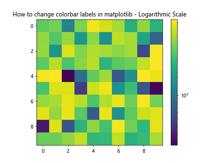
In this example, we’ve used LogNorm() to create a logarithmic scale for our colorbar. This changes how the colors are mapped to values and how the labels are displayed, making it easier to visualize data with a large range of values.
Adding Multiple Colorbars
In some cases, you might want to include multiple colorbars in your plot, each with its own set of labels. This can be useful when you’re plotting multiple datasets or when you want to show different aspects of the same dataset. Here’s how you can add multiple colorbars and change their labels:
import matplotlib.pyplot as plt
import numpy as np

# Create sample data
data1 = np.random.rand(10, 10)
data2 = np.random.rand(10, 10) * 100

# Create a figure and axes
fig, (ax1, ax2) = plt.subplots(1, 2, figsize=(12, 5))

# Create heatmaps with colorbars
im1 = ax1.imshow(data1)
cbar1 = plt.colorbar(im1, ax=ax1)
cbar1.set_label('How2matplotlib.com - Dataset 1', rotation=270, labelpad=15)

im2 = ax2.imshow(data2)
cbar2 = plt.colorbar(im2, ax=ax2)
cbar2.set_label('How2matplotlib.com - Dataset 2', rotation=270, labelpad=15)

# Set the title
fig.suptitle("How to change colorbar labels in matplotlib - Multiple Colorbars")

# Show the plot
plt.tight_layout()
plt.show()
Output:
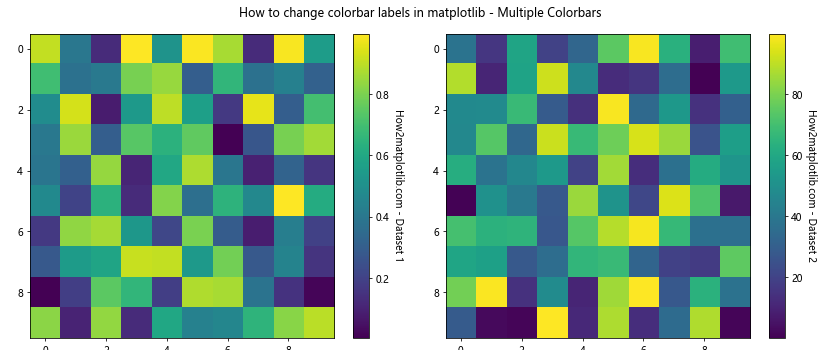
In this example, we’ve created two subplots, each with its own colorbar. We’ve used the set_label() method to add distinct labels to each colorbar, demonstrating how you can customize multiple colorbars in a single figure.
Changing Colorbar Width
The width of your colorbar can affect how the labels are displayed and perceived. Matplotlib allows you to adjust the width of your colorbar. Here’s an example of how to change colorbar labels in matplotlib by adjusting the colorbar width:
import matplotlib.pyplot as plt
import numpy as np
from mpl_toolkits.axes_grid1 import make_axes_locatable

# Create sample data
data = np.random.rand(10, 10)

# Create a figure and axis
fig, ax = plt.subplots()

# Create a heatmap
im = ax.imshow(data)

# Create a divider for the existing axes instance
divider = make_axes_locatable(ax)

# Append axes to the right of the main axes, with 20% width of the main axes
cax = divider.append_axes("right", size="20%", pad=0.05)

# Create the colorbar in the appended axes
cbar = plt.colorbar(im, cax=cax)

# Set the title
plt.title("How to change colorbar labels in matplotlib - Custom Width")

# Show the plot
plt.show()
Output:
In this example, we’ve used make_axes_locatable to create a new axes for the colorbar, allowing us to precisely control its width. This can be particularly useful when you want to emphasize the colorbar or when working with tight layouts.
Using Discrete Colorbars
Sometimes, you might want to use a discrete colorbar instead of a continuous one. This can be particularly useful when your data falls into distinct categories. Here’s how you can create a discrete colorbar and change its labels:
import matplotlib.pyplot as plt
import numpy as np
from matplotlib.colors import BoundaryNorm
from matplotlib.cm import get_cmap

# Create sample data
data = np.random.randint(0, 5, (10, 10))

# Define the boundaries of the color intervals
bounds = [-0.5, 0.5, 1.5, 2.5, 3.5, 4.5]

# Create a colormap
cmap = get_cmap('viridis')

# Create a norm with the color boundaries
norm = BoundaryNorm(bounds, cmap.N)

# Create a figure and axis
fig, ax = plt.subplots()

# Create a heatmap with a discrete colorbar
im = ax.imshow(data, cmap=cmap, norm=norm)
cbar = plt.colorbar(im, boundaries=bounds, ticks=[0, 1, 2, 3, 4])

# Change colorbar labels
cbar.set_ticklabels(['How2matplotlib.com - A', 'How2matplotlib.com - B', 'How2matplotlib.com - C', 'How2matplotlib.com - D', 'How2matplotlib.com - E'])

# Set the title
plt.title("How to change colorbar labels in matplotlib - Discrete Colorbar")

# Show the plot
plt.show()
Output:
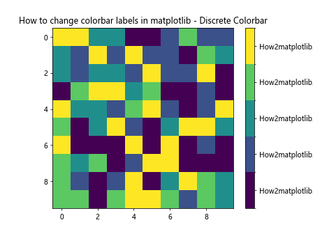
In this example, we’ve used BoundaryNorm to create discrete color intervals and then changed the colorbar labels to represent categories instead of numerical values.
Changing Colorbar Label Rotation
The rotation of colorbar labels can significantly impact the readability of your plot, especially when dealing with long labels. Here’s how you can change the rotation of colorbar labels in matplotlib:
import matplotlib.pyplot as plt
import numpy as np

# Create sample data
data = np.random.rand(10, 10)

# Create a figure and axis
fig, ax = plt.subplots()

# Create a heatmap with a colorbar
im = ax.imshow(data)
cbar = plt.colorbar(im)

# Rotate colorbar labels
cbar.ax.set_yticklabels(cbar.ax.get_yticklabels(), rotation=45)

# Set the title
plt.title("How to change colorbar labels in matplotlib - Label Rotation")

# Show the plot
plt.show()
Output:
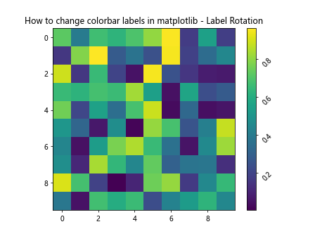
In this example, we’ve used set_yticklabels() to rotate the colorbar labels by 45 degrees. This can be particularly useful when you have long labels or when you want to save space in your plot.
Using Custom Tick Locators
Matplotlib provides various tick locators that can help you control where the ticks (and thus the labels) appear on your colorbar. This can be particularly useful when you want to highlight specific ranges or intervals in your data. Here’s an example of how to change colorbar labels in matplotlib using a custom tick locator:
import matplotlib.pyplot as plt
import numpy as np
from matplotlib.ticker import MaxNLocator

# Create sample data
data = np.random.rand(10, 10) * 100

# Create a figure and axis
fig, ax = plt.subplots()

# Create a heatmap with a colorbar
im = ax.imshow(data)
cbar = plt.colorbar(im)

# Use MaxNLocator to set a maximum number of ticks
cbar.locator = MaxNLocator(nbins=5)
cbar.update_ticks()

# Set the title
plt.title("How to change colorbar labels in matplotlib - Custom Tick Locator")

# Show the plotplt.show()
Output:
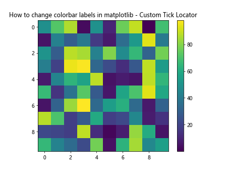
In this example, we’ve used MaxNLocator to limit the number of ticks (and thus labels) on our colorbar to 5. This can help prevent overcrowding of labels and make your colorbar easier to read.
Changing Colorbar Label Format
Sometimes, you might want to change the format of your colorbar labels without changing their values. Matplotlib allows you to do this using a FuncFormatter. Here’s an example:
import matplotlib.pyplot as plt
import numpy as np
from matplotlib.ticker import FuncFormatter

# Create sample data
data = np.random.rand(10, 10) * 100

# Create a figure and axis
fig, ax = plt.subplots()

# Create a heatmap with a colorbar
im = ax.imshow(data)
cbar = plt.colorbar(im)

# Define a function to format the labels
def format_func(value, tick_number):
    return f"How2matplotlib.com - {value:.0f}%"

# Apply the formatter to the colorbar
cbar.formatter = FuncFormatter(format_func)
cbar.update_ticks()

# Set the title
plt.title("How to change colorbar labels in matplotlib - Custom Label Format")

# Show the plot
plt.show()
Output:
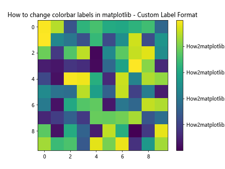
In this example, we’ve defined a custom function that formats our labels as percentages and adds a prefix. We then apply this formatter to our colorbar using FuncFormatter.
Changing Colorbar Label Alignment
The alignment of your colorbar labels can affect the overall look and readability of your plot. Matplotlib allows you to adjust the alignment of your colorbar labels. Here’s how:
import matplotlib.pyplot as plt
import numpy as np

# Create sample data
data = np.random.rand(10, 10)

# Create a figure and axis
fig, ax = plt.subplots()

# Create a heatmap with a colorbar
im = ax.imshow(data)
cbar = plt.colorbar(im)

# Change label alignment
cbar.ax.yaxis.set_tick_params(pad=10)
for label in cbar.ax.yaxis.get_ticklabels():
    label.set_horizontalalignment('left')

# Set the title
plt.title("How to change colorbar labels in matplotlib - Label Alignment")

# Show the plot
plt.show()
Output:
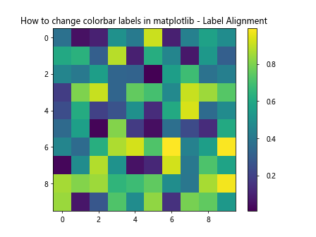
In this example, we’ve adjusted the padding of the labels using set_tick_params(pad=10) and set the horizontal alignment of each label to ‘left’ using set_horizontalalignment('left').
Using Scientific Notation in Colorbar Labels
When dealing with very large or very small numbers, scientific notation can make your colorbar labels more readable. Here’s how to change colorbar labels in matplotlib to use scientific notation:
import matplotlib.pyplot as plt
import numpy as np

# Create sample data with very large values
data = np.random.rand(10, 10) * 1e6

# Create a figure and axis
fig, ax = plt.subplots()

# Create a heatmap with a colorbar
im = ax.imshow(data)
cbar = plt.colorbar(im)

# Use scientific notation for colorbar labels
cbar.formatter.set_scientific(True)
cbar.formatter.set_powerlimits((0, 0))
cbar.update_ticks()

# Set the title
plt.title("How to change colorbar labels in matplotlib - Scientific Notation")

# Show the plot
plt.show()
Output:
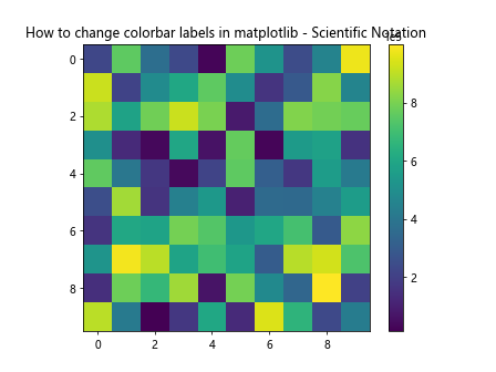
In this example, we’ve used set_scientific(True) to enable scientific notation and set_powerlimits((0, 0)) to ensure all numbers are displayed in scientific notation.
Conclusion
Learning how to change colorbar labels in matplotlib is a crucial skill for creating informative and visually appealing data visualizations. Throughout this article, we’ve explored various techniques to customize colorbar labels, from changing their text and format to adjusting their position and appearance.
We’ve covered how to change tick labels, add a label to the entire colorbar, modify font properties, use custom colors, change orientation, use logarithmic scales, add multiple colorbars, adjust colorbar width, create discrete colorbars, rotate labels, use custom tick locators, change label format, adjust label alignment, and use scientific notation.
Each of these techniques offers a unique way to enhance your visualizations and make them more informative and easier to understand. By mastering these methods, you’ll be able to create colorbars that perfectly complement your data and effectively communicate your insights.
Remember, the key to creating great visualizations is practice and experimentation. Don’t be afraid to try different combinations of these techniques to find what works best for your specific data and audience. With these tools at your disposal, you’re well-equipped to create stunning and informative visualizations using matplotlib.