How to Calculate and Plot a Cumulative Distribution Function with Matplotlib in Python
How to calculate and plot a Cumulative Distribution Function (CDF) with Matplotlib in Python is an essential skill for data scientists and statisticians. This article will provide a detailed explanation of CDFs, their importance, and how to implement them using Python and Matplotlib. We’ll cover various aspects of CDF calculation and visualization, including different types of distributions, customization options, and practical applications.
Understanding Cumulative Distribution Functions
Before diving into the implementation details of how to calculate and plot a Cumulative Distribution Function with Matplotlib in Python, it’s crucial to understand what a CDF is and why it’s important in statistical analysis.
A Cumulative Distribution Function (CDF) is a fundamental concept in probability theory and statistics. It describes the probability that a random variable X takes on a value less than or equal to a given value x. Mathematically, the CDF of a random variable X is defined as:
F(x) = P(X ≤ x)
Where F(x) is the CDF, and P(X ≤ x) represents the probability that the random variable X is less than or equal to x.
CDFs have several important properties:
- The CDF is always non-decreasing: F(x1) ≤ F(x2) for x1 < x2
- The CDF approaches 0 as x approaches negative infinity: lim(x→-∞) F(x) = 0
- The CDF approaches 1 as x approaches positive infinity: lim(x→+∞) F(x) = 1
- The CDF is right-continuous: lim(x→a+) F(x) = F(a)
Understanding how to calculate and plot a Cumulative Distribution Function with Matplotlib in Python is crucial for various applications, including:
- Data analysis and visualization
- Risk assessment and management
- Quality control in manufacturing
- Financial modeling and portfolio analysis
- Reliability engineering
Now that we have a basic understanding of CDFs, let’s explore how to calculate and plot them using Python and Matplotlib.
Setting Up the Environment
Before we begin with how to calculate and plot a Cumulative Distribution Function with Matplotlib in Python, we need to set up our environment. Make sure you have Python installed on your system, along with the following libraries:
- NumPy: For numerical computations
- Matplotlib: For plotting and visualization
- SciPy: For statistical functions and distributions
You can install these libraries using pip:
pip install numpy matplotlib scipy
Once you have these libraries installed, you’re ready to start calculating and plotting CDFs.
Calculating and Plotting a Basic CDF
Let’s start with a simple example of how to calculate and plot a Cumulative Distribution Function with Matplotlib in Python using a basic dataset.
import numpy as np
import matplotlib.pyplot as plt

# Generate sample data
data = np.random.normal(0, 1, 1000)

# Calculate the CDF
sorted_data = np.sort(data)
y = np.arange(1, len(sorted_data) + 1) / len(sorted_data)

# Plot the CDF
plt.figure(figsize=(10, 6))
plt.plot(sorted_data, y, label='CDF')
plt.title('How to calculate and plot a Cumulative Distribution Function with Matplotlib')
plt.xlabel('Value')
plt.ylabel('Cumulative Probability')
plt.legend()
plt.grid(True)
plt.text(0.5, 0.5, 'how2matplotlib.com', fontsize=12, alpha=0.5, ha='center', va='center', transform=plt.gca().transAxes)
plt.show()
Output:
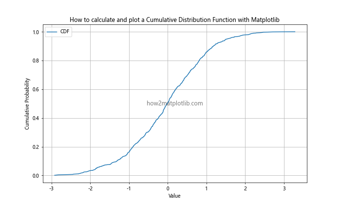
In this example, we first generate a sample dataset using NumPy’s random.normal() function to create 1000 data points from a standard normal distribution. Then, we calculate the CDF by sorting the data and creating a corresponding array of cumulative probabilities.
Finally, we use Matplotlib to plot the CDF. The x-axis represents the values in our dataset, while the y-axis shows the cumulative probability. This basic example demonstrates the fundamental steps in how to calculate and plot a Cumulative Distribution Function with Matplotlib in Python.
Working with Different Distributions
When learning how to calculate and plot a Cumulative Distribution Function with Matplotlib in Python, it’s important to understand that CDFs can be applied to various probability distributions. Let’s explore some common distributions and how to plot their CDFs.
Normal Distribution
The normal distribution, also known as the Gaussian distribution, is one of the most common probability distributions. Here’s how to calculate and plot its CDF:
import numpy as np
import matplotlib.pyplot as plt
from scipy import stats

# Generate x values
x = np.linspace(-4, 4, 1000)

# Calculate CDF for standard normal distribution
cdf = stats.norm.cdf(x)

# Plot the CDF
plt.figure(figsize=(10, 6))
plt.plot(x, cdf, label='Normal CDF')
plt.title('How to calculate and plot a Cumulative Distribution Function (Normal) with Matplotlib')
plt.xlabel('Value')
plt.ylabel('Cumulative Probability')
plt.legend()
plt.grid(True)
plt.text(0, 0.5, 'how2matplotlib.com', fontsize=12, alpha=0.5, ha='center', va='center', transform=plt.gca().transAxes)
plt.show()
Output:
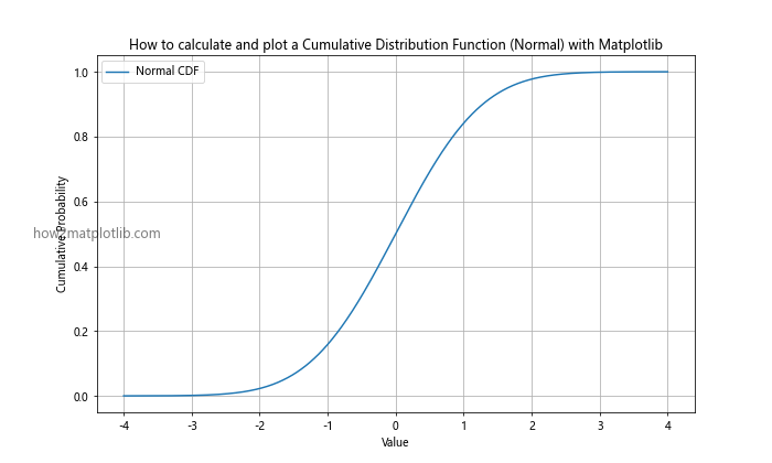
This example uses SciPy’s stats module to calculate the CDF of a standard normal distribution. The resulting plot shows the characteristic S-shaped curve of the normal CDF.
Uniform Distribution
The uniform distribution represents a constant probability over a given range. Here’s how to calculate and plot its CDF:
import numpy as np
import matplotlib.pyplot as plt
from scipy import stats

# Generate x values
x = np.linspace(-1, 2, 1000)

# Calculate CDF for uniform distribution
cdf = stats.uniform.cdf(x, loc=0, scale=1)

# Plot the CDF
plt.figure(figsize=(10, 6))
plt.plot(x, cdf, label='Uniform CDF')
plt.title('How to calculate and plot a Cumulative Distribution Function (Uniform) with Matplotlib')
plt.xlabel('Value')
plt.ylabel('Cumulative Probability')
plt.legend()
plt.grid(True)
plt.text(0.5, 0.5, 'how2matplotlib.com', fontsize=12, alpha=0.5, ha='center', va='center', transform=plt.gca().transAxes)
plt.show()
Output:
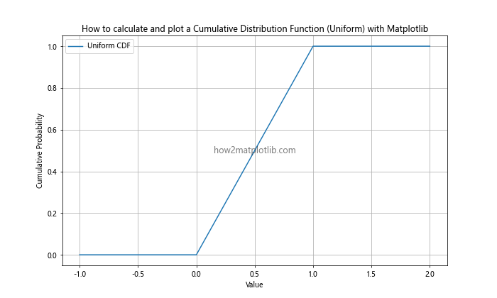
This example demonstrates how to calculate and plot the CDF of a uniform distribution between 0 and 1. The resulting plot shows a straight line between 0 and 1, reflecting the constant probability density of the uniform distribution.
Exponential Distribution
The exponential distribution is often used to model the time between events in a Poisson process. Here’s how to calculate and plot its CDF:
import numpy as np
import matplotlib.pyplot as plt
from scipy import stats

# Generate x values
x = np.linspace(0, 5, 1000)

# Calculate CDF for exponential distribution
cdf = stats.expon.cdf(x, scale=1)

# Plot the CDF
plt.figure(figsize=(10, 6))
plt.plot(x, cdf, label='Exponential CDF')
plt.title('How to calculate and plot a Cumulative Distribution Function (Exponential) with Matplotlib')
plt.xlabel('Value')
plt.ylabel('Cumulative Probability')
plt.legend()
plt.grid(True)
plt.text(2.5, 0.5, 'how2matplotlib.com', fontsize=12, alpha=0.5, ha='center', va='center', transform=plt.gca().transAxes)
plt.show()
Output:
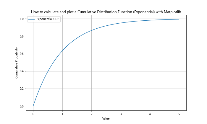
This example shows how to calculate and plot the CDF of an exponential distribution with a scale parameter of 1. The resulting plot demonstrates the rapid initial increase in cumulative probability characteristic of the exponential distribution.
Comparing Multiple CDFs
When learning how to calculate and plot a Cumulative Distribution Function with Matplotlib in Python, it’s often useful to compare multiple CDFs on the same plot. This can help visualize differences between distributions or changes in a distribution under different parameters.
import numpy as np
import matplotlib.pyplot as plt
from scipy import stats

# Generate x values
x = np.linspace(-4, 4, 1000)

# Calculate CDFs for different distributions
normal_cdf = stats.norm.cdf(x)
uniform_cdf = stats.uniform.cdf(x, loc=-2, scale=4)
exponential_cdf = stats.expon.cdf(x, loc=-2, scale=2)

# Plot the CDFs
plt.figure(figsize=(12, 7))
plt.plot(x, normal_cdf, label='Normal CDF')
plt.plot(x, uniform_cdf, label='Uniform CDF')
plt.plot(x, exponential_cdf, label='Exponential CDF')
plt.title('How to calculate and plot multiple Cumulative Distribution Functions with Matplotlib')
plt.xlabel('Value')
plt.ylabel('Cumulative Probability')
plt.legend()
plt.grid(True)
plt.text(0, 0.5, 'how2matplotlib.com', fontsize=12, alpha=0.5, ha='center', va='center', transform=plt.gca().transAxes)
plt.show()
Output:
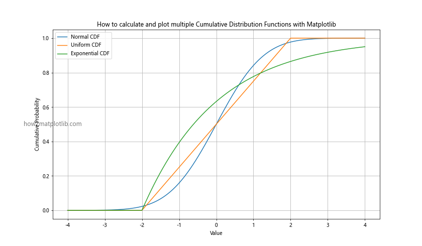
This example demonstrates how to calculate and plot CDFs for normal, uniform, and exponential distributions on the same graph. By comparing these CDFs, we can easily visualize the differences in their cumulative probabilities across different values.
Customizing CDF Plots
When learning how to calculate and plot a Cumulative Distribution Function with Matplotlib in Python, it’s important to know how to customize your plots for better visualization and presentation. Matplotlib offers a wide range of customization options to enhance your CDF plots.
Changing Line Styles and Colors
You can modify the appearance of your CDF plots by changing line styles, colors, and widths:
import numpy as np
import matplotlib.pyplot as plt
from scipy import stats

x = np.linspace(-4, 4, 1000)
cdf = stats.norm.cdf(x)

plt.figure(figsize=(10, 6))
plt.plot(x, cdf, linestyle='--', color='red', linewidth=2, label='Normal CDF')
plt.title('How to calculate and plot a Cumulative Distribution Function with Matplotlib (Customized)')
plt.xlabel('Value')
plt.ylabel('Cumulative Probability')
plt.legend()
plt.grid(True)
plt.text(0, 0.5, 'how2matplotlib.com', fontsize=12, alpha=0.5, ha='center', va='center', transform=plt.gca().transAxes)
plt.show()
Output:
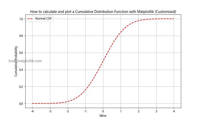
This example shows how to use a dashed red line with increased width for the CDF plot.
Adding Annotations
You can add annotations to highlight specific points on your CDF plot:
import numpy as np
import matplotlib.pyplot as plt
from scipy import stats

x = np.linspace(-4, 4, 1000)
cdf = stats.norm.cdf(x)

plt.figure(figsize=(10, 6))
plt.plot(x, cdf, label='Normal CDF')
plt.title('How to calculate and plot a Cumulative Distribution Function with Matplotlib (Annotated)')
plt.xlabel('Value')
plt.ylabel('Cumulative Probability')
plt.legend()
plt.grid(True)

# Add annotation
plt.annotate('Median', xy=(0, 0.5), xytext=(1, 0.6),
             arrowprops=dict(facecolor='black', shrink=0.05))

plt.text(-2, 0.5, 'how2matplotlib.com', fontsize=12, alpha=0.5, ha='center', va='center', transform=plt.gca().transAxes)
plt.show()
Output:
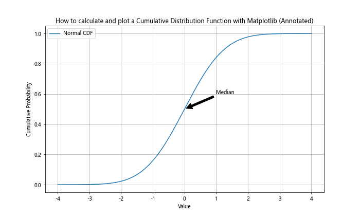
This example adds an annotation to highlight the median of the normal distribution on the CDF plot.
Using a Logarithmic Scale
For distributions with a wide range of values, using a logarithmic scale can be helpful:
import numpy as np
import matplotlib.pyplot as plt
from scipy import stats

x = np.logspace(-2, 2, 1000)
cdf = stats.lognorm.cdf(x, s=1)

plt.figure(figsize=(10, 6))
plt.semilogx(x, cdf, label='Log-normal CDF')
plt.title('How to calculate and plot a Cumulative Distribution Function with Matplotlib (Log Scale)')
plt.xlabel('Value (log scale)')
plt.ylabel('Cumulative Probability')
plt.legend()
plt.grid(True)
plt.text(1, 0.5, 'how2matplotlib.com', fontsize=12, alpha=0.5, ha='center', va='center', transform=plt.gca().transAxes)
plt.show()
Output:

This example demonstrates how to plot the CDF of a log-normal distribution using a logarithmic scale on the x-axis.
Calculating and Plotting Empirical CDFs
When working with real-world data, you often need to calculate and plot empirical CDFs. An empirical CDF is based on observed data rather than a theoretical distribution. Here’s how to calculate and plot an empirical CDF with Matplotlib in Python:
import numpy as np
import matplotlib.pyplot as plt

# Generate sample data
np.random.seed(42)
data = np.random.exponential(scale=2, size=1000)

# Calculate empirical CDF
sorted_data = np.sort(data)
y = np.arange(1, len(sorted_data) + 1) / len(sorted_data)

# Plot empirical CDF
plt.figure(figsize=(10, 6))
plt.plot(sorted_data, y, label='Empirical CDF')
plt.title('How to calculate and plot an Empirical Cumulative Distribution Function with Matplotlib')
plt.xlabel('Value')
plt.ylabel('Cumulative Probability')
plt.legend()
plt.grid(True)
plt.text(2, 0.5, 'how2matplotlib.com', fontsize=12, alpha=0.5, ha='center', va='center', transform=plt.gca().transAxes)
plt.show()
Output:
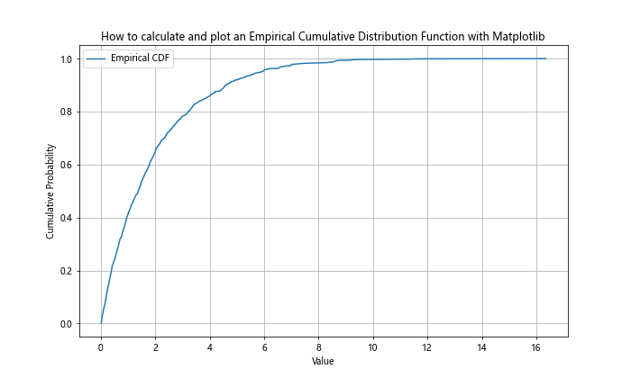
This example demonstrates how to calculate and plot an empirical CDF from a sample of exponentially distributed data. The resulting plot shows the step-like nature of empirical CDFs.
Comparing Empirical and Theoretical CDFs
When learning how to calculate and plot a Cumulative Distribution Function with Matplotlib in Python, it’s often useful to compare empirical CDFs with their theoretical counterparts. This can help assess how well a theoretical distribution fits observed data.
import numpy as np
import matplotlib.pyplot as plt
from scipy import stats

# Generate sample data
np.random.seed(42)
data = np.random.normal(loc=0, scale=1, size=1000)

# Calculate empirical CDF
sorted_data = np.sort(data)
y = np.arange(1, len(sorted_data) + 1) / len(sorted_data)

# Calculate theoretical CDF
x = np.linspace(min(data), max(data), 1000)
theoretical_cdf = stats.norm.cdf(x, loc=0, scale=1)

# Plot both CDFs
plt.figure(figsize=(10, 6))
plt.plot(sorted_data, y, label='Empirical CDF')
plt.plot(x, theoretical_cdf, label='Theoretical CDF', linestyle='--')
plt.title('How to calculate and plot Empirical vs Theoretical Cumulative Distribution Functions with Matplotlib')
plt.xlabel('Value')
plt.ylabel('Cumulative Probability')
plt.legend()
plt.grid(True)
plt.text(0, 0.5, 'how2matplotlib.com', fontsize=12, alpha=0.5, ha='center', va='center', transform=plt.gca().transAxes)
plt.show()
Output:
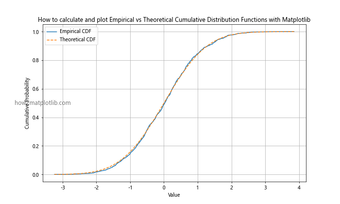
This example shows how to calculate and plot both the empirical CDF of a sample dataset and the theoretical CDF of a normal distribution. By comparing these two curves, you can visually assess how well the normal distribution fits the observed data.## Using CDFs for Data Analysis
Understanding how to calculate and plot a Cumulative Distribution Function with Matplotlib in Python is crucial for various data analysis tasks. Let’s explore some practical applications of CDFs in data analysis.
Percentile Calculation
CDFs can be used to easily calculate percentiles of a distribution:
import numpy as np
import matplotlib.pyplot as plt
from scipy import stats

# Generate sample data
np.random.seed(42)
data = np.random.normal(loc=0, scale=1, size=1000)

# Calculate CDF
sorted_data = np.sort(data)
y = np.arange(1, len(sorted_data) + 1) / len(sorted_data)

# Calculate 25th, 50th, and 75th percentiles
percentiles = [25, 50, 75]
percentile_values = np.percentile(data, percentiles)

# Plot CDF with percentiles
plt.figure(figsize=(10, 6))
plt.plot(sorted_data, y, label='CDF')
for p, v in zip(percentiles, percentile_values):
    plt.axvline(v, linestyle='--', color='red')
    plt.text(v, 0.5, f'{p}th percentile', rotation=90, va='center')

plt.title('How to calculate and plot a Cumulative Distribution Function with Percentiles using Matplotlib')
plt.xlabel('Value')
plt.ylabel('Cumulative Probability')
plt.legend()
plt.grid(True)
plt.text(0, 0.9, 'how2matplotlib.com', fontsize=12, alpha=0.5, ha='center', va='center', transform=plt.gca().transAxes)
plt.show()
Output:
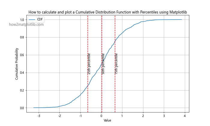
This example demonstrates how to calculate and visualize percentiles using a CDF plot. The vertical lines represent the 25th, 50th (median), and 75th percentiles of the distribution.
Comparing Distributions
CDFs are excellent tools for comparing different distributions or datasets:
import numpy as np
import matplotlib.pyplot as plt
from scipy import stats

# Generate two sample datasets
np.random.seed(42)
data1 = np.random.normal(loc=0, scale=1, size=1000)
data2 = np.random.normal(loc=0.5, scale=1.2, size=1000)

# Calculate CDFs
sorted_data1 = np.sort(data1)
y1 = np.arange(1, len(sorted_data1) + 1) / len(sorted_data1)
sorted_data2 = np.sort(data2)
y2 = np.arange(1, len(sorted_data2) + 1) / len(sorted_data2)

# Plot CDFs
plt.figure(figsize=(10, 6))
plt.plot(sorted_data1, y1, label='Distribution 1')
plt.plot(sorted_data2, y2, label='Distribution 2')
plt.title('How to calculate and plot Cumulative Distribution Functions for Comparison using Matplotlib')
plt.xlabel('Value')
plt.ylabel('Cumulative Probability')
plt.legend()
plt.grid(True)
plt.text(0, 0.5, 'how2matplotlib.com', fontsize=12, alpha=0.5, ha='center', va='center', transform=plt.gca().transAxes)
plt.show()
Output:
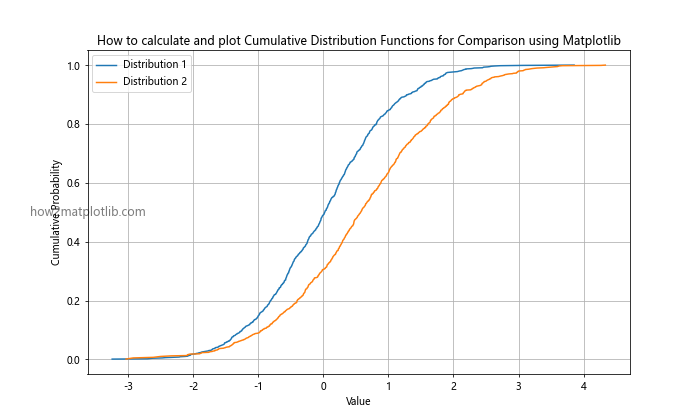
This example shows how to calculate and plot CDFs for two different distributions, allowing for easy visual comparison of their characteristics.
Advanced CDF Techniques
As you become more proficient in how to calculate and plot a Cumulative Distribution Function with Matplotlib in Python, you may want to explore more advanced techniques. Let’s look at some of these methods.
Kernel Density Estimation for Smooth CDFs
When working with small datasets, the empirical CDF can be quite jagged. Kernel Density Estimation (KDE) can be used to create a smoother CDF:
import numpy as np
import matplotlib.pyplot as plt
from scipy import stats

# Generate sample data
np.random.seed(42)
data = np.random.normal(loc=0, scale=1, size=100)

# Calculate empirical CDF
sorted_data = np.sort(data)
y = np.arange(1, len(sorted_data) + 1) / len(sorted_data)

# Calculate KDE CDF
kde = stats.gaussian_kde(data)
x_kde = np.linspace(min(data), max(data), 1000)
cdf_kde = np.array([kde.integrate_box_1d(-np.inf, x) for x in x_kde])

# Plot both CDFs
plt.figure(figsize=(10, 6))
plt.plot(sorted_data, y, label='Empirical CDF')
plt.plot(x_kde, cdf_kde, label='KDE CDF')
plt.title('How to calculate and plot Smooth Cumulative Distribution Functions using KDE and Matplotlib')
plt.xlabel('Value')
plt.ylabel('Cumulative Probability')
plt.legend()
plt.grid(True)
plt.text(0, 0.5, 'how2matplotlib.com', fontsize=12, alpha=0.5, ha='center', va='center', transform=plt.gca().transAxes)
plt.show()
Output:
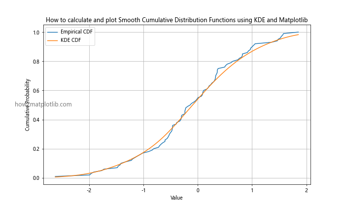
This example demonstrates how to use Kernel Density Estimation to create a smoother CDF, which can be particularly useful for small datasets or when a continuous representation is desired.
Confidence Intervals for CDFs
When working with sample data, it’s often useful to calculate and plot confidence intervals for the CDF:
import numpy as np
import matplotlib.pyplot as plt
from scipy import stats

# Generate sample data
np.random.seed(42)
data = np.random.normal(loc=0, scale=1, size=100)

# Calculate empirical CDF
sorted_data = np.sort(data)
y = np.arange(1, len(sorted_data) + 1) / len(sorted_data)

# Calculate confidence intervals
n = len(data)
ci = 0.95
lower = np.zeros(n)
upper = np.zeros(n)
for i in range(n):
    lower[i], upper[i] = stats.beta.interval(ci, i+1, n-i)

# Plot CDF with confidence intervals
plt.figure(figsize=(10, 6))
plt.plot(sorted_data, y, label='Empirical CDF')
plt.fill_between(sorted_data, lower, upper, alpha=0.3, label=f'{ci*100}% Confidence Interval')
plt.title('How to calculate and plot Cumulative Distribution Functions with Confidence Intervals using Matplotlib')
plt.xlabel('Value')
plt.ylabel('Cumulative Probability')
plt.legend()
plt.grid(True)
plt.text(0, 0.9, 'how2matplotlib.com', fontsize=12, alpha=0.5, ha='center', va='center', transform=plt.gca().transAxes)
plt.show()
Output:
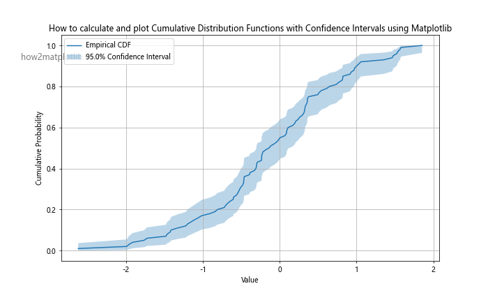
This example shows how to calculate and plot confidence intervals for an empirical CDF, which can be useful for understanding the uncertainty in the estimated CDF due to sampling variability.
Applications of CDFs in Various Fields
Understanding how to calculate and plot a Cumulative Distribution Function with Matplotlib in Python is valuable across many fields. Let’s explore some specific applications in different domains.
Finance: Value at Risk (VaR) Calculation
In finance, the CDF can be used to calculate Value at Risk (VaR), a measure of potential loss in a portfolio:
import numpy as np
import matplotlib.pyplot as plt
from scipy import stats

# Generate sample returns data
np.random.seed(42)
returns = np.random.normal(loc=0.001, scale=0.02, size=1000)

# Calculate CDF
sorted_returns = np.sort(returns)
y = np.arange(1, len(sorted_returns) + 1) / len(sorted_returns)

# Calculate 5% VaR
var_5 = np.percentile(returns, 5)

# Plot CDF with VaR
plt.figure(figsize=(10, 6))
plt.plot(sorted_returns, y, label='Returns CDF')
plt.axvline(var_5, color='red', linestyle='--', label='5% VaR')
plt.title('How to calculate and plot a Cumulative Distribution Function for Value at Risk using Matplotlib')
plt.xlabel('Return')
plt.ylabel('Cumulative Probability')
plt.legend()
plt.grid(True)
plt.text(0, 0.5, 'how2matplotlib.com', fontsize=12, alpha=0.5, ha='center', va='center', transform=plt.gca().transAxes)
plt.show()
Output:
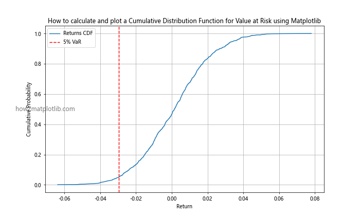
This example demonstrates how to use a CDF to visualize and calculate the Value at Risk for a portfolio of returns.
Engineering: Reliability Analysis
In engineering, CDFs are often used for reliability analysis. Here’s an example of how to calculate and plot a CDF for component lifetimes:
import numpy as np
import matplotlib.pyplot as plt
from scipy import stats

# Generate sample lifetime data (in hours)
np.random.seed(42)
lifetimes = np.random.weibull(2, 1000) * 1000

# Calculate CDF
sorted_lifetimes = np.sort(lifetimes)
y = np.arange(1, len(sorted_lifetimes) + 1) / len(sorted_lifetimes)

# Calculate median lifetime
median_lifetime = np.median(lifetimes)

# Plot CDF
plt.figure(figsize=(10, 6))
plt.plot(sorted_lifetimes, y, label='Lifetime CDF')
plt.axvline(median_lifetime, color='red', linestyle='--', label='Median Lifetime')
plt.title('How to calculate and plot a Cumulative Distribution Function for Reliability Analysis using Matplotlib')
plt.xlabel('Lifetime (hours)')
plt.ylabel('Cumulative Probability')
plt.legend()
plt.grid(True)
plt.text(500, 0.5, 'how2matplotlib.com', fontsize=12, alpha=0.5, ha='center', va='center', transform=plt.gca().transAxes)
plt.show()
Output:
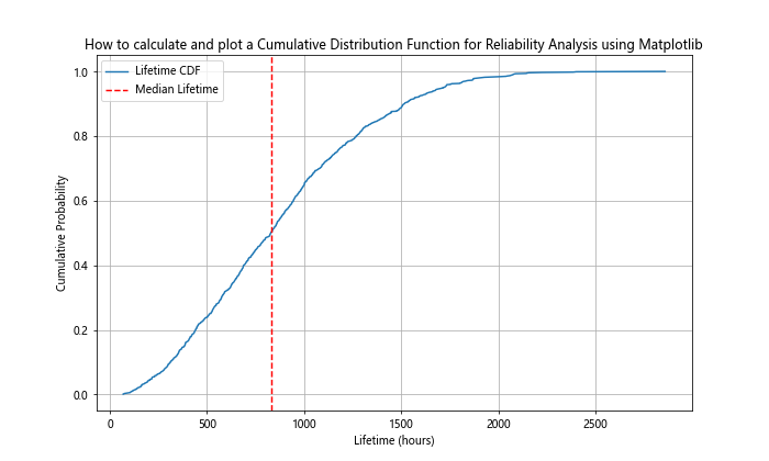
This example shows how to calculate and plot a CDF for component lifetimes, which can be useful in reliability engineering for predicting failure rates and planning maintenance schedules.
Best Practices for CDF Visualization
When learning how to calculate and plot a Cumulative Distribution Function with Matplotlib in Python, it’s important to follow best practices for effective visualization. Here are some tips to keep in mind:
- Choose appropriate scales: Use linear scales for most cases, but consider logarithmic scales for data with wide ranges.
Label axes clearly: Always include clear and descriptive labels for both x and y axes.
Use meaningful titles: Your plot title should concisely describe what the CDF represents.
Include a legend: When plotting multiple CDFs or additional information, use a legend to clarify what each element represents.
Use color effectively: Choose colors that are easily distinguishable and consider color-blind friendly palettes.
Add gridlines: Gridlines can help readers accurately interpret values from the plot.
Consider annotation: Use annotations to highlight important points or features of the CDF.
Show sample size: Include the sample size in the plot or caption, especially for empirical CDFs.
Use appropriate line styles: Use solid lines for primary CDFs and dashed or dotted lines for secondary information.
Maintain aspect ratio: Choose an aspect ratio that clearly shows the shape of the CDF without distortion.
Conclusion
Learning how to calculate and plot a Cumulative Distribution Function with Matplotlib in Python is a valuable skill for data scientists, statisticians, and analysts across various fields. CDFs provide a powerful tool for understanding and visualizing probability distributions, comparing datasets, and deriving important statistical measures. Throughout this article, we’ve covered the fundamentals of CDFs, how to calculate them for various distributions, and how to create effective visualizations using Matplotlib. We’ve explored basic and advanced techniques, including empirical CDFs, smoothing methods, and confidence intervals. We’ve also looked at practical applications in fields such as finance and engineering. By mastering these techniques, you’ll be well-equipped to perform in-depth statistical analysis and create informative visualizations of probability distributions. Remember to follow best practices for visualization to ensure your CDF plots are clear, informative, and easily interpretable.