How to Annotate Matplotlib Scatter Plots
How to Annotate Matplotlib Scatter Plots is an essential skill for data visualization enthusiasts and professionals alike. Matplotlib, a powerful plotting library in Python, offers a wide range of annotation options for scatter plots. In this comprehensive guide, we’ll explore various techniques and best practices for annotating scatter plots using Matplotlib. We’ll cover everything from basic text annotations to advanced customization options, providing you with the knowledge and tools to create informative and visually appealing scatter plots.
Understanding the Basics of Matplotlib Scatter Plots
Before diving into annotations, let’s briefly review the fundamentals of creating scatter plots with Matplotlib. Scatter plots are excellent for visualizing the relationship between two variables, displaying data points as individual markers on a two-dimensional plane.
To create a basic scatter plot, you’ll typically use the plt.scatter() function. Here’s a simple example:
import matplotlib.pyplot as plt
import numpy as np

# Generate sample data
x = np.random.rand(50)
y = np.random.rand(50)

# Create scatter plot
plt.figure(figsize=(8, 6))
plt.scatter(x, y)
plt.title('Basic Scatter Plot - how2matplotlib.com')
plt.xlabel('X-axis')
plt.ylabel('Y-axis')
plt.show()
Output:
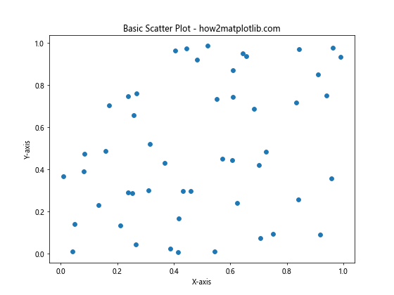
This code creates a basic scatter plot with random data points. Now that we have a foundation, let’s explore how to annotate Matplotlib scatter plots to enhance their informativeness and visual appeal.
Adding Text Annotations to Scatter Plots
One of the simplest ways to annotate a scatter plot is by adding text annotations. These can be used to label specific data points, highlight important information, or provide context to your visualization.
Using plt.annotate() for Text Annotations
The plt.annotate() function is a versatile tool for adding text annotations to your scatter plots. Here’s an example of how to use it:
import matplotlib.pyplot as plt
import numpy as np

# Generate sample data
x = np.random.rand(10)
y = np.random.rand(10)

# Create scatter plot
plt.figure(figsize=(8, 6))
plt.scatter(x, y)

# Add text annotation
plt.annotate('Important Point', xy=(0.5, 0.5), xytext=(0.7, 0.7),
             arrowprops=dict(facecolor='black', shrink=0.05))

plt.title('Scatter Plot with Text Annotation - how2matplotlib.com')
plt.xlabel('X-axis')
plt.ylabel('Y-axis')
plt.show()
Output:
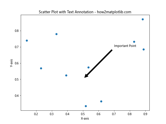
In this example, we’ve added a text annotation with an arrow pointing to a specific point on the plot. The xy parameter specifies the point to annotate, while xytext determines the position of the text. The arrowprops dictionary allows you to customize the appearance of the arrow.
Customizing Text Annotations
You can further customize text annotations by adjusting various properties such as font size, color, and style. Here’s an example:
import matplotlib.pyplot as plt
import numpy as np

# Generate sample data
x = np.random.rand(10)
y = np.random.rand(10)

# Create scatter plot
plt.figure(figsize=(8, 6))
plt.scatter(x, y)

# Add customized text annotation
plt.annotate('Custom Annotation', xy=(0.3, 0.7), xytext=(0.5, 0.9),
             fontsize=12, fontweight='bold', color='red',
             arrowprops=dict(facecolor='red', shrink=0.05, width=2))

plt.title('Scatter Plot with Customized Annotation - how2matplotlib.com')
plt.xlabel('X-axis')
plt.ylabel('Y-axis')
plt.show()
Output:
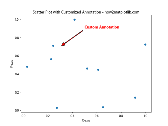
This example demonstrates how to customize the font properties and arrow appearance of the annotation.
Annotating Multiple Points on a Scatter Plot
Often, you’ll want to annotate multiple points on your scatter plot. This can be achieved by using a loop to iterate through your data points and add annotations accordingly.
import matplotlib.pyplot as plt
import numpy as np

# Generate sample data
x = np.random.rand(5)
y = np.random.rand(5)
labels = ['A', 'B', 'C', 'D', 'E']

# Create scatter plot
plt.figure(figsize=(8, 6))
plt.scatter(x, y)

# Annotate multiple points
for i, label in enumerate(labels):
    plt.annotate(label, (x[i], y[i]), xytext=(5, 5), textcoords='offset points')

plt.title('Scatter Plot with Multiple Annotations - how2matplotlib.com')
plt.xlabel('X-axis')
plt.ylabel('Y-axis')
plt.show()
Output:
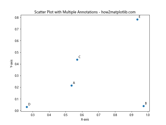
This code annotates each point with a corresponding label from the labels list. The xytext and textcoords parameters are used to offset the annotations slightly from the data points for better readability.
Using Arrows and Shapes for Annotations
Arrows and shapes can be powerful tools for drawing attention to specific areas or trends in your scatter plot. Matplotlib provides various options for adding these visual elements.
Adding Arrows to Scatter Plots
You can use the plt.arrow() function to add arrows to your scatter plot. Here’s an example:
import matplotlib.pyplot as plt
import numpy as np

# Generate sample data
x = np.random.rand(20)
y = np.random.rand(20)

# Create scatter plot
plt.figure(figsize=(8, 6))
plt.scatter(x, y)

# Add arrow annotation
plt.arrow(0.2, 0.2, 0.3, 0.3, head_width=0.05, head_length=0.1, fc='red', ec='red')

plt.title('Scatter Plot with Arrow Annotation - how2matplotlib.com')
plt.xlabel('X-axis')
plt.ylabel('Y-axis')
plt.show()
Output:
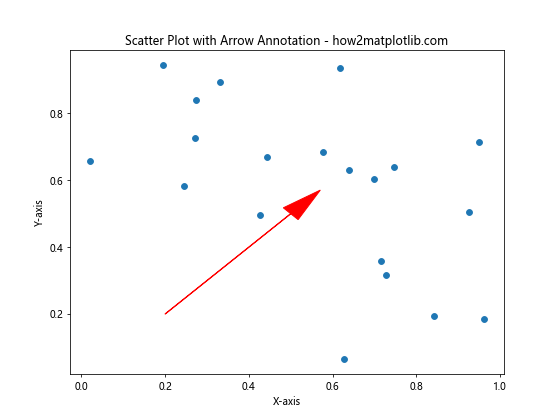
This example adds a red arrow to the scatter plot, highlighting a specific direction or trend.
Using Shapes for Annotations
Shapes like rectangles or circles can be used to highlight regions of interest in your scatter plot. Here’s how you can add a rectangle annotation:
import matplotlib.pyplot as plt
import numpy as np
from matplotlib.patches import Rectangle

# Generate sample data
x = np.random.rand(50)
y = np.random.rand(50)

# Create scatter plot
fig, ax = plt.subplots(figsize=(8, 6))
ax.scatter(x, y)

# Add rectangle annotation
rect = Rectangle((0.2, 0.2), 0.3, 0.3, fill=False, edgecolor='red')
ax.add_patch(rect)

plt.title('Scatter Plot with Rectangle Annotation - how2matplotlib.com')
plt.xlabel('X-axis')
plt.ylabel('Y-axis')
plt.show()
Output:
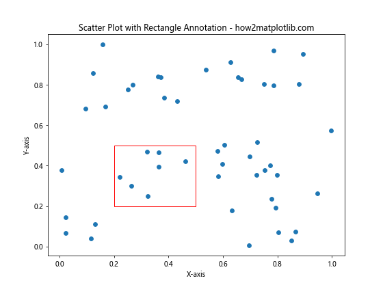
This code adds a red rectangle to the scatter plot, which can be useful for highlighting a specific region of data points.
Annotating Scatter Plots with Data Labels
Sometimes, you may want to directly label each point on your scatter plot with its corresponding data value. This can be achieved using a loop and the plt.text() function.
import matplotlib.pyplot as plt
import numpy as np

# Generate sample data
x = np.random.rand(10)
y = np.random.rand(10)
values = np.random.randint(1, 100, 10)

# Create scatter plot
plt.figure(figsize=(10, 8))
scatter = plt.scatter(x, y, c=values, cmap='viridis')

# Add data labels
for i, value in enumerate(values):
    plt.text(x[i], y[i], str(value), ha='center', va='bottom')

plt.colorbar(scatter, label='Values')
plt.title('Scatter Plot with Data Labels - how2matplotlib.com')
plt.xlabel('X-axis')
plt.ylabel('Y-axis')
plt.show()
Output:
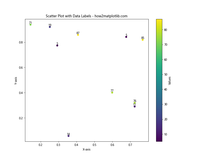
This example creates a scatter plot where each point is colored according to its value and labeled with that value. The ha and va parameters in the plt.text() function control the horizontal and vertical alignment of the labels.
Creating Annotated Bubble Charts
Bubble charts are a variation of scatter plots where the size of each point represents a third variable. You can annotate bubble charts to provide even more information about your data.
import matplotlib.pyplot as plt
import numpy as np

# Generate sample data
x = np.random.rand(15)
y = np.random.rand(15)
sizes = np.random.randint(20, 200, 15)
labels = [f'Point {i+1}' for i in range(15)]

# Create bubble chart
plt.figure(figsize=(10, 8))
scatter = plt.scatter(x, y, s=sizes, alpha=0.5)

# Add annotations
for i, label in enumerate(labels):
    plt.annotate(label, (x[i], y[i]), xytext=(5, 5), textcoords='offset points')

plt.title('Annotated Bubble Chart - how2matplotlib.com')
plt.xlabel('X-axis')
plt.ylabel('Y-axis')
plt.show()
Output:
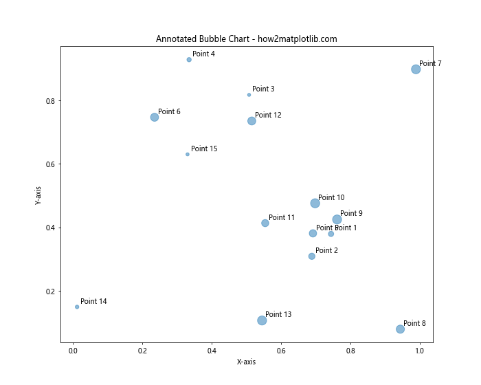
This code creates a bubble chart where each point is labeled with its corresponding identifier. The size of each bubble is determined by the sizes array.
Using Annotations to Highlight Outliers
Annotations can be particularly useful for highlighting outliers or points of interest in your scatter plot. Here’s an example of how to automatically detect and annotate outliers:
import matplotlib.pyplot as plt
import numpy as np
from scipy import stats

# Generate sample data
np.random.seed(42)
x = np.random.normal(0, 1, 100)
y = 2 * x + np.random.normal(0, 1, 100)

# Add some outliers
x = np.append(x, [3, -3, 3])
y = np.append(y, [10, -5, -2])

# Create scatter plot
plt.figure(figsize=(10, 8))
plt.scatter(x, y)

# Detect outliers using z-score
z_scores = np.abs(stats.zscore(np.column_stack((x, y))))
outliers = np.any(z_scores > 3, axis=1)

# Annotate outliers
for i, (xi, yi) in enumerate(zip(x[outliers], y[outliers])):
    plt.annotate(f'Outlier {i+1}', (xi, yi), xytext=(5, 5), textcoords='offset points',
                 bbox=dict(boxstyle='round,pad=0.5', fc='yellow', alpha=0.5),
                 arrowprops=dict(arrowstyle='->', connectionstyle='arc3,rad=0'))

plt.title('Scatter Plot with Annotated Outliers - how2matplotlib.com')
plt.xlabel('X-axis')
plt.ylabel('Y-axis')
plt.show()
Output:
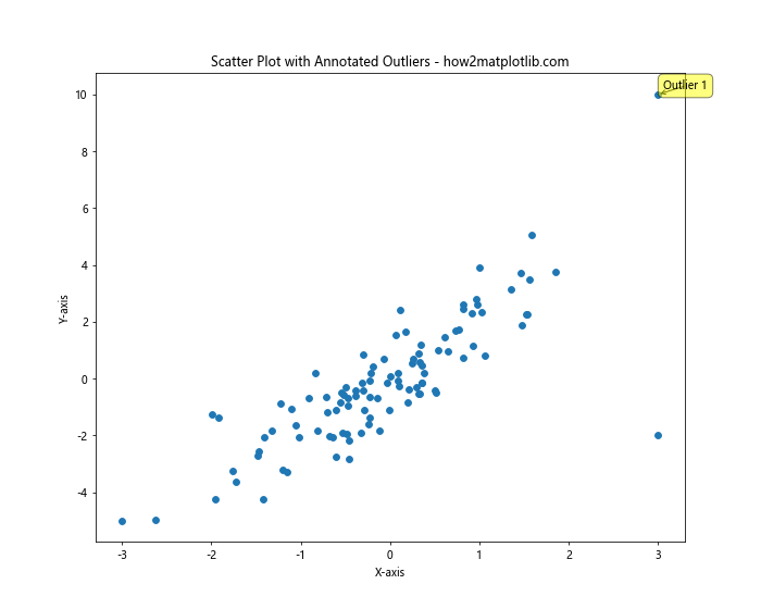
This example uses the z-score method to detect outliers and then annotates them with yellow boxes and arrows.
Customizing Annotation Appearance
Matplotlib offers extensive customization options for annotations. You can adjust properties such as font, color, style, and more to make your annotations stand out or blend in as needed.
import matplotlib.pyplot as plt
import numpy as np

# Generate sample data
x = np.random.rand(10)
y = np.random.rand(10)

# Create scatter plot
plt.figure(figsize=(10, 8))
plt.scatter(x, y)

# Add customized annotations
plt.annotate('Bold Red', (x[0], y[0]), color='red', weight='bold', fontsize=12)
plt.annotate('Italic Blue', (x[1], y[1]), color='blue', style='italic', fontsize=12)
plt.annotate('Custom Font', (x[2], y[2]), family='serif', fontsize=12)
plt.annotate('With Background', (x[3], y[3]), bbox=dict(facecolor='yellow', alpha=0.5))
plt.annotate('Rotated Text', (x[4], y[4]), rotation=45)

plt.title('Scatter Plot with Customized Annotations - how2matplotlib.com')
plt.xlabel('X-axis')
plt.ylabel('Y-axis')
plt.show()
Output:
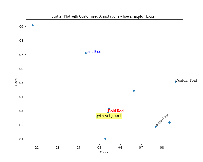
This example demonstrates various ways to customize the appearance of annotations, including changing colors, fonts, styles, and adding backgrounds.
Adding Legends to Annotated Scatter Plots
When working with multiple categories or groups in your scatter plot, it’s often helpful to include a legend. Here’s how you can combine annotations with a legend:
import matplotlib.pyplot as plt
import numpy as np

# Generate sample data
np.random.seed(42)
x1, y1 = np.random.rand(20), np.random.rand(20)
x2, y2 = np.random.rand(20), np.random.rand(20)

# Create scatter plot
plt.figure(figsize=(10, 8))
plt.scatter(x1, y1, c='red', label='Group A')
plt.scatter(x2, y2, c='blue', label='Group B')

# Add annotations
plt.annotate('Point of Interest A', (x1[0], y1[0]), xytext=(5, 5), textcoords='offset points')
plt.annotate('Point of Interest B', (x2[0], y2[0]), xytext=(5, 5), textcoords='offset points')

plt.legend()
plt.title('Annotated Scatter Plot with Legend - how2matplotlib.com')
plt.xlabel('X-axis')
plt.ylabel('Y-axis')
plt.show()
Output:
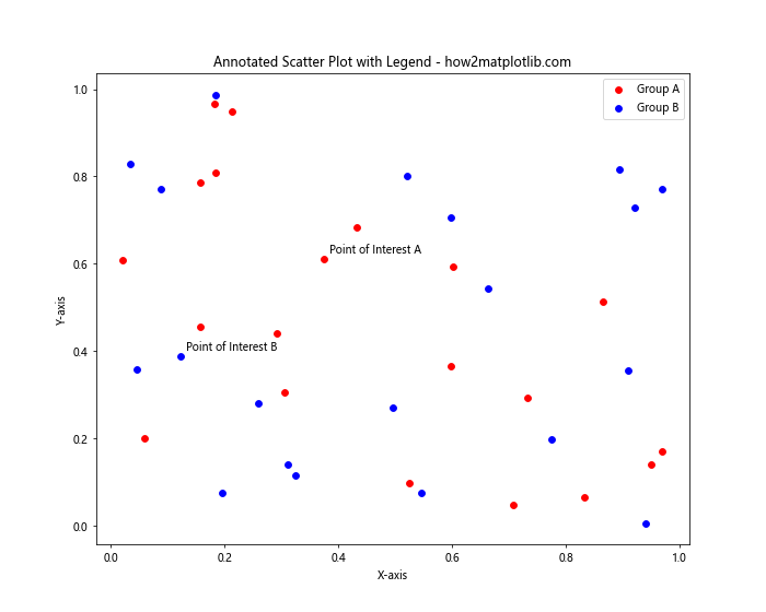
This example creates a scatter plot with two groups of data points, adds annotations to points of interest, and includes a legend to distinguish between the groups.
Using Annotations to Show Trend Lines
Annotations can be used in conjunction with trend lines to highlight the overall pattern in your data. Here’s an example of how to add a trend line and annotate it:
import matplotlib.pyplot as plt
import numpy as np
from scipy import stats

# Generate sample data
x = np.linspace(0, 10, 50)
y = 2 * x + 1 + np.random.normal(0, 2, 50)

# Create scatter plot
plt.figure(figsize=(10, 8))
plt.scatter(x, y)

# Calculate and plot trend line
slope, intercept, r_value, _, _ = stats.linregress(x, y)
line = slope * x + intercept
plt.plot(x, line, color='red', label='Trend Line')

# Annotate trend line
plt.annotate(f'y = {slope:.2f}x + {intercept:.2f}\nR² = {r_value**2:.2f}',
             xy=(x.mean(), line.mean()), xytext=(0.05, 0.95), textcoords='axes fraction',
             bbox=dict(boxstyle='round,pad=0.5', fc='yellow', alpha=0.5),
             arrowprops=dict(arrowstyle='->', connectionstyle='arc3,rad=0'))

plt.legend()
plt.title('Scatter Plot with Annotated Trend Line - how2matplotlib.com')
plt.xlabel('X-axis')
plt.ylabel('Y-axis')
plt.show()
Output:
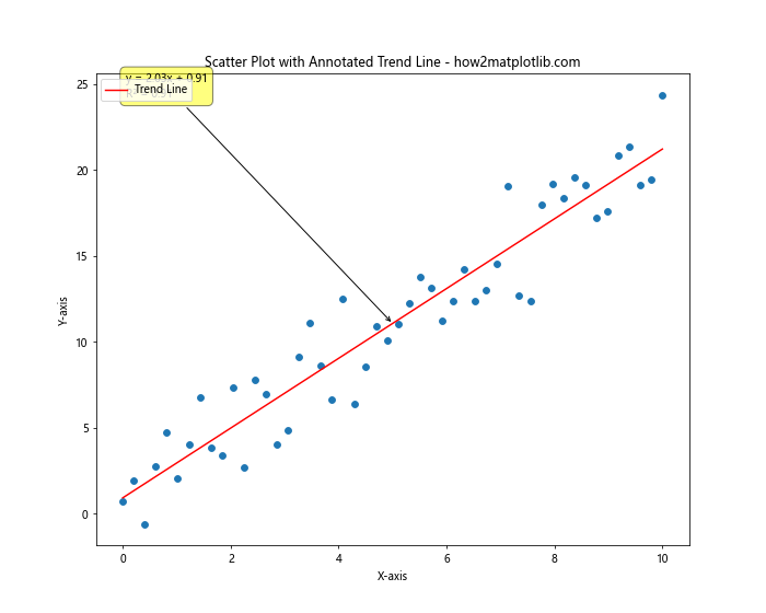
This code adds a trend line to the scatter plot and annotates it with the equation and R-squared value.
Creating Interactive Annotations with mplcursors
For interactive visualizations, you can use the mplcursors library to create annotations that appear when hovering over data points. Here’s an example:
import matplotlib.pyplot as plt
import numpy as np
import mplcursors

# Generate sample data
x = np.random.rand(20)
y = np.random.rand(20)
labels = [f'Point {i+1}' for i in range(20)]

# Create scatter plot
plt.figure(figsize=(10, 8))
scatter = plt.scatter(x, y)# Add interactive annotations
cursor = mplcursors.cursor(scatter, hover=True)
cursor.connect("add", lambda sel: sel.annotation.set_text(labels[sel.target.index]))

plt.title('Interactive Annotated Scatter Plot - how2matplotlib.com')
plt.xlabel('X-axis')
plt.ylabel('Y-axis')
plt.show()
Output:
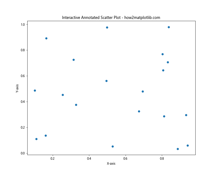
This example creates an interactive scatter plot where hovering over a point displays its label. Note that you’ll need to install the mplcursors library to use this feature.
Annotating Scatter Plots with Statistical Information
Annotations can be used to display statistical information about your data directly on the plot. Here’s an example that shows the mean and standard deviation:
import matplotlib.pyplot as plt
import numpy as np

# Generate sample data
x = np.random.normal(0, 1, 100)
y = np.random.normal(0, 1, 100)

# Calculate statistics
mean_x, mean_y = np.mean(x), np.mean(y)
std_x, std_y = np.std(x), np.std(y)

# Create scatter plot
plt.figure(figsize=(10, 8))
plt.scatter(x, y)

# Add statistical annotations
plt.annotate(f'Mean X: {mean_x:.2f}\nStd X: {std_x:.2f}', xy=(0.05, 0.95), xycoords='axes fraction',
             bbox=dict(boxstyle='round,pad=0.5', fc='yellow', alpha=0.5))
plt.annotate(f'Mean Y: {mean_y:.2f}\nStd Y: {std_y:.2f}', xy=(0.05, 0.85), xycoords='axes fraction',
             bbox=dict(boxstyle='round,pad=0.5', fc='yellow', alpha=0.5))

plt.title('Scatter Plot with Statistical Annotations - how2matplotlib.com')
plt.xlabel('X-axis')
plt.ylabel('Y-axis')
plt.show()
Output:
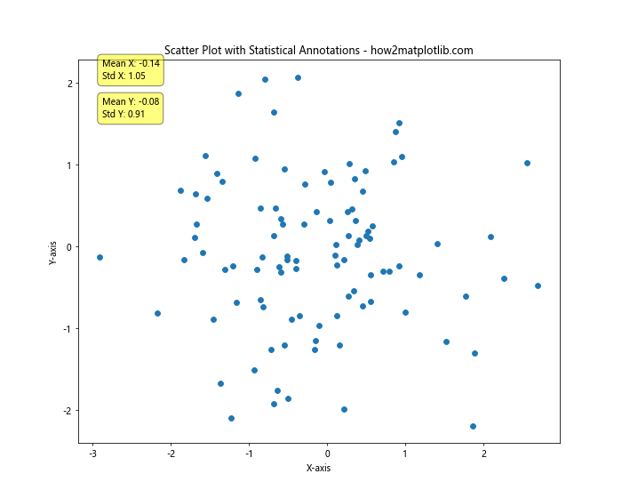
This code adds annotations displaying the mean and standard deviation of both x and y variables.
Using Annotations to Highlight Data Clusters
When working with clustered data, annotations can be used to label and highlight different clusters. Here’s an example using K-means clustering:
import matplotlib.pyplot as plt
import numpy as np
from sklearn.cluster import KMeans

# Generate sample data
np.random.seed(42)
x = np.concatenate([np.random.normal(0, 1, 100), np.random.normal(5, 1, 100)])
y = np.concatenate([np.random.normal(0, 1, 100), np.random.normal(5, 1, 100)])

# Perform K-means clustering
kmeans = KMeans(n_clusters=2, random_state=42)
labels = kmeans.fit_predict(np.column_stack((x, y)))

# Create scatter plot
plt.figure(figsize=(10, 8))
scatter = plt.scatter(x, y, c=labels, cmap='viridis')

# Add cluster center annotations
for i, center in enumerate(kmeans.cluster_centers_):
    plt.annotate(f'Cluster {i+1}', center, xytext=(5, 5), textcoords='offset points',
                 bbox=dict(boxstyle='round,pad=0.5', fc='white', alpha=0.8),
                 arrowprops=dict(arrowstyle='->', connectionstyle='arc3,rad=0'))

plt.colorbar(scatter, label='Cluster')
plt.title('Scatter Plot with Annotated Clusters - how2matplotlib.com')
plt.xlabel('X-axis')
plt.ylabel('Y-axis')
plt.show()
Output:
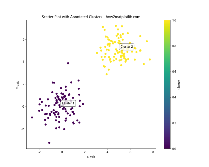
This example performs K-means clustering on the data and annotates the cluster centers.
Creating Annotated 3D Scatter Plots
Matplotlib also supports 3D scatter plots, which can be annotated to provide additional information. Here’s an example:
import matplotlib.pyplot as plt
import numpy as np
from mpl_toolkits.mplot3d import Axes3D

# Generate sample data
np.random.seed(42)
x = np.random.rand(20)
y = np.random.rand(20)
z = np.random.rand(20)

# Create 3D scatter plot
fig = plt.figure(figsize=(10, 8))
ax = fig.add_subplot(111, projection='3d')
scatter = ax.scatter(x, y, z)

# Add annotations
for i in range(len(x)):
    ax.text(x[i], y[i], z[i], f'Point {i+1}', fontsize=8)

ax.set_title('Annotated 3D Scatter Plot - how2matplotlib.com')
ax.set_xlabel('X-axis')
ax.set_ylabel('Y-axis')
ax.set_zlabel('Z-axis')
plt.show()
Output:
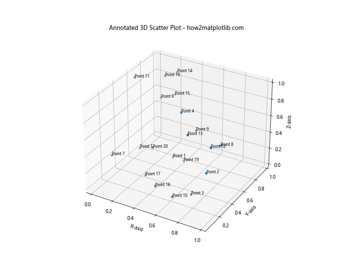
This code creates a 3D scatter plot and adds text annotations to each point.
Using Annotations to Show Data Distribution
Annotations can be combined with histograms or kernel density estimation (KDE) plots to show the distribution of your data alongside the scatter plot. Here’s an example:
import matplotlib.pyplot as plt
import numpy as np
from scipy import stats

# Generate sample data
np.random.seed(42)
x = np.random.normal(0, 1, 1000)
y = 2 * x + np.random.normal(0, 1, 1000)

# Create scatter plot with marginal histograms
fig = plt.figure(figsize=(10, 10))
gs = fig.add_gridspec(3, 3)
ax_scatter = fig.add_subplot(gs[1:, :-1])
ax_histx = fig.add_subplot(gs[0, :-1], sharex=ax_scatter)
ax_histy = fig.add_subplot(gs[1:, -1], sharey=ax_scatter)

# Scatter plot
ax_scatter.scatter(x, y, alpha=0.5)

# Histograms
ax_histx.hist(x, bins=50)
ax_histy.hist(y, bins=50, orientation='horizontal')

# Hide some labels
ax_histx.tick_params(axis="x", labelbottom=False)
ax_histy.tick_params(axis="y", labelleft=False)

# Add KDE annotation
kde = stats.gaussian_kde(np.vstack([x, y]))
xmin, xmax = ax_scatter.get_xlim()
ymin, ymax = ax_scatter.get_ylim()
xx, yy = np.mgrid[xmin:xmax:100j, ymin:ymax:100j]
positions = np.vstack([xx.ravel(), yy.ravel()])
f = kde(positions).reshape(xx.shape)
ax_scatter.contour(xx, yy, f, cmap='Blues')

ax_scatter.set_xlabel('X-axis')
ax_scatter.set_ylabel('Y-axis')
fig.suptitle('Scatter Plot with Distribution Annotations - how2matplotlib.com')
plt.tight_layout()
plt.show()
Output:
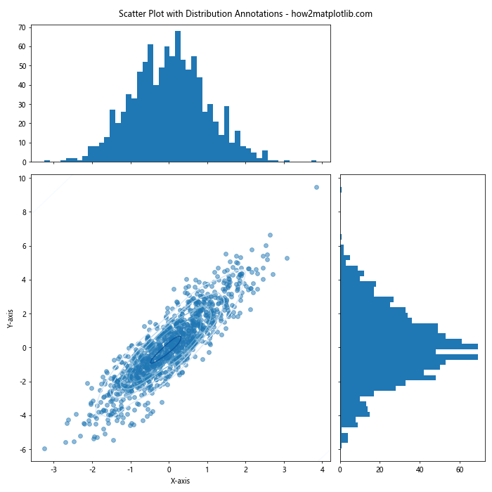
This example creates a scatter plot with marginal histograms and a KDE contour plot to show the distribution of the data.
Annotating Time Series Scatter Plots
When working with time series data, annotations can be used to highlight specific events or time periods. Here’s an example:
import matplotlib.pyplot as plt
import numpy as np
import pandas as pd

# Generate sample time series data
dates = pd.date_range(start='2023-01-01', end='2023-12-31', freq='D')
values = np.cumsum(np.random.randn(len(dates))) + 100

# Create scatter plot
plt.figure(figsize=(12, 6))
plt.scatter(dates, values, alpha=0.5)

# Add event annotations
events = [
    ('2023-03-15', 'Event A'),
    ('2023-07-01', 'Event B'),
    ('2023-11-30', 'Event C')
]

for date, label in events:
    event_value = values[dates == date][0]
    plt.annotate(label, (pd.to_datetime(date), event_value),
                 xytext=(10, 10), textcoords='offset points',
                 arrowprops=dict(arrowstyle='->', connectionstyle='arc3,rad=0.2'))

plt.title('Time Series Scatter Plot with Event Annotations - how2matplotlib.com')
plt.xlabel('Date')
plt.ylabel('Value')
plt.xticks(rotation=45)
plt.tight_layout()
plt.show()
Output:
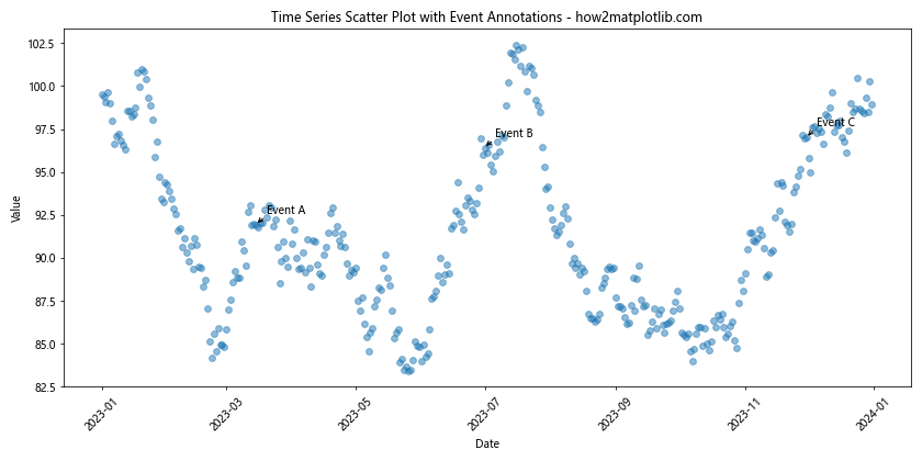
This example creates a time series scatter plot and annotates specific events with labels and arrows.
Creating Custom Annotation Styles
You can create custom annotation styles by combining various Matplotlib features. Here’s an example that creates a callout-style annotation:
import matplotlib.pyplot as plt
import numpy as np
from matplotlib.patches import Circle, ConnectionPatch

def callout_annotation(ax, text, xy, xytext, **kwargs):
    # Create the arrow
    con = ConnectionPatch(xyA=xy, xyB=xytext, coordsA="data", coordsB="data",
                          arrowstyle="-|>", shrinkB=5, clip_on=False, **kwargs)
    ax.add_artist(con)

    # Create the text with a circle around it
    circle = Circle(xytext, radius=0.15, fill=True, color='white', alpha=0.8)
    ax.add_artist(circle)
    ax.annotate(text, xy=xytext, ha='center', va='center', fontweight='bold')

# Generate sample data
x = np.random.rand(20)
y = np.random.rand(20)

# Create scatter plot
fig, ax = plt.subplots(figsize=(10, 8))
ax.scatter(x, y)

# Add custom callout annotation
callout_annotation(ax, "Important\nPoint", xy=(x[0], y[0]), xytext=(0.8, 0.8),
                   color="red", linewidth=2)

ax.set_title('Scatter Plot with Custom Callout Annotation - how2matplotlib.com')
ax.set_xlabel('X-axis')
ax.set_ylabel('Y-axis')
plt.show()
Output:
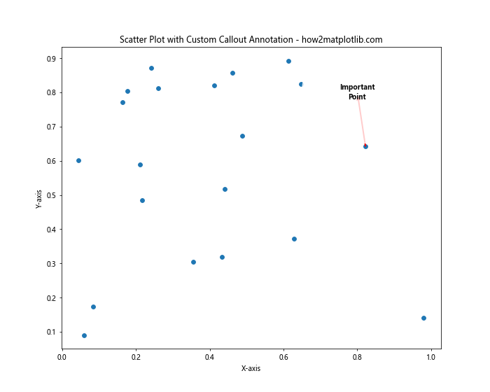
This example creates a custom callout-style annotation with a circle around the text and an arrow pointing to the data point.
Conclusion
In this comprehensive guide, we’ve explored various techniques for annotating Matplotlib scatter plots. From basic text annotations to advanced customization options, we’ve covered a wide range of methods to enhance your data visualizations. By mastering these annotation techniques, you can create more informative and visually appealing scatter plots that effectively communicate your data insights.
Remember that the key to effective annotations is to use them judiciously. While annotations can greatly enhance the interpretability of your plots, overusing them can lead to cluttered and confusing visualizations. Always consider your audience and the main message you want to convey when deciding how to annotate your scatter plots.