How To Adjust Position of Axis Labels in Matplotlib
How to adjust position of axis labels in Matplotlib is an essential skill for creating clear and visually appealing data visualizations. Matplotlib, a powerful plotting library for Python, offers various methods to customize the position of axis labels, allowing you to fine-tune your plots for optimal readability and aesthetics. In this comprehensive guide, we’ll explore different techniques and best practices for adjusting the position of axis labels in Matplotlib, providing you with the knowledge and tools to create professional-looking charts and graphs.
Understanding Axis Labels in Matplotlib
Before diving into the specifics of how to adjust position of axis labels in Matplotlib, it’s important to understand what axis labels are and their role in data visualization. Axis labels are text elements that provide context and meaning to the axes of a plot. They typically describe the units or categories represented by each axis, helping viewers interpret the data correctly.
In Matplotlib, axis labels are associated with the x-axis (horizontal) and y-axis (vertical) of a plot. By default, these labels are positioned at the edges of the plot, but you have the flexibility to adjust their position to suit your specific needs.
Let’s start with a basic example of how to create a plot with axis labels:
import matplotlib.pyplot as plt
import numpy as np

x = np.linspace(0, 10, 100)
y = np.sin(x)

plt.figure(figsize=(8, 6))
plt.plot(x, y)
plt.xlabel('X-axis (how2matplotlib.com)')
plt.ylabel('Y-axis (how2matplotlib.com)')
plt.title('Basic Plot with Axis Labels')
plt.show()
Output:
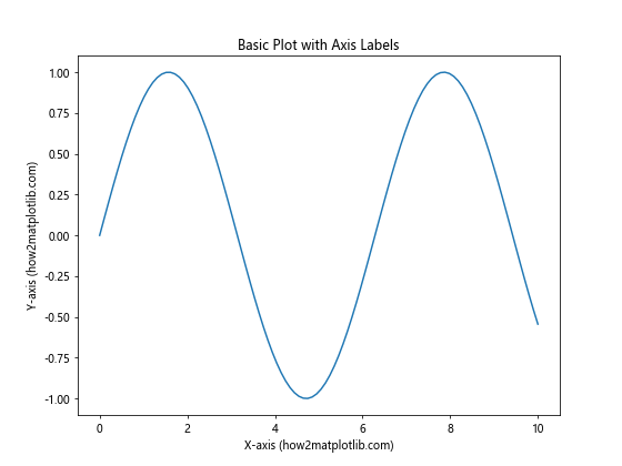
In this example, we’ve created a simple sine wave plot with default axis label positions. Now, let’s explore various methods to adjust the position of these labels.
How To Adjust Position of Axis Labels Using set_label_coords()
One of the most straightforward ways to adjust the position of axis labels in Matplotlib is by using the set_label_coords() method. This method allows you to specify the exact coordinates where you want the label to appear.
Here’s an example of how to adjust position of axis labels using set_label_coords():
import matplotlib.pyplot as plt
import numpy as np

x = np.linspace(0, 10, 100)
y = np.sin(x)

fig, ax = plt.subplots(figsize=(8, 6))
ax.plot(x, y)

ax.set_xlabel('X-axis (how2matplotlib.com)')
ax.set_ylabel('Y-axis (how2matplotlib.com)')

# Adjust position of x-axis label
ax.xaxis.set_label_coords(0.5, -0.1)

# Adjust position of y-axis label
ax.yaxis.set_label_coords(-0.1, 0.5)

plt.title('Adjusted Axis Label Positions')
plt.show()
Output:
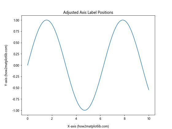
In this example, we’ve moved the x-axis label slightly below its default position and the y-axis label to the left of its default position. The set_label_coords() method takes two arguments: the first represents the position along the axis (0 to 1), and the second represents the position perpendicular to the axis.
How To Adjust Position of Axis Labels Using tick_params()
Another method to adjust the position of axis labels in Matplotlib is by using the tick_params() function. This function allows you to modify various properties of the axis ticks, including the position of the labels.
Here’s an example of how to adjust position of axis labels using tick_params():
import matplotlib.pyplot as plt
import numpy as np

x = np.linspace(0, 10, 100)
y = np.sin(x)

fig, ax = plt.subplots(figsize=(8, 6))
ax.plot(x, y)

ax.set_xlabel('X-axis (how2matplotlib.com)')
ax.set_ylabel('Y-axis (how2matplotlib.com)')

# Adjust position of x-axis label
ax.tick_params(axis='x', labelrotation=45, pad=10)

# Adjust position of y-axis label
ax.tick_params(axis='y', labelrotation=45, pad=10)

plt.title('Adjusted Axis Label Positions with tick_params()')
plt.show()
Output:
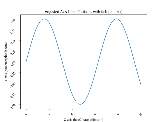
In this example, we’ve rotated both the x-axis and y-axis labels by 45 degrees and increased the padding between the labels and the axis. The pad parameter controls the distance between the labels and the axis.
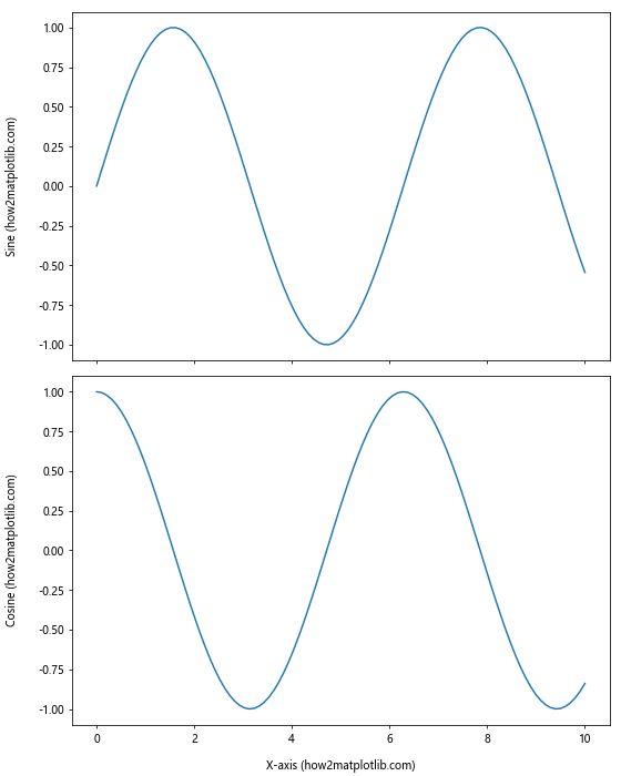
How To Adjust Position of Axis Labels for Multiple Subplots
When working with multiple subplots, you may need to adjust the position of axis labels to ensure they don’t overlap or interfere with each other. Matplotlib provides methods to handle this scenario effectively.
Here’s an example of how to adjust position of axis labels for multiple subplots:
import matplotlib.pyplot as plt
import numpy as np

x = np.linspace(0, 10, 100)
y1 = np.sin(x)
y2 = np.cos(x)

fig, (ax1, ax2) = plt.subplots(2, 1, figsize=(8, 10))

ax1.plot(x, y1)
ax1.set_xlabel('X-axis (how2matplotlib.com)')
ax1.set_ylabel('Y-axis (Sine)')

ax2.plot(x, y2)
ax2.set_xlabel('X-axis (how2matplotlib.com)')
ax2.set_ylabel('Y-axis (Cosine)')

# Adjust position of axis labels for both subplots
ax1.xaxis.set_label_coords(0.5, -0.1)
ax1.yaxis.set_label_coords(-0.1, 0.5)
ax2.xaxis.set_label_coords(0.5, -0.1)
ax2.yaxis.set_label_coords(-0.1, 0.5)

plt.tight_layout()
plt.show()
Output:
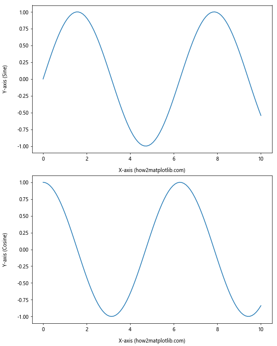
In this example, we’ve created two subplots and adjusted the position of axis labels for both. The tight_layout() function is used to automatically adjust the spacing between subplots.
How To Adjust Position of Axis Labels for Polar Plots
Polar plots present a unique challenge when it comes to adjusting the position of axis labels. Matplotlib provides specific methods to handle axis label positioning in polar coordinates.
Here’s an example of how to adjust position of axis labels for polar plots:
import matplotlib.pyplot as plt
import numpy as np

r = np.arange(0, 2, 0.01)
theta = 2 * np.pi * r

fig, ax = plt.subplots(subplot_kw=dict(projection='polar'), figsize=(8, 8))
ax.plot(theta, r)

ax.set_xlabel('Angle (how2matplotlib.com)')
ax.set_ylabel('Radius (how2matplotlib.com)')

# Adjust position of radial axis labels
ax.set_rlabel_position(45)

plt.title('Polar Plot with Adjusted Axis Labels')
plt.show()
Output:
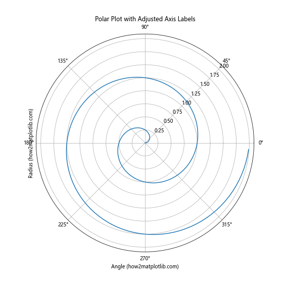
In this example, we’ve created a polar plot and adjusted the position of the radial axis labels using the set_rlabel_position() method. This method takes an angle in degrees as an argument, specifying where the radial labels should be placed.
How To Adjust Position of Axis Labels for 3D Plots
When working with 3D plots in Matplotlib, adjusting the position of axis labels requires a slightly different approach. The set_position() method can be used to fine-tune the label positions in three-dimensional space.
Here’s an example of how to adjust position of axis labels for 3D plots:
import matplotlib.pyplot as plt
import numpy as np
from mpl_toolkits.mplot3d import Axes3D

fig = plt.figure(figsize=(10, 8))
ax = fig.add_subplot(111, projection='3d')

x = np.arange(-5, 5, 0.25)
y = np.arange(-5, 5, 0.25)
X, Y = np.meshgrid(x, y)
Z = np.sin(np.sqrt(X**2 + Y**2))

surf = ax.plot_surface(X, Y, Z)

ax.set_xlabel('X-axis (how2matplotlib.com)')
ax.set_ylabel('Y-axis (how2matplotlib.com)')
ax.set_zlabel('Z-axis (how2matplotlib.com)')

# Adjust position of axis labels
ax.xaxis.set_label_coords(0.5, -0.1)
ax.yaxis.set_label_coords(0.5, -0.1)
ax.zaxis.set_label_coords(0.5, 1.1)

plt.title('3D Plot with Adjusted Axis Labels')
plt.show()
Output:
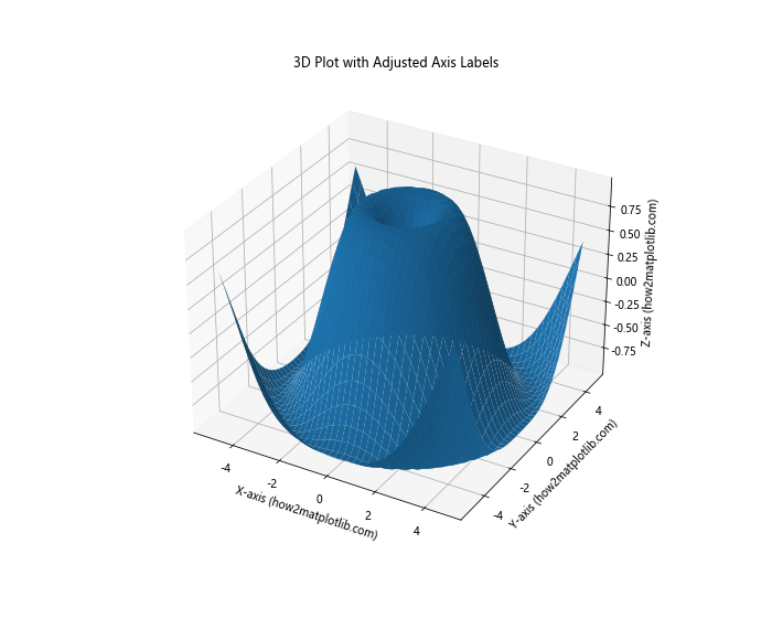
In this example, we’ve created a 3D surface plot and adjusted the position of all three axis labels using the set_label_coords() method. Note that for 3D plots, you may need to experiment with different coordinate values to achieve the desired label positions.
How To Adjust Position of Axis Labels Using Text Objects
For more advanced control over axis label positioning, you can create custom text objects and place them at specific coordinates on the plot. This method provides maximum flexibility in terms of label placement and formatting.
Here’s an example of how to adjust position of axis labels using text objects:
import matplotlib.pyplot as plt
import numpy as np

x = np.linspace(0, 10, 100)
y = np.sin(x)

fig, ax = plt.subplots(figsize=(8, 6))
ax.plot(x, y)

# Remove default axis labels
ax.set_xlabel('')
ax.set_ylabel('')

# Create custom axis labels using text objects
ax.text(5, -1.2, 'X-axis (how2matplotlib.com)', ha='center', va='center')
ax.text(-1, 0, 'Y-axis (how2matplotlib.com)', ha='center', va='center', rotation=90)

plt.title('Custom Axis Labels Using Text Objects')
plt.show()
Output:
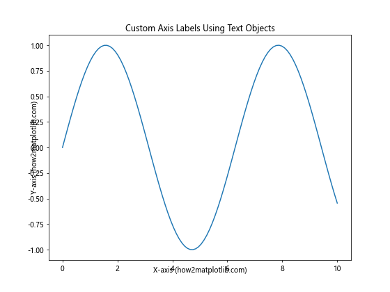
In this example, we’ve removed the default axis labels and created custom text objects to serve as axis labels. The text() method allows you to specify the exact coordinates and properties of each label.
How To Adjust Position of Axis Labels for Logarithmic Scales
When working with logarithmic scales, adjusting the position of axis labels may require special consideration. Matplotlib provides methods to handle label positioning for both linear and logarithmic scales.
Here’s an example of how to adjust position of axis labels for logarithmic scales:
import matplotlib.pyplot as plt
import numpy as np

x = np.logspace(0, 5, 100)
y = x**2

fig, ax = plt.subplots(figsize=(8, 6))
ax.loglog(x, y)

ax.set_xlabel('X-axis (log scale) (how2matplotlib.com)')
ax.set_ylabel('Y-axis (log scale) (how2matplotlib.com)')

# Adjust position of axis labels for logarithmic scales
ax.xaxis.set_label_coords(0.5, -0.1)
ax.yaxis.set_label_coords(-0.1, 0.5)

plt.title('Logarithmic Plot with Adjusted Axis Labels')
plt.show()
Output:
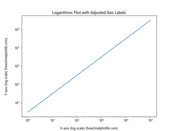
In this example, we’ve created a log-log plot and adjusted the position of the axis labels using the set_label_coords() method. Note that the coordinate system for label positioning remains the same as in linear plots, despite the logarithmic scale.
How To Adjust Position of Axis Labels for Categorical Data
When working with categorical data, adjusting the position of axis labels may require a different approach. Matplotlib provides methods to handle label positioning for categorical axes effectively.
Here’s an example of how to adjust position of axis labels for categorical data:
import matplotlib.pyplot as plt
import numpy as np

categories = ['A', 'B', 'C', 'D', 'E']
values = [3, 7, 2, 5, 8]

fig, ax = plt.subplots(figsize=(8, 6))
ax.bar(categories, values)

ax.set_xlabel('Categories (how2matplotlib.com)')
ax.set_ylabel('Values (how2matplotlib.com)')

# Adjust position of x-axis labels for categorical data
ax.set_xticklabels(categories, rotation=45, ha='right')

# Adjust position of axis labels
ax.xaxis.set_label_coords(0.5, -0.15)
ax.yaxis.set_label_coords(-0.1, 0.5)

plt.title('Categorical Plot with Adjusted Axis Labels')
plt.tight_layout()
plt.show()
Output:
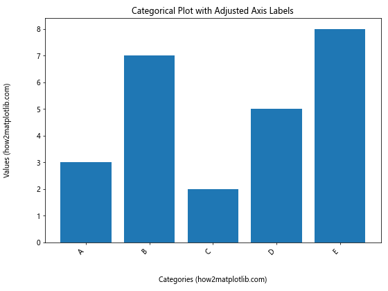
In this example, we’ve created a bar plot with categorical data and adjusted the position of both the x-axis tick labels and the axis labels. The set_xticklabels() method is used to rotate the category labels, while set_label_coords() is used to adjust the position of the main axis labels.
How To Adjust Position of Axis Labels for Time Series Data
Time series data often requires special handling when it comes to axis label positioning. Matplotlib provides tools to effectively manage label placement for time-based axes.
Here’s an example of how to adjust position of axis labels for time series data:
import matplotlib.pyplot as plt
import numpy as np
import pandas as pd

dates = pd.date_range(start='2023-01-01', end='2023-12-31', freq='D')
values = np.cumsum(np.random.randn(len(dates)))

fig, ax = plt.subplots(figsize=(12, 6))
ax.plot(dates, values)

ax.set_xlabel('Date (how2matplotlib.com)')
ax.set_ylabel('Cumulative Value (how2matplotlib.com)')

# Rotate and align the tick labels so they look better
fig.autofmt_xdate()

# Adjust position of axis labels
ax.xaxis.set_label_coords(0.5, -0.1)
ax.yaxis.set_label_coords(-0.05, 0.5)

plt.title('Time Series Plot with Adjusted Axis Labels')
plt.tight_layout()
plt.show()
Output:
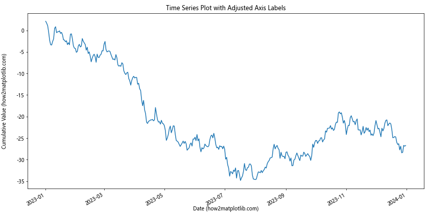
In this example, we’ve created a time series plot and adjusted the position of the axis labels. The autofmt_xdate() method is used to automatically format the date labels on the x-axis, while set_label_coords() is used to adjust the position of the main axis labels.
How To Adjust Position of Axis Labels for Stacked Plots
Stacked plots, such as stacked bar charts or area plots, may require special consideration when adjusting axis label positions. Matplotlib provides methods to handle label positioning for these types of plots effectively.
Here’s an example of how to adjust position of axis labels for stacked plots:
import matplotlib.pyplot as plt
import numpy as np

categories = ['A', 'B', 'C', 'D', 'E']
values1 = [3, 7, 2, 5, 8]
values2 = [2, 4, 6, 3, 5]
values3 = [1, 3, 5, 2, 4]

fig, ax = plt.subplots(figsize=(10, 6))
ax.bar(categories, values1, label='Series 1')
ax.bar(categories, values2, bottom=values1, label='Series 2')
ax.bar(categories, values3, bottom=np.array(values1) + np.array(values2), label='Series 3')

ax.set_xlabel('Categories (how2matplotlib.com)')
ax.set_ylabel('Stacked Values (how2matplotlib.com)')

# Adjust position of axis labels
ax.xaxis.set_label_coords(0.5, -0.1)
ax.yaxis.set_label_coords(-0.05, 0.5)

plt.title('Stacked Bar Plot with Adjusted Axis Labels')
plt.legend()
plt.tight_layout()
plt.show()
Output:
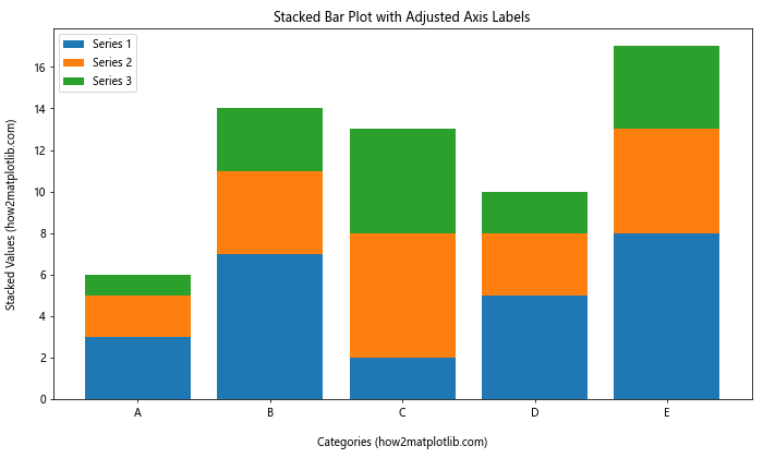
In this example, we’ve created a stacked bar plot and adjusted the position of the axis labels using the set_label_coords() method. The stacked nature of the plot doesn’t affect the label positioning method, but you may need to adjust the coordinates to ensure the labels don’t overlap with the plot elements.
How To Adjust Position of Axis Labels for Subplots with Shared Axes
When working with subplots that share axes, you may want to adjust the position of axis labels to avoid redundancy and improve the overall layout. Matplotlib provides tools to manage label positioning for shared axes effectively.
Here’s an example of how to adjust position of axis labels for subplots with shared axes:
import matplotlib.pyplot as plt
import numpy as np

x = np.linspace(0, 10, 100)
y1 = np.sin(x)
y2 = np.cos(x)

fig, (ax1, ax2) = plt.subplots(2, 1, figsize=(8, 10), sharex=True)

ax1.plot(x, y1)
ax2.plot(x, y2)

# Remove x-axis label from the top subplot
ax1.set_xlabel('')
ax1.set_ylabel('Sine (how2matplotlib.com)')

ax2.set_xlabel('X-axis (how2matplotlib.com)')
ax2.set_ylabel('Cosine (how2matplotlib.com)')

# Adjust position of axis labels
ax1.yaxis.set_label_coords(-0.1, 0.5)
ax2.xaxis.set_label_coords(0.5, -0.1)
ax2.yaxis.set_label_coords(-0.1, 0.5)

plt.tight_layout()
plt.show()
Output:
In this example, we’ve created two subplots with a shared x-axis. We’ve removed the x-axis label from the top subplot to avoid redundancy and adjusted the position of the remaining labels using set_label_coords().
How To Adjust Position of Axis Labels for Plots with Secondary Y-axis
When working with plots that have a secondary y-axis, adjusting the position of axis labels requires careful consideration to ensure clarity and avoid overlap. Matplotlib provides methods to handle label positioning for dual-axis plots effectively.
Here’s an example of how to adjust position of axis labels for plots with a secondary y-axis:
import matplotlib.pyplot as plt
import numpy as np

x = np.linspace(0, 10, 100)
y1 = np.sin(x)
y2 = np.exp(x)

fig, ax1 = plt.subplots(figsize=(10, 6))

color = 'tab:blue'
ax1.set_xlabel('X-axis (how2matplotlib.com)')
ax1.set_ylabel('Sine (how2matplotlib.com)', color=color)
ax1.plot(x, y1, color=color)
ax1.tick_params(axis='y', labelcolor=color)

ax2 = ax1.twinx()  # instantiate a second axes that shares the same x-axis

color = 'tab:orange'
ax2.set_ylabel('Exponential (how2matplotlib.com)', color=color)
ax2.plot(x, y2, color=color)
ax2.tick_params(axis='y', labelcolor=color)

# Adjust position of axis labels
ax1.xaxis.set_label_coords(0.5, -0.1)
ax1.yaxis.set_label_coords(-0.1, 0.5)
ax2.yaxis.set_label_coords(1.1, 0.5)

plt.title('Dual Y-axis Plot with Adjusted Axis Labels')
plt.tight_layout()
plt.show()
Output:
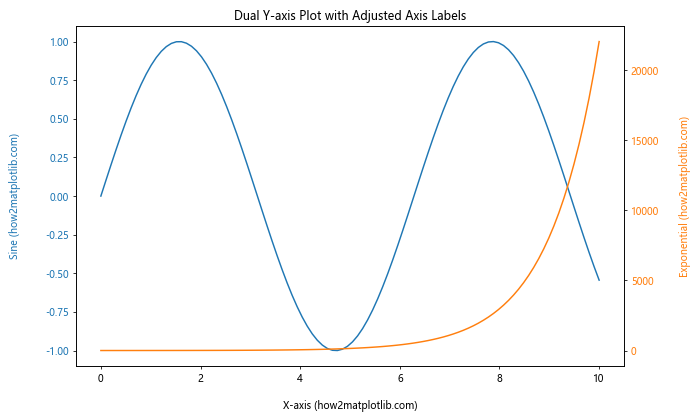
In this example, we’ve created a plot with two y-axes and adjusted the position of all axis labels using set_label_coords(). Note that we’ve positioned the secondary y-axis label on the right side of the plot to maintain clarity.
How To Adjust Position of Axis Labels for Plots with Colorbar
When working with plots that include a colorbar, such as heatmaps or contour plots, adjusting the position of axis labels may require special consideration to accommodate the colorbar. Matplotlib provides methods to handle label positioning for these types of plots effectively.
Here’s an example of how to adjust position of axis labels for plots with a colorbar:
import matplotlib.pyplot as plt
import numpy as np

x = np.linspace(-3, 3, 100)
y = np.linspace(-3, 3, 100)
X, Y = np.meshgrid(x, y)
Z = np.sin(X) * np.cos(Y)

fig, ax = plt.subplots(figsize=(10, 8))
c = ax.pcolormesh(X, Y, Z, cmap='viridis')
fig.colorbar(c, ax=ax, label='Values (how2matplotlib.com)')

ax.set_xlabel('X-axis (how2matplotlib.com)')
ax.set_ylabel('Y-axis (how2matplotlib.com)')

# Adjust position of axis labels
ax.xaxis.set_label_coords(0.5, -0.05)
ax.yaxis.set_label_coords(-0.1, 0.5)

plt.title('Heatmap with Colorbar and Adjusted Axis Labels')
plt.tight_layout()
plt.show()
Output:
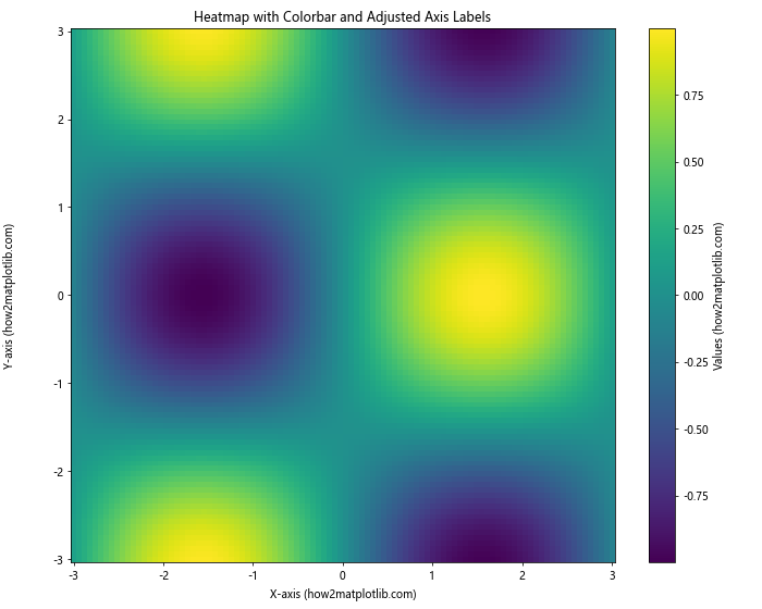
In this example, we’ve created a heatmap with a colorbar and adjusted the position of the axis labels using set_label_coords(). Note that we’ve slightly adjusted the x-axis label position to avoid overlap with the colorbar.
Best Practices for Adjusting Position of Axis Labels in Matplotlib
When learning how to adjust position of axis labels in Matplotlib, it’s important to keep in mind some best practices to ensure your plots are clear, readable, and visually appealing:
- Consistency: Maintain consistent label positioning across similar plots in your project or publication.
Readability: Ensure that labels are easily readable and don’t overlap with other plot elements.
Alignment: Align labels properly with their respective axes to maintain a clean appearance.
Spacing: Use appropriate spacing between labels and plot elements to avoid clutter.
Font size: Adjust font sizes as needed to maintain readability when repositioning labels.
Color: Consider using color to differentiate between multiple axes or to highlight specific labels.
Rotation: Rotate labels when necessary to fit long text or to improve readability in certain plot types.
Units: Include units in your axis labels when applicable to provide context for your data.
Abbreviations: Use abbreviations judiciously and provide a legend or explanation when necessary.
Testing: Always test your plots with different data and on various screen sizes to ensure label positions remain appropriate.
Troubleshooting Common Issues When Adjusting Position of Axis Labels
When learning how to adjust position of axis labels in Matplotlib, you may encounter some common issues. Here are some troubleshooting tips: