How to Adjust Marker Size in Matplotlib
How to Adjust Marker Size in Matplotlib is an essential skill for data visualization enthusiasts and professionals alike. Matplotlib, a powerful plotting library for Python, offers various ways to customize marker sizes in scatter plots, line plots, and other chart types. In this comprehensive guide, we’ll explore different techniques to adjust marker size in Matplotlib, providing you with the knowledge to create visually appealing and informative plots.
Understanding Marker Size in Matplotlib
Before diving into the specifics of how to adjust marker size in Matplotlib, it’s crucial to understand what marker size represents and how it affects your plots. Marker size in Matplotlib refers to the dimensions of the symbols used to represent data points in various types of plots, such as scatter plots or line plots with markers.
The default marker size in Matplotlib is typically set to 6 points, but this can be easily adjusted to suit your visualization needs. By learning how to adjust marker size in Matplotlib, you can emphasize certain data points, create visual hierarchies, or simply improve the overall aesthetics of your plots.
Let’s start with a basic example of how to adjust marker size in Matplotlib:
import matplotlib.pyplot as plt

x = [1, 2, 3, 4, 5]
y = [2, 4, 6, 8, 10]

plt.figure(figsize=(8, 6))
plt.scatter(x, y, s=100, label='how2matplotlib.com')
plt.title('How to Adjust Marker Size in Matplotlib')
plt.xlabel('X-axis')
plt.ylabel('Y-axis')
plt.legend()
plt.show()
Output:
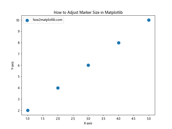
In this example, we’ve created a simple scatter plot with marker size set to 100 using the s parameter in the plt.scatter() function. This demonstrates the basic concept of how to adjust marker size in Matplotlib.
Adjusting Marker Size in Scatter Plots
Scatter plots are one of the most common plot types where you might want to adjust marker size in Matplotlib. The scatter() function provides a straightforward way to control marker size using the s parameter.
Here’s an example of how to adjust marker size in Matplotlib for a scatter plot with varying sizes:
import matplotlib.pyplot as plt
import numpy as np

np.random.seed(42)
x = np.random.rand(50)
y = np.random.rand(50)
sizes = np.random.randint(10, 500, 50)

plt.figure(figsize=(10, 8))
plt.scatter(x, y, s=sizes, alpha=0.5, label='how2matplotlib.com')
plt.title('How to Adjust Marker Size in Matplotlib: Varying Sizes')
plt.xlabel('X-axis')
plt.ylabel('Y-axis')
plt.legend()
plt.show()
Output:
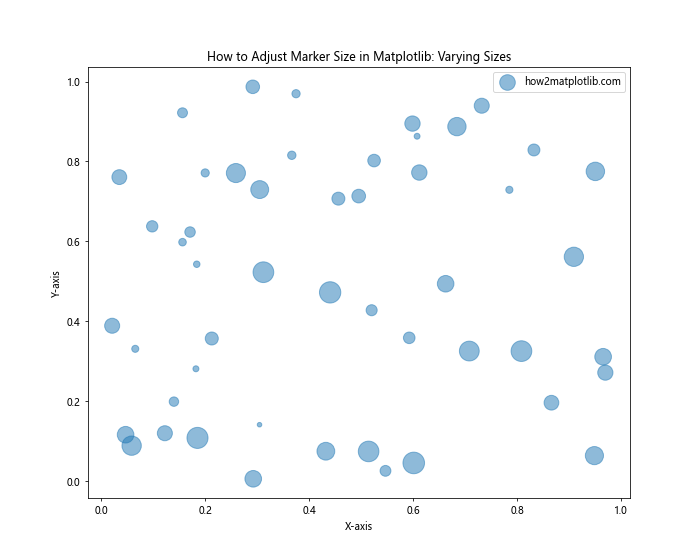
In this example, we’ve created a scatter plot with randomly generated data points and sizes. The s parameter is set to the sizes array, which contains random integers between 10 and 500. This demonstrates how to adjust marker size in Matplotlib for individual data points.
Using Marker Size to Represent Data
One powerful application of adjusting marker size in Matplotlib is to use it to represent an additional dimension of your data. This technique can help you convey more information in a single plot.
Here’s an example of how to adjust marker size in Matplotlib to represent data values:
import matplotlib.pyplot as plt
import numpy as np

np.random.seed(42)
x = np.random.rand(30)
y = np.random.rand(30)
z = np.random.rand(30)

plt.figure(figsize=(10, 8))
scatter = plt.scatter(x, y, s=z*1000, c=z, cmap='viridis', alpha=0.7)
plt.colorbar(scatter, label='Z-value')
plt.title('How to Adjust Marker Size in Matplotlib: Representing Data')
plt.xlabel('X-axis')
plt.ylabel('Y-axis')
plt.text(0.5, -0.1, 'how2matplotlib.com', ha='center', va='center', transform=plt.gca().transAxes)
plt.show()
Output:
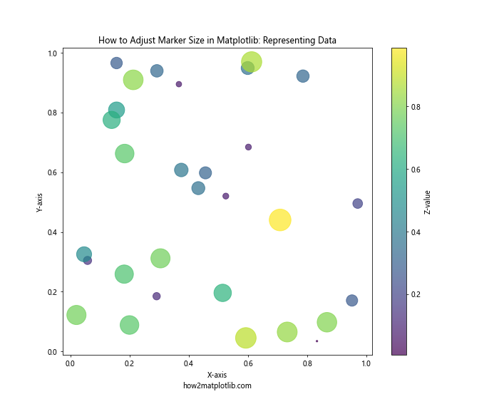
In this example, we’ve used the z values to determine both the size and color of the markers. The marker size is set to z*1000 to make the differences more noticeable. This demonstrates how to adjust marker size in Matplotlib to represent an additional dimension of your data.
Adjusting Marker Size in Line Plots
While scatter plots are the most common use case for adjusting marker size in Matplotlib, you can also apply this technique to line plots. Here’s an example of how to adjust marker size in Matplotlib for a line plot:
import matplotlib.pyplot as plt
import numpy as np

x = np.linspace(0, 10, 50)
y = np.sin(x)

plt.figure(figsize=(12, 6))
plt.plot(x, y, marker='o', markersize=10, linestyle='-', linewidth=2, label='how2matplotlib.com')
plt.title('How to Adjust Marker Size in Matplotlib: Line Plot')
plt.xlabel('X-axis')
plt.ylabel('Y-axis')
plt.legend()
plt.show()
Output:
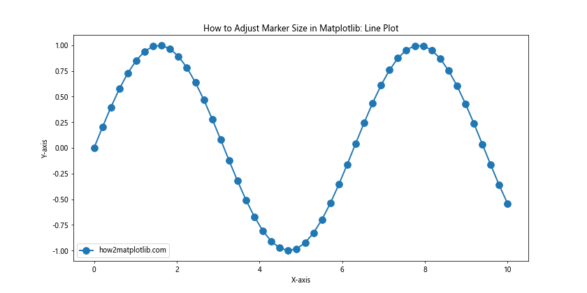
In this example, we’ve created a line plot of the sine function with markers. The markersize parameter is used to adjust the size of the markers. This demonstrates how to adjust marker size in Matplotlib for line plots.
Using Different Marker Styles
When learning how to adjust marker size in Matplotlib, it’s also useful to know about different marker styles. Matplotlib offers a wide range of marker styles that can be combined with size adjustments to create visually distinct data points.
Here’s an example showcasing different marker styles with adjusted sizes:
import matplotlib.pyplot as plt
import numpy as np

x = np.arange(1, 6)
y = x ** 2

marker_styles = ['o', 's', '^', 'D', 'p']
marker_sizes = [100, 150, 200, 250, 300]

plt.figure(figsize=(12, 8))
for i in range(len(x)):
    plt.scatter(x[i], y[i], marker=marker_styles[i], s=marker_sizes[i], label=f'Style {i+1}')

plt.title('How to Adjust Marker Size in Matplotlib: Different Styles')
plt.xlabel('X-axis')
plt.ylabel('Y-axis')
plt.legend()
plt.text(3, 10, 'how2matplotlib.com', ha='center', va='center', fontsize=12)
plt.show()
Output:
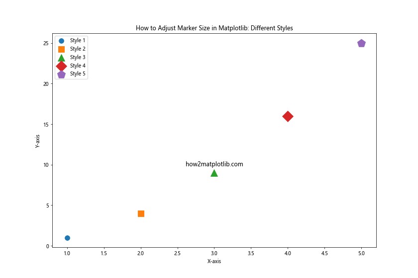
This example demonstrates how to adjust marker size in Matplotlib while also using different marker styles. Each data point has a unique marker style and size, showcasing the versatility of Matplotlib in customizing data point representations.
Adjusting Marker Size Based on Categories
When working with categorical data, you might want to adjust marker size in Matplotlib based on different categories. This can help distinguish between groups in your data more effectively.
Here’s an example of how to adjust marker size in Matplotlib based on categories:
import matplotlib.pyplot as plt
import numpy as np

np.random.seed(42)
categories = ['A', 'B', 'C']
colors = ['red', 'green', 'blue']
sizes = [50, 100, 200]

data = {cat: (np.random.rand(20), np.random.rand(20)) for cat in categories}

plt.figure(figsize=(10, 8))
for cat, (x, y) in data.items():
    plt.scatter(x, y, c=colors[categories.index(cat)], s=sizes[categories.index(cat)], alpha=0.7, label=cat)

plt.title('How to Adjust Marker Size in Matplotlib: Categorical Data')
plt.xlabel('X-axis')
plt.ylabel('Y-axis')
plt.legend()
plt.text(0.5, -0.1, 'how2matplotlib.com', ha='center', va='center', transform=plt.gca().transAxes)
plt.show()
Output:
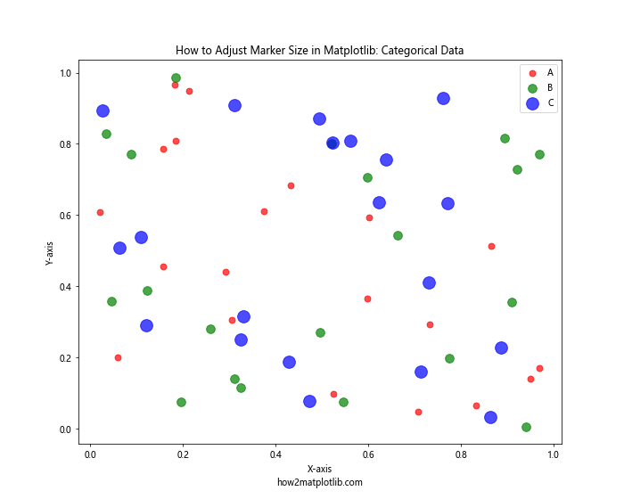
In this example, we’ve created three categories of data points, each with a different color and marker size. This demonstrates how to adjust marker size in Matplotlib to distinguish between different categories in your data.
Creating a Bubble Chart
A bubble chart is a type of scatter plot where the marker size represents a third variable. Learning how to adjust marker size in Matplotlib is crucial for creating effective bubble charts.
Here’s an example of how to create a bubble chart by adjusting marker size in Matplotlib:
import matplotlib.pyplot as plt
import numpy as np

np.random.seed(42)
x = np.random.rand(20)
y = np.random.rand(20)
z = np.random.rand(20)

plt.figure(figsize=(12, 9))
scatter = plt.scatter(x, y, s=z*1000, c=z, cmap='viridis', alpha=0.6)
plt.colorbar(scatter, label='Z-value')
plt.title('How to Adjust Marker Size in Matplotlib: Bubble Chart')
plt.xlabel('X-axis')
plt.ylabel('Y-axis')
plt.text(0.5, -0.1, 'how2matplotlib.com', ha='center', va='center', transform=plt.gca().transAxes)
plt.show()
Output:
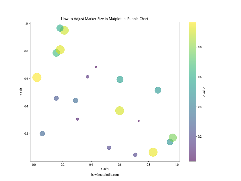
This example demonstrates how to adjust marker size in Matplotlib to create a bubble chart. The size of each bubble is determined by the z values, multiplied by 1000 to make the differences more noticeable.
Adjusting Marker Size in 3D Plots
Matplotlib also supports 3D plotting, and you can adjust marker size in these plots as well. Here’s an example of how to adjust marker size in Matplotlib for a 3D scatter plot:
import matplotlib.pyplot as plt
from mpl_toolkits.mplot3d import Axes3D
import numpy as np

np.random.seed(42)
x = np.random.rand(50)
y = np.random.rand(50)
z = np.random.rand(50)
sizes = np.random.randint(20, 300, 50)

fig = plt.figure(figsize=(12, 9))
ax = fig.add_subplot(111, projection='3d')
scatter = ax.scatter(x, y, z, s=sizes, c=z, cmap='viridis', alpha=0.6)

ax.set_xlabel('X-axis')
ax.set_ylabel('Y-axis')
ax.set_zlabel('Z-axis')
ax.set_title('How to Adjust Marker Size in Matplotlib: 3D Plot')
plt.colorbar(scatter, label='Z-value')
ax.text2D(0.5, -0.05, 'how2matplotlib.com', ha='center', va='center', transform=ax.transAxes)
plt.show()
Output:
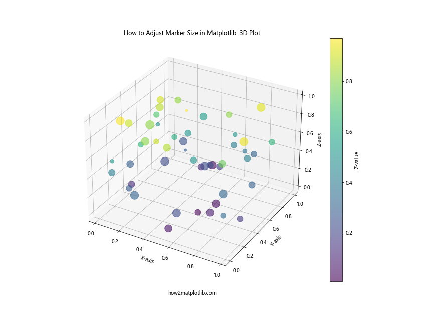
This example shows how to adjust marker size in Matplotlib for a 3D scatter plot. The sizes array is used to set different sizes for each data point, creating a visually interesting 3D representation.
Using Marker Size to Show Uncertainty
Another useful application of adjusting marker size in Matplotlib is to represent uncertainty or error in your data. Larger markers can indicate higher uncertainty, while smaller markers suggest more precise measurements.
Here’s an example of how to adjust marker size in Matplotlib to represent uncertainty:
import matplotlib.pyplot as plt
import numpy as np

np.random.seed(42)
x = np.linspace(0, 10, 20)
y = 2 * x + 1 + np.random.normal(0, 1, 20)
uncertainty = np.random.uniform(0.5, 2, 20)

plt.figure(figsize=(12, 8))
plt.errorbar(x, y, yerr=uncertainty, fmt='none', ecolor='lightgray', capsize=5)
scatter = plt.scatter(x, y, s=uncertainty*100, c=uncertainty, cmap='viridis', alpha=0.7)
plt.colorbar(scatter, label='Uncertainty')

plt.title('How to Adjust Marker Size in Matplotlib: Representing Uncertainty')
plt.xlabel('X-axis')
plt.ylabel('Y-axis')
plt.text(5, 0, 'how2matplotlib.com', ha='center', va='center')
plt.show()
Output:
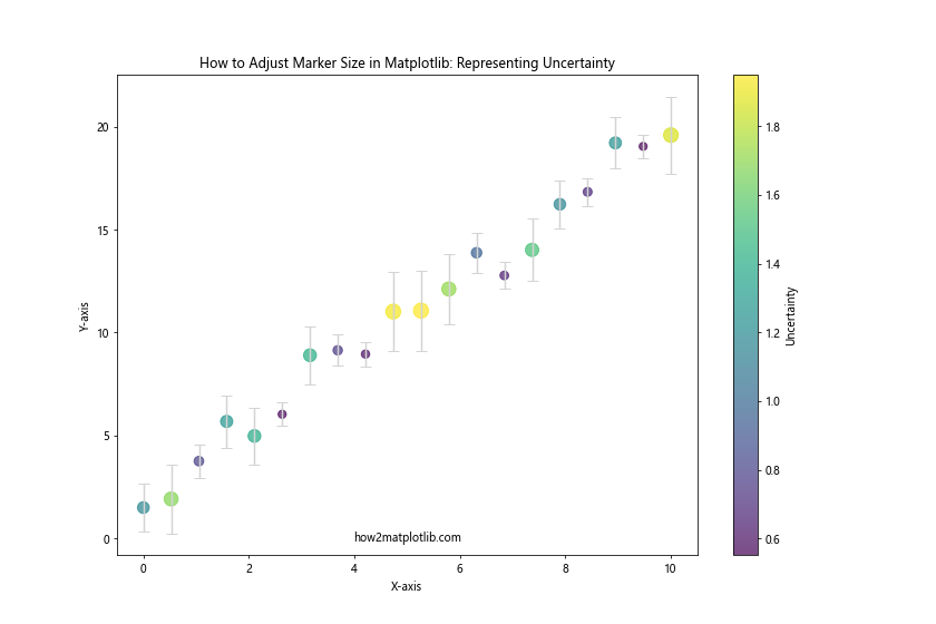
In this example, we’ve used marker size to represent the uncertainty in our measurements. Larger markers indicate higher uncertainty. This demonstrates how to adjust marker size in Matplotlib to convey additional information about data quality or precision.
Adjusting Marker Size Dynamically
Sometimes, you might want to adjust marker size in Matplotlib dynamically based on user input or changing data. Here’s an example of how to create an interactive plot where you can adjust marker size using a slider:
import matplotlib.pyplot as plt
from matplotlib.widgets import Slider
import numpy as np

np.random.seed(42)
x = np.random.rand(50)
y = np.random.rand(50)

fig, ax = plt.subplots(figsize=(10, 8))
plt.subplots_adjust(bottom=0.25)

scatter = ax.scatter(x, y, s=100)
ax.set_title('How to Adjust Marker Size in Matplotlib: Interactive')
ax.set_xlabel('X-axis')
ax.set_ylabel('Y-axis')

ax_slider = plt.axes([0.2, 0.1, 0.6, 0.03])
size_slider = Slider(ax_slider, 'Marker Size', 10, 500, valinit=100)

def update(val):
    scatter.set_sizes([size_slider.val])
    fig.canvas.draw_idle()

size_slider.on_changed(update)

plt.text(0.5, -0.2, 'how2matplotlib.com', ha='center', va='center', transform=ax.transAxes)
plt.show()
Output:
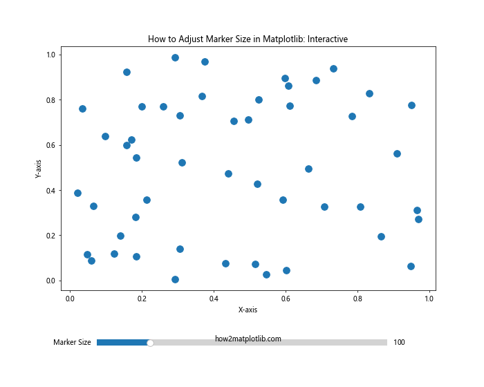
This example demonstrates how to adjust marker size in Matplotlib interactively. The slider allows you to change the marker size dynamically, providing a hands-on way to explore different size options.
Combining Marker Size with Other Visual Elements
When learning how to adjust marker size in Matplotlib, it’s important to consider how marker size interacts with other visual elements like color, transparency, and edge colors. Here’s an example that combines these elements:
import matplotlib.pyplot as plt
import numpy as np

np.random.seed(42)
x = np.random.rand(50)
y = np.random.rand(50)
sizes = np.random.randint(50, 500, 50)
colors = np.random.rand(50)

plt.figure(figsize=(12, 9))
scatter = plt.scatter(x, y, s=sizes, c=colors, cmap='viridis', alpha=0.6, edgecolors='black', linewidths=2)
plt.colorbar(scatter, label='Color Value')

plt.title('How to Adjust Marker Size in Matplotlib: Combined Elements')
plt.xlabel('X-axis')
plt.ylabel('Y-axis')
plt.text(0.5, -0.1, 'how2matplotlib.com', ha='center', va='center', transform=plt.gca().transAxes)
plt.show()
Output:
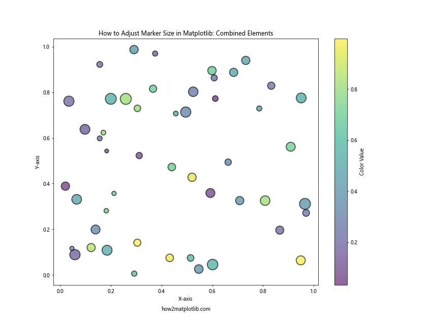
This example shows how to adjust marker size in Matplotlib while also incorporating color mapping, transparency, and edge colors. The combination of these elements creates a visually rich and informative plot.
Adjusting Marker Size in Subplots
When creating multiple subplots, you might want to adjust marker size differently for each subplot. Here’s an example of how to adjust marker size in Matplotlib across different subplots:
import matplotlib.pyplot as plt
import numpy as np

np.random.seed(42)
x = np.random.rand(50)
y = np.random.rand(50)

fig, (ax1, ax2, ax3) = plt.subplots(1, 3, figsize=(18, 6))

ax1.scatter(x, y, s=50)
ax1.set_title('Small Markers')

ax2.scatter(x, y, s=200)
ax2.set_title('Medium Markers')

ax3.scatter(x, y, s=500)
ax3.set_title('Large Markers')

for ax in (ax1, ax2, ax3):
    ax.set_xlabel('X-axis')
    ax.set_ylabel('Y-axis')

plt.suptitle('How to Adjust Marker Size in Matplotlib: Subplots', fontsize=16)
fig.text(0.5, 0.02, 'how2matplotlib.com', ha='center', va='center')
plt.tight_layout()
plt.show()
Output:
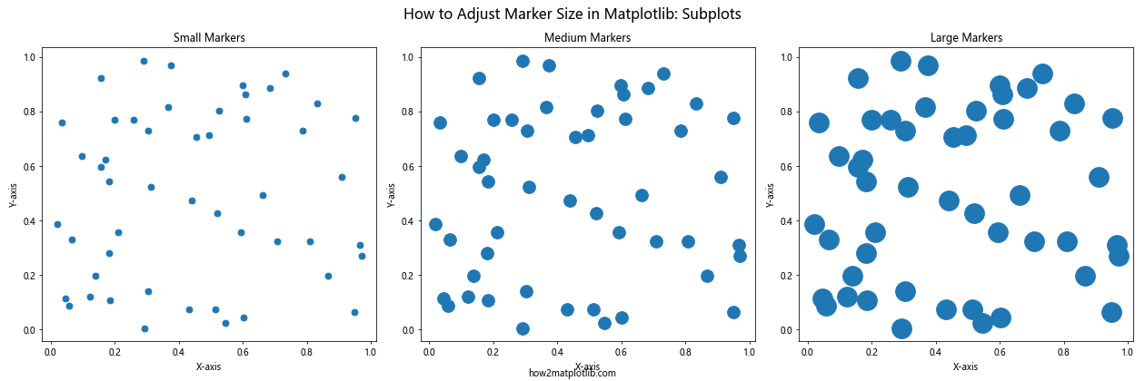
This example demonstrates how to adjust marker size in Matplotlib across different subplots. Each subplot uses a different marker size, allowing for easy comparison of the visual impact of various sizes.
Adjusting Marker Size for Time Series Data
When working with time series data, adjusting marker size can help highlight trends or important events. Here’s an example of how to adjust marker size in Matplotlib for a time series plot:
import matplotlib.pyplot as plt
import numpy as np
import pandas as pd

np.random.seed(42)
dates = pd.date_range(start='2023-01-01', end='2023-12-31', freq='D')
values = np.cumsum(np.random.randn(len(dates)))
importance = np.random.randint(1, 10, len(dates))

plt.figure(figsize=(14, 8))
scatter = plt.scatter(dates, values, s=importance*20, c=importance, cmap='YlOrRd', alpha=0.7)
plt.plot(dates, values, color='gray', alpha=0.5)
plt.colorbar(scatter, label='Importance')

plt.title('How to Adjust Marker Size in Matplotlib: Time Series Data')
plt.xlabel('Date')
plt.ylabel('Value')
plt.text(dates[len(dates)//2], min(values), 'how2matplotlib.com', ha='center', va='center')
plt.show()
Output:
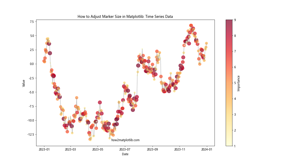
In this example, we’ve used marker size to represent the importance of each data point in a time series. This demonstrates how to adjust marker size in Matplotlib to highlight significant events or data points in temporal data.
Creating a Scatter Matrix with Adjusted Marker Sizes
A scatter matrix is a useful tool for visualizing relationships between multiple variables. Here’s an example of how to adjust marker size in Matplotlib when creating a scatter matrix:
import matplotlib.pyplot as plt
import numpy as np
import pandas as pd
from pandas.plotting import scatter_matrix

np.random.seed(42)
data = {
    'A': np.random.rand(100),
    'B': np.random.rand(100),
    'C': np.random.rand(100),
    'D': np.random.rand(100)
}
df = pd.DataFrame(data)

fig, axes = plt.subplots(4, 4, figsize=(16, 16))
scatter_matrix(df, ax=axes, s=150, alpha=0.6, diagonal='hist')

plt.suptitle('How to Adjust Marker Size in Matplotlib: Scatter Matrix', fontsize=16)
fig.text(0.5, 0.02, 'how2matplotlib.com', ha='center', va='center')
plt.tight_layout()
plt.show()
Output:
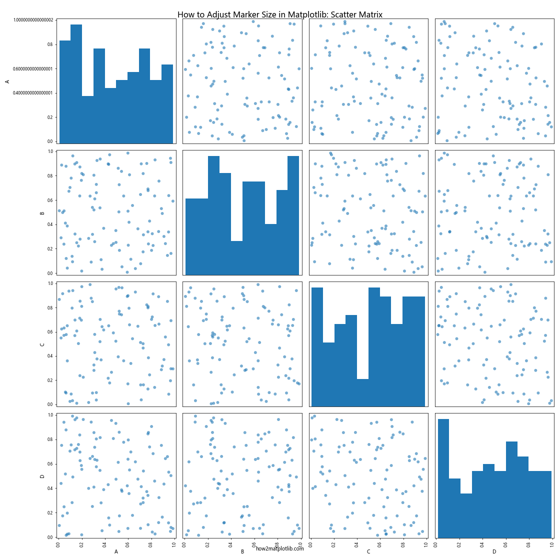
This example shows how to adjust marker size in Matplotlib when creating a scatter matrix. The s parameter in the scatter_matrix function is used to set the marker size for all scatter plots in the matrix.
Adjusting Marker Size Based on Data Density
When dealing with large datasets, adjusting marker size based on data density can help reveal patterns that might be obscured by overlapping points. Here’s an example of how to adjust marker size in Matplotlib based on data density:
import matplotlib.pyplot as plt
import numpy as np
from scipy.stats import gaussian_kde

np.random.seed(42)
x = np.random.normal(0, 1, 1000)
y = x * 0.5 + np.random.normal(0, 1, 1000)

xy = np.vstack([x, y])
z = gaussian_kde(xy)(xy)

plt.figure(figsize=(12, 9))
scatter = plt.scatter(x, y, c=z, s=50*z, cmap='viridis', alpha=0.5)
plt.colorbar(scatter, label='Density')

plt.title('How to Adjust Marker Size in Matplotlib: Density-based Sizing')
plt.xlabel('X-axis')
plt.ylabel('Y-axis')
plt.text(0, -3.5, 'how2matplotlib.com', ha='center', va='center')
plt.show()
Output:
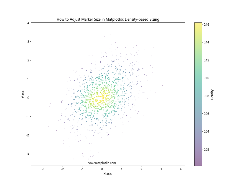
In this example, we’ve used kernel density estimation to calculate the density of points and adjust the marker size accordingly. This demonstrates how to adjust marker size in Matplotlib to highlight areas of high data density.
Conclusion
Learning how to adjust marker size in Matplotlib is a valuable skill that can significantly enhance your data visualizations. Throughout this comprehensive guide, we’ve explored various techniques and applications for adjusting marker size, from basic scatter plots to more advanced visualizations like bubble charts and density plots.
By mastering how to adjust marker size in Matplotlib, you can:
- Emphasize important data points
- Represent additional dimensions of your data
- Create visually appealing and informative plots
- Distinguish between different categories or groups in your data
- Show uncertainty or data quality
- Highlight trends in time series data
- Create interactive visualizations
Remember that when adjusting marker size, it’s important to consider the overall balance and readability of your plot. Experiment with different sizes and combinations of visual elements to find the most effective representation for your data.