How to Add Markers to a Graph Plot in Matplotlib
How to Add Markers to a Graph Plot in Matplotlib is an essential skill for data visualization enthusiasts and professionals alike. Markers are visual elements that highlight specific data points on a graph, making it easier for viewers to interpret and analyze the information presented. In this comprehensive guide, we’ll explore various techniques and best practices for adding markers to graph plots using Matplotlib, a powerful plotting library for Python.
Understanding the Importance of Markers in Matplotlib Plots
Before diving into the specifics of how to add markers to a graph plot in Matplotlib, it’s crucial to understand why markers are important in data visualization. Markers serve several purposes:
- Data point identification: Markers help viewers quickly identify individual data points on a graph.
- Trend visualization: By connecting markers with lines, trends and patterns in the data become more apparent.
- Data differentiation: Different marker styles can be used to distinguish between multiple datasets on the same plot.
- Emphasis: Markers can draw attention to specific data points of interest.
Now that we understand the significance of markers, let’s explore how to add markers to a graph plot in Matplotlib.
Basic Marker Addition: How to Add Markers to a Simple Line Plot
The simplest way to add markers to a graph plot in Matplotlib is by using the plot() function with the appropriate marker parameter. Here’s a basic example:
import matplotlib.pyplot as plt

x = [1, 2, 3, 4, 5]
y = [2, 4, 6, 8, 10]

plt.plot(x, y, marker='o', label='how2matplotlib.com')
plt.title('How to Add Markers to a Graph Plot in Matplotlib')
plt.xlabel('X-axis')
plt.ylabel('Y-axis')
plt.legend()
plt.show()
Output:
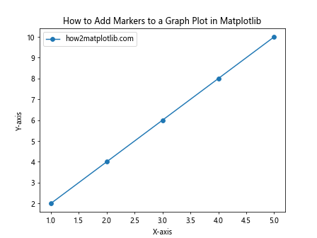
In this example, we use the marker='o' parameter to add circular markers to each data point. The 'o' specifies the marker style, which in this case is a circle. Matplotlib offers a wide variety of marker styles, which we’ll explore in more detail later.
Customizing Marker Appearance: Size, Color, and Edge Properties
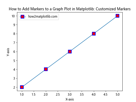
When learning how to add markers to a graph plot in Matplotlib, it’s important to know how to customize their appearance. You can modify the size, color, and edge properties of markers to make them more visually appealing or to convey additional information. Here’s an example:
import matplotlib.pyplot as plt

x = [1, 2, 3, 4, 5]
y = [2, 4, 6, 8, 10]

plt.plot(x, y, marker='s', markersize=10, markerfacecolor='red', markeredgecolor='blue', markeredgewidth=2, label='how2matplotlib.com')
plt.title('How to Add Markers to a Graph Plot in Matplotlib: Customized Markers')
plt.xlabel('X-axis')
plt.ylabel('Y-axis')
plt.legend()
plt.show()
Output:
In this example, we’ve added several parameters to customize the markers:
marker='s': Sets the marker style to a squaremarkersize=10: Increases the size of the markersmarkerfacecolor='red': Sets the fill color of the markers to redmarkeredgecolor='blue': Sets the edge color of the markers to bluemarkeredgewidth=2: Increases the width of the marker edges
By adjusting these parameters, you can create markers that stand out and effectively communicate your data.
Exploring Different Marker Styles in Matplotlib
Matplotlib offers a wide range of marker styles to choose from when adding markers to a graph plot. Here’s an example that demonstrates various marker styles:
import matplotlib.pyplot as plt

x = range(1, 11)
marker_styles = ['o', 's', '^', 'D', 'v', '<', '>', 'p', '*', 'h']

for i, marker in enumerate(marker_styles):
    plt.plot(x, [i*2]*10, marker=marker, label=f'{marker} - how2matplotlib.com')

plt.title('How to Add Markers to a Graph Plot in Matplotlib: Marker Styles')
plt.xlabel('X-axis')
plt.ylabel('Y-axis')
plt.legend(bbox_to_anchor=(1.05, 1), loc='upper left')
plt.tight_layout()
plt.show()
Output:
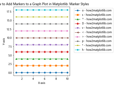
This example creates a plot with multiple lines, each using a different marker style. The marker styles demonstrated include:
- ‘o’: Circle
- ‘s’: Square
- ‘^’: Triangle (pointing up)
- ‘D’: Diamond
- ‘v’: Triangle (pointing down)
- ‘<': Triangle (pointing left)
- ‘>’: Triangle (pointing right)
- ‘p’: Pentagon
- ‘*’: Star
- ‘h’: Hexagon
By experimenting with these marker styles, you can find the one that best represents your data and enhances your visualization.
Adding Markers to Scatter Plots in Matplotlib
While line plots are common, scatter plots are another popular type of graph where markers play a crucial role. Here’s how to add markers to a scatter plot in Matplotlib:
import matplotlib.pyplot as plt
import numpy as np

x = np.random.rand(50)
y = np.random.rand(50)
colors = np.random.rand(50)
sizes = 1000 * np.random.rand(50)

plt.scatter(x, y, c=colors, s=sizes, alpha=0.5, marker='o', label='how2matplotlib.com')
plt.title('How to Add Markers to a Graph Plot in Matplotlib: Scatter Plot')
plt.xlabel('X-axis')
plt.ylabel('Y-axis')
plt.colorbar(label='Color Scale')
plt.legend()
plt.show()
Output:
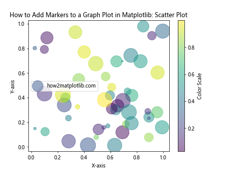
In this example, we use the scatter() function to create a scatter plot with circular markers. The markers’ colors and sizes are determined by the colors and sizes arrays, respectively. The alpha parameter sets the transparency of the markers.
Combining Line Plots and Scatter Plots with Markers
Sometimes, you may want to combine line plots and scatter plots to show both the overall trend and individual data points. Here’s how to add markers to such a combined plot:
import matplotlib.pyplot as plt
import numpy as np

x = np.linspace(0, 10, 50)
y1 = np.sin(x)
y2 = np.cos(x)

plt.plot(x, y1, label='Sin - how2matplotlib.com')
plt.plot(x, y2, label='Cos - how2matplotlib.com')
plt.scatter(x[::5], y1[::5], color='red', s=50, label='Sin points')
plt.scatter(x[::5], y2[::5], color='blue', s=50, label='Cos points')

plt.title('How to Add Markers to a Graph Plot in Matplotlib: Combined Plot')
plt.xlabel('X-axis')
plt.ylabel('Y-axis')
plt.legend()
plt.grid(True)
plt.show()
Output:
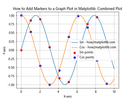
In this example, we first create two line plots using plot(), then add scatter points using scatter(). The [::5] slicing is used to plot only every 5th point, preventing overcrowding of markers.
Using Markers to Highlight Specific Data Points
When learning how to add markers to a graph plot in Matplotlib, it’s important to know how to highlight specific data points of interest. Here’s an example that demonstrates this technique:
import matplotlib.pyplot as plt
import numpy as np

x = np.linspace(0, 10, 100)
y = np.sin(x)

plt.plot(x, y, label='Sin curve - how2matplotlib.com')
plt.scatter(x[y>0.9], y[y>0.9], color='red', s=50, label='Peaks')
plt.scatter(x[y<-0.9], y[y<-0.9], color='blue', s=50, label='Troughs')

plt.title('How to Add Markers to a Graph Plot in Matplotlib: Highlighting Specific Points')
plt.xlabel('X-axis')
plt.ylabel('Y-axis')
plt.legend()
plt.grid(True)
plt.show()
Output:
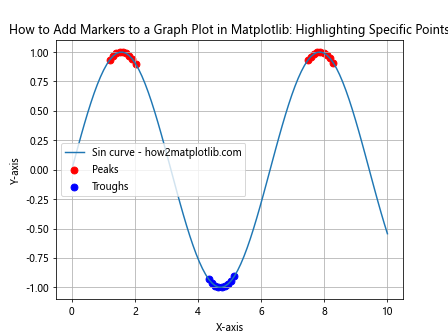
In this example, we plot a sine curve and then use boolean indexing to add markers only to the peaks (y > 0.9) and troughs (y < -0.9) of the curve.
Adding Markers with Different Sizes Based on Data Values
Another useful technique when adding markers to a graph plot in Matplotlib is to vary the size of the markers based on data values. This can add an extra dimension to your visualization. Here's how to do it:
import matplotlib.pyplot as plt
import numpy as np

x = np.linspace(0, 10, 20)
y = np.sin(x)
sizes = np.abs(y) * 500  # Scale marker sizes based on y values

plt.scatter(x, y, s=sizes, c=y, cmap='viridis', alpha=0.7, label='how2matplotlib.com')
plt.colorbar(label='Y values')

plt.title('How to Add Markers to a Graph Plot in Matplotlib: Variable Marker Sizes')
plt.xlabel('X-axis')
plt.ylabel('Y-axis')
plt.legend()
plt.grid(True)
plt.show()
Output:
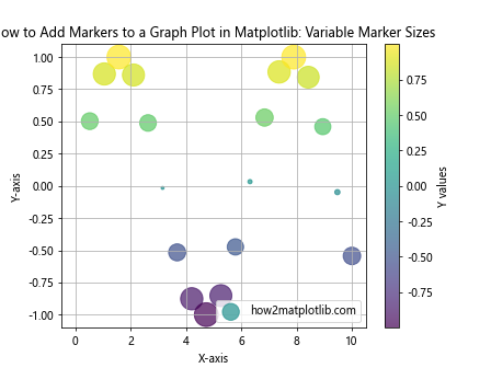
In this example, we create a scatter plot where the size of each marker is proportional to the absolute value of its y-coordinate. The color of each marker is also determined by its y-value, creating a visually rich representation of the data.
Using Markers to Represent Categorical Data
Markers can be particularly useful when representing categorical data in a graph plot. Here's an example of how to add markers to represent different categories:
import matplotlib.pyplot as plt
import numpy as np

categories = ['A', 'B', 'C', 'D']
values = [25, 40, 30, 35]
colors = ['red', 'blue', 'green', 'orange']
markers = ['o', 's', '^', 'D']

for cat, val, col, mark in zip(categories, values, colors, markers):
    plt.scatter(cat, val, c=col, marker=mark, s=200, label=f'{cat} - how2matplotlib.com')

plt.title('How to Add Markers to a Graph Plot in Matplotlib: Categorical Data')
plt.xlabel('Categories')
plt.ylabel('Values')
plt.legend()
plt.grid(True)
plt.show()
Output:
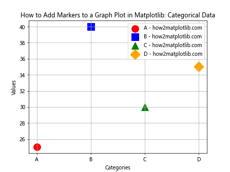
In this example, we use different colors and marker styles to represent different categories. This makes it easy to distinguish between categories at a glance.
Adding Custom Markers to Matplotlib Plots
While Matplotlib provides a wide range of built-in marker styles, sometimes you might want to use custom markers. Here's how to add custom markers to a graph plot in Matplotlib:
import matplotlib.pyplot as plt
import numpy as np

x = np.linspace(0, 10, 10)
y = np.sin(x)

custom_marker = [(-1, -1), (1, -1), (1, 1), (-1, 1), (-1, -1)]

plt.plot(x, y, marker=custom_marker, markersize=10, linewidth=2, label='how2matplotlib.com')

plt.title('How to Add Markers to a Graph Plot in Matplotlib: Custom Markers')
plt.xlabel('X-axis')
plt.ylabel('Y-axis')
plt.legend()
plt.grid(True)
plt.show()
Output:
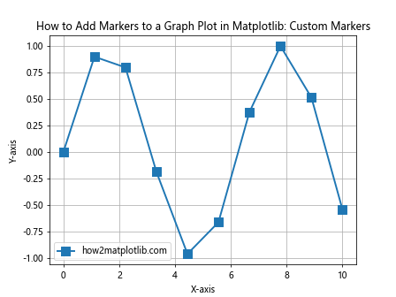
In this example, we define a custom marker as a list of (x, y) coordinates. This creates a square marker rotated 45 degrees. You can define any shape you want using this method.
Adding Markers to Multiple Datasets on the Same Plot
When working with multiple datasets, it's important to know how to add different markers to each dataset for easy differentiation. Here's an example:
import matplotlib.pyplot as plt
import numpy as np

x = np.linspace(0, 10, 50)
y1 = np.sin(x)
y2 = np.cos(x)
y3 = np.tan(x)

plt.plot(x, y1, marker='o', linestyle='-', label='Sin - how2matplotlib.com')
plt.plot(x, y2, marker='s', linestyle='--', label='Cos - how2matplotlib.com')
plt.plot(x, y3, marker='^', linestyle=':', label='Tan - how2matplotlib.com')

plt.title('How to Add Markers to a Graph Plot in Matplotlib: Multiple Datasets')
plt.xlabel('X-axis')
plt.ylabel('Y-axis')
plt.legend()
plt.grid(True)
plt.ylim(-2, 2)  # Limit y-axis for better visualization
plt.show()
Output:
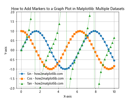
In this example, we plot three different trigonometric functions, each with a different marker style and line style. This makes it easy to distinguish between the datasets even when they intersect.
Adding Markers to Subplots in Matplotlib
When creating complex visualizations, you might need to know how to add markers to multiple subplots. Here's an example:
import matplotlib.pyplot as plt
import numpy as np

x = np.linspace(0, 10, 50)
y1 = np.sin(x)
y2 = np.cos(x)

fig, (ax1, ax2) = plt.subplots(1, 2, figsize=(12, 5))

ax1.plot(x, y1, marker='o', label='Sin - how2matplotlib.com')
ax1.set_title('Sine Function')
ax1.set_xlabel('X-axis')
ax1.set_ylabel('Y-axis')
ax1.legend()

ax2.plot(x, y2, marker='s', label='Cos - how2matplotlib.com')
ax2.set_title('Cosine Function')
ax2.set_xlabel('X-axis')
ax2.set_ylabel('Y-axis')
ax2.legend()

plt.suptitle('How to Add Markers to a Graph Plot in Matplotlib: Subplots')
plt.tight_layout()
plt.show()
Output:
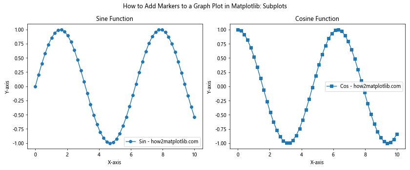
In this example, we create two subplots side by side, each with its own markers and labels. This allows for easy comparison between different datasets.
Adding Markers to 3D Plots in Matplotlib
Matplotlib also supports 3D plotting, and knowing how to add markers to 3D plots can be very useful. Here's an example:
import matplotlib.pyplot as plt
import numpy as np

fig = plt.figure(figsize=(10, 8))
ax = fig.add_subplot(111, projection='3d')

x = np.random.rand(100)
y = np.random.rand(100)
z = np.random.rand(100)
colors = np.random.rand(100)

scatter = ax.scatter(x, y, z, c=colors, s=50, marker='o', label='how2matplotlib.com')

ax.set_xlabel('X-axis')
ax.set_ylabel('Y-axis')
ax.set_zlabel('Z-axis')
ax.set_title('How to Add Markers to a Graph Plot in Matplotlib: 3D Plot')

plt.colorbar(scatter, label='Color Scale')
plt.legend()
plt.show()
Output:
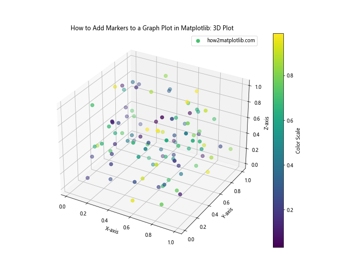
In this example, we create a 3D scatter plot with markers. The color of each marker is determined by the colors array, and a colorbar is added to show the color scale.
Adding Markers to Polar Plots in Matplotlib
Polar plots are useful for visualizing cyclical data, and adding markers to these plots can enhance their readability. Here's how to add markers to a polar plot in Matplotlib:
import matplotlib.pyplot as plt
import numpy as np

theta = np.linspace(0, 2*np.pi, 8, endpoint=False)
r = np.random.rand(8)

plt.polar(theta, r, marker='o', linestyle='-', linewidth=2, markersize=10, label='how2matplotlib.com')

plt.title('How to Add Markers to a Graph Plot in Matplotlib: Polar Plot')
plt.legend()
plt.show()
Output:
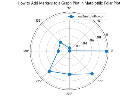
In this example, we create a polar plot with circular markers at each data point. The polar() function is used instead of plot() to create the polar plot.
Adding Markers to Logarithmic Plots in Matplotlib
When dealing with data that spans multiple orders of magnitude, logarithmic plots can be very useful. Here's how to add markers to a logarithmic plot in Matplotlib:
import matplotlib.pyplot as plt
import numpy as np

x = np.logspace(0, 5, 20)
y = x**2

plt.loglog(x, y, marker='o', linestyle='-', label='how2matplotlib.com')

plt.title('How to Add Markers to a Graph Plot in Matplotlib: Logarithmic Plot')
plt.xlabel('X-axis (log scale)')
plt.ylabel('Y-axis (log scale)')
plt.legend()
plt.grid(True)
plt.show()
Output:
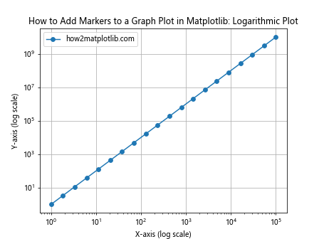
In this example, we use loglog() to create a plot with both x and y axes in logarithmic scale. Markers are added to each data point to make them easier to identify.
Adding Markers to Stacked Plots in Matplotlib
Stacked plots are useful for showing how different components contribute to a total. Here's how to add markers to a stacked plot in Matplotlib:
import matplotlib.pyplot as plt
import numpy as np

x = np.arange(1, 6)
y1 = np.random.randint(1, 10, 5)
y2 = np.random.randint(1, 10, 5)
y3 = np.random.randint(1, 10, 5)

plt.stackplot(x, y1, y2, y3, labels=['A - how2matplotlib.com', 'B - how2matplotlib.com', 'C - how2matplotlib.com'])
plt.plot(x, y1, 'ro-', x, y1+y2, 'go-', x, y1+y2+y3, 'bo-')

plt.title('How to Add Markers to a Graph Plot in Matplotlib: Stacked Plot')
plt.xlabel('X-axis')
plt.ylabel('Y-axis')
plt.legend(loc='upper left')
plt.show()
Output:
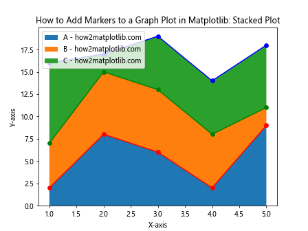
In this example, we first create a stacked plot using stackplot(), then add markers to show the individual data points for each stack level using plot().
Adding Markers to Box Plots in Matplotlib
Box plots are great for showing the distribution of data. While they typically don't use traditional markers, we can add individual points to represent outliers. Here's how:
import matplotlib.pyplot as plt
import numpy as np

data = [np.random.normal(0, std, 100) for std in range(1, 4)]

plt.boxplot(data, labels=['A', 'B', 'C'], showfliers=False)
for i, d in enumerate(data):
    y = d
    x = np.random.normal(i+1, 0.04, len(y))
    plt.plot(x, y, 'r.', alpha=0.2, label='how2matplotlib.com' if i == 0 else '')

plt.title('How to Add Markers to a Graph Plot in Matplotlib: Box Plot with Data Points')
plt.xlabel('Categories')
plt.ylabel('Values')
plt.legend()
plt.show()
Output:
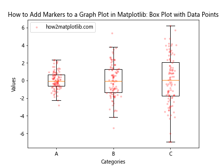
In this example, we create a box plot and then overlay individual data points as small red markers. This combines the summary statistics of the box plot with the detail of individual data points.
Conclusion: Mastering How to Add Markers to a Graph Plot in Matplotlib
Throughout this comprehensive guide, we've explored various techniques for adding markers to graph plots in Matplotlib. We've covered everything from basic marker addition to advanced techniques like customizing marker appearance, using markers in different types of plots, and representing additional dimensions of data through marker properties.
Key takeaways on how to add markers to a graph plot in Matplotlib include:
- Use the
markerparameter inplot()orscatter()functions to add basic markers. - Customize marker appearance with parameters like
markersize,markerfacecolor, andmarkeredgecolor. - Experiment with different marker styles to find the one that best represents your data.
- Use markers to highlight specific data points or represent categorical data.
- Combine markers with other plot elements like error bars or color scales to convey more information.
- Adapt marker usage for different types of plots, including 3D plots, polar plots, and logarithmic plots.
Remember, the goal of adding markers to your graph plots is to enhance data visualization and make your plots more informative and easier to interpret. By mastering these techniques, you'll be able to create more effective and visually appealing data visualizations using Matplotlib.