How to Add a Legend to a Scatter Plot in Matplotlib
How to add a legend to a scatter plot in Matplotlib is an essential skill for data visualization enthusiasts and professionals alike. This comprehensive guide will walk you through the process of creating scatter plots with legends using Matplotlib, one of the most popular plotting libraries in Python. We’ll cover various aspects of adding legends to scatter plots, from basic techniques to advanced customization options. By the end of this article, you’ll have a thorough understanding of how to add legends to your scatter plots effectively.
Understanding the Basics of Scatter Plots and Legends in Matplotlib
Before diving into the specifics of how to add a legend to a scatter plot in Matplotlib, let’s first understand what scatter plots and legends are and why they’re important in data visualization.
A scatter plot is a type of plot that displays individual data points on a two-dimensional graph. Each point represents the values of two variables, typically plotted on the x and y axes. Scatter plots are excellent for visualizing relationships between two continuous variables and identifying patterns or trends in the data.
A legend, on the other hand, is a key that explains the meaning of different elements in a plot. In the context of scatter plots, legends are particularly useful when you have multiple datasets or categories represented by different colors, shapes, or sizes of points.
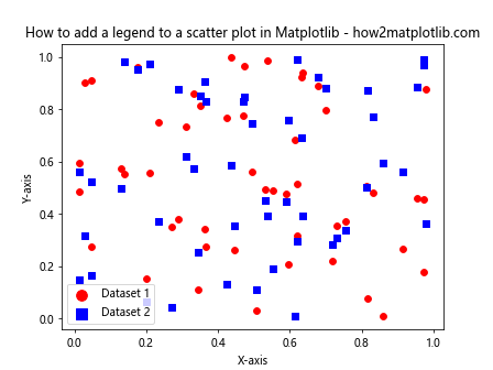
Now, let’s start with a basic example of how to add a legend to a scatter plot in Matplotlib:
import matplotlib.pyplot as plt
import numpy as np

# Generate sample data
x = np.random.rand(50)
y1 = np.random.rand(50)
y2 = np.random.rand(50)

# Create a scatter plot
plt.scatter(x, y1, label='Dataset 1')
plt.scatter(x, y2, label='Dataset 2')

# Add a legend
plt.legend()

# Add labels and title
plt.xlabel('X-axis')
plt.ylabel('Y-axis')
plt.title('How to add a legend to a scatter plot in Matplotlib - how2matplotlib.com')

# Show the plot
plt.show()
Output:
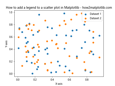
In this example, we create two datasets and plot them using plt.scatter(). We add labels to each scatter plot using the label parameter. Then, we call plt.legend() to add the legend to the plot automatically.
Customizing Legend Placement
When learning how to add a legend to a scatter plot in Matplotlib, it’s important to understand how to control the legend’s placement. Matplotlib offers several options for positioning the legend within the plot area.
Here’s an example demonstrating different legend locations:
import matplotlib.pyplot as plt
import numpy as np

# Generate sample data
x = np.random.rand(50)
y1 = np.random.rand(50)
y2 = np.random.rand(50)

# Create a scatter plot
plt.scatter(x, y1, label='Dataset 1')
plt.scatter(x, y2, label='Dataset 2')

# Add a legend with custom location
plt.legend(loc='upper right')

# Add labels and title
plt.xlabel('X-axis')
plt.ylabel('Y-axis')
plt.title('How to add a legend to a scatter plot in Matplotlib - how2matplotlib.com')

# Show the plot
plt.show()
Output:
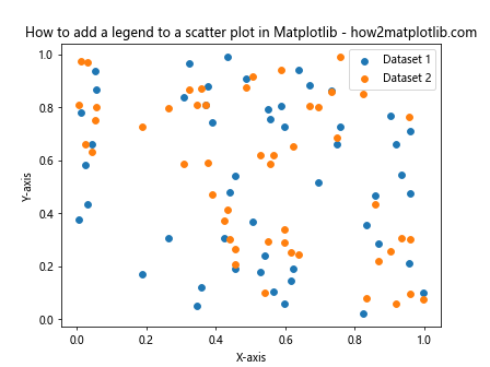
In this example, we use the loc parameter in plt.legend() to specify the legend’s location. Some common location options include:
- ‘best’
- ‘upper right’
- ‘upper left’
- ‘lower right’
- ‘lower left’
- ‘center’
- ‘center left’
- ‘center right’
- ‘lower center’
- ‘upper center’
You can experiment with different locations to find the best placement for your specific scatter plot.
Adding a Legend Outside the Plot Area
Sometimes, you may want to place the legend outside the main plot area to maximize the space for your scatter plot. Here’s how to add a legend to a scatter plot in Matplotlib and position it outside the plot:
import matplotlib.pyplot as plt
import numpy as np

# Generate sample data
x = np.random.rand(50)
y1 = np.random.rand(50)
y2 = np.random.rand(50)

# Create a scatter plot
fig, ax = plt.subplots()
ax.scatter(x, y1, label='Dataset 1')
ax.scatter(x, y2, label='Dataset 2')

# Add a legend outside the plot
ax.legend(bbox_to_anchor=(1.05, 1), loc='upper left')

# Adjust the layout
plt.tight_layout()

# Add labels and title
ax.set_xlabel('X-axis')
ax.set_ylabel('Y-axis')
ax.set_title('How to add a legend to a scatter plot in Matplotlib - how2matplotlib.com')

# Show the plot
plt.show()
Output:
In this example, we use the bbox_to_anchor parameter to position the legend outside the plot area. The (1.05, 1) tuple specifies the x and y coordinates of the legend’s anchor point relative to the plot’s bounding box. We also use plt.tight_layout() to adjust the plot’s layout and prevent the legend from being cut off.
Customizing Legend Appearance
When learning how to add a legend to a scatter plot in Matplotlib, it’s essential to know how to customize its appearance. You can modify various aspects of the legend, such as its font size, background color, and border.
Here’s an example demonstrating some legend customization options:
import matplotlib.pyplot as plt
import numpy as np

# Generate sample data
x = np.random.rand(50)
y1 = np.random.rand(50)
y2 = np.random.rand(50)

# Create a scatter plot
plt.scatter(x, y1, label='Dataset 1')
plt.scatter(x, y2, label='Dataset 2')

# Add a customized legend
plt.legend(fontsize=12, facecolor='lightgray', edgecolor='black', title='Legend Title')

# Add labels and title
plt.xlabel('X-axis')
plt.ylabel('Y-axis')
plt.title('How to add a legend to a scatter plot in Matplotlib - how2matplotlib.com')

# Show the plot
plt.show()
Output:
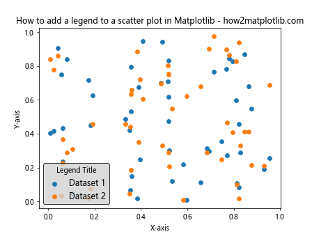
In this example, we customize the legend’s appearance by specifying the fontsize, facecolor, edgecolor, and title parameters. You can adjust these values to match your desired style and make the legend more visually appealing.
Adding a Legend with Custom Markers and Colors
When creating scatter plots with multiple datasets, it’s often useful to use different markers and colors for each dataset. Here’s how to add a legend to a scatter plot in Matplotlib with custom markers and colors:
import matplotlib.pyplot as plt
import numpy as np

# Generate sample data
x = np.random.rand(50)
y1 = np.random.rand(50)
y2 = np.random.rand(50)
y3 = np.random.rand(50)

# Create a scatter plot with custom markers and colors
plt.scatter(x, y1, c='red', marker='o', label='Dataset 1')
plt.scatter(x, y2, c='blue', marker='s', label='Dataset 2')
plt.scatter(x, y3, c='green', marker='^', label='Dataset 3')

# Add a legend
plt.legend()

# Add labels and title
plt.xlabel('X-axis')
plt.ylabel('Y-axis')
plt.title('How to add a legend to a scatter plot in Matplotlib - how2matplotlib.com')

# Show the plot
plt.show()
Output:
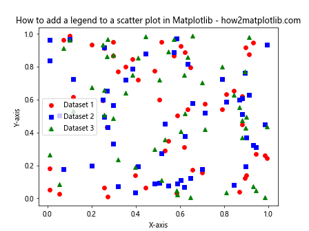
In this example, we use different colors (c parameter) and markers (marker parameter) for each dataset. The legend automatically includes these custom styles, making it easier to distinguish between different datasets in the scatter plot.
Creating a Legend for a Scatter Plot with a Colorbar
Sometimes, you may want to create a scatter plot where the color of the points represents a third variable. In such cases, you’ll need to add both a legend and a colorbar. Here’s how to add a legend to a scatter plot in Matplotlib along with a colorbar:
import matplotlib.pyplot as plt
import numpy as np

# Generate sample data
x = np.random.rand(100)
y = np.random.rand(100)
colors = np.random.rand(100)

# Create a scatter plot with colormap
scatter = plt.scatter(x, y, c=colors, cmap='viridis', label='Data Points')

# Add a colorbar
plt.colorbar(label='Color Value')

# Add a legend
plt.legend()

# Add labels and title
plt.xlabel('X-axis')
plt.ylabel('Y-axis')
plt.title('How to add a legend to a scatter plot in Matplotlib - how2matplotlib.com')

# Show the plot
plt.show()
Output:
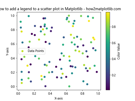
In this example, we create a scatter plot where the color of each point is determined by the colors array. We use the cmap parameter to specify a colormap. The plt.colorbar() function adds a colorbar to the plot, while plt.legend() adds the legend for the scatter plot.
Adding a Legend to Multiple Scatter Plots in Subplots
When working with multiple scatter plots in subplots, you may want to add legends to each subplot or create a single legend for all subplots. Here’s how to add a legend to a scatter plot in Matplotlib when using subplots:
import matplotlib.pyplot as plt
import numpy as np

# Generate sample data
x = np.random.rand(50)
y1 = np.random.rand(50)
y2 = np.random.rand(50)

# Create subplots
fig, (ax1, ax2) = plt.subplots(1, 2, figsize=(12, 5))

# Scatter plot in the first subplot
ax1.scatter(x, y1, label='Dataset 1')
ax1.scatter(x, y2, label='Dataset 2')
ax1.set_title('Subplot 1')
ax1.set_xlabel('X-axis')
ax1.set_ylabel('Y-axis')
ax1.legend()

# Scatter plot in the second subplot
ax2.scatter(x, y1, label='Dataset 1')
ax2.scatter(x, y2, label='Dataset 2')
ax2.set_title('Subplot 2')
ax2.set_xlabel('X-axis')
ax2.set_ylabel('Y-axis')
ax2.legend()

# Add a main title
fig.suptitle('How to add a legend to a scatter plot in Matplotlib - how2matplotlib.com')

# Adjust the layout
plt.tight_layout()

# Show the plot
plt.show()
Output:
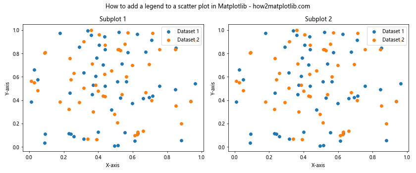
In this example, we create two subplots and add scatter plots to each of them. We then add legends to each subplot individually using the ax.legend() method.
Creating a Single Legend for Multiple Scatter Plots
If you want to create a single legend for multiple scatter plots, you can use the fig.legend() method instead of adding legends to individual subplots. Here’s how to add a legend to a scatter plot in Matplotlib with a single legend for multiple plots:
import matplotlib.pyplot as plt
import numpy as np

# Generate sample data
x = np.random.rand(50)
y1 = np.random.rand(50)
y2 = np.random.rand(50)

# Create subplots
fig, (ax1, ax2) = plt.subplots(1, 2, figsize=(12, 5))

# Scatter plot in the first subplot
ax1.scatter(x, y1, label='Dataset 1')
ax1.scatter(x, y2, label='Dataset 2')
ax1.set_title('Subplot 1')
ax1.set_xlabel('X-axis')
ax1.set_ylabel('Y-axis')

# Scatter plot in the second subplot
ax2.scatter(x, y1, label='Dataset 1')
ax2.scatter(x, y2, label='Dataset 2')
ax2.set_title('Subplot 2')
ax2.set_xlabel('X-axis')
ax2.set_ylabel('Y-axis')

# Add a single legend for both subplots
fig.legend(loc='upper center', bbox_to_anchor=(0.5, -0.05), ncol=2)

# Add a main title
fig.suptitle('How to add a legend to a scatter plot in Matplotlib - how2matplotlib.com')

# Adjust the layout
plt.tight_layout()

# Show the plot
plt.show()
Output:
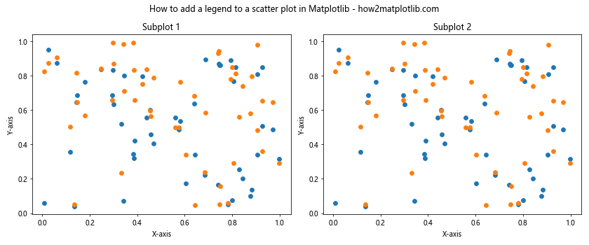
In this example, we use fig.legend() to create a single legend for both subplots. We position the legend below the subplots using the bbox_to_anchor parameter and set ncol=2 to display the legend items in two columns.
Adding a Legend to a 3D Scatter Plot
Learning how to add a legend to a scatter plot in Matplotlib also includes working with 3D scatter plots. Here’s an example of how to create a 3D scatter plot with a legend:
import matplotlib.pyplot as plt
import numpy as np
from mpl_toolkits.mplot3d import Axes3D

# Generate sample data
x = np.random.rand(100)
y = np.random.rand(100)
z1 = np.random.rand(100)
z2 = np.random.rand(100)

# Create a 3D scatter plot
fig = plt.figure(figsize=(10, 8))
ax = fig.add_subplot(111, projection='3d')

# Plot two datasets
ax.scatter(x, y, z1, c='red', label='Dataset 1')
ax.scatter(x, y, z2, c='blue', label='Dataset 2')

# Add a legend
ax.legend()

# Add labels and title
ax.set_xlabel('X-axis')
ax.set_ylabel('Y-axis')
ax.set_zlabel('Z-axis')
ax.set_title('How to add a legend to a scatter plot in Matplotlib - how2matplotlib.com')

# Show the plot
plt.show()
Output:
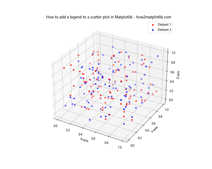
In this example, we create a 3D scatter plot using the Axes3D class from mpl_toolkits.mplot3d. We plot two datasets with different colors and add a legend using the ax.legend() method.
Customizing Legend Markers
When learning how to add a legend to a scatter plot in Matplotlib, you might want to customize the legend markers to make them more visually appealing or to match your specific requirements. Here’s an example of how to customize legend markers:
import matplotlib.pyplot as plt
import numpy as np

# Generate sample data
x = np.random.rand(50)
y1 = np.random.rand(50)
y2 = np.random.rand(50)

# Create a scatter plot
plt.scatter(x, y1, c='red', marker='o', label='Dataset 1')
plt.scatter(x, y2, c='blue', marker='s', label='Dataset 2')

# Customize legend markers
legend = plt.legend()
legend.legendHandles[0]._sizes = [100]
legend.legendHandles[1]._sizes = [100]

# Add labels and title
plt.xlabel('X-axis')
plt.ylabel('Y-axis')
plt.title('How to add a legend to a scatter plot in Matplotlib - how2matplotlib.com')

# Show the plot
plt.show()
Output:
In this example, we customize the size of the legend markers by accessing the legendHandles attribute of the legend object and modifying the _sizes property. This allows you to make the legend markers larger or smaller to improve visibility.
Adding a Legend with Custom Labels
Sometimes, you may want to add a legend to a scatter plot in Matplotlib with custom labels that are different from the ones used in the label parameter of the scatter() function. Here’s how to do that:
import matplotlib.pyplot as plt
import numpy as np

# Generate sample data
x = np.random.rand(50)
y1 = np.random.rand(50)
y2 = np.random.rand(50)

# Create a scatter plot
scatter1 = plt.scatter(x, y1, c='red', marker='o')
scatter2 = plt.scatter(x, y2, c='blue', marker='s')

# Add a legend with custom labels
plt.legend((scatter1, scatter2), ('Custom Label 1', 'Custom Label 2'))

# Add labels and title
plt.xlabel('X-axis')
plt.ylabel('Y-axis')
plt.title('How to add a legend to a scatter plot in Matplotlib - how2matplotlib.com')

# Show the plot
plt.show()
Output:
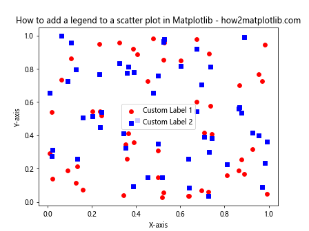
In this example, we create the scatter plots without using the label parameter. Instead, we pass the scatter plot objects and custom labels to the plt.legend() function directly. This allows you to use different labels in the legend than what you might use for other purposes in your code.
Creating a Legend for Scatter Plots with Different Sizes
When learning how to add a legend to a scatter plot in Matplotlib, you might encounter situations where you want to represent different sizes of data points. Here’s an example of how to create a legend for scatter plots with varying sizes:
import matplotlib.pyplot as plt
import numpy as np

# Generate sample data
x = np.random.rand(50)
y = np.random.rand(50)
sizes = np.random.randint(20, 500, 50)

# Create a scatter plot with varying sizes
plt.scatter(x, y, s=sizes, alpha=0.5, label='Data Points')

# Create legend elements for different sizes
size_legend_elements = [
    plt.scatter([], [], s=100, label='Small'),
    plt.scatter([], [], s=300, label='Medium'),
    plt.scatter([], [], s=500, label='Large')
]

# Add a legend with size information
plt.legend(handles=size_legend_elements, title='Point Sizes')

# Add labels and title
plt.xlabel('X-axis')
plt.ylabel('Y-axis')
plt.title('How to add a legend to a scatter plot in Matplotlib - how2matplotlib.com')

# Show the plot
plt.show()
Output:
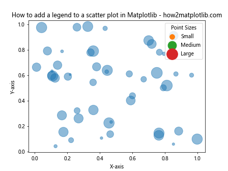
In this example, we create a scatter plot with varying point sizes. To create a legend that explains the different sizes, we use empty scatter plots with specific sizes as legend elements. We then pass these elements to the plt.legend() function using the handles parameter.
Adding a Legend to a Scatter Plot with Error Bars
When working with scatter plots that include error bars, you might want to include this information in the legend. Here’s how to add a legend to a scatter plot in Matplotlib that includes error bars:
import matplotlib.pyplot as plt
import numpy as np

# Generate sample data
x = np.linspace(0, 10, 10)
y1 = np.random.rand(10)
y2 = np.random.rand(10)
yerr1 = np.random.rand(10) * 0.1
yerr2 = np.random.rand(10) * 0.1

# Create a scatter plot with error bars
plt.errorbar(x, y1, yerr=yerr1, fmt='o', label='Dataset 1')
plt.errorbar(x, y2, yerr=yerr2, fmt='s', label='Dataset 2')

# Add a legend
plt.legend()

# Add labels and title
plt.xlabel('X-axis')
plt.ylabel('Y-axis')
plt.title('How to add a legend to a scatter plot in Matplotlib - how2matplotlib.com')

# Show the plot
plt.show()
Output:
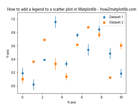
In this example, we use plt.errorbar() to create scatter plots with error bars. The fmt parameter specifies the marker style for the scatter points. By including the label parameter, we ensure that the legend includes both the scatter points and their associated error bars.
Creating a Legend for a Scatter Plot with a Continuous Colormap
When creating a scatter plot with a continuous colormap, you might want to add a legend that explains the color scale. Here’s how to add a legend to a scatter plot in Matplotlib with a continuous colormap:
import matplotlib.pyplot as plt
import numpy as np
from matplotlib.colors import Normalize
from matplotlib.cm import ScalarMappable

# Generate sample data
x = np.random.rand(100)
y = np.random.rand(100)
colors = np.random.rand(100)

# Create a scatter plot with a continuous colormap
scatter = plt.scatter(x, y, c=colors, cmap='viridis')

# Create a colorbar
cbar = plt.colorbar(scatter)
cbar.set_label('Color Value')

# Add a legend for the scatter plot
plt.legend(*scatter.legend_elements(), title="Data Points")

# Add labels and title
plt.xlabel('X-axis')
plt.ylabel('Y-axis')
plt.title('How to add a legend to a scatter plot in Matplotlib - how2matplotlib.com')

# Show the plot
plt.show()
Output:
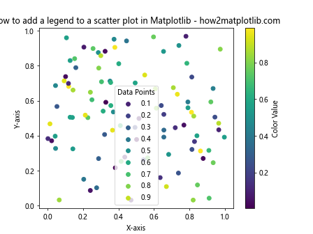
In this example, we create a scatter plot with a continuous colormap using the c parameter. We add a colorbar to explain the color scale. To create a legend for the scatter plot itself, we use the legend_elements() method of the scatter object, which returns handles and labels that can be passed to plt.legend().
Adding a Legend to a Scatter Plot with Multiple Datasets and Styles
When working with multiple datasets in a scatter plot, you might want to use different styles for each dataset and include this information in the legend. Here’s how to add a legend to a scatter plot in Matplotlib with multiple datasets and styles:
import matplotlib.pyplot as plt
import numpy as np

# Generate sample data
x = np.random.rand(50)
y1 = np.random.rand(50)
y2 = np.random.rand(50)
y3 = np.random.rand(50)

# Create a scatter plot with multiple datasets and styles
plt.scatter(x, y1, c='red', marker='o', label='Dataset 1')
plt.scatter(x, y2, c='blue', marker='s', label='Dataset 2')
plt.scatter(x, y3, c='green', marker='^', label='Dataset 3')

# Add a legend with a custom title and position
plt.legend(title='Datasets', loc='center left', bbox_to_anchor=(1, 0.5))

# Add labels and title
plt.xlabel('X-axis')
plt.ylabel('Y-axis')
plt.title('How to add a legend to a scatter plot in Matplotlib - how2matplotlib.com')

# Adjust the layout to make room for the legend
plt.tight_layout()

# Show the plot
plt.show()
Output:
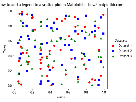
In this example, we create three datasets with different colors and marker styles. We add labels to each scatter plot call, which are then used in the legend. We customize the legend by adding a title and positioning it outside the plot area using bbox_to_anchor.
Conclusion
In this comprehensive guide, we’ve explored various aspects of how to add a legend to a scatter plot in Matplotlib. We’ve covered basic techniques for adding legends, customizing their appearance and placement, working with multiple datasets, and handling special cases like 3D scatter plots and plots with colormaps.
Remember that adding a legend to your scatter plots is crucial for making your visualizations more informative and easier to understand. By mastering these techniques, you’ll be able to create clear, professional-looking scatter plots that effectively communicate your data.