Histograms in Matplotlib
Histograms are a type of bar plot that shows the frequency of data values within certain ranges. In this article, we will explore how to create histograms using Matplotlib, a popular data visualization library in Python.
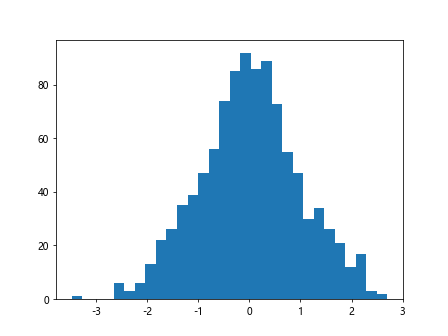
Basic Histogram
import matplotlib.pyplot as plt
import numpy as np

# Generate random data
data = np.random.randn(1000)

# Plot histogram
plt.hist(data, bins=30)
plt.show()
Output:
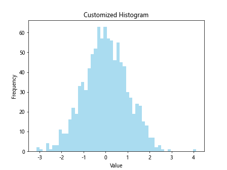
Customizing Histogram
import matplotlib.pyplot as plt
import numpy as np

# Generate random data
data = np.random.randn(1000)

# Plot histogram with customizations
plt.hist(data, bins=50, color='skyblue', alpha=0.7)
plt.xlabel('Value')
plt.ylabel('Frequency')
plt.title('Customized Histogram')
plt.show()
Output:
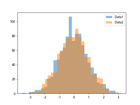
Multiple Histograms
import matplotlib.pyplot as plt
import numpy as np

# Generate random data
data1 = np.random.randn(1000)
data2 = np.random.randn(1000)

# Plot multiple histograms
plt.hist(data1, bins=30, alpha=0.5, label='Data1')
plt.hist(data2, bins=30, alpha=0.5, label='Data2')
plt.legend()
plt.show()
Output:
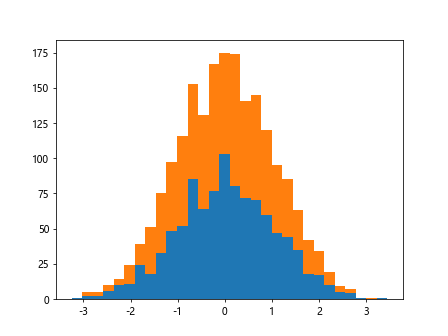
Stacked Histograms
import matplotlib.pyplot as plt
import numpy as np

# Generate random data
data1 = np.random.randn(1000)
data2 = np.random.randn(1000)

# Plot stacked histograms
plt.hist([data1, data2], bins=30, stacked=True)
plt.show()
Output:
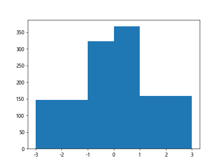
Histogram with Different Bin Sizes
import matplotlib.pyplot as plt
import numpy as np

# Generate random data
data = np.random.randn(1000)

# Plot histogram with different bin sizes
plt.hist(data, bins=[-3, -1, 0, 1, 3])
plt.show()
Output:
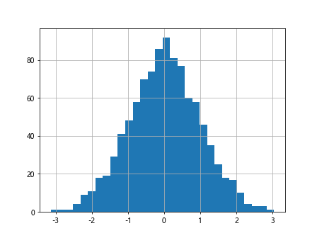
Adding Grid to Histogram
import matplotlib.pyplot as plt
import numpy as np

# Generate random data
data = np.random.randn(1000)

# Plot histogram with grid
plt.hist(data, bins=30)
plt.grid(True)
plt.show()
Output:
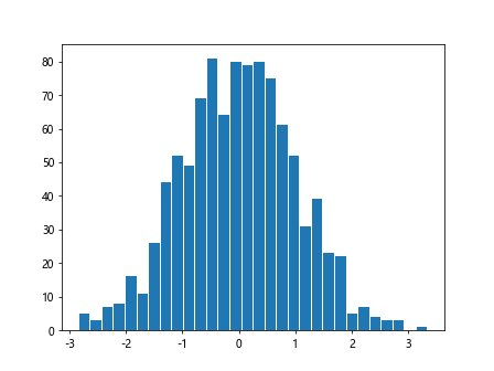
Customizing Bar Width
import matplotlib.pyplot as plt
import numpy as np

# Generate random data
data = np.random.randn(1000)

# Plot histogram with custom bar width
plt.hist(data, bins=30, rwidth=0.9)
plt.show()
Output:
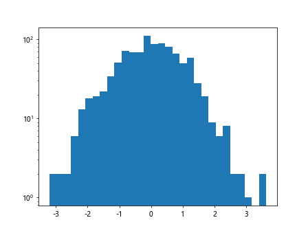
Log Scale Histogram
import matplotlib.pyplot as plt
import numpy as np

# Generate random data
data = np.random.randn(1000)

# Plot histogram with log scale
plt.hist(data, bins=30)
plt.yscale('log')
plt.show()
Output:
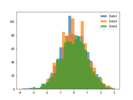
Grouped Histograms
import matplotlib.pyplot as plt
import numpy as np

# Generate random data
data1 = np.random.randn(1000)
data2 = np.random.randn(1000)
data3 = np.random.randn(1000)

# Plot grouped histograms
plt.hist(data1, bins=30, alpha=0.7, label='Data1')
plt.hist(data2, bins=30, alpha=0.7, label='Data2')
plt.hist(data3, bins=30, alpha=0.7, label='Data3')
plt.legend()
plt.show()
Output:
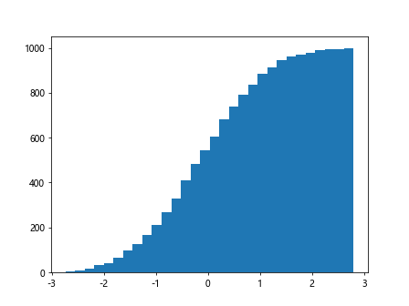
Cumulative Histogram
import matplotlib.pyplot as plt
import numpy as np

# Generate random data
data = np.random.randn(1000)

# Plot cumulative histogram
plt.hist(data, bins=30, cumulative=True)
plt.show()
Output:
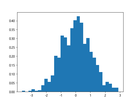
Histogram with Density
import matplotlib.pyplot as plt
import numpy as np

# Generate random data
data = np.random.randn(1000)

# Plot histogram with density
plt.hist(data, bins=30, density=True)
plt.show()
Output:
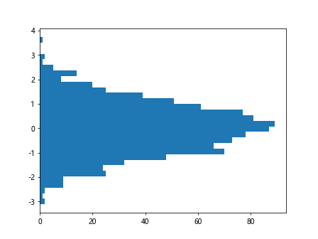
Plotting Horizontal Histogram
import matplotlib.pyplot as plt
import numpy as np

# Generate random data
data = np.random.randn(1000)

# Plot horizontal histogram
plt.hist(data, bins=30, orientation='horizontal')
plt.show()
Output:
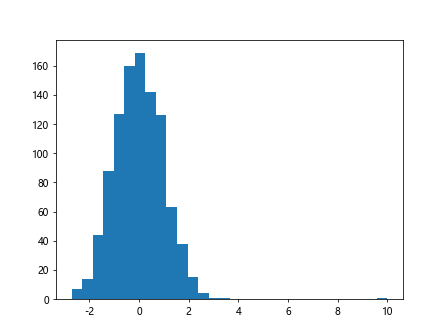
Histogram with Outliers
import matplotlib.pyplot as plt
import numpy as np

# Generate random data with outliers
data = np.random.randn(1000)
data[0] = 10

# Plot histogram with outliers
plt.hist(data, bins=30)
plt.show()
Output:
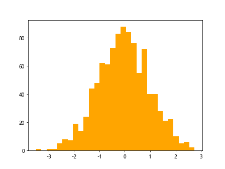
Histogram with Customized Color
import matplotlib.pyplot as plt
import numpy as np

# Generate random data
data = np.random.randn(1000)

# Plot histogram with customized color
plt.hist(data, bins=30, color='orange')
plt.show()
Output:
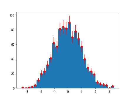
Histogram with Error Bars
import matplotlib.pyplot as plt
import numpy as np

# Generate random data
data = np.random.randn(1000)

# Plot histogram with error bars
counts, bins, _ = plt.hist(data, bins=30)
bin_centers = 0.5 * (bins[1:] + bins[:-1])
errors = np.sqrt(counts)
plt.errorbar(bin_centers, counts, yerr=errors, fmt='o', color='red')
plt.show()
Output:
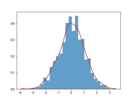
Overlaying Histogram with Kernel Density Estimate
import matplotlib.pyplot as plt
import numpy as np
from scipy.stats import gaussian_kde

# Generate random data
data = np.random.randn(1000)

# Plot histogram and kernel density estimate
plt.hist(data, bins=30, density=True, alpha=0.7)
kde = gaussian_kde(data)
x = np.linspace(min(data), max(data), 1000)
plt.plot(x, kde(x), color='red')
plt.show()
Output:
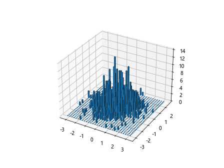
3D Histogram
import matplotlib.pyplot as plt
import numpy as np

# Generate random data
x = np.random.randn(1000)
y = np.random.randn(1000)

# Plot 3D histogram
fig = plt.figure()
ax = fig.add_subplot(111, projection='3d')
hist, xedges, yedges = np.histogram2d(x, y, bins=30)
xpos, ypos = np.meshgrid(xedges[:-1], yedges[:-1], indexing="ij")
xpos = xpos.ravel()
ypos = ypos.ravel()
zpos = 0
dx = dy = np.ones(900) * 0.1
dz = hist.ravel()
ax.bar3d(xpos, ypos, zpos, dx, dy, dz, zsort='average')
plt.show()
Output:
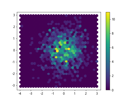
Scatter Histogram
import matplotlib.pyplot as plt
import numpy as np

# Generate random data
x = np.random.randn(1000)
y = np.random.randn(1000)

# Plot scatter histogram
plt.hexbin(x, y, gridsize=30)
plt.colorbar()
plt.show()
Output:
Summary
In this article, we have explored various ways to create and customize histograms using Matplotlib. Histograms are a powerful tool for visualizing the distribution of data and can help in gaining insights into the underlying patterns. Experiment with different parameters and customizations to create impactful visualizations for your data analysis projects.