How to Create a Half Violin Plot in Matplotlib
Half Violin Plot in Matplotlib is a powerful visualization technique that combines elements of box plots and violin plots to display the distribution of data. This article will explore the intricacies of creating and customizing Half Violin Plots using Matplotlib, a popular plotting library in Python. We’ll delve into various aspects of Half Violin Plots, including their advantages, implementation, and customization options.
Understanding Half Violin Plots in Matplotlib
Half Violin Plot in Matplotlib is a variation of the traditional violin plot that shows only one side of the distribution. This type of plot is particularly useful when comparing multiple distributions side by side or when you want to emphasize certain aspects of the data. Half Violin Plots in Matplotlib provide a compact yet informative representation of data distribution, making them an excellent choice for data visualization in various fields.
To create a Half Violin Plot in Matplotlib, we need to understand the basic structure and components of the plot. A Half Violin Plot typically consists of the following elements:
- The violin shape: Represents the kernel density estimation of the data distribution.
- The median line: Indicates the median value of the distribution.
- Optional quartile lines: Show the first and third quartiles of the data.
- Optional individual data points: Display the actual data points on the plot.
Let’s start with a simple example of creating a Half Violin Plot in Matplotlib:
import matplotlib.pyplot as plt
import numpy as np

# Generate sample data
data = np.random.normal(0, 1, 1000)

# Create the plot
fig, ax = plt.subplots(figsize=(8, 6))
ax.violinplot(data, vert=False, showmeans=False, showmedians=True, showextrema=False)
ax.set_title("Half Violin Plot in Matplotlib - how2matplotlib.com")
ax.set_xlabel("Value")
ax.set_ylabel("Distribution")

plt.show()
Output:
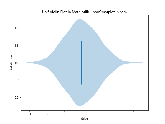
In this example, we create a basic Half Violin Plot using Matplotlib’s violinplot function. The vert=False parameter rotates the plot horizontally, while showmedians=True displays the median line. We’ve also customized the title and axis labels to make the plot more informative.
Advantages of Half Violin Plots in Matplotlib
Half Violin Plots in Matplotlib offer several advantages over traditional box plots and full violin plots:
- Compact representation: Half Violin Plots take up less space than full violin plots, making them ideal for comparing multiple distributions side by side.
- Clear visualization of distribution shape: The violin shape provides a clear view of the data distribution, including skewness and multimodality.
- Easy comparison of central tendencies: The median line and optional quartile lines allow for quick comparison of central tendencies across different groups.
- Flexibility in customization: Matplotlib offers extensive customization options for Half Violin Plots, allowing you to tailor the visualization to your specific needs.
Let’s explore these advantages further with another example:
import matplotlib.pyplot as plt
import numpy as np

# Generate sample data for multiple groups
data1 = np.random.normal(0, 1, 1000)
data2 = np.random.normal(1, 1.5, 1000)
data3 = np.random.normal(-1, 0.5, 1000)

# Create the plot
fig, ax = plt.subplots(figsize=(10, 6))
positions = [1, 2, 3]
parts = ax.violinplot([data1, data2, data3], positions, vert=False, showmeans=False, showmedians=True, showextrema=False)

# Customize the plot
ax.set_title("Comparing Multiple Distributions with Half Violin Plots - how2matplotlib.com")
ax.set_xlabel("Value")
ax.set_yticks(positions)
ax.set_yticklabels(["Group A", "Group B", "Group C"])

plt.show()
Output:
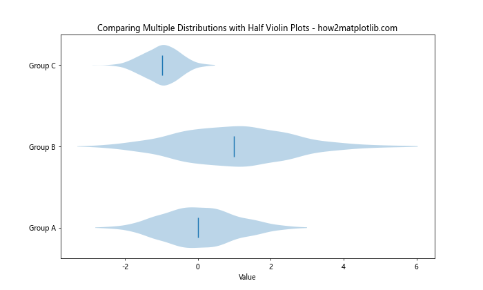
This example demonstrates how Half Violin Plots in Matplotlib can be used to compare multiple distributions side by side. We’ve created three different normal distributions and plotted them as Half Violin Plots, allowing for easy comparison of their shapes and central tendencies.
Creating Basic Half Violin Plots in Matplotlib
To create a basic Half Violin Plot in Matplotlib, we use the violinplot function from the matplotlib.pyplot module. Here’s a step-by-step guide to creating a simple Half Violin Plot:
- Import the necessary libraries:
import matplotlib.pyplot as plt
import numpy as np
- Generate or load your data:
data = np.random.lognormal(0, 0.5, 1000)
- Create a figure and axis object:
fig, ax = plt.subplots(figsize=(8, 6))
- Use the
violinplotfunction to create the Half Violin Plot:
parts = ax.violinplot(data, vert=False, showmeans=False, showmedians=True, showextrema=False)
- Customize the plot with titles and labels:
ax.set_title("Basic Half Violin Plot in Matplotlib - how2matplotlib.com")
ax.set_xlabel("Value")
ax.set_ylabel("Distribution")
- Display the plot:
plt.show()
Here’s the complete example:
import matplotlib.pyplot as plt
import numpy as np

# Generate sample data
data = np.random.lognormal(0, 0.5, 1000)

# Create the plot
fig, ax = plt.subplots(figsize=(8, 6))
parts = ax.violinplot(data, vert=False, showmeans=False, showmedians=True, showextrema=False)

# Customize the plot
ax.set_title("Basic Half Violin Plot in Matplotlib - how2matplotlib.com")
ax.set_xlabel("Value")
ax.set_ylabel("Distribution")

plt.show()
Output:
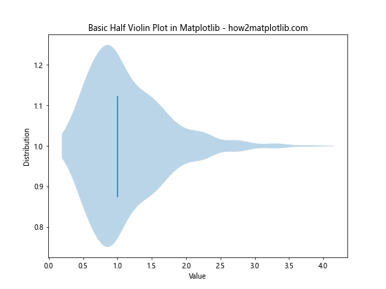
This example creates a basic Half Violin Plot using a lognormal distribution. The vert=False parameter ensures that the plot is horizontal, while showmedians=True displays the median line.
Customizing Half Violin Plots in Matplotlib
Matplotlib offers extensive customization options for Half Violin Plots. Let’s explore some of the most common customizations:
Changing Colors and Styles
You can customize the colors and styles of various elements in a Half Violin Plot:
import matplotlib.pyplot as plt
import numpy as np

# Generate sample data
data = np.random.normal(0, 1, 1000)

# Create the plot
fig, ax = plt.subplots(figsize=(8, 6))
parts = ax.violinplot(data, vert=False, showmeans=False, showmedians=True, showextrema=False)

# Customize colors and styles
parts['bodies'][0].set_facecolor('lightblue')
parts['bodies'][0].set_edgecolor('navy')
parts['bodies'][0].set_alpha(0.7)
parts['cmedians'].set_color('red')

ax.set_title("Customized Half Violin Plot in Matplotlib - how2matplotlib.com")
ax.set_xlabel("Value")
ax.set_ylabel("Distribution")

plt.show()
Output:
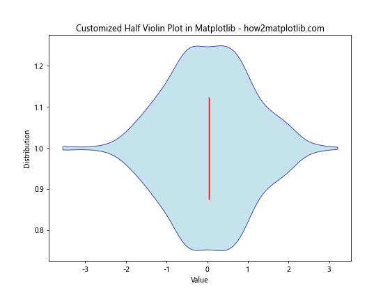
In this example, we’ve customized the color of the violin body, its edge color, transparency, and the color of the median line.
Adding Quartile Lines
You can add quartile lines to your Half Violin Plot to provide more information about the data distribution:
import matplotlib.pyplot as plt
import numpy as np

# Generate sample data
data = np.random.normal(0, 1, 1000)

# Create the plot
fig, ax = plt.subplots(figsize=(8, 6))
parts = ax.violinplot(data, vert=False, showmeans=False, showmedians=True, showextrema=False, quantiles=[0.25, 0.75])

# Customize the plot
ax.set_title("Half Violin Plot with Quartile Lines - how2matplotlib.com")
ax.set_xlabel("Value")
ax.set_ylabel("Distribution")

plt.show()
Output:
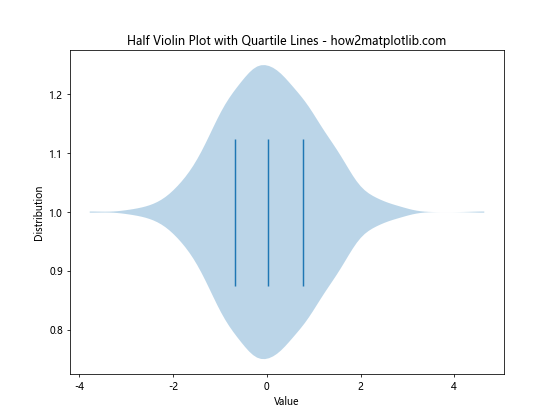
This example adds quartile lines to the Half Violin Plot by setting the quantiles parameter to [0.25, 0.75].
Displaying Individual Data Points
To provide a more detailed view of the data, you can add individual data points to your Half Violin Plot:
import matplotlib.pyplot as plt
import numpy as np

# Generate sample data
data = np.random.normal(0, 1, 100)

# Create the plot
fig, ax = plt.subplots(figsize=(8, 6))
parts = ax.violinplot(data, vert=False, showmeans=False, showmedians=True, showextrema=False)

# Add individual data points
ax.scatter(data, np.full_like(data, 1), color='red', alpha=0.5, s=5)

# Customize the plot
ax.set_title("Half Violin Plot with Individual Data Points - how2matplotlib.com")
ax.set_xlabel("Value")
ax.set_ylabel("Distribution")
ax.set_yticks([])

plt.show()
Output:
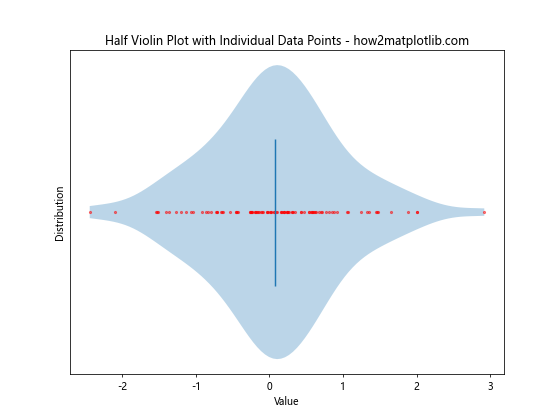
In this example, we’ve added individual data points using the scatter function, providing a more detailed view of the data distribution.
Creating Multiple Half Violin Plots in Matplotlib
When working with multiple groups or categories, you can create multiple Half Violin Plots side by side for easy comparison. Here’s an example:
import matplotlib.pyplot as plt
import numpy as np

# Generate sample data for multiple groups
data1 = np.random.normal(0, 1, 1000)
data2 = np.random.normal(1, 1.5, 1000)
data3 = np.random.normal(-1, 0.5, 1000)

# Create the plot
fig, ax = plt.subplots(figsize=(10, 6))
positions = [1, 2, 3]
parts = ax.violinplot([data1, data2, data3], positions, vert=False, showmeans=False, showmedians=True, showextrema=False)

# Customize the plot
ax.set_title("Multiple Half Violin Plots in Matplotlib - how2matplotlib.com")
ax.set_xlabel("Value")
ax.set_yticks(positions)
ax.set_yticklabels(["Group A", "Group B", "Group C"])

# Add a grid for better readability
ax.grid(True, axis='x', linestyle='--', alpha=0.7)

plt.show()
Output:
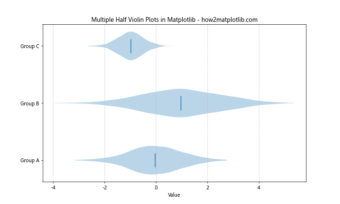
This example creates three Half Violin Plots side by side, allowing for easy comparison of different groups or categories.
Combining Half Violin Plots with Other Plot Types in Matplotlib
Half Violin Plots can be combined with other plot types to create more informative visualizations. Let’s explore some combinations:
Half Violin Plot with Box Plot
Combining a Half Violin Plot with a Box Plot can provide a comprehensive view of the data distribution:
import matplotlib.pyplot as plt
import numpy as np

# Generate sample data
data = np.random.normal(0, 1, 1000)

# Create the plot
fig, ax = plt.subplots(figsize=(8, 6))

# Create Half Violin Plot
parts_violin = ax.violinplot(data, vert=False, showmeans=False, showmedians=False, showextrema=False)
parts_violin['bodies'][0].set_facecolor('lightblue')
parts_violin['bodies'][0].set_alpha(0.7)

# Create Box Plot
parts_box = ax.boxplot(data, vert=False, positions=[1], widths=0.3, patch_artist=True)
parts_box['boxes'][0].set_facecolor('lightgreen')
parts_box['medians'][0].set_color('red')

# Customize the plot
ax.set_title("Half Violin Plot with Box Plot - how2matplotlib.com")
ax.set_xlabel("Value")
ax.set_yticks([])

plt.show()
Output:
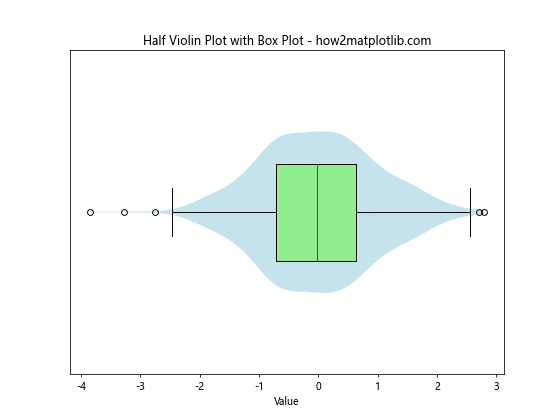
This example combines a Half Violin Plot with a Box Plot, providing both a detailed view of the distribution shape and summary statistics.
Half Violin Plot with Scatter Plot
Combining a Half Violin Plot with a Scatter Plot can show both the distribution and individual data points:
import matplotlib.pyplot as plt
import numpy as np

# Generate sample data
data = np.random.normal(0, 1, 100)

# Create the plot
fig, ax = plt.subplots(figsize=(8, 6))

# Create Half Violin Plot
parts_violin = ax.violinplot(data, vert=False, showmeans=False, showmedians=True, showextrema=False)
parts_violin['bodies'][0].set_facecolor('lightblue')
parts_violin['bodies'][0].set_alpha(0.7)

# Add Scatter Plot
ax.scatter(data, np.full_like(data, 1), color='red', alpha=0.5, s=5)

# Customize the plot
ax.set_title("Half Violin Plot with Scatter Plot - how2matplotlib.com")
ax.set_xlabel("Value")
ax.set_yticks([])

plt.show()
Output:
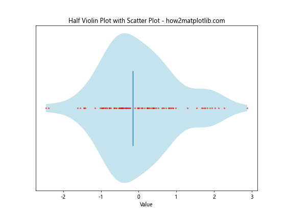
This example combines a Half Violin Plot with a Scatter Plot, showing both the overall distribution and individual data points.
Advanced Techniques for Half Violin Plots in Matplotlib
Let’s explore some advanced techniques for creating and customizing Half Violin Plots in Matplotlib:
Creating Split Half Violin Plots
Split Half Violin Plots allow you to compare two distributions side by side:
import matplotlib.pyplot as plt
import numpy as np

# Generate sample data
data1 = np.random.normal(0, 1, 1000)
data2 = np.random.normal(0.5, 1.2, 1000)

# Create the plot
fig, ax = plt.subplots(figsize=(8, 6))

# Create Split Half Violin Plot
parts = ax.violinplot([data1, data2], vert=False, showmeans=False, showmedians=True, showextrema=False)

# Customize the plot
parts['bodies'][0].set_facecolor('lightblue')
parts['bodies'][1].set_facecolor('lightgreen')
parts['bodies'][0].set_alpha(0.7)
parts['bodies'][1].set_alpha(0.7)

ax.set_title("Split Half Violin Plot in Matplotlib - how2matplotlib.com")
ax.set_xlabel("Value")
ax.set_yticks([1, 2])
ax.set_yticklabels(["Group A", "Group B"])

plt.show()
Output:
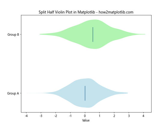
This example creates a Split Half Violin Plot, allowing for easy comparison of two distributions side by side.
Adding Confidence Intervals
You can add confidence intervals to your Half Violin Plots to provide more information about the uncertainty in the data:
import matplotlib.pyplot as plt
import numpy as np
from scipy import stats

# Generate sample data
data = np.random.normal(0, 1, 1000)

# Calculate confidence interval
mean = np.mean(data)
ci = stats.t.interval(0.95, len(data)-1, loc=mean, scale=stats.sem(data))

# Create the plot
fig, ax = plt.subplots(figsize=(8, 6))

# Create Half Violin Plot
parts = ax.violinplot(data, vert=False, showmeans=False, showmedians=True, showextrema=False)

# Add confidence interval
ax.hlines(1, ci[0], ci[1], color='red', linestyle='--', label='95% CI')

# Customize the plot
ax.set_title("Half Violin Plot with Confidence Interval - how2matplotlib.com")
ax.set_xlabel("Value")
ax.set_yticks([])
ax.legend()

plt.show()
Output:
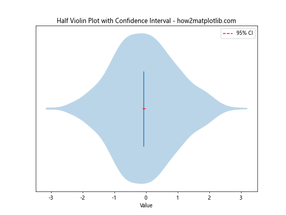
This example adds a 95% confidence interval to the Half Violin Plot, providing information about the uncertainty in the mean estimate.
Creating Grouped Half Violin Plots
When dealing with multiple categories and groups, you can create grouped Half Violin Plots:
import matplotlib.pyplot as plt
import numpy as np

# Generate# Generate sample data for multiple groups and categories
np.random.seed(42)
categories = ['A', 'B', 'C']
groups = ['Group 1', 'Group 2', 'Group 3']
data = {group: {cat: np.random.normal(0, 1, 100) for cat in categories} for group in groups}

# Create the plot
fig, ax = plt.subplots(figsize=(12, 6))

# Set positions for the violins
positions = np.arange(1, len(categories) * len(groups) + 1, len(groups))
width = 0.8

# Create grouped Half Violin Plots
for i, group in enumerate(groups):
    group_data = [data[group][cat] for cat in categories]
    parts = ax.violinplot(group_data, positions=positions + i * width / len(groups),
                          vert=False, showmeans=False, showmedians=True, showextrema=False, widths=width/len(groups))

    # Customize colors for each group
    color = plt.cm.Set3(i / len(groups))
    for pc in parts['bodies']:
        pc.set_facecolor(color)
        pc.set_alpha(0.7)

# Customize the plot
ax.set_title("Grouped Half Violin Plots in Matplotlib - how2matplotlib.com")
ax.set_xlabel("Value")
ax.set_yticks(positions + width/2)
ax.set_yticklabels(categories)
ax.legend(groups, loc='upper right')

plt.show()
Output:
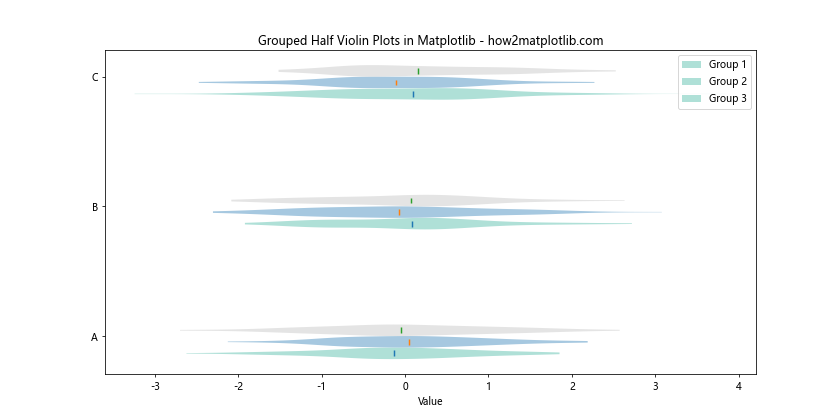
This example creates grouped Half Violin Plots, allowing for comparison across multiple categories and groups simultaneously.
Best Practices for Half Violin Plots in Matplotlib
When creating Half Violin Plots in Matplotlib, it’s important to follow some best practices to ensure your visualizations are effective and informative:
- Choose appropriate scales: Ensure that the scale of your plot accurately represents the data and doesn’t distort the visualization.
Use color effectively: Choose colors that are visually appealing and help distinguish between different groups or categories.
Add context: Include titles, labels, and legends to provide context for your Half Violin Plots.
Consider your audience: Tailor the complexity of your plots to your audience’s familiarity with statistical concepts.
Combine with other plot types: When appropriate, combine Half Violin Plots with other plot types to provide a more comprehensive view of the data.
Use consistent styling: When creating multiple Half Violin Plots, maintain consistent styling to facilitate comparisons.
Avoid overplotting: When dealing with large datasets, consider using techniques like transparency or jittering to avoid overplotting.
Let’s implement some of these best practices in an example: