How to Find Outlier Points in Matplotlib
Finding the outlier points from Matplotlib is an essential skill for data scientists and analysts working with visualizations. Matplotlib, a powerful plotting library in Python, offers various techniques to identify and highlight outliers in your data. This article will explore different methods and best practices for finding outlier points using Matplotlib, providing you with the tools you need to effectively analyze and visualize your data.
Understanding Outliers in Matplotlib
Before diving into the methods of finding outlier points from Matplotlib, it’s crucial to understand what outliers are and why they’re important in data analysis. Outliers are data points that significantly differ from other observations in a dataset. These points can have a substantial impact on statistical analyses and visualizations, potentially skewing results or leading to incorrect conclusions.
In Matplotlib, outliers can be identified and visualized in various ways, depending on the type of plot you’re using and the nature of your data. Let’s explore some common techniques for finding outlier points from Matplotlib.
Basic Scatter Plot for Outlier Detection
One of the simplest ways to start finding outlier points from Matplotlib is by creating a basic scatter plot. This method allows you to visually inspect your data and identify points that appear to be far from the main cluster.
Here’s a simple example of how to create a scatter plot and visually identify outliers:
import matplotlib.pyplot as plt
import numpy as np

# Generate sample data
np.random.seed(42)
x = np.random.normal(0, 1, 100)
y = np.random.normal(0, 1, 100)

# Add some outliers
x = np.append(x, [3, -3, 3])
y = np.append(y, [3, 3, -3])

# Create scatter plot
plt.figure(figsize=(10, 6))
plt.scatter(x, y, color='blue', alpha=0.7)
plt.title('Scatter Plot for Finding Outlier Points from Matplotlib')
plt.xlabel('X-axis (how2matplotlib.com)')
plt.ylabel('Y-axis (how2matplotlib.com)')
plt.grid(True)
plt.show()
Output:
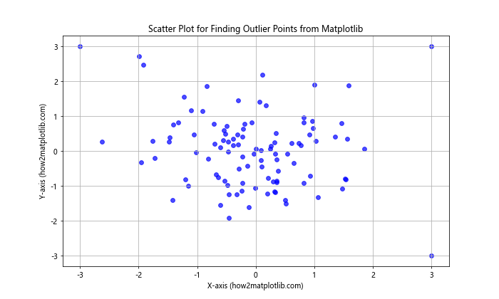
In this example, we generate random data and deliberately add some outlier points. The scatter plot allows us to visually identify these outliers as they appear far from the main cluster of points.
Box Plot for Outlier Detection
Box plots, also known as box-and-whisker plots, are excellent tools for finding outlier points from Matplotlib. They provide a visual summary of the data distribution and clearly highlight potential outliers.
Here’s an example of how to create a box plot to identify outliers:
import matplotlib.pyplot as plt
import numpy as np

# Generate sample data
np.random.seed(42)
data = np.random.normal(0, 1, 100)

# Add some outliers
data = np.append(data, [5, -5, 6, -6])

# Create box plot
plt.figure(figsize=(10, 6))
plt.boxplot(data, vert=False)
plt.title('Box Plot for Finding Outlier Points from Matplotlib')
plt.xlabel('Values (how2matplotlib.com)')
plt.ylabel('Dataset')
plt.show()
Output:
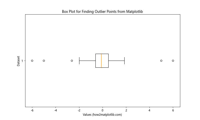
In this box plot, the whiskers extend to 1.5 times the interquartile range (IQR). Any points beyond the whiskers are considered potential outliers and are plotted individually.
Histogram with KDE for Outlier Detection
Histograms combined with Kernel Density Estimation (KDE) can be useful for finding outlier points from Matplotlib, especially when dealing with univariate data.
Here’s an example of how to create a histogram with KDE to identify outliers:
import matplotlib.pyplot as plt
import numpy as np
from scipy import stats

# Generate sample data
np.random.seed(42)
data = np.random.normal(0, 1, 1000)

# Add some outliers
data = np.append(data, [5, -5, 6, -6])

# Create histogram with KDE
plt.figure(figsize=(12, 6))
plt.hist(data, bins=30, density=True, alpha=0.7)
kde = stats.gaussian_kde(data)
x_range = np.linspace(data.min(), data.max(), 100)
plt.plot(x_range, kde(x_range), 'r-', linewidth=2)
plt.title('Histogram with KDE for Finding Outlier Points from Matplotlib')
plt.xlabel('Values (how2matplotlib.com)')
plt.ylabel('Density')
plt.show()
Output:
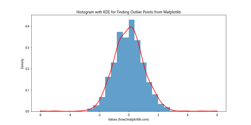
In this example, the histogram shows the distribution of the data, while the KDE line helps to identify areas where the data is sparse, potentially indicating outliers.
Z-Score Method for Outlier Detection
The Z-score method is a statistical approach for finding outlier points from Matplotlib. It measures how many standard deviations away a data point is from the mean.
Here’s an example of how to use the Z-score method to identify outliers:
import matplotlib.pyplot as plt
import numpy as np
from scipy import stats

# Generate sample data
np.random.seed(42)
data = np.random.normal(0, 1, 100)

# Add some outliers
data = np.append(data, [5, -5, 6, -6])

# Calculate Z-scores
z_scores = np.abs(stats.zscore(data))

# Create scatter plot
plt.figure(figsize=(10, 6))
plt.scatter(range(len(data)), data, c=z_scores, cmap='viridis')
plt.colorbar(label='Z-score')
plt.title('Z-Score Method for Finding Outlier Points from Matplotlib')
plt.xlabel('Index (how2matplotlib.com)')
plt.ylabel('Values')
plt.show()
Output:
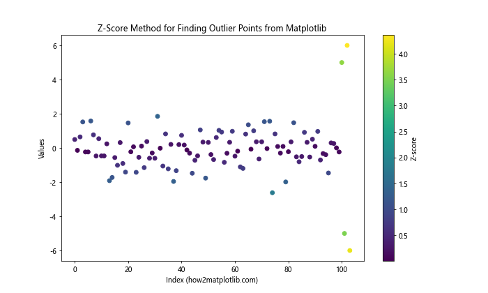
In this example, we calculate the Z-scores for each data point and use them to color the scatter plot. Points with higher Z-scores (typically above 3) are considered potential outliers.
Interquartile Range (IQR) Method for Outlier Detection
The Interquartile Range (IQR) method is another popular technique for finding outlier points from Matplotlib. It uses the concept of quartiles to identify data points that fall far from the central tendency.
Here’s an example of how to use the IQR method to detect outliers:
import matplotlib.pyplot as plt
import numpy as np

# Generate sample data
np.random.seed(42)
data = np.random.normal(0, 1, 100)

# Add some outliers
data = np.append(data, [5, -5, 6, -6])

# Calculate IQR
q1, q3 = np.percentile(data, [25, 75])
iqr = q3 - q1
lower_bound = q1 - (1.5 * iqr)
upper_bound = q3 + (1.5 * iqr)

# Identify outliers
outliers = data[(data < lower_bound) | (data > upper_bound)]

# Create scatter plot
plt.figure(figsize=(10, 6))
plt.scatter(range(len(data)), data, c='blue', alpha=0.7)
plt.scatter(np.where((data < lower_bound) | (data > upper_bound))[0], outliers, c='red', s=100)
plt.axhline(y=lower_bound, color='r', linestyle='--')
plt.axhline(y=upper_bound, color='r', linestyle='--')
plt.title('IQR Method for Finding Outlier Points from Matplotlib')
plt.xlabel('Index (how2matplotlib.com)')
plt.ylabel('Values')
plt.show()
Output:
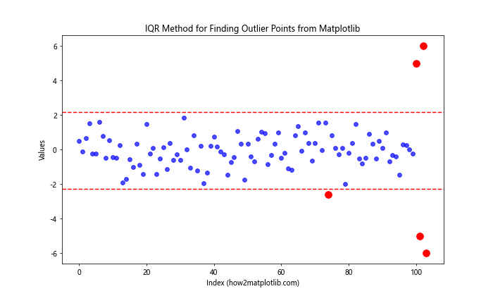
In this example, we calculate the IQR and use it to define upper and lower bounds. Any points outside these bounds are considered outliers and are highlighted in red.
Mahalanobis Distance for Multivariate Outlier Detection
When dealing with multivariate data, the Mahalanobis distance can be an effective method for finding outlier points from Matplotlib. This technique takes into account the covariance structure of the data.
Here’s an example of how to use Mahalanobis distance for outlier detection:
import matplotlib.pyplot as plt
import numpy as np
from scipy.stats import chi2

def mahalanobis(x, data):
    covariance_matrix = np.cov(data, rowvar=False)
    inv_covariance_matrix = np.linalg.inv(covariance_matrix)
    diff = x - np.mean(data, axis=0)
    return np.sqrt(diff.dot(inv_covariance_matrix).dot(diff.T))

# Generate sample data
np.random.seed(42)
data = np.random.multivariate_normal([0, 0], [[1, 0.5], [0.5, 1]], 100)

# Add some outliers
outliers = np.array([[5, 5], [-5, -5], [5, -5], [-5, 5]])
data = np.vstack((data, outliers))

# Calculate Mahalanobis distances
distances = [mahalanobis(x, data) for x in data]

# Create scatter plot
plt.figure(figsize=(10, 6))
scatter = plt.scatter(data[:, 0], data[:, 1], c=distances, cmap='viridis')
plt.colorbar(scatter, label='Mahalanobis Distance')
plt.title('Mahalanobis Distance for Finding Outlier Points from Matplotlib')
plt.xlabel('X-axis (how2matplotlib.com)')
plt.ylabel('Y-axis (how2matplotlib.com)')
plt.show()
Output:
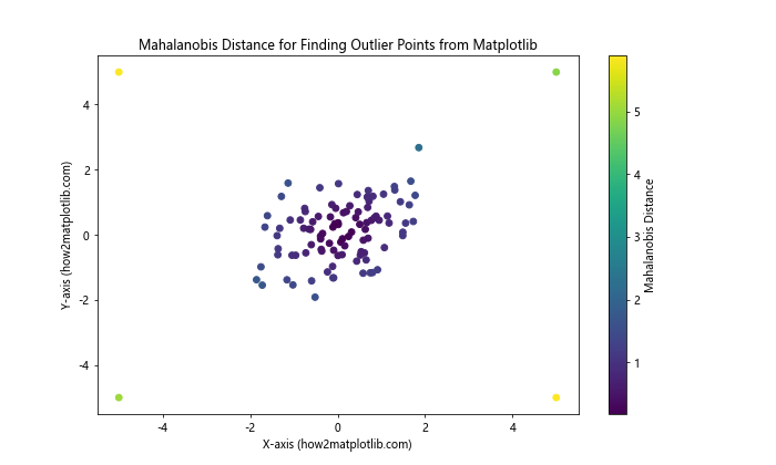
In this example, we calculate the Mahalanobis distance for each point and use it to color the scatter plot. Points with larger Mahalanobis distances are potential outliers.
Local Outlier Factor (LOF) for Density-Based Outlier Detection
The Local Outlier Factor (LOF) is a density-based method for finding outlier points from Matplotlib. It compares the local density of a point with the local densities of its neighbors.
Here’s an example of how to use LOF for outlier detection:
import matplotlib.pyplot as plt
import numpy as np
from sklearn.neighbors import LocalOutlierFactor

# Generate sample data
np.random.seed(42)
X = np.random.normal(0, 1, (100, 2))

# Add some outliers
X = np.vstack((X, [[5, 5], [-5, -5], [5, -5], [-5, 5]]))

# Fit LOF
lof = LocalOutlierFactor(n_neighbors=20, contamination=0.1)
y_pred = lof.fit_predict(X)

# Create scatter plot
plt.figure(figsize=(10, 6))
scatter = plt.scatter(X[:, 0], X[:, 1], c=y_pred, cmap='viridis')
plt.colorbar(scatter, label='LOF Prediction (-1: outlier, 1: inlier)')
plt.title('Local Outlier Factor for Finding Outlier Points from Matplotlib')
plt.xlabel('X-axis (how2matplotlib.com)')
plt.ylabel('Y-axis (how2matplotlib.com)')
plt.show()
Output:
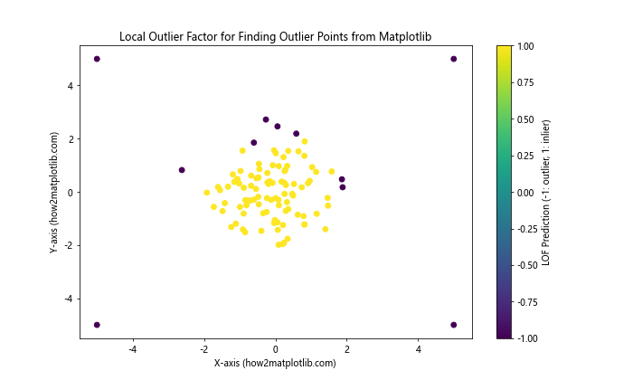
In this example, we use scikit-learn’s LocalOutlierFactor to identify outliers. The resulting plot shows inliers and outliers with different colors.
Isolation Forest for Outlier Detection
Isolation Forest is an unsupervised learning algorithm that excels at finding outlier points from Matplotlib, especially in high-dimensional datasets.
Here’s an example of how to use Isolation Forest for outlier detection:
import matplotlib.pyplot as plt
import numpy as np
from sklearn.ensemble import IsolationForest

# Generate sample data
np.random.seed(42)
X = np.random.normal(0, 1, (100, 2))

# Add some outliers
X = np.vstack((X, [[5, 5], [-5, -5], [5, -5], [-5, 5]]))

# Fit Isolation Forest
iso_forest = IsolationForest(contamination=0.1, random_state=42)
y_pred = iso_forest.fit_predict(X)

# Create scatter plot
plt.figure(figsize=(10, 6))
scatter = plt.scatter(X[:, 0], X[:, 1], c=y_pred, cmap='viridis')
plt.colorbar(scatter, label='Isolation Forest Prediction (-1: outlier, 1: inlier)')
plt.title('Isolation Forest for Finding Outlier Points from Matplotlib')
plt.xlabel('X-axis (how2matplotlib.com)')
plt.ylabel('Y-axis (how2matplotlib.com)')
plt.show()
Output:
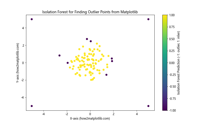
In this example, we use scikit-learn’s IsolationForest to identify outliers. The resulting plot shows inliers and outliers with different colors.
DBSCAN for Density-Based Outlier Detection
DBSCAN (Density-Based Spatial Clustering of Applications with Noise) is another effective method for finding outlier points from Matplotlib, particularly when dealing with clusters of varying shapes and densities.
Here’s an example of how to use DBSCAN for outlier detection:
import matplotlib.pyplot as plt
import numpy as np
from sklearn.cluster import DBSCAN

# Generate sample data
np.random.seed(42)
X = np.random.normal(0, 1, (100, 2))

# Add some outliers
X = np.vstack((X, [[5, 5], [-5, -5], [5, -5], [-5, 5]]))

# Fit DBSCAN
dbscan = DBSCAN(eps=0.5, min_samples=5)
y_pred = dbscan.fit_predict(X)

# Create scatter plot
plt.figure(figsize=(10, 6))
scatter = plt.scatter(X[:, 0], X[:, 1], c=y_pred, cmap='viridis')
plt.colorbar(scatter, label='DBSCAN Cluster Label (-1: outlier)')
plt.title('DBSCAN for Finding Outlier Points from Matplotlib')
plt.xlabel('X-axis (how2matplotlib.com)')
plt.ylabel('Y-axis (how2matplotlib.com)')
plt.show()
Output:
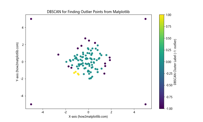
In this example, we use scikit-learn’s DBSCAN to identify outliers. Points labeled as -1 are considered outliers by the algorithm.
Combining Multiple Methods for Robust Outlier Detection
When finding outlier points from Matplotlib, it’s often beneficial to combine multiple methods for more robust results. By using different techniques and comparing their outputs, you can gain a more comprehensive understanding of potential outliers in your data.
Here’s an example of how to combine Z-score, IQR, and Isolation Forest methods:
import matplotlib.pyplot as plt
import numpy as np
from scipy import stats
from sklearn.ensemble import IsolationForest

# Generate sample data
np.random.seed(42)
data = np.random.normal(0, 1, 100)

# Add some outliers
data = np.append(data, [5, -5, 6, -6])

# Z-score method
z_scores = np.abs(stats.zscore(data))
z_score_outliers = data[z_scores > 3]

# IQR method
q1, q3 = np.percentile(data, [25, 75])
iqr = q3 - q1
iqr_outliers = data[(data < q1 - 1.5 * iqr) | (data > q3 + 1.5 * iqr)]

# Isolation Forest method
iso_forest = IsolationForest(contamination=0.1, random_state=42)
iso_forest_outliers = data[iso_forest.fit_predict(data.reshape(-1, 1)) == -1]

# Create subplots
fig, (ax1, ax2, ax3) = plt.subplots(3, 1, figsize=(12, 15))

# Z-score plot
ax1.scatter(range(len(data)), data, c='blue', alpha=0.7)
ax1.scatter(np.where(z_scores > 3)[0], z_score_outliers, c='red', s=100)
ax1.set_title('Z-Score Method for Finding Outlier Points from Matplotlib')
ax1.set_xlabel('Index (how2matplotlib.com)')
ax1.set_ylabel('Values')

# IQR plot
ax2.scatter(range(len(data)), data, c='blue', alpha=0.7)
ax2.scatter(np.where((data < q1 - 1.5 * iqr) | (data > q3 + 1.5 * iqr))[0], iqr_outliers, c='red', s=100)
ax2.set_title('IQR Method for Finding Outlier Points from Matplotlib')
ax2.set_xlabel('Index (how2matplotlib.com)')
ax2.set_ylabel('Values')

# Isolation Forest plot
ax3.scatter(range(len(data)), data, c='blue', alpha=0.7)
ax3.scatter(np.where(iso_forest.fit_predict(data.reshape(-1, 1)) == -1)[0], iso_forest_outliers, c='red', s=100)
ax3.set_title('Isolation Forest Method for Finding Outlier Points from Matplotlib')
ax3.set_xlabel('Index (how2matplotlib.com)')
ax3.set_ylabel('Values')

plt.tight_layout()
plt.show()
Output:
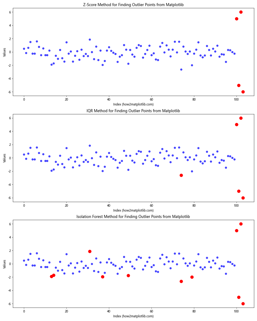
In this example, we apply three different methods (Z-score, IQR, and Isolation Forest) to the same dataset and visualize the results side by side. This approach allows us to compare the outliers detected by each method and make more informed decisions about which points to consider as true outliers.
Handling Outliers in Matplotlib
Once you’ve identified outlier points from Matplotlib, you may want to handle them in various ways depending on your analysis goals. Here are some common approaches:
- Removal: In some cases, you might choose to remove outliers entirely from your dataset.
- Transformation: Applying transformations like log or square root can sometimes reduce the impact of outliers.
- Capping: You can cap extreme values at a certain percentile (e.g., 1st and 99th percentiles).
- Imputation: Replace outlier values with more reasonable estimates based on other data points.
Here’s an example of how to visualize these different outlier handling techniques:
import matplotlib.pyplot as plt
import numpy as np
import pandas as pd

# Generate sample data with outliers
np.random.seed(42)
data = np.random.normal(0, 1, 1000)
data = np.append(data, [10, -10, 12, -12])

# Create DataFrame
df = pd.DataFrame({'original': data})

# Remove outliers
df['removed'] = df['original']
df.loc[np.abs(df['removed']) > 3, 'removed'] = np.nan

# Transform data (log transformation)
df['transformed'] = np.log1p(df['original'] - df['original'].min() + 1)

# Cap outliers
lower, upper = np.percentile(df['original'], [1, 99])
df['capped'] = df['original'].clip(lower, upper)

# Impute outliers (replace with median)
df['imputed'] = df['original']
median = df['imputed'].median()
df.loc[np.abs(df['imputed']) > 3, 'imputed'] = median

# Create subplots
fig, axes = plt.subplots(3, 2, figsize=(15, 15))

# Plot original data
axes[0, 0].hist(df['original'], bins=50)
axes[0, 0].set_title('Original Data')
axes[0, 0].set_xlabel('Value (how2matplotlib.com)')
axes[0, 0].set_ylabel('Frequency')

# Plot data with outliers removed
axes[0, 1].hist(df['removed'].dropna(), bins=50)
axes[0, 1].set_title('Outliers Removed')
axes[0, 1].set_xlabel('Value (how2matplotlib.com)')
axes[0, 1].set_ylabel('Frequency')

# Plot transformed data
axes[1, 0].hist(df['transformed'], bins=50)
axes[1, 0].set_title('Log Transformed Data')
axes[1, 0].set_xlabel('Value (how2matplotlib.com)')
axes[1, 0].set_ylabel('Frequency')

# Plot capped data
axes[1, 1].hist(df['capped'], bins=50)
axes[1, 1].set_title('Outliers Capped')
axes[1, 1].set_xlabel('Value (how2matplotlib.com)')
axes[1, 1].set_ylabel('Frequency')

# Plot imputed data
axes[2, 0].hist(df['imputed'], bins=50)
axes[2, 0].set_title('Outliers Imputed')
axes[2, 0].set_xlabel('Value (how2matplotlib.com)')
axes[2, 0].set_ylabel('Frequency')

# Keep last subplot empty for balance
axes[2, 1].axis('off')

plt.tight_layout()
plt.show()
Output:
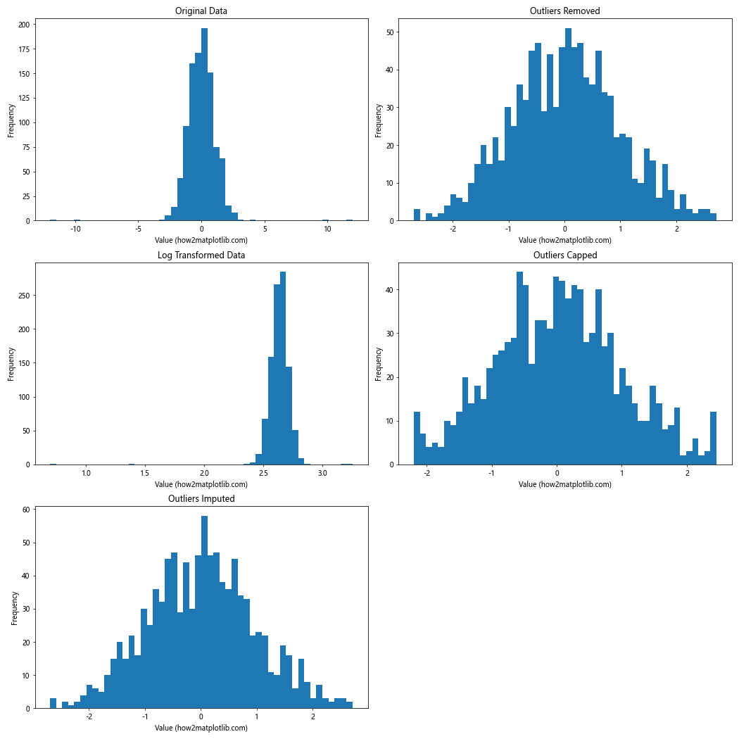
This example demonstrates different techniques for handling outliers and visualizes the results using histograms. Each method has its own advantages and disadvantages, and the choice of method depends on your specific use case and the nature of your data.
Best Practices for Finding Outlier Points from Matplotlib
When working on finding outlier points from Matplotlib, consider the following best practices:
- Understand your data: Before applying any outlier detection technique, thoroughly understand the nature and distribution of your data.
Use multiple methods: Different outlier detection methods may yield different results. Using multiple methods can provide a more comprehensive view of potential outliers.
Visualize results: Always visualize the results of your outlier detection methods. Matplotlib offers various plot types that can help you understand the distribution of your data and the location of potential outliers.
Consider domain knowledge: Sometimes, what appears to be an outlier statistically may be a valid data point in the context of your domain. Always consider domain expertise when interpreting results.
Be cautious with automatic removal: Automatically removing outliers can sometimes lead to loss of important information. Consider the impact of removing outliers on your analysis.
Document your process: Keep a record of the methods you used for finding outlier points from Matplotlib and the rationale behind your decisions.
Use appropriate color schemes: When visualizing outliers, use color schemes that make it easy to distinguish between regular data points and outliers.
Label axes and titles clearly: Ensure that your plots have clear, informative labels and titles to aid in interpretation.
Consider the dimensionality of your data: Some methods work better for univariate data, while others are more suitable for multivariate data.
Be aware of the limitations: Each method for finding outlier points from Matplotlib has its own assumptions and limitations. Be aware of these when interpreting results.
Conclusion
Finding outlier points from Matplotlib is a crucial skill in data analysis and visualization. This article has covered various techniques, from simple visual inspection using scatter plots to more advanced statistical and machine learning methods. We’ve explored how to use box plots, histograms, Z-scores, IQR, Mahalanobis distance, Local Outlier Factor, Isolation Forest, and DBSCAN for outlier detection. Remember that the choice of method depends on your specific dataset and analysis goals. It’s often beneficial to combine multiple techniques and visualize the results using Matplotlib’s powerful plotting capabilities. By mastering these techniques for finding outlier points from Matplotlib, you’ll be better equipped to handle anomalies in your data and make more informed decisions in your data analysis projects.