How to Master Drawing Scatter Trend Lines Using Matplotlib
Drawing Scatter Trend Lines Using Matplotlib is an essential skill for data visualization in Python. This comprehensive guide will walk you through the process of creating scatter plots with trend lines using Matplotlib, one of the most popular plotting libraries in Python. We’ll cover everything from basic scatter plots to advanced techniques for drawing trend lines, ensuring you have a solid understanding of how to effectively visualize your data using Matplotlib.
Introduction to Drawing Scatter Trend Lines Using Matplotlib
Drawing Scatter Trend Lines Using Matplotlib combines two powerful visualization techniques: scatter plots and trend lines. Scatter plots are excellent for displaying the relationship between two variables, while trend lines help identify patterns and trends in the data. Matplotlib provides a robust set of tools for creating these visualizations, making it an ideal choice for data scientists, researchers, and analysts.
Let’s start with a basic example of Drawing Scatter Trend Lines Using Matplotlib:
import matplotlib.pyplot as plt
import numpy as np

# Generate sample data
x = np.linspace(0, 10, 50)
y = 2 * x + 1 + np.random.randn(50)

# Create scatter plot
plt.scatter(x, y, label='Data')

# Calculate and plot trend line
z = np.polyfit(x, y, 1)
p = np.poly1d(z)
plt.plot(x, p(x), "r--", label='Trend line')

plt.title('Drawing Scatter Trend Lines Using Matplotlib - how2matplotlib.com')
plt.xlabel('X-axis')
plt.ylabel('Y-axis')
plt.legend()
plt.show()
Output:
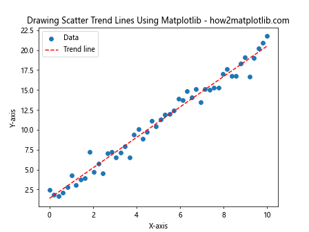
In this example, we’ve created a scatter plot of random data points and added a linear trend line. The np.polyfit() function calculates the coefficients of the trend line, and np.poly1d() creates a polynomial function that we can use to plot the line.
Understanding Scatter Plots in Matplotlib
Before diving deeper into Drawing Scatter Trend Lines Using Matplotlib, it’s essential to understand scatter plots themselves. Scatter plots are two-dimensional plots that use dots to represent the values of two different variables. They are useful for identifying correlations between variables and spotting outliers.
Here’s an example of a basic scatter plot using Matplotlib:
import matplotlib.pyplot as plt
import numpy as np

# Generate sample data
x = np.random.rand(50)
y = np.random.rand(50)

# Create scatter plot
plt.scatter(x, y)

plt.title('Basic Scatter Plot - how2matplotlib.com')
plt.xlabel('X-axis')
plt.ylabel('Y-axis')
plt.show()
Output:
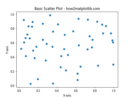
This code creates a simple scatter plot with random data points. You can customize the appearance of the scatter plot by adjusting various parameters:
import matplotlib.pyplot as plt
import numpy as np

# Generate sample data
x = np.random.rand(50)
y = np.random.rand(50)

# Create customized scatter plot
plt.scatter(x, y, c='blue', s=100, alpha=0.5, marker='o')

plt.title('Customized Scatter Plot - how2matplotlib.com')
plt.xlabel('X-axis')
plt.ylabel('Y-axis')
plt.show()
Output:
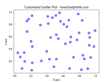
In this example, we’ve customized the color (c), size (s), transparency (alpha), and marker style of the scatter points.
Types of Trend Lines for Drawing Scatter Trend Lines Using Matplotlib
When Drawing Scatter Trend Lines Using Matplotlib, you have several options for the type of trend line to use. The choice depends on the nature of your data and the relationship you want to highlight. Here are some common types of trend lines:
- Linear Trend Lines
- Polynomial Trend Lines
- Exponential Trend Lines
- Logarithmic Trend Lines
Let’s explore each of these types with examples.
Linear Trend Lines
Linear trend lines are the simplest and most common type when Drawing Scatter Trend Lines Using Matplotlib. They work well for data that follows a roughly linear pattern.
import matplotlib.pyplot as plt
import numpy as np

# Generate sample data
x = np.linspace(0, 10, 50)
y = 2 * x + 1 + np.random.randn(50) * 2

# Create scatter plot
plt.scatter(x, y, label='Data')

# Calculate and plot linear trend line
z = np.polyfit(x, y, 1)
p = np.poly1d(z)
plt.plot(x, p(x), "r--", label='Linear Trend')

plt.title('Linear Trend Line - how2matplotlib.com')
plt.xlabel('X-axis')
plt.ylabel('Y-axis')
plt.legend()
plt.show()
Output:
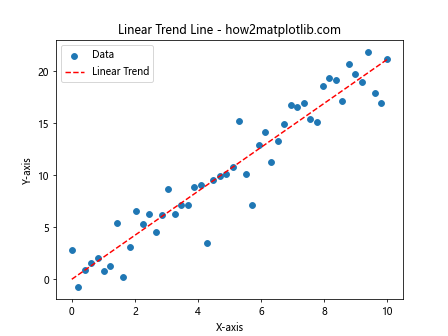
This example demonstrates a linear trend line fitted to scattered data points.
Polynomial Trend Lines
Polynomial trend lines are useful when Drawing Scatter Trend Lines Using Matplotlib for data that fluctuates. They can capture more complex relationships between variables.
import matplotlib.pyplot as plt
import numpy as np

# Generate sample data
x = np.linspace(0, 10, 50)
y = 2 * x**2 - 5 * x + 3 + np.random.randn(50) * 10

# Create scatter plot
plt.scatter(x, y, label='Data')

# Calculate and plot polynomial trend line
z = np.polyfit(x, y, 2)
p = np.poly1d(z)
plt.plot(x, p(x), "r--", label='Polynomial Trend')

plt.title('Polynomial Trend Line - how2matplotlib.com')
plt.xlabel('X-axis')
plt.ylabel('Y-axis')
plt.legend()
plt.show()
Output:
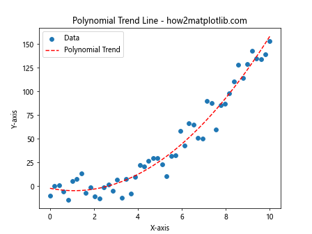
In this example, we’ve fitted a second-degree polynomial trend line to the data.
Exponential Trend Lines
Exponential trend lines are appropriate when Drawing Scatter Trend Lines Using Matplotlib for data that increases or decreases at an increasingly higher rate.
import matplotlib.pyplot as plt
import numpy as np

# Generate sample data
x = np.linspace(0, 5, 50)
y = np.exp(x) + np.random.randn(50) * 10

# Create scatter plot
plt.scatter(x, y, label='Data')

# Calculate and plot exponential trend line
z = np.polyfit(x, np.log(y), 1)
p = np.poly1d(z)
plt.plot(x, np.exp(p(x)), "r--", label='Exponential Trend')

plt.title('Exponential Trend Line - how2matplotlib.com')
plt.xlabel('X-axis')
plt.ylabel('Y-axis')
plt.legend()
plt.show()
Output:
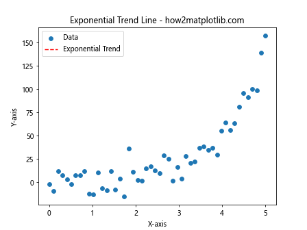
This example shows how to fit an exponential trend line to scattered data points.
Logarithmic Trend Lines
Logarithmic trend lines are useful when Drawing Scatter Trend Lines Using Matplotlib for data that increases or decreases quickly and then levels out.
import matplotlib.pyplot as plt
import numpy as np

# Generate sample data
x = np.linspace(1, 10, 50)
y = np.log(x) * 10 + np.random.randn(50) * 2

# Create scatter plot
plt.scatter(x, y, label='Data')

# Calculate and plot logarithmic trend line
z = np.polyfit(np.log(x), y, 1)
p = np.poly1d(z)
plt.plot(x, p(np.log(x)), "r--", label='Logarithmic Trend')

plt.title('Logarithmic Trend Line - how2matplotlib.com')
plt.xlabel('X-axis')
plt.ylabel('Y-axis')
plt.legend()
plt.show()
Output:
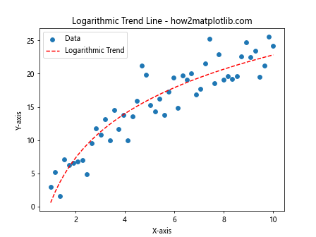
This example demonstrates fitting a logarithmic trend line to scattered data.
Advanced Techniques for Drawing Scatter Trend Lines Using Matplotlib
Now that we’ve covered the basics, let’s explore some advanced techniques for Drawing Scatter Trend Lines Using Matplotlib.
Multiple Trend Lines
Sometimes, you may want to compare different types of trend lines on the same plot:
import matplotlib.pyplot as plt
import numpy as np

# Generate sample data
x = np.linspace(0, 10, 50)
y = 2 * x**2 - 5 * x + 3 + np.random.randn(50) * 10

# Create scatter plot
plt.scatter(x, y, label='Data')

# Linear trend line
z1 = np.polyfit(x, y, 1)
p1 = np.poly1d(z1)
plt.plot(x, p1(x), "r--", label='Linear Trend')

# Polynomial trend line
z2 = np.polyfit(x, y, 2)
p2 = np.poly1d(z2)
plt.plot(x, p2(x), "g--", label='Polynomial Trend')

plt.title('Multiple Trend Lines - how2matplotlib.com')
plt.xlabel('X-axis')
plt.ylabel('Y-axis')
plt.legend()
plt.show()
Output:
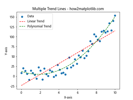
This example shows how to plot both linear and polynomial trend lines on the same scatter plot.
Confidence Intervals
When Drawing Scatter Trend Lines Using Matplotlib, you might want to include confidence intervals to show the uncertainty in your trend line:
import matplotlib.pyplot as plt
import numpy as np
from scipy import stats

# Generate sample data
x = np.linspace(0, 10, 50)
y = 2 * x + 1 + np.random.randn(50) * 2

# Create scatter plot
plt.scatter(x, y, label='Data')

# Calculate trend line
slope, intercept, r_value, p_value, std_err = stats.linregress(x, y)
line = slope * x + intercept
plt.plot(x, line, 'r', label='Trend line')

# Calculate confidence interval
ci = 1.96 * std_err
plt.fill_between(x, line - ci, line + ci, color='r', alpha=0.1, label='95% CI')

plt.title('Trend Line with Confidence Interval - how2matplotlib.com')
plt.xlabel('X-axis')
plt.ylabel('Y-axis')
plt.legend()
plt.show()
Output:
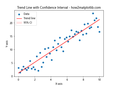
This example demonstrates how to add a 95% confidence interval to your trend line.
Weighted Trend Lines
When Drawing Scatter Trend Lines Using Matplotlib, you might want to give more importance to certain data points:
import matplotlib.pyplot as plt
import numpy as np

# Generate sample data
x = np.linspace(0, 10, 50)
y = 2 * x + 1 + np.random.randn(50) * 2
weights = np.random.rand(50)  # Random weights

# Create scatter plot
plt.scatter(x, y, s=weights*100, alpha=0.5, label='Data')

# Calculate weighted trend line
z = np.polyfit(x, y, 1, w=weights)
p = np.poly1d(z)
plt.plot(x, p(x), "r--", label='Weighted Trend')

plt.title('Weighted Trend Line - how2matplotlib.com')
plt.xlabel('X-axis')
plt.ylabel('Y-axis')
plt.legend()
plt.show()
Output:
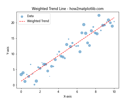
In this example, we’ve used random weights to influence the trend line calculation and the size of the scatter points.
Customizing Your Plots When Drawing Scatter Trend Lines Using Matplotlib
Customization is key to creating effective visualizations when Drawing Scatter Trend Lines Using Matplotlib. Let’s explore some ways to enhance your plots.
Color Schemes
Using appropriate color schemes can make your plots more visually appealing and easier to interpret:
import matplotlib.pyplot as plt
import numpy as np

# Generate sample data
x = np.linspace(0, 10, 50)
y1 = 2 * x + 1 + np.random.randn(50) * 2
y2 = 1.5 * x + 2 + np.random.randn(50) * 2

# Create scatter plot with custom colors
plt.scatter(x, y1, c='skyblue', label='Data Set 1')
plt.scatter(x, y2, c='lightgreen', label='Data Set 2')

# Calculate and plot trend lines
z1 = np.polyfit(x, y1, 1)
p1 = np.poly1d(z1)
plt.plot(x, p1(x), "b--", label='Trend 1')

z2 = np.polyfit(x, y2, 1)
p2 = np.poly1d(z2)
plt.plot(x, p2(x), "g--", label='Trend 2')

plt.title('Custom Color Scheme - how2matplotlib.com')
plt.xlabel('X-axis')
plt.ylabel('Y-axis')
plt.legend()
plt.show()
Output:
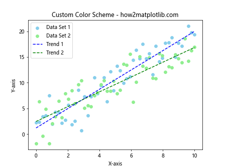
This example uses custom colors for different data sets and their corresponding trend lines.
Adding Annotations
Annotations can provide additional context when Drawing Scatter Trend Lines Using Matplotlib:
import matplotlib.pyplot as plt
import numpy as np

# Generate sample data
x = np.linspace(0, 10, 50)
y = 2 * x + 1 + np.random.randn(50) * 2

# Create scatter plot
plt.scatter(x, y, label='Data')

# Calculate and plot trend line
z = np.polyfit(x, y, 1)
p = np.poly1d(z)
plt.plot(x, p(x), "r--", label='Trend line')

# Add annotation
plt.annotate('Interesting point', xy=(5, p(5)), xytext=(6, 15),
             arrowprops=dict(facecolor='black', shrink=0.05))

plt.title('Annotated Plot - how2matplotlib.com')
plt.xlabel('X-axis')
plt.ylabel('Y-axis')
plt.legend()
plt.show()
Output:
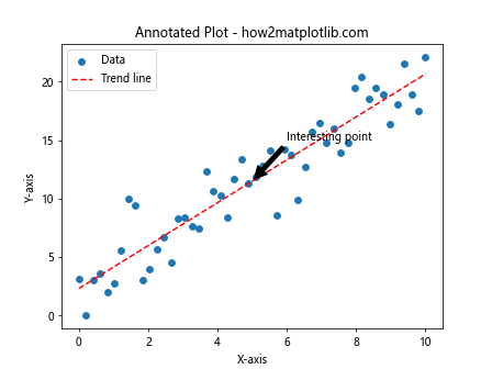
This example adds an annotation to highlight a specific point on the trend line.
Handling Multiple Datasets When Drawing Scatter Trend Lines Using Matplotlib
Often, you’ll need to work with multiple datasets when Drawing Scatter Trend Lines Using Matplotlib. Let’s explore some techniques for handling this scenario.
Subplots
Subplots allow you to create multiple plots within a single figure:
import matplotlib.pyplot as plt
import numpy as np

# Generate sample data
x = np.linspace(0, 10, 50)
y1 = 2 * x + 1 + np.random.randn(50) * 2
y2 = 1.5 * x**2 + np.random.randn(50) * 5

# Create subplots
fig, (ax1, ax2) = plt.subplots(1, 2, figsize=(12, 5))

# First subplot
ax1.scatter(x, y1, label='Data 1')
z1 = np.polyfit(x, y1, 1)
p1 = np.poly1d(z1)
ax1.plot(x, p1(x), "r--", label='Trend 1')
ax1.set_title('Linear Trend - how2matplotlib.com')
ax1.set_xlabel('X-axis')
ax1.set_ylabel('Y-axis')
ax1.legend()

# Second subplot
ax2.scatter(x, y2, label='Data 2')
z2 = np.polyfit(x, y2, 2)
p2 = np.poly1d(z2)
ax2.plot(x, p2(x), "g--", label='Trend 2')
ax2.set_title('Polynomial Trend - how2matplotlib.com')
ax2.set_xlabel('X-axis')
ax2.set_ylabel('Y-axis')
ax2.legend()

plt.tight_layout()
plt.show()
Output:
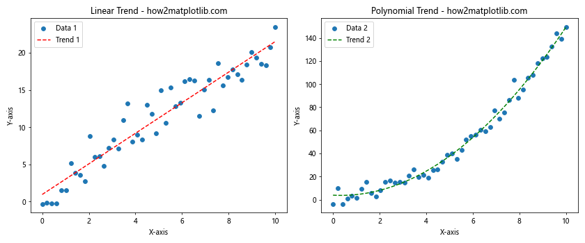
This example creates two subplots, each with its own dataset and trend line.
Overlaying Multiple Datasets
You can also overlay multiple datasets on the same plot:
import matplotlib.pyplot as plt
import numpy as np

# Generate sample data
x = np.linspace(0, 10, 50)
y1 = 2 * x + 1 + np.random.randn(50) * 2
y2 = 1.5 * x + 2 + np.random.randn(50) * 2

# Create scatter plot
plt.scatter(x, y1, label='Data Set 1', alpha=0.5)
plt.scatter(x, y2, label='Data Set 2', alpha=0.5)

# Calculate and plot trend lines
z1 = np.polyfit(x, y1, 1)
p1 = np.poly1d(z1)
plt.plot(x, p1(x), "r--", label='Trend 1')

z2 = np.polyfit(x, y2, 1)
p2 = np.poly1d(z2)
plt.plot(x, p2(x), "g--", label='Trend 2')

plt.title('Multiple Datasets - how2matplotlib.com')
plt.xlabel('X-axis')
plt.ylabel('Y-axis')
plt.legend()
plt.show()
Output:
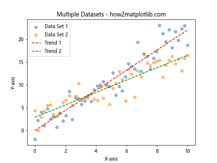
This example overlays two datasets and their respective trend lines on a single plot.
Advanced Visualization Techniques for Drawing Scatter Trend Lines Using Matplotlib
Let’s explore some advanced visualization techniques that can enhance your scatter plots and trend lines.
3D Scatter Plots with Trend Planes
When working with three-dimensional data, you can create 3D scatter plots with trend planes:
import matplotlib.pyplot as plt
import numpy as np
from mpl_toolkits.mplot3d import Axes3D

# Generate sample data
x = np.random.rand(100)
y = np.random.rand(100)
z = 2*x + 3*y + np.random.rand(100)

# Create 3D scatter plot
fig = plt.figure(figsize=(10, 7))
ax = fig.add_subplot(111, projection='3d')
ax.scatter(x, y, z)

# Calculate trend plane
X, Y = np.meshgrid(np.linspace(0, 1, 10), np.linspace(0, 1, 10))
Z = 2*X + 3*Y

# Plot trend plane
ax.plot_surface(X, Y, Z, alpha=0.5)

ax.set_title('3D Scatter Plot with Trend Plane - how2matplotlib.com')
ax.set_xlabel('X-axis')
ax.set_ylabel('Y-axis')
ax.set_zlabel('Z-axis')
plt.show()
Output:
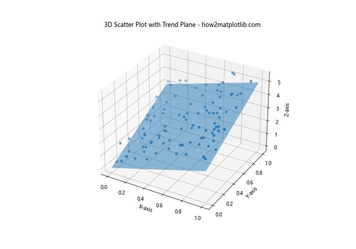
This example creates a 3D scatter plot and adds a trend plane to visualize the relationship between three variables.
Heatmaps with Trend Lines
Heatmaps can be useful for visualizing the density of scatter points along with trend lines:
import matplotlib.pyplot as plt
import numpy as np
from scipy.stats import gaussian_kde

# Generate sample data
x = np.random.randn(1000)
y = 2*x + 1 + np.random.randn(1000)*0.5

# Calculate point density
xy = np.vstack([x,y])
z = gaussian_kde(xy)(xy)

# Sort the points by density
idx = z.argsort()
x, y, z = x[idx], y[idx], z[idx]

# Create scatter plot with color-coded density
plt.scatter(x, y, c=z, s=50, alpha=0.5)

# Calculate and plot trend line
z = np.polyfit(x, y, 1)
p = np.poly1d(z)
plt.plot(x, p(x), "r--", label='Trend line')

plt.title('Heatmap Scatter Plot with Trend Line - how2matplotlib.com')
plt.xlabel('X-axis')
plt.ylabel('Y-axis')
plt.colorbar(label='Point Density')
plt.legend()
plt.show()
Output:
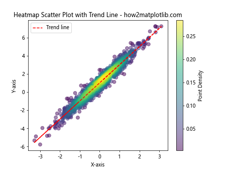
This example creates a heatmap-style scatter plot where the color of each point represents its density, along with a trend line.
Best Practices for Drawing Scatter Trend Lines Using Matplotlib
When Drawing Scatter Trend Lines Using Matplotlib, it’s important to follow some best practices to ensure your visualizations are effective and accurate.
- Choose the appropriate type of trend line for your data.
- Always include a legend to explain what each element in your plot represents.
- Use clear and descriptive titles and axis labels.
- Consider the scale of your axes to avoid misleading representations.
- Use color effectively to distinguish between different datasets or elements.
- Include error bars or confidence intervals when appropriate.
- Be cautious about extrapolating trend lines beyond your data range.
Let’s implement some of these best practices in an example:
import matplotlib.pyplot as plt
import numpy as np
from scipy import stats

# Generate sample data
x = np.linspace(0, 10, 50)
y = 2 * x + 1 + np.random.randn(50) * 2

# Create scatter plot
plt.figure(figsize=(10, 6))
plt.scatter(x, y, label='Data Points', alpha=0.7)

# Calculate trend line
slope, intercept, r_value, p_value, std_err = stats.linregress(x, y)
line = slope * x + intercept
plt.plot(x, line, 'r', label=f'Trend Line (R² = {r_value**2:.2f})')

# Calculate and plot confidence interval
ci = 1.96 * std_err
plt.fill_between(x, line - ci, line + ci, color='r', alpha=0.1, label='95% CI')

plt.title('Scatter Plot with Trend Line and Confidence Interval - how2matplotlib.com')
plt.xlabel('Independent Variable (X)')
plt.ylabel('Dependent Variable (Y)')
plt.legend()
plt.grid(True, linestyle='--', alpha=0.7)

# Add text annotation
plt.text(0.5, 0.95, 'Note: Trend line should not be extrapolated beyond data range',
         transform=plt.gca().transAxes, fontsize=10, verticalalignment='top')

plt.tight_layout()
plt.show()
Output:
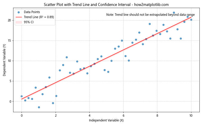
This example incorporates several best practices, including clear labeling, a legend, confidence intervals, and a note about extrapolation.
Troubleshooting Common Issues When Drawing Scatter Trend Lines Using Matplotlib
Even experienced users can encounter issues when Drawing Scatter Trend Lines Using Matplotlib. Here are some common problems and their solutions:
Issue 1: Trend Line Not Visible
If your trend line isn’t visible, it might be because it’s outside the plot range. You can fix this by adjusting the axis limits:
import matplotlib.pyplot as plt
import numpy as np

# Generate sample data
x = np.linspace(0, 10, 50)
y = 100 * x + 1000 + np.random.randn(50) * 200

# Create scatter plot
plt.scatter(x, y, label='Data')

# Calculate and plot trend line
z = np.polyfit(x, y, 1)
p = np.poly1d(z)
plt.plot(x, p(x), "r--", label='Trend line')

# Adjust axis limits
plt.ylim(0, max(y) * 1.1)

plt.title('Adjusted Axis Limits - how2matplotlib.com')
plt.xlabel('X-axis')
plt.ylabel('Y-axis')
plt.legend()
plt.show()
Output:
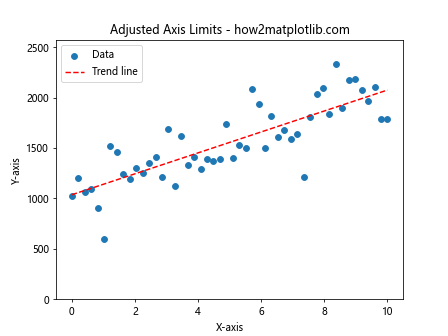
This example adjusts the y-axis limit to ensure the trend line is visible.
Issue 2: Incorrect Trend Line
If your trend line doesn’t seem to fit the data well, you might need to consider a different type of trend line:
import matplotlib.pyplot as plt
import numpy as np

# Generate sample data
x = np.linspace(0, 10, 50)
y = x**2 + np.random.randn(50) * 5

# Create scatter plot
plt.scatter(x, y, label='Data')

# Linear trend line (incorrect)
z1 = np.polyfit(x, y, 1)
p1 = np.poly1d(z1)
plt.plot(x, p1(x), "r--", label='Linear Trend (Incorrect)')

# Quadratic trend line (correct)
z2 = np.polyfit(x, y, 2)
p2 = np.poly1d(z2)
plt.plot(x, p2(x), "g--", label='Quadratic Trend (Correct)')

plt.title('Choosing the Right Trend Line - how2matplotlib.com')
plt.xlabel('X-axis')
plt.ylabel('Y-axis')
plt.legend()
plt.show()
Output:
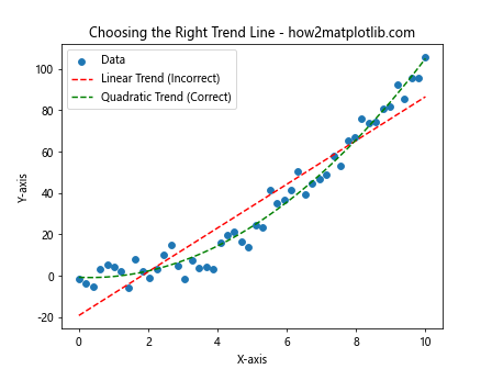
This example shows how a quadratic trend line can be more appropriate for certain datasets.
Conclusion
Drawing Scatter Trend Lines Using Matplotlib is a powerful technique for visualizing and analyzing relationships in your data. We’ve covered a wide range of topics, from basic scatter plots to advanced techniques like 3D visualization and handling multiple datasets. By mastering these skills, you’ll be able to create informative and visually appealing plots that effectively communicate your data insights.
Remember to always consider the nature of your data when choosing the type of trend line, and don’t forget to implement best practices such as proper labeling and legend usage. With practice and experimentation, you’ll become proficient at Drawing Scatter Trend Lines Using Matplotlib, enhancing your data visualization capabilities and improving your ability to extract meaningful insights from your data.