How to Draw a Horizontal Bar Chart with Matplotlib
Draw a horizontal bar chart with Matplotlib is an essential skill for data visualization in Python. Horizontal bar charts are excellent for comparing categories, especially when dealing with long category names or numerous categories. This article will provide a detailed guide on how to draw a horizontal bar chart with Matplotlib, covering various aspects and customization options.
Introduction to Drawing Horizontal Bar Charts with Matplotlib
To draw a horizontal bar chart with Matplotlib, we primarily use the barh() function. This function is specifically designed for creating horizontal bar charts, making it easy to visualize data in a horizontal layout. Let’s start with a basic example to draw a horizontal bar chart with Matplotlib:
import matplotlib.pyplot as plt

categories = ['Category A', 'Category B', 'Category C', 'Category D']
values = [25, 40, 30, 55]

plt.figure(figsize=(10, 6))
plt.barh(categories, values)
plt.title('How to Draw a Horizontal Bar Chart with Matplotlib')
plt.xlabel('Values')
plt.ylabel('Categories')
plt.savefig('how2matplotlib.com_horizontal_bar_chart.png')
plt.show()
Output:
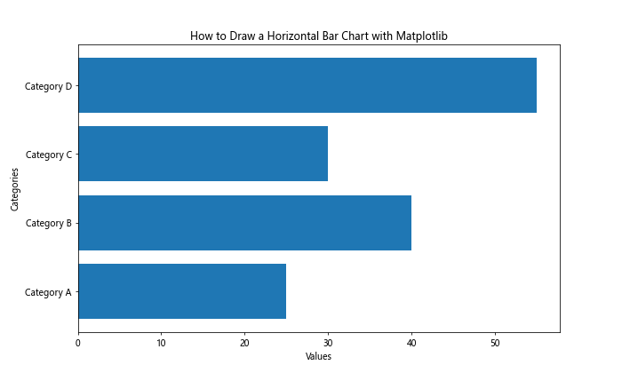
In this example, we import Matplotlib, define our categories and values, create a figure, use plt.barh() to draw the horizontal bar chart, set the title and labels, and finally display the chart. This basic structure forms the foundation for drawing horizontal bar charts with Matplotlib.
Customizing Colors When You Draw a Horizontal Bar Chart with Matplotlib
When you draw a horizontal bar chart with Matplotlib, customizing colors can greatly enhance the visual appeal and readability of your chart. Let’s explore how to customize colors:
import matplotlib.pyplot as plt

categories = ['Product A', 'Product B', 'Product C', 'Product D']
sales = [1500, 1200, 1800, 1000]

plt.figure(figsize=(10, 6))
plt.barh(categories, sales, color=['red', 'green', 'blue', 'orange'])
plt.title('How to Draw a Horizontal Bar Chart with Matplotlib: Sales by Product')
plt.xlabel('Sales ($)')
plt.ylabel('Products')
plt.savefig('how2matplotlib.com_colored_horizontal_bar_chart.png')
plt.show()
Output:
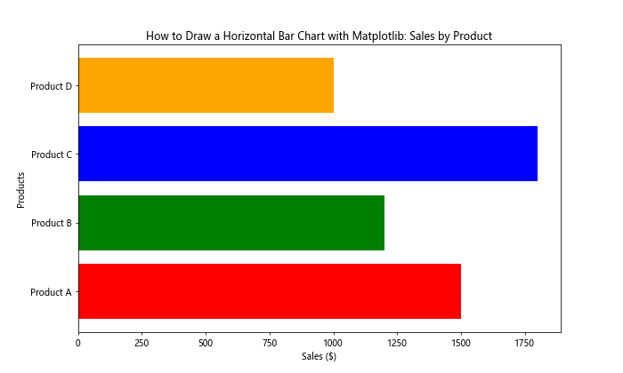
In this example, we use the color parameter in plt.barh() to specify different colors for each bar. You can use color names, hex codes, or RGB tuples to define colors when you draw a horizontal bar chart with Matplotlib.
Adding Labels to Bars When You Draw a Horizontal Bar Chart with Matplotlib
Adding labels to bars can provide additional information directly on the chart. Here’s how to add labels when you draw a horizontal bar chart with Matplotlib:
import matplotlib.pyplot as plt

countries = ['USA', 'China', 'Japan', 'Germany', 'UK']
gdp = [21400, 14300, 5100, 3800, 2700]

fig, ax = plt.subplots(figsize=(12, 6))
bars = ax.barh(countries, gdp, color='skyblue')
ax.set_title('How to Draw a Horizontal Bar Chart with Matplotlib: GDP by Country')
ax.set_xlabel('GDP (Billion $)')
ax.set_ylabel('Countries')

for bar in bars:
    width = bar.get_width()
    ax.text(width, bar.get_y() + bar.get_height()/2, f'${width:,}B',
            ha='left', va='center')

plt.savefig('how2matplotlib.com_labeled_horizontal_bar_chart.png')
plt.show()
Output:
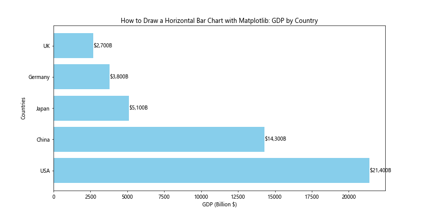
This example demonstrates how to add labels to the end of each bar, showing the GDP value for each country. We use a loop to iterate through the bars and add text annotations.
Sorting Data When You Draw a Horizontal Bar Chart with Matplotlib
Sorting data can make your horizontal bar chart more informative and easier to read. Here’s how to sort data when you draw a horizontal bar chart with Matplotlib:
import matplotlib.pyplot as plt

fruits = ['Apple', 'Banana', 'Orange', 'Mango', 'Pineapple']
sales = [1000, 1500, 800, 1200, 950]

# Sort the data
sorted_data = sorted(zip(sales, fruits), reverse=True)
sorted_sales, sorted_fruits = zip(*sorted_data)

plt.figure(figsize=(10, 6))
plt.barh(sorted_fruits, sorted_sales, color='lightgreen')
plt.title('How to Draw a Horizontal Bar Chart with Matplotlib: Fruit Sales (Sorted)')
plt.xlabel('Sales')
plt.ylabel('Fruits')
plt.savefig('how2matplotlib.com_sorted_horizontal_bar_chart.png')
plt.show()
Output:
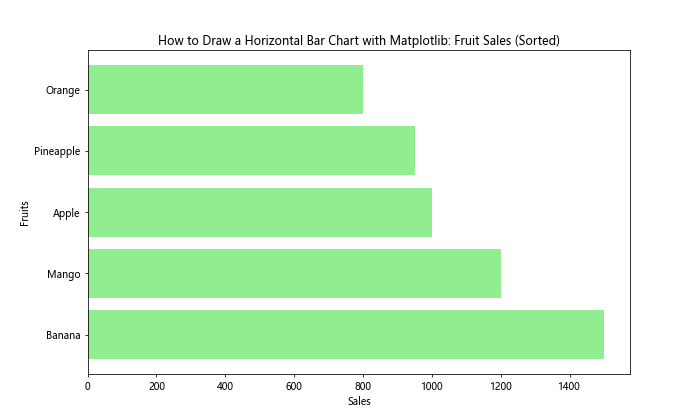
In this example, we use the sorted() function with zip() to sort the data based on sales values before drawing the horizontal bar chart. This results in a chart where the bars are arranged from highest to lowest sales.
Using a Custom Color Palette to Draw a Horizontal Bar Chart with Matplotlib
Creating a custom color palette can give your horizontal bar chart a unique and cohesive look. Here’s how to use a custom color palette when you draw a horizontal bar chart with Matplotlib:
import matplotlib.pyplot as plt
import seaborn as sns

categories = ['Category A', 'Category B', 'Category C', 'Category D', 'Category E']
values = [35, 47, 52, 40, 58]

# Create a custom color palette
custom_palette = sns.color_palette("husl", len(categories))

plt.figure(figsize=(10, 6))
plt.barh(categories, values, color=custom_palette)
plt.title('How to Draw a Horizontal Bar Chart with Matplotlib: Custom Color Palette')
plt.xlabel('Values')
plt.ylabel('Categories')
plt.savefig('how2matplotlib.com_custom_palette_horizontal_bar_chart.png')
plt.show()
Output:
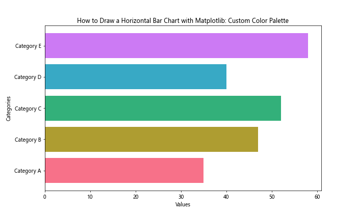
In this example, we use Seaborn’s color_palette() function to create a custom color palette. This allows for more sophisticated color schemes when you draw a horizontal bar chart with Matplotlib.
Adding Error Bars When You Draw a Horizontal Bar Chart with Matplotlib
Error bars can provide information about the variability of your data. Here’s how to add error bars when you draw a horizontal bar chart with Matplotlib:
import matplotlib.pyplot as plt
import numpy as np

products = ['Product A', 'Product B', 'Product C', 'Product D']
sales = [1000, 1200, 900, 1500]
errors = [100, 150, 80, 200]

plt.figure(figsize=(10, 6))
plt.barh(products, sales, xerr=errors, capsize=5, color='lightblue', ecolor='red')
plt.title('How to Draw a Horizontal Bar Chart with Matplotlib: Sales with Error Bars')
plt.xlabel('Sales ($)')
plt.ylabel('Products')
plt.savefig('how2matplotlib.com_error_bars_horizontal_bar_chart.png')
plt.show()
Output:
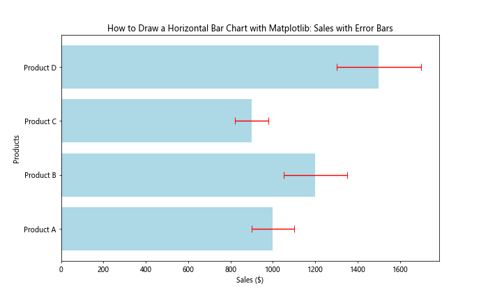
This example shows how to add error bars to your horizontal bar chart using the xerr parameter in plt.barh(). The capsize parameter controls the width of the error bar caps.
Creating Stacked Horizontal Bar Charts with Matplotlib
Stacked horizontal bar charts are useful for showing the composition of different categories. Here’s how to create a stacked horizontal bar chart when you draw a horizontal bar chart with Matplotlib:
import matplotlib.pyplot as plt

categories = ['Category A', 'Category B', 'Category C', 'Category D']
values1 = [20, 35, 30, 25]
values2 = [15, 25, 20, 30]
values3 = [30, 15, 25, 20]

plt.figure(figsize=(10, 6))
plt.barh(categories, values1, label='Group 1')
plt.barh(categories, values2, left=values1, label='Group 2')
plt.barh(categories, values3, left=[i+j for i,j in zip(values1, values2)], label='Group 3')

plt.title('How to Draw a Horizontal Bar Chart with Matplotlib: Stacked Chart')
plt.xlabel('Values')
plt.ylabel('Categories')
plt.legend()
plt.savefig('how2matplotlib.com_stacked_horizontal_bar_chart.png')
plt.show()
Output:
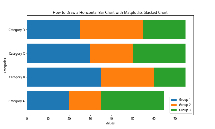
In this example, we use multiple calls to plt.barh() with the left parameter to stack the bars horizontally. This allows you to show multiple data series for each category.
Adding a Secondary Axis When You Draw a Horizontal Bar Chart with Matplotlib
Adding a secondary axis can be useful when you want to display two different scales on the same chart. Here’s how to add a secondary axis when you draw a horizontal bar chart with Matplotlib:
import matplotlib.pyplot as plt

categories = ['Product A', 'Product B', 'Product C', 'Product D']
sales = [1000, 1200, 900, 1500]
profit_margin = [15, 20, 10, 25]

fig, ax1 = plt.subplots(figsize=(12, 6))

ax1.barh(categories, sales, color='skyblue')
ax1.set_xlabel('Sales ($)')
ax1.set_title('How to Draw a Horizontal Bar Chart with Matplotlib: Sales and Profit Margin')

ax2 = ax1.twiny()
ax2.plot(profit_margin, categories, color='red', marker='o')
ax2.set_xlabel('Profit Margin (%)')

plt.savefig('how2matplotlib.com_secondary_axis_horizontal_bar_chart.png')
plt.show()
Output:
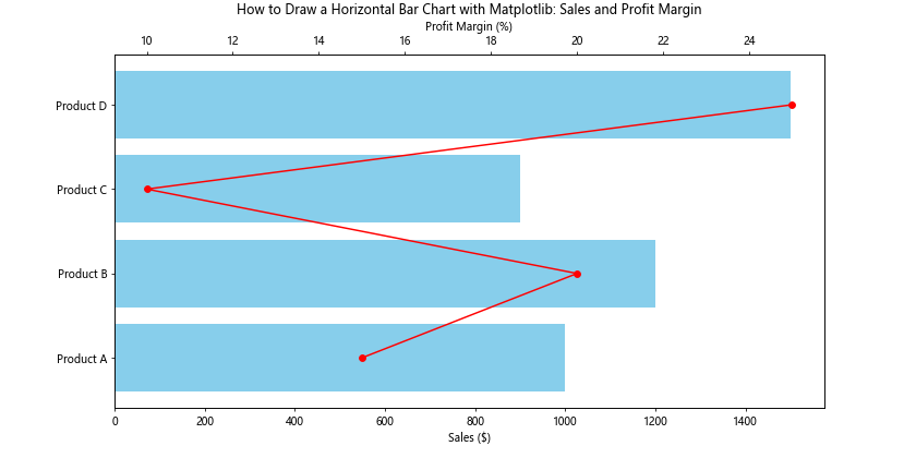
This example demonstrates how to create a horizontal bar chart showing sales, with a secondary axis displaying profit margin as a line plot.
Customizing Bar Width and Spacing When You Draw a Horizontal Bar Chart with Matplotlib
Adjusting bar width and spacing can improve the aesthetics of your horizontal bar chart. Here’s how to customize these aspects:
import matplotlib.pyplot as plt

categories = ['Category A', 'Category B', 'Category C', 'Category D', 'Category E']
values = [30, 45, 60, 35, 50]

plt.figure(figsize=(10, 6))
plt.barh(categories, values, height=0.5, left=5, align='center')
plt.title('How to Draw a Horizontal Bar Chart with Matplotlib: Custom Width and Spacing')
plt.xlabel('Values')
plt.ylabel('Categories')
plt.xlim(0, max(values) + 10)
plt.savefig('how2matplotlib.com_custom_width_spacing_horizontal_bar_chart.png')
plt.show()
Output:
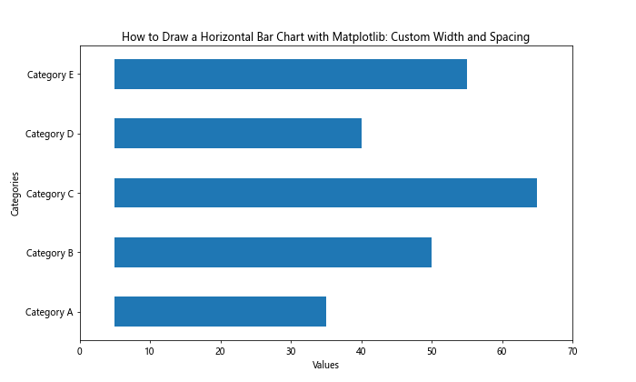
In this example, we use the height parameter to adjust the bar width, left to add spacing from the y-axis, and align to center the bars on their respective y-coordinates.
Adding Data Labels Inside Bars When You Draw a Horizontal Bar Chart with Matplotlib
Placing data labels inside the bars can be an effective way to display values directly on the chart. Here’s how to add data labels inside bars when you draw a horizontal bar chart with Matplotlib:
import matplotlib.pyplot as plt

categories = ['Category A', 'Category B', 'Category C', 'Category D']
values = [75, 120, 90, 150]

fig, ax = plt.subplots(figsize=(10, 6))
bars = ax.barh(categories, values, color='lightgreen')

ax.set_title('How to Draw a Horizontal Bar Chart with Matplotlib: Labels Inside Bars')
ax.set_xlabel('Values')
ax.set_ylabel('Categories')

for bar in bars:
    width = bar.get_width()
    ax.text(width/2, bar.get_y() + bar.get_height()/2, f'{width}',
            ha='center', va='center')

plt.savefig('how2matplotlib.com_labels_inside_bars_horizontal_bar_chart.png')
plt.show()
Output:
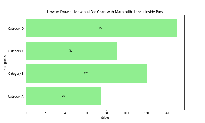
This example shows how to add text labels at the center of each bar, displaying the corresponding value.
Creating Grouped Horizontal Bar Charts with Matplotlib
Grouped horizontal bar charts are useful for comparing multiple categories across different groups. Here’s how to create a grouped horizontal bar chart when you draw a horizontal bar chart with Matplotlib:
import matplotlib.pyplot as plt
import numpy as np

categories = ['Group A', 'Group B', 'Group C', 'Group D']
men_means = [20, 35, 30, 35]
women_means = [25, 32, 34, 20]

x = np.arange(len(categories))
width = 0.35

fig, ax = plt.subplots(figsize=(12, 6))
rects1 = ax.barh(x - width/2, men_means, width, label='Men', color='skyblue')
rects2 = ax.barh(x + width/2, women_means, width, label='Women', color='lightpink')

ax.set_title('How to Draw a Horizontal Bar Chart with Matplotlib: Grouped Chart')
ax.set_xlabel('Values')
ax.set_yticks(x)
ax.set_yticklabels(categories)
ax.legend()

plt.savefig('how2matplotlib.com_grouped_horizontal_bar_chart.png')
plt.show()
Output:
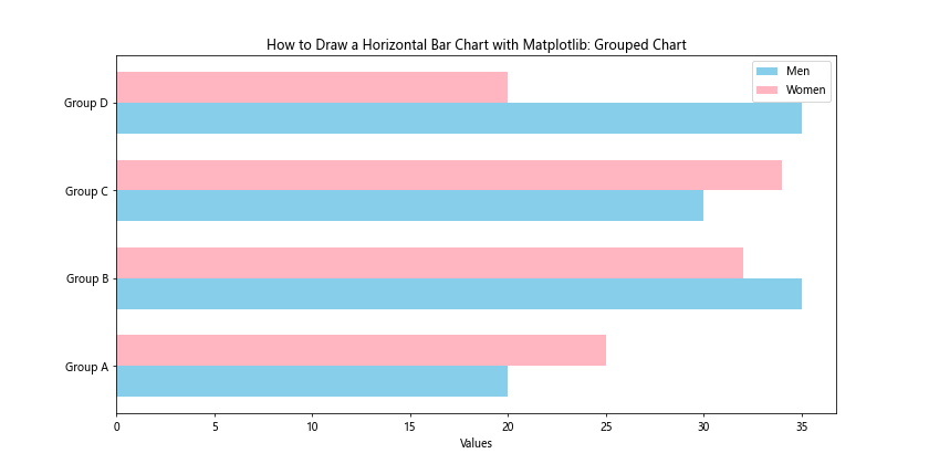
This example demonstrates how to create a grouped horizontal bar chart by adjusting the y-coordinates of the bars for each group.
Adding a Color Gradient When You Draw a Horizontal Bar Chart with Matplotlib
Using a color gradient can add visual interest to your horizontal bar chart and potentially convey additional information. Here’s how to add a color gradient:
import matplotlib.pyplot as plt
import numpy as np

categories = ['Category A', 'Category B', 'Category C', 'Category D', 'Category E']
values = [30, 45, 60, 35, 50]

fig, ax = plt.subplots(figsize=(10, 6))
gradient = plt.cm.Blues(np.linspace(0.3, 1, len(categories)))

bars = ax.barh(categories, values, color=gradient)

ax.set_title('How to Draw a Horizontal Bar Chart with Matplotlib: Color Gradient')
ax.set_xlabel('Values')
ax.set_ylabel('Categories')

plt.savefig('how2matplotlib.com_color_gradient_horizontal_bar_chart.png')
plt.show()
Output:
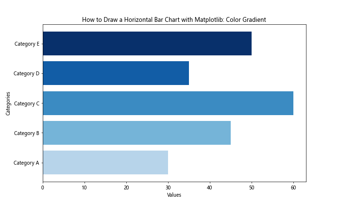
In this example, we use a color map (plt.cm.Blues) to create a gradient effect across the bars.
Creating a Horizontal Bar Chart with Negative Values Using Matplotlib
Horizontal bar charts can also represent negative values, which is useful for showing profits and losses or other comparative data. Here’s how to create a horizontal bar chart with negative values:
import matplotlib.pyplot as plt

categories = ['Product A', 'Product B', 'Product C', 'Product D', 'Product E']
values = [30, -15, 45, -10, 25]

fig, ax = plt.subplots(figsize=(10, 6))
bars = ax.barh(categories, values)

ax.set_title('How to Draw a Horizontal Bar Chart with Matplotlib: Positive and Negative Values')
ax.set_xlabel('Values')
ax.set_ylabel('Categories')
ax.axvline(x=0, color='k', linestyle='-', linewidth=0.5)

for bar in bars:
    width = bar.get_width()
    if width < 0:
        bar.set_color('red')
    else:
        bar.set_color('green')

plt.savefig('how2matplotlib.com_negative_values_horizontal_bar_chart.png')
plt.show()
Output:
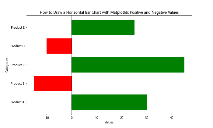
This example shows how to represent both positive and negative values in a horizontal bar chart, with different colors for positive and negative bars.
Adding Annotations to Your Horizontal Bar Chart with Matplotlib
Annotations can provide additional context or highlight specific points in your horizontal bar chart. Here's how to add annotations:
import matplotlib.pyplot as plt

categories = ['Category A', 'Category B', 'Category C', 'Category D', 'Category E']
values = [30, 45, 60, 35, 50]

fig, ax = plt.subplots(figsize=(12, 6))
bars = ax.barh(categories, values, color='lightblue')

ax.set_title('How to Draw a Horizontal Bar Chart with Matplotlib: With Annotations')
ax.set_xlabel('Values')
ax.set_ylabel('Categories')

# Adding annotations
ax.annotate('Highest Value', xy=(60, 2), xytext=(70, 2.5),
            arrowprops=dict(facecolor='black', shrink=0.05))

ax.annotate('Lowest Value', xy=(30, 0), xytext=(20, -0.5),
            arrowprops=dict(facecolor='black', shrink=0.05))

plt.savefig('how2matplotlib.com_annotated_horizontal_bar_chart.png')
plt.show()
Output:
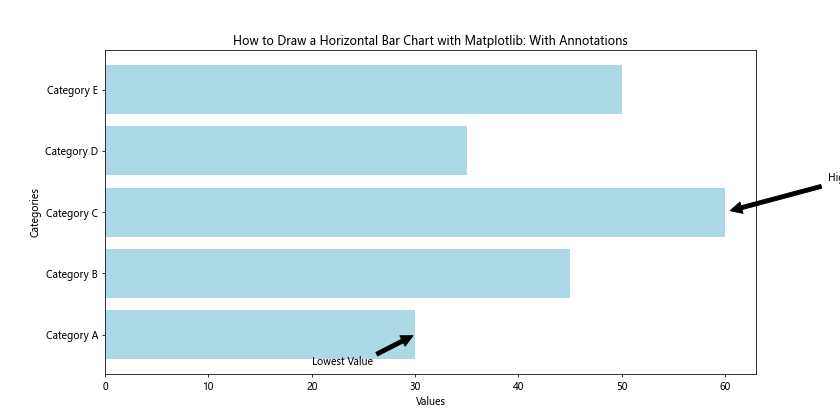
This example demonstrates how to add annotations to your horizontal bar chart, pointing out specific features or data points of interest.
Creating a Horizontal Bar Chart with Subplots Using Matplotlib
Sometimes, you may want to create multiple horizontal bar charts side by side for comparison. Here's how to create a horizontal bar chart with subplots:
import matplotlib.pyplot as plt

categories = ['Category A', 'Category B', 'Category C', 'Category D']
values1 = [30, 45, 60, 35]
values2 = [40, 55, 45, 50]

fig, (ax1, ax2) = plt.subplots(1, 2, figsize=(15, 6))

ax1.barh(categories, values1, color='skyblue')
ax1.set_title('How to Draw a Horizontal Bar Chart with Matplotlib: Subplot 1')
ax1.set_xlabel('Values')
ax1.set_ylabel('Categories')

ax2.barh(categories, values2, color='lightgreen')
ax2.set_title('How to Draw a Horizontal Bar Chart with Matplotlib: Subplot 2')
ax2.set_xlabel('Values')
ax2.set_ylabel('Categories')

plt.tight_layout()
plt.savefig('how2matplotlib.com_subplots_horizontal_bar_chart.png')
plt.show()
Output:
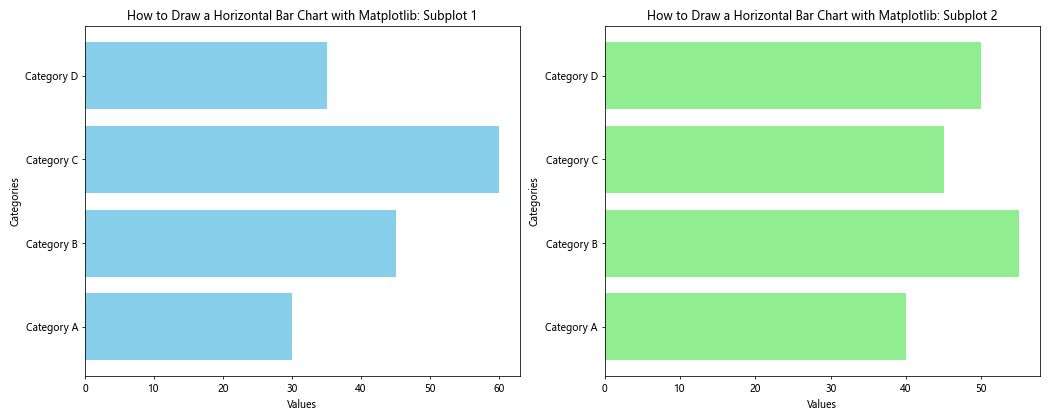
This example shows how to create two horizontal bar charts side by side using subplots, allowing for easy comparison between two sets of data.
Adding a Logarithmic Scale When You Draw a Horizontal Bar Chart with Matplotlib
When dealing with data that spans several orders of magnitude, a logarithmic scale can be useful. Here's how to add a logarithmic scale when you draw a horizontal bar chart with Matplotlib:
import matplotlib.pyplot as plt
import numpy as np

categories = ['Category A', 'Category B', 'Category C', 'Category D', 'Category E']
values = [100, 1000, 10000, 100000, 1000000]

fig, ax = plt.subplots(figsize=(10, 6))
ax.barh(categories, values, color='purple')

ax.set_title('How to Draw a Horizontal Bar Chart with Matplotlib: Logarithmic Scale')
ax.set_xlabel('Values (log scale)')
ax.set_ylabel('Categories')
ax.set_xscale('log')

plt.savefig('how2matplotlib.com_logarithmic_horizontal_bar_chart.png')
plt.show()
Output:
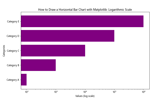
This example demonstrates how to use a logarithmic scale on the x-axis, which is particularly useful for data with large variations in magnitude.
Conclusion: Mastering How to Draw a Horizontal Bar Chart with Matplotlib
Throughout this comprehensive guide, we've explored numerous aspects of how to draw a horizontal bar chart with Matplotlib. From basic charts to more complex visualizations with custom colors, labels, error bars, and various other features, you now have a solid foundation for creating informative and visually appealing horizontal bar charts.
Remember, the key to effective data visualization is not just in the technical implementation, but also in choosing the right type of chart for your data and audience. Horizontal bar charts are particularly useful when you have:
- Categorical data with long labels
- A large number of categories to compare
- Data that benefits from a left-to-right reading direction