How to Create a Stunning Donut Chart using Matplotlib in Python
Donut Chart using Matplotlib in Python is a powerful visualization technique that allows you to represent data in a circular format with a hole in the center. This article will provide an in-depth exploration of creating donut charts using Matplotlib, one of the most popular data visualization libraries in Python. We’ll cover everything from basic donut charts to advanced customization techniques, ensuring you have all the tools necessary to create visually appealing and informative donut charts for your data analysis projects.
Understanding Donut Charts and Their Importance
Before diving into the technical aspects of creating a donut chart using Matplotlib in Python, it’s essential to understand what donut charts are and why they are valuable in data visualization. A donut chart, also known as a doughnut chart, is a variation of the pie chart with a hollow center. This chart type is particularly useful for displaying the relative proportions of different categories within a dataset.
Donut charts using Matplotlib in Python offer several advantages over traditional pie charts:
- Improved readability: The hollow center allows for additional information or labels to be placed inside the chart.
- Better comparison: The ring shape makes it easier to compare the sizes of different segments.
- Aesthetic appeal: Donut charts often have a more modern and visually pleasing appearance.
Let’s start with a basic example of creating a donut chart using Matplotlib in Python:
import matplotlib.pyplot as plt

# Data for the donut chart
sizes = [30, 20, 25, 15, 10]
labels = ['A', 'B', 'C', 'D', 'E']

# Create a figure and axis
fig, ax = plt.subplots()

# Create the donut chart
ax.pie(sizes, labels=labels, autopct='%1.1f%%', startangle=90, wedgeprops=dict(width=0.3))

# Add a title
ax.set_title('Basic Donut Chart using Matplotlib in Python - how2matplotlib.com')

# Equal aspect ratio ensures that pie is drawn as a circle
ax.axis('equal')

plt.show()
Output:
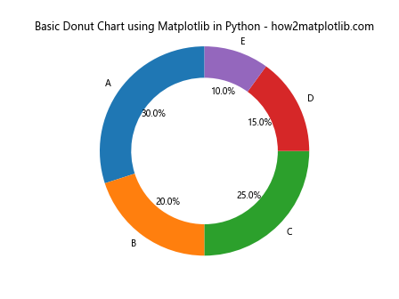
In this example, we create a simple donut chart using Matplotlib in Python. The pie() function is used to create the chart, and we set the wedgeprops parameter to include a width value, which creates the donut hole. The autopct parameter adds percentage labels to each segment.
Customizing Colors in Donut Charts
One of the key aspects of creating visually appealing donut charts using Matplotlib in Python is color customization. Matplotlib offers a wide range of color options and palettes that you can use to enhance your donut charts. Let’s explore how to customize colors in your donut charts:
import matplotlib.pyplot as plt

# Data for the donut chart
sizes = [30, 20, 25, 15, 10]
labels = ['A', 'B', 'C', 'D', 'E']

# Custom colors
colors = ['#ff9999', '#66b3ff', '#99ff99', '#ffcc99', '#ff99cc']

# Create a figure and axis
fig, ax = plt.subplots()

# Create the donut chart with custom colors
ax.pie(sizes, labels=labels, colors=colors, autopct='%1.1f%%', startangle=90, wedgeprops=dict(width=0.3))

# Add a title
ax.set_title('Donut Chart with Custom Colors using Matplotlib in Python - how2matplotlib.com')

# Equal aspect ratio ensures that pie is drawn as a circle
ax.axis('equal')

plt.show()
Output:
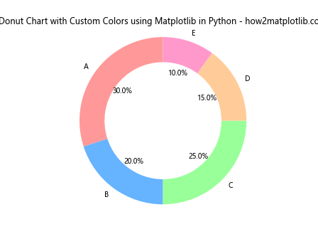
In this example, we define a custom color palette using hexadecimal color codes. By passing the colors parameter to the pie() function, we can apply these custom colors to our donut chart using Matplotlib in Python.
Adding Labels and Legends to Donut Charts
To make your donut charts more informative, it’s important to add clear labels and legends. Matplotlib provides various options for adding and customizing labels and legends in your donut charts. Let’s explore how to enhance our donut chart with these elements:
import matplotlib.pyplot as plt

# Data for the donut chart
sizes = [30, 20, 25, 15, 10]
labels = ['Category A', 'Category B', 'Category C', 'Category D', 'Category E']

# Create a figure and axis
fig, ax = plt.subplots()

# Create the donut chart
wedges, texts, autotexts = ax.pie(sizes, labels=labels, autopct='%1.1f%%', startangle=90, wedgeprops=dict(width=0.3))

# Add a title
ax.set_title('Donut Chart with Labels and Legend using Matplotlib in Python - how2matplotlib.com')

# Add a legend
ax.legend(wedges, labels, title="Categories", loc="center left", bbox_to_anchor=(1, 0, 0.5, 1))

# Equal aspect ratio ensures that pie is drawn as a circle
ax.axis('equal')

plt.show()
Output:
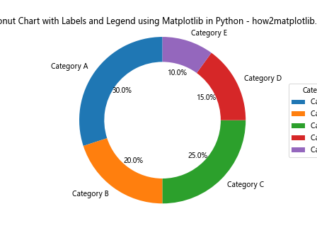
In this example, we add labels to each segment of the donut chart and include a legend. The legend() function is used to create the legend, and we position it to the right of the chart using the bbox_to_anchor parameter.
Creating Nested Donut Charts
Nested donut charts, also known as multi-level donut charts, are an advanced variation of donut charts that allow you to display hierarchical data. These charts consist of multiple rings, each representing a different level of data. Let’s explore how to create a nested donut chart using Matplotlib in Python:
import matplotlib.pyplot as plt
import numpy as np

# Data for the nested donut chart
sizes_outer = [30, 20, 25, 15, 10]
sizes_inner = [15, 10, 12, 8, 5]
labels_outer = ['A', 'B', 'C', 'D', 'E']
labels_inner = ['A1', 'B1', 'C1', 'D1', 'E1']

# Create a figure and axis
fig, ax = plt.subplots()

# Create the outer donut
ax.pie(sizes_outer, labels=labels_outer, radius=1, wedgeprops=dict(width=0.3, edgecolor='white'))

# Create the inner donut
ax.pie(sizes_inner, labels=labels_inner, radius=0.7, wedgeprops=dict(width=0.3, edgecolor='white'))

# Add a title
ax.set_title('Nested Donut Chart using Matplotlib in Python - how2matplotlib.com')

# Equal aspect ratio ensures that pie is drawn as a circle
ax.axis('equal')

plt.show()
Output:
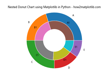
In this example, we create two separate pie charts with different radii to achieve the nested donut effect. The outer ring represents the main categories, while the inner ring shows subcategories or additional details.
Animating Donut Charts
Adding animation to your donut charts can make them more engaging and help highlight changes in data over time. Matplotlib provides animation capabilities that you can use to create dynamic donut charts. Let’s explore how to create an animated donut chart:
import matplotlib.pyplot as plt
import matplotlib.animation as animation
import numpy as np

# Function to update the chart
def update_chart(num):
    ax.clear()
    sizes = [30 + num, 20 - num, 25, 15, 10]
    ax.pie(sizes, labels=['A', 'B', 'C', 'D', 'E'], autopct='%1.1f%%', startangle=90, wedgeprops=dict(width=0.3))
    ax.set_title(f'Animated Donut Chart using Matplotlib in Python - Frame {num} - how2matplotlib.com')
    ax.axis('equal')

# Create a figure and axis
fig, ax = plt.subplots()

# Create the animation
ani = animation.FuncAnimation(fig, update_chart, frames=range(10), repeat=True, interval=500)

plt.show()
Output:
In this example, we use Matplotlib’s animation module to create a dynamic donut chart. The update_chart() function is called for each frame of the animation, updating the sizes of the chart segments.
Creating Exploded Donut Charts
Exploded donut charts are a variation where one or more segments are separated from the main body of the chart. This technique is useful for emphasizing specific categories. Let’s see how to create an exploded donut chart using Matplotlib in Python:
import matplotlib.pyplot as plt

# Data for the donut chart
sizes = [30, 20, 25, 15, 10]
labels = ['A', 'B', 'C', 'D', 'E']
explode = (0, 0.1, 0, 0, 0)  # Explode the second slice

# Create a figure and axis
fig, ax = plt.subplots()

# Create the exploded donut chart
ax.pie(sizes, labels=labels, explode=explode, autopct='%1.1f%%', startangle=90, wedgeprops=dict(width=0.3))

# Add a title
ax.set_title('Exploded Donut Chart using Matplotlib in Python - how2matplotlib.com')

# Equal aspect ratio ensures that pie is drawn as a circle
ax.axis('equal')

plt.show()
Output:
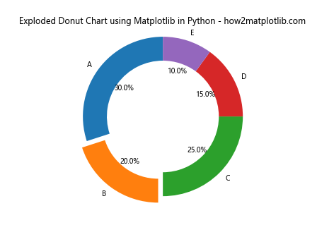
In this example, we use the explode parameter to separate the second slice from the main body of the donut chart. You can adjust the values in the explode tuple to control which slices are exploded and by how much.
Creating Multiple Donut Charts in a Single Figure
When comparing different datasets or time periods, it can be useful to display multiple donut charts side by side. Matplotlib allows you to create subplots, which is perfect for this purpose. Let’s see how to create multiple donut charts in a single figure:
import matplotlib.pyplot as plt

# Data for the donut charts
sizes1 = [30, 20, 25, 15, 10]
sizes2 = [25, 22, 18, 20, 15]
labels = ['A', 'B', 'C', 'D', 'E']

# Create a figure with two subplots
fig, (ax1, ax2) = plt.subplots(1, 2, figsize=(12, 6))

# Create the first donut chart
ax1.pie(sizes1, labels=labels, autopct='%1.1f%%', startangle=90, wedgeprops=dict(width=0.3))
ax1.set_title('Donut Chart 1 - how2matplotlib.com')

# Create the second donut chart
ax2.pie(sizes2, labels=labels, autopct='%1.1f%%', startangle=90, wedgeprops=dict(width=0.3))
ax2.set_title('Donut Chart 2 - how2matplotlib.com')

# Add a main title
fig.suptitle('Multiple Donut Charts using Matplotlib in Python', fontsize=16)

# Equal aspect ratio ensures that pie is drawn as a circle
ax1.axis('equal')
ax2.axis('equal')

plt.tight_layout()
plt.show()
Output:
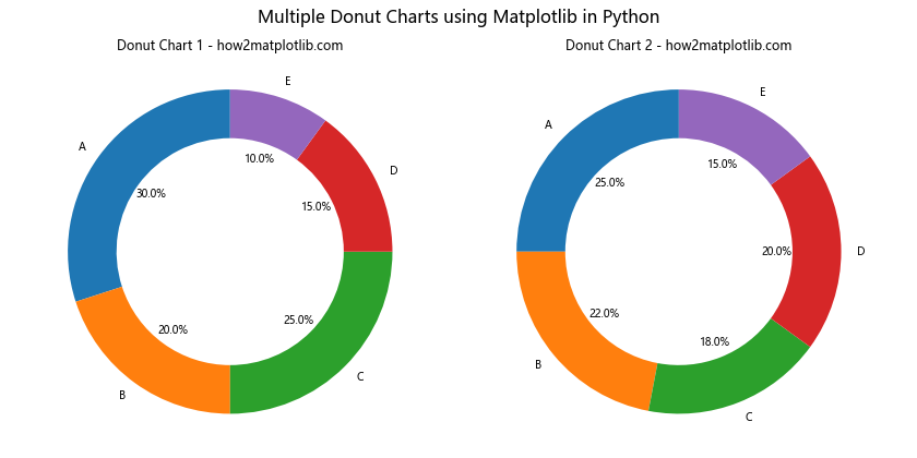
In this example, we create two subplots using plt.subplots() and create a donut chart in each subplot. This allows for easy comparison between two datasets or time periods.
Combining Donut Charts with Other Plot Types
Donut charts can be combined with other plot types to create more complex visualizations. For example, you might want to display a donut chart alongside a bar chart or line graph. Let’s explore how to create a combination plot:
import matplotlib.pyplot as plt
import numpy as np

# Data for the donut chart
sizes = [30, 20, 25, 15, 10]
labels = ['A', 'B', 'C', 'D', 'E']

# Data for the bar chart
categories = ['Category 1', 'Category 2', 'Category 3', 'Category 4']
values = [40, 55, 30, 45]

# Create a figure with two subplots
fig, (ax1, ax2) = plt.subplots(1, 2, figsize=(15, 6))

# Create the donut chart
ax1.pie(sizes, labels=labels, autopct='%1.1f%%', startangle=90, wedgeprops=dict(width=0.3))
ax1.set_title('Donut Chart - how2matplotlib.com')

# Create the bar chart
ax2.bar(categories, values)
ax2.set_title('Bar Chart - how2matplotlib.com')
ax2.set_ylabel('Values')

# Add a main title
fig.suptitle('Combining Donut Chart with Bar Chart using Matplotlib in Python', fontsize=16)

# Adjust layout and display
plt.tight_layout()
plt.show()
Output:
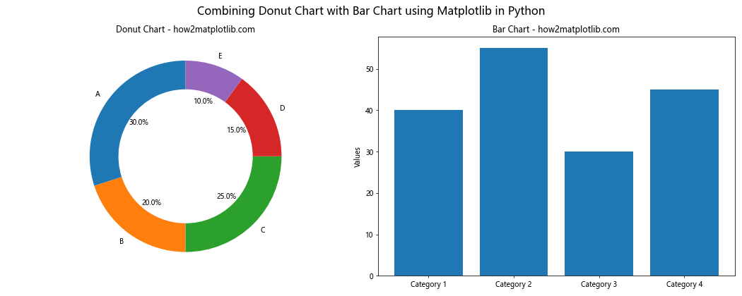
This example demonstrates how to create a figure with both a donut chart and a bar chart side by side, allowing for a more comprehensive data visualization.
Creating 3D Donut Charts
While traditional donut charts are 2D, Matplotlib also supports 3D plotting, allowing you to create 3D donut charts for a unique visual effect. Here’s an example of how to create a 3D donut chart:
import matplotlib.pyplot as plt
import numpy as np
from mpl_toolkits.mplot3d import Axes3D

# Data for the 3D donut chart
sizes = [30, 20, 25, 15, 10]
labels = ['A', 'B', 'C', 'D', 'E']
colors = plt.cm.Pastel1(np.arange(len(sizes)))

# Create a figure and 3D axis
fig = plt.figure(figsize=(10, 8))
ax = fig.add_subplot(111, projection='3d')

# Create the 3D donut chart
start_angle = 0
for i, (size, label, color) in enumerate(zip(sizes, labels, colors)):
    end_angle = start_angle + size/sum(sizes) * 2 * np.pi

    theta = np.linspace(start_angle, end_angle, 100)
    x = np.cos(theta)
    y = np.sin(theta)
    z = np.ones_like(theta) * 0.5

    ax.plot(x, y, z, color=color, linewidth=50)

    mid_angle = (start_angle + end_angle) / 2
    ax.text(np.cos(mid_angle)*1.2, np.sin(mid_angle)*1.2, 0.5, label, ha='center', va='center')

    start_angle = end_angle

# Customize the 3D view
ax.set_xlim(-1.5, 1.5)
ax.set_ylim(-1.5, 1.5)
ax.set_zlim(0, 1)
ax.set_axis_off()

# Add a title
plt.title('3D Donut Chart using Matplotlib in Python - how2matplotlib.com', fontsize=16)

plt.show()
Output:
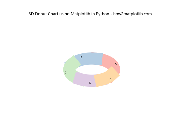
This example creates a 3D donut chart by plotting segments on a 3D axis. The result is a visually striking representation of the data that can be rotated and viewed from different angles.
Handling Large Datasets in Donut Charts
When dealing with large datasets, donut charts can become cluttered and difficult to read. One solution is to group smaller categories together into an “Other” category. Here’s an example of how to handle large datasets in donut charts:
import matplotlib.pyplot as plt

# Large dataset
sizes = [30, 20, 15, 10, 8, 7, 5, 3, 2]
labels = ['A', 'B', 'C', 'D', 'E', 'F', 'G', 'H', 'I']

# Threshold for grouping
threshold = 5

# Group small categories
other_sum = sum(size for size in sizes if size < threshold)
grouped_sizes = [size for size in sizes if size >= threshold] + [other_sum]
grouped_labels = [label for size, label in zip(sizes, labels) if size >= threshold] + ['Other']

# Create a figure and axis
fig, ax = plt.subplots()

# Create the donut chart
wedges, texts, autotexts = ax.pie(grouped_sizes, labels=grouped_labels, autopct='%1.1f%%', startangle=90, wedgeprops=dict(width=0.3))

# Add a title
ax.set_title('Donut Chart with Grouped Categories using Matplotlib in Python - how2matplotlib.com')

# Equal aspect ratio ensures that pie is drawn as a circle
ax.axis('equal')

plt.show()
Output:
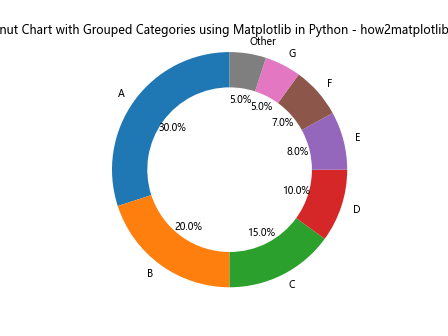
In this example, we group all categories with sizes below a certain threshold into an “Other” category, making the chart more readable for large datasets.
Creating Gradient-Filled Donut Charts
To add a more visually appealing effect to your donut charts, you can use gradient fills for the segments. While Matplotlib doesn’t have built-in support for gradient fills in pie charts, we can achieve this effect using a workaround with RadialGradient. Here’s an example:
import matplotlib.pyplot as plt
import matplotlib.colors as mcolors
import numpy as np

def gradient_fill(ax, x, y, fill_color, alpha=0.3, ax_circle=None):
    r = np.sqrt(x**2 + y**2)
    center = ax.transData.transform((0, 0))
    gradient = mcolors.LinearSegmentedColormap.from_list("", ["w", fill_color])
    if ax_circle is None:
        ax_circle = ax
    im = ax_circle.imshow(np.array([[1]]), extent=[-1.2, 1.2, -1.2, 1.2],
                          cmap=gradient, alpha=alpha, aspect='equal',
                          zorder=0, transform=ax.transData)
    im.set_clip_path(ax_circle.patch)
    return im

# Data for the donut chart
sizes = [30, 20, 25, 15, 10]
labels = ['A', 'B', 'C', 'D', 'E']
colors = ['#ff9999', '#66b3ff', '#99ff99', '#ffcc99', '#ff99cc']

# Create a figure and axis
fig, ax = plt.subplots(figsize=(10, 8))

# Create the donut chart
wedges, texts, autotexts = ax.pie(sizes, labels=labels, colors=colors, autopct='%1.1f%%', startangle=90,
                                  wedgeprops=dict(width=0.3, edgecolor='white'))

# Add gradient fill to each wedge
for wedge in wedges:
    gradient_fill(ax, *wedge.center, wedge.get_facecolor())

# Add a title
ax.set_title('Gradient-Filled Donut Chart using Matplotlib in Python - how2matplotlib.com', fontsize=16)

# Equal aspect ratio ensures that pie is drawn as a circle
ax.axis('equal')

plt.show()
Output:
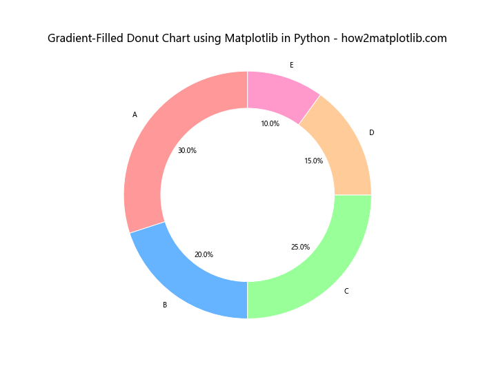
This example creates a donut chart with gradient-filled segments, giving it a more polished and professional look.
Conclusion
In this comprehensive guide, we’ve explored various aspects of creating donut charts using Matplotlib in Python. From basic charts to advanced customization techniques, we’ve covered a wide range of topics to help you create visually appealing and informative donut charts for your data visualization needs.
Donut charts using Matplotlib in Python offer a flexible and powerful way to represent proportional data. By leveraging Matplotlib’s extensive features and customization options, you can create charts that not only convey information effectively but also look visually stunning.