How to Customize Minor Ticks in Matplotlib: A Comprehensive Guide to Turning on Minor Ticks Only on the Y-Axis
Customizing minor ticks in Matplotlib, particularly turning on minor ticks only on the Y-axis, is a crucial skill for data visualization enthusiasts. This article will delve deep into the intricacies of minor tick customization in Matplotlib, focusing on the specific task of enabling minor ticks exclusively on the Y-axis. We’ll explore various techniques, provide numerous examples, and offer insights into best practices for achieving precise control over your plot’s appearance.
Understanding Minor Ticks in Matplotlib
Before we dive into the specifics of customizing minor ticks and turning them on only for the Y-axis, let’s first understand what minor ticks are in Matplotlib. Minor ticks are smaller tick marks that appear between the major ticks on a plot’s axes. They provide additional granularity and can help readers interpret data more accurately.
In Matplotlib, minor ticks are disabled by default. However, they can be easily enabled and customized to enhance the readability and aesthetics of your plots. When it comes to turning on minor ticks only on the Y-axis, Matplotlib offers several approaches, which we’ll explore in detail throughout this article.
Controlling Minor Tick Density
Sometimes, you might want to control the number of minor ticks that appear between major ticks. Matplotlib’s MultipleLocator class allows you to specify the interval between minor ticks. Here’s an example:
import matplotlib.pyplot as plt
import numpy as np
from matplotlib.ticker import MultipleLocator

# Generate sample data
x = np.linspace(0, 10, 100)
y = np.log(x + 1)

# Create the plot
fig, ax = plt.subplots(figsize=(10, 6))
ax.plot(x, y, label='Logarithmic Growth')

# Turn on minor ticks for Y-axis only with custom interval
ax.yaxis.set_minor_locator(MultipleLocator(0.1))

# Customize the plot
ax.set_title('Logarithmic Growth with Controlled Y-Axis Minor Ticks - how2matplotlib.com')
ax.set_xlabel('X-axis')
ax.set_ylabel('Y-axis')
ax.legend()
ax.grid(True, which='both', linestyle='--', alpha=0.7)

plt.show()
Output:
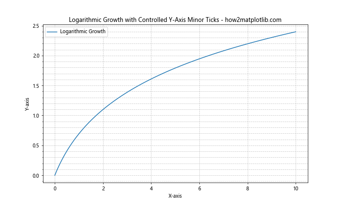
In this example, we’ve used MultipleLocator(0.1) to set minor ticks at intervals of 0.1 units on the Y-axis. This gives you precise control over the density of minor ticks, allowing you to balance between providing sufficient detail and avoiding clutter.
Combining Major and Minor Tick Customization
While our focus is on customizing minor ticks on the Y-axis, it’s often useful to consider how they interact with major ticks. Let’s look at an example where we customize both major and minor ticks on the Y-axis:
import matplotlib.pyplot as plt
import numpy as np
from matplotlib.ticker import MultipleLocator, FormatStrFormatter

# Generate sample data
x = np.linspace(0, 10, 100)
y = x**2

# Create the plot
fig, ax = plt.subplots(figsize=(10, 6))
ax.plot(x, y, label='Quadratic Function')

# Customize major ticks on Y-axis
ax.yaxis.set_major_locator(MultipleLocator(20))
ax.yaxis.set_major_formatter(FormatStrFormatter('%d'))

# Turn on and customize minor ticks for Y-axis only
ax.yaxis.set_minor_locator(MultipleLocator(5))

# Customize tick appearance
ax.tick_params(axis='y', which='major', length=10, width=2, color='b')
ax.tick_params(axis='y', which='minor', length=5, width=1, color='r')

# Customize the plot
ax.set_title('Quadratic Function with Customized Y-Axis Ticks - how2matplotlib.com')
ax.set_xlabel('X-axis')
ax.set_ylabel('Y-axis')
ax.legend()
ax.grid(True, which='both', linestyle=':', alpha=0.7)

plt.show()
Output:
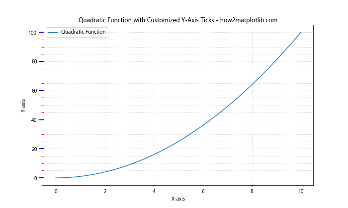
In this example, we’ve customized both major and minor ticks on the Y-axis. Major ticks are set at intervals of 20 units and formatted as integers, while minor ticks are set at intervals of 5 units. We’ve also given them different colors and sizes to distinguish them clearly.
Logarithmic Scales and Minor Ticks
When dealing with data that spans multiple orders of magnitude, logarithmic scales can be very useful. Customizing minor ticks on a logarithmic Y-axis requires a slightly different approach. Let’s see how we can achieve this:
import matplotlib.pyplot as plt
import numpy as np

# Generate sample data
x = np.linspace(1, 1000, 100)
y = x**2

# Create the plot
fig, ax = plt.subplots(figsize=(10, 6))
ax.plot(x, y, label='Power Function')

# Set Y-axis to log scale
ax.set_yscale('log')

# Turn on minor ticks for Y-axis only
ax.yaxis.set_minor_locator(plt.LogLocator(subs=np.arange(2, 10)))

# Customize tick appearance
ax.tick_params(axis='y', which='minor', length=4, width=1, color='g')

# Customize the plot
ax.set_title('Power Function with Logarithmic Y-Axis and Minor Ticks - how2matplotlib.com')
ax.set_xlabel('X-axis')
ax.set_ylabel('Y-axis (log scale)')
ax.legend()
ax.grid(True, which='both', linestyle=':', alpha=0.7)

plt.show()
Output:
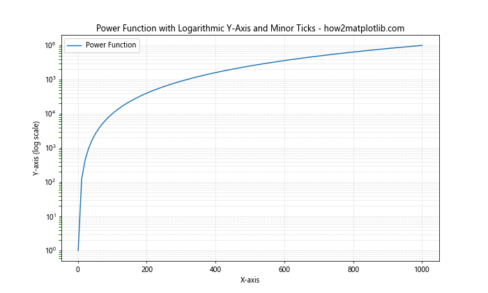
In this example, we’ve set the Y-axis to a logarithmic scale using set_yscale('log'). We then use LogLocator to place minor ticks at positions between the major tick marks. The subs parameter specifies where these minor ticks should appear within each order of magnitude.
Customizing Minor Tick Labels
While minor ticks are typically unlabeled, there might be scenarios where you want to add labels to them, especially on the Y-axis. Here’s how you can achieve this:
import matplotlib.pyplot as plt
import numpy as np
from matplotlib.ticker import AutoMinorLocator, FuncFormatter

# Generate sample data
x = np.linspace(0, 10, 100)
y = np.sin(x) * np.exp(-x/10)

# Create the plot
fig, ax = plt.subplots(figsize=(10, 6))
ax.plot(x, y, label='Damped Sine Wave')

# Turn on minor ticks for Y-axis only
ax.yaxis.set_minor_locator(AutoMinorLocator(2))

# Function to format minor tick labels
def minor_tick_formatter(x, pos):
    return f'{x:.2f}'

# Set minor tick formatter
ax.yaxis.set_minor_formatter(FuncFormatter(minor_tick_formatter))

# Customize tick appearance
ax.tick_params(axis='y', which='minor', length=4, width=1, labelsize=8)

# Customize the plot
ax.set_title('Damped Sine Wave with Labeled Y-Axis Minor Ticks - how2matplotlib.com')
ax.set_xlabel('X-axis')
ax.set_ylabel('Y-axis')
ax.legend()
ax.grid(True, which='both', linestyle=':', alpha=0.7)

plt.show()
Output:
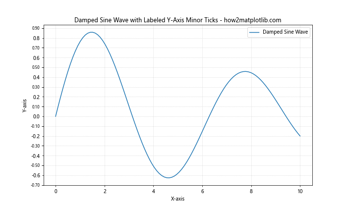
In this example, we’ve added labels to the minor ticks on the Y-axis. We’ve defined a custom formatter function minor_tick_formatter that formats the tick values to two decimal places. The FuncFormatter is then used to apply this formatting to the minor tick labels.
Selective Minor Tick Placement
Sometimes, you might want to place minor ticks only in certain regions of your plot. Matplotlib allows for this level of customization. Here’s an example of how to achieve selective minor tick placement on the Y-axis:
import matplotlib.pyplot as plt
import numpy as np
from matplotlib.ticker import MultipleLocator

# Generate sample data
x = np.linspace(0, 10, 100)
y = np.exp(x/2)

# Create the plot
fig, ax = plt.subplots(figsize=(10, 6))
ax.plot(x, y, label='Exponential Growth')

# Custom function to place minor ticks
def custom_minor_locator(min_val, max_val):
    if min_val < 50:
        return MultipleLocator(5)
    elif 50 <= min_val < 500:
        return MultipleLocator(50)
    else:
        return MultipleLocator(500)

# Turn on minor ticks for Y-axis only with custom placement
ax.yaxis.set_minor_locator(custom_minor_locator(ax.get_ylim()[0], ax.get_ylim()[1]))

# Customize the plot
ax.set_title('Exponential Growth with Selective Y-Axis Minor Ticks - how2matplotlib.com')
ax.set_xlabel('X-axis')
ax.set_ylabel('Y-axis')
ax.legend()
ax.grid(True, which='both', linestyle=':', alpha=0.7)

plt.show()
Output:
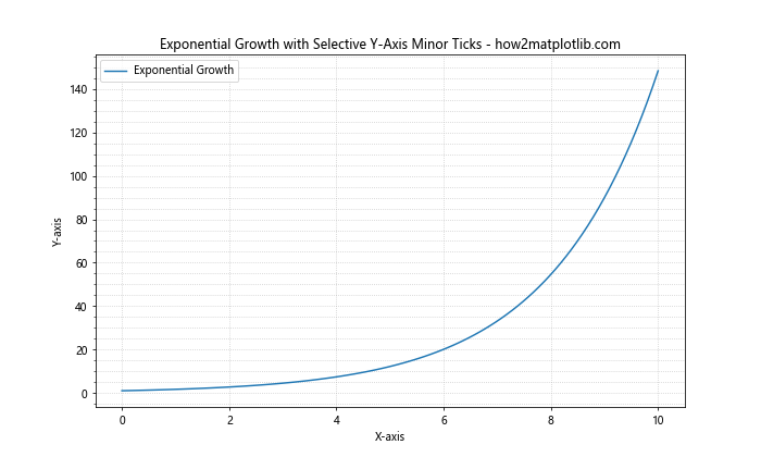
In this example, we've defined a custom function custom_minor_locator that returns different MultipleLocator instances based on the range of Y-values. This allows us to have denser minor ticks for smaller Y-values and sparser minor ticks for larger Y-values, adapting to the exponential nature of the data.
Combining Minor Ticks with Other Axis Customizations
When customizing minor ticks on the Y-axis, you might want to combine this with other axis customizations for a more polished look. Let's explore an example that incorporates several axis customization techniques:
import matplotlib.pyplot as plt
import numpy as np
from matplotlib.ticker import AutoMinorLocator, MultipleLocator

# Generate sample data
x = np.linspace(0, 10, 100)
y = np.sin(x) * x

# Create the plot
fig, ax = plt.subplots(figsize=(10, 6))
ax.plot(x, y, label='Modulated Sine Wave')

# Customize Y-axis
ax.yaxis.set_major_locator(MultipleLocator(2))
ax.yaxis.set_minor_locator(AutoMinorLocator(4))
ax.set_ylim(-10, 10)

# Add spines
ax.spines['left'].set_position(('data', 0))
ax.spines['bottom'].set_position(('data', 0))
ax.spines['top'].set_visible(False)
ax.spines['right'].set_visible(False)

# Customize tick appearance
ax.tick_params(axis='y', which='major', length=10, width=2, color='b', direction='inout')
ax.tick_params(axis='y', which='minor', length=5, width=1, color='r', direction='in')

# Customize the plot
ax.set_title('Modulated Sine Wave with Customized Y-Axis - how2matplotlib.com')
ax.set_xlabel('X-axis')
ax.set_ylabel('Y-axis')
ax.legend(loc='upper left')
ax.grid(True, which='both', linestyle=':', alpha=0.7)

plt.show()
Output:
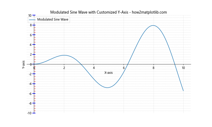
In this example, we've combined several customizations:
- We've set major ticks at intervals of 2 and minor ticks with 4 subdivisions between each major tick on the Y-axis.
- We've positioned the X and Y axes to intersect at (0, 0) and removed the top and right spines.
- We've customized the appearance of both major and minor ticks, giving them different colors, lengths, and directions.
This combination of customizations results in a clean, professional-looking plot with emphasis on the Y-axis minor ticks.
Customizing Minor Ticks in 3D Plots
While we've focused primarily on 2D plots, it's worth noting that you can also customize minor ticks on the Y-axis of 3D plots. Here's an example:
import matplotlib.pyplot as plt
import numpy as np
from mpl_toolkits.mplot3d import Axes3D
from matplotlib.ticker import AutoMinorLocator

# Generate sample data
x = np.linspace(-5, 5, 100)
y = np.linspace(-5, 5, 100)
X, Y = np.meshgrid(x, y)
Z = np.sin(np.sqrt(X**2 + Y**2))

# Create the 3D plot
fig = plt.figure(figsize=(10, 8))
ax = fig.add_subplot(111, projection='3d')
surf = ax.plot_surface(X, Y, Z, cmap='viridis')

# Turn on minor ticks for Y-axis only
ax.yaxis.set_minor_locator(AutoMinorLocator())

# Customize tick appearance
ax.tick_params(axis='y', which='minor', length=4, width=1, color='r')

# Customize the plot
ax.set_title('3D Surface Plot with Y-Axis Minor Ticks - how2matplotlib.com')
ax.set_xlabel('X-axis')
ax.set_ylabel('Y-axis')
ax.set_zlabel('Z-axis')

plt.show()
Output:
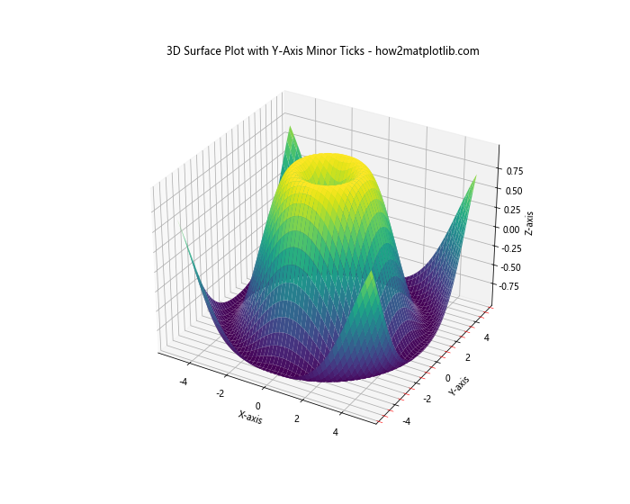
In this 3D plot example, we've added minor ticks to the Y-axis using the AutoMinorLocator(). This demonstrates that the principles of customizing minor ticks apply to 3D plots as well, allowing for consistent styling across different types of visualizations.
Handling Categorical Y-Axis
Sometimes, you might have categorical data on your Y-axis. While minor ticks are less common in such scenarios, you can still use them to add visual separation between categories. Here's an example:
import matplotlib.pyplot as plt
import numpy as np

# Generate sample data
categories = ['Category A', 'Category B', 'Category C', 'Category D', 'Category E']
values = np.random.rand(5) * 100

# Create the plot
fig, ax = plt.subplots(figsize=(10, 6))
ax.barh(categories, values)

# Turn on minor ticks for Y-axis only
ax.yaxis.set_minor_locator(plt.MultipleLocator(0.5))

# Customize tick appearance
ax.tick_params(axis='y', which='minor', length=4, width=1, color='r')

# Customize the plot
ax.set_title('Categorical Plot with Y-Axis Minor Ticks - how2matplotlib.com')
ax.set_xlabel('Values')
ax.set_ylabel('Categories')
ax.grid(True, axis='x', linestyle=':', alpha=0.7)

plt.show()
Output:
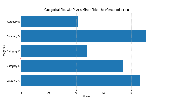
In this example, we've added minor ticks between the categorical labels on the Y-axis. While they don't correspond to specific data points, they can help visually separate the categories and improve the overall aesthetics of the plot.
Customizing Minor Ticks in Subplots
When working with multiple subplots, you might want to customize minor ticks consistently across all plots or differently for each subplot. Here's an example demonstrating both approaches:
import matplotlib.pyplot as plt
import numpy as np
from matplotlib.ticker import AutoMinorLocator, MultipleLocator

# Generate sample data
x = np.linspace(0, 10, 100)
y1 = np.sin(x)
y2 = np.cos(x)
y3 = np.tan(x)
y4 = x**2

# Create the subplots
fig, ((ax1, ax2), (ax3, ax4)) = plt.subplots(2, 2, figsize=(12, 10))
axes = [ax1, ax2, ax3, ax4]

# Plot data
ax1.plot(x, y1, label='Sine')
ax2.plot(x, y2, label='Cosine')
ax3.plot(x, y3, label='Tangent')
ax4.plot(x, y4, label='Quadratic')

# Customize Y-axis minor ticks for each subplot
ax1.yaxis.set_minor_locator(AutoMinorLocator())
ax2.yaxis.set_minor_locator(MultipleLocator(0.1))
ax3.yaxis.set_minor_locator(AutoMinorLocator(5))
ax4.yaxis.set_minor_locator(MultipleLocator(5))

# General customization for all subplots
for ax in axes:
    ax.tick_params(axis='y', which='minor', length=4, width=1, color='r')
    ax.set_xlabel('X-axis')
    ax.set_ylabel('Y-axis')
    ax.legend()
    ax.grid(True, which='both', linestyle=':', alpha=0.7)

# Customize titles
ax1.set_title('Sine Wave - how2matplotlib.com')
ax2.set_title('Cosine Wave - how2matplotlib.com')
ax3.set_title('Tangent Function - how2matplotlib.com')
ax4.set_title('Quadratic Function - how2matplotlib.com')

plt.tight_layout()
plt.show()
Output:
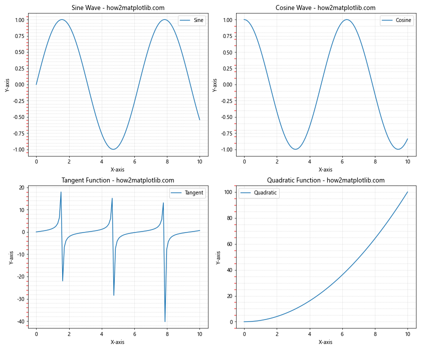
In this example, we've created four subplots, each with a different function plotted. We've customized the Y-axis minor ticks differently for each subplot to demonstrate various approaches:
- The sine wave uses
AutoMinorLocator()for automatic minor tick placement. - The cosine wave uses
MultipleLocator(0.1)for fixed interval minor ticks. - The tangent function uses
AutoMinorLocator(5)for automatic placement with 5 subdivisions. - The quadratic function uses
MultipleLocator(5)for wider-spaced minor ticks.
This approach allows you to tailor the minor tick placement to the specific characteristics of each dataset while maintaining a consistent overall style.
Conclusion
Customizing minor ticks in Matplotlib, particularly turning them on only for the Y-axis, is a powerful technique for enhancing the readability and aesthetics of your plots.