How to Master Customizing Heatmap Colors with Matplotlib
Customizing heatmap colors with Matplotlib is an essential skill for data visualization enthusiasts and professionals alike. This article will delve deep into the various techniques and methods for customizing heatmap colors using Matplotlib, providing you with a comprehensive understanding of this powerful feature. We’ll explore different color schemes, color mapping techniques, and advanced customization options to help you create stunning and informative heatmaps that effectively communicate your data.
Understanding the Basics of Heatmap Colors in Matplotlib
Before we dive into customizing heatmap colors with Matplotlib, it’s crucial to understand the fundamentals. A heatmap is a graphical representation of data where individual values are represented as colors. Matplotlib provides powerful tools for creating and customizing heatmaps, allowing you to tailor the color scheme to best represent your data.
Let’s start with a basic example of creating a heatmap using Matplotlib:
import matplotlib.pyplot as plt
import numpy as np

# Generate sample data
data = np.random.rand(10, 10)

# Create a heatmap
plt.imshow(data, cmap='viridis')
plt.colorbar()
plt.title('Basic Heatmap - how2matplotlib.com')
plt.show()
Output:
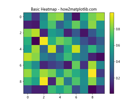
In this example, we’re using the imshow() function to create a heatmap from random data. The cmap parameter is set to ‘viridis’, which is one of Matplotlib’s default color maps. This gives us a basic heatmap with a color scheme ranging from dark blue to yellow.
Exploring Built-in Color Maps for Customizing Heatmap Colors
Matplotlib offers a wide range of built-in color maps that you can use for customizing heatmap colors. These color maps are designed to represent data effectively and can be easily applied to your heatmaps. Let’s explore some popular color maps:
import matplotlib.pyplot as plt
import numpy as np

# Generate sample data
data = np.random.rand(10, 10)

# Create a list of color maps to explore
cmaps = ['viridis', 'plasma', 'inferno', 'magma', 'cividis']

# Create subplots for each color map
fig, axes = plt.subplots(2, 3, figsize=(15, 10))
fig.suptitle('Exploring Color Maps - how2matplotlib.com', fontsize=16)

for i, cmap in enumerate(cmaps):
    ax = axes[i // 3, i % 3]
    im = ax.imshow(data, cmap=cmap)
    ax.set_title(cmap)
    plt.colorbar(im, ax=ax)

plt.tight_layout()
plt.show()
Output:
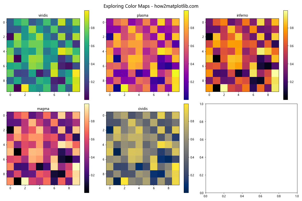
This example demonstrates how to create multiple heatmaps using different built-in color maps. We’re using a loop to iterate through a list of color maps and create a subplot for each one. This allows us to compare and contrast different color schemes for customizing heatmap colors with Matplotlib.
Creating Custom Color Maps for Heatmaps
While Matplotlib’s built-in color maps are versatile, you may sometimes need to create custom color maps to better represent your data or match your visualization style. Customizing heatmap colors with Matplotlib allows you to create unique color schemes tailored to your specific needs.
Here’s an example of how to create a custom color map:
import matplotlib.pyplot as plt
import matplotlib.colors as colors
import numpy as np

# Generate sample data
data = np.random.rand(10, 10)

# Define custom colors
colors_list = ['#ff0000', '#00ff00', '#0000ff']  # Red, Green, Blue

# Create a custom color map
custom_cmap = colors.LinearSegmentedColormap.from_list('custom', colors_list)

# Create a heatmap with the custom color map
plt.imshow(data, cmap=custom_cmap)
plt.colorbar()
plt.title('Custom Color Map Heatmap - how2matplotlib.com')
plt.show()
Output:
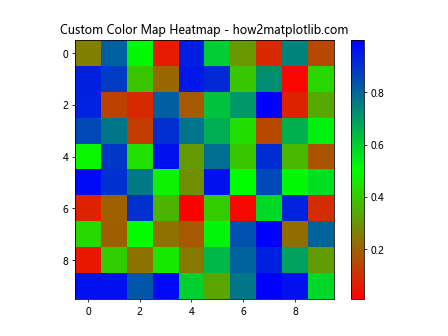
In this example, we’re creating a custom color map using the LinearSegmentedColormap.from_list() function. We define a list of colors (in this case, red, green, and blue) and use them to create a custom color map. This allows for greater flexibility in customizing heatmap colors with Matplotlib.
Adjusting Color Map Ranges for Better Visualization
When customizing heatmap colors with Matplotlib, it’s often necessary to adjust the color map range to better represent your data. This can help highlight specific ranges or patterns in your data. Let’s explore how to adjust color map ranges:
import matplotlib.pyplot as plt
import numpy as np

# Generate sample data
data = np.random.normal(0, 1, (10, 10))

# Create a heatmap with adjusted color map range
plt.imshow(data, cmap='coolwarm', vmin=-2, vmax=2)
plt.colorbar()
plt.title('Adjusted Color Map Range - how2matplotlib.com')
plt.show()
Output:
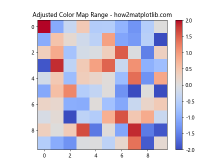
In this example, we’re using the vmin and vmax parameters to set the minimum and maximum values for the color map. This ensures that the color range is centered around zero and extends from -2 to 2, which can be useful for visualizing data with both positive and negative values.
Applying Discrete Color Maps for Categorical Data
Sometimes, you may need to represent categorical data in a heatmap. In such cases, using a discrete color map can be more appropriate. Let’s see how to apply a discrete color map when customizing heatmap colors with Matplotlib:
import matplotlib.pyplot as plt
import numpy as np

# Generate sample categorical data
data = np.random.randint(0, 5, (10, 10))

# Create a discrete color map
discrete_cmap = plt.cm.get_cmap('Set3', 5)

# Create a heatmap with the discrete color map
plt.imshow(data, cmap=discrete_cmap)
plt.colorbar(ticks=range(5))
plt.title('Discrete Color Map Heatmap - how2matplotlib.com')
plt.show()
Output:
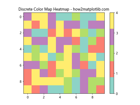
In this example, we’re using the get_cmap() function to create a discrete color map with 5 distinct colors. The imshow() function then applies this discrete color map to our categorical data, resulting in a heatmap where each category is represented by a unique color.
Customizing Heatmap Colors with Normalization
Normalization is a powerful technique for customizing heatmap colors with Matplotlib. It allows you to transform your data values to a standard range, which can be particularly useful when dealing with data that has outliers or skewed distributions. Let’s explore how to use normalization:
import matplotlib.pyplot as plt
import matplotlib.colors as colors
import numpy as np

# Generate sample data with outliers
data = np.random.normal(0, 1, (10, 10))
data[0, 0] = 10  # Add an outlier

# Create a logarithmic normalization
norm = colors.LogNorm(vmin=data.min(), vmax=data.max())

# Create a heatmap with logarithmic normalization
plt.imshow(data, cmap='viridis', norm=norm)
plt.colorbar()
plt.title('Heatmap with Logarithmic Normalization - how2matplotlib.com')
plt.show()
In this example, we’re using LogNorm to apply logarithmic normalization to our data. This helps to compress the color scale, making it easier to visualize data with a wide range of values or outliers.
Creating Diverging Color Maps for Bipolar Data
When working with data that has both positive and negative values, or data that diverges from a central point, using a diverging color map can be effective. Let’s see how to create and apply a diverging color map when customizing heatmap colors with Matplotlib:
import matplotlib.pyplot as plt
import numpy as np

# Generate sample bipolar data
data = np.random.normal(0, 1, (10, 10))

# Create a diverging color map
diverging_cmap = plt.cm.RdYlBu_r

# Create a heatmap with the diverging color map
plt.imshow(data, cmap=diverging_cmap)
plt.colorbar()
plt.title('Diverging Color Map Heatmap - how2matplotlib.com')
plt.show()
Output:
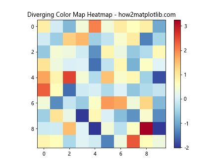
In this example, we’re using the RdYlBu_r color map, which is a reversed Red-Yellow-Blue diverging color map. This type of color map is particularly effective for visualizing data that diverges from a central point, with one color representing positive values and another representing negative values.
Enhancing Heatmaps with Annotations
Adding annotations to your heatmap can provide additional context and make the visualization more informative. Let’s explore how to add text annotations when customizing heatmap colors with Matplotlib:
import matplotlib.pyplot as plt
import numpy as np

# Generate sample data
data = np.random.randint(0, 100, (5, 5))

# Create a heatmap with annotations
fig, ax = plt.subplots()
im = ax.imshow(data, cmap='YlOrRd')

# Add colorbar
cbar = ax.figure.colorbar(im, ax=ax)
cbar.ax.set_ylabel('Value', rotation=-90, va="bottom")

# Add text annotations
for i in range(5):
    for j in range(5):
        text = ax.text(j, i, data[i, j], ha="center", va="center", color="black")

ax.set_title('Annotated Heatmap - how2matplotlib.com')
plt.show()
Output:
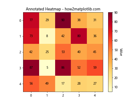
In this example, we’re adding text annotations to each cell in the heatmap. The text color is set to black for visibility, but you could adjust this based on the background color of each cell for better contrast.
Customizing Heatmap Colors with Transparency
Adding transparency to your heatmap colors can be useful when you want to overlay the heatmap on another plot or image. Let’s see how to incorporate transparency when customizing heatmap colors with Matplotlib:
import matplotlib.pyplot as plt
import numpy as np

# Generate sample data
data = np.random.rand(10, 10)

# Create a heatmap with transparency
plt.imshow(data, cmap='viridis', alpha=0.7)
plt.colorbar()
plt.title('Transparent Heatmap - how2matplotlib.com')
plt.show()
Output:
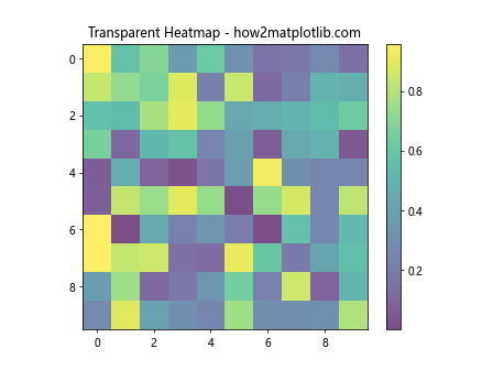
In this example, we’re using the alpha parameter to set the transparency of the heatmap. An alpha value of 0.7 means the heatmap is 70% opaque. This can be particularly useful when you want to show underlying patterns or combine multiple layers of information in your visualization.
Creating Masked Heatmaps for Incomplete Data
When dealing with incomplete or masked data, you may want to represent missing values differently in your heatmap. Matplotlib provides tools for creating masked heatmaps. Let’s explore how to do this:
import matplotlib.pyplot as plt
import numpy as np
import numpy.ma as ma

# Generate sample data with some masked values
data = np.random.rand(10, 10)
mask = np.random.choice([0, 1], data.shape, p=[0.8, 0.2])
masked_data = ma.masked_array(data, mask)

# Create a masked heatmap
plt.imshow(masked_data, cmap='viridis', interpolation='nearest')
plt.colorbar()
plt.title('Masked Heatmap - how2matplotlib.com')
plt.show()
Output:
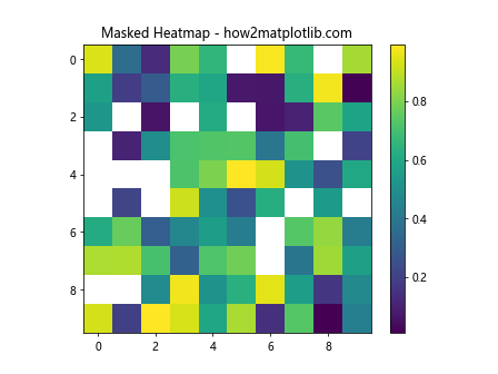
In this example, we’re creating a masked array where some values are randomly masked. The imshow() function automatically handles the masked values, typically representing them as white or transparent cells in the heatmap.
Customizing Heatmap Colors with Contour Lines
Adding contour lines to your heatmap can help emphasize patterns and transitions in your data. Let’s see how to combine contour lines with a heatmap when customizing heatmap colors with Matplotlib:
import matplotlib.pyplot as plt
import numpy as np

# Generate sample data
x = np.linspace(-3, 3, 100)
y = np.linspace(-3, 3, 100)
X, Y = np.meshgrid(x, y)
Z = np.sin(X) * np.cos(Y)

# Create a heatmap with contour lines
plt.imshow(Z, extent=[-3, 3, -3, 3], origin='lower', cmap='RdBu_r', alpha=0.5)
plt.colorbar()
plt.contour(X, Y, Z, colors='black', alpha=0.5)
plt.title('Heatmap with Contour Lines - how2matplotlib.com')
plt.show()
Output:
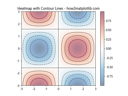
In this example, we’re using imshow() to create the heatmap and contour() to add contour lines. The alpha parameter is used to make both the heatmap and contour lines semi-transparent, allowing for better visibility of both elements.
Creating 3D Surface Plots from Heatmap Data
While not strictly a heatmap, creating a 3D surface plot from your heatmap data can provide an alternative perspective on your data. Let’s see how to create a 3D surface plot when customizing heatmap colors with Matplotlib:
import matplotlib.pyplot as plt
import numpy as np
from mpl_toolkits.mplot3d import Axes3D

# Generate sample data
x = np.linspace(-3, 3, 100)
y = np.linspace(-3, 3, 100)
X, Y = np.meshgrid(x, y)
Z = np.sin(X) * np.cos(Y)

# Create a 3D surface plot
fig = plt.figure()
ax = fig.add_subplot(111, projection='3d')
surf = ax.plot_surface(X, Y, Z, cmap='viridis')
fig.colorbar(surf)
ax.set_title('3D Surface Plot - how2matplotlib.com')
plt.show()
Output:
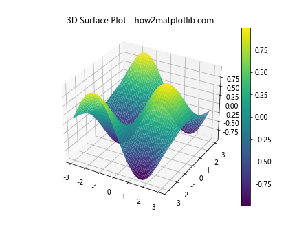
In this example, we’re using plot_surface() to create a 3D surface plot from our data. The color map is applied to the surface, creating a 3D representation of the heatmap data.
Customizing Heatmap Colors with Multiple Color Maps
Sometimes, you may want to use different color maps for different ranges of your data. This can be achieved by creating a custom color map that combines multiple existing color maps. Let’s see how to do this:
import matplotlib.pyplot as plt
import matplotlib.colors as colors
import numpy as np

# Generate sample data
data = np.random.normal(0, 1, (10, 10))

# Create a custom color map combining two existing color maps
cmap1 = plt.cm.Blues_r
cmap2 = plt.cm.Reds
colors1 = cmap1(np.linspace(0., 1, 128))
colors2 = cmap2(np.linspace(0, 1, 128))
colors_combined = np.vstack((colors1, colors2))
custom_cmap = colors.LinearSegmentedColormap.from_list('custom', colors_combined)

# Create a heatmap with the custom combined color map
plt.imshow(data, cmap=custom_cmap)
plt.colorbar()
plt.title('Heatmap with Combined Color Maps - how2matplotlib.com')
plt.show()
Output:
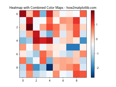
In this example, we’re creating a custom color map that combines the reversed Blues color map for negative values and the Reds color map for positive values. This results in a heatmap where negative values are represented by shades of blue and positive values by shades of red.
Customizing Heatmap Colors with Logarithmic Color Scales
When dealing with data that spans several orders of magnitude, using a logarithmic color scale can be beneficial. Let’s explore how to implement a logarithmic color scale when customizing heatmap colors with Matplotlib:
import matplotlib.pyplot as plt
import numpy as np

# Generate sample data with exponential distribution
data = np.random.exponential(1, (10, 10))

# Create a heatmap with logarithmic color scale
plt.imshow(data, cmap='viridis', norm=plt.LogNorm())plt.colorbar()
plt.title('Heatmap with Logarithmic Color Scale - how2matplotlib.com')
plt.show()
In this example, we’re using plt.LogNorm() to apply a logarithmic normalization to the color scale. This is particularly useful for data with a wide range of values, as it allows smaller values to be more easily distinguished.
Customizing Heatmap Colors for Correlation Matrices
Heatmaps are often used to visualize correlation matrices. When customizing heatmap colors for correlation matrices, it’s common to use a diverging color map centered around zero. Let’s see how to create a correlation matrix heatmap:
import matplotlib.pyplot as plt
import numpy as np
import pandas as pd
import seaborn as sns

# Generate sample data
np.random.seed(0)
df = pd.DataFrame(np.random.randn(10, 5), columns=['A', 'B', 'C', 'D', 'E'])
corr = df.corr()

# Create a heatmap of the correlation matrix
plt.figure(figsize=(10, 8))
sns.heatmap(corr, annot=True, cmap='coolwarm', vmin=-1, vmax=1, center=0)
plt.title('Correlation Matrix Heatmap - how2matplotlib.com')
plt.show()
Output:
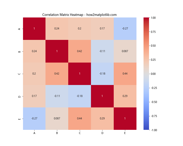
In this example, we’re using Seaborn’s heatmap() function, which is built on top of Matplotlib. We’re using the ‘coolwarm’ color map, which is well-suited for correlation matrices as it clearly shows positive (warm colors) and negative (cool colors) correlations.
Customizing Heatmap Colors with Discrete Boundaries
Sometimes, you may want to create a heatmap with discrete color boundaries rather than a continuous color scale. This can be achieved by using the BoundaryNorm class. Let’s see how to implement this:
import matplotlib.pyplot as plt
import matplotlib.colors as colors
import numpy as np

# Generate sample data
data = np.random.rand(10, 10)

# Define color boundaries and corresponding colors
bounds = [0, 0.2, 0.4, 0.6, 0.8, 1]
colors_list = ['#ff0000', '#ff8000', '#ffff00', '#80ff00', '#00ff00']

# Create a custom color map with discrete boundaries
cmap = colors.ListedColormap(colors_list)
norm = colors.BoundaryNorm(bounds, cmap.N)

# Create a heatmap with discrete color boundaries
plt.imshow(data, cmap=cmap, norm=norm)
plt.colorbar(ticks=bounds)
plt.title('Heatmap with Discrete Color Boundaries - how2matplotlib.com')
plt.show()
Output:
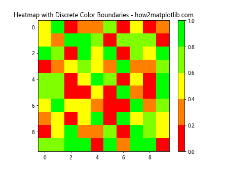
In this example, we’re defining specific boundaries for our color ranges and assigning a color to each range. This results in a heatmap where the colors change discretely at the specified boundaries, rather than continuously across the range of data values.
Customizing Heatmap Colors for Time Series Data
When visualizing time series data as a heatmap, you might want to customize the color scheme to highlight patterns over time. Let’s create a heatmap for time series data:
import matplotlib.pyplot as plt
import numpy as np
import pandas as pd

# Generate sample time series data
dates = pd.date_range(start='2023-01-01', end='2023-12-31', freq='D')
data = np.random.randn(len(dates), 5)
df = pd.DataFrame(data, index=dates, columns=['A', 'B', 'C', 'D', 'E'])

# Create a heatmap for time series data
plt.figure(figsize=(12, 8))
plt.imshow(df.T, aspect='auto', cmap='YlOrRd')
plt.colorbar()
plt.yticks(range(len(df.columns)), df.columns)
plt.xticks(range(0, len(df.index), 30), df.index[::30], rotation=45)
plt.title('Time Series Heatmap - how2matplotlib.com')
plt.tight_layout()
plt.show()
Output:
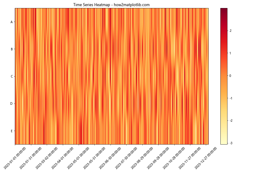
In this example, we’re creating a heatmap where each row represents a different variable and each column represents a day. The ‘YlOrRd’ color map is used to show intensity, with darker colors representing higher values.
Advanced Techniques for Customizing Heatmap Colors
As you become more proficient in customizing heatmap colors with Matplotlib, you may want to explore more advanced techniques. Here are a few additional methods to consider:
- Custom Colorbars: You can create custom colorbars with specific tick locations and labels to better represent your data.
Diverging Normalization: For data that diverges from a central value, you can use
TwoSlopeNormto create a color scale that diverges from a central point.Combining Multiple Plots: You can create complex visualizations by combining heatmaps with other types of plots, such as line graphs or scatter plots.
Interactive Heatmaps: Using libraries like Plotly or Bokeh, you can create interactive heatmaps that allow users to zoom, pan, and hover over data points.
Animated Heatmaps: For time-series data, you can create animated heatmaps that show how the data changes over time.
Conclusion
Customizing heatmap colors with Matplotlib is a powerful way to enhance your data visualizations. By mastering the techniques discussed in this article, you’ll be able to create heatmaps that effectively communicate your data’s patterns, trends, and relationships. Remember that the key to creating effective heatmaps is to choose color schemes that are appropriate for your data and that make it easy for your audience to interpret the information. As you continue to work with Matplotlib and heatmaps, don’t be afraid to experiment with different color schemes, normalization techniques, and customization options. The more you practice, the more intuitive the process of customizing heatmap colors will become. Whether you’re visualizing scientific data, financial information, or any other type of data that lends itself to heatmap representation, the skills you’ve learned in this article will serve you well. Keep exploring, keep experimenting, and keep pushing the boundaries of what’s possible with Matplotlib heatmaps. Remember, the goal of data visualization is not just to make your plots look good, but to make them communicate effectively. By mastering the art of customizing heatmap colors with Matplotlib, you’ll be able to create visualizations that are both beautiful and informative, helping your audience gain valuable insights from your data.