How to Create a Temporal Range Time-Series Spiral Plot with Matplotlib
Creating a Temporal Range Time-Series Spiral Plot is an innovative way to visualize time-series data in a compact and visually appealing format. This article will guide you through the process of creating such a plot using Matplotlib, a powerful plotting library in Python. We’ll explore various aspects of creating a Temporal Range Time-Series Spiral Plot, from basic concepts to advanced techniques, providing you with the knowledge and tools to create stunning visualizations for your data.
Understanding the Temporal Range Time-Series Spiral Plot
A Temporal Range Time-Series Spiral Plot is a unique visualization technique that combines the concepts of spiral plots and time-series data. This type of plot is particularly useful for displaying cyclical patterns in temporal data, such as daily, weekly, or seasonal trends. By creating a Temporal Range Time-Series Spiral Plot, you can effectively represent long periods of time in a compact space while highlighting recurring patterns and anomalies.
To create a Temporal Range Time-Series Spiral Plot, we’ll use Matplotlib, a versatile plotting library in Python. Matplotlib provides a wide range of tools and functions that allow us to customize our plots and create visually appealing representations of our data.
Let’s start with a basic example of creating a simple spiral plot using Matplotlib:
import matplotlib.pyplot as plt
import numpy as np

# Generate data for the spiral
theta = np.linspace(0, 8*np.pi, 1000)
r = theta

# Create the plot
fig, ax = plt.subplots(subplot_kw={'projection': 'polar'})
ax.plot(theta, r)
ax.set_title("Basic Spiral Plot - how2matplotlib.com")
plt.show()
Output:
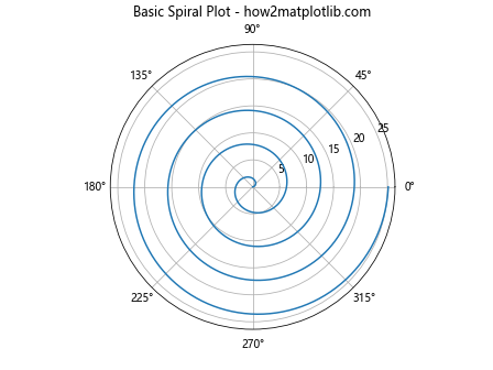
In this example, we create a basic spiral plot using polar coordinates. The theta variable represents the angle, and r represents the radius. By plotting these values in a polar projection, we create a simple spiral.
Creating a Basic Temporal Range Time-Series Spiral Plot
Now that we have our data prepared, let’s create a basic Temporal Range Time-Series Spiral Plot:
import matplotlib.pyplot as plt
import pandas as pd
import numpy as np
from datetime import datetime, timedelta

# Generate sample data
start_date = datetime(2023, 1, 1)
dates = [start_date + timedelta(days=i) for i in range(365)]
values = np.random.rand(365) * 100

# Create a DataFrame
df = pd.DataFrame({'date': dates, 'value': values})

# Convert dates to angles (0 to 2π)
df['angle'] = (df['date'].dt.dayofyear - 1) * (2 * np.pi / 365)

# Calculate radius based on the value
df['radius'] = df['value']

# Create the plot
fig, ax = plt.subplots(subplot_kw={'projection': 'polar'})
ax.plot(df['angle'], df['radius'])
ax.set_title("Basic Temporal Range Time-Series Spiral Plot - how2matplotlib.com")
plt.show()
Output:
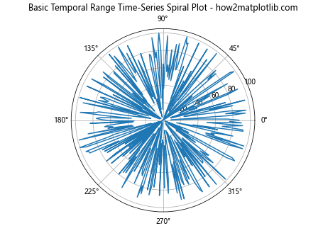
This example creates a basic Temporal Range Time-Series Spiral Plot using the data we prepared earlier. The angle represents the day of the year, and the radius represents the value for that day.
Customizing the Temporal Range Time-Series Spiral Plot
To make our Temporal Range Time-Series Spiral Plot more informative and visually appealing, we can customize various aspects of the plot. Let’s explore some customization options:
Adding Color Gradients
We can add color gradients to our plot to represent different ranges or categories of data:
import matplotlib.pyplot as plt
import pandas as pd
import numpy as np
from datetime import datetime, timedelta

# Generate sample data
start_date = datetime(2023, 1, 1)
dates = [start_date + timedelta(days=i) for i in range(365)]
values = np.random.rand(365) * 100

# Create a DataFrame
df = pd.DataFrame({'date': dates, 'value': values})

# Convert dates to angles (0 to 2π)
df['angle'] = (df['date'].dt.dayofyear - 1) * (2 * np.pi / 365)

# Calculate radius based on the value
df['radius'] = df['value']

# Create the plot
fig, ax = plt.subplots(subplot_kw={'projection': 'polar'})
scatter = ax.scatter(df['angle'], df['radius'], c=df['value'], cmap='viridis')
ax.set_title("Temporal Range Time-Series Spiral Plot with Color Gradient - how2matplotlib.com")

# Add a colorbar
plt.colorbar(scatter)

plt.show()
Output:
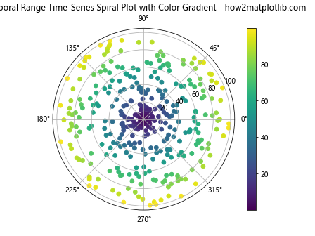
In this example, we use ax.scatter() instead of ax.plot() to create the plot. This allows us to specify a color for each point based on its value. We use the ‘viridis’ colormap, but you can experiment with different colormaps to find one that suits your data best.
Adjusting the Spiral Spacing
We can adjust the spacing of the spiral to create a more visually appealing plot:
import matplotlib.pyplot as plt
import pandas as pd
import numpy as np
from datetime import datetime, timedelta

# Generate sample data
start_date = datetime(2023, 1, 1)
dates = [start_date + timedelta(days=i) for i in range(365)]
values = np.random.rand(365) * 100

# Create a DataFrame
df = pd.DataFrame({'date': dates, 'value': values})

# Convert dates to angles (0 to 2π)
df['angle'] = (df['date'].dt.dayofyear - 1) * (2 * np.pi / 365)

# Calculate radius based on the value and add a constant to create spacing
df['radius'] = df['value'] + 50

# Create the plot
fig, ax = plt.subplots(figsize=(10, 10), subplot_kw={'projection': 'polar'})
ax.plot(df['angle'], df['radius'])
ax.set_title("Temporal Range Time-Series Spiral Plot with Adjusted Spacing - how2matplotlib.com")

# Remove radial ticks
ax.set_yticks([])

plt.show()
Output:
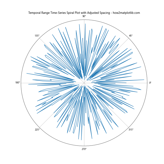
In this example, we add a constant value to the radius calculation (df['value'] + 50) to create more spacing between the spiral loops. We also remove the radial ticks to create a cleaner look.
Adding Date Labels
To make our Temporal Range Time-Series Spiral Plot more informative, we can add date labels:
import matplotlib.pyplot as plt
import pandas as pd
import numpy as np
from datetime import datetime, timedelta

# Generate sample data
start_date = datetime(2023, 1, 1)
dates = [start_date + timedelta(days=i) for i in range(365)]
values = np.random.rand(365) * 100

# Create a DataFrame
df = pd.DataFrame({'date': dates, 'value': values})

# Convert dates to angles (0 to 2π)
df['angle'] = (df['date'].dt.dayofyear - 1) * (2 * np.pi / 365)

# Calculate radius based on the value and add a constant to create spacing
df['radius'] = df['value'] + 50

# Create the plot
fig, ax = plt.subplots(figsize=(12, 12), subplot_kw={'projection': 'polar'})
ax.plot(df['angle'], df['radius'])
ax.set_title("Temporal Range Time-Series Spiral Plot with Date Labels - how2matplotlib.com")

# Remove radial ticks
ax.set_yticks([])

# Add month labels
months = ['Jan', 'Feb', 'Mar', 'Apr', 'May', 'Jun', 'Jul', 'Aug', 'Sep', 'Oct', 'Nov', 'Dec']
ax.set_xticks(np.linspace(0, 2*np.pi, 12, endpoint=False))
ax.set_xticklabels(months)

plt.show()
Output:
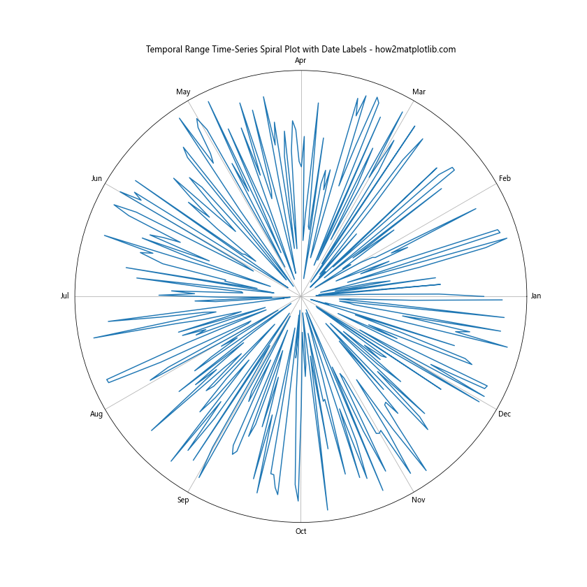
In this example, we add month labels to the plot by setting custom x-axis ticks and labels.
Advanced Techniques for Temporal Range Time-Series Spiral Plots
Now that we’ve covered the basics, let’s explore some advanced techniques for creating more complex and informative Temporal Range Time-Series Spiral Plots.
Multiple Data Series
We can plot multiple data series on the same Temporal Range Time-Series Spiral Plot to compare different variables or time periods:
import matplotlib.pyplot as plt
import pandas as pd
import numpy as np
from datetime import datetime, timedelta

# Generate sample data for two series
start_date = datetime(2023, 1, 1)
dates = [start_date + timedelta(days=i) for i in range(365)]
values1 = np.random.rand(365) * 100
values2 = np.random.rand(365) * 100

# Create a DataFrame
df = pd.DataFrame({'date': dates, 'value1': values1, 'value2': values2})

# Convert dates to angles (0 to 2π)
df['angle'] = (df['date'].dt.dayofyear - 1) * (2 * np.pi / 365)

# Calculate radius based on the values and add constants to create spacing
df['radius1'] = df['value1'] + 50
df['radius2'] = df['value2'] + 150

# Create the plot
fig, ax = plt.subplots(figsize=(12, 12), subplot_kw={'projection': 'polar'})
ax.plot(df['angle'], df['radius1'], label='Series 1')
ax.plot(df['angle'], df['radius2'], label='Series 2')
ax.set_title("Multiple Series Temporal Range Time-Series Spiral Plot - how2matplotlib.com")

# Remove radial ticks
ax.set_yticks([])

# Add month labels
months = ['Jan', 'Feb', 'Mar', 'Apr', 'May', 'Jun', 'Jul', 'Aug', 'Sep', 'Oct', 'Nov', 'Dec']
ax.set_xticks(np.linspace(0, 2*np.pi, 12, endpoint=False))
ax.set_xticklabels(months)

# Add legend
ax.legend()

plt.show()
Output:
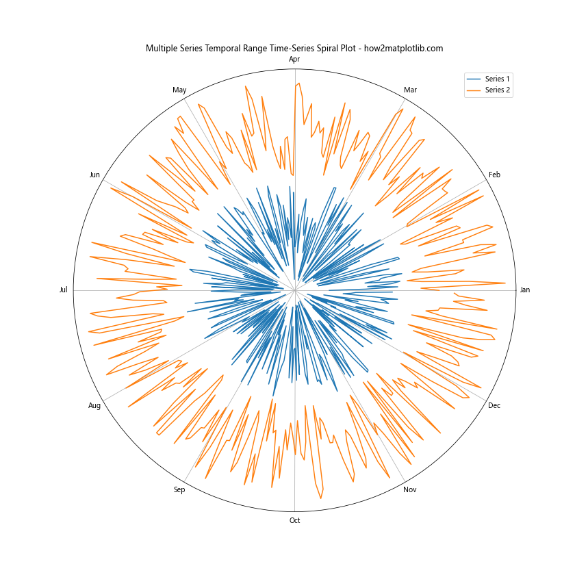
This example plots two data series on the same spiral, allowing for easy comparison between the two.
Highlighting Specific Time Periods
We can highlight specific time periods or events on our Temporal Range Time-Series Spiral Plot:
import matplotlib.pyplot as plt
import pandas as pd
import numpy as np
from datetime import datetime, timedelta

# Generate sample data
start_date = datetime(2023, 1, 1)
dates = [start_date + timedelta(days=i) for i in range(365)]
values = np.random.rand(365) * 100

# Create a DataFrame
df = pd.DataFrame({'date': dates, 'value': values})

# Convert dates to angles (0 to 2π)
df['angle'] = (df['date'].dt.dayofyear - 1) * (2 * np.pi / 365)

# Calculate radius based on the value and add a constant to create spacing
df['radius'] = df['value'] + 50

# Create the plot
fig, ax = plt.subplots(figsize=(12, 12), subplot_kw={'projection': 'polar'})
ax.plot(df['angle'], df['radius'])
ax.set_title("Temporal Range Time-Series Spiral Plot with Highlighted Period - how2matplotlib.com")

# Remove radial ticks
ax.set_yticks([])

# Add month labels
months = ['Jan', 'Feb', 'Mar', 'Apr', 'May', 'Jun', 'Jul', 'Aug', 'Sep', 'Oct', 'Nov', 'Dec']
ax.set_xticks(np.linspace(0, 2*np.pi, 12, endpoint=False))
ax.set_xticklabels(months)

# Highlight summer months (June, July, August)
summer_start = (datetime(2023, 6, 1) - start_date).days
summer_end = (datetime(2023, 8, 31) - start_date).days
summer_angles = df['angle'][summer_start:summer_end+1]
summer_radii = df['radius'][summer_start:summer_end+1]
ax.fill_between(summer_angles, 0, summer_radii, alpha=0.3, color='yellow', label='Summer')

# Add legend
ax.legend()

plt.show()
Output:
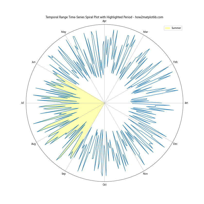
In this example, we highlight the summer months (June, July, and August) using ax.fill_between() to create a shaded region.
Handling Large Datasets in Temporal Range Time-Series Spiral Plots
When dealing with large datasets, creating a Temporal Range Time-Series Spiral Plot can become challenging due to performance issues and visual clutter. Here are some techniques to handle large datasets effectively:
Data Aggregation
One approach to handling large datasets is to aggregate the data before plotting. This can help reduce the number of points plotted while still maintaining the overall trend of the data:
import matplotlib.pyplot as plt
import pandas as pd
import numpy as np
from datetime import datetime, timedelta

# Generate a large sample dataset
start_date = datetime(2020, 1, 1)
dates = [start_date + timedelta(hours=i) for i in range(24*365*3)]  # 3 years of hourly data
values = np.random.rand(24*365*3) * 100

# Create a DataFrame
df = pd.DataFrame({'date': dates, 'value': values})

# Aggregate data to daily averages
df_daily = df.resample('D', on='date').mean().reset_index()

# Convert dates to angles (0 to 2π)
df_daily['angle'] = (df_daily['date'].dt.dayofyear - 1) * (2 * np.pi / 365)

# Calculate radius based on the value and add a constant to create spacing
df_daily['radius'] = df_daily['value'] + 50

# Create the plot
fig, ax = plt.subplots(figsize=(12, 12), subplot_kw={'projection': 'polar'})
ax.plot(df_daily['angle'], df_daily['radius'])
ax.set_title("Temporal Range Time-Series Spiral Plot with Aggregated Data - how2matplotlib.com")

# Remove radial ticks
ax.set_yticks([])

# Add month labels
months = ['Jan', 'Feb', 'Mar', 'Apr', 'May', 'Jun', 'Jul', 'Aug', 'Sep', 'Oct', 'Nov', 'Dec']
ax.set_xticks(np.linspace(0, 2*np.pi, 12, endpoint=False))
ax.set_xticklabels(months)

plt.show()
Output:
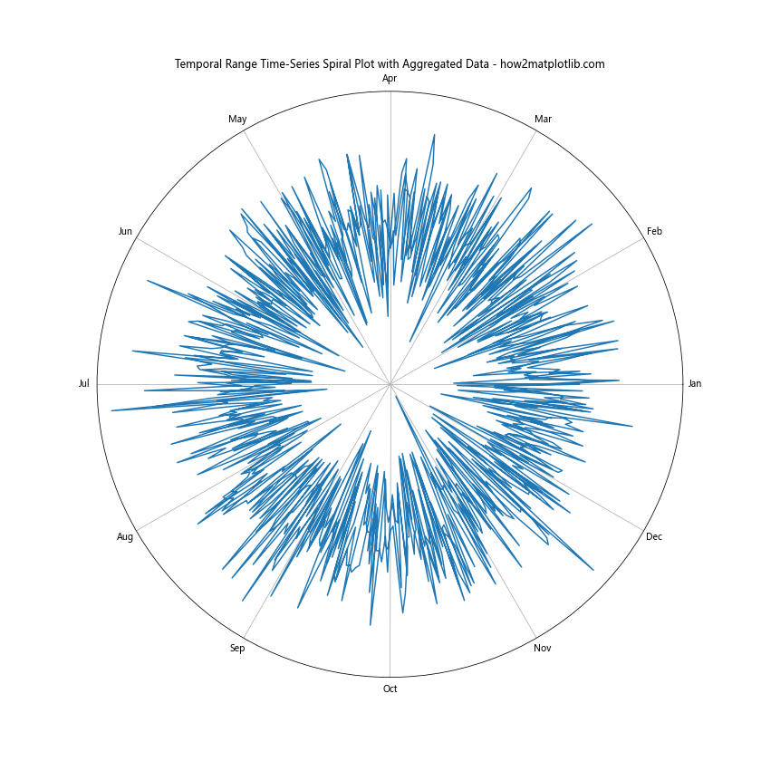
In this example, we aggregate hourly data to daily averages before plotting, significantly reducing the number of points while still preserving the overall pattern.
Using Alpha Transparency
Another technique for handling large datasets is to use alpha transparency to reduce visual clutter:
import matplotlib.pyplot as plt
import pandas as pd
import numpy as np
from datetime import datetime, timedelta

# Generate a large sample dataset
start_date = datetime(2020, 1, 1)
dates = [start_date + timedelta(hours=i) for i in range(24*365*3)]  # 3 years of hourly data
values = np.random.rand(24*365*3) * 100

# Create a DataFrame
df = pd.DataFrame({'date': dates, 'value': values})

# Convert dates to angles (0 to 2π)
df['angle'] = (df['date'].dt.dayofyear - 1 + df['date'].dt.hour / 24) * (2 * np.pi / 365)

# Calculate radius based on the value and add a constant to create spacing
df['radius'] = df['value'] + 50

# Create the plot
fig, ax = plt.subplots(figsize=(12, 12), subplot_kw={'projection': 'polar'})
ax.scatter(df['angle'], df['radius'], alpha=0.01, s=1)
ax.set_title("Temporal Range Time-Series Spiral Plot with Alpha Transparency - how2matplotlib.com")

# Remove radial ticks
ax.set_yticks([])

# Add month labels
months = ['Jan', 'Feb', 'Mar', 'Apr', 'May', 'Jun', 'Jul', 'Aug', 'Sep', 'Oct', 'Nov', 'Dec']
ax.set_xticks(np.linspace(0, 2*np.pi, 12, endpoint=False))
ax.set_xticklabels(months)

plt.show()
Output:
In this example, we use ax.scatter() with a low alpha value (0.01) to plot all data points while reducing visual clutter.
Customizing Color Schemes in Temporal Range Time-Series Spiral Plots
Color schemes play a crucial role in visualizing data effectively. Let’s explore how to customize color schemes in Temporal Range Time-Series Spiral Plots:
import matplotlib.pyplot as plt
import pandas as pd
import numpy as np
from datetime import datetime, timedelta
from matplotlib.colors import LinearSegmentedColormap

# Generate sample data
start_date = datetime(2023, 1, 1)
dates = [start_date + timedelta(days=i) for i in range(365)]
values = np.random.rand(365) * 100

# Create a DataFrame
df = pd.DataFrame({'date': dates, 'value': values})

# Convert dates to angles (0 to 2π)
df['angle'] = (df['date'].dt.dayofyear - 1) * (2 * np.pi / 365)

# Calculate radius based on the value and add a constant to create spacing
df['radius'] = df['value'] + 50

# Create a custom colormap
colors = ['#1a237e', '#4a148c', '#880e4f', '#b71c1c', '#ff6f00', '#ffd600']
n_bins = 100
cmap = LinearSegmentedColormap.from_list('custom', colors, N=n_bins)

# Create the plot
fig, ax = plt.subplots(figsize=(12, 12), subplot_kw={'projection': 'polar'})
scatter = ax.scatter(df['angle'], df['radius'], c=df['value'], cmap=cmap)
ax.set_title("Temporal Range Time-Series Spiral Plot with Custom Color Scheme - how2matplotlib.com")

# Remove radial ticks
ax.set_yticks([])

# Add month labels
months = ['Jan', 'Feb', 'Mar', 'Apr', 'May', 'Jun', 'Jul', 'Aug', 'Sep', 'Oct', 'Nov', 'Dec']
ax.set_xticks(np.linspace(0, 2*np.pi, 12, endpoint=False))
ax.set_xticklabels(months)

# Add a colorbar
plt.colorbar(scatter)

plt.show()
Output:
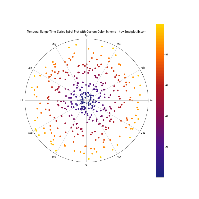
In this example, we create a custom colormap using LinearSegmentedColormap.from_list() to define a unique color scheme for our Temporal Range Time-Series Spiral Plot.
Combining Temporal Range Time-Series Spiral Plots with Other Visualizations
To provide a more comprehensive view of the data, we can combine Temporal Range Time-Series Spiral Plots with other visualizations:
import matplotlib.pyplot as plt
import pandas as pd
import numpy as np
from datetime import datetime, timedelta

# Generate sample data
start_date = datetime(2023, 1, 1)
dates = [start_date + timedelta(days=i) for i in range(365)]
values = np.random.rand(365) * 100

# Create a DataFrame
df = pd.DataFrame({'date': dates, 'value': values})

# Convert dates to angles (0 to 2π)
df['angle'] = (df['date'].dt.dayofyear - 1) * (2 * np.pi / 365)

# Calculate radius based on the value and add a constant to create spacing
df['radius'] = df['value'] + 50

# Create the plot
fig = plt.figure(figsize=(16, 8))

# Spiral plot
ax1 = fig.add_subplot(121, projection='polar')
ax1.plot(df['angle'], df['radius'])
ax1.set_title("Temporal Range Time-Series Spiral Plot - how2matplotlib.com")
ax1.set_yticks([])
months = ['Jan', 'Feb', 'Mar', 'Apr', 'May', 'Jun', 'Jul', 'Aug', 'Sep', 'Oct', 'Nov', 'Dec']
ax1.set_xticks(np.linspace(0, 2*np.pi, 12, endpoint=False))
ax1.set_xticklabels(months)

# Line plot
ax2 = fig.add_subplot(122)
ax2.plot(df['date'], df['value'])
ax2.set_title("Traditional Time-Series Line Plot - how2matplotlib.com")
ax2.set_xlabel("Date")
ax2.set_ylabel("Value")

plt.tight_layout()
plt.show()
Output:
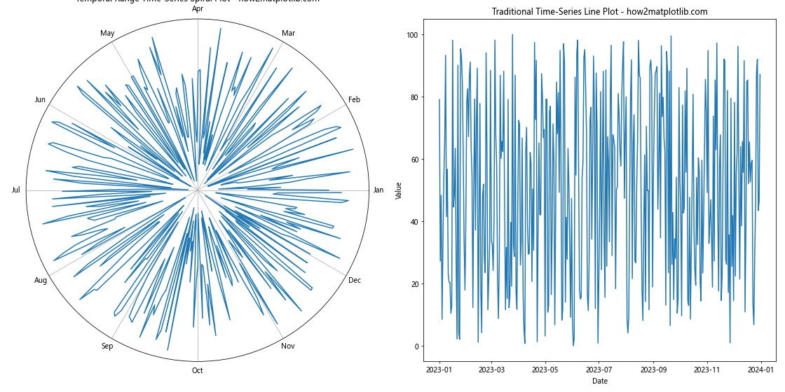
This example combines a Temporal Range Time-Series Spiral Plot with a traditional time-series line plot, allowing for easy comparison between the two visualization techniques.
Conclusion
Creating a Temporal Range Time-Series Spiral Plot is a powerful way to visualize cyclical patterns in time-series data. Throughout this article, we’ve explored various techniques for creating, customizing, and enhancing these plots using Matplotlib and other libraries.