How to Create a Pseudocolor Plot of an Unstructured Triangular Grid in Python Using Matplotlib
Create a pseudocolor plot of an unstructured triangular grid in Python using Matplotlib is a powerful technique for visualizing data on irregular meshes. This article will explore various aspects of creating such plots, providing detailed explanations and examples along the way. We’ll cover everything from basic concepts to advanced techniques, ensuring you have a thorough understanding of how to create a pseudocolor plot of an unstructured triangular grid in Python using Matplotlib.
Understanding Unstructured Triangular Grids
Before we dive into creating a pseudocolor plot of an unstructured triangular grid in Python using Matplotlib, it’s essential to understand what an unstructured triangular grid is. An unstructured triangular grid is a mesh composed of triangular elements that are not arranged in a regular pattern. These grids are particularly useful for representing complex geometries or data with varying resolution.
To create a pseudocolor plot of an unstructured triangular grid in Python using Matplotlib, we first need to define the grid itself. Here’s a simple example of how to create an unstructured triangular grid:
import numpy as np
import matplotlib.pyplot as plt
from matplotlib.tri import Triangulation

# Create sample data for the grid
x = np.random.rand(20)
y = np.random.rand(20)
triangles = Triangulation(x, y)

# Create a figure and axis
fig, ax = plt.subplots()

# Plot the triangulation
ax.triplot(triangles, 'ko-')

# Set labels and title
ax.set_xlabel('X-axis')
ax.set_ylabel('Y-axis')
ax.set_title('Unstructured Triangular Grid - how2matplotlib.com')

plt.show()
Output:
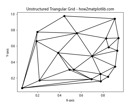
In this example, we use NumPy to generate random points for our grid and Matplotlib’s Triangulation function to create the triangular mesh. The triplot function is then used to visualize the grid.
Basic Pseudocolor Plot of an Unstructured Triangular Grid
Now that we understand the basics of unstructured triangular grids, let’s create a simple pseudocolor plot of an unstructured triangular grid in Python using Matplotlib. A pseudocolor plot assigns colors to each triangle based on a scalar value associated with that triangle.
Here’s an example of how to create a basic pseudocolor plot of an unstructured triangular grid in Python using Matplotlib:
import numpy as np
import matplotlib.pyplot as plt
from matplotlib.tri import Triangulation

# Create sample data for the grid
x = np.random.rand(50)
y = np.random.rand(50)
triangles = Triangulation(x, y)

# Create sample data for the pseudocolor plot
z = np.sin(3 * x) * np.cos(3 * y)

# Create a figure and axis
fig, ax = plt.subplots()

# Create the pseudocolor plot
triplot = ax.tripcolor(triangles, z, shading='flat', cmap='viridis')

# Add a colorbar
fig.colorbar(triplot, ax=ax, label='Value')

# Set labels and title
ax.set_xlabel('X-axis')
ax.set_ylabel('Y-axis')
ax.set_title('Pseudocolor Plot of Unstructured Triangular Grid - how2matplotlib.com')

plt.show()
Output:
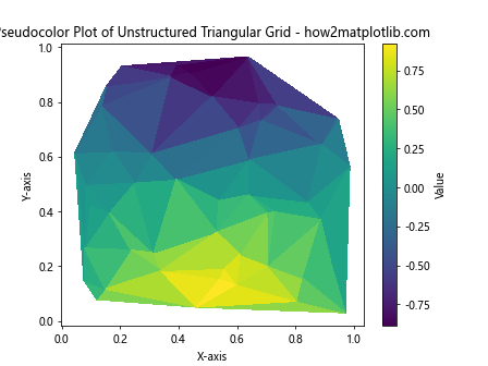
In this example, we use the tripcolor function to create the pseudocolor plot. The z variable contains the scalar values associated with each point in the grid. The shading='flat' argument ensures that each triangle is filled with a single color, and the cmap='viridis' argument specifies the colormap to use.
Customizing the Colormap
When you create a pseudocolor plot of an unstructured triangular grid in Python using Matplotlib, choosing the right colormap can greatly enhance the visualization. Matplotlib offers a wide range of colormaps, and you can even create custom ones. Let’s explore how to customize the colormap:
import numpy as np
import matplotlib.pyplot as plt
from matplotlib.tri import Triangulation
from matplotlib.colors import LinearSegmentedColormap

# Create sample data for the grid
x = np.random.rand(100)
y = np.random.rand(100)
triangles = Triangulation(x, y)

# Create sample data for the pseudocolor plot
z = np.sin(5 * x) * np.cos(5 * y)

# Create a custom colormap
colors = ['#1a9850', '#91cf60', '#d9ef8b', '#fee08b', '#fc8d59', '#d73027']
n_bins = 100
cmap = LinearSegmentedColormap.from_list('custom_cmap', colors, N=n_bins)

# Create a figure and axis
fig, ax = plt.subplots()

# Create the pseudocolor plot with the custom colormap
triplot = ax.tripcolor(triangles, z, shading='flat', cmap=cmap)

# Add a colorbar
fig.colorbar(triplot, ax=ax, label='Value')

# Set labels and title
ax.set_xlabel('X-axis')
ax.set_ylabel('Y-axis')
ax.set_title('Custom Colormap Pseudocolor Plot - how2matplotlib.com')

plt.show()
Output:
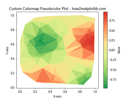
In this example, we create a custom colormap using LinearSegmentedColormap.from_list(). This allows us to define our own color sequence and control the number of color bins. The resulting plot will use this custom colormap to represent the data.
Adding Contour Lines to the Pseudocolor Plot
To enhance the visualization when you create a pseudocolor plot of an unstructured triangular grid in Python using Matplotlib, you can add contour lines. These lines help to highlight specific values in the data. Here’s how to add contour lines to your plot:
import numpy as np
import matplotlib.pyplot as plt
from matplotlib.tri import Triangulation

# Create sample data for the grid
x = np.random.rand(200)
y = np.random.rand(200)
triangles = Triangulation(x, y)

# Create sample data for the pseudocolor plot
z = np.sin(7 * x) * np.cos(7 * y)

# Create a figure and axis
fig, ax = plt.subplots()

# Create the pseudocolor plot
triplot = ax.tripcolor(triangles, z, shading='flat', cmap='coolwarm')

# Add contour lines
contour = ax.tricontour(triangles, z, colors='k', linewidths=0.5, levels=10)

# Add contour labels
ax.clabel(contour, inline=True, fontsize=8, fmt='%.2f')

# Add a colorbar
fig.colorbar(triplot, ax=ax, label='Value')

# Set labels and title
ax.set_xlabel('X-axis')
ax.set_ylabel('Y-axis')
ax.set_title('Pseudocolor Plot with Contour Lines - how2matplotlib.com')

plt.show()
Output:
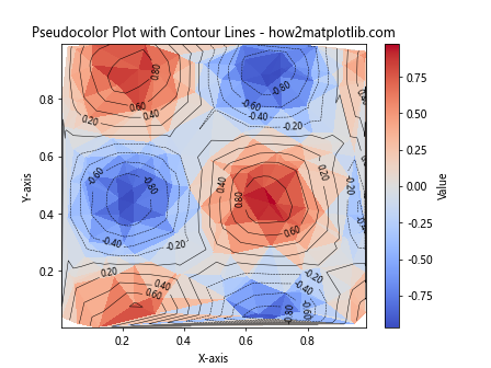
In this example, we use the tricontour function to add contour lines to the plot. The colors='k' argument sets the contour lines to black, and levels=10 specifies the number of contour levels. We also use clabel to add labels to the contour lines.
Interpolating Data on the Unstructured Grid
When you create a pseudocolor plot of an unstructured triangular grid in Python using Matplotlib, you might want to interpolate the data to create a smoother visualization. Matplotlib provides the LinearTriInterpolator class for this purpose. Here’s an example of how to use interpolation:
import numpy as np
import matplotlib.pyplot as plt
from matplotlib.tri import Triangulation, LinearTriInterpolator

# Create sample data for the grid
x = np.random.rand(50)
y = np.random.rand(50)
triangles = Triangulation(x, y)

# Create sample data for the pseudocolor plot
z = np.sin(5 * x) * np.cos(5 * y)

# Create a linear interpolator
interpolator = LinearTriInterpolator(triangles, z)

# Create a fine grid for interpolation
xi = yi = np.linspace(0, 1, 100)
Xi, Yi = np.meshgrid(xi, yi)

# Interpolate the data
Zi = interpolator(Xi, Yi)

# Create a figure and axis
fig, ax = plt.subplots()

# Create the pseudocolor plot with interpolated data
triplot = ax.pcolormesh(Xi, Yi, Zi, shading='auto', cmap='viridis')

# Add a colorbar
fig.colorbar(triplot, ax=ax, label='Value')

# Set labels and title
ax.set_xlabel('X-axis')
ax.set_ylabel('Y-axis')
ax.set_title('Interpolated Pseudocolor Plot - how2matplotlib.com')

plt.show()
Output:
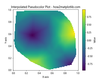
In this example, we use LinearTriInterpolator to create an interpolation function based on our unstructured grid data. We then create a fine regular grid using np.linspace and np.meshgrid, and apply the interpolation function to this grid. Finally, we use pcolormesh to create the pseudocolor plot with the interpolated data.
Handling Missing Data in Unstructured Grids
When you create a pseudocolor plot of an unstructured triangular grid in Python using Matplotlib, you may encounter situations where some data points are missing. Matplotlib provides ways to handle missing data in unstructured grids. Here’s an example:
import numpy as np
import matplotlib.pyplot as plt
from matplotlib.tri import Triangulation

# Create sample data for the grid
x = np.random.rand(100)
y = np.random.rand(100)
triangles = Triangulation(x, y)

# Create sample data for the pseudocolor plot with some missing values
z = np.sin(5 * x) * np.cos(5 * y)
z[np.random.choice(len(z), 20, replace=False)] = np.nan  # Set 20 random values to NaN

# Create a mask for triangles with NaN values
mask = np.isnan(z[triangles.triangles]).any(axis=1)
triangles.set_mask(mask)

# Create a figure and axis
fig, ax = plt.subplots()

# Create the pseudocolor plot
triplot = ax.tripcolor(triangles, z, shading='flat', cmap='viridis')

# Add a colorbar
fig.colorbar(triplot, ax=ax, label='Value')

# Set labels and title
ax.set_xlabel('X-axis')
ax.set_ylabel('Y-axis')
ax.set_title('Pseudocolor Plot with Missing Data - how2matplotlib.com')

plt.show()
Output:
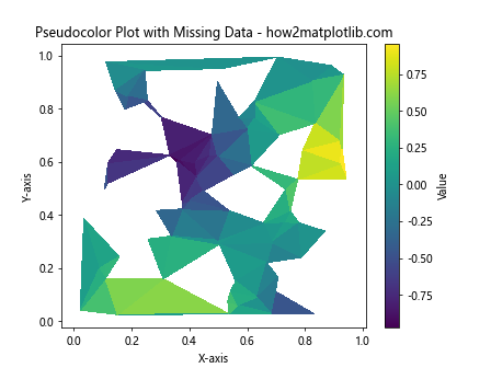
In this example, we artificially introduce missing data by setting some values in z to NaN. We then create a mask for triangles that contain any NaN values and apply this mask to the triangulation. This ensures that triangles with missing data are not plotted.
Adding Text and Annotations to the Plot
To provide more context when you create a pseudocolor plot of an unstructured triangular grid in Python using Matplotlib, you can add text and annotations to your plot. Here’s an example of how to do this:
import numpy as np
import matplotlib.pyplot as plt
from matplotlib.tri import Triangulation

# Create sample data for the grid
x = np.random.rand(50)
y = np.random.rand(50)
triangles = Triangulation(x, y)

# Create sample data for the pseudocolor plot
z = np.sin(5 * x) * np.cos(5 * y)

# Create a figure and axis
fig, ax = plt.subplots()

# Create the pseudocolor plot
triplot = ax.tripcolor(triangles, z, shading='flat', cmap='viridis')

# Add a colorbar
fig.colorbar(triplot, ax=ax, label='Value')

# Add text to the plot
ax.text(0.5, 0.95, 'Unstructured Grid Analysis', transform=ax.transAxes,
        ha='center', va='top', fontsize=14, fontweight='bold')

# Add an annotation
max_index = np.argmax(z)
ax.annotate(f'Max value: {z[max_index]:.2f}',
            xy=(x[max_index], y[max_index]), xytext=(0.7, 0.8),
            textcoords='axes fraction',
            arrowprops=dict(facecolor='black', shrink=0.05),
            fontsize=10, ha='right', va='top')

# Set labels and title
ax.set_xlabel('X-axis')
ax.set_ylabel('Y-axis')
ax.set_title('Annotated Pseudocolor Plot - how2matplotlib.com')

plt.show()
Output:
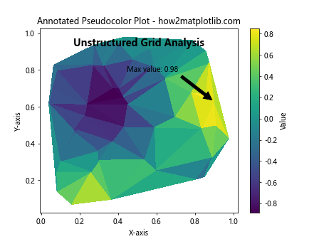
In this example, we use ax.text() to add a title to the plot and ax.annotate() to add an annotation pointing to the maximum value in the data. The annotation includes an arrow pointing to the specific point on the plot.
Creating Multiple Subplots
When you create a pseudocolor plot of an unstructured triangular grid in Python using Matplotlib, you might want to compare different datasets or visualizations side by side. Matplotlib makes it easy to create multiple subplots. Here’s an example:
import numpy as np
import matplotlib.pyplot as plt
from matplotlib.tri import Triangulation

# Create sample data for the grid
x = np.random.rand(100)
y = np.random.rand(100)
triangles = Triangulation(x, y)

# Create sample data for the pseudocolor plots
z1 = np.sin(5 * x) * np.cos(5 * y)
z2 = np.cos(5 * x) * np.sin(5 * y)

# Create a figure with two subplots
fig, (ax1, ax2) = plt.subplots(1, 2, figsize=(12, 5))

# Create the first pseudocolor plot
triplot1 = ax1.tripcolor(triangles, z1, shading='flat', cmap='viridis')
fig.colorbar(triplot1, ax=ax1, label='Value')
ax1.set_xlabel('X-axis')
ax1.set_ylabel('Y-axis')
ax1.set_title('Dataset 1 - how2matplotlib.com')

# Create the second pseudocolor plot
triplot2 = ax2.tripcolor(triangles, z2, shading='flat', cmap='plasma')
fig.colorbar(triplot2, ax=ax2, label='Value')
ax2.set_xlabel('X-axis')
ax2.set_ylabel('Y-axis')
ax2.set_title('Dataset 2 - how2matplotlib.com')

# Adjust the layout and display the plot
plt.tight_layout()
plt.show()
Output:
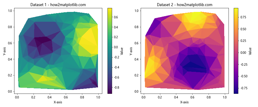
In this example, we create two subplots side by side using plt.subplots(1, 2). We then create a pseudocolor plot for each dataset on its respective subplot. This allows for easy comparison between different datasets or visualizations.
Customizing the Triangulation
When you create a pseudocolor plot of an unstructured triangular grid in Python using Matplotlib, you might want to customize the triangulation itself. Matplotlib allows you to modify the triangulation or create a custom one. Here’s an example of how to do this:
import numpy as np
import matplotlib.pyplot as plt
from matplotlib.tri import Triangulation

# Create sample data for the grid
x = np.random.rand(100)
y = np.random.rand(100)

# Create a custom triangulation
triangles = []
for i in range(len(x) - 2):
    triangles.append([i, i+1, len(x)-1])
triangles = np.array(triangles)

# Create the triangulation object
triang = Triangulation(x, y, triangles)

# Create sample data for the pseudocolor plot
z = np.sin(5 * x) * np.cos(5 * y)

# Create# Create a figure and axis
fig, ax = plt.subplots()

# Create the pseudocolor plot with custom triangulation
triplot = ax.tripcolor(triang, z, shading='flat', cmap='viridis')

# Add a colorbar
fig.colorbar(triplot, ax=ax, label='Value')

# Set labels and title
ax.set_xlabel('X-axis')
ax.set_ylabel('Y-axis')
ax.set_title('Custom Triangulation Pseudocolor Plot - how2matplotlib.com')

plt.show()
Output:
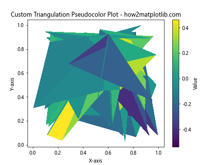
In this example, we create a custom triangulation by manually defining the triangles. We create triangles that all share a common vertex at the last point in our dataset. This results in a fan-like triangulation. The Triangulation object is then created using this custom triangle definition.
Adding a Mask to the Triangulation
When you create a pseudocolor plot of an unstructured triangular grid in Python using Matplotlib, you might want to exclude certain triangles from the plot. This can be achieved by adding a mask to the triangulation. Here’s an example:
import numpy as np
import matplotlib.pyplot as plt
from matplotlib.tri import Triangulation

# Create sample data for the grid
x = np.random.rand(100)
y = np.random.rand(100)
triangles = Triangulation(x, y)

# Create sample data for the pseudocolor plot
z = np.sin(5 * x) * np.cos(5 * y)

# Create a mask for the triangulation
mask = np.zeros(triangles.triangles.shape[0], dtype=bool)
mask[triangles.triangles.min(axis=1) < 10] = True

# Apply the mask to the triangulation
triangles.set_mask(mask)

# Create a figure and axis
fig, ax = plt.subplots()

# Create the pseudocolor plot with masked triangulation
triplot = ax.tripcolor(triangles, z, shading='flat', cmap='viridis')

# Add a colorbar
fig.colorbar(triplot, ax=ax, label='Value')

# Set labels and title
ax.set_xlabel('X-axis')
ax.set_ylabel('Y-axis')
ax.set_title('Masked Triangulation Pseudocolor Plot - how2matplotlib.com')

plt.show()
Output:
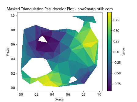
In this example, we create a mask that excludes triangles with any vertex index less than 10. We then apply this mask to the triangulation using triangles.set_mask(mask). The resulting plot will not include the masked triangles.
Adjusting the Color Scale
When you create a pseudocolor plot of an unstructured triangular grid in Python using Matplotlib, you might want to adjust the color scale to highlight specific ranges of values. Matplotlib provides several ways to do this. Here's an example:
import numpy as np
import matplotlib.pyplot as plt
from matplotlib.tri import Triangulation
from matplotlib.colors import Normalize

# Create sample data for the grid
x = np.random.rand(100)
y = np.random.rand(100)
triangles = Triangulation(x, y)

# Create sample data for the pseudocolor plot
z = np.sin(5 * x) * np.cos(5 * y)

# Create a figure and axis
fig, ax = plt.subplots()

# Create a custom normalization
norm = Normalize(vmin=-0.5, vmax=0.5)

# Create the pseudocolor plot with custom normalization
triplot = ax.tripcolor(triangles, z, shading='flat', cmap='viridis', norm=norm)

# Add a colorbar
fig.colorbar(triplot, ax=ax, label='Value', extend='both')

# Set labels and title
ax.set_xlabel('X-axis')
ax.set_ylabel('Y-axis')
ax.set_title('Adjusted Color Scale Pseudocolor Plot - how2matplotlib.com')

plt.show()
Output:
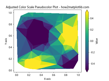
In this example, we use Normalize to create a custom normalization that maps the color scale to the range [-0.5, 0.5]. This can help to highlight specific ranges of values in your data. The extend='both' argument in the colorbar function adds arrows to indicate that there are values beyond the specified range.
Adding a Streamplot to the Pseudocolor Plot
When you create a pseudocolor plot of an unstructured triangular grid in Python using Matplotlib, you might want to visualize vector fields along with the scalar data. This can be achieved by adding a streamplot to your pseudocolor plot. Here's an example:
import numpy as np
import matplotlib.pyplot as plt
from matplotlib.tri import Triangulation, LinearTriInterpolator

# Create sample data for the grid
x = np.random.rand(100)
y = np.random.rand(100)
triangles = Triangulation(x, y)

# Create sample data for the pseudocolor plot
z = np.sin(5 * x) * np.cos(5 * y)

# Create vector field data
u = np.cos(5 * x)
v = np.sin(5 * y)

# Create interpolators for the vector field
u_interp = LinearTriInterpolator(triangles, u)
v_interp = LinearTriInterpolator(triangles, v)

# Create a fine grid for the streamplot
xi = yi = np.linspace(0, 1, 30)
Xi, Yi = np.meshgrid(xi, yi)

# Interpolate the vector field onto the fine grid
Ui = u_interp(Xi, Yi)
Vi = v_interp(Xi, Yi)

# Create a figure and axis
fig, ax = plt.subplots()

# Create the pseudocolor plot
triplot = ax.tripcolor(triangles, z, shading='flat', cmap='viridis')

# Add the streamplot
ax.streamplot(Xi, Yi, Ui, Vi, color='white', linewidth=0.5, density=1, arrowsize=0.5)

# Add a colorbar
fig.colorbar(triplot, ax=ax, label='Value')

# Set labels and title
ax.set_xlabel('X-axis')
ax.set_ylabel('Y-axis')
ax.set_title('Pseudocolor Plot with Streamplot - how2matplotlib.com')

plt.show()
Output:
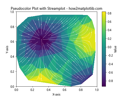
In this example, we create vector field data (u and v) and interpolate it onto a regular grid using LinearTriInterpolator. We then use ax.streamplot() to add streamlines representing the vector field on top of the pseudocolor plot.
Creating an Interactive Pseudocolor Plot
When you create a pseudocolor plot of an unstructured triangular grid in Python using Matplotlib, you might want to make it interactive to allow users to explore the data. Here's an example using Matplotlib's interactive features:
import numpy as np
import matplotlib.pyplot as plt
from matplotlib.tri import Triangulation
from matplotlib.widgets import Slider

# Create sample data for the grid
x = np.random.rand(100)
y = np.random.rand(100)
triangles = Triangulation(x, y)

# Create sample data for the pseudocolor plot
def z_func(x, y, freq):
    return np.sin(freq * x) * np.cos(freq * y)

# Create a figure and axis
fig, ax = plt.subplots()
plt.subplots_adjust(bottom=0.25)

# Initial frequency
initial_freq = 5
z = z_func(x, y, initial_freq)

# Create the initial pseudocolor plot
triplot = ax.tripcolor(triangles, z, shading='flat', cmap='viridis')

# Add a colorbar
cbar = fig.colorbar(triplot, ax=ax, label='Value')

# Set labels and title
ax.set_xlabel('X-axis')
ax.set_ylabel('Y-axis')
ax.set_title('Interactive Pseudocolor Plot - how2matplotlib.com')

# Create a slider
ax_slider = plt.axes([0.2, 0.1, 0.6, 0.03])
freq_slider = Slider(ax_slider, 'Frequency', 1, 10, valinit=initial_freq)

# Update function for the slider
def update(val):
    freq = freq_slider.val
    z = z_func(x, y, freq)
    triplot.set_array(z)
    fig.canvas.draw_idle()

freq_slider.on_changed(update)

plt.show()
Output:
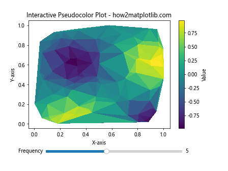
In this example, we create an interactive plot with a slider that allows the user to adjust the frequency of the sine and cosine functions used to generate the data. The update function is called whenever the slider value changes, updating the plot accordingly.
Saving the Pseudocolor Plot
After you create a pseudocolor plot of an unstructured triangular grid in Python using Matplotlib, you'll often want to save it for later use or inclusion in reports. Matplotlib provides several options for saving plots. Here's an example:
import numpy as np
import matplotlib.pyplot as plt
from matplotlib.tri import Triangulation

# Create sample data for the grid
x = np.random.rand(100)
y = np.random.rand(100)
triangles = Triangulation(x, y)

# Create sample data for the pseudocolor plot
z = np.sin(5 * x) * np.cos(5 * y)

# Create a figure and axis
fig, ax = plt.subplots(figsize=(10, 8), dpi=300)

# Create the pseudocolor plot
triplot = ax.tripcolor(triangles, z, shading='flat', cmap='viridis')

# Add a colorbar
fig.colorbar(triplot, ax=ax, label='Value')

# Set labels and title
ax.set_xlabel('X-axis')
ax.set_ylabel('Y-axis')
ax.set_title('Saved Pseudocolor Plot - how2matplotlib.com')

# Save the plot in different formats
plt.savefig('pseudocolor_plot.png', dpi=300, bbox_inches='tight')
plt.savefig('pseudocolor_plot.pdf', bbox_inches='tight')
plt.savefig('pseudocolor_plot.svg', bbox_inches='tight')

plt.show()
Output:
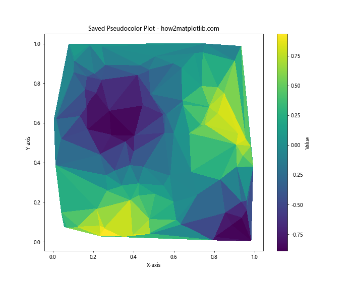
In this example, we save the plot in three different formats: PNG, PDF, and SVG. The dpi argument sets the resolution for raster formats like PNG, while bbox_inches='tight' ensures that the entire plot, including labels and titles, is included in the saved file.
Conclusion
Creating a pseudocolor plot of an unstructured triangular grid in Python using Matplotlib is a powerful technique for visualizing complex data. Throughout this article, we've explored various aspects of this process, from basic plot creation to advanced customization and interactivity.
We've covered topics such as:
- Understanding unstructured triangular grids
- Creating basic pseudocolor plots
- Customizing colormaps
- Adding contour lines
- Interpolating data
- Handling missing data
- Adding text and annotations
- Creating multiple subplots
- Customizing triangulations
- Adding masks to triangulations
- Adjusting color scales
- Adding streamplots
- Creating interactive plots
- Saving plots in various formats