How to Create 3D Scatter Plots in Python using Matplotlib
3D Scatter Plotting in Python using Matplotlib is a powerful technique for visualizing three-dimensional data. This article will provide an in-depth exploration of how to create stunning 3D scatter plots using Matplotlib, one of the most popular data visualization libraries in Python. We’ll cover everything from basic plot creation to advanced customization techniques, ensuring you have all the tools you need to create impressive 3D scatter plots for your data analysis and presentation needs.
Introduction to 3D Scatter Plotting in Python using Matplotlib
3D Scatter Plotting in Python using Matplotlib allows you to represent data points in a three-dimensional space. Each point in a 3D scatter plot is defined by three coordinates: x, y, and z. This type of visualization is particularly useful when you need to analyze relationships between three variables simultaneously.
Matplotlib, a comprehensive library for creating static, animated, and interactive visualizations in Python, provides robust tools for 3D scatter plotting. Let’s start with a basic example to get familiar with the concept:
import matplotlib.pyplot as plt
from mpl_toolkits.mplot3d import Axes3D
import numpy as np

# Generate sample data
x = np.random.rand(100)
y = np.random.rand(100)
z = np.random.rand(100)

# Create a 3D scatter plot
fig = plt.figure(figsize=(10, 8))
ax = fig.add_subplot(111, projection='3d')
scatter = ax.scatter(x, y, z)

# Set labels and title
ax.set_xlabel('X-axis')
ax.set_ylabel('Y-axis')
ax.set_zlabel('Z-axis')
ax.set_title('Basic 3D Scatter Plot - how2matplotlib.com')

plt.show()
Output:
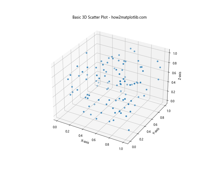
In this example, we import the necessary modules, generate random data for x, y, and z coordinates, create a 3D subplot, and use the scatter() function to plot the points. We then set labels for each axis and add a title to the plot.
Setting Up Your Environment for 3D Scatter Plotting in Python using Matplotlib
Before diving deeper into 3D scatter plotting, it’s essential to ensure your Python environment is properly set up. Here’s a step-by-step guide:
- Install Python: If you haven’t already, download and install Python from the official website (python.org).
Install Matplotlib: Open your terminal or command prompt and run:
pip install matplotlib- Install NumPy: While not strictly necessary for 3D scatter plotting, NumPy is often used in conjunction with Matplotlib for data manipulation:
pip install numpy - Verify installation: Open a Python interpreter and run:
import matplotlib
import numpy
print(matplotlib.__version__)
print(numpy.__version__)
If these commands execute without errors and print version numbers, you’re ready to start 3D scatter plotting in Python using Matplotlib!
Basic 3D Scatter Plotting in Python using Matplotlib
Let’s explore some basic techniques for creating 3D scatter plots with Matplotlib:
Creating a Simple 3D Scatter Plot
Here’s an example of a simple 3D scatter plot using randomly generated data:
import matplotlib.pyplot as plt
from mpl_toolkits.mplot3d import Axes3D
import numpy as np

# Generate random data
n = 100
x = np.random.rand(n)
y = np.random.rand(n)
z = np.random.rand(n)

# Create the 3D scatter plot
fig = plt.figure(figsize=(10, 8))
ax = fig.add_subplot(111, projection='3d')
scatter = ax.scatter(x, y, z)

# Customize the plot
ax.set_xlabel('X-axis')
ax.set_ylabel('Y-axis')
ax.set_zlabel('Z-axis')
ax.set_title('Simple 3D Scatter Plot - how2matplotlib.com')

plt.show()
Output:
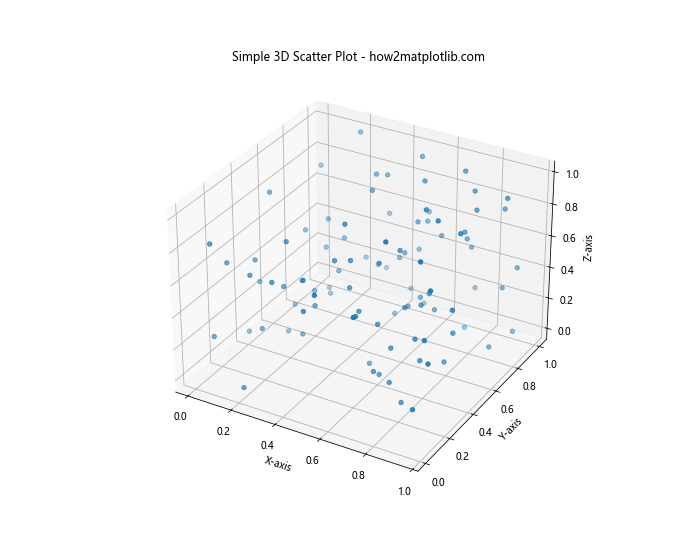
This code creates a basic 3D scatter plot with 100 randomly generated points. The figsize parameter sets the size of the figure, and add_subplot(111, projection='3d') creates a 3D axes object.
Customizing Point Colors in 3D Scatter Plotting
You can customize the colors of the points in your 3D scatter plot to represent an additional dimension of data:
import matplotlib.pyplot as plt
from mpl_toolkits.mplot3d import Axes3D
import numpy as np

# Generate random data
n = 100
x = np.random.rand(n)
y = np.random.rand(n)
z = np.random.rand(n)
colors = np.random.rand(n)

# Create the 3D scatter plot with colored points
fig = plt.figure(figsize=(10, 8))
ax = fig.add_subplot(111, projection='3d')
scatter = ax.scatter(x, y, z, c=colors, cmap='viridis')

# Add a color bar
plt.colorbar(scatter)

# Customize the plot
ax.set_xlabel('X-axis')
ax.set_ylabel('Y-axis')
ax.set_zlabel('Z-axis')
ax.set_title('3D Scatter Plot with Colored Points - how2matplotlib.com')

plt.show()
Output:
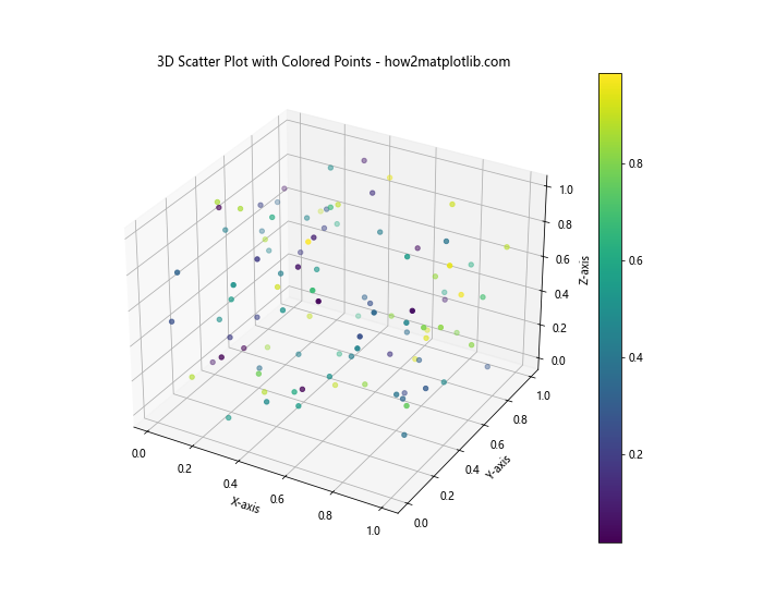
In this example, we use the c parameter to specify colors for each point, and cmap to choose a color map. The plt.colorbar() function adds a color scale to the plot.
Advanced Techniques for 3D Scatter Plotting in Python using Matplotlib
Now that we’ve covered the basics, let’s explore some more advanced techniques for 3D scatter plotting in Python using Matplotlib.
Adjusting Point Size and Transparency
You can adjust the size and transparency of points in your 3D scatter plot to highlight certain data points or reduce visual clutter:
import matplotlib.pyplot as plt
from mpl_toolkits.mplot3d import Axes3D
import numpy as np

# Generate random data
n = 100
x = np.random.rand(n)
y = np.random.rand(n)
z = np.random.rand(n)
sizes = 1000 * np.random.rand(n)

# Create the 3D scatter plot with varying point sizes and transparency
fig = plt.figure(figsize=(10, 8))
ax = fig.add_subplot(111, projection='3d')
scatter = ax.scatter(x, y, z, s=sizes, alpha=0.6)

# Customize the plot
ax.set_xlabel('X-axis')
ax.set_ylabel('Y-axis')
ax.set_zlabel('Z-axis')
ax.set_title('3D Scatter Plot with Varying Point Sizes - how2matplotlib.com')

plt.show()
Output:
In this example, we use the s parameter to set varying point sizes and alpha to adjust transparency.
Adding a Custom Color Map to 3D Scatter Plots
You can create custom color maps for your 3D scatter plots to better represent your data:
import matplotlib.pyplot as plt
from mpl_toolkits.mplot3d import Axes3D
import numpy as np
from matplotlib.colors import LinearSegmentedColormap

# Generate random data
n = 100
x = np.random.rand(n)
y = np.random.rand(n)
z = np.random.rand(n)
values = np.random.rand(n)

# Create a custom color map
colors = ['blue', 'green', 'yellow', 'red']
n_bins = 100
cmap = LinearSegmentedColormap.from_list('custom_cmap', colors, N=n_bins)

# Create the 3D scatter plot with the custom color map
fig = plt.figure(figsize=(10, 8))
ax = fig.add_subplot(111, projection='3d')
scatter = ax.scatter(x, y, z, c=values, cmap=cmap)

# Add a color bar
plt.colorbar(scatter)

# Customize the plot
ax.set_xlabel('X-axis')
ax.set_ylabel('Y-axis')
ax.set_zlabel('Z-axis')
ax.set_title('3D Scatter Plot with Custom Color Map - how2matplotlib.com')

plt.show()
Output:
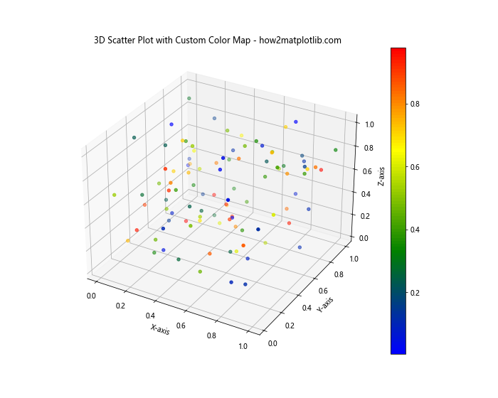
This example demonstrates how to create a custom color map using LinearSegmentedColormap.from_list() and apply it to your 3D scatter plot.
Enhancing 3D Scatter Plots with Additional Features
Let’s explore some additional features that can enhance your 3D scatter plots in Python using Matplotlib.
Adding Text Labels to 3D Scatter Plots
You can add text labels to specific points in your 3D scatter plot to provide more context:
import matplotlib.pyplot as plt
from mpl_toolkits.mplot3d import Axes3D
import numpy as np

# Generate random data
n = 20
x = np.random.rand(n)
y = np.random.rand(n)
z = np.random.rand(n)

# Create the 3D scatter plot
fig = plt.figure(figsize=(10, 8))
ax = fig.add_subplot(111, projection='3d')
scatter = ax.scatter(x, y, z)

# Add text labels to some points
for i in range(5):
    ax.text(x[i], y[i], z[i], f'Point {i+1}', fontsize=9)

# Customize the plot
ax.set_xlabel('X-axis')
ax.set_ylabel('Y-axis')
ax.set_zlabel('Z-axis')
ax.set_title('3D Scatter Plot with Text Labels - how2matplotlib.com')

plt.show()
Output:
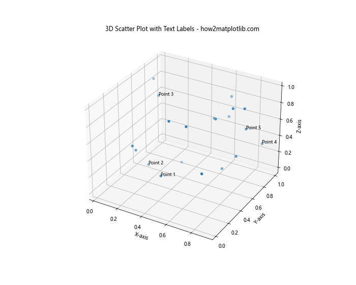
This example uses the ax.text() function to add labels to the first five points in the plot.
Combining 3D Scatter Plots with Other Plot Types
You can combine 3D scatter plots with other types of plots to create more informative visualizations:
import matplotlib.pyplot as plt
from mpl_toolkits.mplot3d import Axes3D
import numpy as np

# Generate random data
n = 100
x = np.random.rand(n)
y = np.random.rand(n)
z = np.random.rand(n)

# Create the 3D scatter plot
fig = plt.figure(figsize=(12, 8))
ax = fig.add_subplot(111, projection='3d')
scatter = ax.scatter(x, y, z, c='blue', label='Data Points')

# Add a plane to the plot
xx, yy = np.meshgrid(np.linspace(0, 1, 10), np.linspace(0, 1, 10))
z = 0.5 * np.ones(xx.shape)
ax.plot_surface(xx, yy, z, alpha=0.3, color='red', label='Plane z=0.5')

# Customize the plot
ax.set_xlabel('X-axis')
ax.set_ylabel('Y-axis')
ax.set_zlabel('Z-axis')
ax.set_title('3D Scatter Plot with a Plane - how2matplotlib.com')
ax.legend()

plt.show()
Output:
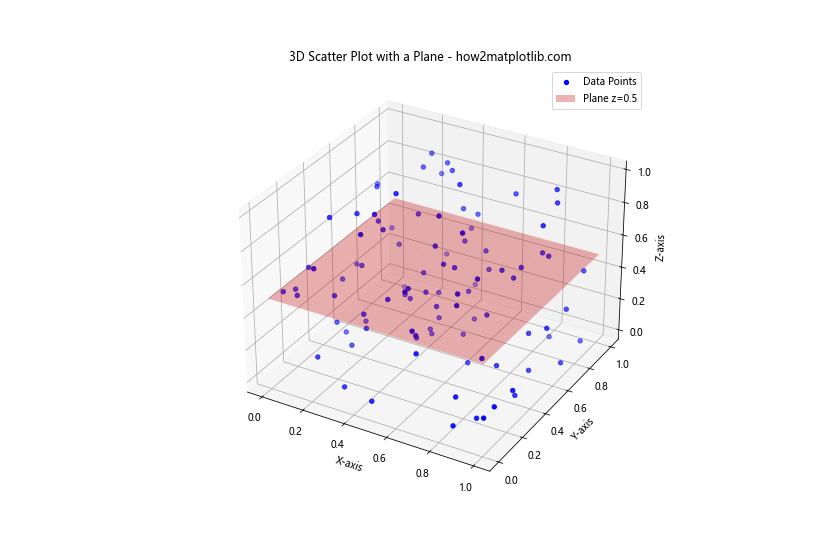
This example combines a 3D scatter plot with a surface plot to show the relationship between the scattered points and a plane.
Animating 3D Scatter Plots in Python using Matplotlib
Animation can add an extra dimension to your 3D scatter plots, allowing you to visualize changes over time or from different perspectives.
Creating a Rotating 3D Scatter Plot
Here’s an example of how to create a rotating 3D scatter plot:
import matplotlib.pyplot as plt
from mpl_toolkits.mplot3d import Axes3D
import numpy as np
from matplotlib.animation import FuncAnimation

# Generate random data
n = 100
x = np.random.rand(n)
y = np.random.rand(n)
z = np.random.rand(n)

# Create the 3D scatter plot
fig = plt.figure(figsize=(10, 8))
ax = fig.add_subplot(111, projection='3d')
scatter = ax.scatter(x, y, z)

# Customize the plot
ax.set_xlabel('X-axis')
ax.set_ylabel('Y-axis')
ax.set_zlabel('Z-axis')
ax.set_title('Rotating 3D Scatter Plot - how2matplotlib.com')

# Animation function
def rotate(angle):
    ax.view_init(elev=10., azim=angle)
    return scatter,

# Create the animation
ani = FuncAnimation(fig, rotate, frames=np.linspace(0, 360, 100), interval=50, blit=True)

plt.show()
Output:
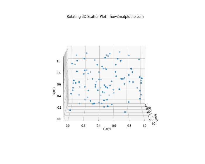
This example uses FuncAnimation to create a rotating view of the 3D scatter plot.
Handling Large Datasets in 3D Scatter Plotting
When dealing with large datasets, 3D scatter plotting can become challenging due to performance issues and visual clutter. Here are some techniques to handle large datasets effectively:
Using Alpha Blending for Dense 3D Scatter Plots
Alpha blending can help visualize dense clusters of points:
import matplotlib.pyplot as plt
from mpl_toolkits.mplot3d import Axes3D
import numpy as np

# Generate a large dataset
n = 10000
x = np.random.normal(0, 1, n)
y = np.random.normal(0, 1, n)
z = np.random.normal(0, 1, n)

# Create the 3D scatter plot with alpha blending
fig = plt.figure(figsize=(10, 8))
ax = fig.add_subplot(111, projection='3d')
scatter = ax.scatter(x, y, z, alpha=0.1, s=1)

# Customize the plot
ax.set_xlabel('X-axis')
ax.set_ylabel('Y-axis')
ax.set_zlabel('Z-axis')
ax.set_title('3D Scatter Plot with Alpha Blending - how2matplotlib.com')

plt.show()
Output:
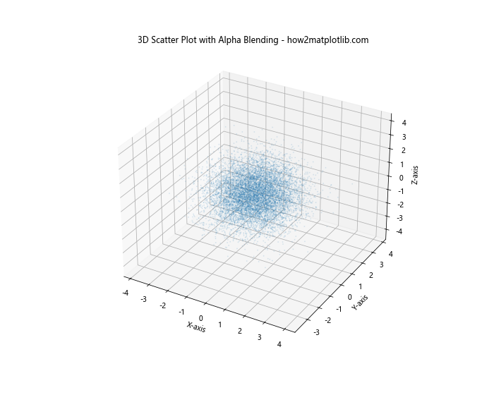
In this example, we use a low alpha value (0.1) and small point size (s=1) to visualize a large number of points without overwhelming the plot.
Subsampling Data for 3D Scatter Plots
When dealing with extremely large datasets, you might want to subsample your data:
import matplotlib.pyplot as plt
from mpl_toolkits.mplot3d import Axes3D
import numpy as np

# Generate a very large dataset
n = 1000000
x = np.random.normal(0, 1, n)
y = np.random.normal(0, 1, n)
z = np.random.normal(0, 1, n)

# Subsample the data
subsample_size = 10000
indices = np.random.choice(n, subsample_size, replace=False)
x_sub = x[indices]
y_sub = y[indices]
z_sub = z[indices]

# Create the 3D scatter plot with subsampled data
fig = plt.figure(figsize=(10, 8))
ax = fig.add_subplot(111, projection='3d')
scatter = ax.scatter(x_sub, y_sub, z_sub, alpha=0.5, s=2)

# Customize the plot
ax.set_xlabel('X-axis')
ax.set_ylabel('Y-axis')
ax.set_zlabel('Z-axis')
ax.set_title('3D Scatter Plot with Subsampled Data - how2matplotlib.com')

plt.show()
Output:
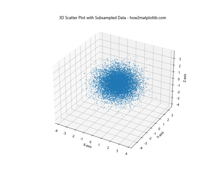
This example demonstrates how to randomly subsample a large dataset to create a more manageable 3D scatter plot.
Advanced Customization Techniques for 3D Scatter Plotting in Python using Matplotlib
Let’s explore some advanced customization techniques to make your 3D scatter plots even more informative and visually appealing.
Adding Annotations to 3D Scatter Plots
You can add annotations to highlight specific points or regions in your 3D scatter plot:
import matplotlib.pyplot as plt
from mpl_toolkits.mplot3d import Axes3D
import numpy as np

# Generate random data
n = 100
x = np.random.rand(n)
y = np.random.rand(n)
z = np.random.rand(n)

# Create the 3D scatter plot
fig = plt.figure(figsize=(12, 8))
ax = fig.add_subplot(111, projection='3d')
scatter = ax.scatter(x, y, z)

# Add an annotation
ax.text(0.8, 0.8, 0.8, "Important Region", fontsize=12,
        bbox=dict(facecolor='red', alpha=0.5))

# Add an arrow
ax.quiver(0.5, 0.5, 0.5, 0.3, 0.3, 0.3, color='green', arrow_length_ratio=0.1)

# Customize the plot
ax.set_xlabel('X-axis')
ax.set_ylabel('Y-axis')
ax.set_zlabel('Z-axis')
ax.set_title('3D Scatter Plot with Annotations - how2matplotlib.com')

plt.show()
Output:
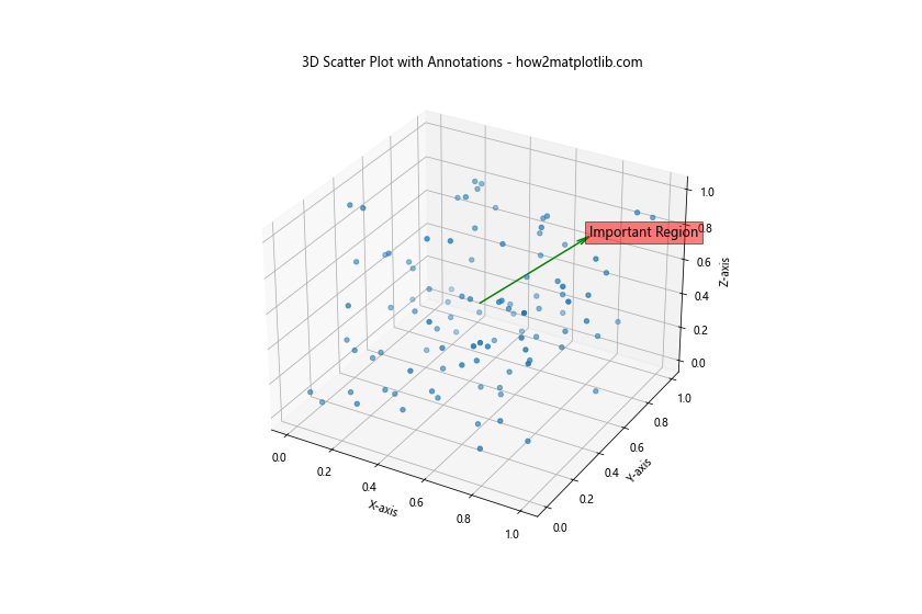
This example shows how to add text annotations and arrows to your 3D scatter plot.
Comparing Multiple Datasets in 3D Scatter Plotting
When working with multiple datasets, you might want to compare them in the same 3D scatter plot. Here’s how you can do that:
Creating a 3D Scatter Plot with Multiple Datasets
import matplotlib.pyplot as plt
from mpl_toolkits.mplot3d import Axes3D
import numpy as np

# Generate random data for two datasets
n = 100
x1, y1, z1 = np.random.rand(3, n)
x2, y2, z2 = np.random.rand(3, n) + 0.5

# Create the 3D scatter plot
fig = plt.figure(figsize=(12, 8))
ax = fig.add_subplot(111, projection='3d')

# Plot the first dataset
scatter1 = ax.scatter(x1, y1, z1, c='blue', label='Dataset 1')

# Plot the second dataset
scatter2 = ax.scatter(x2, y2, z2, c='red', label='Dataset 2')

# Customize the plot
ax.set_xlabel('X-axis')
ax.set_ylabel('Y-axis')
ax.set_zlabel('Z-axis')
ax.set_title('3D Scatter Plot with Multiple Datasets - how2matplotlib.com')
ax.legend()

plt.show()
Output:
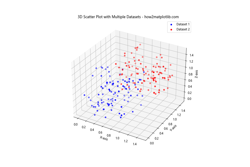
This example demonstrates how to plot two different datasets in the same 3D scatter plot, using different colors and labels for each dataset.
Integrating 3D Scatter Plots with Other Matplotlib Features
Matplotlib offers a wide range of features that can be combined with 3D scatter plots to create more complex visualizations.
Adding 2D Projections to 3D Scatter Plots
You can add 2D projections of your 3D scatter plot to provide additional perspectives:
import matplotlib.pyplot as plt
from mpl_toolkits.mplot3d import Axes3D
import numpy as np

# Generate random data
n = 100
x = np.random.rand(n)
y = np.random.rand(n)
z = np.random.rand(n)

# Create the 3D scatter plot with 2D projections
fig = plt.figure(figsize=(12, 8))
ax = fig.add_subplot(111, projection='3d')

# Plot the 3D scatter
scatter = ax.scatter(x, y, z)

# Plot 2D projections
ax.scatter(x, y, zs=0, zdir='z', c='red', alpha=0.5)
ax.scatter(x, z, zs=1, zdir='y', c='green', alpha=0.5)
ax.scatter(y, z, zs=0, zdir='x', c='blue', alpha=0.5)

# Customize the plot
ax.set_xlabel('X-axis')
ax.set_ylabel('Y-axis')
ax.set_zlabel('Z-axis')
ax.set_title('3D Scatter Plot with 2D Projections - how2matplotlib.com')

plt.show()
Output:
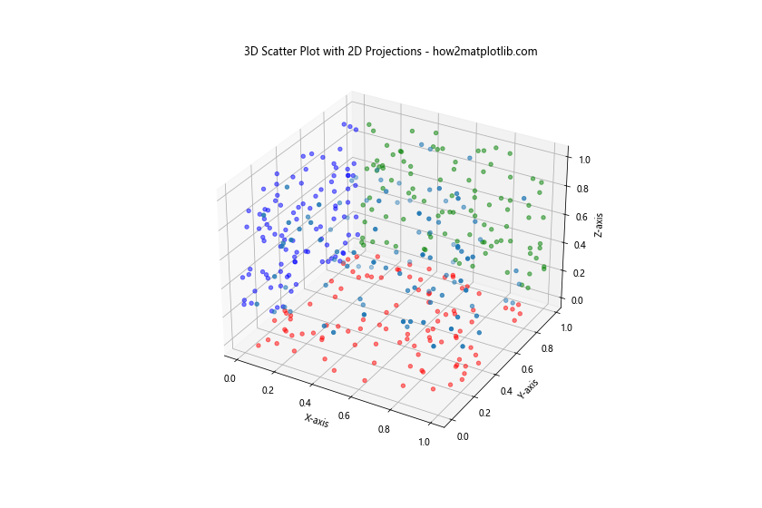
This example shows how to add 2D projections of the 3D scatter plot onto each plane.
Best Practices for 3D Scatter Plotting in Python using Matplotlib
When creating 3D scatter plots, it’s important to follow some best practices to ensure your visualizations are effective and informative:
- Choose appropriate axes ranges: Make sure your axes ranges are set to show all data points clearly.
Use color effectively: Color can be a powerful tool to represent an additional dimension of data, but be mindful of color blindness and choose color maps accordingly.
Add context with labels and titles: Always include clear labels for each axis and a descriptive title for your plot.
Consider point size and transparency: Adjust these parameters to prevent overlapping points from obscuring each other.
Use interactivity when possible: For large datasets, consider using interactive plots that allow zooming and rotation.
Be mindful of perspective: 3D plots can sometimes be misleading due to perspective. Consider including 2D projections or multiple views.
Optimize for performance: When dealing with large datasets, use techniques like subsampling or alpha blending to maintain performance.
Troubleshooting Common Issues in 3D Scatter Plotting with Matplotlib
When working with 3D scatter plots in Matplotlib, you might encounter some common issues. Here are some problems and their solutions: