How to Add Space Between Histogram Bars in Matplotlib
Add space between histogram bars in Matplotlib is an essential technique for creating clear and visually appealing data visualizations. This article will explore various methods to add space between histogram bars in Matplotlib, providing detailed explanations and examples to help you master this important skill. Whether you’re a beginner or an experienced data scientist, understanding how to add space between histogram bars in Matplotlib will enhance your ability to create effective and professional-looking charts.
Understanding the Importance of Adding Space Between Histogram Bars
Before we dive into the specifics of how to add space between histogram bars in Matplotlib, let’s discuss why this technique is crucial for data visualization. Adding space between histogram bars can:
- Improve readability: By creating separation between bars, it becomes easier for viewers to distinguish individual data points.
- Enhance aesthetics: Properly spaced bars can make your histogram look more polished and professional.
- Highlight specific data: Adding space can draw attention to particular bars or groups of bars.
- Accommodate labels: Extra space allows for the inclusion of labels or annotations without overcrowding.
Now that we understand the importance of adding space between histogram bars in Matplotlib, let’s explore various methods to achieve this effect.
Method 1: Using the ‘rwidth’ Parameter to Add Space Between Histogram Bars
One of the simplest ways to add space between histogram bars in Matplotlib is by using the ‘rwidth’ parameter. This parameter controls the relative width of the bars, allowing you to create space between them. Let’s look at an example:
import matplotlib.pyplot as plt
import numpy as np

# Generate sample data
data = np.random.normal(0, 1, 1000)

# Create histogram with space between bars
plt.figure(figsize=(10, 6))
plt.hist(data, bins=20, rwidth=0.8, edgecolor='black')
plt.title('Histogram with Space Between Bars (how2matplotlib.com)')
plt.xlabel('Value')
plt.ylabel('Frequency')
plt.show()
Output:
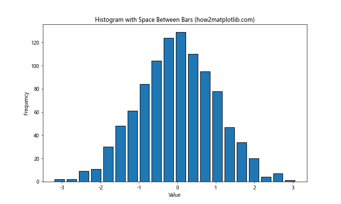
In this example, we set rwidth=0.8, which means each bar will occupy 80% of its allocated space, leaving 20% as space between bars. By adjusting the rwidth value, you can control the amount of space between histogram bars in Matplotlib.
Method 2: Adjusting Bar Width to Add Space Between Histogram Bars
Another approach to add space between histogram bars in Matplotlib is by manually adjusting the width of each bar. This method gives you more control over the spacing and allows for non-uniform gaps if desired. Here’s an example:
import matplotlib.pyplot as plt
import numpy as np

# Generate sample data
data = np.random.normal(0, 1, 1000)

# Calculate histogram data
counts, bins, _ = plt.hist(data, bins=20)
plt.clf()  # Clear the current figure

# Plot histogram with custom bar width
plt.figure(figsize=(10, 6))
plt.bar(bins[:-1], counts, width=0.8 * (bins[1] - bins[0]), align='edge', edgecolor='black')
plt.title('Histogram with Custom Bar Width (how2matplotlib.com)')
plt.xlabel('Value')
plt.ylabel('Frequency')
plt.show()
Output:
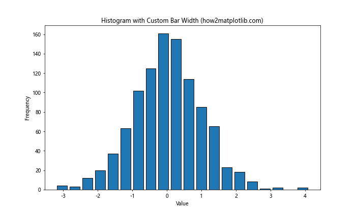
In this example, we first calculate the histogram data using plt.hist(), then clear the figure and create a bar plot using plt.bar(). By setting the width parameter to 80% of the bin width, we create space between the bars.
Method 3: Using Multiple Histograms to Create Space
A creative way to add space between histogram bars in Matplotlib is by creating multiple histograms with different colors. This technique can be particularly useful when you want to emphasize different categories within your data. Here’s an example:
import matplotlib.pyplot as plt
import numpy as np

# Generate sample data
data1 = np.random.normal(0, 1, 500)
data2 = np.random.normal(2, 1, 500)

# Create histogram with space between bars using multiple histograms
plt.figure(figsize=(10, 6))
plt.hist(data1, bins=20, alpha=0.7, label='Data 1')
plt.hist(data2, bins=20, alpha=0.7, label='Data 2')
plt.title('Histogram with Space Using Multiple Datasets (how2matplotlib.com)')
plt.xlabel('Value')
plt.ylabel('Frequency')
plt.legend()
plt.show()
Output:
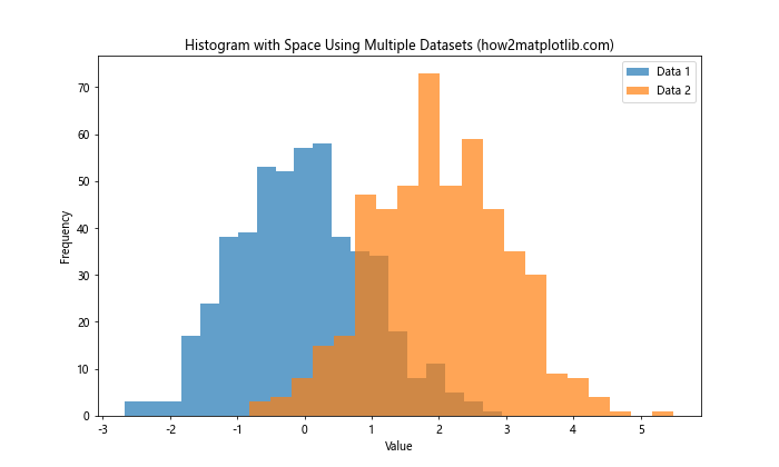
This method creates two overlapping histograms with transparency, effectively adding space between the bars of each dataset.
Advanced Techniques to Add Space Between Histogram Bars in Matplotlib
Now that we’ve covered the basics, let’s explore some more advanced techniques to add space between histogram bars in Matplotlib.
Using Step Histograms
Step histograms can be an effective way to add space between bars while maintaining a continuous appearance. Here’s how to create a step histogram:
import matplotlib.pyplot as plt
import numpy as np

# Generate sample data
data = np.random.normal(0, 1, 1000)

# Create step histogram
plt.figure(figsize=(10, 6))
counts, bins, _ = plt.hist(data, bins=20, histtype='step', linewidth=2)
plt.title('Step Histogram with Implicit Spacing (how2matplotlib.com)')
plt.xlabel('Value')
plt.ylabel('Frequency')
plt.show()
Output:
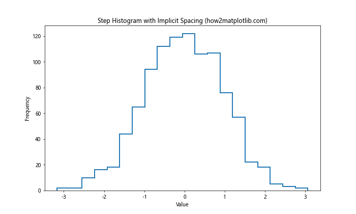
This method creates a histogram with lines instead of filled bars, implicitly adding space between the data points.
Customizing Bar Edges
Adding distinct edges to histogram bars can create the illusion of space. Here’s how to customize bar edges:
import matplotlib.pyplot as plt
import numpy as np

# Generate sample data
data = np.random.normal(0, 1, 1000)

# Create histogram with customized bar edges
plt.figure(figsize=(10, 6))
plt.hist(data, bins=20, edgecolor='black', linewidth=1.2)
plt.title('Histogram with Customized Bar Edges (how2matplotlib.com)')
plt.xlabel('Value')
plt.ylabel('Frequency')
plt.show()
Output:
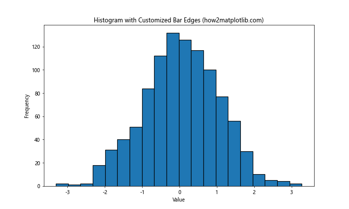
By setting edgecolor and linewidth, we create distinct edges that visually separate the bars.
Using a Combination of Techniques
For maximum control over spacing, you can combine multiple techniques. Here’s an example that uses custom bar widths and edge colors:
import matplotlib.pyplot as plt
import numpy as np

# Generate sample data
data = np.random.normal(0, 1, 1000)

# Calculate histogram data
counts, bins, _ = plt.hist(data, bins=20)
plt.clf()  # Clear the current figure

# Plot histogram with custom bar width and edges
plt.figure(figsize=(10, 6))
plt.bar(bins[:-1], counts, width=0.8 * (bins[1] - bins[0]), align='edge', edgecolor='black', linewidth=1.2)
plt.title('Histogram with Custom Width and Edges (how2matplotlib.com)')
plt.xlabel('Value')
plt.ylabel('Frequency')
plt.show()
Output:
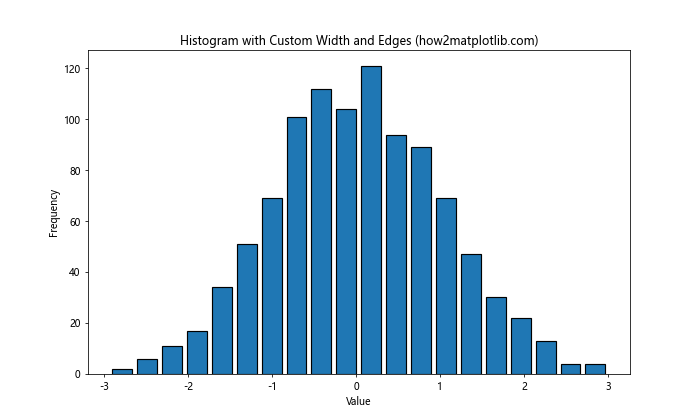
This example combines custom bar widths with distinct edge colors to create clear separation between bars.
Adjusting Spacing for Different Types of Histograms
The method to add space between histogram bars in Matplotlib may vary depending on the type of histogram you’re creating. Let’s explore how to adjust spacing for different histogram types.
Stacked Histograms
For stacked histograms, adding space between bars requires a slightly different approach. Here’s an example:
import matplotlib.pyplot as plt
import numpy as np

# Generate sample data
data1 = np.random.normal(0, 1, 1000)
data2 = np.random.normal(1, 1, 1000)

# Create stacked histogram with space between bars
plt.figure(figsize=(10, 6))
plt.hist([data1, data2], bins=20, stacked=True, rwidth=0.8)
plt.title('Stacked Histogram with Space Between Bars (how2matplotlib.com)')
plt.xlabel('Value')
plt.ylabel('Frequency')
plt.legend(['Data 1', 'Data 2'])
plt.show()
Output:
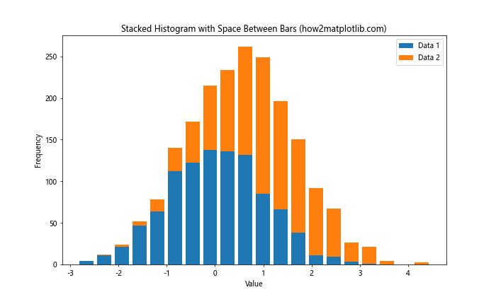
In this case, we use the rwidth parameter to add space between the stacked bars.
Horizontal Histograms
To add space between bars in a horizontal histogram, we can use a similar approach to vertical histograms. Here’s how:
import matplotlib.pyplot as plt
import numpy as np

# Generate sample data
data = np.random.normal(0, 1, 1000)

# Create horizontal histogram with space between bars
plt.figure(figsize=(10, 6))
plt.hist(data, bins=20, orientation='horizontal', rwidth=0.8)
plt.title('Horizontal Histogram with Space Between Bars (how2matplotlib.com)')
plt.xlabel('Frequency')
plt.ylabel('Value')
plt.show()
Output:
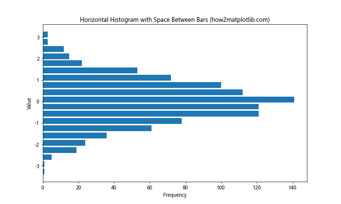
The rwidth parameter works the same way for horizontal histograms, creating space between the bars.
Fine-tuning Histogram Spacing
To achieve the perfect spacing for your histogram, you may need to fine-tune various parameters. Let’s explore some advanced techniques to add space between histogram bars in Matplotlib.
Adjusting Bin Edges
By manually specifying bin edges, you can control the spacing between bars more precisely. Here’s an example:
import matplotlib.pyplot as plt
import numpy as np

# Generate sample data
data = np.random.normal(0, 1, 1000)

# Create custom bin edges
bin_edges = np.linspace(-4, 4, 21)

# Create histogram with custom bin edges
plt.figure(figsize=(10, 6))
plt.hist(data, bins=bin_edges, rwidth=0.8, edgecolor='black')
plt.title('Histogram with Custom Bin Edges (how2matplotlib.com)')
plt.xlabel('Value')
plt.ylabel('Frequency')
plt.show()
Output:
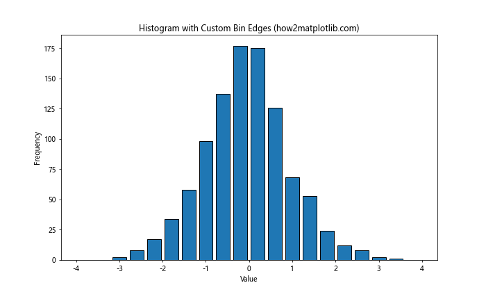
This method allows you to control both the number of bins and their exact positions, giving you more control over the spacing.
Using Log Scale
For data with a wide range of values, using a log scale can help visualize the distribution while maintaining space between bars:
import matplotlib.pyplot as plt
import numpy as np

# Generate sample data with a wide range
data = np.random.lognormal(0, 1, 1000)

# Create histogram with log scale
plt.figure(figsize=(10, 6))
plt.hist(data, bins=20, rwidth=0.8, log=True)
plt.title('Histogram with Log Scale and Space Between Bars (how2matplotlib.com)')
plt.xlabel('Value (log scale)')
plt.ylabel('Frequency (log scale)')
plt.show()
Output:
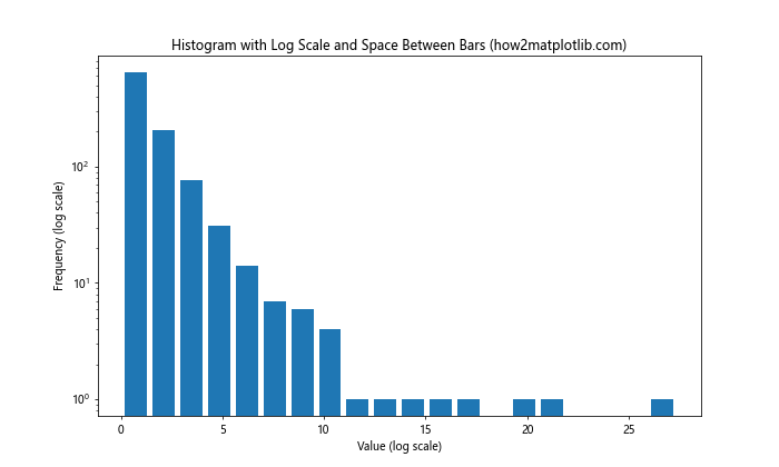
The log=True parameter applies a logarithmic scale to both axes, which can help separate bars in datasets with large value ranges.
Combining Histograms with Other Plot Types
Adding space between histogram bars in Matplotlib can be particularly useful when combining histograms with other plot types. Let’s explore some examples.
Histogram with Kernel Density Estimation (KDE)
Combining a histogram with a KDE plot can provide additional insights into your data distribution:
import matplotlib.pyplot as plt
import numpy as np
from scipy import stats

# Generate sample data
data = np.random.normal(0, 1, 1000)

# Create histogram with KDE
plt.figure(figsize=(10, 6))
plt.hist(data, bins=20, density=True, alpha=0.7, rwidth=0.85)
kde = stats.gaussian_kde(data)
x_range = np.linspace(data.min(), data.max(), 100)
plt.plot(x_range, kde(x_range), 'r-', linewidth=2)
plt.title('Histogram with KDE and Space Between Bars (how2matplotlib.com)')
plt.xlabel('Value')
plt.ylabel('Density')
plt.show()
Output:
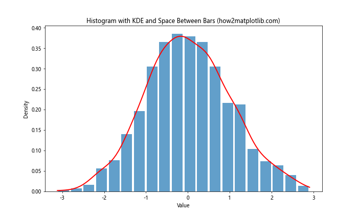
In this example, we create a histogram with spaced bars and overlay a KDE plot for a more comprehensive view of the data distribution.
Histogram with Cumulative Distribution Function (CDF)
Adding a CDF to your histogram can provide insights into the cumulative properties of your data:
import matplotlib.pyplot as plt
import numpy as np

# Generate sample data
data = np.random.normal(0, 1, 1000)

# Create histogram with CDF
plt.figure(figsize=(10, 6))
counts, bins, _ = plt.hist(data, bins=20, density=True, alpha=0.7, rwidth=0.85)
cdf = np.cumsum(counts) / sum(counts)
plt.plot(bins[1:], cdf, 'r-', linewidth=2)
plt.title('Histogram with CDF and Space Between Bars (how2matplotlib.com)')
plt.xlabel('Value')
plt.ylabel('Density / Cumulative Probability')
plt.legend(['CDF', 'Histogram'])
plt.show()
Output:
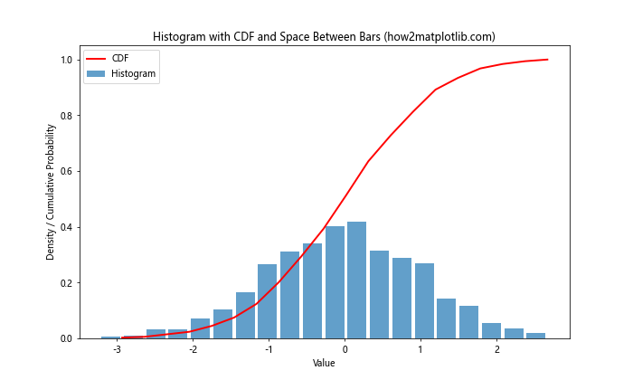
This example demonstrates how to add a CDF to a histogram with spaced bars, providing a comprehensive view of the data distribution.
Customizing Histogram Aesthetics
While adding space between histogram bars in Matplotlib improves readability, there are additional aesthetic customizations you can apply to enhance your visualizations further.
Color Gradients
Using color gradients can add depth to your histogram while maintaining the spacing between bars:
import matplotlib.pyplot as plt
import numpy as np

# Generate sample data
data = np.random.normal(0, 1, 1000)

# Create histogram with color gradient
plt.figure(figsize=(10, 6))
n, bins, patches = plt.hist(data, bins=20, rwidth=0.8)

# Color gradient
cm = plt.cm.get_cmap('viridis')
for i, p in enumerate(patches):
    plt.setp(p, 'facecolor', cm(i / len(patches)))

plt.title('Histogram with Color Gradient and Space Between Bars (how2matplotlib.com)')
plt.xlabel('Value')
plt.ylabel('Frequency')
plt.colorbar(ticks=[])
plt.show()
This example applies a color gradient to the histogram bars while maintaining the spacing between them.
Adding Error Bars
For histograms representing data with uncertainty, adding error bars can provide valuable information:
import matplotlib.pyplot as plt
import numpy as np

# Generate sample data
data = np.random.normal(0, 1, 1000)

# Calculate histogram data
counts, bins, _ = plt.hist(data, bins=20)
plt.clf()  # Clear the current figure

# Calculate error (assuming Poisson distribution)
errors = np.sqrt(counts)

# Plot histogram with error bars
plt.figure(figsize=(10, 6))
plt.bar(bins[:-1], counts, width=0.8 * (bins[1] - bins[0]), align='edge', yerr=errors, capsize=5)
plt.title('Histogram with Error Bars and Space Between Bars (how2matplotlib.com)')
plt.xlabel('Value')
plt.ylabel('Frequency')
plt.show()
Output:
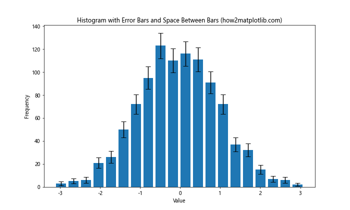
This example demonstrates how to add error bars to a histogram while maintaining space between the bars.
Handling Special Cases
Sometimes, you may encounter special cases where adding space between histogram bars in Matplotlib requires additional considerations. Let’s explore a few of these scenarios.
Dealing with Outliers
When your data contains outliers, you may need to adjust your approach to maintain readable spacing:
import matplotlib.pyplot as plt
import numpy as np

# Generate sample data with outliers
data = np.concatenate([np.random.normal(0, 1, 990), np.random.normal(10, 1, 10)])

# Create histogram with adjusted range
plt.figure(figsize=(10, 6))
plt.hist(data, bins=20, range=(-4, 4), rwidth=0.8)
plt.title('Histogram with Outliers and Space Between Bars (how2matplotlib.com)')
plt.xlabel('Value')
plt.ylabel('Frequency')
plt.text(3.5, plt.ylim()[1]*0.9, f'Outliers: {sum(data > 4)}', ha='right')
plt.show()
Output:
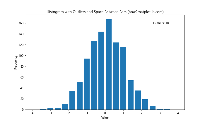
In this example, we set a specific range for the histogram tofocus on the main distribution while acknowledging the presence of outliers.
Handling Discrete Data
When working with discrete data, you may need to adjust the bin edges to ensure proper spacing:
import matplotlib.pyplot as plt
import numpy as np

# Generate sample discrete data
data = np.random.randint(1, 11, 1000)

# Create histogram for discrete data
plt.figure(figsize=(10, 6))
plt.hist(data, bins=np.arange(0.5, 11.5, 1), rwidth=0.8, align='mid')
plt.title('Histogram for Discrete Data with Space Between Bars (how2matplotlib.com)')
plt.xlabel('Value')
plt.ylabel('Frequency')
plt.xticks(range(1, 11))
plt.show()
Output:
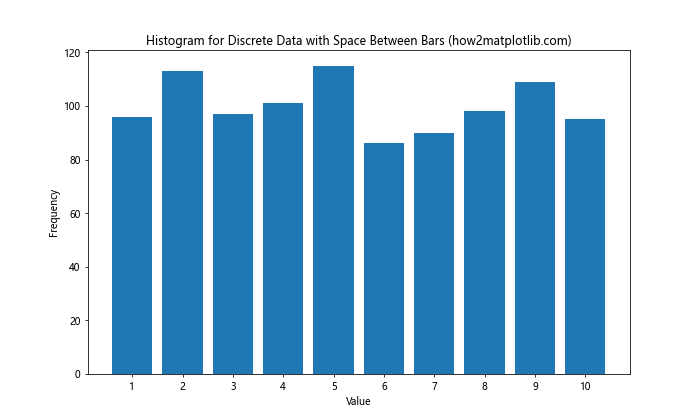
This example uses bin edges that are offset by 0.5 to center the bars on integer values while maintaining space between them.
Best Practices for Adding Space Between Histogram Bars in Matplotlib
As we conclude our comprehensive guide on how to add space between histogram bars in Matplotlib, let’s review some best practices to ensure your visualizations are both effective and visually appealing:
- Consistency: Maintain consistent spacing across all histograms in your project for a professional look.
Balance: Strike a balance between bar width and spacing. Too much space can make the histogram look sparse, while too little can make it cluttered.
Context: Consider the context of your data when deciding on spacing. Some datasets may benefit from more pronounced spacing than others.
Readability: Ensure that the spacing enhances readability without compromising the overall message of your visualization.
Experimentation: Don’t be afraid to experiment with different spacing techniques to find what works best for your specific dataset and audience.
Annotation: Use the added space effectively by including annotations or labels where appropriate.
Color: Consider using color strategically to enhance the visual separation between bars.
Axis Limits: Adjust axis limits as needed to accommodate the added space without cutting off important data.
Legend: If using multiple datasets, ensure the legend is clear and doesn’t interfere with the spaced bars.
Responsive Design: Consider how your histogram will appear on different screen sizes and adjust spacing accordingly.
Conclusion
Adding space between histogram bars in Matplotlib is a powerful technique that can significantly enhance the clarity and visual appeal of your data visualizations. Throughout this article, we’ve explored various methods to achieve this effect, from simple parameter adjustments to more advanced customizations. We’ve covered how to add space between histogram bars in Matplotlib using the ‘rwidth’ parameter, adjusting bar widths manually, and creating multiple overlapping histograms. We’ve also delved into advanced techniques such as using step histograms, customizing bar edges, and combining multiple methods for maximum control. Furthermore, we’ve discussed how to adjust spacing for different types of histograms, including stacked and horizontal histograms. We’ve explored fine-tuning techniques like adjusting bin edges and using log scales, as well as combining histograms with other plot types like KDE and CDF. We’ve also touched on aesthetic customizations such as color gradients and adding error bars, and addressed special cases like dealing with outliers and discrete data. Finally, we’ve provided a set of best practices to guide you in creating effective and visually appealing histograms with proper spacing. By mastering these techniques to add space between histogram bars in Matplotlib, you’ll be well-equipped to create clear, professional, and informative data visualizations. Remember that the key to effective data visualization is not just in the techniques themselves, but in how you apply them to best represent your data and communicate your insights.