Using colorbar in Matplotlib
Matplotlib is a powerful Python library for creating static, animated, and interactive visualizations. One common feature used in Matplotlib plots is the colorbar, which provides a visual representation of the relationship between the colors in a plot and the data that they represent. In this article, we will explore how to use colorbar in Matplotlib plots in detail.
Basic Colorbar
The colorbar() function in Matplotlib is used to add a colorbar to a plot. Let’s start by creating a simple scatter plot with a colorbar:
import matplotlib.pyplot as plt
import numpy as np

x = np.random.rand(100)
y = np.random.rand(100)
colors = np.random.rand(100)
sizes = 1000 * np.random.rand(100)

plt.scatter(x, y, c=colors, s=sizes, cmap='RdYlGn')
plt.colorbar()
plt.show()
Output:
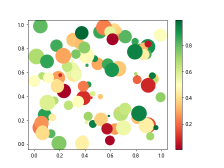
In this example, we generate random data for x and y coordinates, colors, and sizes of the markers in a scatter plot. We use the cmap='RdYlGn' parameter in the scatter() function to specify the colormap. The plt.colorbar() function then adds a colorbar to the plot.
Colorbar Orientation
You can control the orientation of the colorbar using the orientation parameter. The default orientation is ‘vertical’, but you can change it to ‘horizontal’ as shown in the example below:
import matplotlib.pyplot as plt
import numpy as np

x = np.linspace(0, 10, 100)
y = np.sin(x)
colors = x

plt.scatter(x, y, c=colors, cmap='viridis')
plt.colorbar(orientation='horizontal')
plt.show()
Output:
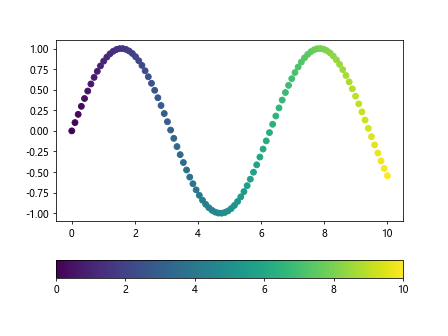
In this example, we create a scatter plot with a horizontal colorbar using the orientation='horizontal' parameter in the colorbar() function.
Colorbar Placement
You can adjust the placement of the colorbar in relation to the plot using the location parameter. The possible locations are ‘right’, ‘left’, ‘top’, and ‘bottom’. Here is an example of placing the colorbar on the right side of the plot:
import matplotlib.pyplot as plt

plt.figure(figsize=(8, 6))
plt.scatter(range(10), range(10), c=range(10), cmap='viridis')
plt.colorbar(location='right')
plt.show()
Output:
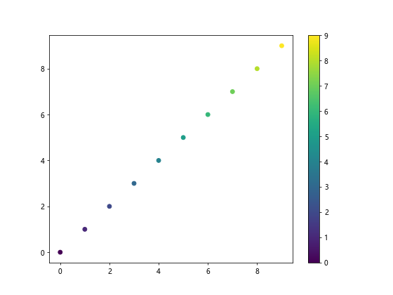
By specifying location='right', the colorbar is placed on the right side of the plot.
Custom Colorbar Ticks
You can specify custom ticks for the colorbar using the ticks parameter. This is useful when you want to customize the tick positions on the colorbar. Here is an example:
import matplotlib.pyplot as plt
import numpy as np

x = np.linspace(0, 10, 100)
y = np.sin(x)

plt.scatter(x, y, c=x, cmap='viridis')
plt.colorbar(ticks=[0, 5, 10])
plt.show()
Output:
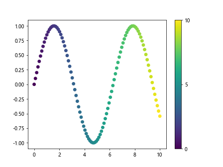
In this example, we set custom ticks at positions 0, 5, and 10 on the colorbar using the ticks=[0, 5, 10] parameter in the colorbar() function.
Scaling the Colorbar
You can adjust the scaling of the colorbar by setting the norm parameter. This allows you to normalize the colors based on different scales. Here is an example that scales the colorbar logarithmically:
import matplotlib.pyplot as plt
import numpy as np

x = np.random.rand(100)
y = np.random.rand(100)
colors = np.random.rand(100)
sizes = 1000 * np.random.rand(100)

plt.scatter(x, y, c=colors, s=sizes, cmap='viridis')
plt.colorbar(norm=LogNorm())
plt.show()
In this example, we use the LogNorm() function to create a logarithmic scaling for the colorbar. This can be useful when dealing with data that spans several orders of magnitude.
Discrete Colorbar
If you have discrete values for the colors in your plot, you can create a discrete colorbar using the BoundariesNorm() function. Here is an example:
import matplotlib.pyplot as plt
import numpy as np
from matplotlib.colors import BoundaryNorm

x = np.random.rand(100)
y = np.random.rand(100)
colors = np.random.randint(0, 10, 100)  # Discrete values

plt.scatter(x, y, c=colors, cmap='viridis', norm=BoundaryNorm(range(0, 11, 2), 256))
plt.colorbar()
plt.show()
Output:
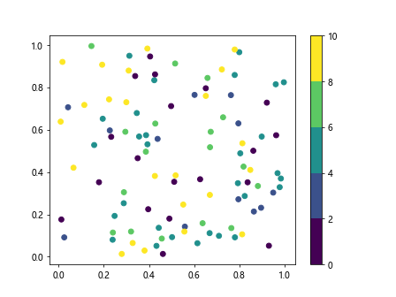
In this example, we use the BoundaryNorm() function to create discrete boundaries for the colorbar. We specify the range of values and the number of intervals between them.
Colorbar Title
You can add a title to the colorbar using the set_label() function. This allows you to provide additional information about the data represented by the colors. Here is an example:
import matplotlib.pyplot as plt
import numpy as np

x = np.linspace(0, 10, 100)
y = np.sin(x)
colors = x

plt.scatter(x, y, c=colors, cmap='viridis')
cbar = plt.colorbar()
cbar.set_label('X values')
plt.show()
Output:

In this example, we add a title ‘X values’ to the colorbar using the set_label() function.
Colorbar Format
You can format the tick labels of the colorbar using the format parameter. This allows you to customize the appearance of the tick labels, such as using scientific notation. Here is an example:
import matplotlib.pyplot as plt
import numpy as np
from matplotlib.ticker import ScalarFormatter

x = np.linspace(0, 10, 100)
y = np.sin(x)

plt.scatter(x, y, c=x, cmap='viridis')
cbar = plt.colorbar(format=ScalarFormatter())
plt.show()
Output:

In this example, we use the ScalarFormatter() function to format the tick labels of the colorbar.
Colorbar Tick Labels
You can customize the tick labels of the colorbar using the set_ticks() function. This allows you to specify the positions of the tick labels on the colorbar. Here is an example:
import matplotlib.pyplot as plt
import numpy as np

x = np.linspace(0, 10, 100)
y = np.sin(x)

plt.scatter(x, y, c=x, cmap='viridis')
cbar = plt.colorbar()
cbar.set_ticks([0, 5, 10])
plt.show()
Output:

In this example, we set the tick positions of the colorbar at values 0, 5, and 10 using the set_ticks() function.
Colorbar Labels
You can customize both the tick labels and the positions of the ticks on the colorbar using the set_ticks() and set_ticklabels() functions. This allows you to provide custom labels for each tick position. Here is an example:
import matplotlib.pyplot as plt
import numpy as np

x = np.linspace(0, 10, 100)
y = np.sin(x)

plt.scatter(x, y, c=x, cmap='viridis')
cbar = plt.colorbar()
cbar.set_ticks([0, 5, 10])
cbar.set_ticklabels(['Low', 'Medium', 'High'])
plt.show()
Output:
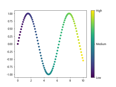
In this example, we set the tick positions at values 0, 5, and 10 on the colorbar and provide custom labels ‘Low’, ‘Medium’, and ‘High’ for each tick position.
Colorbar Transparency
You can make the colorbar partially transparent using the alpha parameter. This can help blend the colorbar with the plot and improve the overall visualization. Here is an example:
import matplotlib.pyplot as plt
import numpy as np

x = np.linspace(0, 10, 100)
y = np.sin(x)

plt.scatter(x, y, c=x, cmap='viridis')
cbar = plt.colorbar()
cbar.set_alpha(0.8)
plt.show()
Output:

In this example, we set the transparency of the colorbar to 0.8 using the set_alpha() function.
Colorbar Border
You can customize the border of the colorbar using the set_edgecolor() function. This allows you to change the color of the border to
import matplotlib.pyplot as plt
import numpy as np

x = np.linspace(0, 10, 100)
y = np.sin(x)

plt.scatter(x, y, c=x, cmap='viridis')
cbar = plt.colorbar()
cbar.outline.set_edgecolor('red')
plt.show()
Output:
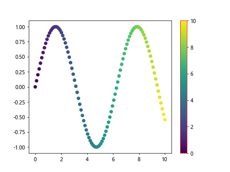
In this example, we change the color of the colorbar border to red using the set_edgecolor() function.
Colorbar Thickness
You can adjust the thickness of the colorbar using the set_linewidth() function. This allows you to control the visual appearance of the colorbar border. Here is an example:
import matplotlib.pyplot as plt
import numpy as np

x = np.linspace(0, 10, 100)
y = np.sin(x)

plt.scatter(x, y, c=x, cmap='viridis')
cbar = plt.colorbar()
cbar.outline.set_linewidth(2)
plt.show()
Output:
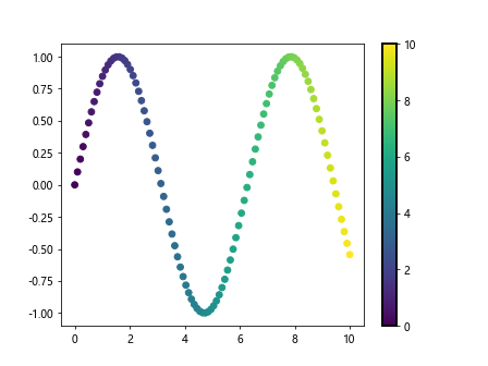
In this example, we set the thickness of the colorbar border to 2 points using the set_linewidth() function.
Colorbar Background Color
You can change the background color of the colorbar using the set_facecolor() function. This allows you to customize the appearance of the colorbar. Here is an example:
import matplotlib.pyplot as plt
import numpy as np

x = np.linspace(0, 10, 100)
y = np.sin(x)

plt.scatter(x, y, c=x, cmap='viridis')
cbar = plt.colorbar()
cbar.set_facecolor('lightgrey')
plt.show()
In this example, we change the background color of the colorbar to light grey using the set_facecolor() function.
Colorbar Orientation
You can rotate the colorbar labels to be vertical using the ax.set_ylabel function. Here is an example:
import matplotlib.pyplot as plt
import numpy as np

x = np.linspace(0, 10, 100)
y = np.sin(x)

plt.scatter(x, y, c=x, cmap='viridis')
cbar = plt.colorbar()
cbar.ax.set_ylabel('X values', rotation=90)
plt.show()
Output:
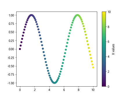
In this example, we rotate the colorbar label ‘X values’ to be vertical using the ax.set_ylabel function with rotation value of 90 degrees.
Colorbar Tick Labels Rotation
You can also rotate the tick labels on the colorbar using the ax.tick_params function. Here is an example:
import matplotlib.pyplot as plt
import numpy as np

x = np.linspace(0, 10, 100)
y = np.sin(x)

plt.scatter(x, y, c=x, cmap='viridis')
cbar = plt.colorbar()
cbar.ax.tick_params(labelrotation=45)
plt.show()
Output:
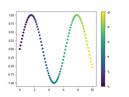
In this example, we rotate the tick labels on the colorbar by 45 degrees using the ax.tick_params function with labelrotation parameter.
Colorbar Tick Labels Font Size
You can adjust the font size of the tick labels on the colorbar using the fontsize parameter in the tick_params function. Here is an example:
import matplotlib.pyplot as plt
import numpy as np

x = np.linspace(0, 10, 100)
y = np.sin(x)

plt.scatter(x, y, c=x, cmap='viridis')
cbar = plt.colorbar()
cbar.ax.tick_params(labelsize=12)
plt.show()
Output:
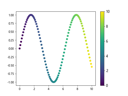
In this example, we set the font size of the tick labels on the colorbar to 12 points using the fontsize parameter in the tick_params function.
Colorbar Tick Labels Font Weight
You can also adjust the font weight of the tick labels on the colorbar using the fontweight parameter in the tick_params function. Here is an example:
import matplotlib.pyplot as plt
import numpy as np

x = np.linspace(0, 10, 100)
y = np.sin(x)

plt.scatter(x, y, c=x, cmap='viridis')
cbar = plt.colorbar()
cbar.ax.tick_params(axis='y', labelweight='bold')
plt.show()
In this example, we set the font weight of the tick labels on the colorbar to bold using the fontweight parameter in the tick_params function.
colorbar plt Conclusion
In this article, we have explored various aspects of using colorbars in Matplotlib plots. We have covered how to add colorbars, customize their appearance, adjust their orientation, and more. By leveraging the features of colorbars, you can enhance the visual representation of your data and create more informative and appealing plots in Matplotlib.