Understanding Colormaps in Matplotlib
When it comes to visualizing data in Matplotlib, choosing the right colormap can make a huge difference in how your plot is perceived. In this article, we will explore the concept of colormaps in Matplotlib and how you can use them to enhance your visualizations.
What is a Colormap?
A colormap, or cmap for short, is a mapping of scalar values to colors. In Matplotlib, colormaps are used to color various plot elements such as lines, markers, and surfaces. Colormaps are essential for representing data in a way that is both visually appealing and informative.
Example Code:
import matplotlib.pyplot as plt

# Display all available color maps
plt.colormaps()
plt.show()
Choosing the Right Colormap
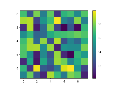
There are many built-in colormaps in Matplotlib, each with its own unique characteristics. It’s important to choose the right colormap based on the type of data you are visualizing. Some colormaps are better suited for sequential data, while others are more appropriate for diverging or qualitative data.
Example Code:
import numpy as np
import matplotlib.pyplot as plt

data = np.random.rand(10, 10)

plt.imshow(data, cmap='viridis')
plt.colorbar()
plt.show()
Output:
Types of Colormaps
Matplotlib provides various types of colormaps that are designed for different types of data. Some of the most commonly used types of colormaps are:
- Sequential Colormaps
- Diverging Colormaps
- Qualitative Colormaps
Let’s explore each type of colormap in more detail.
Sequential Colormaps
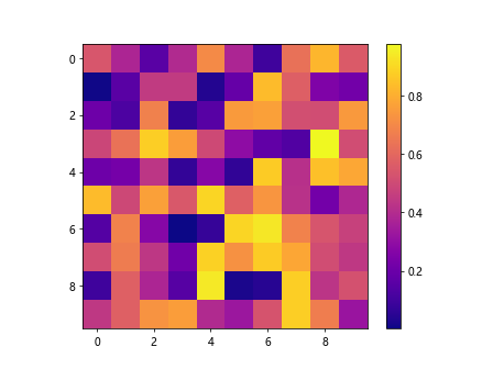
Sequential colormaps are used to represent data that has a natural progression from low to high values. These colormaps are ideal for visualizing data that has a continuous range of values.
Example Code:
import numpy as np
import matplotlib.pyplot as plt

data = np.random.rand(10, 10)

plt.imshow(data, cmap='plasma')
plt.colorbar()
plt.show()
Output:
Diverging Colormaps
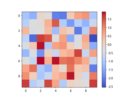
Diverging colormaps are used to represent data that has a clear midpoint and diverges in two directions. These colormaps are often used to highlight positive and negative values in the data.
Example Code:
import numpy as np
import matplotlib.pyplot as plt

data = np.random.randn(10, 10)

plt.imshow(data, cmap='coolwarm')
plt.colorbar()
plt.show()
Output:
Qualitative Colormaps
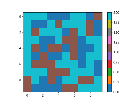
Qualitative colormaps are used to represent categorical data where the individual values do not have a natural ordering. These colormaps use distinct colors to differentiate between categories.
Example Code:
import numpy as np
import matplotlib.pyplot as plt

data = np.random.randint(0, 3, (10, 10))

plt.imshow(data, cmap='tab10')
plt.colorbar()
plt.show()
Output:
Customizing Colormaps
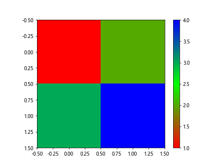
In addition to the built-in colormaps, you can also create custom colormaps in Matplotlib. Custom colormaps allow you to choose specific colors and color transitions to best represent your data.
Example Code:
import matplotlib.pyplot as plt
import matplotlib.colors as mcolors

colors = ['#FF0000', '#00FF00', '#0000FF']
cmap_custom = mcolors.LinearSegmentedColormap.from_list('Custom', colors)

plt.imshow([[1, 2], [3, 4]], cmap=cmap_custom)
plt.colorbar()
plt.show()
Output:
Understanding Colormaps in Matplotlib Conclusion
Colormaps play a crucial role in the visualization of data in Matplotlib. By understanding the different types of colormaps and how to use them effectively, you can create visually appealing and informative plots that effectively communicate your data.